kottke.org posts about art
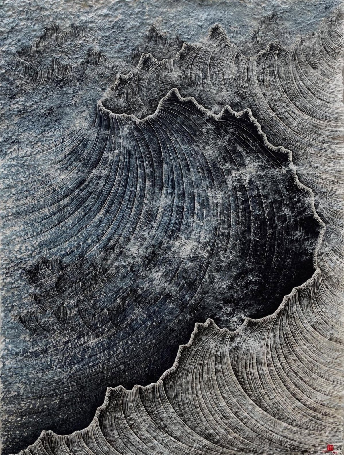
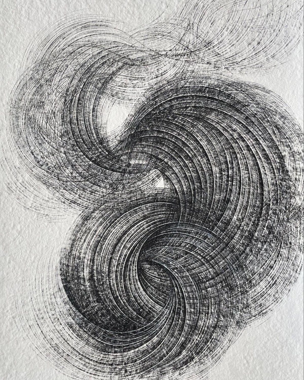
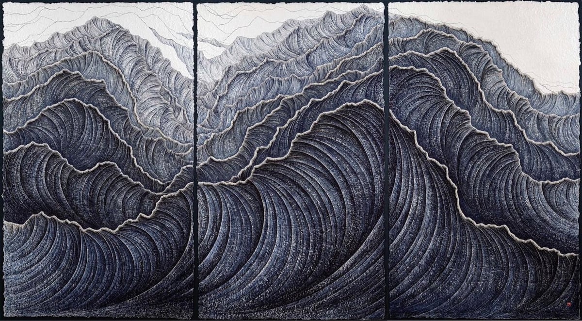
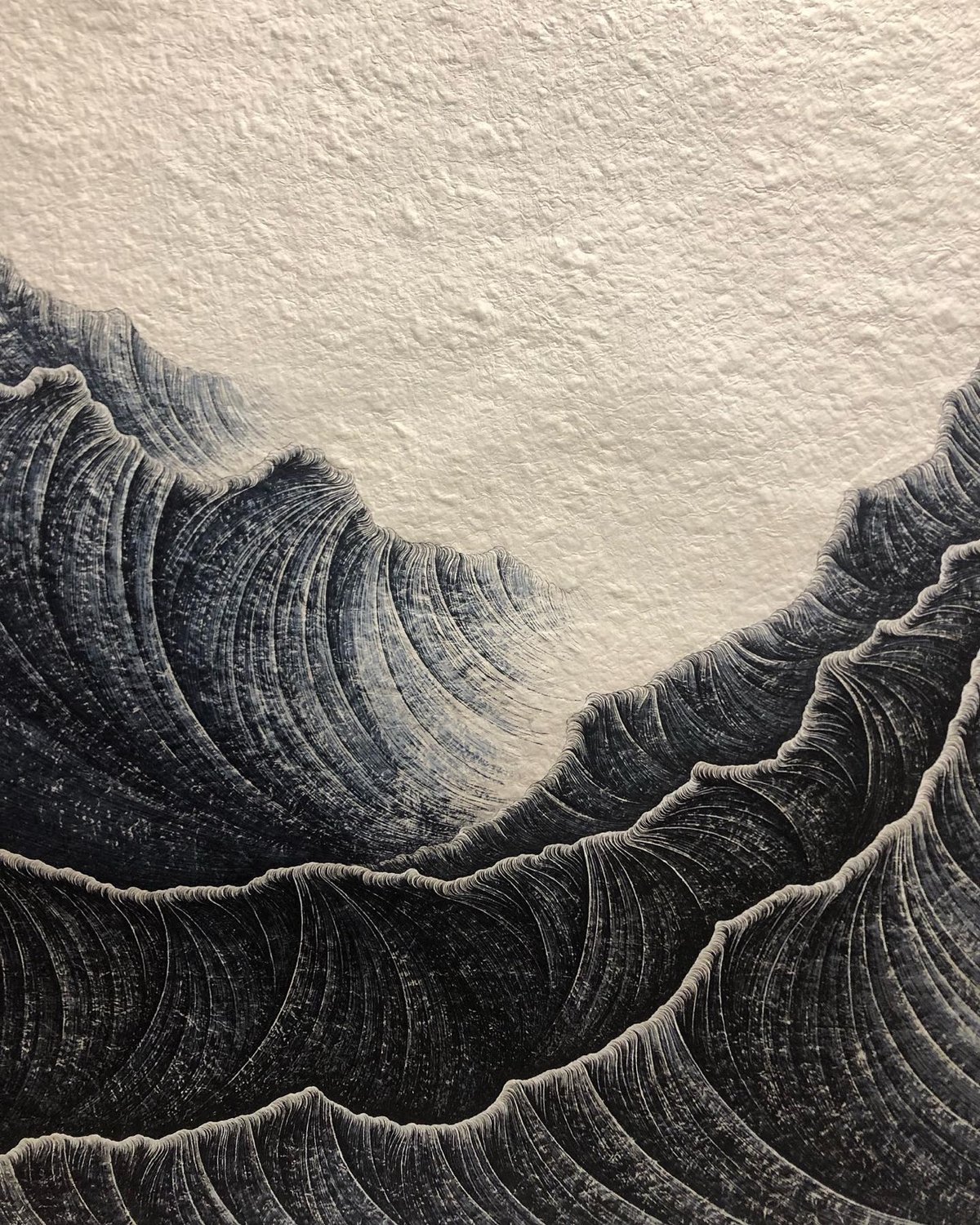
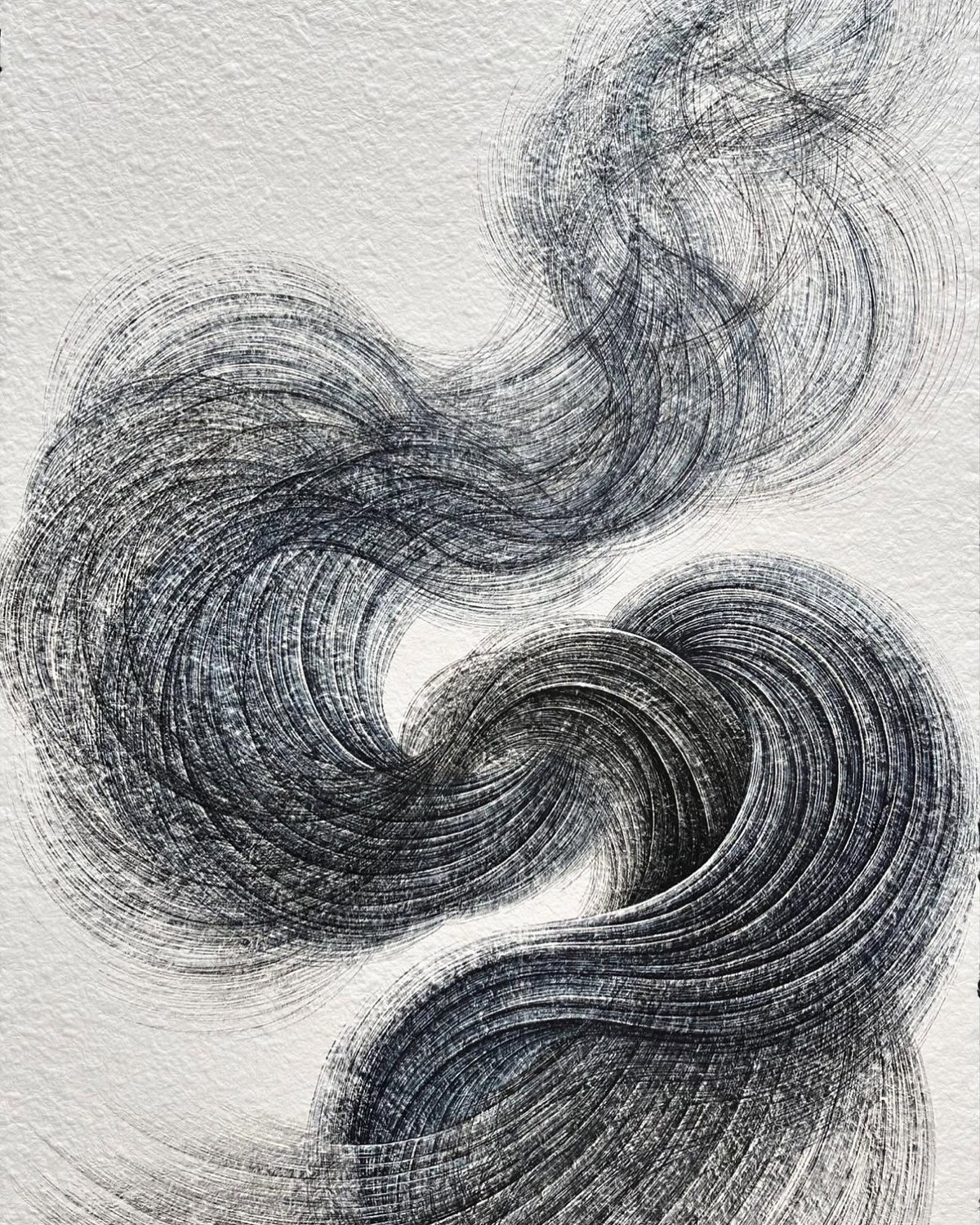
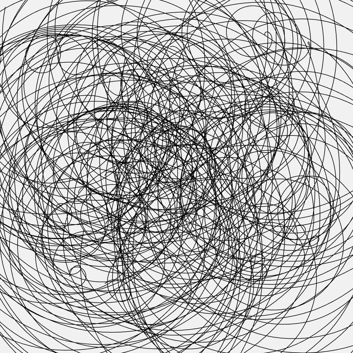
I’ve posted about Korean artist Lee Hyun-Joung’s swirling and swooping work before, but I recently saw one of her pieces in person and decided to feature some of her most recent stuff. It’s always a good time to look at art.
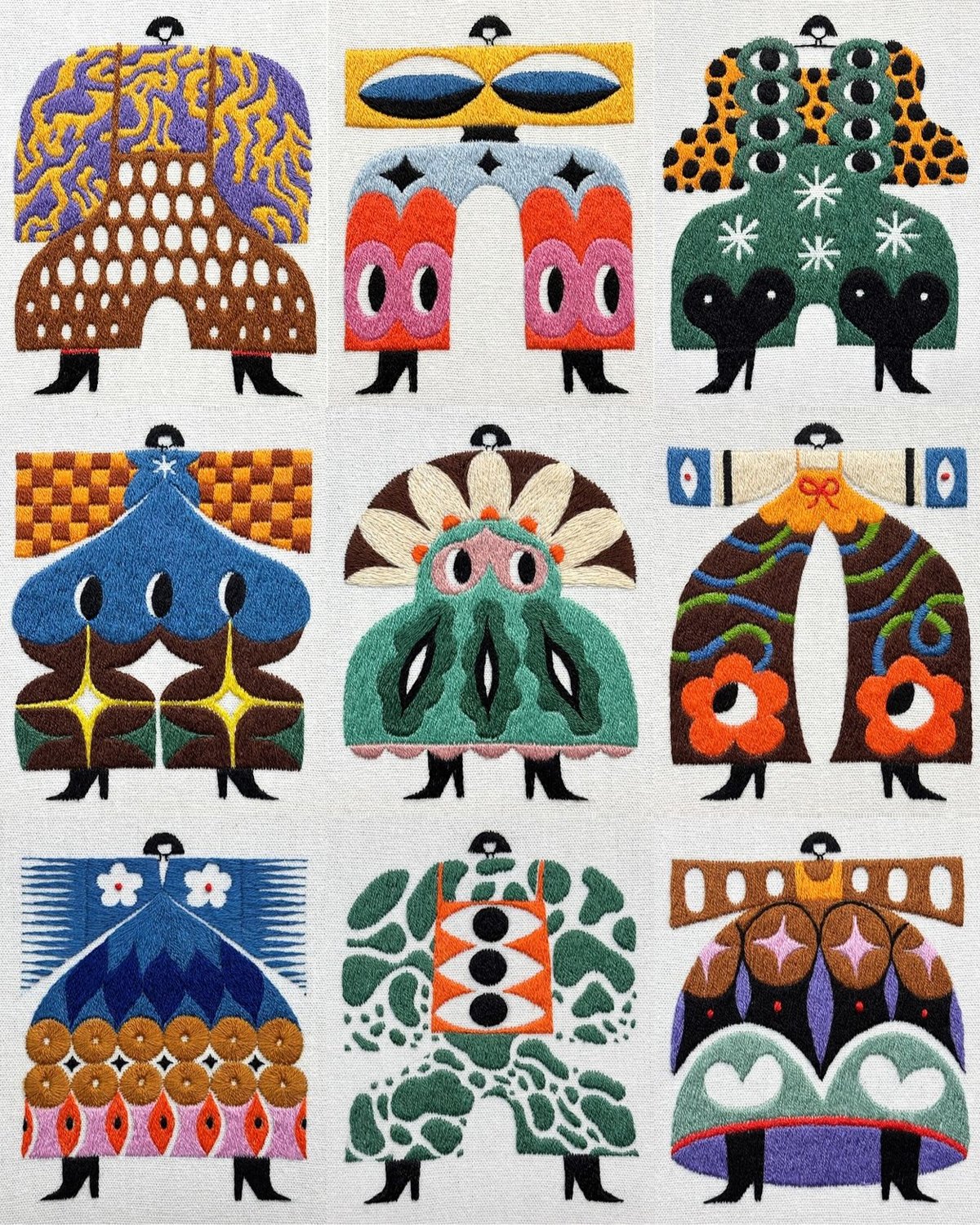
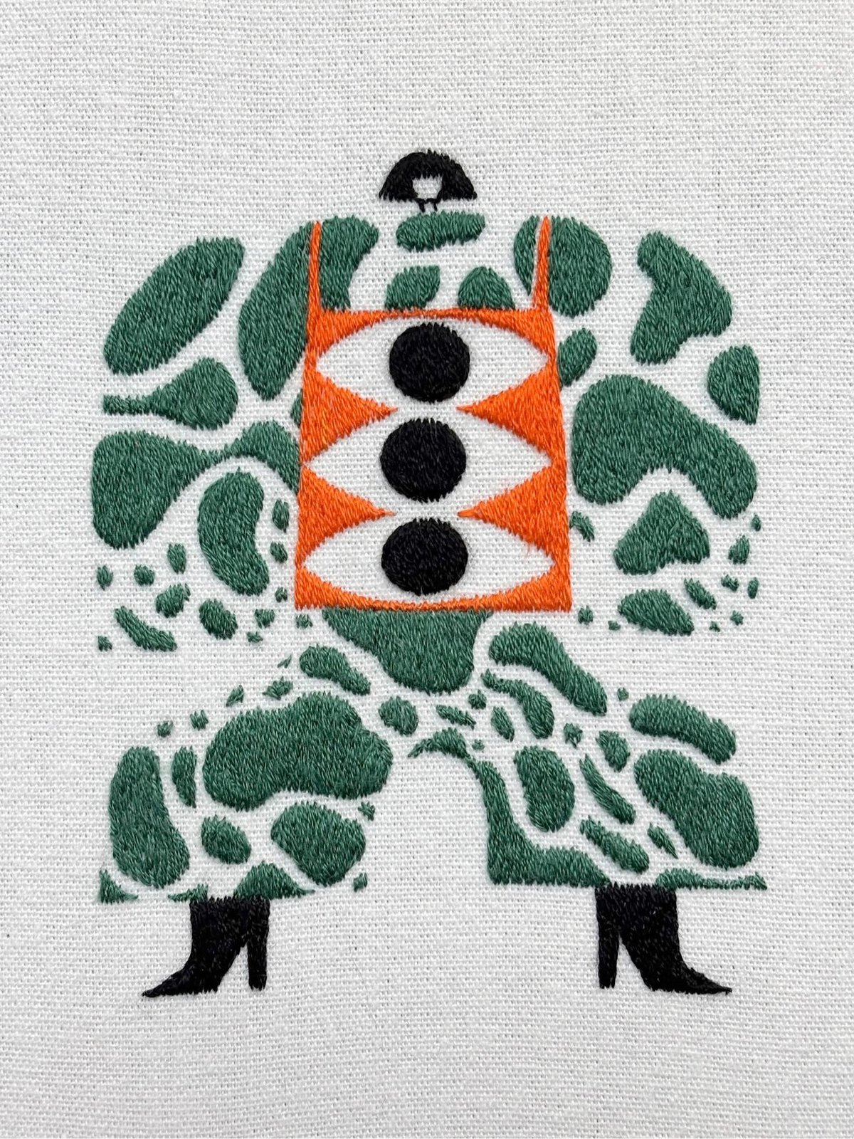

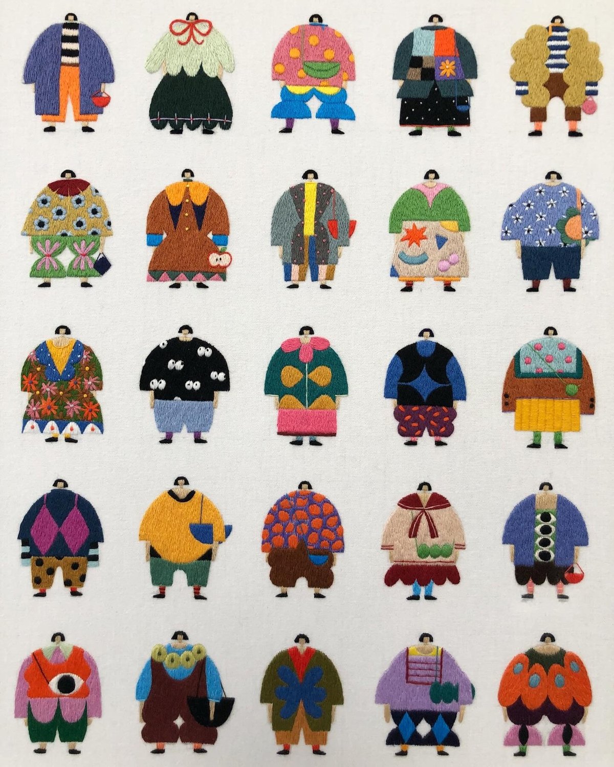
How cool are these embroidered Nona Kecil (“little woman”) figures by Indonesian artist Irene Saputra, aka Nengiren. She explained to Colossal what the figures signify:
Nona Kecil’s evolution mirrors my own journey as an artist. Initially, she adorned simple OOTDs with muted colors and straightforward patterns. However, the turning point occurred three years ago when I embraced motherhood. Balancing time between my son and art intensified my experimentation, leading Nona Kecil to explore more expressive and elaborate outfits.
(via @antichrista)
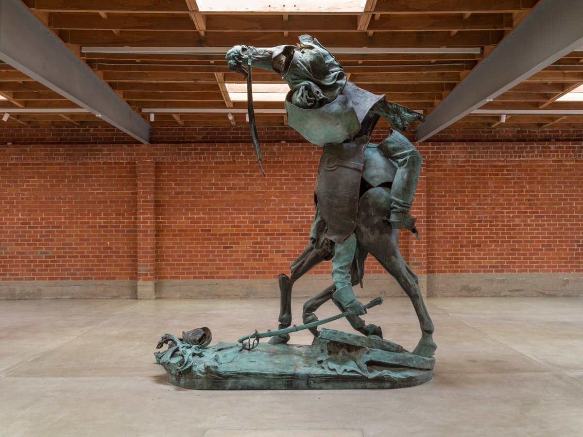

This is incredible: artist Kara Walker took a statue of Confederate general Stonewall Jackson that had stood in Charlottesville, Virginia until 2021, chopped it up, and reconstituted it into a disfigured beast. It’s part of an exhibition of several such works called Monuments, which opens at The Geffen Contemporary at MOCA in LA on October 23. From the press release:
In 2021, The Brick (then known as LAXART) acquired a decommissioned equestrian monument of “Stonewall” Jackson from the city of Charlottesville, Virginia. The monument was given to Kara Walker to create the new work Unmanned Drone (2023). The original bronze statue portrayed Jackson spurring his steed into the heat of battle. Walker dissected the statue and reshuffled the parts in a Hieronymous Bosch-like fashion. The result is still horse and rider, but instead of charging into battle, Walker’s horseman wanders in Civil War purgatory, dragging its sword over a ruined battlefield.
Here’s the statue as it looked in Charlottesville:

Walker described the intent of the work in this NY Times piece:
She likened the result to a haint — a Southern concept with roots in Gullah Geechee culture that designates a spirit that has slipped its human form and roams about making mischief and exacting vengeance. Here, what is deconstructed is not just a statue but the myth of suppressed Confederate glory that it represents. Her sculpture, she suggested, “exists as a sort of haint of itself — the imagination of the Lost Cause having to recognize itself for what it is.”
The Guardian also has a long article on the show and Walker’s piece.

Artist Guy Buffet has painted a number of different variations of his depiction of how to make various drinks (martini, margarita, Manhattan) but I like this version the best. (thx, ollie)
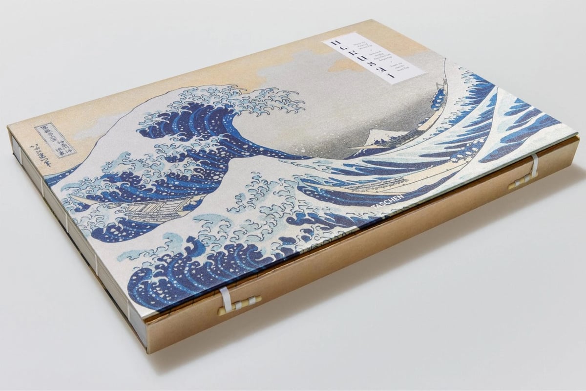


This book, from Taschen, looks amazing. Bound in Japanese style, it’s a reproduction of Katsushika Hokusai’s Thirty-six Views of Mount Fuji, a collection of woodblock prints of which the most famous is the Great Wave.
The prints illustrate Hokusai’s own obsession with Mount Fuji as well as the flourishing domestic tourism of the late Edo period. Just as the mountain was a cherished view for travelers heading to the capital Edo (now Tokyo) along the Tōkaidō road, Mount Fuji is the infallible backdrop to each of the series’ unique scenes. Hokusai captures the distinctive landscape and provincial charm of each setting with a vivid palette and exquisite detail. Including the iconic Under the Great Wave off Kanagawa (also The Great Wave), this widely celebrated series is a treasure of international art history.
This XXL version of the book is available at Taschen ($175), Bookshop ($210), and Amazon ($158). A smaller version of the book comes out in a few months and can be pre-ordered from Taschen ($80), Bookshop ($74), and Amazon ($80).
A few years ago, a researcher looked at every surviving print of Hokusai’s The Great Wave off Kanagawa that she could find (113 in all) and, using differences caused by “woodblock wear”, developed a system for determining if a particular print was made early in the life of the woodblocks used, late, or somewhere in-between.
Did you know there are 113 identified copies of Hokusai’s The Great Wave. I know the title says 111, but scientist Capucine Korenberg found another 2 after completing her research. What research was that? Finding every print of The Great Wave around the world and then sequencing them, to find out when they were created during the life cycle of the woodblocks they were printed from.
This involved painstakingly documenting visible signs of wear to the keyblock that made the Great Wave, and tracking these visible changes as the keyblock continued to be used (fun fact; scholars estimate there were likely as many as 8000 prints of The Great Wave originally in circulation).
See also The Evolution of Hokusai’s Great Wave.
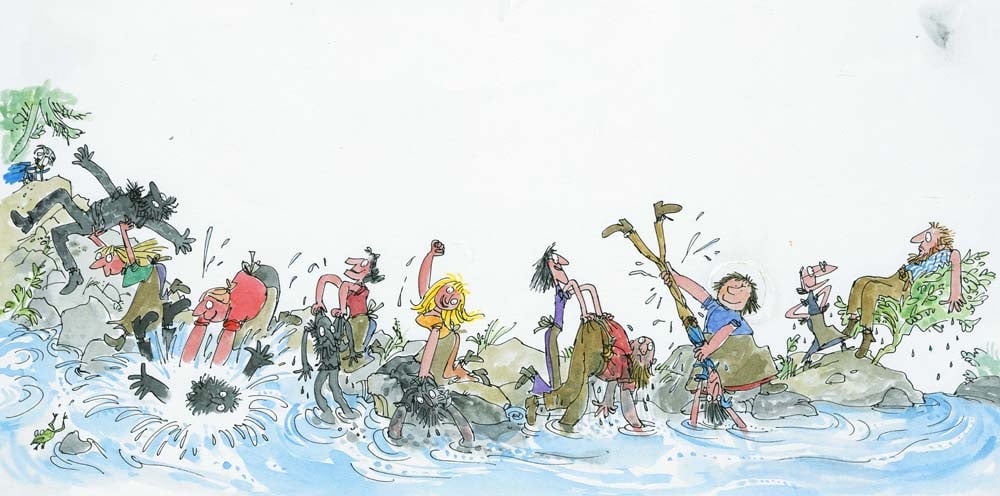
Illustrator Quentin Blake, who is most widely known for his energetic drawings for Roald Dahl’s books, generously shares his drawing process on his website and also in a series of videos.
I do a freewheeling sort of drawing that looks as though it is done on the spur of the moment. However even a single drawing needs a certain amount of preparation and planning. Most of the time I need to do a rough in which I find out how people stand, what sort of expressions they have and how they fit on the page.
Here are some of the videos he’s done. Quentin Blake draws a Hornswoggler:
Ten Minutes of Illustration (in three parts for some reason):
We Live in Worrying Times:
The illustration above is from The Wild Washerwomen.
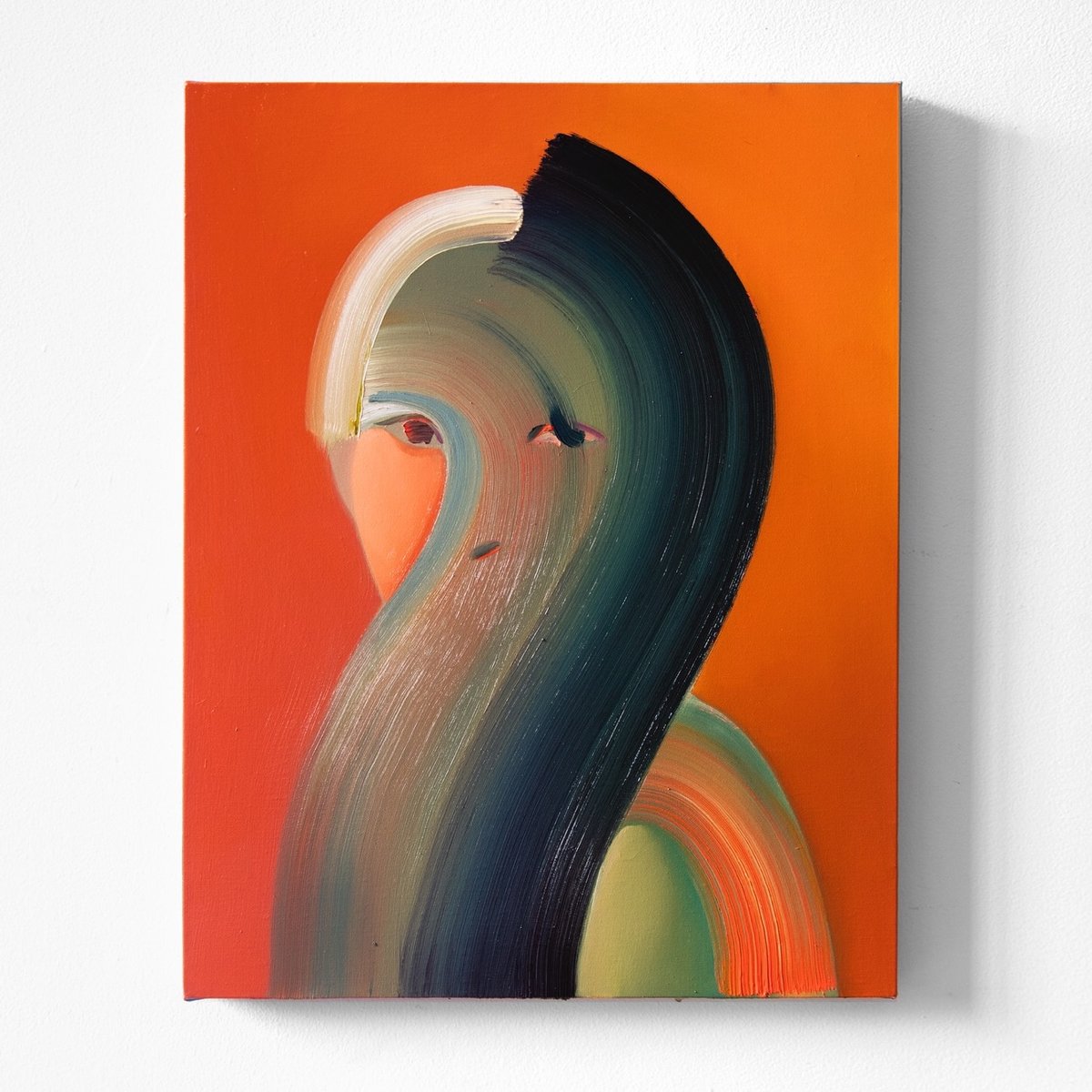
I love this self-portrait by Na Kim. It’s somehow bold and subtle? Wow.

Speaking of Benito Mussolini and fascism, the excellent Poster House museum in NYC has a new exhibition on for the next few months: The Future Was Then: The Changing Face of Fascist Italy. It features “some of the best posters produced during the worst period in modern Italian history”.
In a fascist movement inspired by art, how does the fascist government influence the artists living in its grasp? This exhibition explores how Benito Mussolini’s government created a broad-reaching culture that grew with and into the Futurist movement to claw into advertising, propaganda, and the very heart of the nation he commanded.


That Lubrificanti Fiat poster is incredible. The Future Was Then is on view at Poster House until Feb 22, 2026.
A few days ago, I linked to a NY Times piece about the V&A’s 90,000-piece archive of David Bowie stuff — costumes, photos, drawings, lyrics, etc.
The David Bowie Centre is a working archive with new reading and study rooms. The archive contains over 80,000 items, including 414 costumes and accessories, nearly 150 musical instruments and other sound equipment, designs, props and scenery for concerts, film and theatre. Bowie’s own desk is part of the archive, alongside notebooks, diaries, lyrics, correspondence, fan mail and over 70,000 photographic prints, negatives and transparencies.
The Centre is brought to life with a series of small, curated displays. Highlights include 1970s Ziggy Stardust and Aladdin Sane ensembles designed by Freddie Burretti and Kansai Yamamoto, a film showcasing performances from Bowie’s career, and an installation tracing his impact on popular culture.
Last week, Open Culture linked to this video tour of the Bowie collection by Jessica the Museum Guide:
I imagine it’s not quite like being there in person, but still. (via open culture)
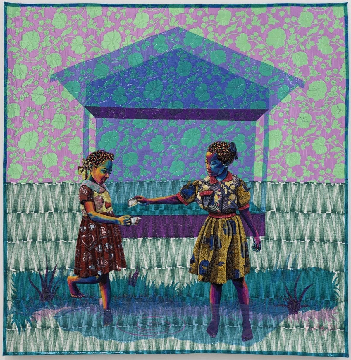
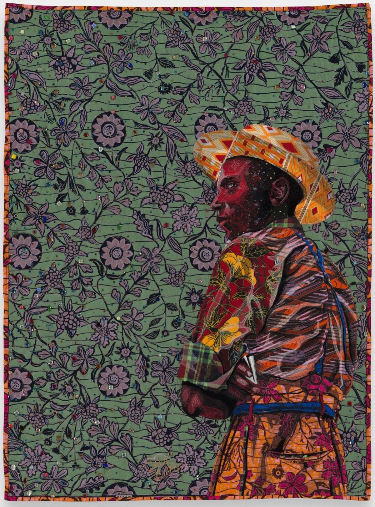
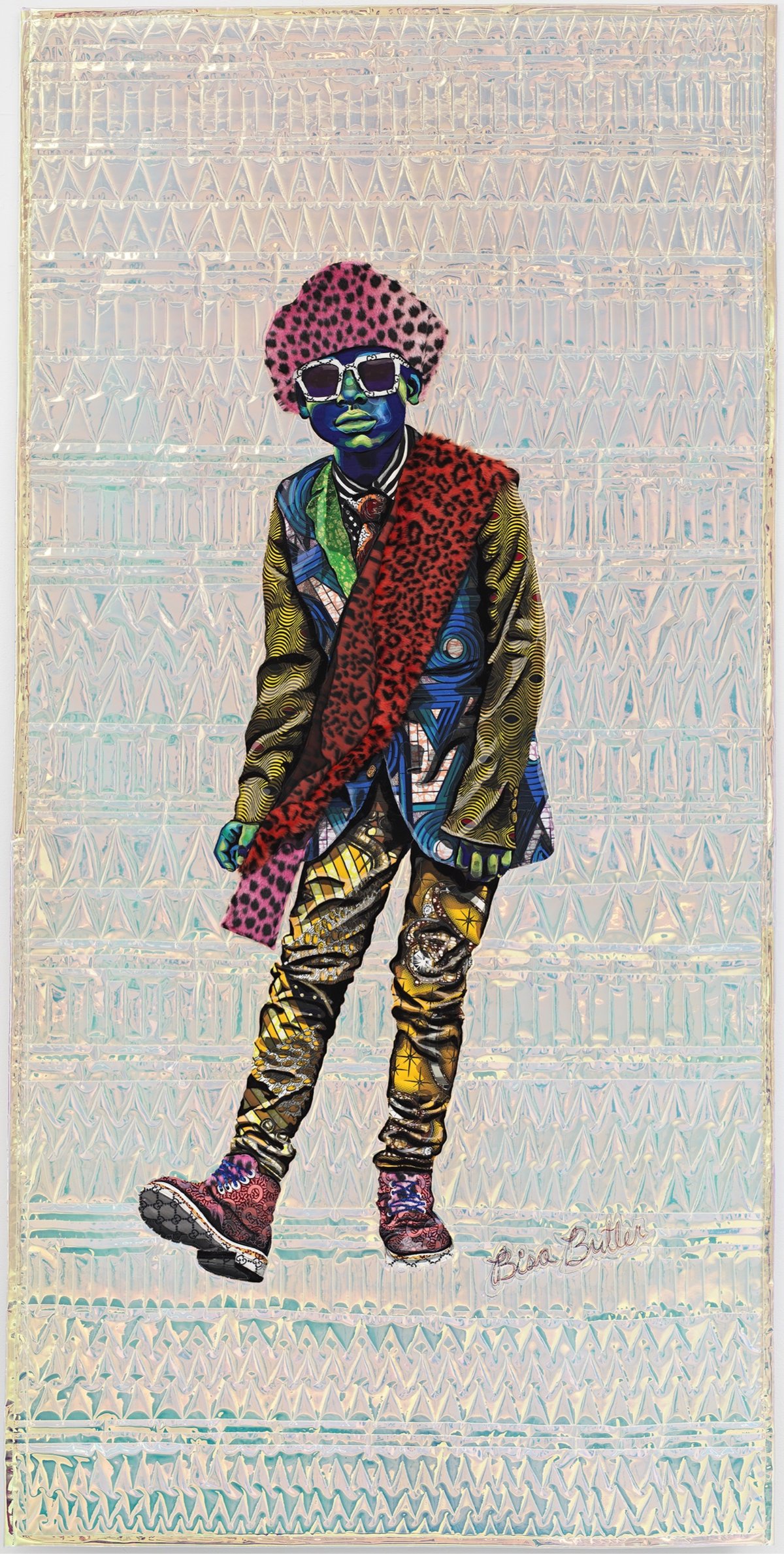
Bisa Butler makes quilted portraits and recently debuted a show with some of her newest work called Hold Me Close. From her artist’s statement:
This body of work is a visual response to how I am feeling as an African American woman living in 2025. We lived through COVID and witnessed the uprising of the Black Lives Matter movement, only to arrive at a time when many of the civil rights I grew up with are being challenged and reversed. Protections and programs for non-white Americans, women, queer people, poor people, and people with disabilities are under attack, and it has left me feeling destabilized. Watching immigrants being hunted, chased down, and kidnapped by masked men horrifies me. The thought of people being gunned down and starved for political agendas is the stuff of nightmares. I’ve been looking for solace and turned to my work like a visual diary.
Colossal has a good gallery of images from the show and Butler did a video tour where you can see how shiny & glittery some of the pieces are:
Hold Me Close is on view from September 13 to November 1, 2025 at Jeffrey Deitch in Los Angeles.
Artist and composer Matthew Wilcock looks for patterns in the everyday and creates music from them. It’s easier to quickly watch an example than to explain:
Instantly thought of the video for Star Guitar by The Chemical Brothers, directed by Michel Gondry. They also seem like the sort of videos you would have found on Mister Rodgers’ or Sesame Street back in the day.
In addition to traffic, Wilcock has made music with people on escalators:
Each escalator and path is assigned three notes and they alternate between those as the person’s head breaks the line. Lowest note closest to camera, highest furtherest away. I love the idea of involving all these people unknowingly in an artwork. Recorded in Liverpool St. station, London.
And a bird eating:
Factory workers:
Bees:
You can find more of these video compositions on Wilcock’s YouTube channel and Instagram. He’s most active (and popular) on Insta; check out his Tour de France and swingset videos there. (thx, andy)
I had a lot of fun playing around with this collection of generative design tools, especially the textual ones. I wore out the “randomize” button on each of these. (via sidebar)


Enigmatriz uses ASCII art to punch up and blow out public domain photos and illustrations — I love their style. From It’s Nice That:
Using the Image to ASCII tool available online, Enigmatriz found a new way to play with digital assets. “Everyday, I sit on my computer and browse through hundreds of images in the public domain to find things that catch my attention and feel are worth shining a new light on them,” says Enigmatriz. “When working with ASCII, what I like and find particularly interesting is the blend between hundred old paintings, photographs etc. and modern technologies.” Enigmatriz creates unique contrasts between images — historical paintings are overlaid with spatterings of text, ASCII renders are layered on top of playing cards or archival imagery.
You can find more of their work on Instagram.


The style of ShouXin’s drawings is a perfect match for their subject matter — cats are simultaneously wild and carefully composed. (via colossal)


These are some of my favorite portrait illustrations from Sofia Bonati.
In her art you’ll find female portraits that invite you into a dreamlike world where the woman and her surroundings intertwine, connect. They are women with deep, mysterious looks, who want to tell us something.
I especially like the more geometric ones that radiate. Prints and original works are available in her shop. (via colossal)
Christian Marclay debuted his 24-hour film The Clock 15 years ago. The film is made up of thousands of clips from movies and TV shows that show timepieces or otherwise make reference to the time of day. I’ve seen chunks of it in a few museums & galleries and it’s wonderful.
Using this extraordinary minute-by-minute timeline of nearly all the scenes that make up The Clock, one person is attempting to reverse engineer the entire film. It’s not The Clock, but it’s A Clock. Here are a couple of excerpts:
Says the creator:
So, when I stumbled upon this Fandom Wiki, where the mysterious user ElevenFiftyNine had seemingly started the task of listing all the movies in The Clock, I couldn’t help myself; I started remaking the whole thing from scratch.
So, since I can’t really say this is The Clock, it is my best attempt at making a Clock, by following the excellent effort by ElevenFiftyNine.
A ten-minute excerpt is free on the website but you need to join the Patreon to watch the entire work-in-progress. According to their most recent update, the film is finished but the final version isn’t online quite yet; October 15th is the release date.
BTW, here’s the creator’s definition of “finished”:
I spoke some months ago about what 100% means for this project, and it is not that it is a fully perfect copy of Marclay’s work. The information available online is incomplete, and new information might appear in the future. For now, 100% means that all available information, is in a Clock.
And incredibly, they have never actually seen The Clock in person:
Unfortunately I have never had a chance to see The Clock, as it is only visible when exhibited at a museum. This is increasingly a rare occurrence, and even then, apparently the queues when it is on show, are monstrous. Never mind that it might be anywhere in the world!
Aside from the clips, I haven’t watched any of this yet, but it is a very tempting alternative to waiting for a rare showing somewhere I happen to be.

A gem of a find by The Public Domain Review of a collection from the Rijksmuseum: photographs of plaster models of the Moon’s surface that were made from observations of the Moon through a telescope.
Peering through a self-made telescope, James Nasmyth sketched the moon’s scarred, cratered and mountainous surface. Aiming to “faithfully reproduce the lunar effects of light and shadow” he then built plaster models based on the drawings, and photographed these against black backgrounds in the full glare of the sun. As the technology for taking photographs directly through a telescope was still in its infancy, the drawing and modelling stages of the process were essential for attaining the moonly detail he wanted.
These are incredible; I love them so much. While Nasmyth’s models were spikier than the Moon’s actual surface, they still look amazingly realistic for something produced in the 1870s. (The 1870s!)


The book from which these were taken also contains this page, where Nasmyth seems to hypothesize that certain mountain ranges on the Moon (and Earth?) are formed by “shrinkage of the globe”:

You win some, you lose some. 🤷♂️
See also Henry Draper’s photographs of the Moon from the 1860s and 1870s.

Artist and poet Marcus Merritt draws objects from films — the TV above is from E.T. and the payphone is from Terminator 2.
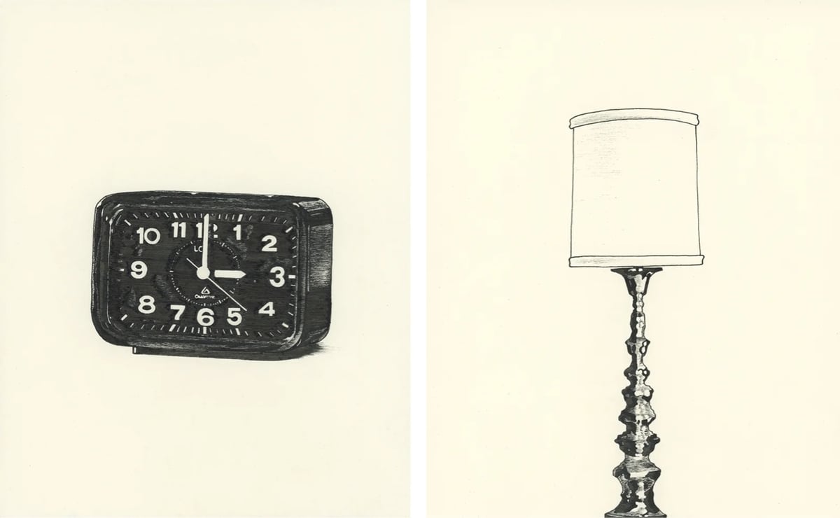
I very much dig the spare illustration style here. (via waxy)
Dan Sinker recently visited an arcade full of old school vintage arcade games and documented some of the wonderful typography and design of the game cabinet marquees.
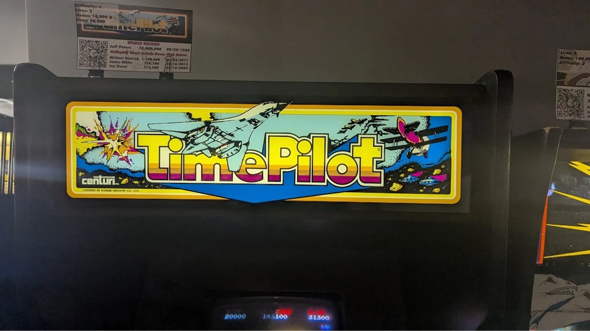


After a while though, I became captivated not by the games themselves but by the incredible art on the cabinets and specifically the marquee, the sign set above the screen, tempting a kid from 1983 to spend their hard-earned quarters. The marquee back then had to do a lot of work, because the games themselves were all low resolution and blocky affairs. The marquee had to sell the idea of the game, the excitement around the concept and the story because the on-screen graphics alone weren’t going to do it. So you made sure that your marquees did the job, filling it with exquisite hand-lettered logos, art borrowed from the pages of fantasy novels, sci-fi, and comics, and vivid color palettes that would shine out into the dark arcade.
I’ve been to Funspot in New Hampshire a few times and it’s so fun to walk around and marvel at all of the 70s, 80s, and 90s graphic design — to see what the past thought the future was going to look like.

In the aftermath of the 2016 election, British American artist Jo Hay began a series of engaging portraits called Persisters “that depict contemporary, trailblazing women in pursuit of civil rights and justice”. Pictured above are her paintings of Letitia James, Elizabeth Warren, Greta Thunberg, Christine Blasey Ford, Alexandria Ocasio-Cortez, and Marie Yovanovitch. The portraits are quite large, as you can see in this photo of AOC’s painting.
I also quite like Hay’s other portraits, including this poignant one of Anne Frank.
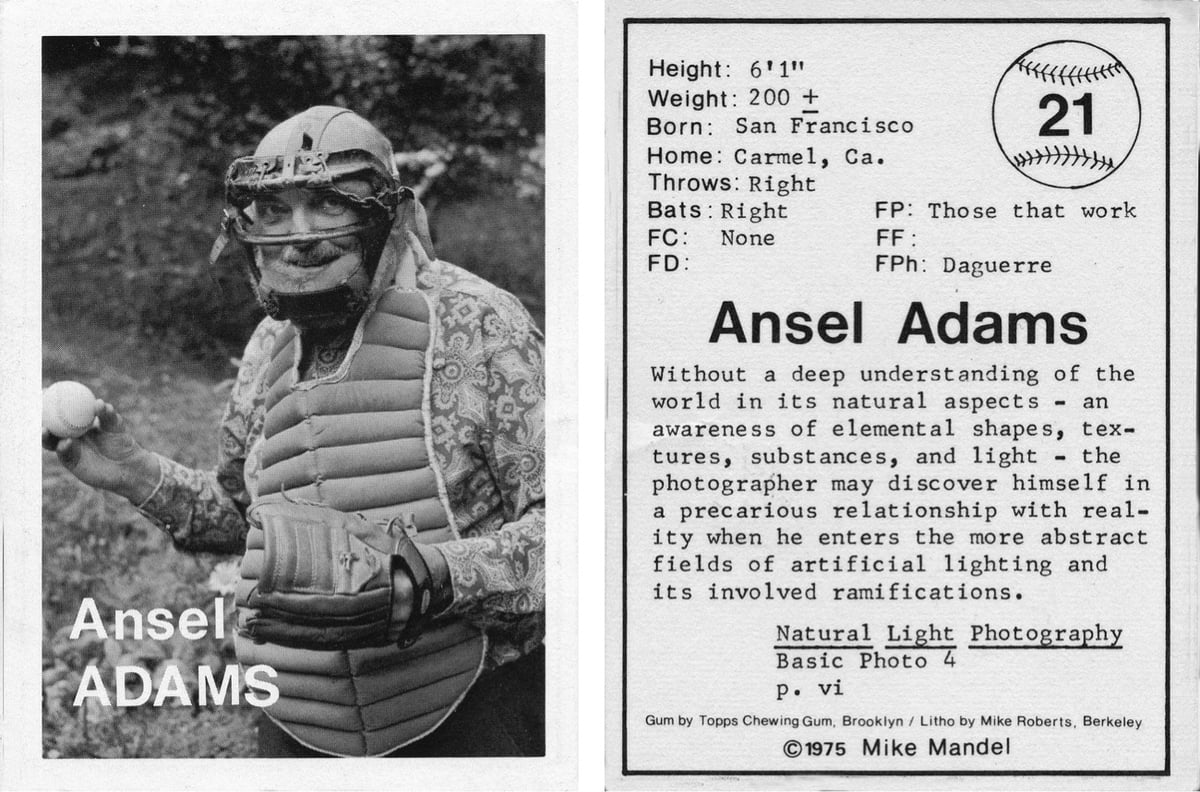
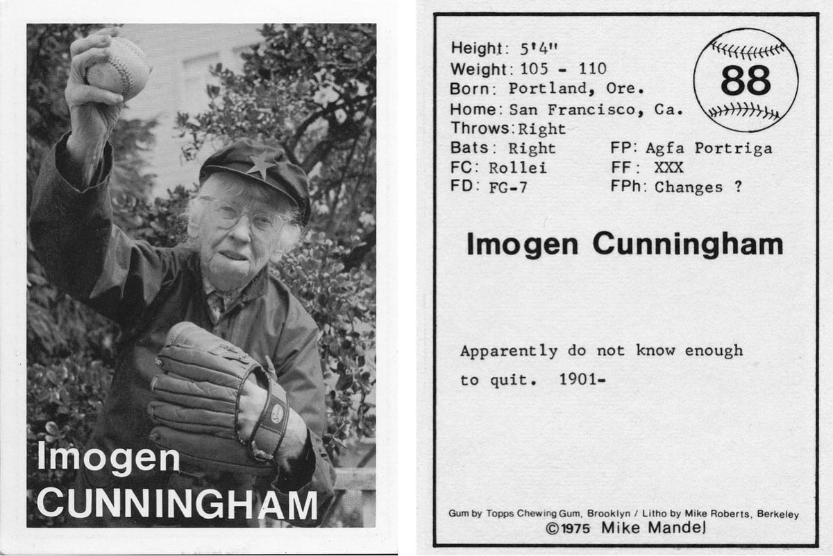
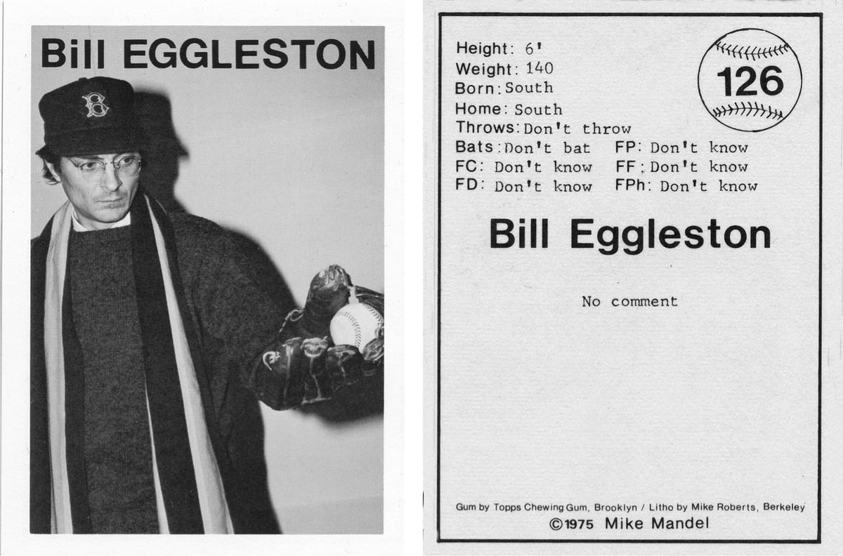
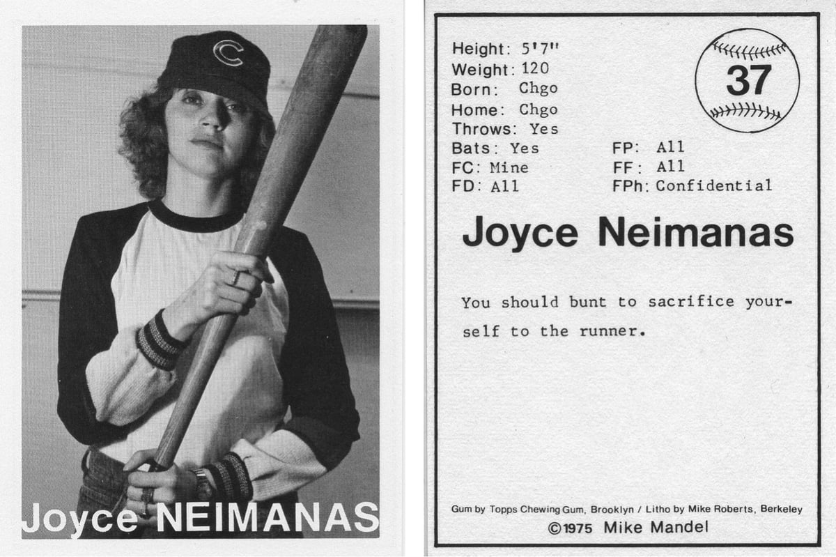
In the mid-70s, Mike Mandel traveled around the United States photographing photographers as if they were baseball players, capturing the likes of Imogen Cunningham, Ed Ruscha, William Eggleston, and Ansel Adams.
I photographed photographers as if they were baseball players and produced a set of cards that were packaged in random groups of ten, with bubble gum, so that the only way of collecting a complete set was to make a trade. I travelled around the United States visiting about 150 photographic “personalities” and had them pose for me. I carried baseball paraphernalia: caps, gloves, balls, a mask and chest protector, a bat, as well as photographic equipment, and made a 14,000 mile odyssey. Out of this experience came 134 Baseball-Photographer images. I designed a reverse side for the card which would allow for each photographer to fill in their own personal data that in a way referred to the information usually included on real baseball cards: Favorite camera, favorite developer, favorite film, height, weight, etc. I used whatever information each photographer provided me.
You can hear Mandel talking about the project in this SFMOMA video — the gum he included in the packages of cards was donated by Topps:
You can find some of the cards on eBay for around $10-50 apiece and a complete set, signed by Mandel & Imogen Cunningham, can be had for $3,650. (thx, duncan)
Now showing at the Brooklyn Museum (through April 2026) and the ICA in Boston (until Spet 1, 2025) is Christian Marclay’s Doors. Like his masterpiece The Clock, Doors is a film montage, this time of people in movies opening and closing doors.
In Doors (2022), Marclay stitches together hundreds of short film clips featuring the opening and closing of doors. More than a decade in the making, the moving image collage draws from nearly all genres of narrative cinema ranging from French New Wave to Hollywood blockbusters. Carefully edited by Marclay, the visual narrative follows actors entering new spaces, with each door marking an editing point and transitioning between films and soundscapes. The work suggests a labyrinthine journey where protagonists get lost and found again. Marclay describes the video as sculptural – a “mental architecture that the viewer might or might not follow and get lost in.”
The film is 54 minutes long but runs in a continuous loop. These videos feature some footage from the film; this one shows five minutes and this one four minutes:
Here’s Marclay on the process of making the video:
It’s quite difficult to find scenes in cinema showing an actor entering a space and then going into another space. I needed two doors: The actor enters one space and then leaves through another door — so it’s one room to the next room to the next room to the next room, and every time a different actor in a different film. It’s a strange choreography to edit. The door has to be opened in a similar way and at the same speed to make it believable. If someone is running and then you see them peek slowly through the door on the other side, it doesn’t look realistic. I also had to match the motion of pulling or pushing the door. To make things even more complicated, that door is hinged on one side and that has to match, the hinge and the door handle. If done well, the viewer gets sucked in and fooled by these editing tricks. So you see an actor in color in the ’80s entering a black-and-white film from the ’50s, and you know it’s not the same actor, but your mind wants to believe that it is. The trick is to create a flow, an illusion of continuity.
Doors brings to mind Christopher Nolan’s Inception (“a mental architecture that the viewer might or might not follow and get lost in”) and the doorway effect (“The doorway effect or location updating effect is a replicable psychological phenomenon characterized by short-term memory loss when passing through a doorway or moving from one location to another.”)
P.S. The Clock is showing at the Neue Nationalgalerie in Berlin, starting at the end of November and running through Jan 18, 2026.
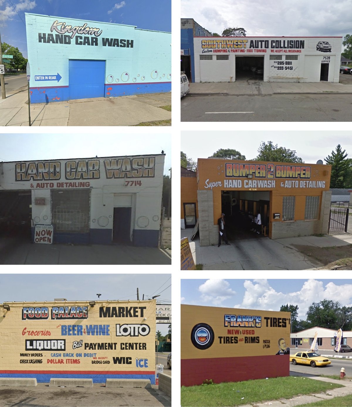
Ron Miller is one of the most prolific sign painters in Detroit. Photographer Andrew Anderson has collected dozens of images of Miller’s signs from Google Street View.
Ron Miller has been painting signs since 1978. He loves adding color to the neighborhood with his work. He has no website, no email and works all by word of mouth in Detroit.
Anderson also made a map of the locations of Miller’s signs. And here’s the man himself:

(thx, jordan)

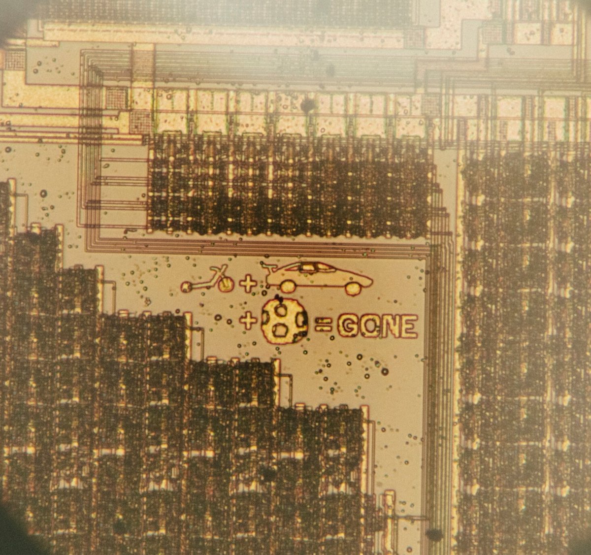
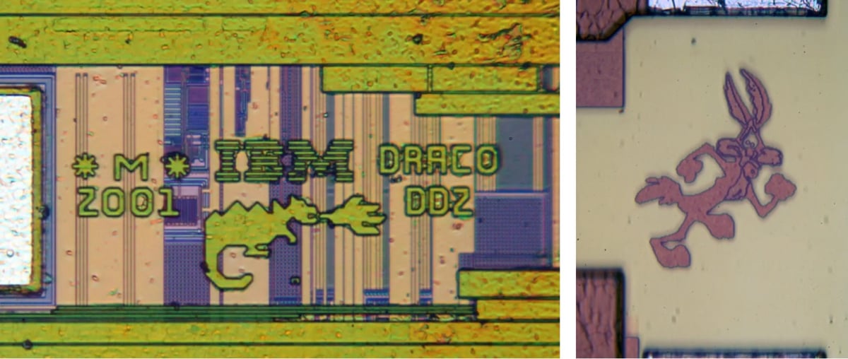
Back in the earlier days of microchips, the designers would sometimes add tiny images to the chips, for fun. From NPR:
Many of the doodles came from engineers who weren’t doing it for an audience.
“We did it for ourselves,” said Willy McAllister, a retired electrical engineer who worked for more than a decade at Hewlett-Packard (HP) and helped craft a chip with the sleek image of a cheetah on it. “Nobody ever expected it to be cracked open 10 years later and marveled at. That was never the point.”
The cheetah was picked as a visual representation for an HP project code named after the world’s fastest land animal.
And from a recent NY Times story:
“They were the maverick days, like the early days of flying,” Mr. John said. “At that time, it could do no harm to the chip, so it was purely creative expression.”
Mr. John tried, with mixed results, to recreate a yacht from the period’s Old Spice advertisements. Another colleague who was thin drew elaborate muscles. The doodles were drawn with a chip design tool.
The most important reason behind the covert graffiti, Mr. John added, was for the doodles to say: “I’m signing my name on this chip, so it’s got to mean something.”
You can find many more microchip doodles at Silicon Zoo.
Well, it’s been awhile since I’ve done one of these but I’m gonna skip the apologies and get right into it. Here’s a list of what I’ve been reading, watching, listening to, and experiencing over the past several months. Let us know what movies, books, art, TV, music, etc. you’ve been enjoying in the comments below!
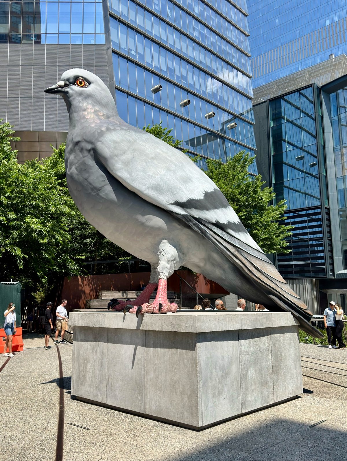
Dinosaur. It’s a huge pigeon on the High Line — what else do you need to know? (A-)
The Ministry of Time by Kaliane Bradley. Entertaining and engaging. It’ll make a good TV series. (B+)
Bill and Ted’s Excellent Adventure. I hadn’t seen this in several years but I still knew all the words. (A-)
My Brilliant Friend (season four). If there’s one thing I’ve watched in the past several years that I wish had gotten more attention from viewers, critics, and awards panels, it’s this wonderful show. (A+)
Pirates of the Caribbean: The Curse of the Black Pearl. Johnny Depp’s Jack Sparrow might be the most perfectly cast role in the history of cinema. Great story too. This movie surprised me when I saw it in the theater in 2003 and it’s still in the top tier of action/adventure movies. (A)
Andor (season one). A rewatch to prep for season two. I didn’t understand what the fuss was about this show the first time around, but this second viewing was a revelation. Andor is easily the best Star Wars thing since Empire. (A+)
Galleria Borghese. As previously discussed, the Bernini sculptures were a highlight of the summer. (A+)
Caravaggio 2025. Fantastic exhibition. (A)

The vivid blue color of the Mediterranean. (A+)
La Vita è Un Mozzico. We waited for an hour for sandwiches and it was probably worth it? (A)
Black Doves. British spy thriller? Keira Knightley? Ben Whishaw? Twist my arm. (B+)
Captain America: Brave New World. I’m sorry Sam Wilson / Anthony Mackie, there’s a “we have the Avengers at home” vibe here that’s hard to shake. (B)
Music to Refine To: A Remix Companion to Severance. I love this album; one of my favorite things of the past several months. (A+)
Mickey 17. It was fine? I was distracted while watching it in the theater, which is never a good sign. My favorite Bong Joon Ho film is still Snowpiercer. (B)

Amy Sherald: American Sublime. Absolutely fantastic. (A+)
The French Dispatch. This has quietly become a favorite of mine among Anderson’s films. (A)
The Royal Tenenbaums. However, this is still my favorite. (A+)
Paris Is Burning. Classic documentary of a bygone NYC era & a subculture that is now both flourishing and threatened. (A-)
Star Trek: Strange New Worlds (season two). I love these characters, always the sign of a good Trek. The crossover episode with Lower Decks was delightful even though I’ve not watched any of the animated series yet. The musical episode I liked less (not a showtunes guy) but I appreciated the experimentation. Bring on the Muppet episode. (A)
Severance (season two). Perhaps not as good as the first season — there was a lot in the mid-season episodes that didn’t land for me. Still, I always watched when a new episode dropped. (A-)
Army of Shadows. Part of the unplanned resistance film festival I’ve been screening for myself recently. Not quite as good as I remembered it, but it’s nice to watch something that doesn’t just lay everything out on a platter for you so you can emote properly. (A-)
Best in Show. So many lines from this that I use in my daily life. (A-)
The 99% Invisible Breakdown: The Power Broker. This is such a good series with fantastic guests about a legendary book. Who knew that Roman Mars was such a gigglepuss though? (A)
Johnny English. I didn’t find this quite as delightful as my family does. I prefer Mr. Bean. (B+)
Paddington in Peru. Not quite the magic of the first two, but entertaining. (B)
Indiana Jones and the Last Crusade. I have likely said this before, but while Raiders is likely the best Indy movie, Last Crusade is my favorite (probably due to Tom Stoppard’s heavy rewrite of the script). (A+)
Star Wars: The Return of the Jedi. It’s interesting to watch the original trilogy having seen so many subsequent movies & TV series.
Ocean’s Twelve. The dancing lasers scene is completely ridiculous. (A)
Wallace & Gromit: Vengeance Most Fowl. Well, I wasn’t expecting a critique of AI and the role of technology in society from this animated feature, but maybe I should have? (B+)
A Complete Unknown. Liked this more than I thought I would. (A-)
Pride and Prejudice by Jane Austen. Just a wonderful book — witty and fun. (A)
The Devil in the White City by Erik Larson. Fantastic book. Listen to the audiobook version if you can — Scott Brick’s narration elevates the story. (A)
A Quiet Place: Day One. I only watched this because I was on a plane. (B)
Severance (season one). After watching the second season, I rewatched season one. There was apparently much I missed the first time around. (A-)
Black Bag. Soderbergh is always worth watching, especially when he dips into Ocean’s Eleven territory — although this was more serious. (A-)
A Minecraft Movie. The first half was tolerable, enjoyable even. And then not so much. (C+)
Star Wars: Revenge of the Sith. Watched this in the theater for the 20th anniversary. There are some good bits in here, but some of the acting really stinks. Folks in the theater cheered when Anakin slaughtered the younglings, which is probably some sort of meme that I don’t want to know about. (B+)
Sinners. I loved this movie. (A+)
Thunderbolts*. Thought I would like this more than I did. (B)
Mission: Impossible – The Final Reckoning. The last scene is a masterclass in not having the faintest idea how to end a movie. (B+)
Andor (season two). Only a slight dip from season one. Overall, the series was a brilliant look at radicalization, the messiness of rebellion, and the oppressive flatness of authoritarianism. (A+)
There There by Tommy Orange. Devastating. (A-)
The Fear of Never Landing. Good album to chill out to by Marconi Union, who previously brought you the most relaxing song in the world. (A-)
Novocaine. This was bad. (D+)
Glass Onion. More Benoit Blanc mysteries please — I love watching Daniel Craig and his CSI: KFC accent chewing scenery. (A-)
The Gorge. Half of this was great and the other half was just another pseudo-horror action thing. (B-)
Martyr! by Kaveh Akbar. Marvelous. (A)
Andor: The Rogue One Arc. This fan edit of Rogue One in the style of a three-episode Andor arc is as Gilroy-esque a cut as you’re ever going to get. (A-)
Mission: Impossible – Rogue Nation. I had been kinda ambivalent about the M:I movies, but Fallout converted me, so now I’m slowly making my way back through the back catalog. (B+)
Via Carota. Best meal I’ve had in a long time. The tagliatelle was better than any pasta dish I had during my trip to Rome — it’s true, don’t @ me! And the roast chicken was perfect. (A+)
V for Vendetta. Underrated. (A-)
The Last Samurai by Helen DeWitt. I’m going to tell you the embarrassing truth: I thought this was about actual samurai and perhaps related to the Tom Cruise movie. It is very much not. I gave it a real shot but ended up abandoning it about halfway through. (C)
Spider-Man: Into the Spider-Verse. Still a marvel of animated creativity. (A)
The Phoenician Scheme. Didn’t vibe with this at all. (B-)
Downhill mountain biking. This is giving me so much life right now. (A+)
Wallace & Gromit: A Matter of Loaf and Death. Not my favorite W&G but still. (B+)
F1. Like Top Gun: Maverick crossed with Ford v Ferarri but Cruise and Bale played the aging outsider role much better than Pitt. Is Pitt even a good actor or is he just extremely charismatic? (B+)
Superman. I thought it was fine but didn’t like it as much as others seemed to. Better than anything Zach Snyder did for DC though. (B)
Shōgun. Rewatch with my son. Just an incredible show all the way around. (A+)
The Last of Us (season two). This show was always fighting an uphill battle with me — I don’t like zombie media and I dislike characters (Ellie!) who wouldn’t survive/thrive in the situations that they’re in with their personalities & characteristics. And I finally won. (C+)
The Handmaid’s Tale (season six). *sigh* No idea why I started watching (and then finished) this season; I’m a sucker for closure I guess. (C)
Nintendo Switch 2. I bought this to play Kart with my kids and also for a better Fortnite experience. So far, so good. (B+)
Mario Kart World. I haven’t played a ton of this, but it’s good so far. Free roam mode is pretty fun. I’ve gotta write up my Kart wishlist sometime…Nintendo only checked off one or two items in World. (B+)
Sargent and Paris. Caught this on the very last day of the show and hoo boy was it crowded. (A- for the show, C+ for the crowds)
Let God Sort Em Out. Need to listen to this one a few more times but I’m liking it so far. (B+)
Right now, I’m watching Star Trek: Strange New Worlds season three, listening to Deacon King Kong on audiobook (fantastic, a lock for an A+), rewatching Wandavision, and picking at Is a River Alive? by Robert Macfarlane.
Past installments of my media diet are available here. What good things have you watched, read, or listened to lately?
I love the look of this black & white animated video made by Anthony Dickenson from thousands of hand-painted frames for Rival Consoles’ song Soft Gradient Beckons. Stick around after the song ends for a behind-the-scenes look at how it was made.
If I plan too much, it’s often disappointing. It’s much nicer if I just let it go the way it wants to go. But obviously sometimes it just doesn’t work and, you know, that’s okay. Sometimes, the mistakes are the bits that really reveal kind of new techniques. I love these little moments of imperfection. Otherwise, you know, you might as well just build it in AI.
The skateboard dolly! (via colossal)


I am totally smitten with the intricate drawings of Japanese artist Shunshun. It’s worth clicking through to see them in detail. Here’s a look at his process:
You can follow Shunshun on Instagram.
Wanting to get away from manufactured perfection, artist Wang Mansheng makes his own paint brushes.
Manufactured things are, you know, have a certain form. Like a manufactured brush; they’re all really fine. The factory trying to make as fine as they could, but when you use it, all the lines come out smooth and beautiful. But sometimes, I think it’s too perfect, because I really love the rough surface of a rock or the big tree trunk.
Wang’s work is currently on display at The Huntington near LA in San Marino, CA.

Ah, this is awesome: Great Art Explained is one of my favorite YouTube channels and there’s a book version coming out in the fall.
Art can be thrilling, and resonate on a deep personal level. It is how you view the work, place it in context and understand its history that makes an artwork truly come alive.
A fresh approach to a classic subject, James Payne’s no-nonsense analysis sheds new light on 30 masterpieces from around the globe and reveals what makes them truly timeless works of art.
Each chapter delves into not only the art itself but also the artist’s life, as well as the work’s place in their wider oeuvre; in other words, what makes it “great.”
You can preorder Great Art Explained from Bookshop or Amazon.
Newer posts
Older posts
Socials & More