kottke.org posts about art
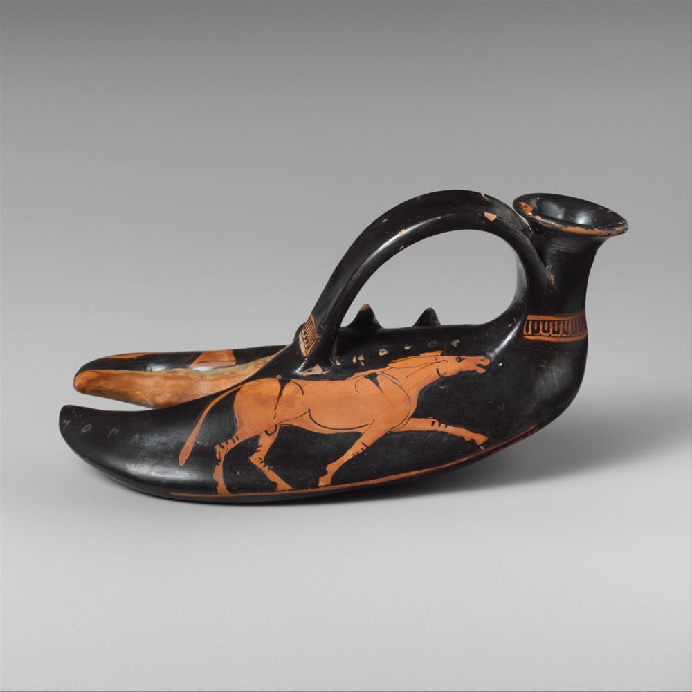
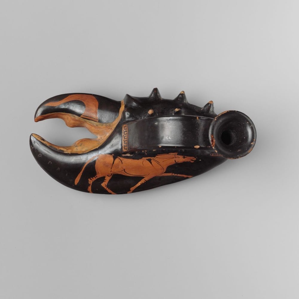
Terracotta vase in the form of a lobster claw from the collection at the Met. Circa 460 BC.
Because so many aspects of Greek life depended on the sea, a vase in the shape of a lobster claw is not surprising. It is, however, exceptional and may be a variant of the askos — a bag-shaped oil container provided with a vertical mouth and strap handle. The Dionysiac iconography of the lobster claw suggests that it was a novelty item used at symposia (drinking parties).
The vase bears an inscription that reads “the boy is fair”.
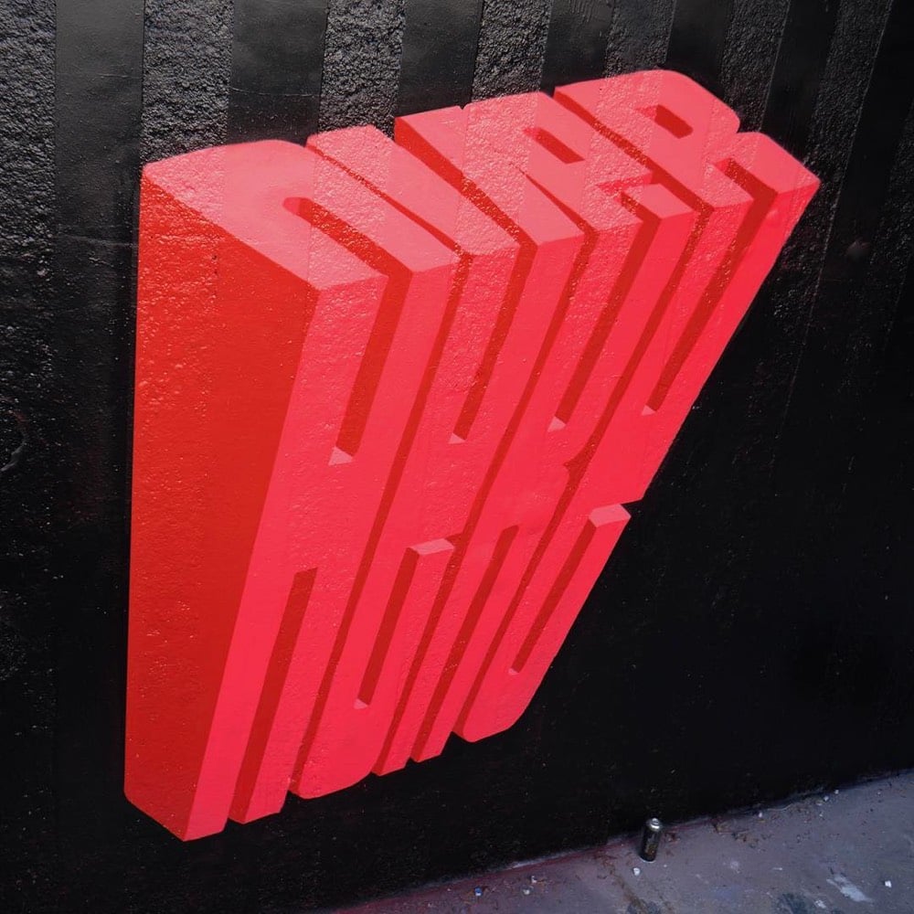
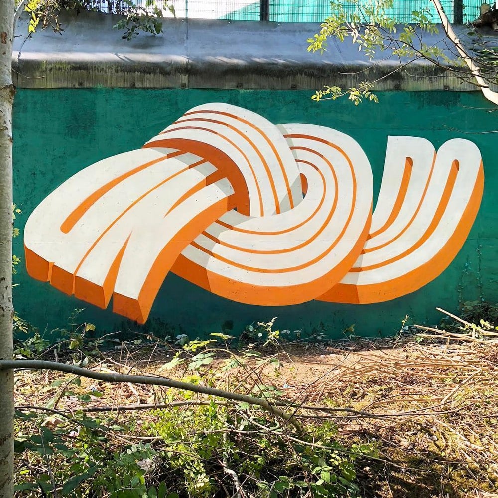
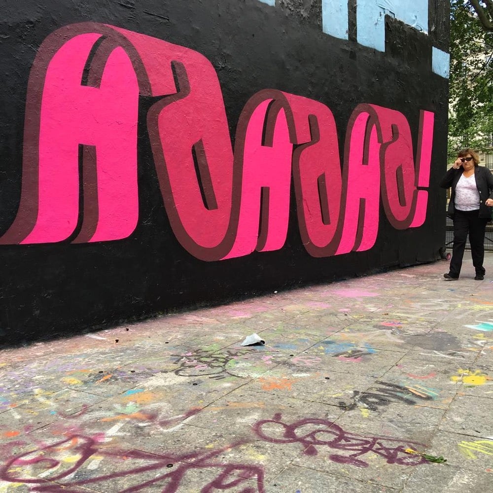
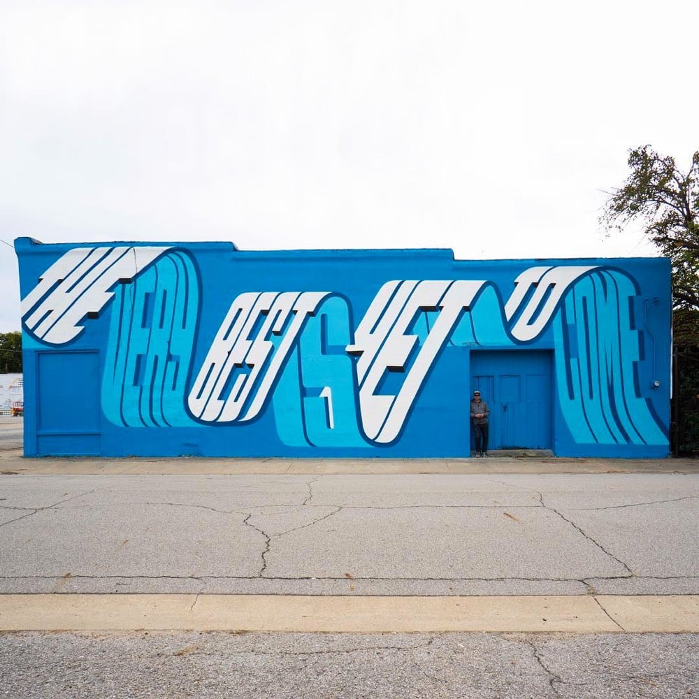
I love this chunky/wavy typographic street art by Pref. He spoke with Colossal back in May about his art.
“Since then I have pushed and experimented with this idea of overlapping words, seeing how many I can fit into the space of one word, and then slowly boiling it down and simplifying this idea to become more legible,” he tells Colossal. “This in turn lead more to the use of ‘typography’ throughout my style as you see today. I have always been interested in the idea of graffiti speaking to the general public, rather than just other graffiti writers, and readable letters or a more ‘typographic’ approach has been a good route to that.”
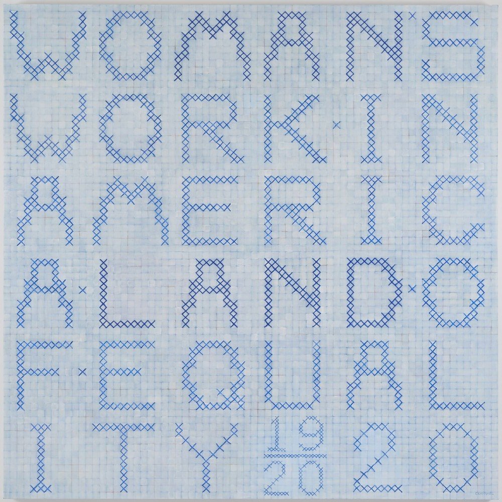
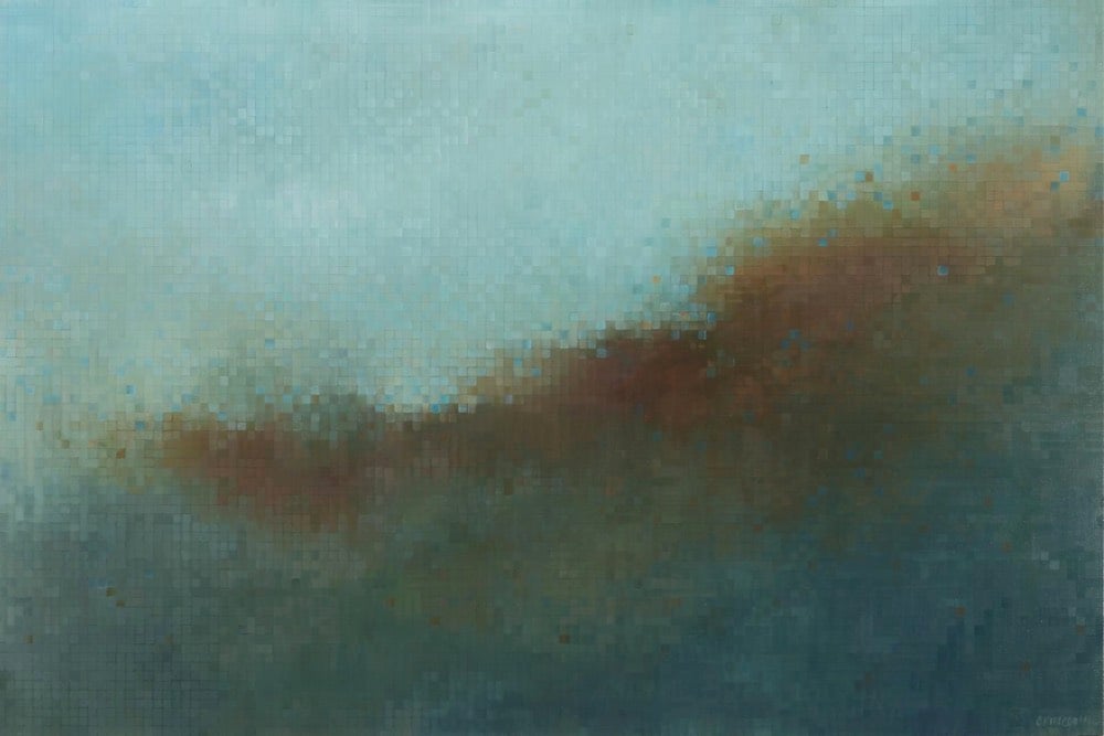
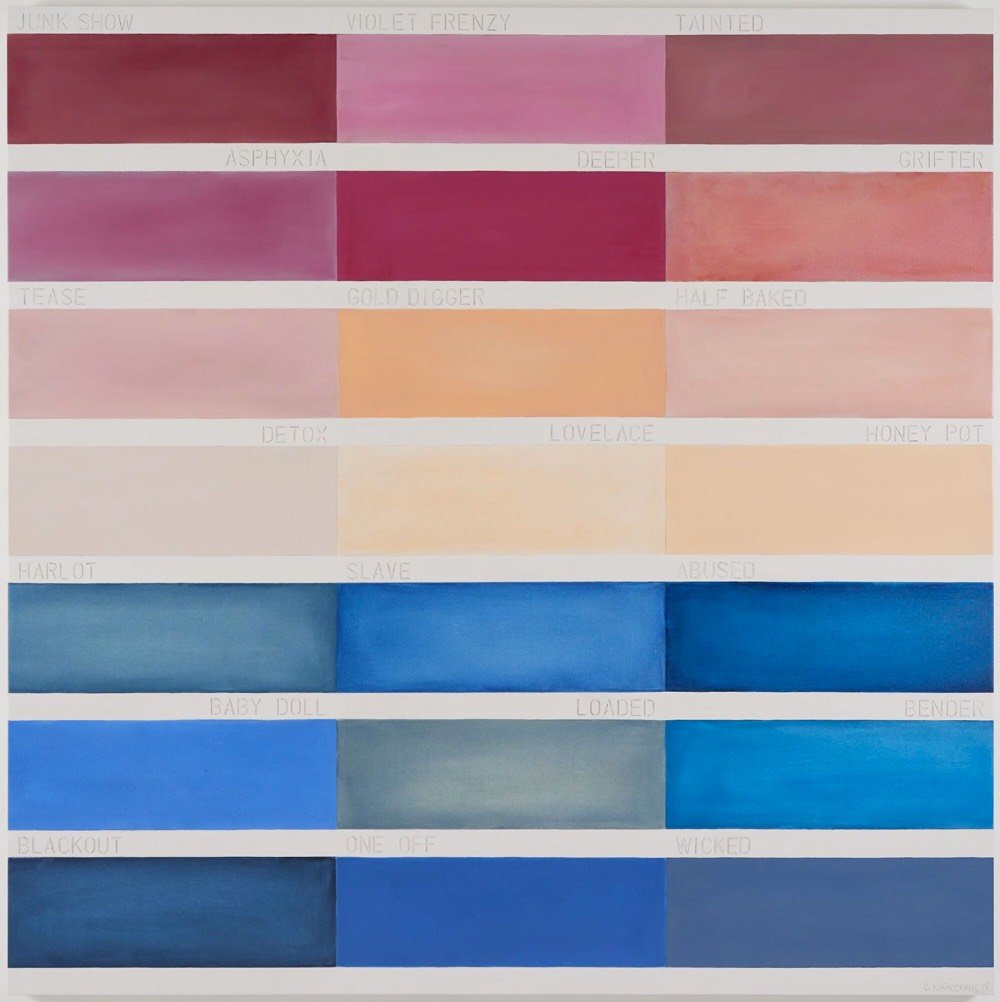
Next week at the Berggruen Gallery in SF, Clare Kirkconnell’s show “Women’s Work” opens and will be on view until Feb 16. (The top and bottom pieces are from “Women’s Work”…the one in the middle is an older piece.) (via @thoughtbrain)
Over the course of two years, metalsmith Seth Gould built a project he calls Coffer, a gorgeous wrought iron puzzle box. Gould made the box from scratch — he forged the metal, machined the bolts, everything!
The majority of pieces, including the bolts, levers, and staples, are made from wrought iron, a material I use primarily for its working properties (enjoyable to forge and file). Wrought iron is no longer manufactured, so each piece needed to be forged from salvaged material. The forging is done using a coal forge, hammer, anvil, and power hammer. Once the pieces are forged as close to their finished shape as possible, I move to the bench to refine the surface and shape with a file. The final touch is a bit of file embellishment.
I mean, look at this intricate deliciousness:

The video above is a short film of Gould making his box filmed by Jesse Beecher. The soundtrack cleverly incorporates the sounds of the workshop (sawing, hammering, flames) into the music, resulting in a particularly artful making-of film. (via colossal)
Update: The box made by Gould is called an armada box.
An iron-bound strongbox for storing valuables in the 16th and 17th centuries, often with a large, complicated lock on the underside of the lid. Some were for the use of officers at sea, and would have been bolted to the deck of the owner’s cabin. Usually of German make, the chests could be anything from a few inches to 6ft (1.8m) long. The name itself was a fanciful Victorian invention recalling chests imagined to be used by the Spanish Armada.
Swiss artist Zimoun makes large-scale sound sculptures out of simple materials like cardboard boxes, wires, washers, tiny motors, and sticks of wood. Here are a few of his works (sound on, obviously):
I would love to see one of these installations in person sometime.
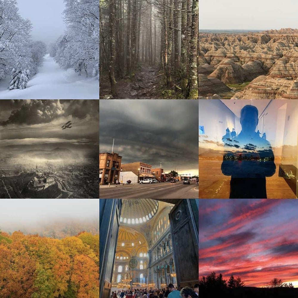
Just like last year, I kept track of almost everything I read, watched, listened to, and experienced in my media diet posts. In this post, I’m gonna share some of the very best of that content, stuff that stuck with me in one way or another. I marked my absolute favorites with a (*). (Above, my #bestnine Instagram images of 2018.)
Books. I made an effort to read more books this year, particularly those written by women. Hope to continue both of those trends in 2019.
After years of reading the entire Harry Potter series with my kids, we spent several months reading Emily Wilson’s translation of The Odyssey. I was unsure whether they would be into it, but they’d routinely ask for some extra reading time before bed.*
Charles Mann is one of the best nonfiction authors out there, a master of combining culture, history, and science into compelling stories. The Wizard and the Prophet is his latest book and I recommend you read it.*
Normally I shy away from terms like “must-read” or “important” when talking about books, but I’m making an exception for this one. The Wizard and the Prophet is an important book, and I urge you to read it. (The chapter on climate change, including its fascinating history, is alone worth the effort.)
(The theme of the book also popped up in Avengers: Infinity War.)
A Man on the Moon: The Voyages of the Apollo Astronauts by Andrew Chaikin. I will always be a total space nerd and this is a great history of the Apollo program.
Arbitrary Stupid Goal by Tamara Shopsin. Lots for me to chew on in this one, not least of which is the value of a non-traditional childhood.
I listened to the audiobook version of Kitchen Confidential read by Anthony Bourdain. This book is 18 years old but aside from some details, it felt as immediate and vital as when it came out. What a unique spirit we lost this year.
Circe by Madeline Miller. A fun and engrossing “sequel” to The Odyssey.
In response to this post about They Shall Not Grow Old by Tim Carmody, Stephan Pimpare wrote: “Howard Zinn is derided for a sometimes simplistic and sloppy history, but his singular contribution was a kind of historical Rashomon — the urgent lesson that the shape of all histories can and should be inverted.” Small Fry by Lisa Brennan-Jobs is an inversion of sorts of the traditional history of Silicon Valley.
Movies. Geography has hindered my movie choices since moving to Vermont, and I haven’t seen many of the movies on everyone else’s best of lists. But my movie-viewing has also been less adventurous this year; I’ve preferred less challenging fare after long work days.
Somehow, Black Panther came out this year? It seems like it’s always been with us. BP is the 2018 movie I’d most like to erase from my memory so I could watch it again for the first time. (Honorable mention to Avengers: Infinity War.)
Isle of Dogs. The cinematography and production design of this were just so good. I left the theater wanting to make great things.
Won’t You Be My Neighbor? I waited to see this one at home because I didn’t want to be caught sobbing in public.
Even in the age of Netflix, going to the theater can still be a lot of fun. I saw Bohemian Rhapsody on opening night with a bunch of Queen fans and they made the theater shake with their singing, clapping, and stomping.
Three Identical Strangers. A fascinating documentary about nature vs nurture.
TV. I watched a lot of TV this year, perhaps too much. But not a whole lot of it ended up being that substantial…I saw nothing this year as good as Planet Earth II, Blue Planet II, or The Vietnam War. Maybe I should watch a little less next year?
The Americans. An excellent final season and a very strong and heartbreaking last episode.*
My Brilliant Friend. I spent the first 3-4 episodes disappointed that it wasn’t the books, but by the end, I was ready for a second season. The two lead actresses were excellent, particularly Margherita Mazzucco as Elena Greco.
The Handmaid’s Tale. Many people felt this stumbled this season, but I was not one of them.
Music. Not a musical year for me. The only thing I would single out is Kendrick Lamar’s album for Black Panther.
Podcasts. I like listening to podcasts with discrete seasons or topics these days…so not a lot of Reply All or Radiolab but more like the following…
Seeing White. Recommended by a reader, this 14-part series on race and whiteness is essential listening.*
Slow Burn. Two seasons, one on Watergate and the other on the Clinton/Lewinsky affair. Both excellent.*
Caliphate. Upsetting and important. This is a look at ISIS you don’t get on cable.*
Experiences & misc. Most of my favorite stuff falls into this category this year.
An Incomplete History of Protest. This exhibition at the Whitney was up for a long while, so I got to see it a few times.
Alto’s Odyssey. Perhaps one of my all-time favorite games. Several months ago, I made it up to #2 on the global high score list. I deleted it from my phone last week because I was playing it too much.*
Kennedy Space Center. Hoping to go back for a launch sometime soon!*
Lots of things about Istanbul, including the Hagia Sophia, my breakfast at Van Kahvalti Evi, and having dinner on a tiny street of tiny businesses, loosely joined.*
While I waited for my food, I noticed an order of köfte going out of the kitchen…to a diner at the restaurant across the street. When he was finished, the staff at that place bussed the dishes back across the way. Meanwhile, my meal arrived and the köfte were flavorful and tender and juicy, exactly what I wanted…no wonder the place across the street had outsourced their meatballs to this place. I’d noticed the owner, the waiter, and the cook drinking tea, so after I finished, I asked if I could get a tea. The owner nodded and started yelling to a guy at the tea place two door down. A few minutes later, a man bearing a tray with four glasses of tea arrived, dropping one at my table and the other three for the staff.
Hilma af Klint: Paintings for the Future. What Chrysanthe said.
Electricity. Ok, let me explain. I live in a rural area and work from home so when it’s really windy or there’s an ice storm, the power goes out. Sometimes it’s out for an hour or two, sometimes longer. It would be quaint if I didn’t have stuff to do. When electricity isn’t the default, you come to appreciate it a lot more.
The Deutsches Technikmuseum. Science and technology museum in Berlin. Along with the Topographie Des Terrors, this was my favorite thing from my stay in Berlin.
Foggy hikes. I’d never hiked in the fog before and now I think I might prefer it to sunny days?*
My new electric toothbrush. I’ve had it for months now and I still look forward to brushing with it. My mouth and teeth feel so much cleaner.
The Wizarding World of Harry Potter at Universal Studios Florida. After spending so much time in the Wizarding World on the pages of books and on movie screens, it was a complete trip to wander around Diagon Alley, Hogwarts, and the rest.*
Solo roadtrips across the United States. Probably my favorite thing of the year. Can’t wait to do this again, perhaps in the American Southwest.*
SpaceX launch of Falcon Heavy. Watching those two boosters land back on the surface at almost the same time was mind-blowing.
Sleep. Getting at least 7 (and often 8+) hours of sleep every night has transformed my life. This is even lower-hanging self-help fruit than yoga or meditation.
Goodthreads t-shirt. I’m heading into uniform territory and having plain white t-shirts that fit me perfectly is essential.
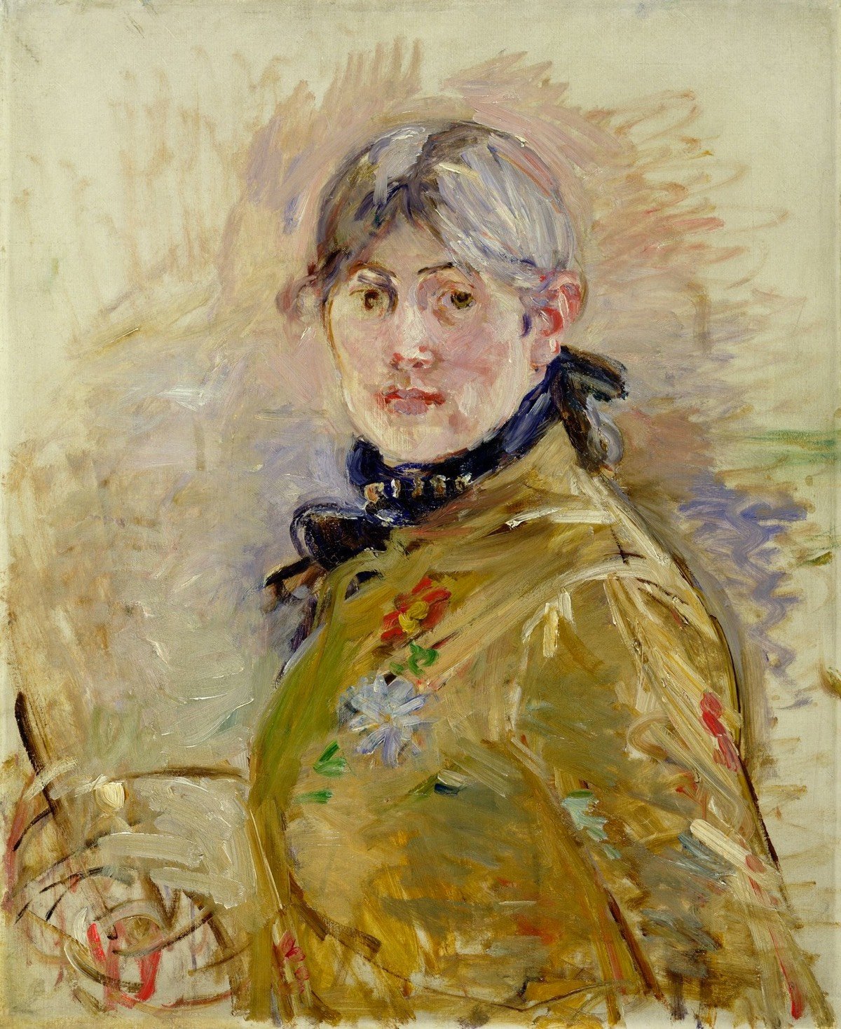
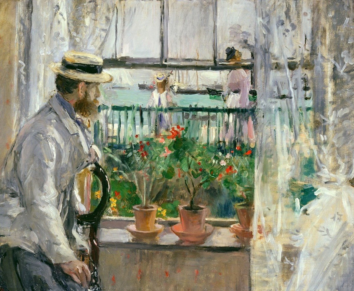
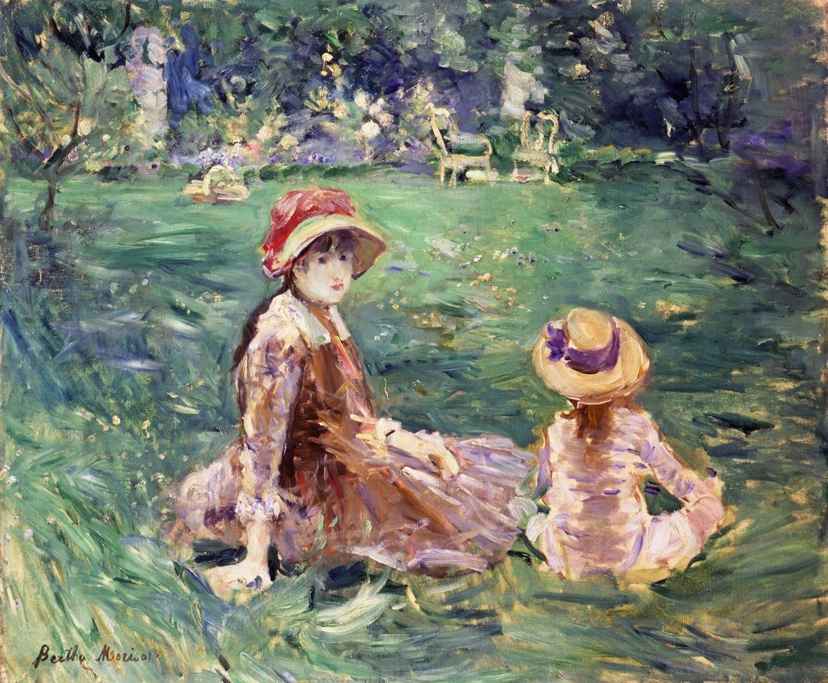
Manet, Degas, Renoir, Monet, and Morisot. You’ve likely not heard of that last one, but Berthe Morisot was one of the founding members of painting’s Impressionist movement and because of a new retrospective exhibition, she’s finally getting her due. Berthe Morisot: Woman Impressionist is a collaboration among five museums from around the world and is currently on display at The Barnes Foundation in Philadelphia (though only until January 14). Peter Schjeldahl’s review for the New Yorker calls Morisot “the most interesting artist of her generation”.
About half of the sixty-eight paintings in the show remain in private collections. But, aside from a few partial failures that instructively exemplify risks Morisot took, they are all more than museum-worthy. Morisot is still emerging from the margins of the Impressionist club of certified alphas, betas, and minions, but the priority for valuing her work is not just the issuing of retroactive membership. It’s re-seeing and rethinking the whole history of modern art from the perspective of women who never stood a chance of major attainment. In a different world, Morisot would be the doyenne of an established tradition that built and expanded on her example.
If you miss the show at the Barnes, the exhibition will be touring the other supporting museums, including the Dallas Museum of Art (Feb 24 - May 26, 2019) and the Musée d’Orsay (June 18, Sept 22, 2019).
My pal Bryan Boyer has built a device he calls a VSMP (Very Slow Movie Player). It’s an e-paper display that shows a movie not at 24 frames/sec but at 24 frames per hour.
Films are vain creatures that typically demand a dark room, full attention, and eager eyeballs ready to accept light beamed from the screen or projector to your visual cortex. VSMP inverts all of that. It is impossible to “watch” in a traditional way because it’s too slow. In a staring contest with VSMP you will always lose. It can be noticed, glanced-at, or even inspected, but not watched. That’s one of the things I like about the Bill Viola pieces. You don’t watch them because they’re not films; they’re portraits so you see them, and it just so happens that you see them in four dimensions.
Ahhh, look at this gloriously retro aesthetic:
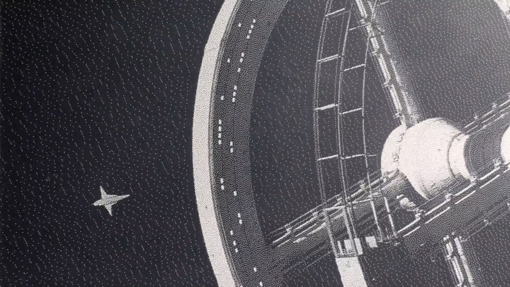
His whole essay about the project is worth reading for the thoughtful insights throughout. I totally want a wall-sized VSMP in my bedroom.
Update: Inspired by the VSMP, Jon Bell built a web page that will show Sofia Coppola’s Lost In Translation stretched out over the course of the next year. You can watch here.
Update: Inspired by the projects above, Nic Magnier made Yearlong Koyaanisqatsi, a Twitter bot that will show Godfrey Reggio’s Koyaanisqatsi very slowly over the course of the next year, one frame every 6 hours.
Update: Tom Whitwell recently built a VSMP and it’s quite a bit easier now — no soldering or anything like that.
This is a relatively straightforward project. There’s no soldering and no hardcore coding. If you’re at all comfortable using a command line, and you’ve seen Python script before then you’ll be fine. The e-paper screen, Pi, SD Card and IKEA frame cost me about £120 in total.
I’ve been keeping track of every media thing I “consume”, so here are quick reviews of some things I’ve read, seen, heard, and experienced in the last month or so. Look for 2018 media recap sometime later this week.
Small Fry by Lisa Brennan-Jobs. Under-read and under-remarked upon by the tech press…but if you read this just for the Steve Jobs bits, you’re really missing out. (A)
The Good Place. Not quite as charmed by this as everyone else, but I’d definitely listen to a weekly hour-long podcast that goes deeper into the philosophy featured in each episode. (B+)
Outlaw King. Not so bad if you’re in the mood for medieval battles. (B)
Fantastic Beasts: The Crimes of Grindelwald. A letdown after the first film, which has gotten better every time I’ve rewatched it. Way too much exposition and not enough fun. By the end, I was bored. My kids said they liked it but without much conviction in their voices. (C+)
Bodyguard. Some shows, even my all-time favorites, took a few episodes to get into. Bodyguard hooked me after 5 minutes. (A-)
Function. A podcast on “how technology is shaping culture and communications” hosted by my pal Anil Dash. (I listened to the Should Twitter Have an Edit Button? episode.) The podcast reproduces to a remarkable degree the experience & content of dinner conversation with Anil. (B+)
Andy Warhol - From A to B and Back Again. I was personally underwhelmed by this, possibly because I’ve seen so much Warhol and read so much about him and his work? (B)
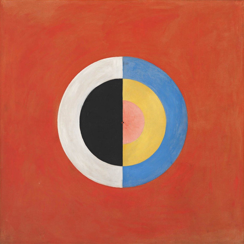
Hilma af Klint: Paintings for the Future. Absolutely thrilling, like discovering a secret room in your house. Many thanks to Chrysanthe for the nudge. (A)
The Odyssey translated by Emily Wilson. Finally finished reading this with the kids. Everyone loved it. (A)
Yotam Ottolenghi’s green gazpacho. It was hardly the season for it, but I was jonesing for the green gazpacho dish that my favorite restaurant used to serve. I took a guess that they used Ottolenghi’s recipe…naaaaaailed it. Delicious with some shrimp and croutons. Will use less garlic next time though. (A-)
Deceptive Practice: The Mysteries and Mentors of Ricky Jay. There’s probably a better movie to be made of Jay’s life, but this was sufficient for my purposes. (B)
Fawlty Towers. Passing on the family tradition of watching old British comedies to my children. Some of the best television ever made, yessiree. (A)
Ralph Breaks the Internet. Perhaps this is small-minded, but I really wanted to see a little kottke.org shop in the background when Ralph and Vanellope are bopping around Internet City, like a tiny boutique next to BuzzzTube or something. (B+)
The Favourite. Delightful and fun. Loved it. (A-)
The Ballad of Buster Scruggs. The Coen brothers, perfectly tuned to the streaming TV format. The stories reminded me a bit of Roald Dahl’s The Tales of the Unexpected. (A-)
Can You Ever Forgive Me? Great acting, particularly from Melissa McCarthy. She reminded me of a young Kathy Bates in this. (B+)
The Day After Tomorrow. I’ve seen this movie probably 10 times and it seems more and more plausible with each viewing. (A)
Circe by Madeline Miller. I am enjoying this trend of old stories told from new vantage points. (A-)
The Marvelous Mrs. Maisel. I was charmed by the first three episodes but the rest wasn’t as entertaining. People kept changing their entire personalities from episode to episode and we’re supposed to just go along with that? I don’t agree with all of it, but I loved reading Emily Nussbaum’s pan of the show for the New Yorker. (B-)
Spider-Man: Into the Spider-Verse. Visually dazzling and by far my favorite Spider-Man movie, but I preferred Black Panther and Avengers: Infinity War. This movie is much more “comics-y” than the live-action Marvel movies and despite much effort, I am just not a comics guy. (B)

Dr. Mario. Used to play this a lot when I was a kid. Still fun. Would love a networked version to play against friends. (B+)
My Brilliant Friend. About halfway through and enjoying it, but it’s just not the book (which I loved). (B+)
My Brilliant Friend soundtrack. Max Richter, enough said. (A-)
Summer Games. This track off of Drake’s Scorpion has grabbed my attention lately. I love the Chariots of Fire + NES Track and Field vibe of the music. (B+)
On Being with Anand Giridharadas. An interview about his book, Winners Take All. (B+)
The Ezra Klein Show with Anand Giridharadas. This episode was referenced in the On Being interview above and is slightly better because Klein pushes back on Giridharadas’s argument and makes him work a little harder. (B+)
Why Is This Happening? with Ta-Nehisi Coates. They talk politics & racism but also how to focus on what’s important to you, even if it means quitting Twitter. (B+)
Past installments of my media diet are available here.
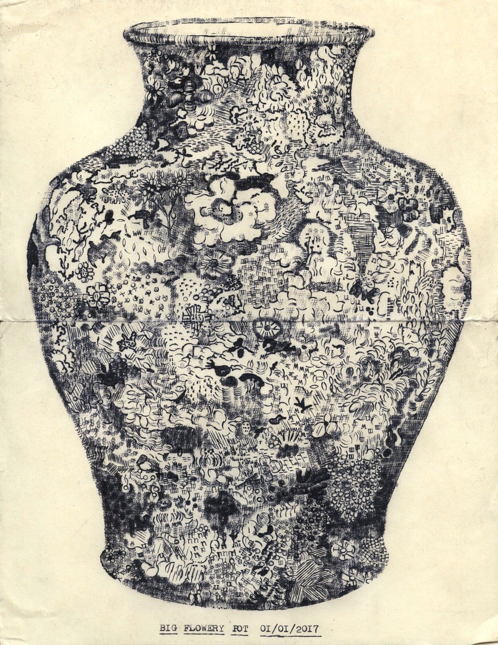
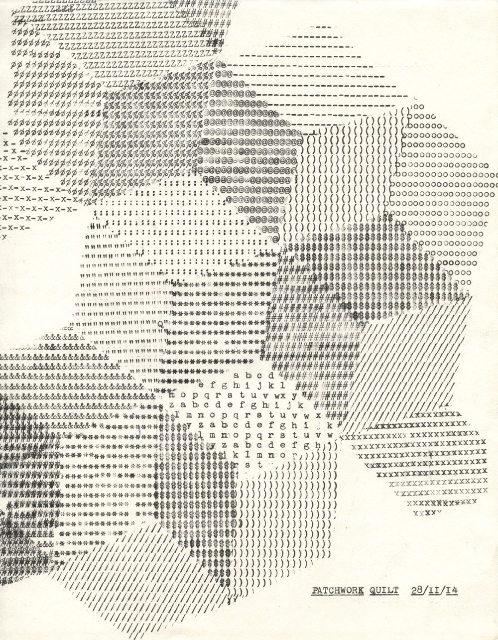
Lenka Clayton does drawings using a portable 1957 Smith-Corona Skyriter typewriter. That vase is amazing. (via @warmestregard)
In 2016, the National Museum of Brazil in Rio de Janeiro started working with Google Arts & Culture to make their collection available online. In September 2018, a devastating fire at the museum destroyed an estimated 20 million pieces, from one-of-a-kind artworks to archeological artifacts. Now Google is hosting an online exhibition of the museum’s collection where you can virtually explore the pre-fire museum in a Street View interface.
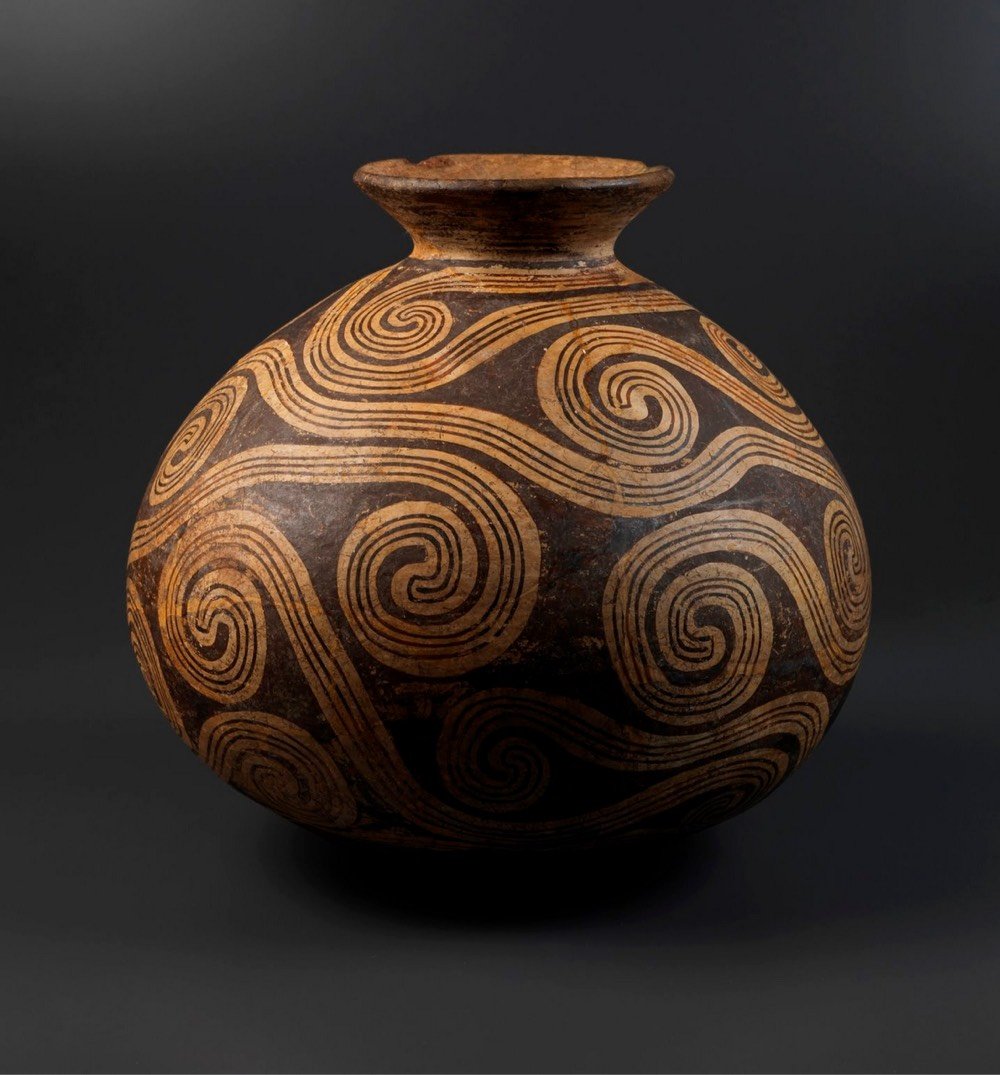

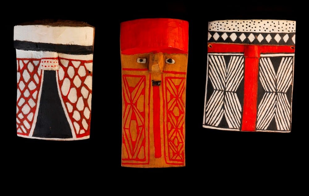
The artifacts pictured here are, from top to bottom: a 3000-year-old vase from the Marajoara culture, a skull from the oldest human skeleton discovered in the Americas, and indigenous masks from the Awetí, Waurá and Mehináku people.
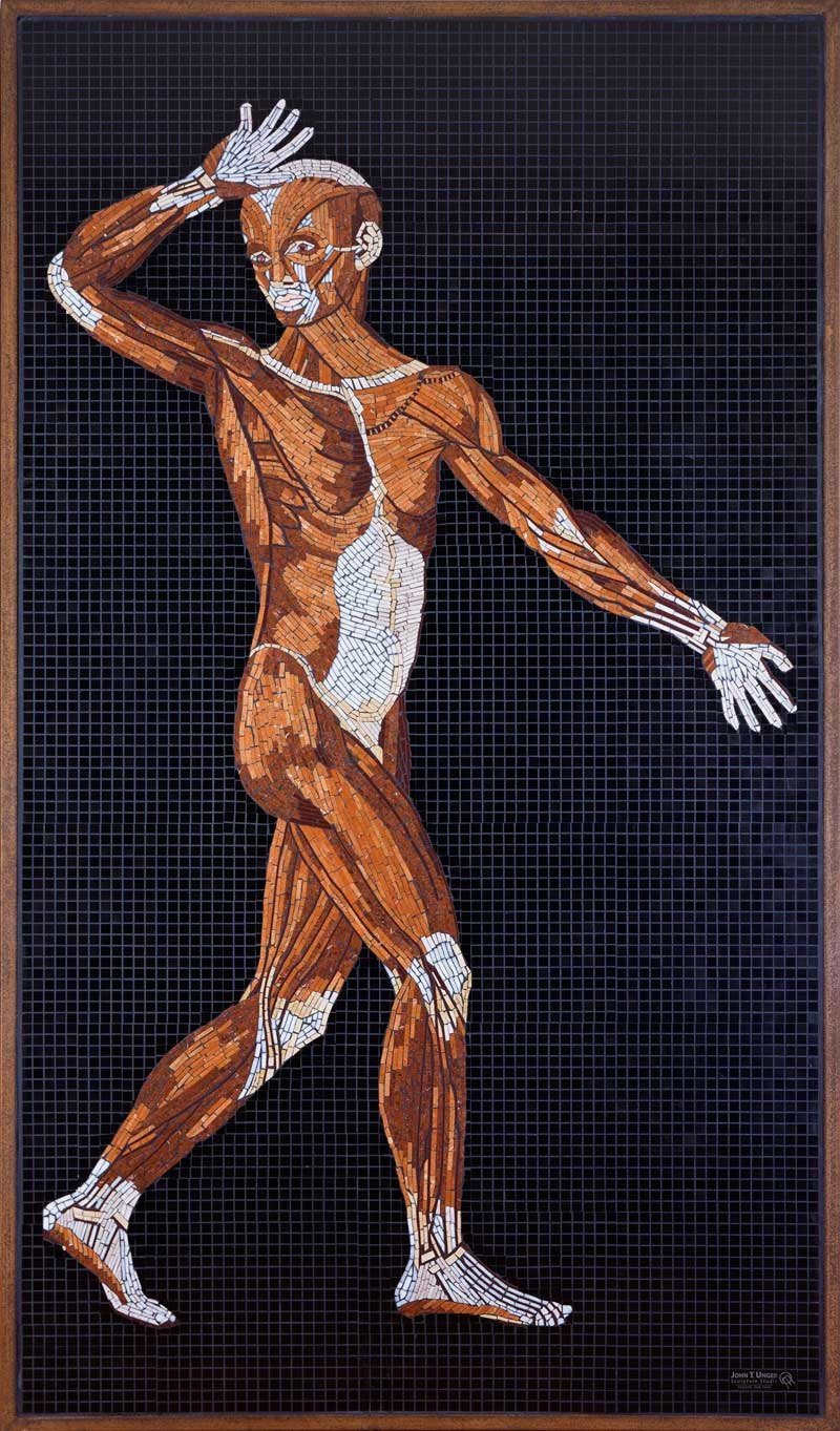
Sculptor John T. Unger is making a series of life-size stone mosaics based on anatomical drawings by the 16th-century Italian scientist Bartolomeo Eustachi.
Bartolomeo Eustachi, one of the first modern anatomists, is also considered the first comparative anatomist, as he was the first to use examples from the animal realm for comparison and clarity. Eustachi was a contemporary of Vesalius, and they share the credit of having created the science of human anatomy. In 1552 (nine years after Vesalius published his Fabrica) Eustachi completed a series of anatomical illustrations so accurate that had they been published in his lifetime, a modern understanding of anatomy might have come to pass two centuries before it was attained.
Unger has completed about half of the mosaics and is doing a Kickstarter campaign to help finish the rest of them. The first public showing of the finished artworks will be at the Carrie Haddad Gallery in Hudson, NY starting in June 2019.
From Jerry Saltz, failed artist and art critic for New York Magazine, a list of 33 rules on how to be a successful artist.
Lesson 3: Feel Free to Imitate. We all start as copycats, people who make pastiches of other people’s work. Fine! Do that. However, when you do this, focus, start to feel the sense of possibility in making all these things your own — even when the ideas, tools, and moves come from other artists. Whenever you make anything, think of yourself as entering a gigantic stadium filled with ideas, avenues, ways, means, and materials. And possibilities. Make these things yours. This is your house now.
And on the other side of the same coin:
Lesson 12: Know What You Hate. It is probably you. Make a list of three artists whose work you despise. Make a list of five things about each artist that you do not like; be as specific as possible. Often there’s something about what these artists do that you share. Really think about this.
I’ve you’ve ever skied or snowboarded in the US, Canada, or many other spots around the world, chances are you’ve used a ski map painted by James Niehues. He’s hand-painted almost 200 trail maps for places like Alta, Vail, Big Sky, Okemo, and Mammoth.
Ski Magazine regularly ranks the Top 50 resorts in North America. Jim has hand painted 45 of them. His tools of choice are a camera, a notepad, a paintbrush and a canvas. Every painstaking detail — peaks, cliffs, trees and shadows — is painted by hand. Jim’s large and beautiful paintings have helped generations of skiers navigate and capture the unique character of each mountain. He has had more impact on the image and feel of skiing than almost anyone, yet few people know his name.
With the help of a small team, Niehues is publishing a hardcover coffee table book featuring all of his work along with a series of prints. Here are a couple of the maps that will be in the book:


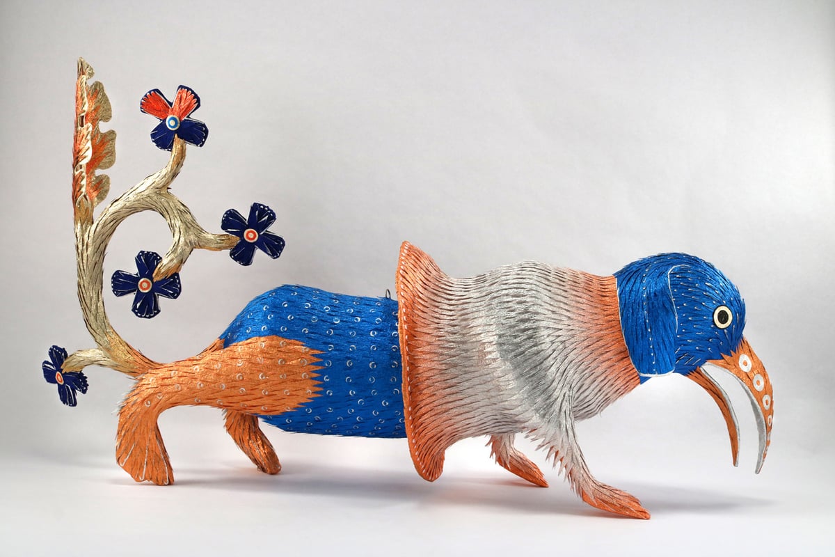
Roberto Benavidez is a Los Angeles-based artist who previously created a series of piñatas inspired by the art of Hieronymous Bosch, as well as a magnificent series of sculpted birds. His latest project, “Illuminated Piñata,” is inspired by mythical creatures found in the illuminations from medieval manuscripts. They are gorgeous, multidimensional, and inspiring. Here are just a few of them.
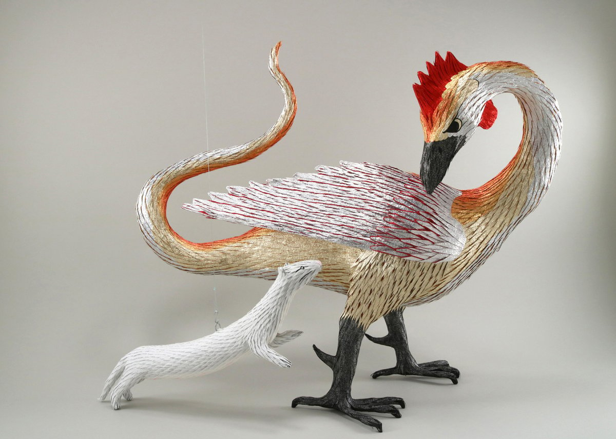
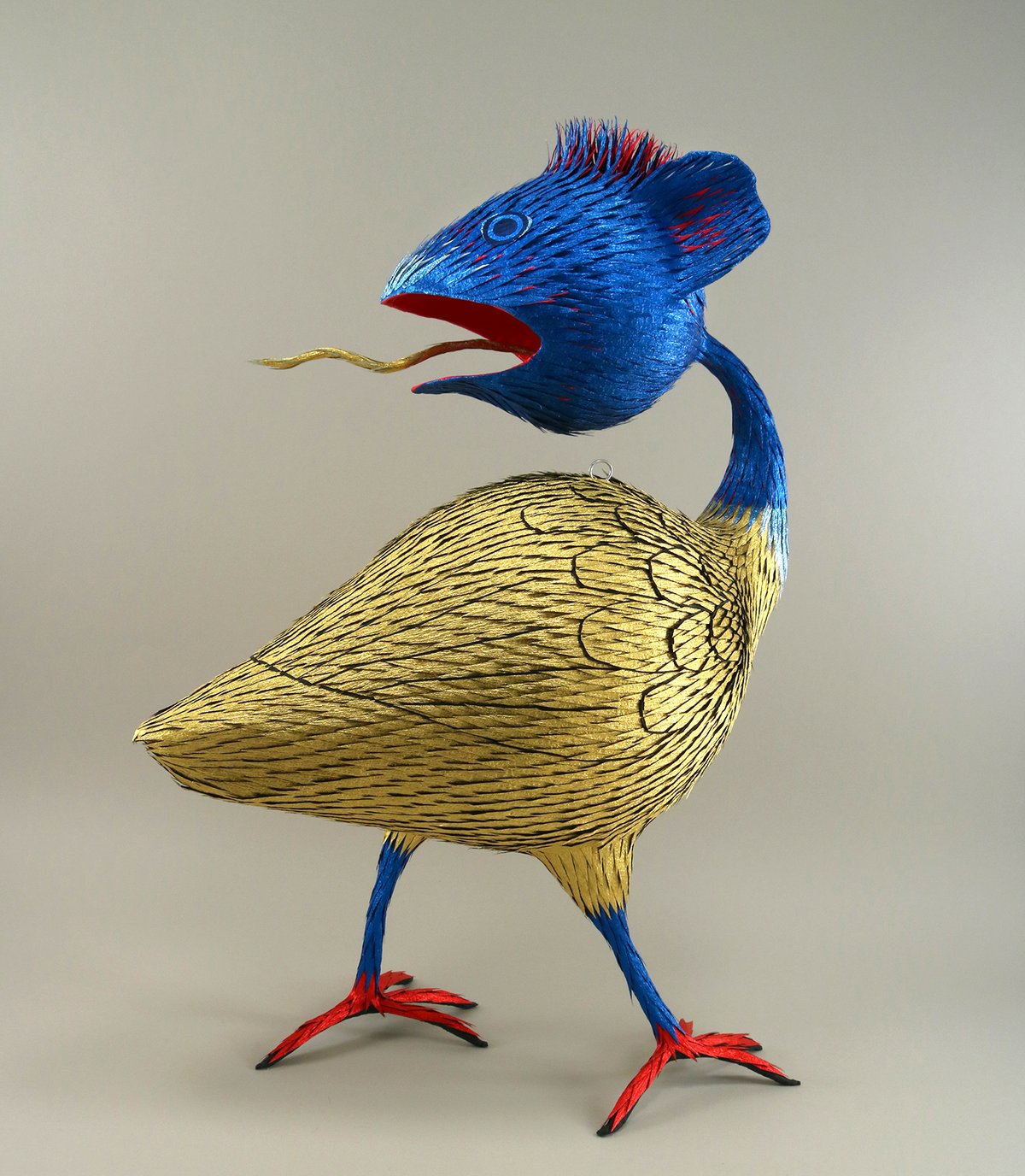
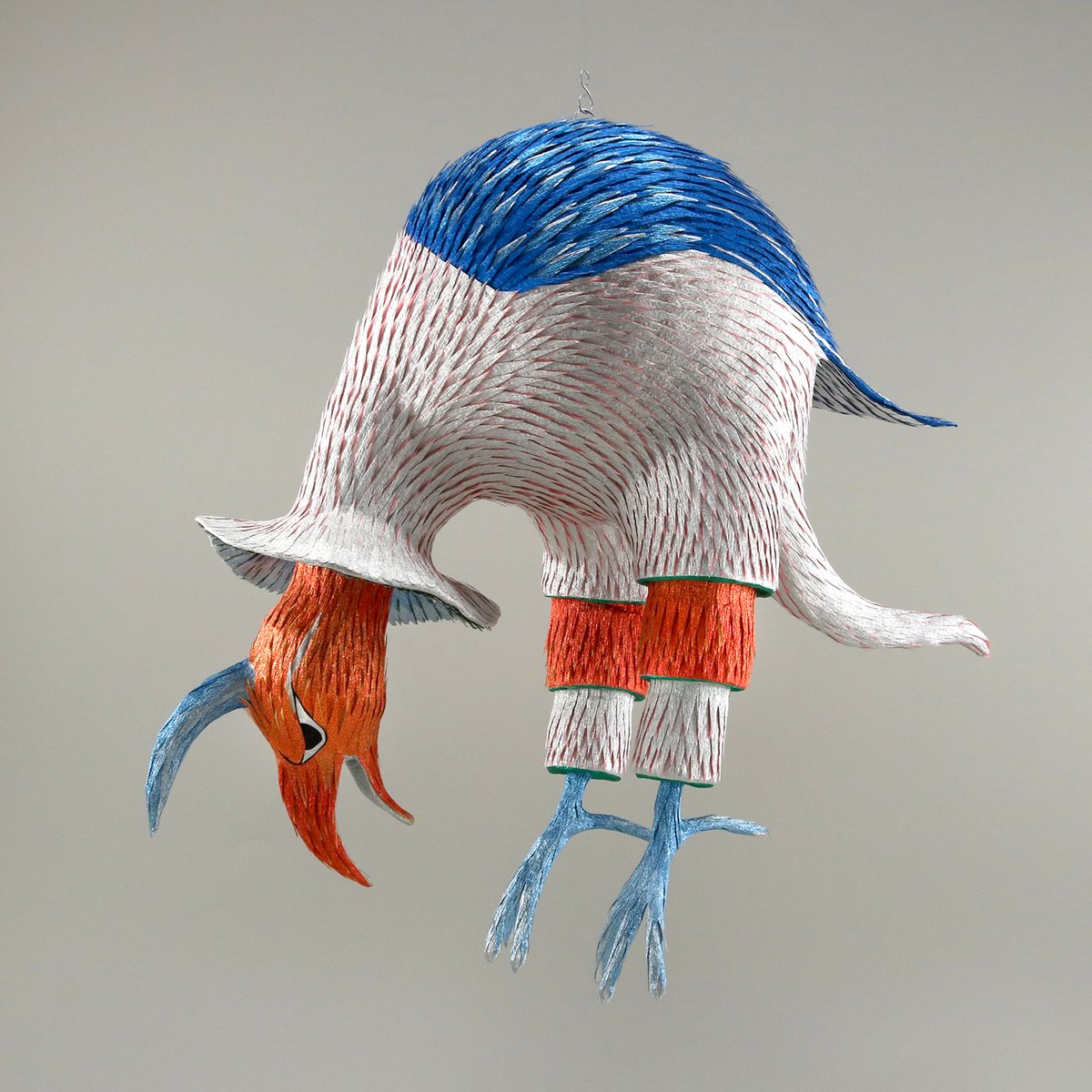
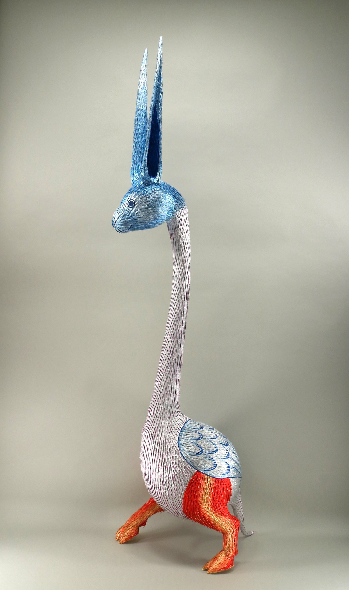
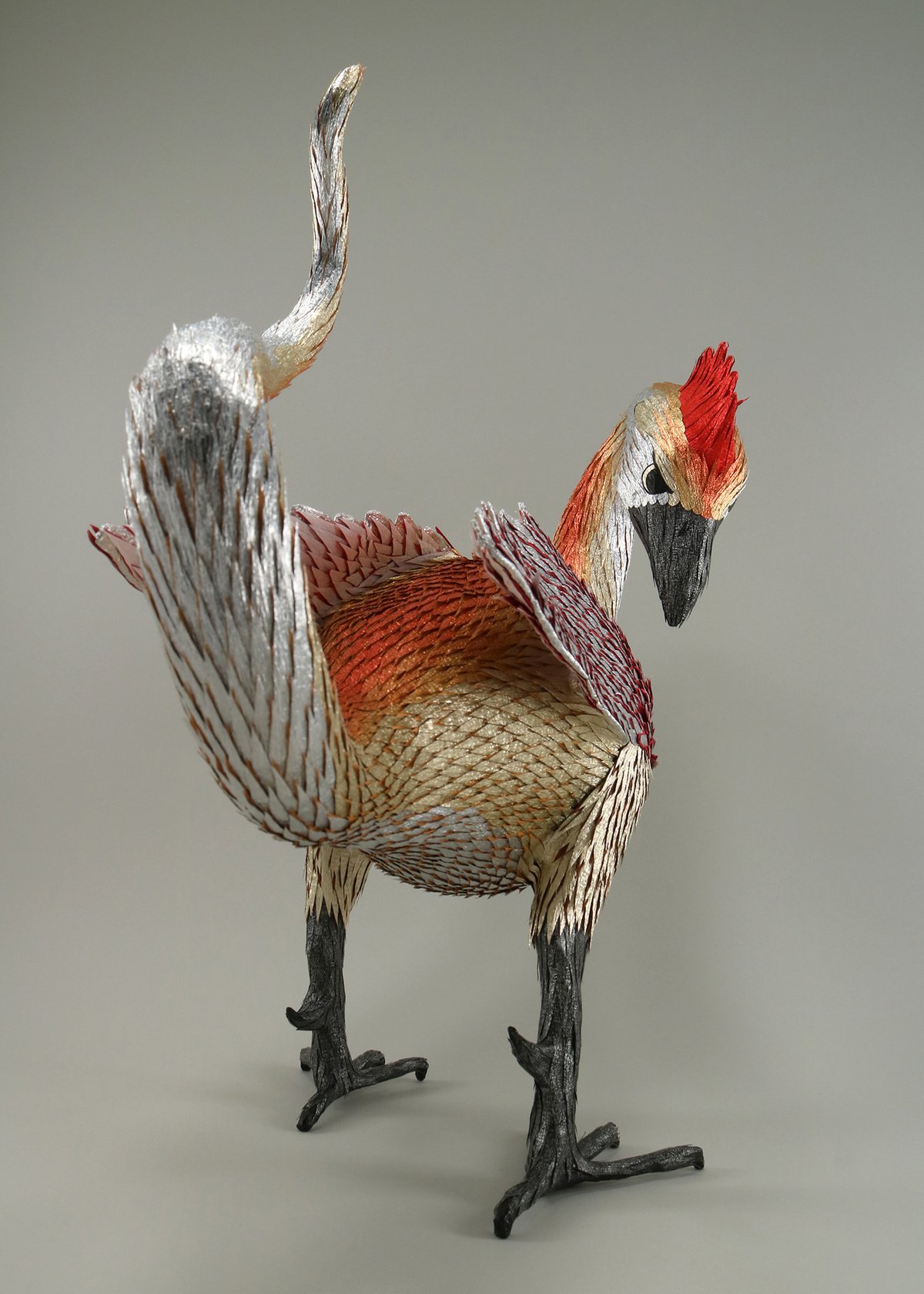
Via Colossal.
Forensic scientist Thiago Piwowarczyk and art historian Jeffrey Taylor are often called upon to authenticate purported paintings by well-known artists. Using a drip painting resembling Jackson Pollock’s work, they show how they use historical research, hardcore science, and good-ol’ human observation. The steps they go through are:
1. Provenance research. Is there any documentation of the artist painting this? Who owned it and when? Forged documentation can be an issue here.
2. Visual analysis. Does the material used for the painting fit the artist and the timeframe? Often, a forger won’t sign a fake to mitigate any potential legal ramifications.
3. Photography and ultraviolet analysis. Was the canvas reused? Is there an under-painting or drawing?
4. X-ray fluorescence spectroscopy. What elements are present in the paint? Do they match those in the paints normally used by the artist?
5. Microscopy & Raman spectroscopy. What kind of paint was used? Did that paint exist when the artist was working?
Super interesting. All of the craft aside, Piwowarczyk also says that “if the deal is too good, there’s something wrong”. $25,000 for a Pollack? Nope. (via open culture)
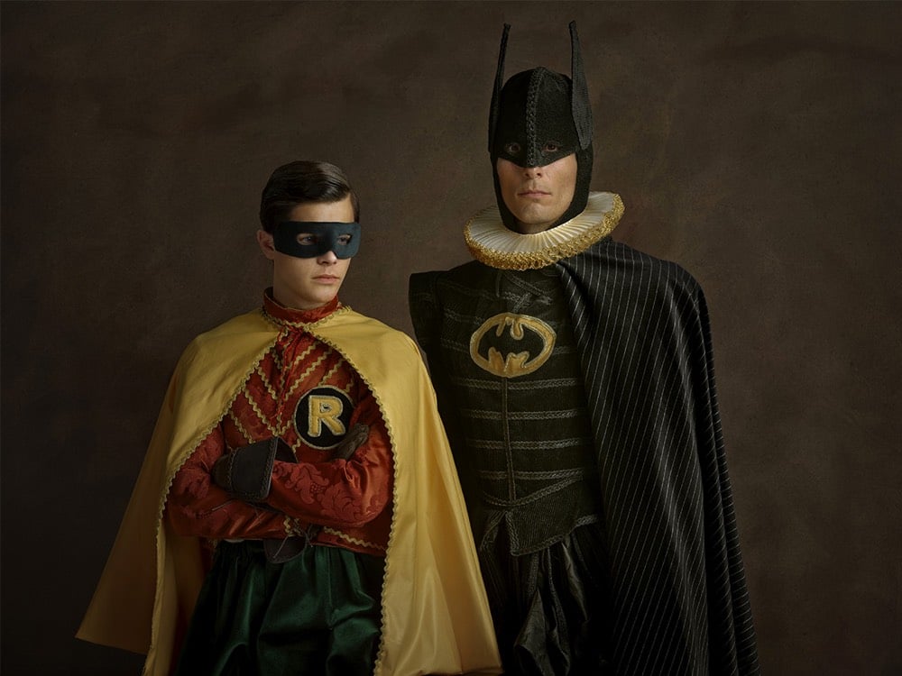
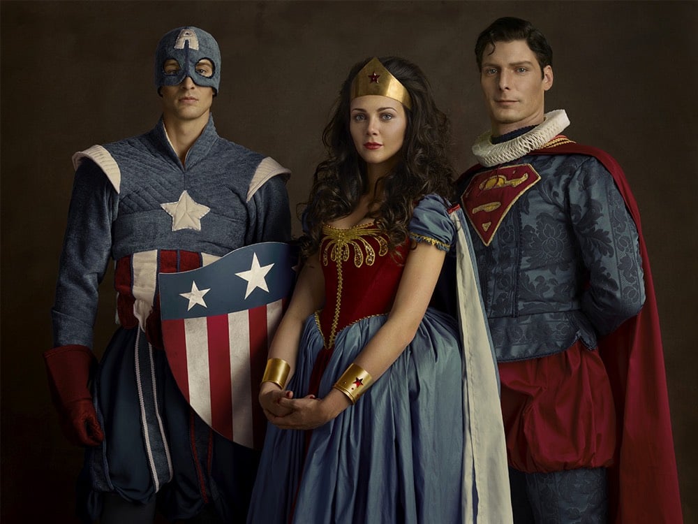
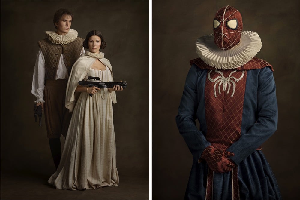
Sacha Goldberger made a series of portraits of characters from Star Wars and superhero comics as if they were the subjects of 16th-century Flemish paintings, ruffs and all. (thx, anna)
For a cultural program to accompany the 2012 Olympics in London, artist Sue Austin created a video of herself exploring a coral reef in a wheelchair outfitted with motors and wings to help it steer and go through the water.
It’s a tiny bit surreal to see how freely she moves around in something that many of us associate with an absence of a particular type of movement. But as Austin explains in her 2013 TED Talk, she thinks of her wheelchair in terms of freedom of movement, which is highlighted for others by the underwater video. (via colossal)
The last time I posted a video by Vladimir Tomin I struggled to describe what it was about, eventually punting with “just give it 5 seconds and you’ll get the idea”. They’re fun augmented reality sketches — like peeling up a road’s center line with a cursor — what’s not to like?! (via colossal)
Abbie Paulhus is selling copies of this great illustrated poster she made featuring a Wes Anderson alphabet on her Etsy shop.
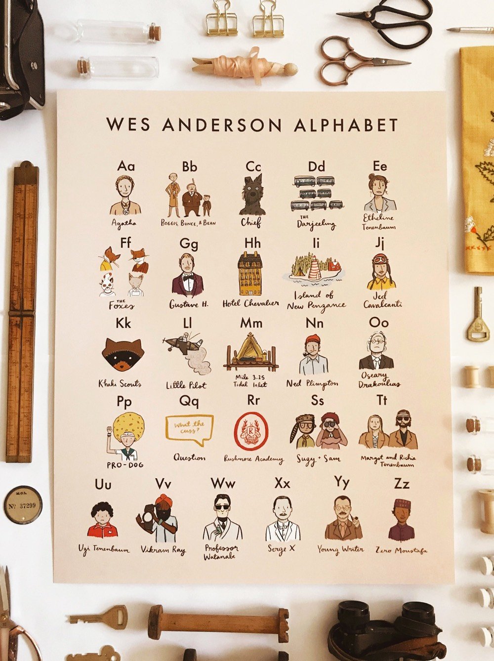
It features people, places, and objects from many of Anderson’s films (I didn’t see any Bottle Rocket references): B is for Boggis, Bunce, and Bean, N is for Ned Plimpton, and T is for Margot and Richie Tenenbaum.
The NY times recently asked eight artists what art projects they would do if they could fly to the Moon. Here’s Kara Walker’s answer:
Gil Scott Heron wrote that famous poem, “Whitey on the Moon”: “The man just upped my rent last night / Cause whitey’s on the moon / No hot water, no toilets, no lights / But whitey’s on the moon.”
I got thinking about a moon colony, which plenty of people have talked about pretty seriously over the years. So what I’d do is this: For every female child born on Earth, one sexist, white supremacist adult male would be shipped to the moon. They could colonize it to their heart’s content, and look down from a distance of a quarter-million miles. It’s a monochrome world up there; probably they’d love it. The colony would be hermetically sealed. And the rest of us could enjoy the sight of them from a safe distance. Maybe there could be some kind of selection ritual involved, something to do with menstruation and the tides — a touch of nature, to add a bit of irony justice to the endeavor.
For the supremacists, maybe traveling so far from home would help inspire a different worldview. And for the rest of us down on Earth, perhaps this is an opportunity to focus on the nature of our home planet with the same dreamy reverence we once reserved for the moon.
Here’s Scott-Heron’s Whitey on the Moon. In contrast, architect Daniel Libeskind would turn the Moon into a square by painting part of it black:
My son Noam is an astrophysicist at the Leibniz Institute in Germany, and we did some calculations about how it could work. We thought the best way would be to paint sections of it black, so they no longer reflect the sun’s light. To account for the curvature, you’d need to paint four spherical caps on the moon’s surface. That would create a kind of frame that looks square when you see it from earth.
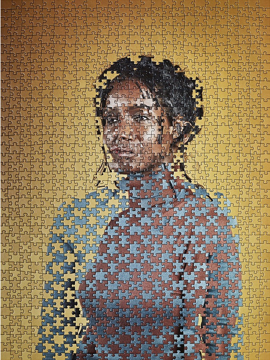
Taking advantage of the fact that puzzle manufacturers typically use the same cut patterns to make many different puzzles, Tim Klein uses the interchangeable pieces to create surrealist mashups of puzzles.
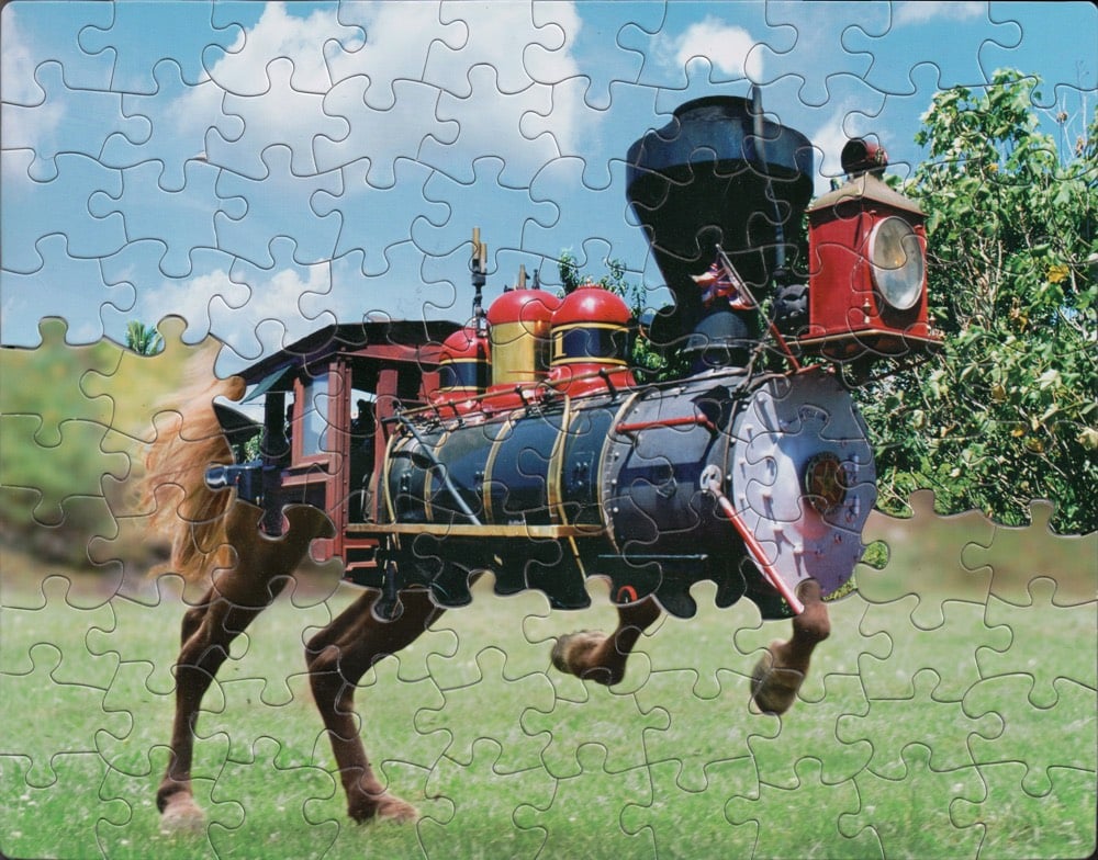
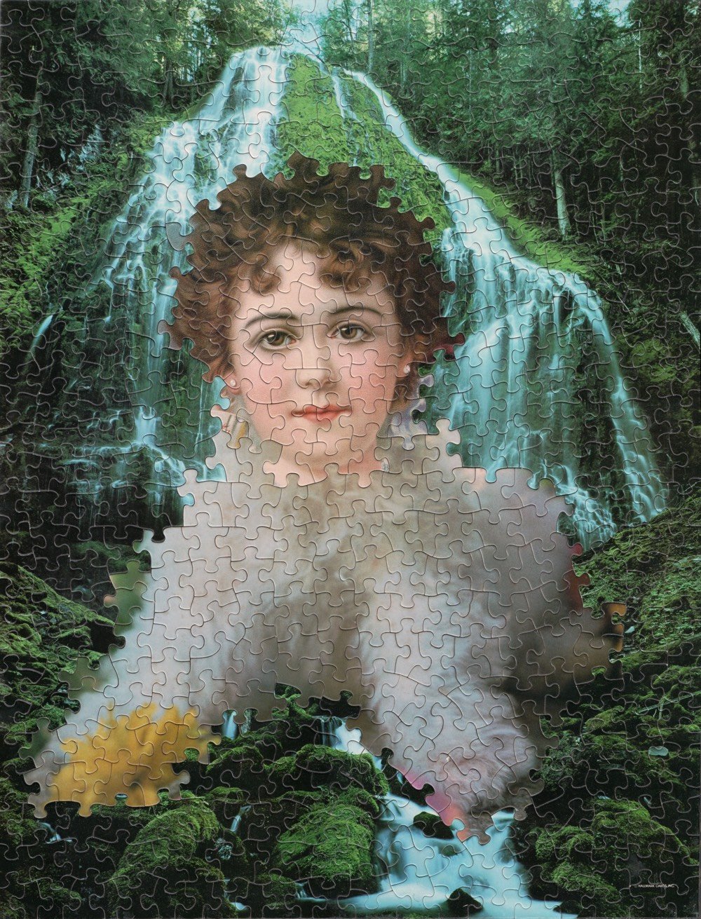
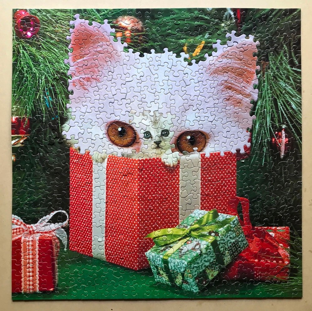
Artist Alma Haser used this technique for her Within 15 Minutes project in which she melded identically cut puzzles of portraits of identical twins.
(via @john_overholt)
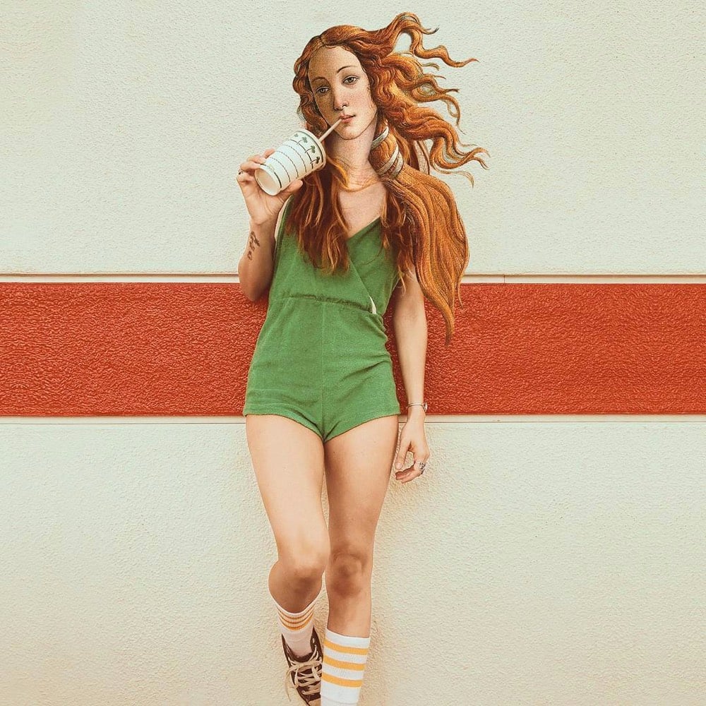
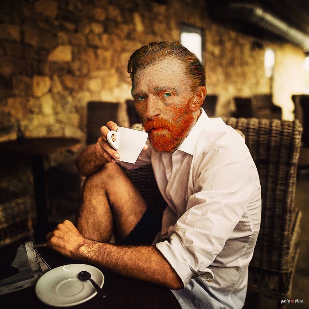

I seemingly cannot get enough of contemporizing old paintings and works of art. Here, from Rodrigo Pinheiro, are some familiar young people hanging out with modern beverages.
See also Girl with a Pearl Earring and Point-and-Shoot Camera and Art History Comes to Life.
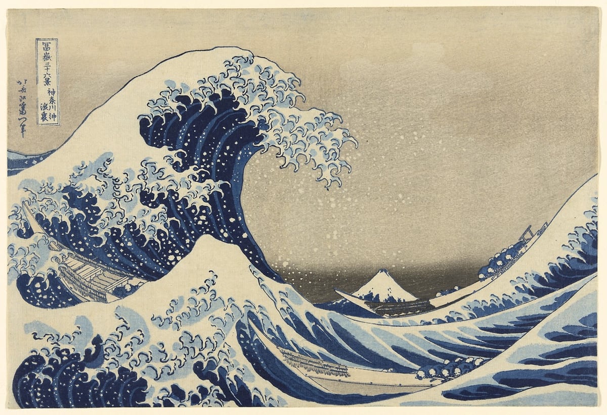
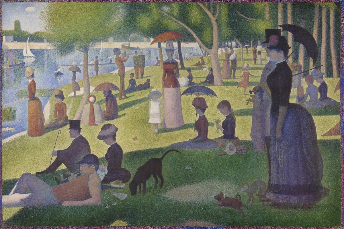
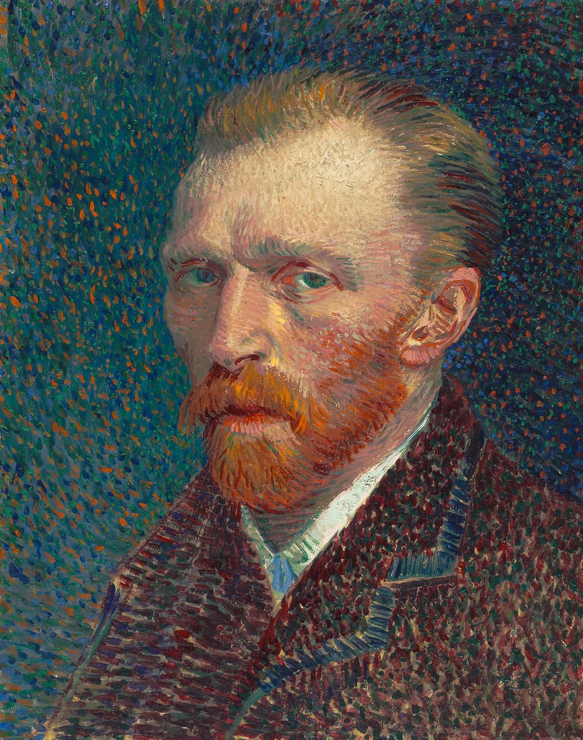
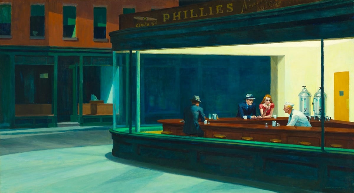
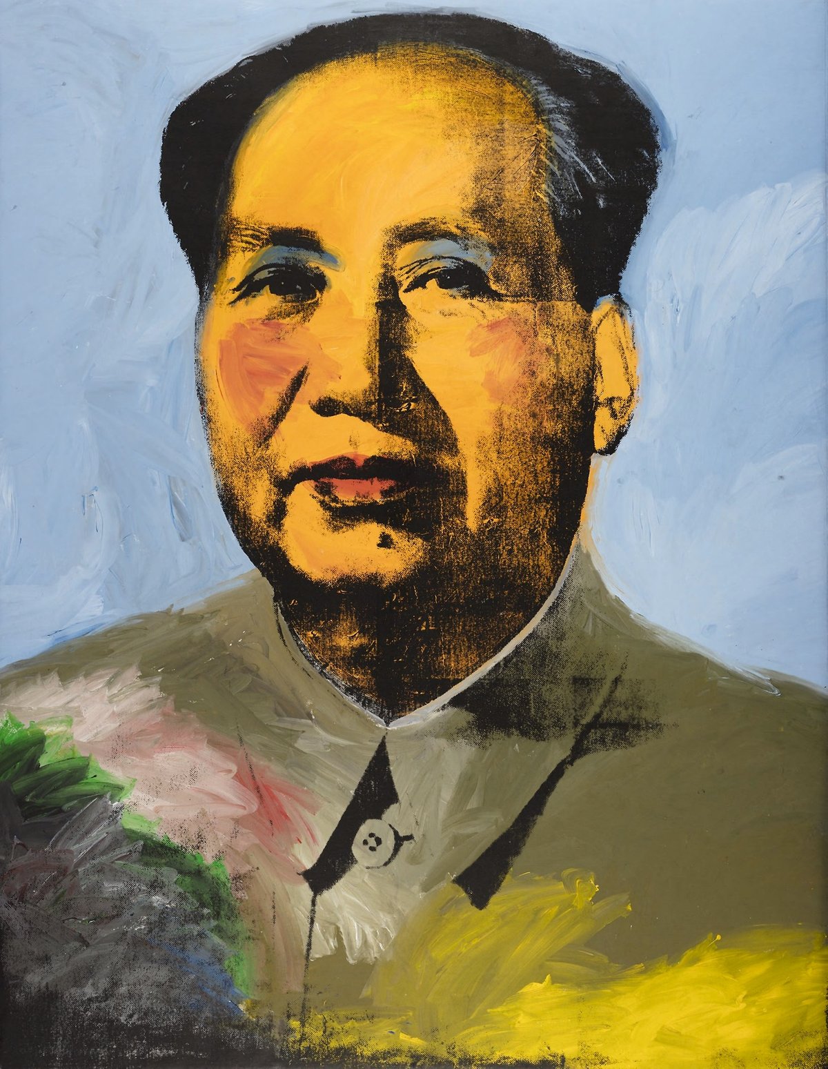
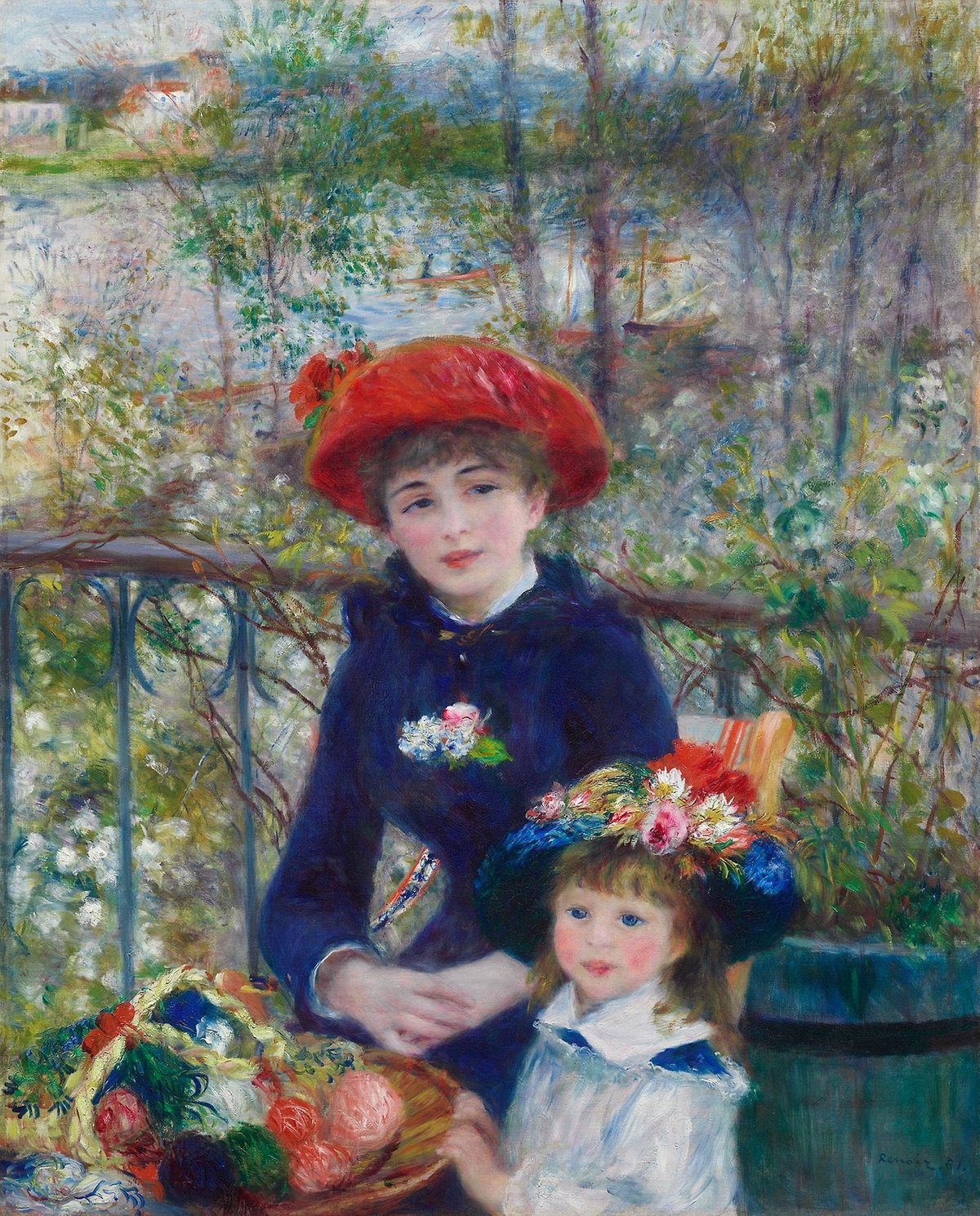
The Art Institute of Chicago recently unveiled a new website design. As part of their first design upgrade in 6 years, they have placed more than 52,000 high-resolution images from their collection online, available to all comers without restriction.
Students, educators, and just regular art lovers might be interested to learn that we’ve released thousands of images in the public domain on the new website in an open-access format (52,438 to be exact, and growing regularly). Made available under the Creative Commons Zero (CC0) license, these images can be downloaded for free on the artwork pages.
We’ve also enhanced the image viewing capabilities on object pages, which means that you can see much greater detail on objects than before. Check out the paint strokes in Van Gogh’s The Bedroom, the charcoal details on Charles White’s Harvest Talk, or the synaesthetic richness of Georgia O’Keeffe’s Blue and Green Music.
I’ve included a few notable works from their collection above: The Great Wave by Katsushika Hokusai, A Sunday on La Grande Jatte by Georges Seurat (which you can zoom and pretend you’re Cameron in Ferris Bueller’s Day Off), Self-Portrait by Vincent van Gogh, Nighthawks by Edward Hopper, Mao by Andy Warhol, and Two Sisters (On the Terrace) by Pierre-Auguste Renoir. The resolution on the images is high enough to check out the brushstrokes on the paintings. Here’s some detail on the van Gogh:
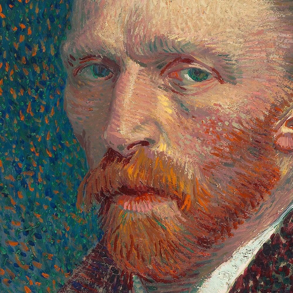
I love seeing more museums doing this.
This is a real treasure: a free, searchable database of hundreds of thousands of Japanese woodcut prints, from many collections, spanning from the early 18th century to contemporary artists. It’ll even do reverse image search and find alternate prints of the same woodcut.
A few favorites I browsed from the collection:
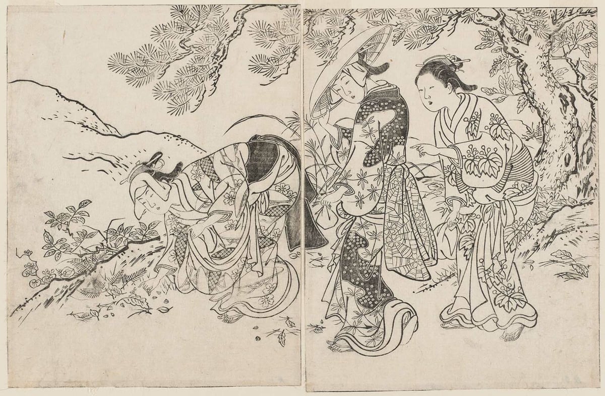
(Nishikawa Sukenobu, 1731)
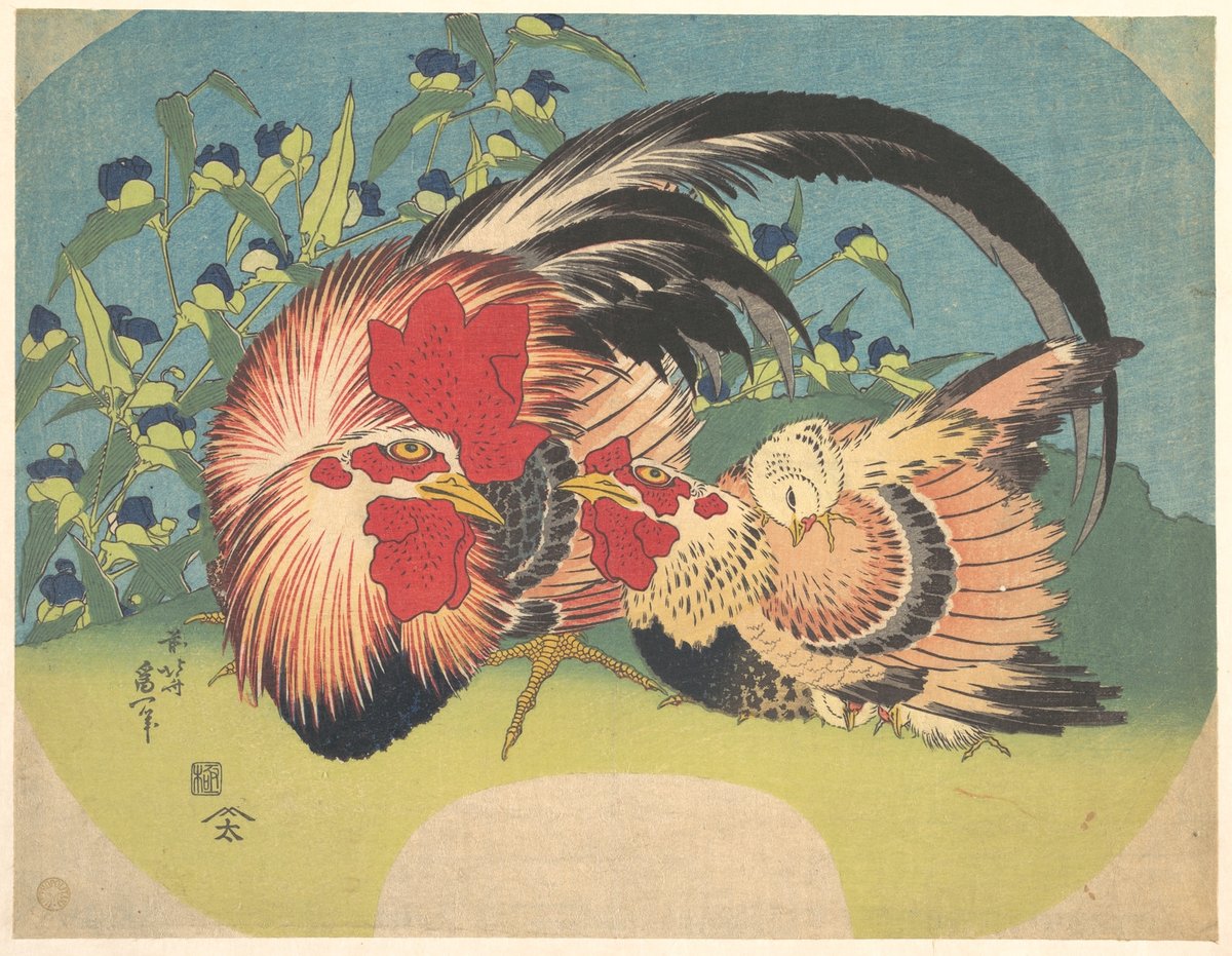
(Katsushika Hokusai, 1830)
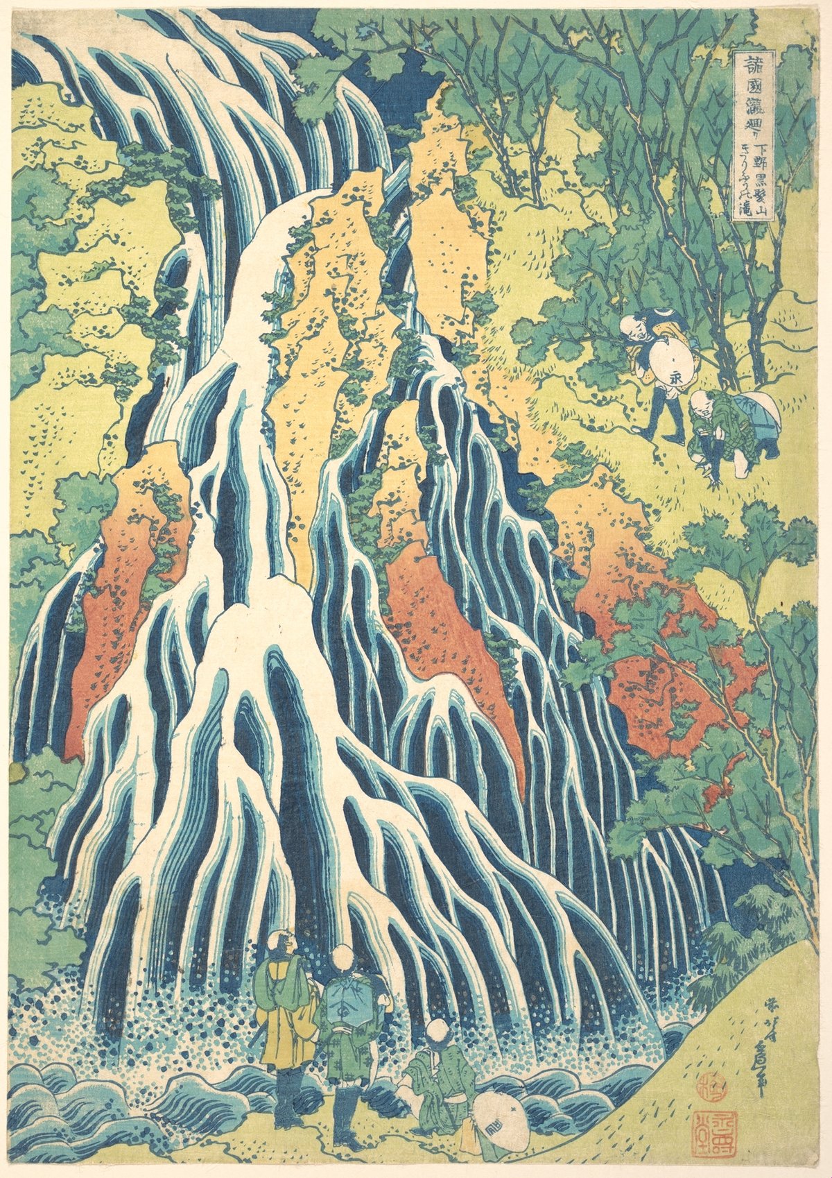
(Katsushika Hokusai, 1832)
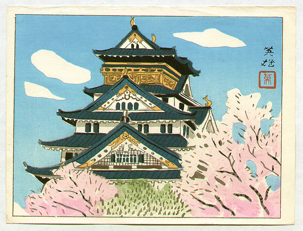
(Hagiwara Hideo, 1950s)
For his newest project IDENTITYCHRIST, Joseph Lee is pushing representational abstract painting to its limits.
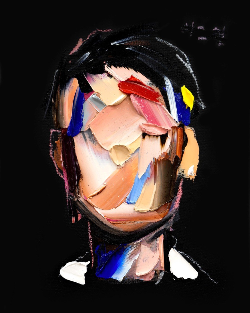
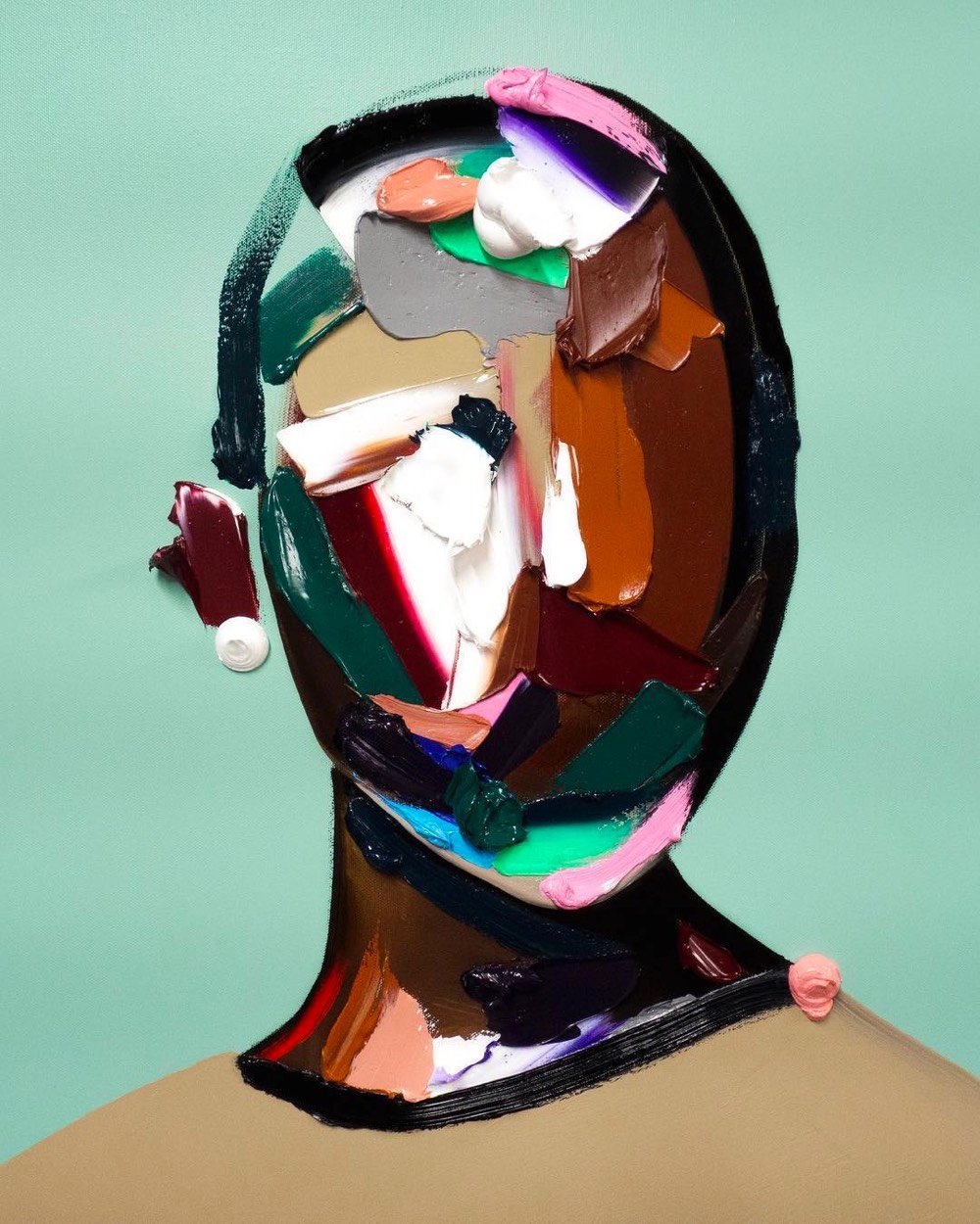
I love how rough these are but you can still tell they’re people. Prints are available.
P.S. Lee is also an actor — you may have seen him playing the brother of the lead character in Searching, which is worth watching if only for the unique way the story is told. (via colossal)
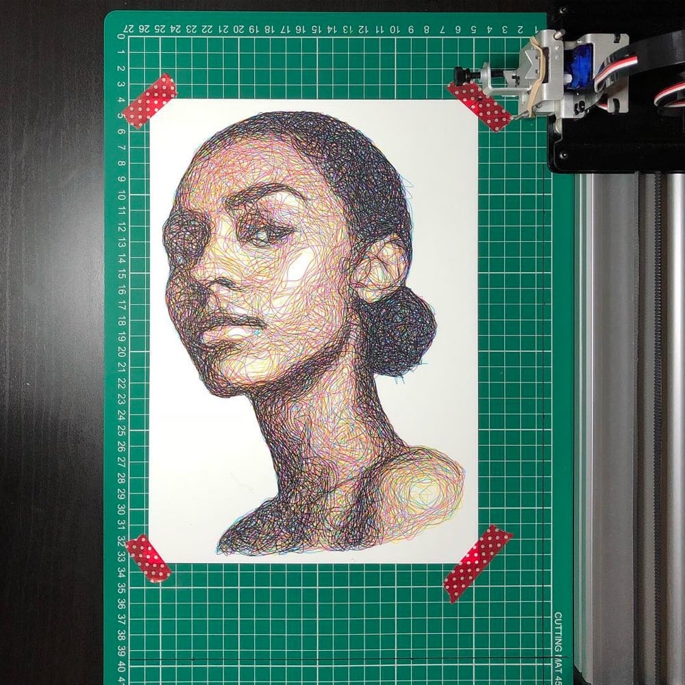
Samer Dabra uses a drawing machine called the AxiDraw and a custom program to generate Impressionistic line drawings of people. The machine builds the portraits using four single lines drawn in the four CMYK colors, one on top of another, with minimal tweaking from Dabra. Rion Nakaya of The Kid Should See This edited together a video of the machine creating drawings.
There is something more than a little Vincent van Gogh & Georges Seurat about these. You can see the results on Instagram.
The Hilma af Klint retrospective at the Guggenheim is by far the trippiest thing I’ve seen within the confines of an esteemed art institution. The show is expansive and stunning and truly transcends time (images in her paintings look like things discovered decades later, from a double helix to the 80s electronic memory game Simon). As if to prove she’s a futurist, she envisioned that her major body of work would be displayed in a spiral temple.
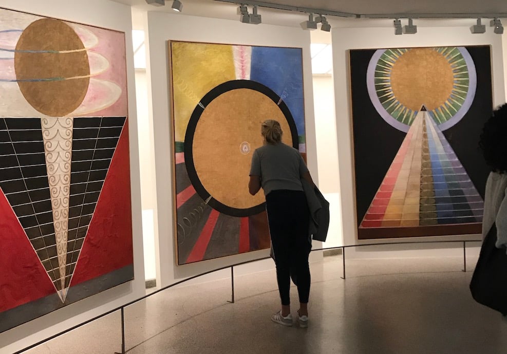
Words cannot fully describe the power or style of her pieces, which are botanical, psychedelic, scientific, occult, and truly mystical. Her abstract paintings, which she started producing five years before Kandinsky or any other of the more famous men of her time created something of the sort, were channeled through her spiritualism. She was influenced by Rosicrucianism, Theosophy, and later in life, anthroposophy.
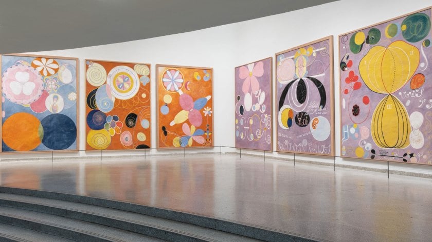
It’s all a bit mind-bending. af Klint knew that the world was not ready for her work, so she specified it not be shown until 20 years after her death. This was likely because, at a visit to her Stockholm studio in 1908, Rudolf Steiner was “unable to decipher the paintings and claims that no one during the coming 50 years will be able to.” She died in 1944, the same year as Kandinsky and Mondrian, and it was over four decades until there was a show that included her paintings.
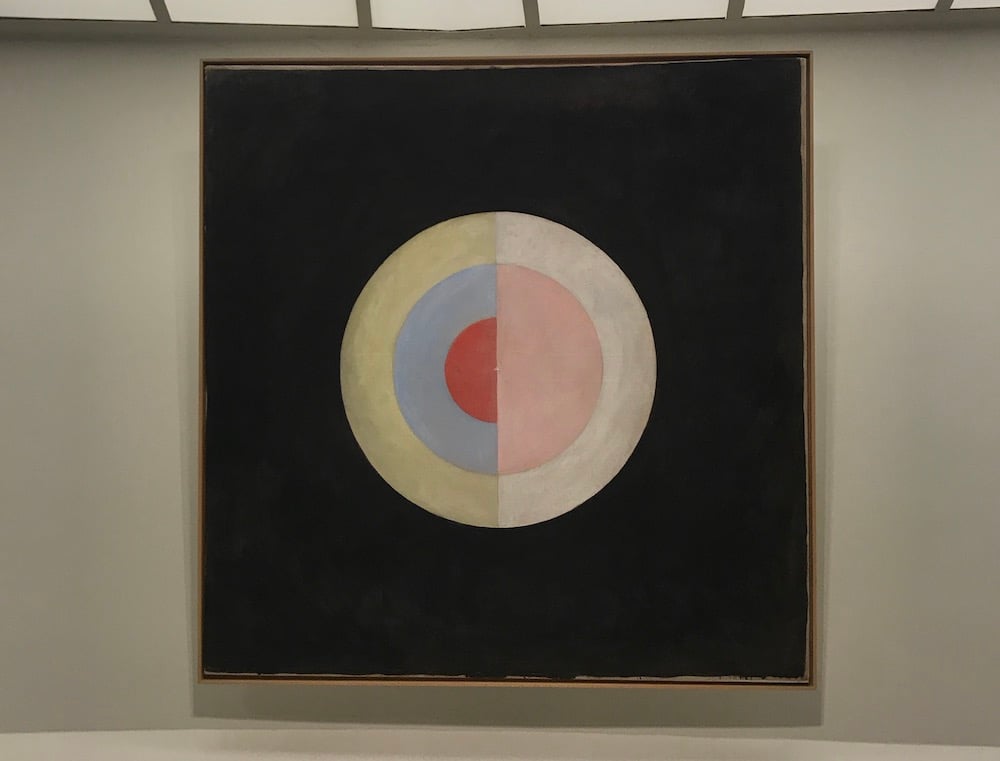
From The New Yorker:
The art is fearfully esoteric. But something about it resonates with a restlessly searching mood in present culture, hostile to old ideas. Af Klint has a lot of people’s rapt attention. From what I hear, young artists of many stripes are mad for her.
Yes, people are ready for it. Never before have I witnessed so many museum-goers studying paintings so up close (see my top photo, above) and really being with the art. And I’d argue our current #MeToo era is fertile ground for retelling origin stories with more representation of women and those who were otherwise overlooked.
The endlessly inspiring Hilma af Klint: Paintings for the Future is up at the Guggenheim in New York until April 23, 2019.
n.b. You may recall that Acne Studios did a capsule collection using Hilma af Klint prints in 2014. (thx Eviana)
Update: Here’s a good video introduction to af Klint’s work:
I somehow didn’t know until recently that Piet Mondrian created a whole series of flowers, including charcoals and watercolors.
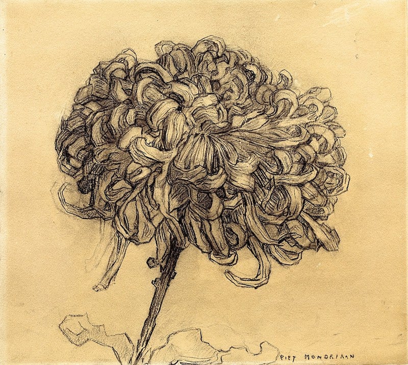
The chrysanthemum, at least, is very Van Gogh. The amaryllis gives a hint of the primary colors to come in his work.
Barbara Kruger, Untitled (Questions)
(1990/2018)
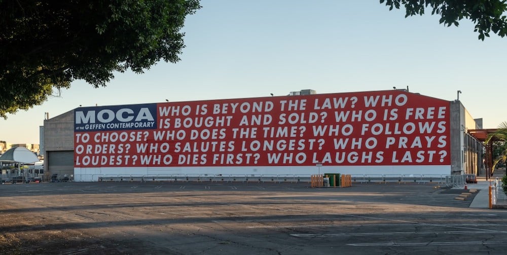
Nine big questions by Barbara Kruger are now on display at MOCA in Los Angeles until November 2020. The museum will also host voter registration events in conjunction with the installation, made possible by an anonymous donor.
It’s worth noting that MOCA is just blocks away from LA’s Skid Row, where about 2,500 people live on the street. It’ll be interesting to see who shows up for their events and how they’ll do outreach.
Newer posts
Older posts




Socials & More