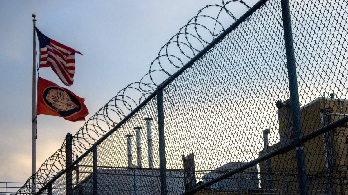
This short video takes us on a trip through the criminal justice system and highlights a “hidden form of punishment” directed toward incarcerated people: fees. At every turn, people who are sentenced to incarceration are subject to tens of thousands of dollars in fees: bail fees, public defender fees, filing fees, court costs, mandatory contributions to funds like the state police fund, room & board, phone calls, money transfer fees, medical co-pays, and fees for post-incarceration monitoring. This is on top of any penalties that are paid by offenders.
We’re not talking about fines, those monetary punishments that judges impose on offenders. And this isn’t about restitution, which is an additional sanction intended to reimburse victims. Fees are far more insidious, functioning like predatory taxes that raise revenue for the government. They can vary from state to state, municipality to municipality, institution to institution.
And they can have severe economic consequences, particularly for people who are already broke when they enter the system — that is, most people who run afoul of the law. The resulting debts can destroy people’s credit, prevent them from voting and interfere with their ability to find employment and housing.
And guess what? People in debt turn to crime to pay their bills. This is all just another way that America’s criminal justice system is punitive and not rehabilitative.
In order to leave comments on posts, you need to be a current kottke.org member. If you'd like to sign up for a membership to support the site and join the conversation, you can explore your options here.
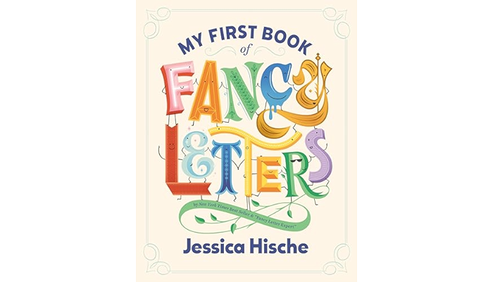
New children’s picture book from the excellent Jessica Hische: My First Book of Fancy Letters, “a delightful spin on the traditional alphabet book, featuring creatively hand-lettered words from A to Z”.
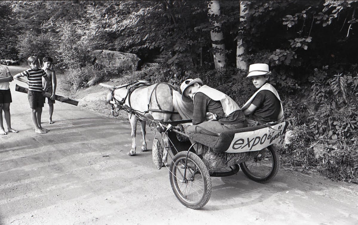
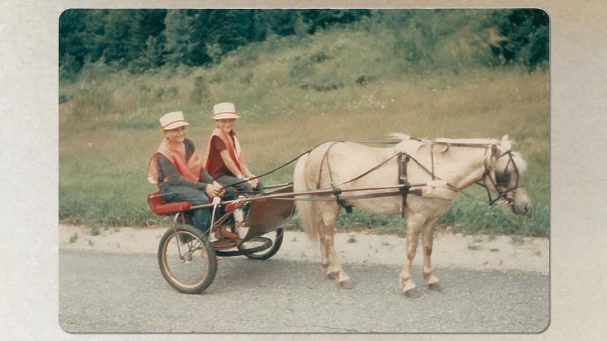
Pony Boys is a delightful short documentary about two boys (aged 9 & 11) who traveled from a Boston suburb to the 1967 World’s Fair in Montreal by pony cart.
In the short documentary above, the “pony boys,” Tony and Jeff Whittemore, recount that as youngsters, they were unaware of the controversial questions the trip raises. What constitutes responsible parenting? Did their parents do something dangerous, or was it a brilliant parenting move that taught lifelong lessons? What they recall is a life-changing adventure made possible by a free-spirited mother who believed they could do it.
Three thought experiments that suggest “the space-time continuum we seem to inhabit is not fundamental but an approximation of something deeper, and that the concept will eventually be replaced…” What a wrench in the works black holes are!
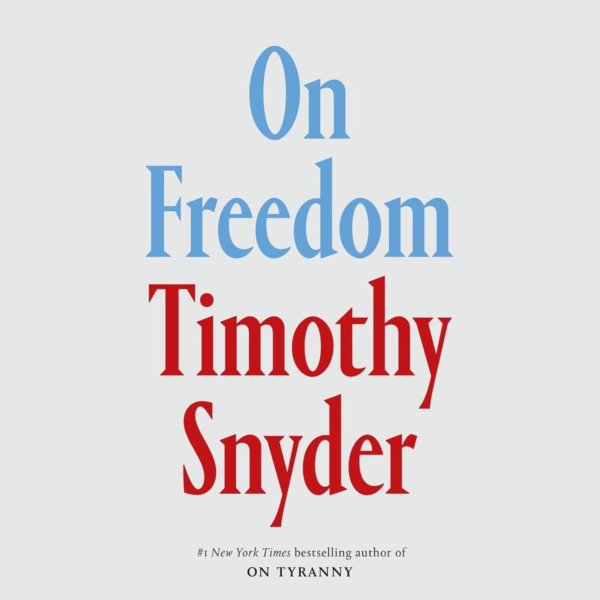
Freedom is the great American commitment, but as Snyder argues, we have lost sight of what it means — and this is leading us into crisis. Too many of us look at freedom as the absence of state power: We think we’re free if we can do and say as we please, and protect ourselves from government overreach. But true freedom isn’t so much freedom from as freedom to — the freedom to thrive, to take risks for futures we choose by working together. Freedom is the value that makes all other values possible.
Before Google, reference librarians answered questions via telephone. “We learned not merely how to find information but how to think about finding information. Don’t take anything for granted; don’t trust your memory; look for the context…”
This Icelandic hotel offers a unique a valuable service: an aurora wake-up call. “When the northern lights appear in the night sky, they’ll wake you to make sure don’t miss a once-in-a-lifetime viewing experience.”
For the latest installment of Every Frame a Painting, Tony Zhou and Taylor Ramos examine the artistry and thought silent film master Buster Keaton put into the physical comedy in his movies. I used to watch all sorts of old movies with my dad (Chaplin, Keaton, Laurel & Hardy) and had forgotten how good Keaton was. If you’re anything like me in wanting to head down a Keaton rabbit hole, they recommend starting with the first short film he directed and released, One Week.
I love this: a carpenter fires his nail gun in time to the music of a band practicing or performing next door. Music, artistry, and playfulness is everywhere.
The Onion: “The Donald Trump and Kamala Harris campaigns both debuted new commercials Tuesday that attempt to win support for their respective candidates with a supercut of Trump’s most racist comments.” 🎯
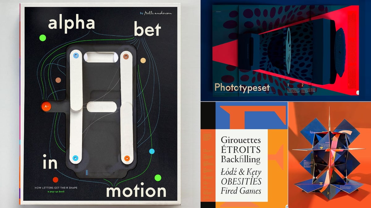
Oh boy, a new book from one of my favorite designers: Kelli Anderson’s Alphabet in Motion, a pop-up book that explains how typography works. Watch the video…this book is bonkers. Instant pre-order for me.
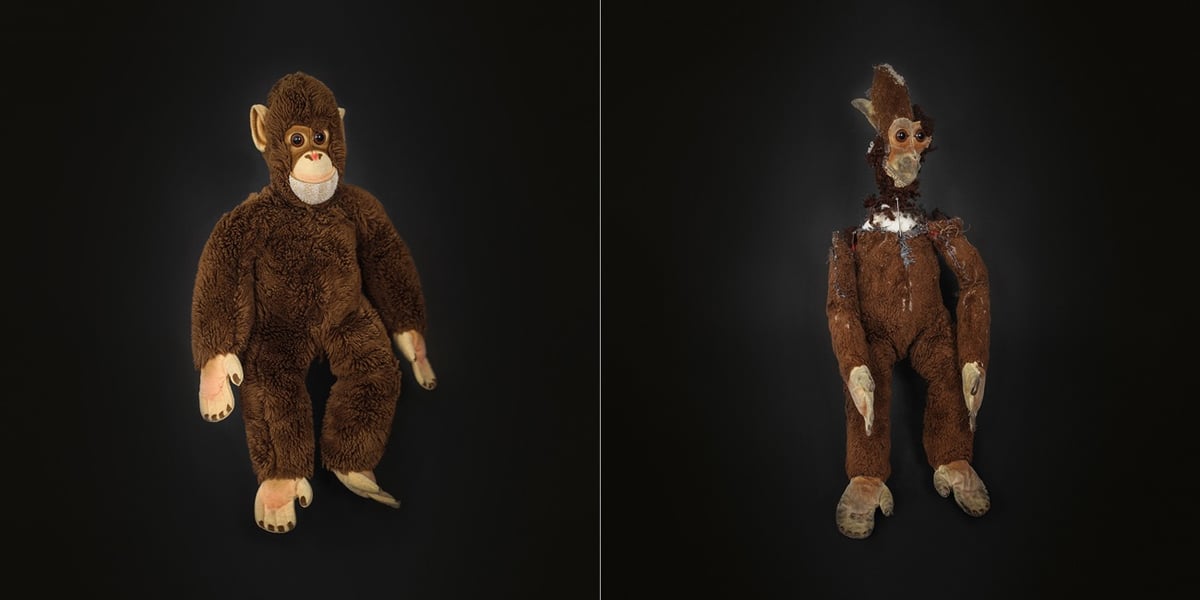
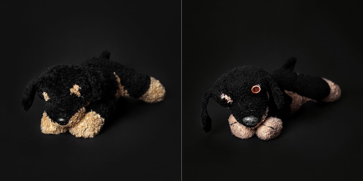
Too Much Love is a project from Katja Kemnitz in which she photographs the beloved dolls & stuffed animals of young children alongside brand-new versions of the same toys. Anyone who is a parent or caregiver can relate to the destruction on display here, as well as the difficulty of replacing these items.
I show old, much-loved teddies and dolls and compare them with as good as new doppelgangers. I think the broken stuffed animals have a lot of soul. The project is inspired by my older daughter, who took her plush dog everywhere when she was little. One day I found this dog again without button eye and torn seams in the store and bought it. She did not like him. The old one was better and could not be replaced.
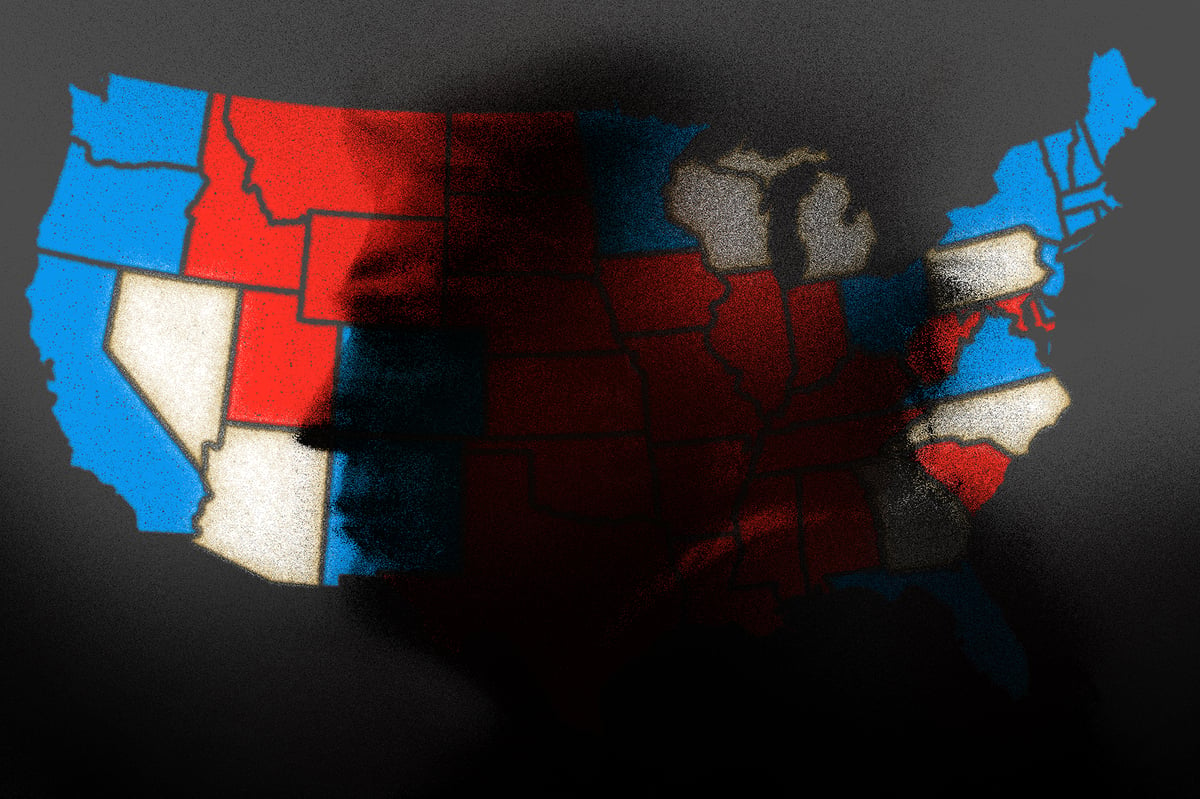
An attempt to rapidly deport twelve million people will also change everyone else. As Trump has said, such an action will have to bring in law enforcement at all levels. Such a huge mission will effectively redefine the purpose of law enforcement: the principle is no longer to make all people feel safe, but to make some people unsafe. And of course the diversion of law enforcement resources to deportation means that crimes will not be investigated or prosecuted. So some people will be radically less safe, but everyone regardless of status will in fact be less safe.
Such an enormous deportation will requires an army of informers. People who denounce their neighbors or coworkers will be presented as positive examples. Denunciation then becomes a culture. If you are Latino, expect to be denounced at some point, and expect special attention from a government that will demand your help to find people who are not documented. This is especially true if you are a local civic or business leader. You will be expected to collaborate in the deportation effort: if you do, you will be harming others; if you do not, you risk being seen as disloyal yourself. This painful choice can be avoided not at a later point but only now, by voting against mass deportations.
The Trump campaign is telling us straight out that this is their plan — they are not hiding it! at all! — and historians are letting us know what has happened in similar situations in the past and it’s just not all that confusing or complicated to understand. Even if they try and don’t succeed, it’s going to be absolutely brutal. Those are the stakes.
My 17-year-old took this Street Survival driving skills course this weekend and I recommend it! They learn how to handle their own car, how it feels to stop fast, corner fast, etc. You can see the kids level up their driving throughout the day.
I did have a close working relationship with Mike Myers, who basically wrote his own sketches and would come down to our art department to talk to me about the graphics. He wanted to approve everything himself. He was very specific in what he wanted, and I truly enjoyed working with him.
I clicked with him on where he was coming from creatively. I loved establishing the Euro-style SPROCKETS graphics for him, and creating all his Simon drawings for that series of his sketches, which was really fun. As someone with a similar passion for UK ’60s pop culture, I also loved drawing and creating the title sequence for his “1960s Movie” sketch, which I have a hunch was the seed of the idea for his Austin Powers movies!
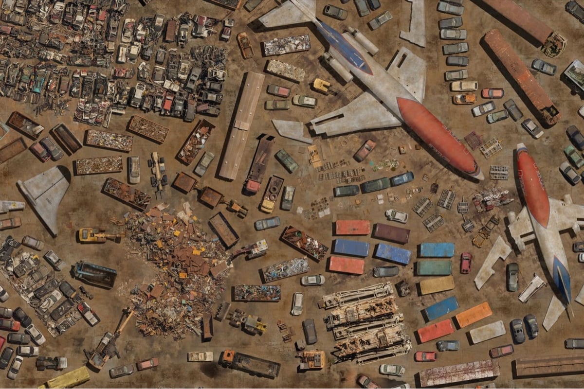
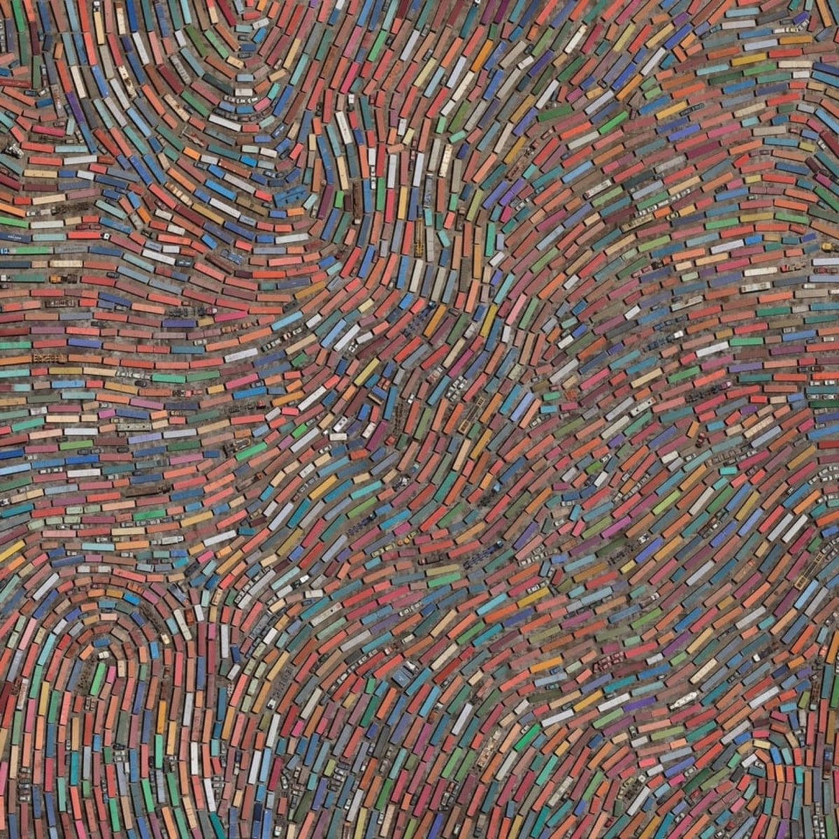
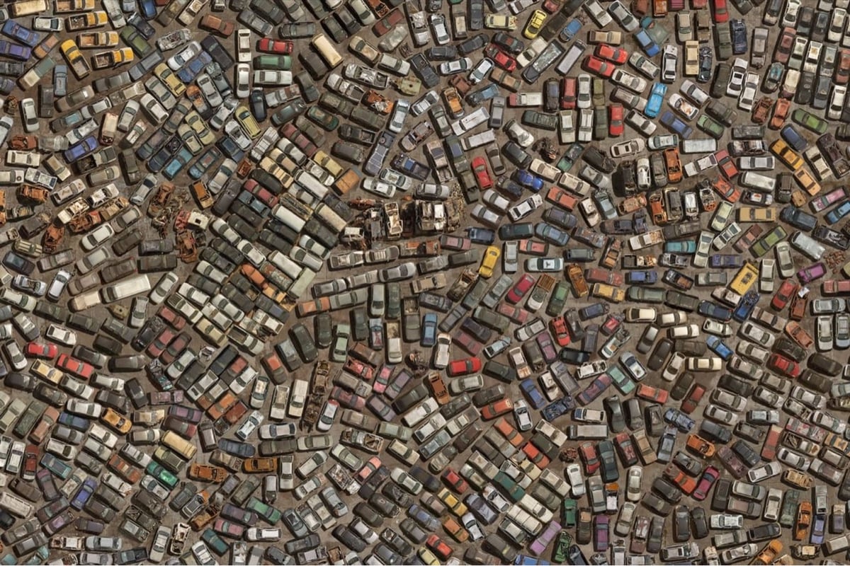
OVER presents a scenario that seems to point to a dystopian future, but which, in fact, brings together fragments of the present. The exaggerated agglomeration denounces the misleading idea of “disposal”, given that objects do not cease to exist in the world when we throw them away. Rather, they inhabit other places.
This video shows the artist’s process, from hanging out the side of a helicopter to arranging all the items in Photoshop.
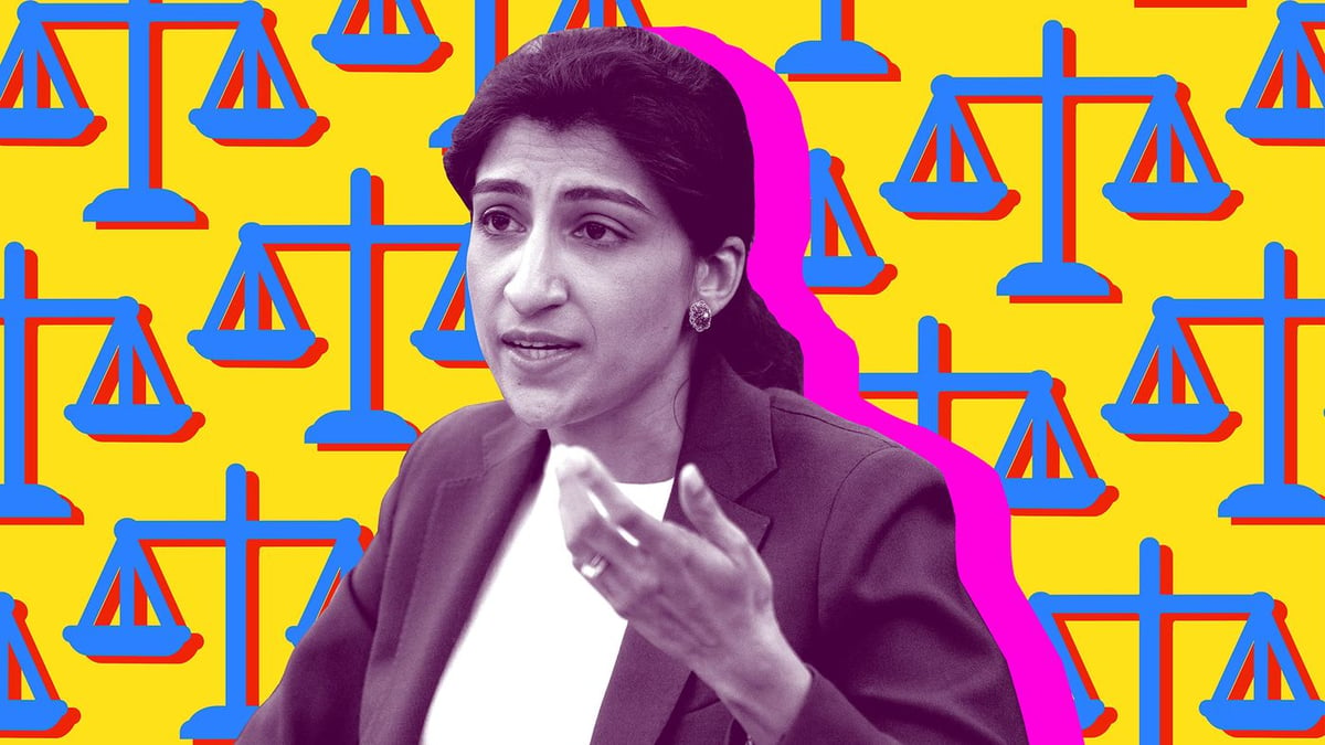
Loving that the FTC has adopted a click-to-cancel rule. “Under the rule, businesses can’t force customers to cancel a subscription using a method different from how they signed up.” So if you sign up online, they can’t force you to call to cancel. 🙌
This video seems like it was made specifically for kottke.org. In the first half of it, you learn how cranberries are harvested. In the second half, there’s gorgeous HD slo-mo footage of wakeskating through a cranberry bog.
And with a Tycho soundtrack no less…it’s all too perfect. (via ★interesting)
Supreme Court Rules 6-3 To Open Evil Tomb Of Batibat. “Contemporaneous accounts provide no evidence the Founding Fathers envisioned a role for the federal government in vanquishing this unholy entity from the face of the earth.”
Ok, this is a genuinely shocking thing to hear: “There is a new species of shark or shark relative (skate, ray, or chimera) discovered approximately every two weeks.” —shark expert David Shiffman
The Binary Game tests you on quickly converting numbers from binary to decimal and from decimal to binary, from 0 (00000000) to 255 (11111111). “Before long you’ll be doing these conversions in your head.” My son turned me onto this — it’s fun!
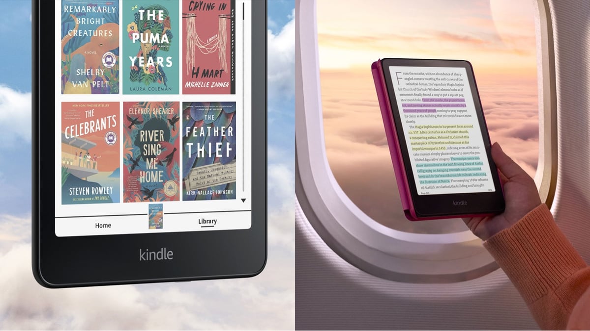
I think this counts as a FINALLY! Amazon is coming out with a full-color e-reader called the Kindle Colorsoft. You can pre-order it now for $280 and it ships on October 30. This will be great for comics, graphic novels, and books with art & photography. I am a committed ebook reader and it’s always been disappointing to view photos on the Kindle…they look like they were faxed from the Voyager space probe or something.
As it happens, I’m in the market for a new e-reader — I lost my Kindle Paperwhite a few weeks ago and haven’t replaced it (partially because I’m in the midst of an actual paper book right now but mostly because I am stubbon and don’t want to believe I have become the sort of person who loses things — my driver’s license also went missing recently). Anyway, I’m trying to decide between the Colorsoft ($280), the Boox Palma (aka the Gentle Librarian, also $280), or getting the new & improved Paperwhite (faster, bigger screen, thinner, higher contrast, $160). Hmm…
Kasso is a Japanese game show that’s like a skateboarding version of Ninja Warrior. A group of skaters is challenged to navigate a series of obstacle courses that require the street and park skating skills. Some of the obstacles are truly diabolical — to get the gist, check out these videos:
Jimmy Carter cast his mail-in ballot for Kamala Harris today, two months after stating he wanted to live long enough to do so. Carter was born when Calvin Coolidge was president and was first eligible to vote in the 1948 election (Truman vs Dewey).


Stay Connected