How You Hope Your Extended Family Will React When You Explain Your Job To Them. “Your eight-year-old cousin will run in, his eye wide, his cheeks rosy. ‘When I grow up,’ he will shout, ‘I want to be a permalancer!’”
Advertise here with Carbon Ads
This site is made possible by member support. 💞
Big thanks to Arcustech for hosting the site and offering amazing tech support.
When you buy through links on kottke.org, I may earn an affiliate commission. Thanks for supporting the site!
kottke.org. home of fine hypertext products since 1998.
Beloved by 86.47% of the web.
Entries for January 2019
The Incurable Disease vs the Relentless Couple
When Sonia Vallabh lost her mother to a rare disease called fatal familial insomnia, she soon found out that she had inherited the disease, that there was no cure, and that she’d be dead in “a decade or two”. Despite almost no scientific training, Vallabh and her husband both quit their jobs to work on a cure. Talk about going all-in.
Within a few weeks of the diagnosis, Sonia had quit her job to study science full time, continuing classes at MIT during the day and enrolling in a night class in biology at Harvard’s extension school. The pair lived off savings and Eric’s salary. Sonia had expected to take a temporary sabbatical from her real life, but soon textbooks and academic articles weren’t enough. “The practice of science and the classroom version of science are such different animals,” Sonia says. She wanted to try her hand in the lab. She found a position as a technician with a research group focusing on Huntington’s disease. Eric, not wanting to be left behind, quit his job too and offered his data-crunching expertise to a genetics lab. The deeper they dove into science, the more they began to fixate on finding a cure.
They’re now on the brink of getting their Harvard PhDs and are pushing ahead with a promising medical therapy.
As soon as the couple began their presentation, Lander says, there was a sense of “pushing on an open door” — quite a surprise, given the agency’s stodgy reputation. “People still flat-out don’t believe the FDA was cool with it,” Minikel says. Afterward, one of the 25 scientists in the audience pulled Lander aside and said, “That was one of the best presentations I’ve ever seen.” Schreiber agreed. He alluded to a pharmaceutical company he’d helped set up early in his career. “Twenty-four years into that company, there was nothing to show for it. Not one thing,” he says. “For two graduate students who are not trained in science to come in and do what they did? Absolute forces of nature, savants. They keep seeing things that other people don’t see.”
Update: D.T. Max wrote a book on prions and prion-based diseases called The Family That Couldn’t Sleep. I looked in the kottke.org archives and found a 2010 post on a National Geographic article Max wrote about sleep that specifically referenced fatal familial insomnia:
The main symptom of FFI, as the disease is often called, is the inability to sleep. First the ability to nap disappears, then the ability to get a full night’s sleep, until the patient cannot sleep at all. The syndrome usually strikes when the sufferer is in his or her 50s, ordinarily lasts about a year, and, as the name indicates, always ends in death.
(via @mattbucher)
Historic Topographic Maps Pushed Into 3D
Designer Scott Reinhard takes old geological survey maps and combines them with elevation data to produce these wonderful hybrid topographic maps. From top to bottom, here are Reinhard’s 3D versions of a 1878 USGS Yellowstone map, a 1904 USGS map of Acadia National Park, and a 1899 USGS map of the Grand Tetons.
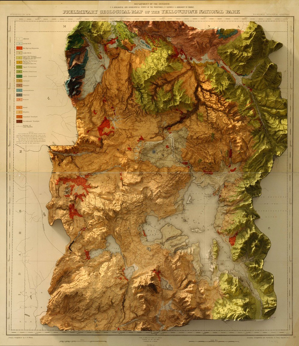
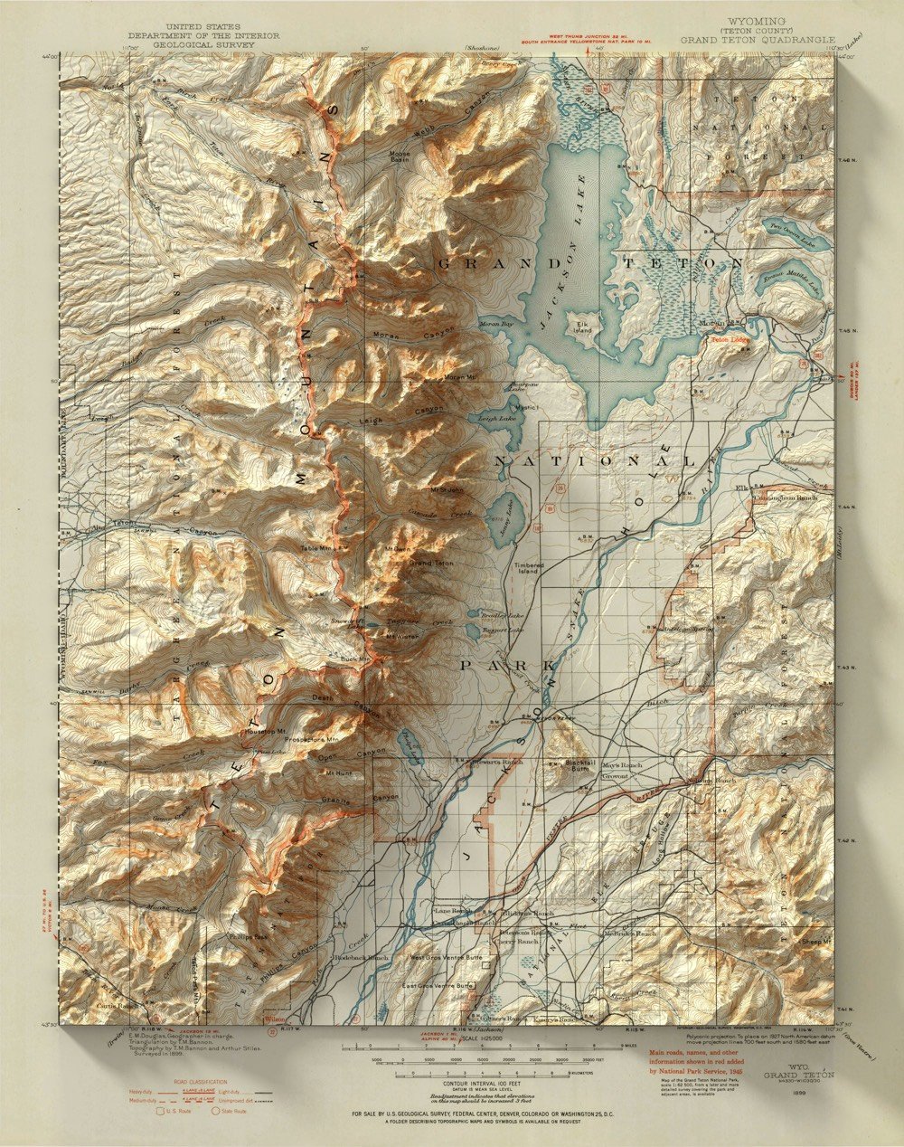
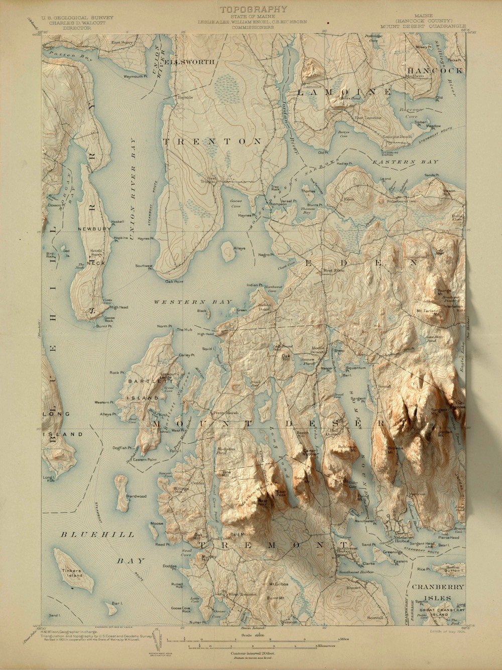
What really sells it is the shadows cast by the topological part of the map onto the borders; it’s particularly evident in the Teton and Acadia maps. I’d love to see an animated version of the mountains pushing up from the flatness of the map. (via the morning news and several emailers)
Update: FYI, if you want to buy prints of some of these maps, Reinhard has set up a shop selling prints.
The Art of Noticing
When Tim and I first started the Noticing newsletter, I got a note from Rob Walker, a design and technology journalist whose work I’ve followed for some years. He said he was working on a book about paying attention and that the book and an affiliated newsletter were going to have a similar name to “Noticing”. Name collisions like that are always a bummer, but we didn’t challenge each other to a duel or anything. Instead, he asked me to contribute a tiny bit to the book and I said I’d write about it when it was coming out.
So here’s the skinny. The book is called The Art of Noticing: 131 Ways to Spark Creativity, Find Inspiration, and Discover Joy In the Everyday, will be out in May 2019, and can be preordered from Amazon right now. Walker describes it as a practical guide to becoming a better observer, “a series of exercises and prompts and games and things you can actually do (or reflect upon) to build attention muscles or just get off your phone and enjoy noticing stuff that everyone else missed”.
The Art of Noticing is an expansion of an essay by Walker called How to Pay Attention. One of the suggestions is “Look slowly”:
Robert Irwin, the artist mentioned above, shaped his practice in part by spending insane-sounding amounts of time simply looking — at his own paintings, at rooms, at outdoor settings. “Slow Art Day” is an annual event at multiple locations around the country that picks up this spirit in a perhaps more manageable form: Participants meet at a museum and “look at five works of art for 10 minutes each and then meet together over lunch to talk about their experience,” the event’s site explains.
The weekly newsletter associated with the book is right here if you’d like to join me in signing up. So far, it’s both whetting the appetite for the book and also providing interesting attention-adjacent things to snack on in the meantime.
P.S. I love Walker’s idea that paying attention is something that a person can learn to do. In the introduction letter to Noticing, I wrote about a similar assertion Walter Isaacson made about Leonardo da Vinci in his biography:
One of Isaacson’s main points in the book was that Leonardo’s accomplishments were due in no small part to his extraordinary powers of observation. By observing things closely and from all possible angles, he was able to make connections and find details that other people didn’t and express them in his work. Isaacson argues that Leonardo’s observational powers were not innate and that with sufficient practice, we can all observe as he did. People talk in a precious way about genius, creativity, and curiosity as superpowers that people are born with but noticing is a more humble pursuit. Noticing is something we can all do.
P.P.S. When working on the book, Walker asked a number of people for tips on paying better attention. My tip (the “tiny bit” mentioned above) didn’t make it into the book, so I thought I’d share it here:
The thing that popped into my head about noticing suggestions is to pay attention to kids. They are literally at a different level in the world, ocularly speaking, and so notice different things. They’ve also got Beginner’s Minds, again literally. Having been a designer for many years, I am pretty good at observation, but my kids are always noticing details that I miss. I’m not saying you should crawl around on your hands and knees, but occasionally directing your gaze as a child would is often instructive.
Related to this, a few months ago I was able to add a new tool to their observational skills. The kids were having repeated difficulty with the door to a store in our town and on one particular visit, my son voiced his frustration. I asked them why he thought the door was so tough and they couldn’t really say, so I told them about Norman doors and now every time they have trouble with, say, a PULL door with PUSH indications, they go, “Norman door! They should get a better designed door.” It’s really fun because it turns a boring shopping trip into a little exercise in how the world could be a tiny bit better if people were just a little more observant about how others use things.
P.P.P.S. <— Last one, I promise. A version of this post first appeared in last week’s Noticing newsletter. If you’d like to subscribe, right this way.
Meet the Black Market Dropgangs
Ok, this is fascinating. In “dropgangs, or the future of darknet markets”, Jonathan Logan shares how vendors on the darknet have evolved in recent years. Instead of relying on markets like Silk Road to connect with customers and the post office to deliver, vendors have brought customer communications in-house and utilize public dead drop locations for delivery, just like espionage organizations.
To prevent the problems of customer binding, and losing business when darknet markets go down, merchants have begun to leave the specialized and centralized platforms and instead ventured to use widely accessible technology to build their own communications and operational back-ends.
Instead of using websites on the darknet, merchants are now operating invite-only channels on widely available mobile messaging systems like Telegram. This allows the merchant to control the reach of their communication better and be less vulnerable to system take-downs. To further stabilize the connection between merchant and customer, repeat customers are given unique messaging contacts that are independent of shared channels and thus even less likely to be found and taken down. Channels are often operated by automated bots that allow customers to inquire about offers and initiate the purchase, often even allowing a fully bot-driven experience without human intervention on the merchant’s side.
The use of messaging platforms provides a much better user experience to the customers, who can now reach their suppliers with mobile applications they are used to already. It also means that a larger part of the communication isn’t routed through the Tor or I2P networks anymore but each side - merchant and customer - employ their own protection technology, often using widely spread VPNs.
The other major change is the use of “dead drops” instead of the postal system which has proven vulnerable to tracking and interception. Now, goods are hidden in publicly accessible places like parks and the location is given to the customer on purchase. The customer then goes to the location and picks up the goods. This means that delivery becomes asynchronous for the merchant, he can hide a lot of product in different locations for future, not yet known, purchases. For the client the time to delivery is significantly shorter than waiting for a letter or parcel shipped by traditional means - he has the product in his hands in a matter of hours instead of days. Furthermore this method does not require for the customer to give any personally identifiable information to the merchant, which in turn doesn’t have to safeguard it anymore. Less data means less risk for everyone.
Logan expects this type of thing to become more widespread in the near future and it will be difficult to know what effect it will have on society. Maybe one of those effects is that being a corner hopper (like in The Wire) will be more widely available to young people (emphasis mine):
More people will find their livelihoods in taking part in these distribution networks, since required skills and risks are low, while a steady income for the industrious can be expected. Instead of delivering papers, teenagers will service dead drops.
(via @pomeranian99)
Chuck Wendig ranks grocery store apples. He calls the Red Delicious “an apple best used for throwing at your enemies” and the Honeycrisp “the Ed Sheeran of apples”.
“All Truths in Roma Are Revealed by Water”
Yesterday on Twitter, Guillermo del Toro shared “10 personal musings about ROMA”, the film by Alfonso Cuarón that just won best film at the Critics’ Choice awards. It is also a tiny masterclass in how to watch a film.
1) The opening shot suggests that earth (the shit-infested ground) and heaven (the plane) are irreconcilably far even if they are joined — momentarily — and revealed, by water (the reflection). All truths in ROMA are revealed by water.
2) These planes of existence, like the separation within classes in the household cannot be broached. The moments the family comes “closer” are fleeting… “She saved our lives” is promptly followed by “Can you make me a banana shake?”
This bit in particular makes me want to watch the whole thing again:
In every sense, ROMA is a Fresco, a Mural, not a portrait. Not only the way it is lensed but the way it “scrolls” with long lateral dollies. The audio visual information (context, social unrest, factions & politics / morals of the time) exists within the frame to be read.
If you haven’t seen it, I highly recommend Roma. It’s still showing in a few theaters but is also available on Netflix.
In a Nutshell
In a Nutshell is a mesmerizing stop motion animation directed by Fabio Friedli that attempts to sum up the entire world in just five minutes, “from a seed to war, from meat to love, from indifference to apocalypse”. This is very very well done. (via waxy)
Is Eating Organic Food Better for Us? For the Earth?
In their latest video, Kurzgesagt asks: “Is Organic Really Better? Healthy Food or Trendy Scam?” Using the results of dozens of studies (their extensive list of sources is here), they examine the evidence that organic food is better for our health and for the environment than food produced by conventional methods (with artificial pesticides, fertilizers, etc.). The result is pretty much a toss-up. Their ultimate conclusion: eating more fruits and vegetables of any kind and buying local food that is in season is a better option than eating organic. (Note: the video and studies they used seem to cover only organic produce and not meat. That comparison might have a different outcome.)
The World’s Fastest Human on a Bike
In 1995, Fred Rompelberg set the record for the fastest speed on a bicycle: 167 mph. In September 2018, drafting behind the same custom-made dragster that Rompelberg used to set his record, Denise Mueller-Korenek smashed that record by almost 17 mph.
Mueller-Korenek mounted a specially equipped bike with a massive gear and tethered it to a race car, which then accelerated to 100-plus mph-the velocity necessary for the rider to turn over the cranks on her own volition. Then she unhooked from the car and stayed in the slipstream, smashing the pedals around to hit the highest speed possible under her own power.
Her speed on her final mile on the Bonneville Salt Flats was 183.93 mph. This short film from WSJ shows how Mueller-Korenek became the world’s fastest human on a bike. The salty maelstrom whipped up as she pushed past 180 is incredible. Tough. As. Nails.
The Harry Ransom Center at The University of Texas at Austin announced that their Mad Men archive is now open for research. “Classes…have already used the collection to study popular culture, nostalgia, advertising and the press.”
The Embroidered Computer
Artists Irene Posch & Ebru Kurbak have built The Embroidered Computer, a programmable 8-bit computer made using traditional embroidery techniques and materials.
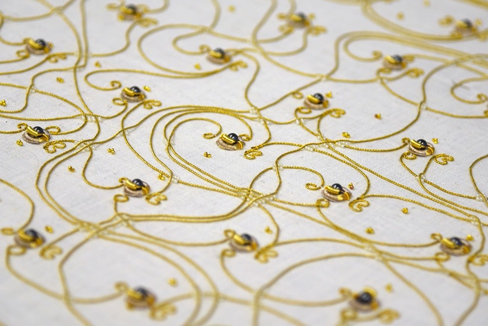
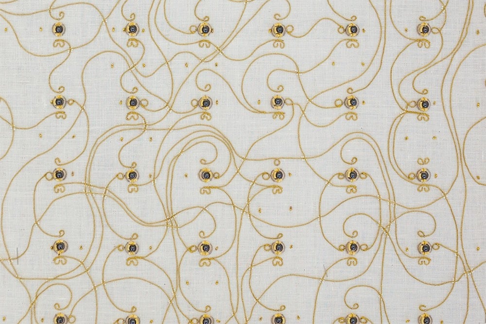
Solely built from a variety of metal threads, magnetic, glas and metal beads, and being inspired by traditional crafting routines and patterns, the piece questions the appearance of current digital and electronic technologies surrounding us, as well as our interaction with them.
Technically, the piece consists of (textile) relays, similar to early computers before the invention of semiconductors. Visually, the gold materials, here used for their conductive properties, arranged into specific patterns to fulfill electronic functions, dominate the work. Traditionally purely decorative, their pattern here defines they function. They lay bare core digital routines usually hidden in black boxes. Users are invited to interact with the piece in programming the textile to compute for them.
The piece also slyly references the connection between the early history of computing and the textile industry.
When British mathematician Charles Babbage released his plans for the Analytical Engine, widely considered the first modern computer design, fellow mathematician Ada Lovelace is famously quoted as saying that ‘the Analytical Engine weaves algebraic patterns, just as the Jacquard loom weaves flowers and leaves.’
The Jacquard loom is often considered a predecessor to the modern computer because it uses a binary system to store information that can be read by the loom and reproduced many times over.
See also Posch’s & Kurbak’s The Knitted Radio, a sweater that functions as an FM radio transmitter.
Say “No” to Crack and Say “Yes” to Roller Skating!
This gave me a solid laugh this morning: perhaps the most local local commercial I’ve ever seen. Jemele Hill called it “the worst-best commercial I’ve ever seen”.
The ad was filmed by comedy duo Rhett & Link for Roller Kingdom in Reno, NV, so the whole thing is definitely tongue-in-cheek…but still worth watching. (via @jemelehill)
The Colorful 80s Vibe of Blank VHS Tape Cases
I don’t know about you, but my house was blanketed with VHS tapes. The tapes were filled with episodes of Star Trek and movies meticulously taped from network TV without commercials — you had a to be a real Johnny-on-the-spot with the pause button or you’d miss a few post-commercial seconds of Chevy Chase’s antics in the G-rated version of National Lampoon’s Vacation. This video is a quick two-minute ode to the colorfully designed cases those tapes were sold in. Total memory bomb seeing these again.
I’ve said this before, but the contemporary web is 50% America’s Funniest Home Videos and 50% “Elvis Is A Martian!!” tabloids from 80s supermarket checkout aisles. And no one predicted this.
Sunshine Considered Harmful? Perhaps Not.
For Outside magazine, Rowan Jacobsen talks to scientists whose research suggests that the current guidelines for protecting human skin from exposure to the sun are backwards. Despite the skin cancer risk, we should be getting more sun, not less.
When I spoke with Weller, I made the mistake of characterizing this notion as counterintuitive. “It’s entirely intuitive,” he responded. “Homo sapiens have been around for 200,000 years. Until the industrial revolution, we lived outside. How did we get through the Neolithic Era without sunscreen? Actually, perfectly well. What’s counterintuitive is that dermatologists run around saying, ‘Don’t go outside, you might die.’”
When you spend much of your day treating patients with terrible melanomas, it’s natural to focus on preventing them, but you need to keep the big picture in mind. Orthopedic surgeons, after all, don’t advise their patients to avoid exercise in order to reduce the risk of knee injuries.
Meanwhile, that big picture just keeps getting more interesting. Vitamin D now looks like the tip of the solar iceberg. Sunlight triggers the release of a number of other important compounds in the body, not only nitric oxide but also serotonin and endorphins. It reduces the risk of prostate, breast, colorectal, and pancreatic cancers. It improves circadian rhythms. It reduces inflammation and dampens autoimmune responses. It improves virtually every mental condition you can think of. And it’s free.
These seem like benefits everyone should be able to take advantage of. But not all people process sunlight the same way. And the current U.S. sun-exposure guidelines were written for the whitest people on earth.
Exposure and sunscreen recommendations for people with dark skin may be particularly misleading.
People of color rarely get melanoma. The rate is 26 per 100,000 in Caucasians, 5 per 100,000 in Hispanics, and 1 per 100,000 in African Americans. On the rare occasion when African Americans do get melanoma, it’s particularly lethal — but it’s mostly a kind that occurs on the palms, soles, or under the nails and is not caused by sun exposure.
At the same time, African Americans suffer high rates of diabetes, heart disease, stroke, internal cancers, and other diseases that seem to improve in the presence of sunlight, of which they may well not be getting enough. Because of their genetically higher levels of melanin, they require more sun exposure to produce compounds like vitamin D, and they are less able to store that vitamin for darker days. They have much to gain from the sun and little to fear.
50 things that will be 50 years old in 2019. Sesame Street, the Moon landing, PBS, the Internet, Woodstock, Monty Python…1969 was quite a year.
Music for Nothing, a selection of free music clips from composer/sound designer Joel Corelitz. If you have a podcast that needs some intro music, this is a goldmine.
A Bright Future: How Some Countries Have Solved Climate Change and the Rest Can Follow. Oddly, nowhere in the book’s description do they actually say how these countries did it: nuclear power.
A Year in Weather
This is mesmerizing to watch for a few minutes: a time lapse map of weather activity across the entire US in 2018. I was thinking it would be instructive to see this sped up a bit more, that perhaps different patterns might reveal themselves, and then I remembered that you can control the playback speed on YouTube videos…just click the gear icon. I think I like the 2X version better. (via @DesignObserver)
The Self-Domestication of Humans
In an essay adapted from his forthcoming book, The Goodness Paradox: The Strange Relationship Between Virtue and Violence in Human Evolution, anthropologist Richard Wrangham says that before humans domesticated dogs, cows, and pigs, we domesticated ourselves.
No other mammal has the brainpower to organize capital punishment. When language became sufficiently sophisticated, our ancestors’ ability to conspire led not only to a more peaceful species but also to a new kind of hierarchy. No longer would human groups be ruled by the physical force of an individual. The emergence of capital punishment meant that henceforth, anyone aspiring to be an alpha couldn’t get away with just being a fighter. He had to be a politician, too.
The result of generations of such selective pressure is that human beings are best understood as an animal species that has been domesticated — like dogs, horses or chickens. Recent archaeological evidence suggests that humans became increasingly docile and less reactively aggressive around the time of becoming Homo sapiens, a process that started about 300,000 years ago.
Markers of domestication show up in the fossil records of domesticated animals and they are present in human fossils too:
Dr. Leach listed four characteristics of the bones of domesticated animals: They mainly have smaller bodies than their wild ancestors; their faces tend to be shorter and don’t project as far forward; the differences between males and females are less highly developed; and they tend to have smaller brain cavities (and thus brains). As it turns out, all of these changes appear in human fossils. Even our brain size fits the pattern: While the human brain grew steadily over the last two million years, that trajectory took a sudden turn about 30,000 years ago, when brains started to become smaller.
The essay is from the WSJ and might be paywalled…here’s an article from Big Think early last year that goes over some of the same material. I couldn’t find a definitive paper that Wrangham has written on the topic…feel free to browse through his published papers on Google Scholar.
The 20 Best TV Dramas Since “The Sopranos”. The list includes Mad Men, The Americans, Deadwood, The Wire, and Breaking Bad. Halt & Catch Fire is the first entry in the “Toughest Omissions” section.
Why Video Games Are Made of Tiny Triangles
For Vox, Cleo Abram explains why game designers use triangles when designing 3D animated games (and not, say, circles or rectangles).
Triangles are a key part of how these gorgeous, detailed games appear on your screen — the hidden heroes we should all thank as we play. This simple shape helps keep the number of computations needed for each detail as low as possible, allowing the player’s computer to process these elaborate games.
I like how the arms race among game developers to create more and more realistic objects out of smaller and smaller triangles mirrors the process in differential calculus of finding the slope of a curve by — wait for it — using smaller and smaller triangles. The game designers are going to have a problem truly getting to infinitesimally small triangles though…
Ocean Warming Is Accelerating Faster Than Thought, New Research Finds. “The oceans are heating up 40 percent faster on average than a United Nations panel estimated five years ago.”
The Inverted Grand Canyon

What would the Grand Canyon look like as a Grand Mountain, i.e. if its depth became its height? Not quite as Grand perhaps, but still pretty cool.
Some of my earliest memories of the place had to do with the trippy feeling of my eyes and mind trying to make sense of the scale. I had seen many mountain ranges and vistas, including some on the way, but the vast negative space played havoc with my perception of magnitude. I’ve felt it a few times since, but never like that first Grand Canyon overlook.
I wondered, then, if flipping the Grand Canyon into a Grand Mountain might in some way help me make sense of its scale. I’m much more accustomed to seeing the mass of something rather than the massive void of something. So, here’s what that looks like.
For reference, the depth at the deepest part of the canyon is ~6000 feet and the top of the canyon is between 6000 and 8000 feet above sea level, so the highest point of the Grand Mountains would be somewhere between 12,000 and 14,000 feet, in the ballpark of the Rocky Mountains. It would be fun to see what an inverted Kola Superdeep Borehole would look like: a 9-inch spire rising 40,000 feet into the air from a starting point very close to sea level, more that 10,000 feet higher than Everest.
If you want to dig into the details of how this visualization was made, check out this post on the ArcGIS blog. (thx, john)
Jami Attenberg on moving from a big city (where she was surviving) to a smaller one (where she’s thriving). “I had started to feel aged out in New York, a place that is constantly seeking the new.”
Slipping the Surly Bonds of Earth

I love this photo of the Space Shuttle Endeavour rising through the clouds on a plume of smoke during its last launch in 2011. We are but infinitesimal specks on a tiny rock orbiting a small star in an ordinary galaxy among trillions in an endless universe. And yet we’ve pushed our way into that vastness, just a little bit. I wonder where we’ll end up?
Mongolian Heavy Metal Band Shreds with Traditional Instruments and Throat Singing
For years, Mongolian folk metal band The Hu have been honing their distinctive brand of heavy metal, combining the Western musical form with traditional instruments and throat singing. From an NPR piece on the band:
Mongolian rock combines traditional Mongolian instruments, like a horsehead fiddle (morin khuur), Jew’s harp (tumur khuur) and Mongolian guitar (tovshuur) with the pounding bass and drums of rock.
It also involves singing in a guttural way known as throat singing while throwing heads back and forth reminiscent of the headbanging of ’80s heavy metal bands like Metallica. Those who study Mongolian music believe one reason The Hu has proved so popular with outsiders is this combining of modern and historical and Eastern and Western elements.
The group’s music videos take a bit to get going, but once the music starts, it’s pretty cool. (via open culture)
The trailer for Weird City, a new show from Jordan Peele. “The middle class has completely vanished dividing Weird City into two sections: Above the Line (The Haves), and Below the Line (The Have Nots).”
At CES in Vegas this year, people can get married by the voice assistant in Mercedes’ new electric car. “By the power vested in me by my own artificial intelligence…”
The Flag of the Popular Vote

Toph Tucker has designed an algorithmic version of the US flag called the Flag of the Popular Vote, where the size of the stars and stripes are proportional to the current populations of the original 13 colonies (stripes) and current 50 states (stars). There’s also an animated version with tiny new stars appearing when new states are admitted into the union and the stars & stripes shift in size as populations grow. This New Aesthetic flag reminds me a bit of Rem Koolhaas’ proposed EU flag.
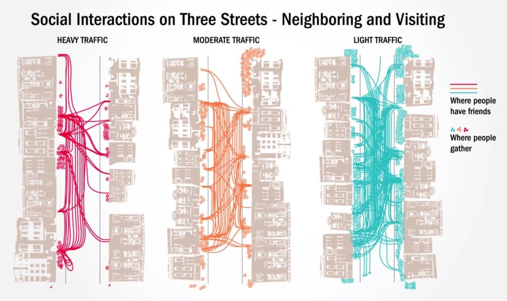
Creating Livable City Streets
In 1981, a Berkeley urban design professor named Donald Appleyard published a book called Livable Streets (now out of print). In it, he described the results of research he’d done in the late 1960s about the effects of car traffic on the people who live in cities. For the study, he selected three similar residential streets in San Francisco that only differed in the amount of street traffic and then measured how the residents used their streets.
To illustrate his findings, Appleyard used these simple and revealing maps of the data he collected. The first map shows gathering spots on the streets and the friendships made amongst neighbors:
The second map shows what residents considered their “home territory” on their street:
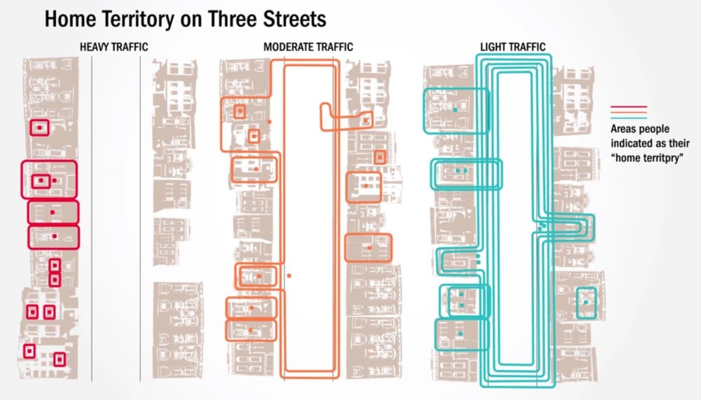
What Appleyard found was that the amount of car traffic on the street dictated how friendly neighbors were with each other, how “at home” people felt in their neighborhood, and how familiar they were with their surroundings.
In the late 1960s Appleyard conducted a renowned study on livable streets, comparing three residential streets in San Francisco which on the surface did not differ on much else but their levels of traffic. The 2,000 vehicles per day street was considered Light Street, 8,000 traveled on Medium Street and 16,000 vehicles passing down Heavy Street. His research showed that residents of Light Street had three more friends and twice as many acquaintances as the people on Heavy Street.
Further, as traffic volume increases, the space people considered to be their territory shrank. Appleyard suggested that these results were related, indicating that residents on Heavy Street had less friends and acquaintances precisely because there was less home territory (exchange space) in which to interact socially.
Light Street was a closely knit community. Front steps were used for sitting and chatting, sidewalks for children to play and for adults to stand and pass the time of day, especially around the corner store, and the roadway for children and teenagers to play more active games like football. Moreover, the street was seen as a whole and no part was out of bounds.
Heavy Street, on the other hand, had little or no sidewalk activity and was used solely as a corridor between the sanctuary of individual homes and the outside world. Residents kept very much to themselves, and there was virtually no feeling of community. The difference in the perceptions and experience of children and the elderly across the two streets was especially striking.
Cars separate people from each other and so does traffic. As @wrathofgnon put it:
This was in 1969, and here we are today in 2018 still building these terrible anti-human suburbs and cities. There is no progress, and there certainly is no science, when we ignore basic common sense and even the studies that prove it.
In 1973, just a few years after Appleyard conducted his research, George Lucas’s ode to American car culture, American Graffiti, came out. Even with the gas and oil shortages in the 1970s, the sense of freedom, rebellion, and individualism depicted in American Graffiti and similar films like The French Connection, Bullitt, Smokey and the Bandit, and Cannonball Run won out over Appleyard’s attempts to show how cars wrecked the social fabric of cities. It was no contest…Americans love cars.
In a sad twist of fate, Appleyard died relatively young at 54 — he was struck and killed by a speeding car in Athens, Greece in 1982.
Richard Feynman and the Myth of Separating Science from the Scientist
In Surely You’re a Creep, Mr. Feynman, science historian Leila McNeill writes about the difficulty in separating science from the behavior of the scientist.
In addition to cataloguing the trespasses of individual scientists who abuse the cultural power of their position, we have to dismantle the structures that have allowed their abuses to continue with little to no disruption. Just for starters, this means abandoning the myth that the science can be separated from the scientist.
The conversation about separating the person from the practice has been slower to surface in science than it has in the literary, film, journalism, and art worlds. It might seem that there is less distance between an artist and the thing they create than for their counterparts in the sciences because art is often positioned as subjective and abstract. It’s easier to draw a clear line from a writer like Junot Diaz who has displayed abusive behaviors to women in real life and his male characters who do the same. Scientists, however, have been framed as objective observers of phenomena while scientific practice itself has been seen as empirical, measureable, stable, and separate. This typical framing disconnects science from the rest of the world, allowing it to be perceived as a disembodied conduit for unadulterated knowledge. But science isn’t just a body of knowledge; it’s an institution and a culture with material connections to a lived-in world. Its practitioners are makers of and participants in that institution and culture.
Destination Art, a guide to 500 works of permanently installed artworks from around the world. Books like these are great bucket list populators.
Americans Greatly Overestimate Racial Economic Equality in Our Country
One of the defining features of the United States is a deep and long-lasting economic inequality between white and black people in terms of wages, income, and especially wealth.
Average wealth for white families is seven times higher than average wealth for black families. Worse still, median white wealth (wealth for the family in the exact middle of the overall distribution-wealthier than half of all families and less-wealthy than half) is twelve times higher than median black wealth. More than one in four black households have zero or negative net worth, compared to less than one in ten white families without wealth, which explains the large differences in the racial wealth gap at the mean and median. These raw differences persist, and are growing, even after taking age, household structure, education level, income, or occupation into account.
Despite the magnitude and persistence of this inequality, Americans (both black and white) vastly underestimate racial gaps in income and wealth.
For instance, one question in the study asked: “For every $100 earned by an average white family, how much do you think was earned by an average black family in 2013?” The average respondent guessed $85.59, meaning they thought black families make $14.41 less than average white families. The real answer, based on the Current Population Survey, was $57.30, a gap of $42.70. Study participants were off by almost 30 points.
The gap between estimate and reality was largest for a question about household wealth. Participants guessed that the difference between white and black households would be about $100 to $85, when in reality it’s $100 to $5. In other words, study participants were off by almost 80 points. Participants were also overly optimistic about differences in wages and health coverage.
The full paper is here. Closing that gap will be challenging, in part because the often racist mythology around it is persistent. In a report called
What We Get Wrong About Closing the Racial Wealth Gap, the authors conclude “that the wealth gap is structural in nature, cannot be solved through the individual actions of blacks, and can only be solved through ‘a major redistributive effort or another major public policy intervention to build black American wealth’”.
The Mars Anthropocene. In humanity’s rush to go to Mars, we should stop to consider the permanent effects we will have on the planet (as we haven’t with our own).
Barber Shaves Play Button into Man’s Head
Technology is so ubiquitous now that bits of our digital interfaces make their way into real life — like people saying “hashtag” in conversation or coding error messages printed onto clothing labels. In a hilarious recent instance of this, a man showed his barber a paused video clip of the haircut he wanted, and the barber obliged, shaving the overlaid play button into the side of the man’s head.

I laughed for a solid minute when I first saw this. It’s the literal cake wrecks of haircuts. It’s also an inadvertent example of the flip-flop, Robin Sloan’s term for things moving from the physical world to the digital world and back again. The play button has been used on media players since at least the 60s, made the jump to digital interfaces sometime in the 70s/80s, and has now flipped back to analog on the side of this dude’s head.
Socials & More