kottke.org posts about art
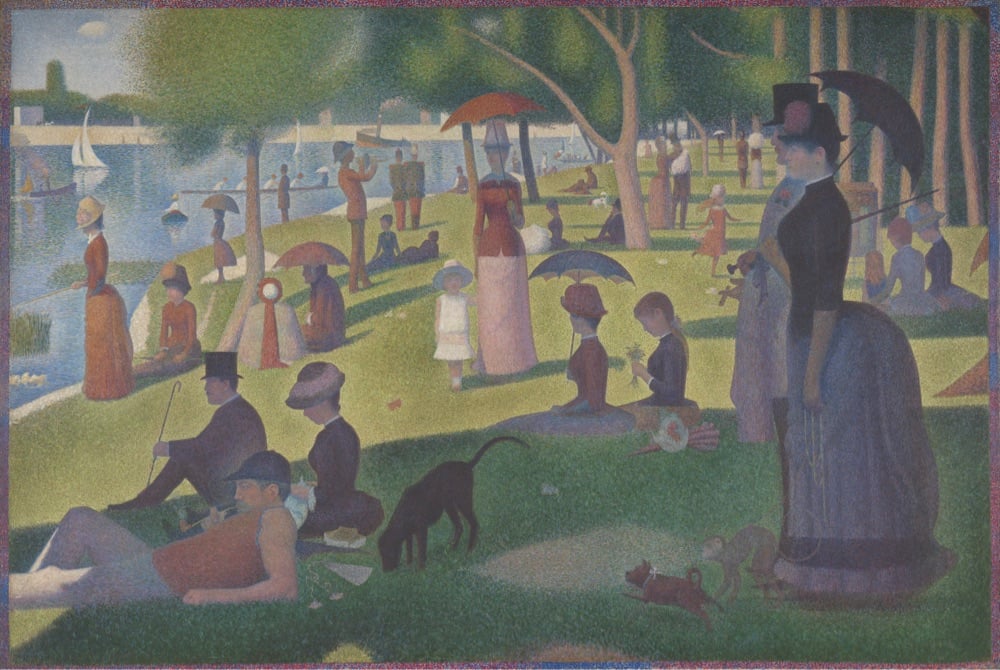
Say what you will about The Algorithms, but YouTube’s reliably informs this art history lover of every new episode of Great Art Explained and for that I am grateful. This latest episode is about the pointillist masterpiece by Georges Seurat, A Sunday on La Grande Jatte. I had a chance to see this painting in person last summer at The Art Institute of Chicago — spent quite a bit of time looking at it from all angles and distances — so this episode was the perfect accompaniment to that visit.
The lack of narrative means we really should look to the artist’s obsession with form, technique and theory — which is practically all he wrote about — and not to meaning or subject matter - which he didn’t write about at all. The painting is really his manifesto. His protagonists don’t have faces or body language, neither a history nor individuality. They are reduced to a hat, a corset, or a pet. They are just characters in his frieze. They exist only to give perfect balance to the composition.
Some paintings are designed for the viewer to “empathise with” but Seurat keeps us at arm’s length. We are not invited to “participate” in the promenade, and their psychological distance is clear. Both with their neighbors, and with us. It was ancient art that Seurat looked to — of Egypt and Greece. He once said that he “wanted to make modern people move about as they do on the Parthenon Frieze”, and placed them on canvases organized by harmonies of colour. It is what makes the painting so intriguing.
I am not a particular fan of fantasy games, but I do like watching people draw and talk about their process, particularly when it’s accessible to beginners. On his YouTube channel, JP Coovert shows people how to draw maps for fantasy games, books, and other media. Here’s a few examples to whet the appetite.
(via the kid should see this)


Every day, Chris Silverman draws a small artwork using only the Notes app on his iPhone.
#notesArt is a style formed by the limitations of the medium: I draw with my finger on a screen the size of a 3-by-5 card, using drawing tools that were designed for annotating documents, not making artwork. Similar to an app, each work is minimalist and limited in scope. The simple nature of the tool allows me to focus on the essence of each piece; perhaps a strange thing to be able to do on a device known primarily for providing distraction.
Like he says, this is a great example of how contraints can foster creativity. Here’s what I don’t understand though: WTF? How does anyone do drawings this detailed in the Notes app with just their finger?! I just tried to make a smiley face and it looks like a 3-year-old did it. (Ok, a 1-year-old.)
Ok, this is one where you’re going to have to trust me and just watch it. Grands Canons is a stop-motion animated video by Alain Biet of thousands of meticulously hand-painted images of everyday items moving and dancing to music.
A brush makes watercolors appear on a white sheet of paper. An everyday object takes shape, drawn with precision by an artist’s hand. Then two, then three, then four… Superimposed, condensed, multiplied, thousands of documentary drawings in successive series come to life on the screen, composing a veritable visual symphony of everyday objects. The accumulation, both fascinating and dizzying, takes us on a trip through time.
It’s really just wonderful — once you get into it, you won’t be able to stop watching. More of Biet’s work can be found on his website or on Instagram. (via waxy & colossal)
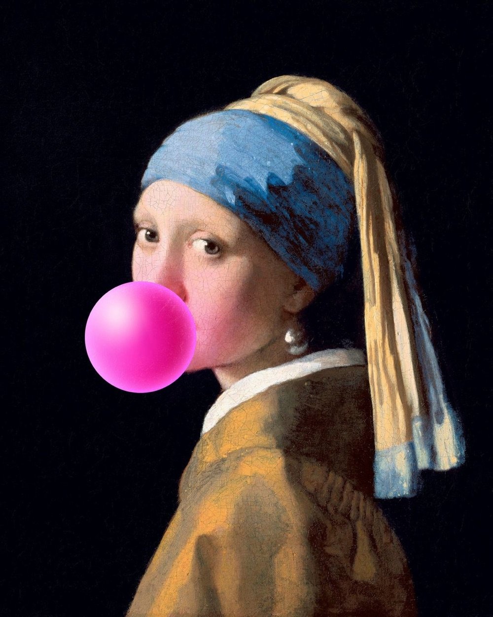
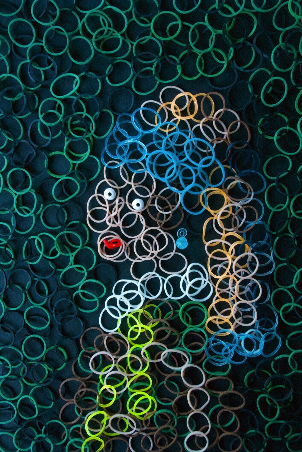
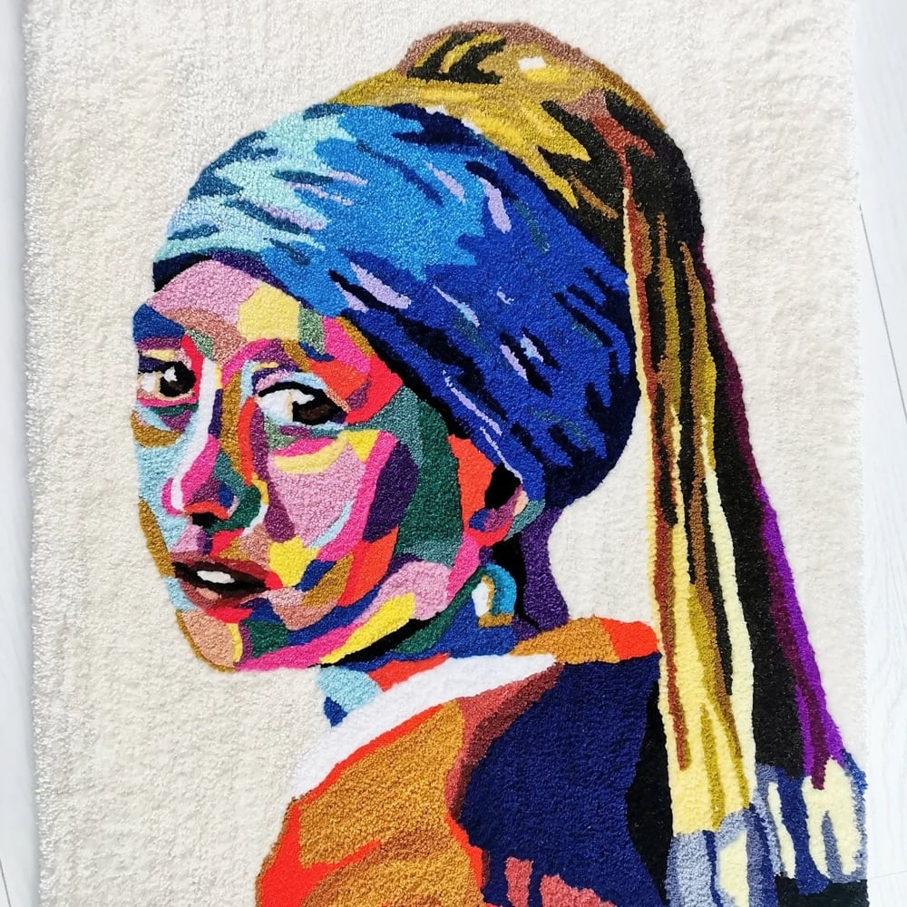
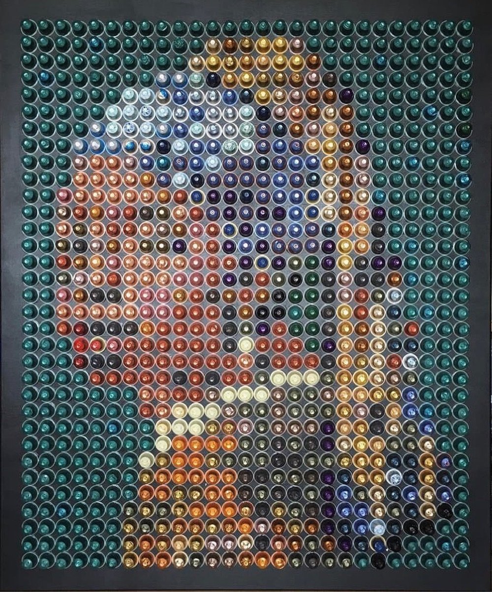
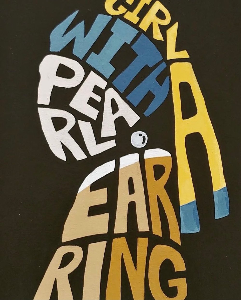
The Mauritshuis museum has loaned out Girl With a Pearl Earring to the Rijksmuseum for its blockbuster, once-in-a-lifetime Johannes Vermeer exhibition. While she’s out of the building, they’re digitally displaying dozens of renditions of the artwork submitted during an open call for entries last year. If you can’t make it to the museum in person (*sigh*), they’re showcasing some of the entries on Instagram and you can see what the in-person display looks like in this video.
Regular readers might remember that I have something of a thing for Girl/Pearl remixes. Here are just a few from the archives: Corn with a Pearl Earring, Girl with the Grande Iced Latte, Rihanna with a Pearl Earring, Girl with a Schmeared Earring, at the beach with Mona & Vincent, Girl with a Pearl Earring and Point-and-Shoot Camera, and Lego Girl with a Pearl Earring. (via colossal)
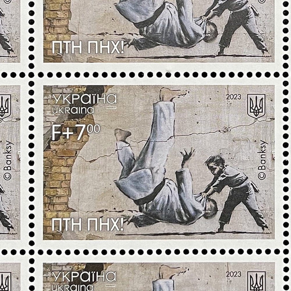
The Ukrainian postal service has released a stamp featuring artwork by Banksy to mark the first anniversary of the full-scale Russian invasion. The artist painted the image on a wall in the town of Borodianka in November 2022 and has apparently given his permission for use on the stamp. From The Guardian:
The image draws inspiration from the Russian president, Vladimir Putin, known to be a black belt in judo, and depicts a young judoka representing Ukraine knocking down a grown man.
The phrase “FCK PTN” in Cyrillic has been added to the lower left part of the new stamp.
You can buy your own sheet of these stamps directly from the Ukraine postal service — they ship worldwide, in the midst of a war!
See also: you might remember that the postal service ran a contest to design a stamp that illustrated “Ukrainians’ determination to defend their land” shortly after the invasion, which resulted in several eye-catching entries.


Rocky Bergen makes papercraft models of vintage computers like the original Macintosh, Commodore 64, the IBM 5150, and TRS-80. The collection also includes a few gaming consoles and a boombox. And here’s the thing — you can download the patterns for each model for free and make your own at home. Neat!
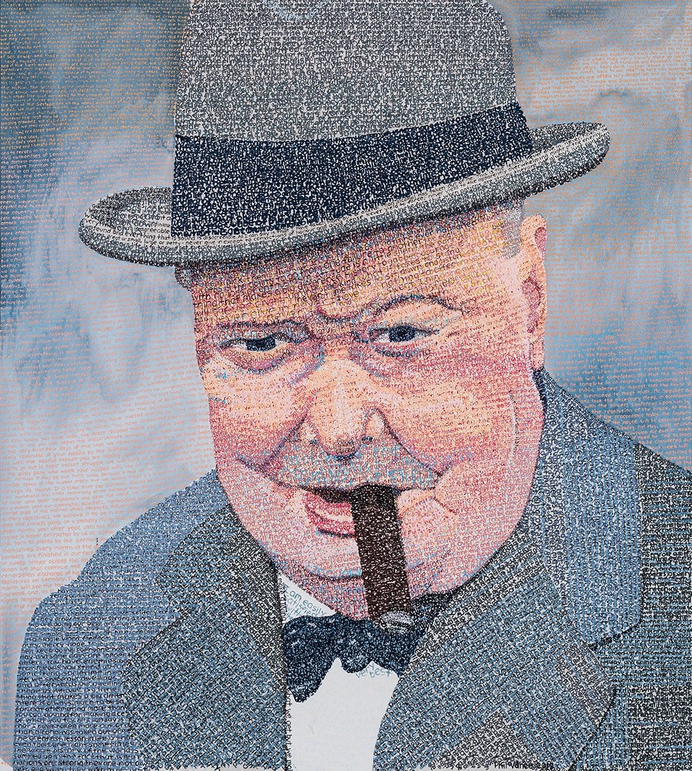
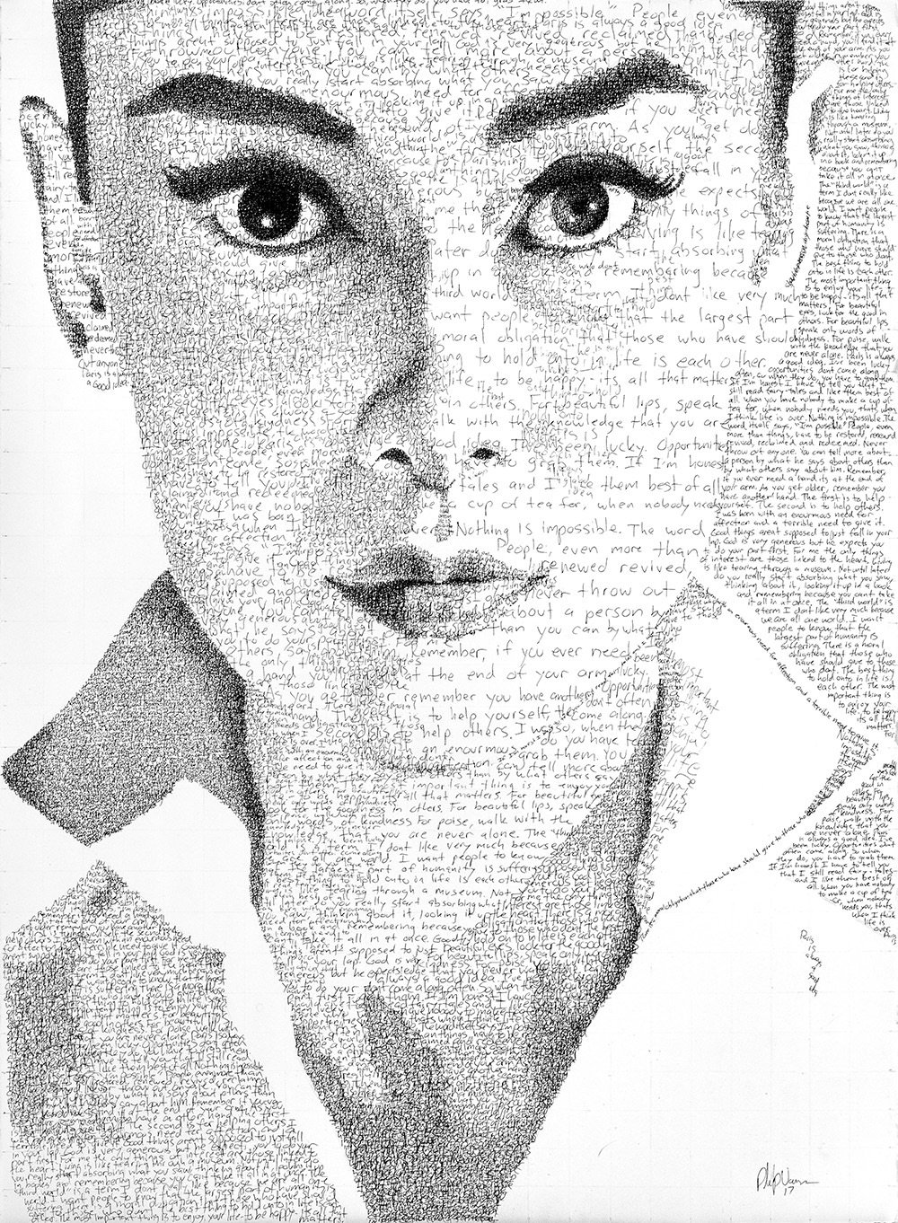
Phil Vance creates these wonderful typographic portraits of notable people like Audrey Hepburn, Albert Einstein, and Johnny Cash constructed from hand-painted type consisting of their own words. For instance, his portrait of Cash was created using the lyrics from his cover of God’s Gonna Cut You Down. You can check out more of Vance’s work on Instagram.
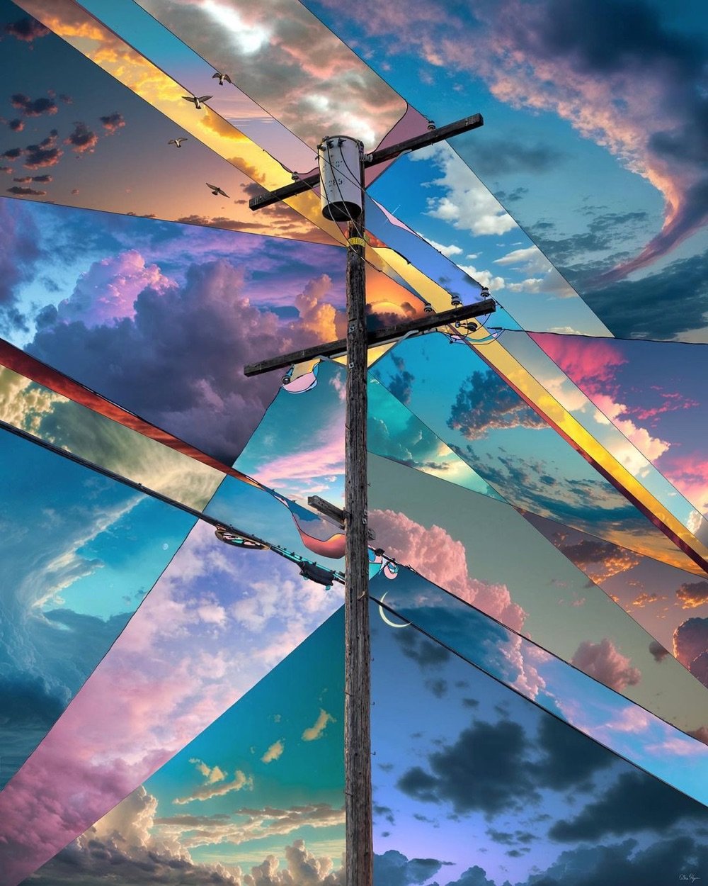
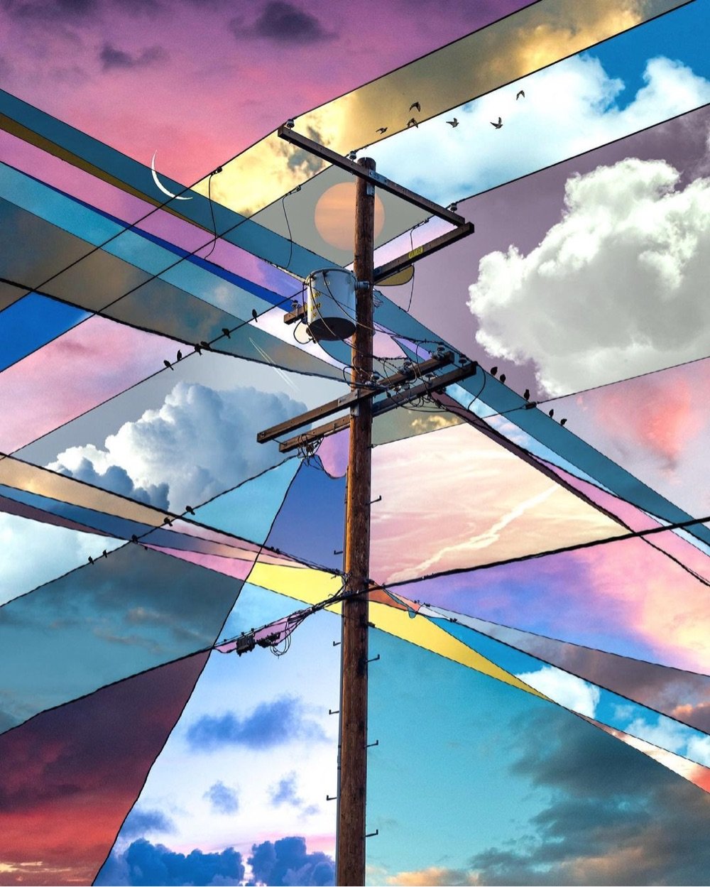
I love these photographic collages by Alex Hyner centered around images of power lines — the intersections of the lines form geometric shapes that each get their own different shade and texture of sky. Such a simple idea done really well.
You can see more of Hyner’s work on Instagram or buy prints of his Skies series on his website.
The Greek government and activists have long been calling for the return of the Parthenon Marbles from the British Museum to Greece. But how did the marbles get to Britain in the first place?
In the early 19th century, a British lord named Elgin removed a significant portion of the remaining marble decoration and statuary from The Parthenon in Athens and brought it back to Britain. To cover his debts, he sold the marbles to the British government and they eventually made their way into the British Museum. In the video above, Evan Puschak provides more detail about how it all went down.
For its part, the British Museum isn’t budging, although their official stance on the matter seems defensive, almost like they know they’re on thin ice, morally speaking. It’s long past time the marbles were repatriated and they should just get it over with already.
Update: This is interesting from David Allen Green: the return of the Parthenon Marbles isn’t up to the British Museum.
The fourth point is that the current legislation does make it difficult-to-impossible for the museum to dispose (to use the legal word) of the marbles as it wishes, either by returning them to Greece or otherwise.
An elaborate legal basis could, perhaps be provided, but — on balance — one suspects an English court would rule such a disposal as unlawful.
This means this is not a matter solely for the trustees of the museum (as I explain here).
For the marbles to be returned properly to Greece would require a change in primary legislation, which in turn means it has to have government support (or at least no government opposition).
(via someone I can’t remember but thank you!)
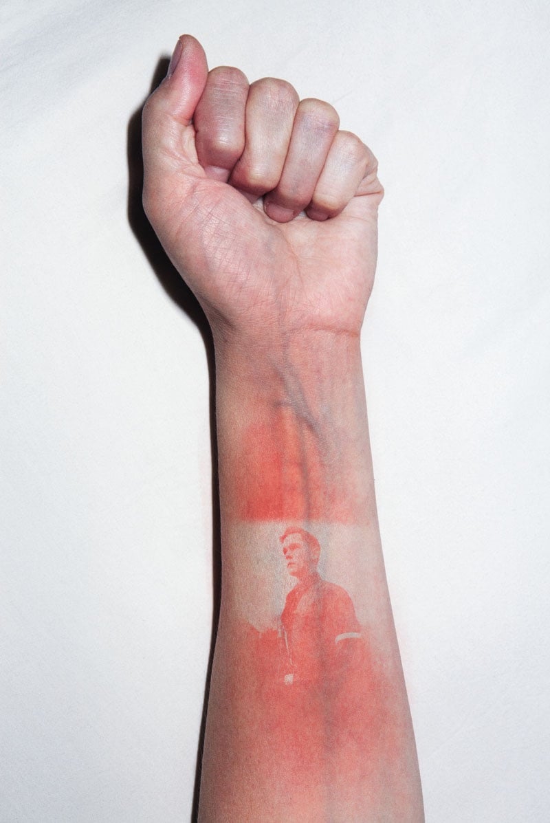


For his project Illustrated People, Thomas Mailaender imprinted photographic images onto people’s skin by shining a UV light through negatives. The visual effect created is not unlike that of a sunburn but it goes away as soon as the skin is exposed to light. I wonder…does it hurt like a sunburn?
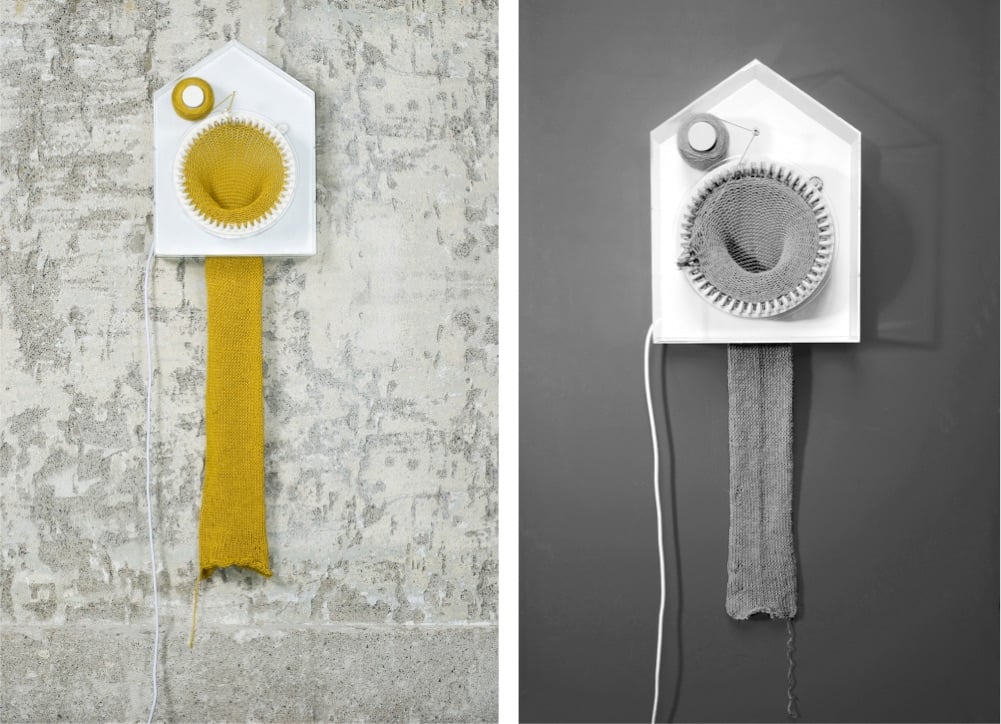
Artist Siren Elise Wilhelmsen designed a clock that knits while it tells time — the clock makes one two-meter long scarf every 365 days.
Time is manifested in physical objects; in things that grow, develop or extinguish. Time is an ever forward-moving force and I wanted to make a clock based on times true nature, more than the numbers we have attached to it.
(via clive thompson)


It’s been a bit since we’ve checked in on artist Reuben Wu, who uses drones to paint (sculpt?) with light in the sky over dark landscapes. Most of his recent stuff seems to be video on his Instagram account but I pulled a couple of photos of his that I haven’t featured before. Always inspiring stuff worth exploring.
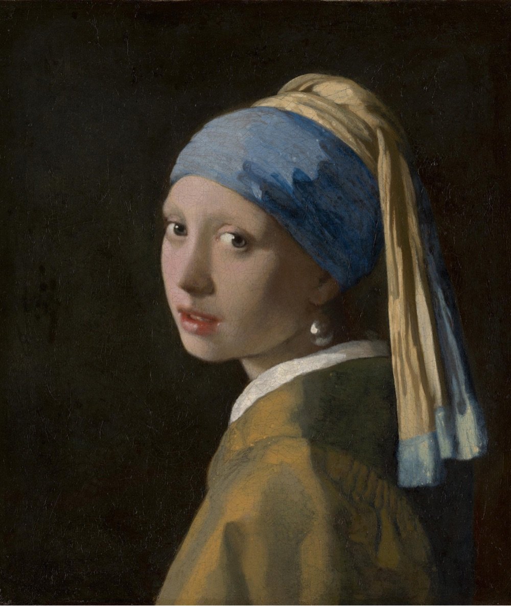
Wow! A forthcoming exhibition at Amsterdam’s Rijksmuseum will bring together 28 of the 37 known paintings by Dutch master Johannes Vermeer, including The Girl with a Pearl Earring. As the museum’s website says: “Never before have so many Vermeers been brought together”.
The exhibition will include masterpieces such as The Girl with a Pearl Earring (Mauritshuis, The Hague), The Geographer (Städel Museum, Frankfurt am Main), Lady Writing a Letter with her Maid (The National Gallery of Ireland, Dublin) and Woman Holding a Balance (The National Gallery of Art, Washington DC).
Works never before shown to the public in the Netherlands will include the newly restored Girl Reading a Letter at the Open Window from the Gemäldegalerie Alte Meister in Dresden.
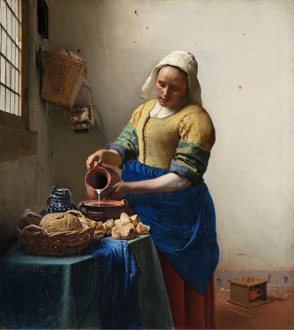
This page lists all of the works that will appear in the exhibition — you can click on the title of any of the artworks to see a zoomable high-resolution image of the painting, e.g. The Milkmaid or Girl Reading a Letter at an Open Window.
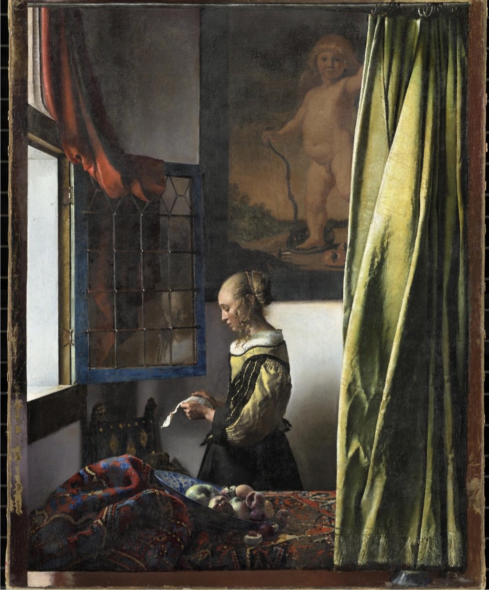
Accompanying the exhibition is an online guided tour of Vermeer’s works, narrated in English by Stephen Fry. The History Blog raved about the tour:
This is one of the best virtual exhibitions I have ever seen, and I have seen a lot of them. It is written in a personable, light-hearted style that still manages to be incredibly information-rich. The way they zoom into the detail of the paintings to illustrate the commentary is flawlessly paced and takes full advantage of the ultra-high resolution photographs. Fry explains changes Vermeer made based on the most recent imaging and research into his process. There are also annotated areas of each painting which you can click on for a shot of additional information. The notes open in windows that have click-through images, so every note is really multiple notes. Then when you’re done exploring the nooks and crannies, you click back to the main tour and the narration picks up where you left off. Whoever designed this is a content management genius, seriously.
The exhibition runs at the Rijksmuseum from February 10 to June 4, 2023 — but note that The Girl with a Pearl Earring will only be available for viewing until March 30, at which point the painting will return to Mauritshuis in The Hague. I….think I might have to get to Amsterdam to go see this?
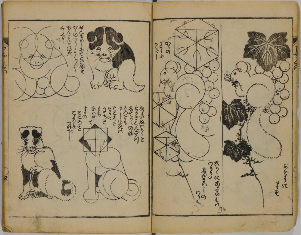
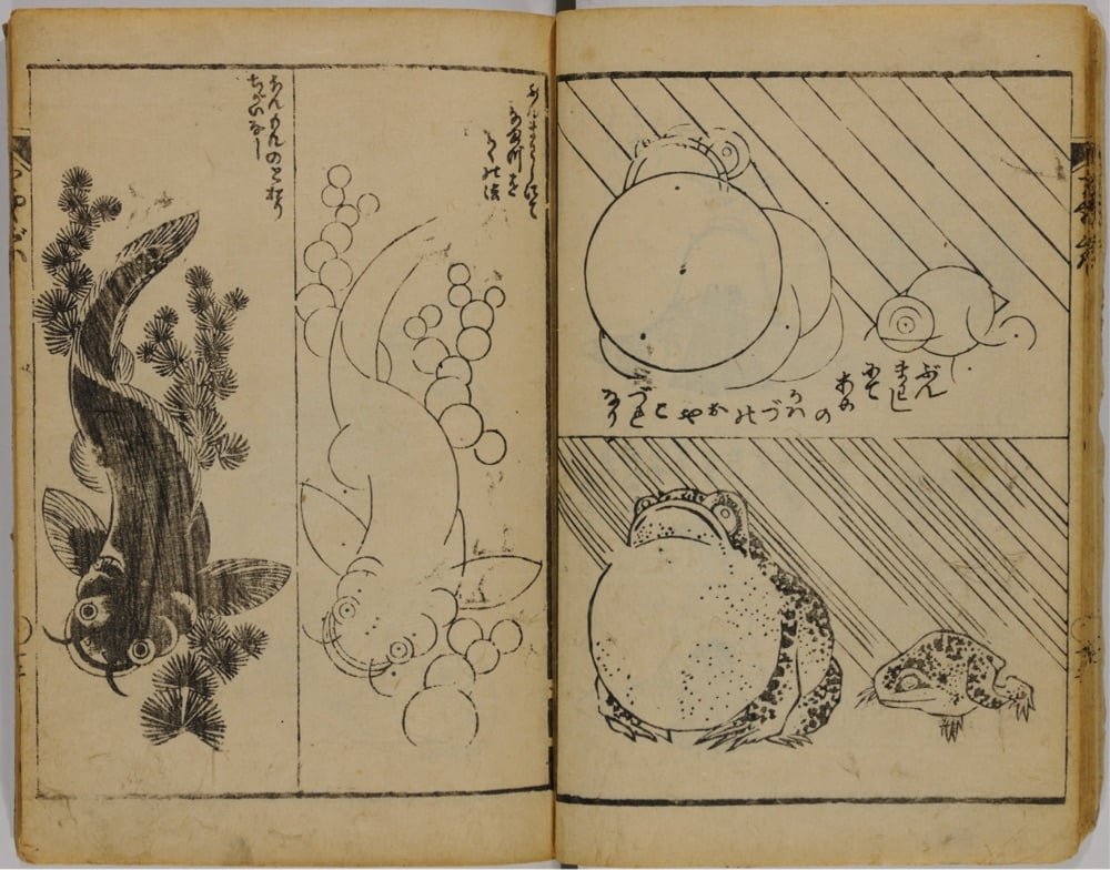
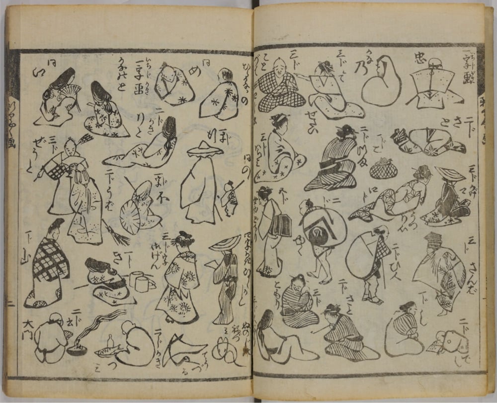
In 1812, Japanese woodblock print artist Katsushika Hokusai, who would later become famous for his iconic Great Wave off Kanagawa prints, published a three-volume series called Quick Lessons in Simplified Drawing. All three volumes are available online: one, two, three. Even if you’re not in the market for drawing lessons, the pages are wonderful to flip through.
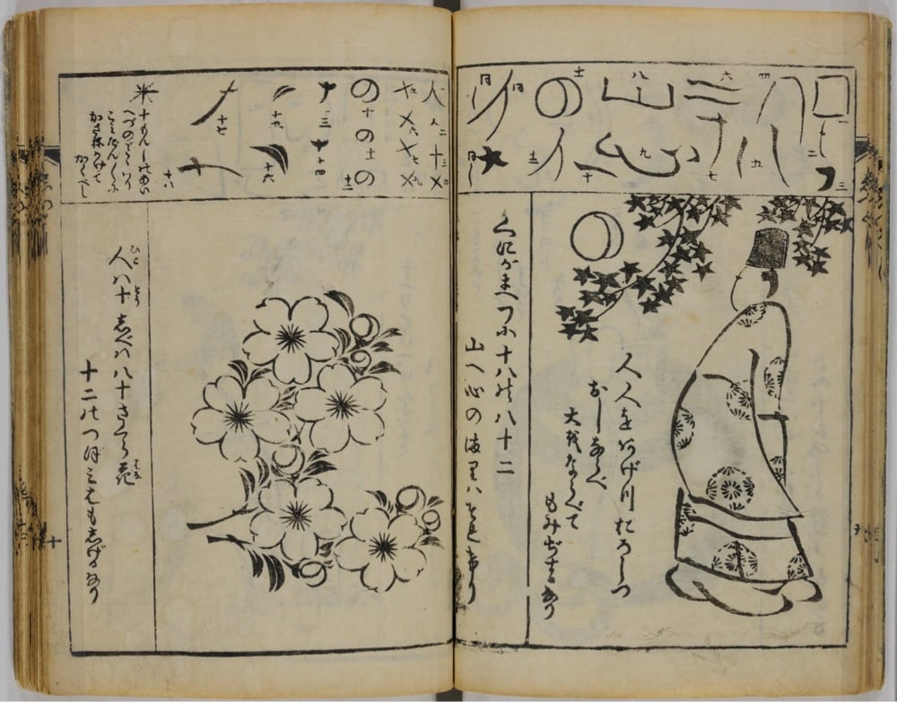
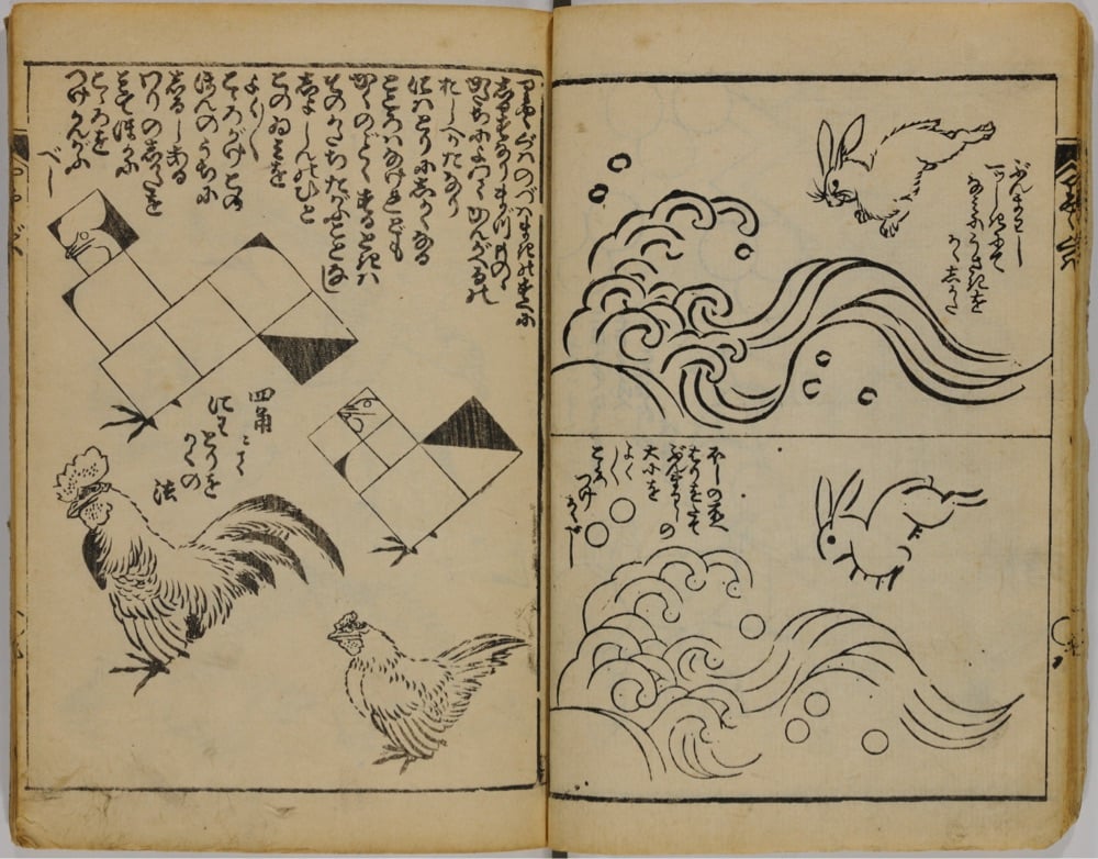
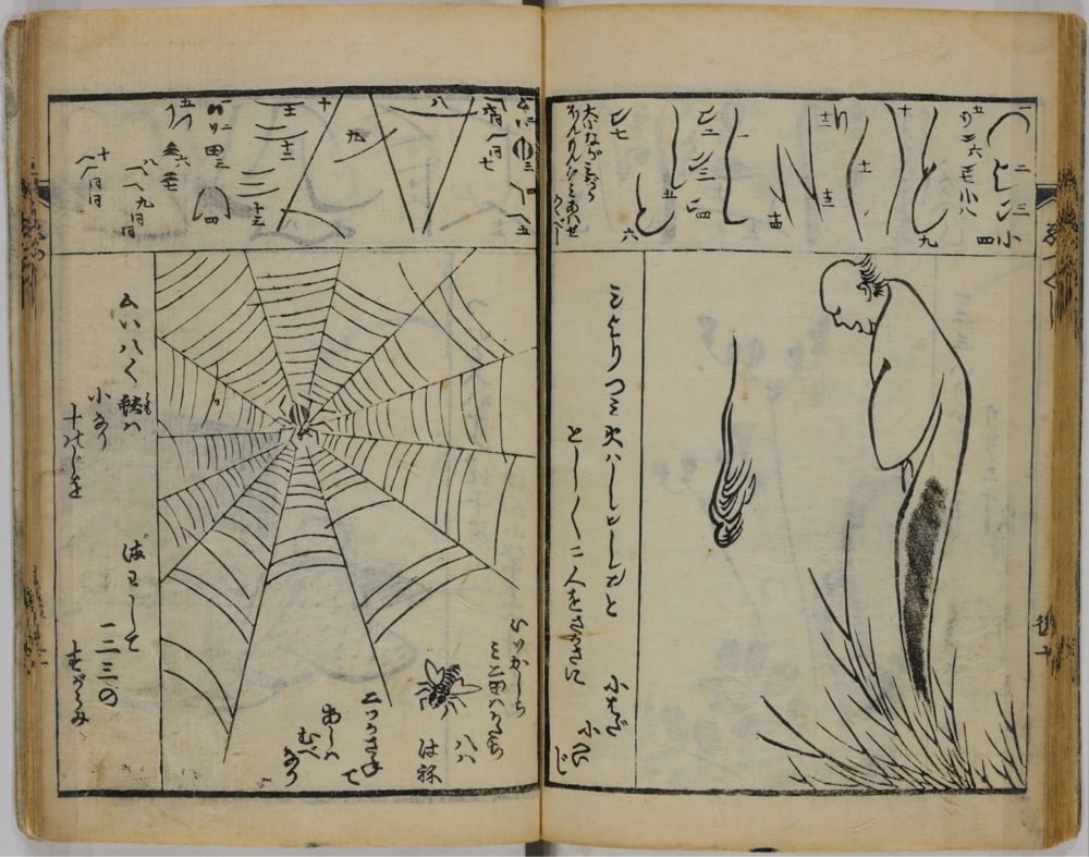
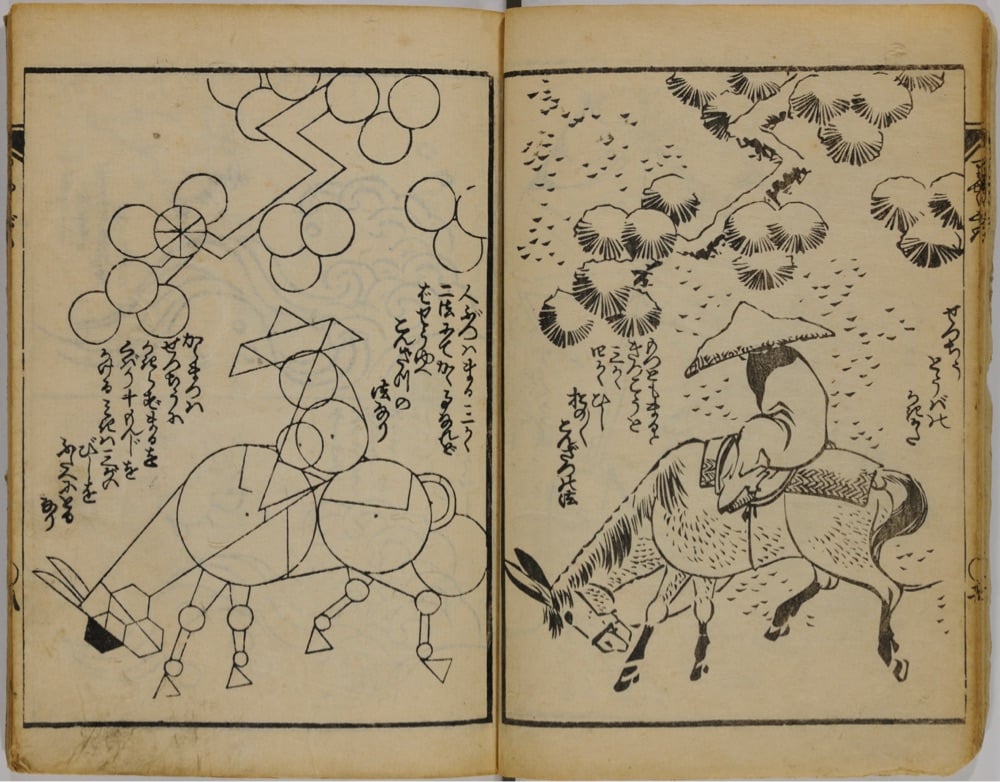
(via open culture)
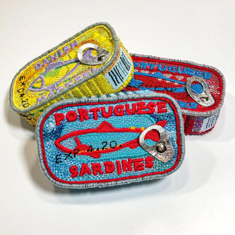
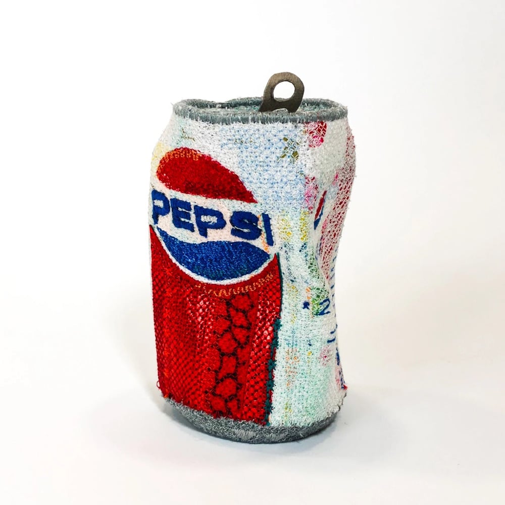
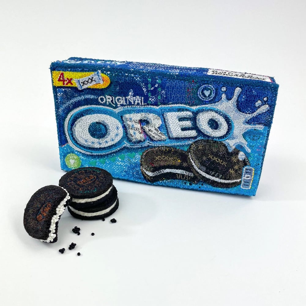
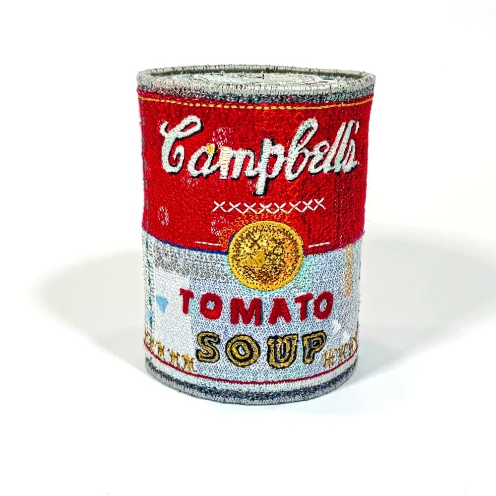
Textile artist Alicja Kozlowska’s Embroidered Ordinaries series recalls the the pop art of Warhol & Lichtenstein and Andreas Gursky’s 99 Cent II Diptychon while also being firmly contemporary. There’s maybe a Duchamp/readymade something something riff in there? I dunno, I’m not an art critic, just a fan. Anyway, I love how detailed these are — remarkably true-to-life for objects that are embroidered. (via colossal)
From steel scrap to testing the final product with a ton of water pressure, here’s how Japanese manhole covers are made. The video is perhaps a little long in parts, so I would not blame you for skipping ahead to ~12:10 to see how some of the covers are hand-painted in brilliant color.
See also Japanese Manhole Covers Are Beautiful.
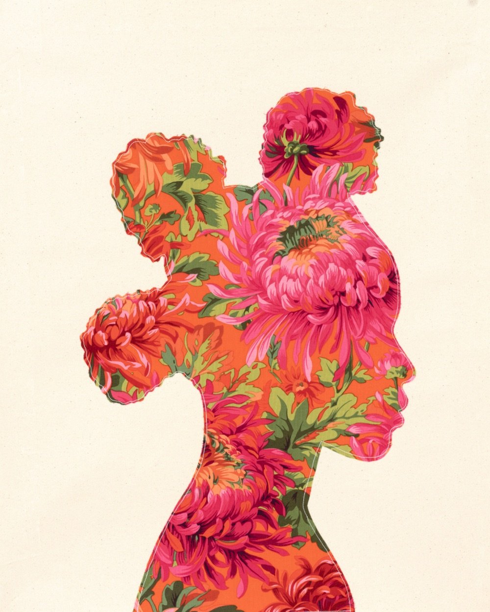
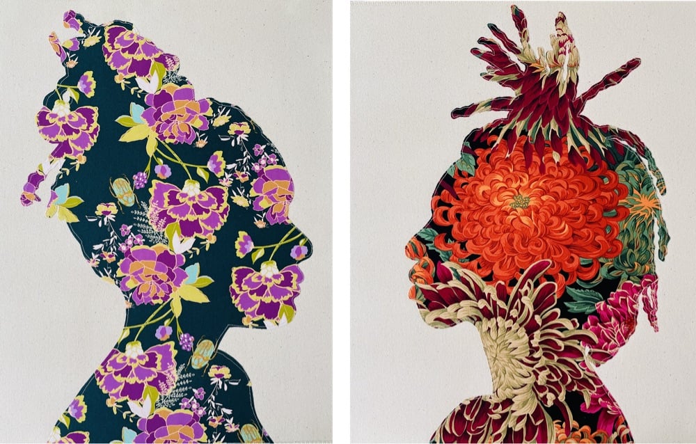
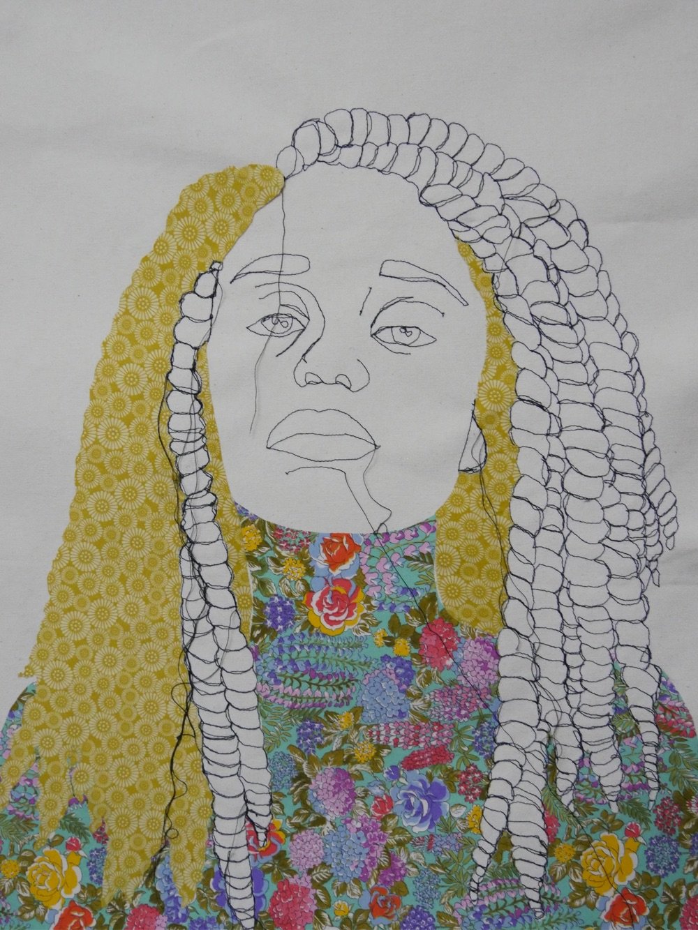
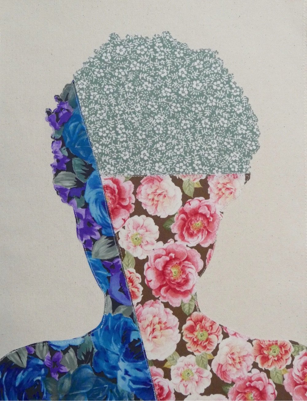
I am loving these vibrant fabric portraits by Bahamian artist Gio Swaby (Instagram). Here’s a brief statement of work from her website (italics mine):
Gio Swaby is a Bahamian visual artist whose practice is an exploratory celebration of Blackness and womanhood. Her work centres on Black joy as a radical act of resistance. It works through the philosophy of love as liberation and explores pathways of healing and empowerment. It allows space for both the strong and soft to coexist.
(via colossal)
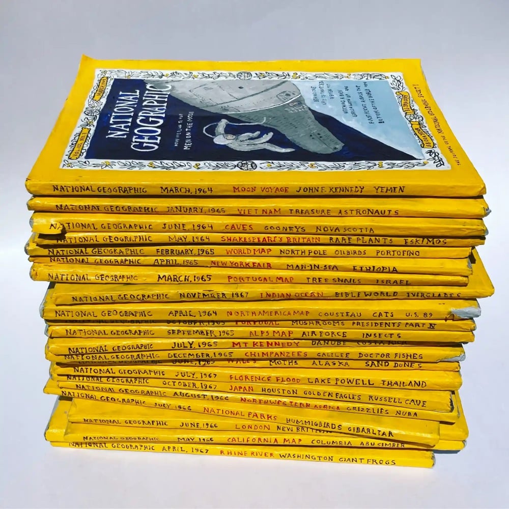
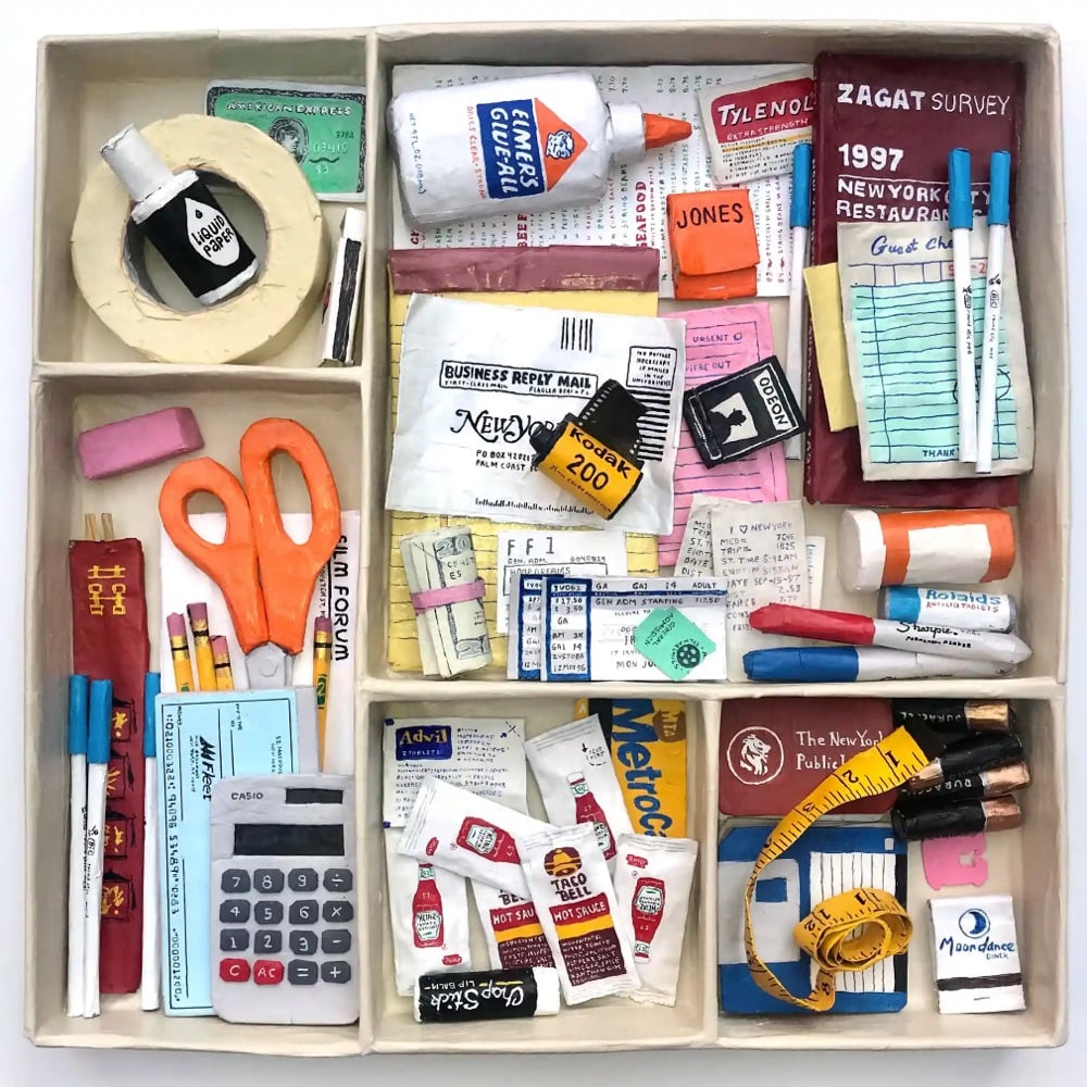
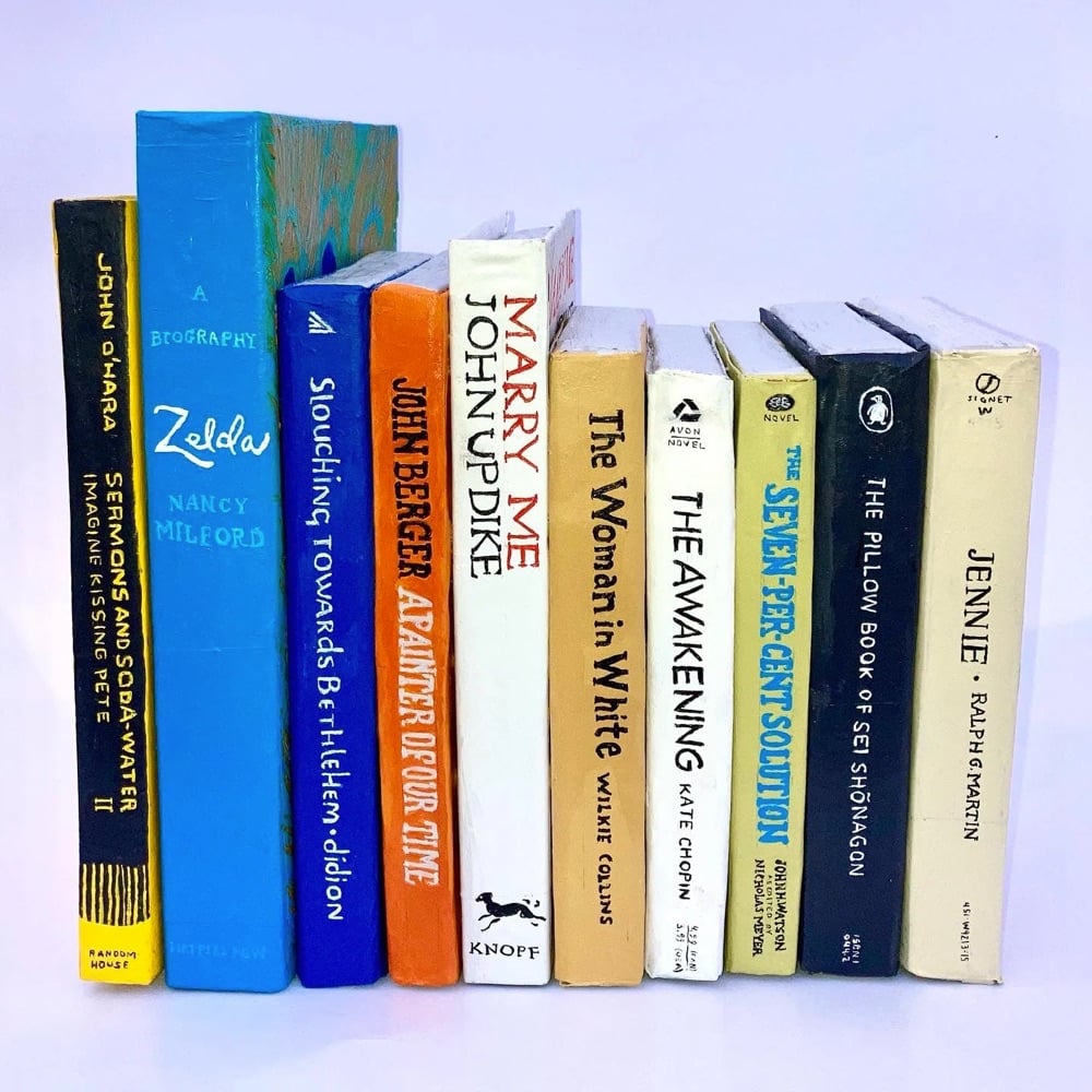
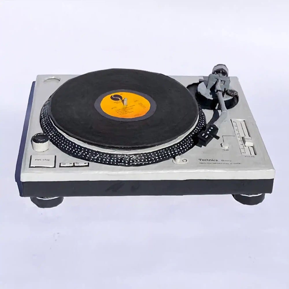
Bernie Kaminski makes everyday objects out of paper mâché and posts the results to his Instagram account. At a glance, you wouldn’t be able to tell that some of these weren’t real and then after a moment you’re like, waaaait a minute… At any rate, the twee design aesthetic here is off the charts. (via @thoughtbrain)
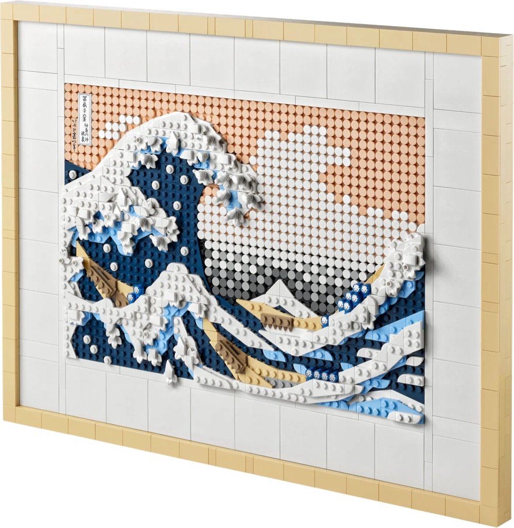
As part of the company’s effort to get more adults building with bricks, LEGO has released an 1810-piece set based on Hokusai’s The Great Wave Off Kanagawa. Here’s the only problem: it’s sold out online (and on Amazon as well). Perhaps you can find one at your local toy store?
If you were lucky enough to procure a set, Lego has produced an 85-minute audio piece about The Great Wave that you can listen to while you’re putting it together. The piece includes interviews with woodblock printer David Bull, Alfred Haft, curator of Japanese Art at the British Museum, and anime & manga scholar Susan Napier. Very cool.
Last month, the US Postal Service revealed some stamps that are due to be released in 2023. Alongside a stamp honoring John Lewis and some cool microphotography stamps are a series of four stamps featuring the Art of the Skateboard.

Antonio Alcalá designed the stamps, which feature skateboard decks created by four different artists:
Di’Orr Greenwood is a member of the Najavo Nation who does pyrographic art, burning images into the wooden decks of some of the boards she designs. Greenwood also carves cedar wood flutes and teaches skateboarding. From her Instagram, one of decks she’s designed recently:

William James Taylor Jr. is a prolific self-taught artist from Virginia. You can check out his work on Instagram and buy a bunch of decks with his designs — here are just a few of them:
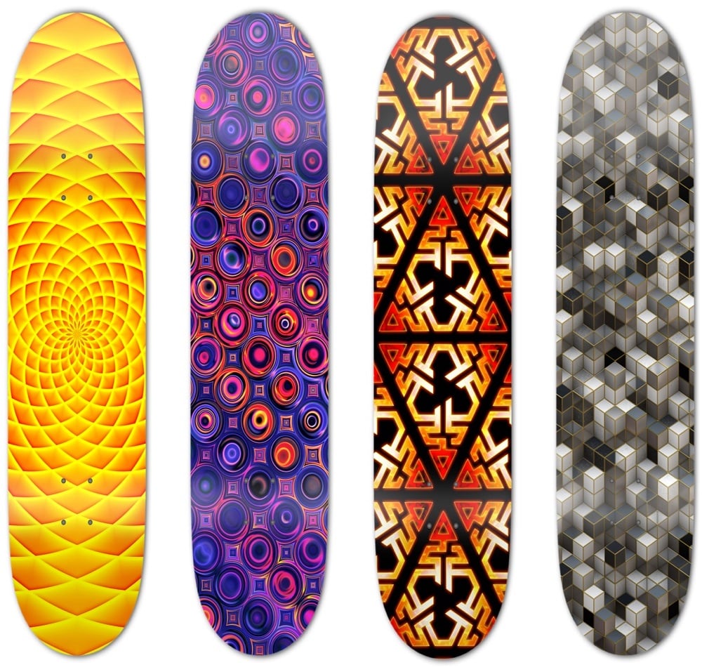
Crystal Worl is “Tlingit Athabascan from Raven moiety, Sockeye Clan, from the Raven House” who currently lives and works in Juneau, Alaska. Her Instagram is here and here’s a recent deck from her website:

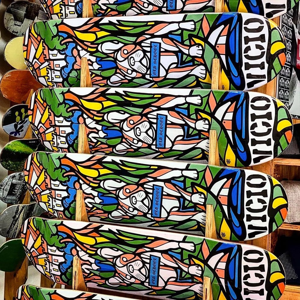
Federico Frum is a street mural artist from Colombia who is based in Washington DC; he operates under the name MasPaz. From his Instagram, a recent desk design:
I’m excited to get some of these stamps when they come out later in the year. (via lizzie armanto)
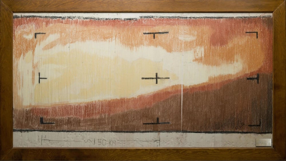
On July 15, 1965, NASA’s Mariner 4 probe flew within 6,118 miles of the surface of Mars, capturing images as it passed over the planet. The image data was transmitted back to scientists on Earth, but they didn’t have a good way to quickly render a photograph from it. They determined that the fastest way to see what Mariner 4 had seen was to print out the imaging data as a series of numbers, paste them into a grid, buy a set of pastels from a nearby art store, and do a paint-by-numbers job with the pastels on the data grid. The result (pictured above) was the first closeup representation of the surface of an extraterrestrial planet — in color, no less!
After the flyby of the planet it would take several hours for computers to process a real image. So while they were waiting, the engineers thought of different ways of taking the 1’s and 0’s from the actual data and create an image. After a few variations, it seemed most efficient to print out the digits and color over them based upon how bright each pixel was. So Mr. Grumm went to a local art store and asked for a set of chalk with different shades of gray. The art store replied that they “did not sell chalk” (as that was apparently too low for them, only convenience stores sold “chalk”), but they did have colored pastels. Richard did not want to spend a lot of time arguing with them, so he bought the pastels (actual pastels seen below), had the 1’s and 0’s printed out on ticker tape about 3in wide, and his team colored them by their brightness level (color key seen below).
Here’s a closer view of the pastels and numbers:
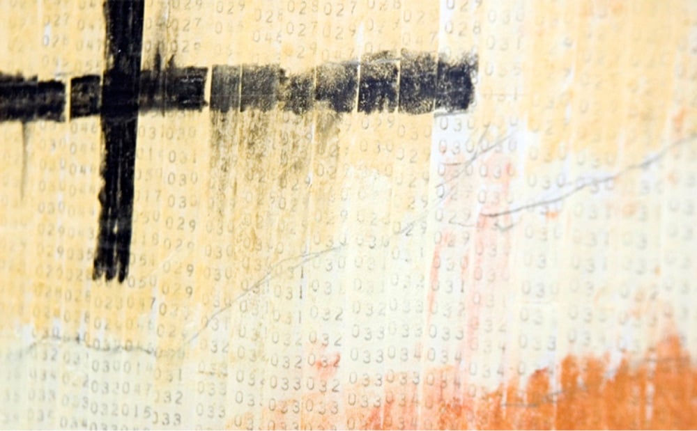
The choice of color palette was serendipitous:
Though he used a brown/red color scheme, the thought that Mars was red did not enter his mind. He really was looking for the colors that best represented a grey scale, since that was what they were going to get anyway. It is uncanny how close his color scheme is to the actual colors of Mars. It’s as if they came right out of current images of the planet.
Compare with the photography we’re getting from Curiosity these days; we’ve come a long way in the last 60 years. (via @jenniferrrrrroberts and robin sloan)
From Behind the Masterpiece, a whirlwind summary of evolution of Western art movements, from prehistoric art to the Renaissance to Romanticism to Impressionism to Cubism and beyond. 23 minutes seems like the sweet spot for this kind of thing: any shorter and there wouldn’t be time to give the viewer a sense of each movement but if it were 40 minutes, perhaps many fewer people would be enticed to watch. (via open culture)



I’m not going to actually look, but I’ve probably featured Ulric Collette’s series Genetic Portraits here before. Collette photographed family members in the same pose and then digitally stitched them together. The resemblances and differences between family members are fascinating. (via jenni leder)
Update: A similar series by Bobby Neel Adams. (via @geedix)
Update: See also these similar paintings by Daevid Anderson.
Dang, look at these new mosaics by Kiki Smith and Yayoi Kusama for Grand Central Madison, the MTA’s newest LIRR station.
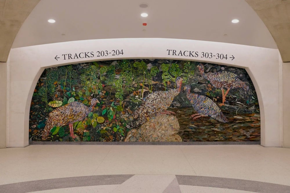
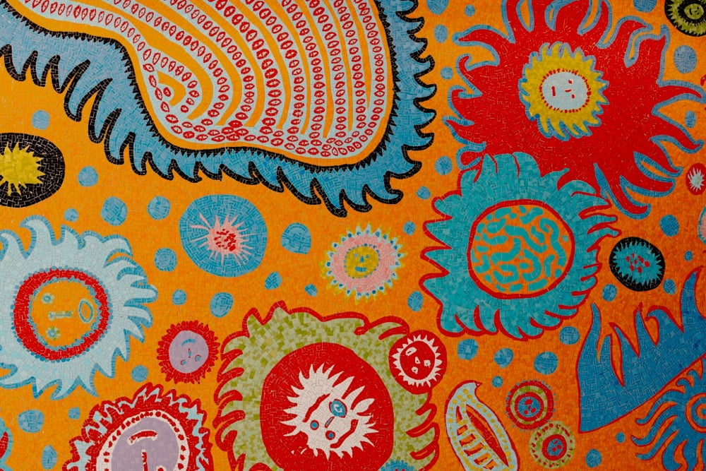
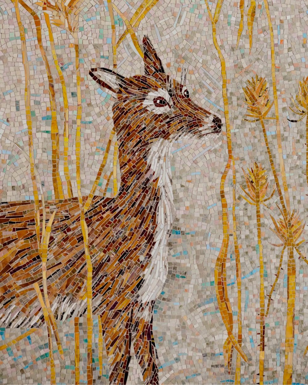
As a former (and future?) New Yorker, I know a lot of the city’s dwellers appreciate the MTA’s commitment to public art and to mosaics in particular. Like the Dude’s rug, it really ties the city together.
I did not mean to watch an entire 75-minute documentary in the middle of my workday, but this sucked me right in and it might do the same to you. Zhao Xiaoyong is one of thousands of painters in Dafen, China who hand-paint replicas of famous paintings by the likes of Matisse, Degas, Renoir, Leonardo, and Kahlo. But a favorite artist amongst many of them, including Zhao, is Vincent van Gogh.
Zhao says, “I’ve been painting his paintings for nearly 20 years. I want to see the originals.” He works from photos of paintings and believes his work will be better if he can see them in person. And so, he and a few others make the trip to Europe — to visit a buyer of their paintings in the Netherlands, to see the originals of their replicas in the Van Gogh Museum, and to visit some of the places he lived and worked. It quickly becomes a spiritual journey. On a street in Arles, they came across a scene that van Gogh painted in 1888:
Here we are! Oh, it is like this. Things from a hundred years ago are still here. See, the sky in my picture is so blue. The sky is so blue! Van Gogh also painted this picture at dusk. Now I know why his sky is so bright. It was at dusk when he painted. Just like how we experienced today. It’s just like that.
Never having painted from life before but inspired by the scene, Zhao paints the scene as van Gogh would have more than a century before — that is, as van Gogh would have stood there painting but also in the artist’s signature style and informed by Zhao’s deep knowledge of having made many replicas of that specific painting over the years.
After his trip, while sitting around a dinner table with friends, Zhao asks, “Have I become an artist? Do I have anything that deserves appreciation?” and it’s not difficult to imagine any number of painters and artists throughout the centuries and asking themselves those same questions over dinner and drink. Fascinating documentary.
P.S. You can follow and buy Zhao’s work on Instagram. (via open culture)
Well hey there, it’s been a few months, so it’s time for another roundup of what I’ve been reading, watching, listening to, and experiencing recently. In addition to the stuff below, I have a few things in progress: the second season of Russian Doll, Oliver Burkeman’s Four Thousand Weeks, and I just started dipping into Rebecca Woolf’s forthcoming memoir, All of This. Oh, and I’m listening to Russell Shorto’s The Island at the Center of the World on audiobook and the third season of Michael Lewis’ Against the Rules podcast. All always, don’t sweat the letter grades too much.
Everything Everywhere All at Once. This movie is a little bit of a miracle: action, comedy, heartfelt, and a little bit of a mess, all together in a perfect balance. This is the best movie I’ve seen in ages. (A+)
Encanto. The kids and I liked it fine. (B+)
The Expanse (season six). I’m going to miss spending time in this world with these people. (A-)
Matrix by Lauren Groff. Was delighted and moved by this work of historical fiction about Marie de France. (A)
Station Eleven. I loved the slow burn and resolution of this show. I didn’t think I wanted to watch a TV show about a flu pandemic causing the end of civilization, but it was actually perfect. Both actresses who played Kirsten were fantastic. (A/A+)
The Last Duel. Every director is entitled to their Rashomon I guess? And I’m not sure Matt Damon was the right choice here… (B)
Pig. Had no idea what to expect from this one. Even so, Taken + Truffle Hunters + Fight Club + Ratatouille was a surprise. (B+)
Strafford ice cream. This Black-owned dairy farm makes the richest, creamiest ice cream I’ve ever had. So glad I randomly bought a pint of it a few months ago…I’m never going back to anything else. (A)
Severance. Fantastic opening credits sequence and while I wasn’t as enamored as many were after the first few episodes, the show definitely grew on me. (A-)
My Brilliant Friend (season three). I don’t know why there’s no more buzz about this show. The acting, world-building, story, and Max Richter’s soundtrack are all fantastic. And the fight against fascism! (A)
The Gilded Age. Exactly what I wanted out of a period drama from the maker of Downton Abbey and Gosford Park. (B+)
Exhalation. Second time through, this time on audiobook. I love these stories - Chiang is a genius. (A)
The Book of Boba Fett. This turned into season 2.5 of The Mandalorian and I am totally ok with that. (B+)
Other People’s Money podcast. As a snack-sized in-between season for his excellent Against the Rules podcast, Michael Lewis revisits his first book, Liar’s Poker, written about his experience working for Salomon Brothers in the 80s. (A-)
The King’s Man. Not as fun as the first movie but more fun than the second one? But they all could be better. (B)
Turning Red. I loved Domee Shi’s short film, Bao, and this film is similarly clever and heartfelt. (A-)
Drive My Car. Really appreciated the cinematography of this one; wish I could have seen it in the theater. (A-)
Jennifer Packer at The Whitney. I was unfamiliar with Packer’s work before seeing this exhibition, but I’m a fan now. (A-)
Licorice Pizza. I’m really flabbergasted at the two pointless racist scenes in this film. PT Anderson is a better filmmaker than this. It’s a shame because I enjoyed the rest of the film — the two leads are great. Can’t recommend it though. (D)
Death on the Nile. These movies are fun. Sometimes all you want to do is watch Kenneth Branagh chew scenery as Hercule Poirot. (B+)
Moonfall. Not as fun or coherent (I know, lol) as some of Emmerich’s other movies. The acting in this is…not great. (C+)
Hawkeye. Fun but I don’t know how many more Marvel things I want to keep up with. (B)
Spider-Man: No Way Home. Tom Holland’s Spider-Man is always fun. (B+)
Fantastic Beasts: The Secrets of Dumbledore. Better than the overcomplicated sequel and Mikkelsen was a better Grindelwald than Depp. The story wrapped up so nicely that who knows if there will be a fourth movie. (B)
The Tragedy of Macbeth. Brilliant cinematography and set design. (B+)
The Batman. Oh I don’t know. I guess this was a pretty decent detective story, but I’m not sure why Batman needed to be involved. (B)
The Northman. This would have been much better had it ended 20 minutes sooner. Not sure we needed another movie that concludes with ultimately pointless violent masculine revenge. (B-)
Kimi. Soderbergh does Rear Window + The Conversation. The direction is always tight and Zoë Kravitz is great in this. (A-)
The Mysterious Benedict Society. The kids and I enjoyed this solid adaptation of the first book of a popular series. (B+)
Armageddon. The pace of this movie is incredible — it just drops you right into the action and never stops for more than 2 hours. Also, the top question when searching this movie title on Google is “Is Armageddon movie a true story?” *sigh* (B-)
Past installments of my media diet are available here.
Rudy Willingham holds up paper cutouts of people (and Muppets!) against carefully chosen backgrounds and photographs the results, resulting in these witty portraits.
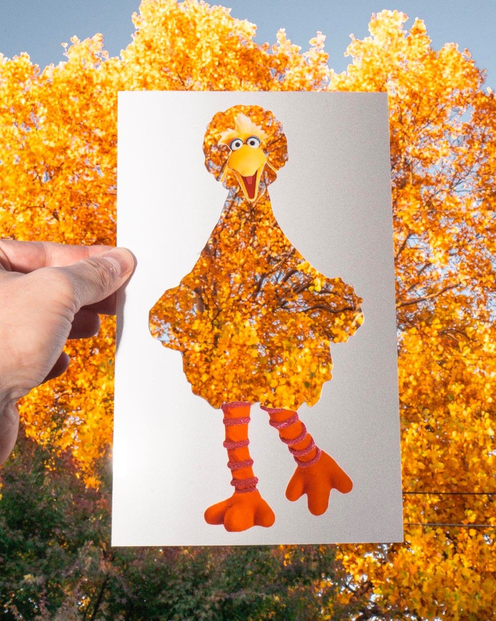
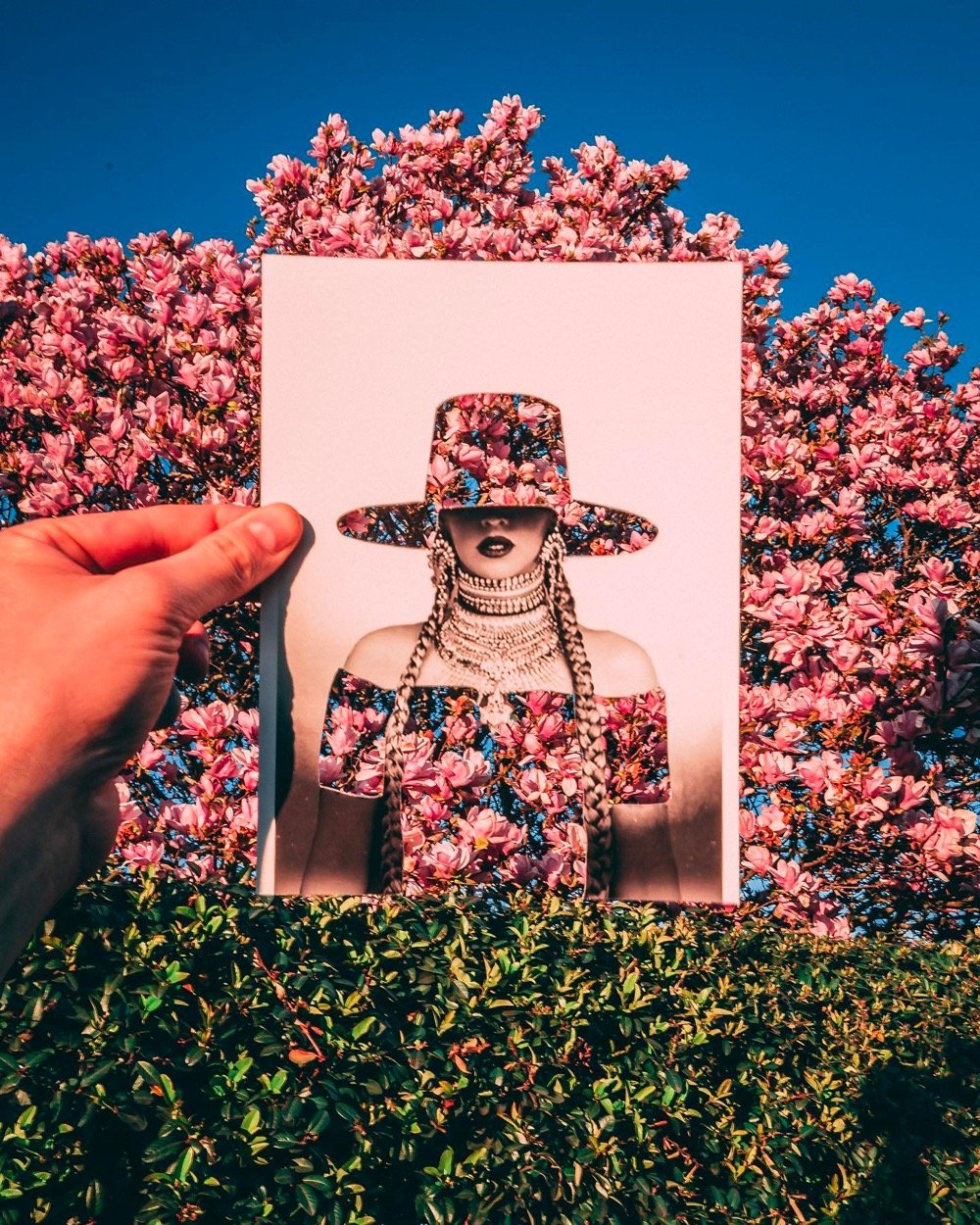
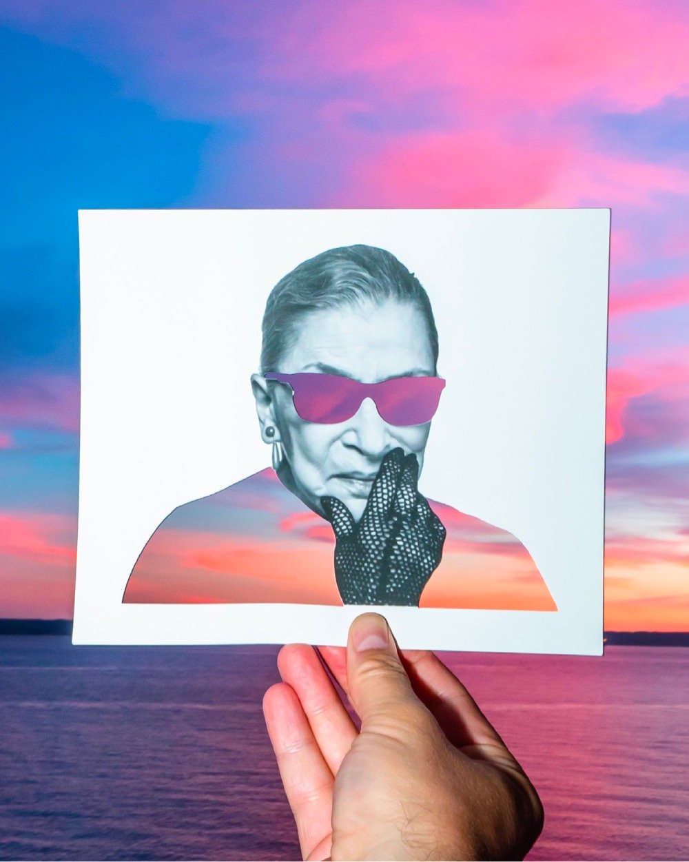
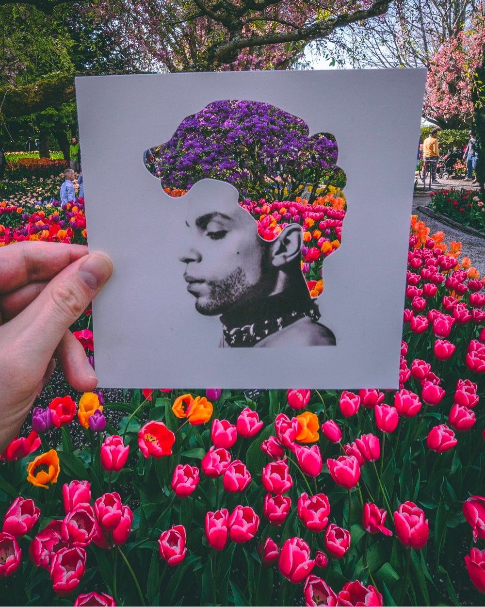
You can find more of Willingham’s work across his various social media platforms: website, Instagram, Twitter, Facebook, and TikTok.
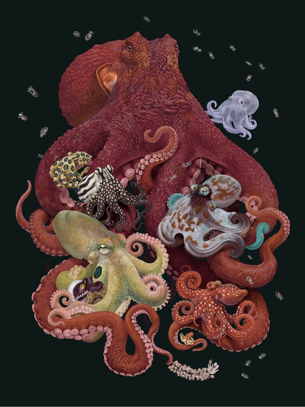
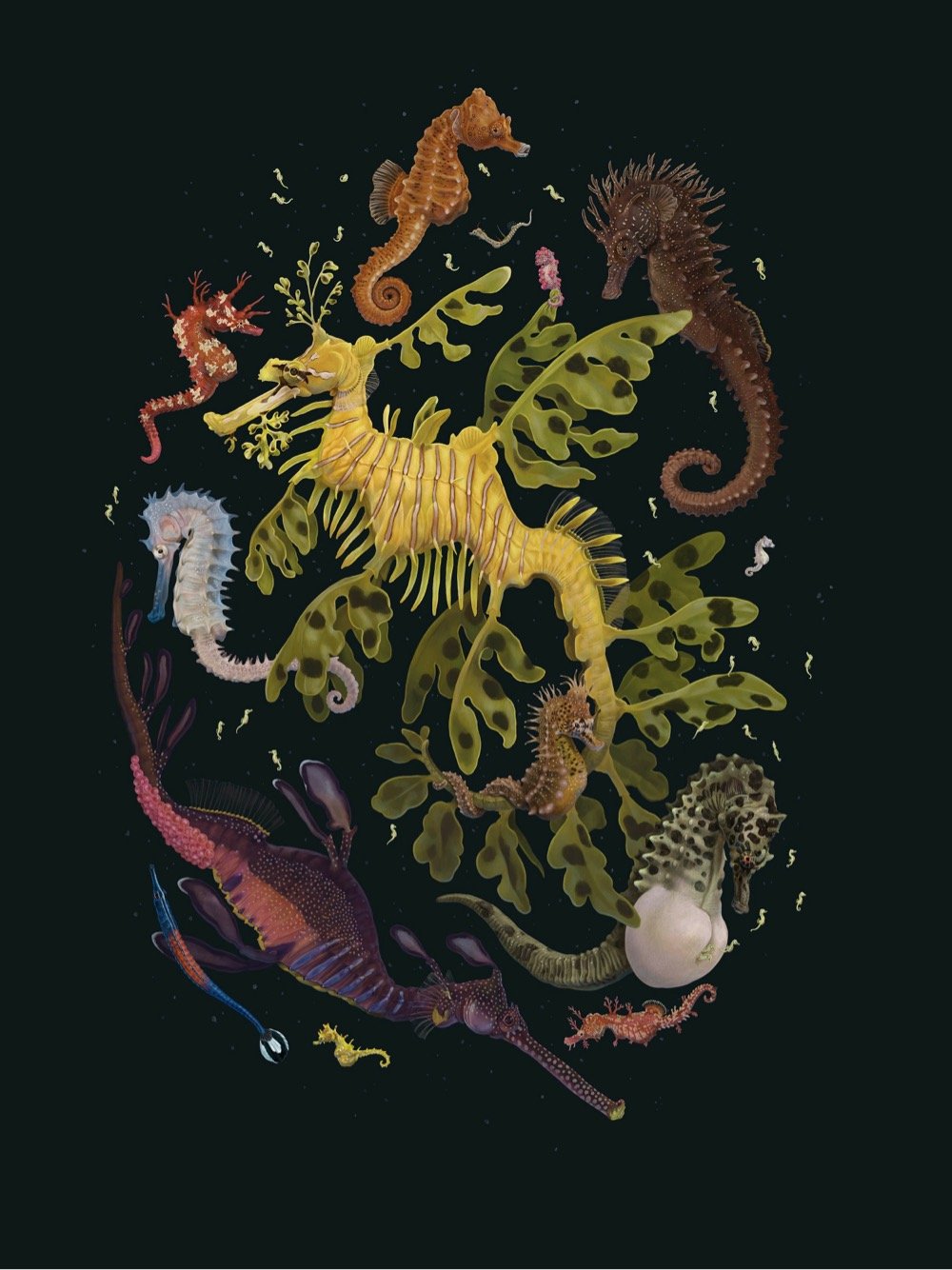
Zoe Keller’s Ocean Biodiversity Print Series celebrates the diversity of the animals that live in the sea. Each of the four prints concerns a different sea creature or region of the ocean: the octopus, the jellyfish, the seahorse, and the deep sea. (via dense discovery)
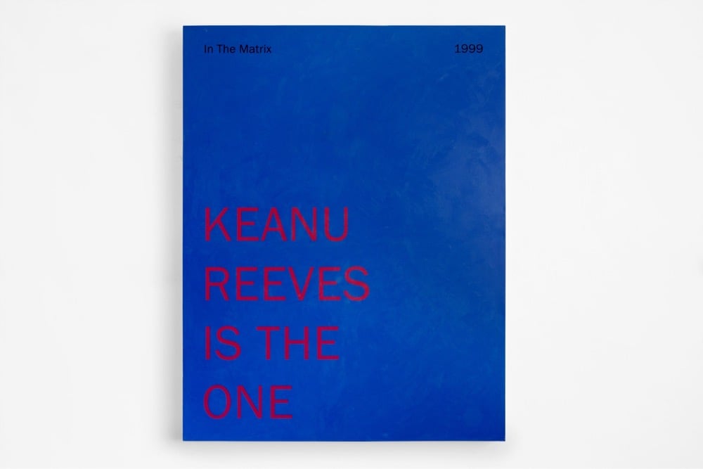
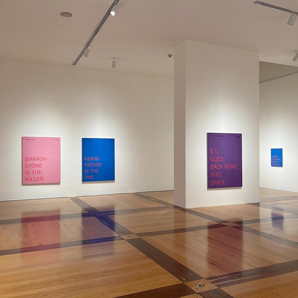
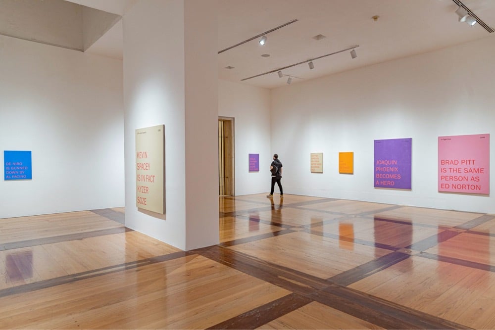
For his series of Spoiler Paintings, Mario García Torres silkscreened short texts on colorful backgrounds that reveal major plot points of movies like The Usual Suspects, The Matrix, E.T., Basic Instinct, Heat, and Fight Club.
Although the Spoiler Paintings may seem conventional and harmless, they were produced with the intention of displacing the reaction in a work of art by producing tension even before seeing the piece. This objective is achieved by using the widespread notion that knowing the end of a film destroys its experience.
Newer posts
Older posts





Socials & More