Beautifully Arranged Rock Sculptures
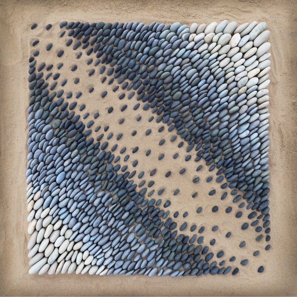
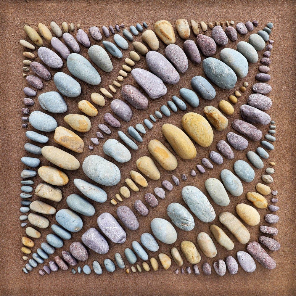
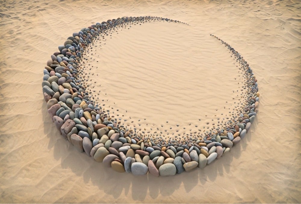
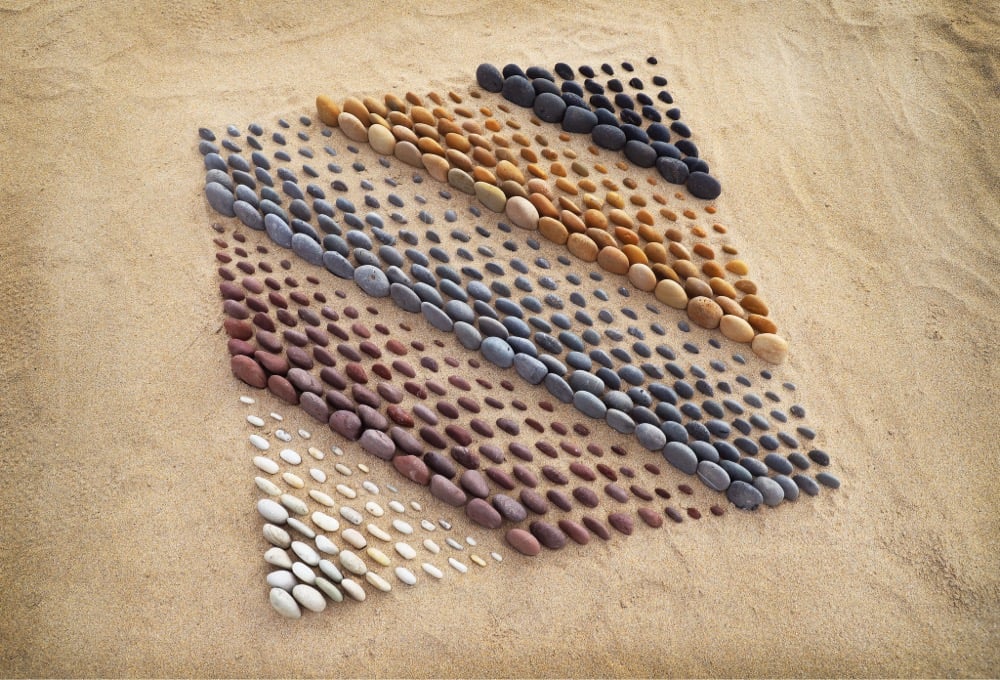
Jon Foreman neatly arranges rocks into colorful sculptures. He also does similar sand, leaves, debris, and shells. You can order prints on his site or check out more of his stuff on Instagram. (via colossal)


This site is made possible by member support. 💞
Big thanks to Arcustech for hosting the site and offering amazing tech support.
When you buy through links on kottke.org, I may earn an affiliate commission. Thanks for supporting the site!
kottke.org. home of fine hypertext products since 1998.


Jon Foreman neatly arranges rocks into colorful sculptures. He also does similar sand, leaves, debris, and shells. You can order prints on his site or check out more of his stuff on Instagram. (via colossal)


CJ Hendry has done a series of photorealistic drawings of hair called BLONDE. You can see some of the work in progress on her Instagram and see it in person in NYC Dec 10-12. Love these. (via @downtown.collective)
These days, movies, TV shows, and even commercials all use something called the Dutch angle,1 a filmmaking technique where the camera is angled to produce a tilted scene, often to highlight that something is not quite right. The technique originated in Germany, inspired by Expressionist painters.
It was pioneered by German directors during World War I, when outside films were blocked from being shown in Germany. Unlike Hollywood, which was serving up largely glamorous, rollicking films, the German film industry took inspiration from the Expressionist movement in art and literature, which was focused on processing the insanity of world war. Its themes touched on betrayal, suicide, psychosis, and terror. And Expressionist films expressed that darkness not just through their plotlines, but their set designs, costumes… and unusual camera shots.
This got me thinking about my favorite shot from Black Panther, this camera roll in the scene where Killmonger takes the Wakandan throne:
It’s the Dutch angle but even more dynamic and it blew me away the first time I saw it. I poked around a little to see if this particular move had been done before (if director Ryan Coogler and cinematographer Rachel Morrison were referencing something specific) and I found Christopher Nolan (although I’d argue that he uses it in a slightly different way) and Stranger Things (in the scene starting at 1:33). Anywhere else?
As with Pennsylvania Dutch, the Dutch in Dutch angle is a bastardization of Deutsch (German).↩
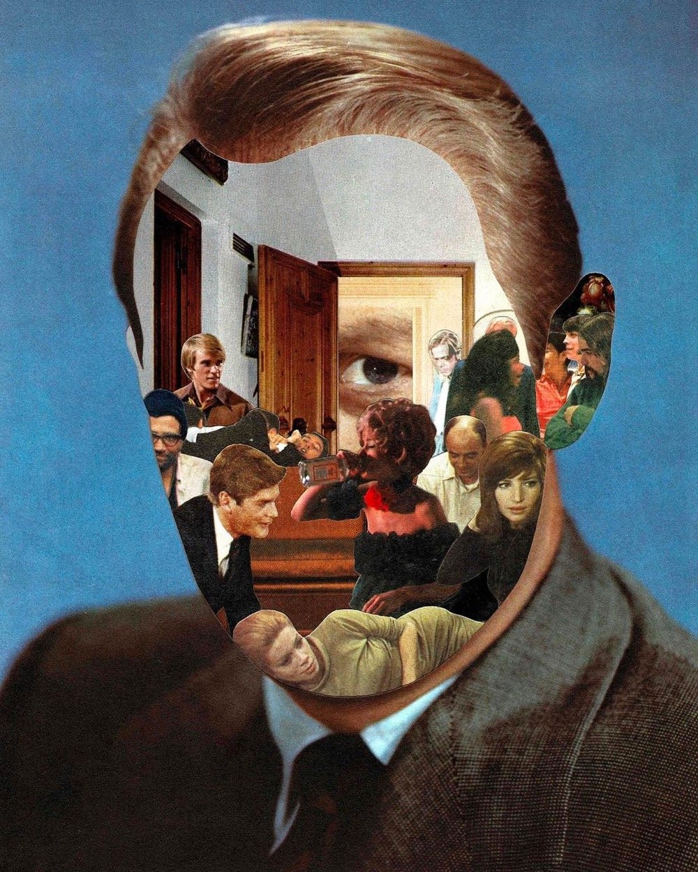
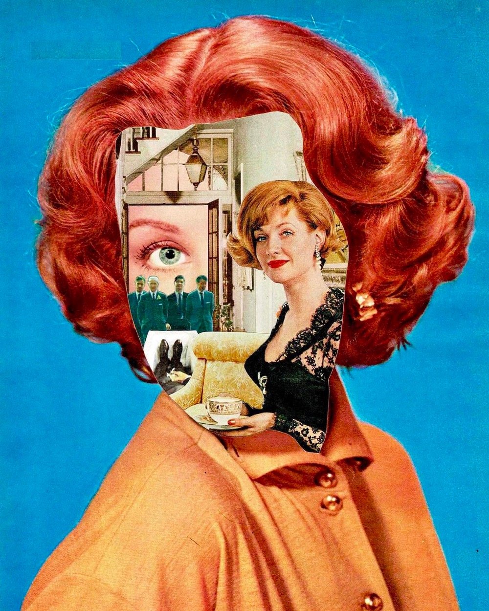
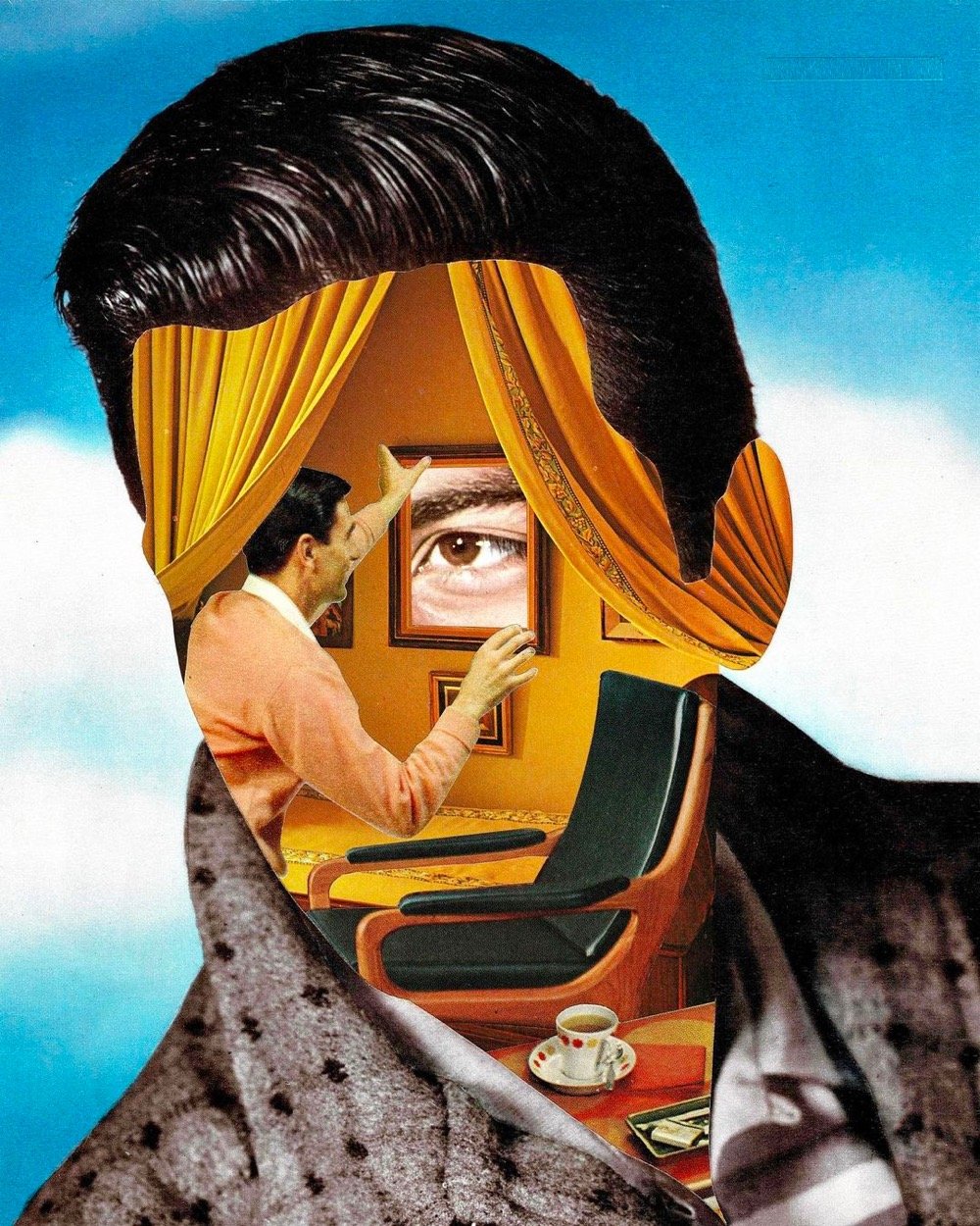
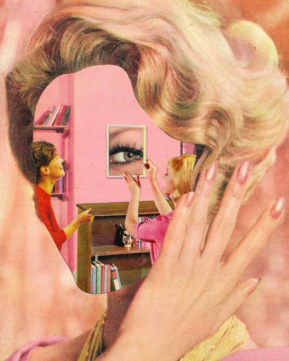
For the past year or so, UK artist Shane Wheatcroft has been making these hand-cut collages that replace people’s faces with various other scenes and objects. It’s hard to tell from these images, but (at least some of?) the collages are 3D. A number of Wheatcroft’s artworks are available for sale on Artfinder. (via jenni)
In the most recent episode of the excellent YouTube series Great Art Explained, James Payne expands on an earlier, shorter video on the Mona Lisa with this double-length extended cut.
For Mona Lisa, Leonardo used a thin grain of poplar tree and applied an undercoat of lead white, rather than just a mix of chalk and pigment. He wanted a reflective base. Leonardo painted with semi-transparent glazes that had a very small amount of pigment mixed with the oil, so how dark you wanted your glaze to be depends on how much pigment you use. He used more like a “wash”, which he applied thin — layer by layer. Here you can see two colors of contrast — light and dark. When you apply thin glaze over both of them, you can see it starts to unify the contrast but also brings depth and luminosity. The lead white undercoat reflects the light back through the glazes, giving the picture more depth and in essence, lighting Mona Lisa from within.
This was fascinating, not a wasted moment in the whole thing. I’ve read, watched, and listened to a lot of analysis of the Mona Lisa over the years, but Payne’s detailed explanation both added to my knowledge and clarified what I already knew.
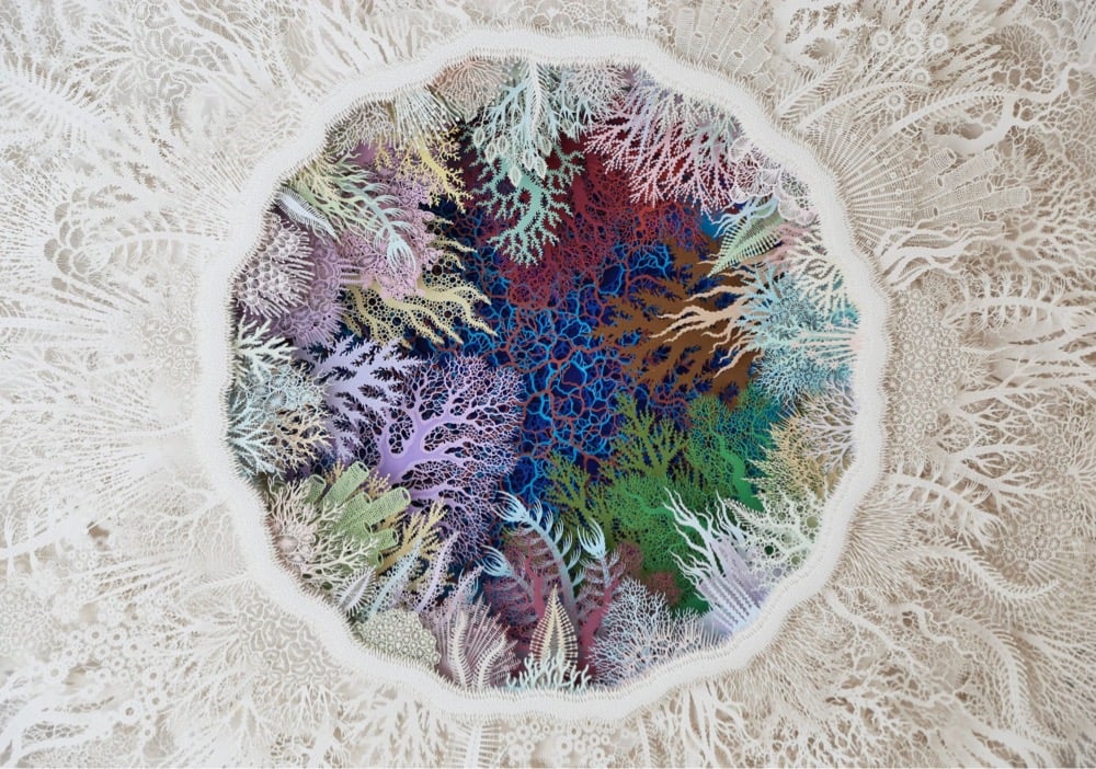
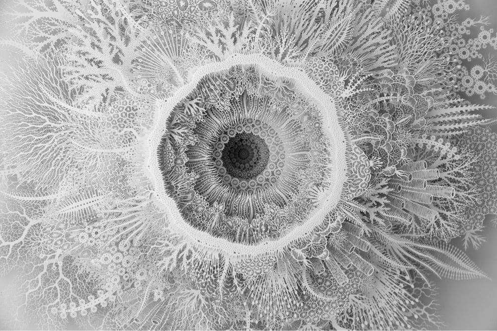
Artist Rogan Brown is highlighting what the climate crisis is doing to global coral populations with two recent delicate and intricate paper sculptures of bleached coral. Brown writes:
Here I try to capture the beauty, intricacy and fragility of the coral reef in layers of simple paper. The world’s coral reefs have become symbols of the devastating effects of global warming and man-made pollution. Mass bleaching events occur each year with increasing regularity and if the situation continues then it is inevitable that we will witness the demise of these magnificent biodiverse habitats. My hope is that by reminding us of how astonishing these ecosystems are we may unite to save them.
You can check out the rest of Brown’s intricate paper sculptures in his portfolio or on Instagram. (via colossal)
For the latest episode of Nerdwriter, Evan Puschak (after briefly introducing his forthcoming book) discusses his favorite Leonardo da Vinci painting, The Virgin and Child with Saint Anne.
In this way, moving from the apex of the pyramid to its bottom right corner is actually a trip through time, from the past to the present to the future. And that timeline also extends along a three-dimensional axis — the lamb is in front of Jesus, who’s in front of Mary, who’s in front of Anne. But on this axis, it goes even further — behind Anne, we’re launched into the geological past. These mountains, these bones of the Earth, suggest a deep time — so deep that it conflicts with the Christian sense of the age of the world. Now that reflects a larger conflict in the Renaissance between religion and a growing appreciation for natural science, which is embodied in no person more than Leonardo da Vinci, the insatiably curious polymath.
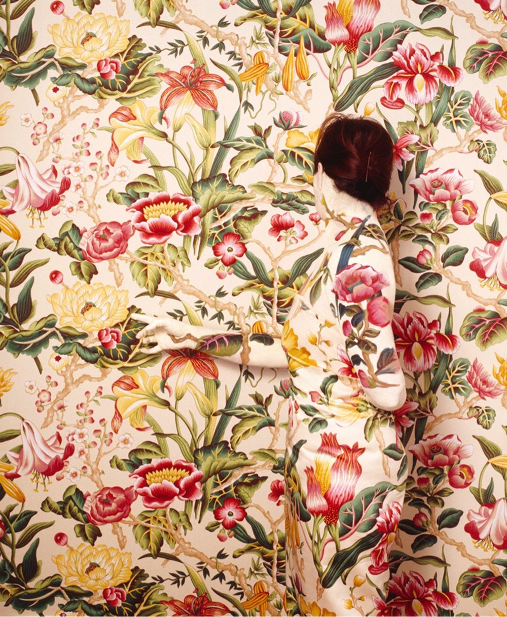
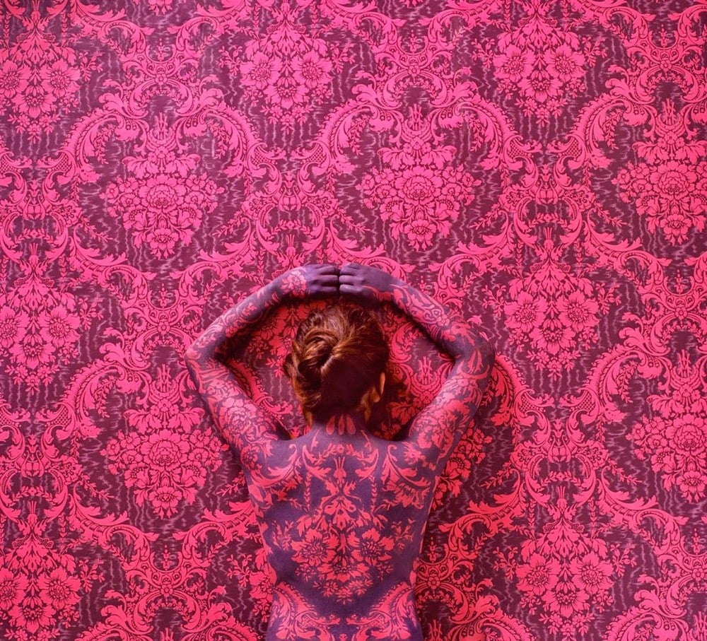
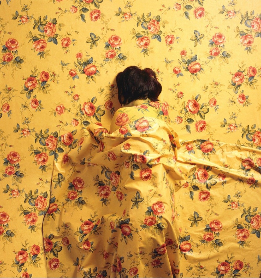
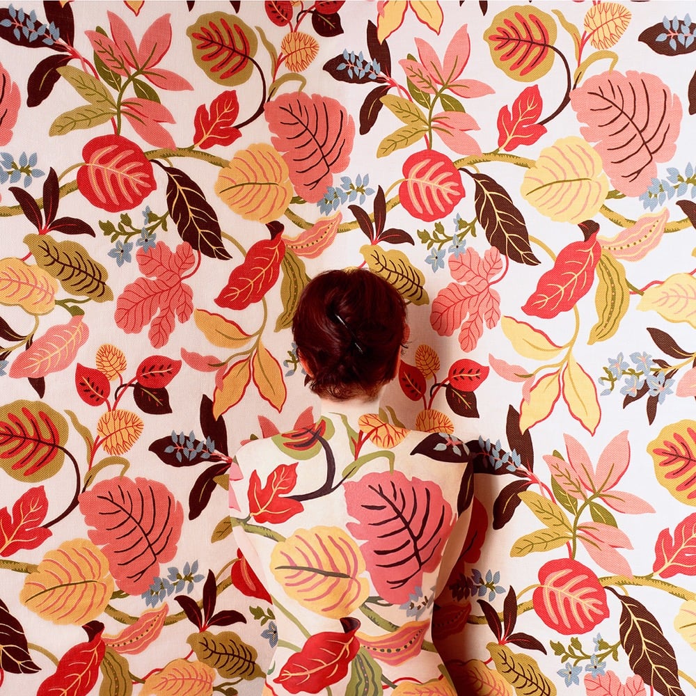
Cecilia Paredes takes photos of herself blending into elaborate backgrounds. You can see more of her work at Colossal, Lens Culture, Schneider Gallery, and Artsy.
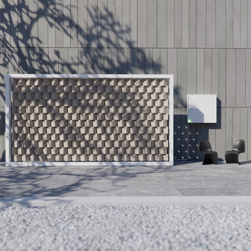
Designer Joe Doucet’s Wind Turbine Wall is both a kinetic sculpture and a way to harness wind power to create electricity.
Wind energy has played a key role in helping national grids around the world reduce dependence on fossil fuels to generate energy, but wind turbines for the home have encountered very slow uptake due, in part, to their intrusive physicality.
Designed to be as aesthetically pleasing as it is functional, this “kinetic wall” is made up of an array of rotary blades that spin individually, driving a mini generator that creates electricity. The electricity is utilized in the home or business, can be stored in a wall-mounted battery, or can even be fed back into the national grid to provide revenue for the owner.
Here’s the wall in action:
From a writeup of the project in Fast Company:
Doucet has built a prototype for a single spinning rod and run simulations based on that. The average annual electricity consumption for an American home uses a little over 10,000 kilowatt-hours per year. One of these walls would be enough. But where Doucet sees true potential is in larger-scale commercial buildings and even cities. “Instead of the typical retaining walls along roads and freeways, you’d have an array of these,” says Doucet, who says he’s in conversation with several manufacturers to help him bring the product to market. “With the added wind boost from trucks, our highways could take care of all our energy needs.”
(thx, michael)
Artist & engineer JBV has built a robot artist called Flingbot that works by throwing paint at a canvas according to a number of randomized parameters, e.g. fling strength, scoop shape, paint color, and throwing angles:
The next parameters are the starting and ending fling angles. Randomly chosen by the code, the trajectory and point it hits the canvas is variable creating another factor of uniqueness. This is all controlled by a servo under the base of the catapult, which also happens to be the motor that allows Flingbot to position itself under the paint reservoirs.
This means that every painting Flingbot creates is effectively unique.
All in all, accounting for all the different parameters, there are almost 3 trillion paintings that Flingbot can make. The number is likely even higher than this because there are even more variables to consider that are out of Flingbots control. These include the consistency of the paint, the angle of the canvas, the temperature in the room…the list goes on. It’s safe to say that each one of Flingbot’s painting is truly one of a kind.
(via the morning news)
Korean artist Lee Sangsoo makes these minimalist yet expressive sculptures of animals, people, and objects. And they’re perhaps larger than you expect.
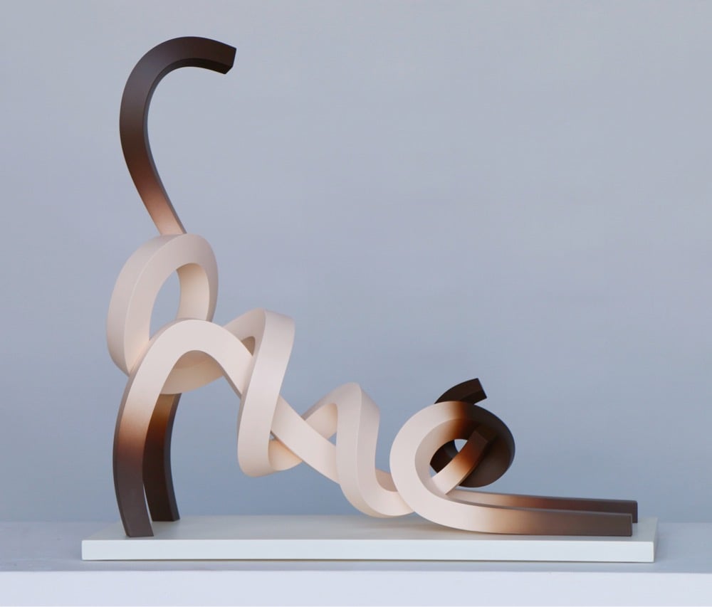
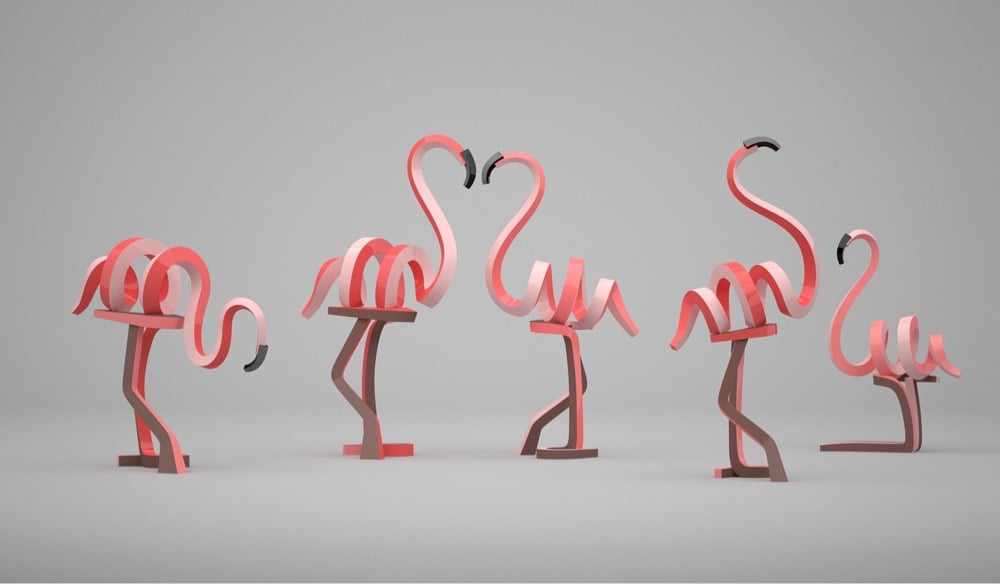
I know I’ve said this probably 100 times before, but I’m continually amazed at how, with just a few strokes of a brush or twists of metal, an artist can create something that’s both abstract and familiar. That beige and brown sculpture above…my brain took about 0.03 seconds to recognize that as a siamese cat. Artists hacking the human brain’s pattern recognition ability and us being delighted by it is the gift that keeps on giving. (via colossal)
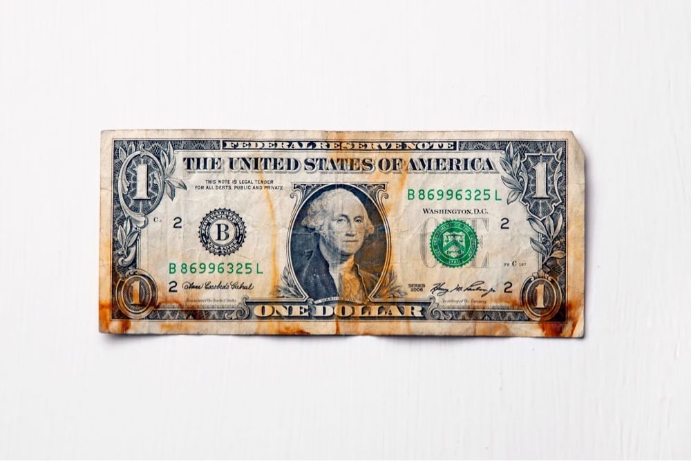
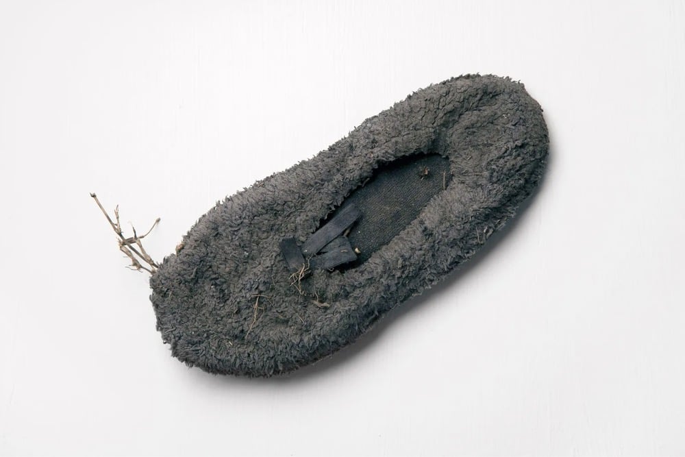
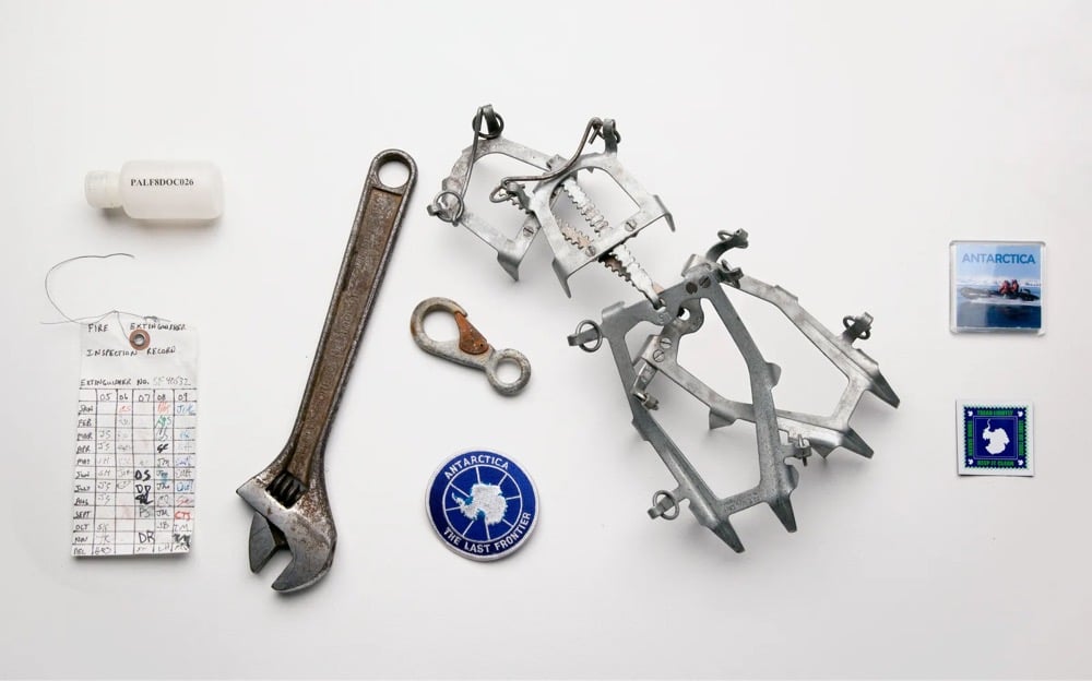
For the last ten years, artist Amy Balkin has been collecting artifacts related to the climate crisis. The collection is called A People’s Archive of Sinking and Melting.
A People’s Archive of Sinking and Melting is a collection of materials contributed by people living in places that may disappear because of the combined physical, political, and economic impacts of climate change, primarily sea level rise, erosion, desertification, and glacial melting.
From a piece about the archive in the New Yorker:
There is an incredible pathos to Balkin’s collection of things. In the light of imagined future eyes, tinged by loss, all manner of things become relevant that would otherwise pass unnoticed. Even two beer-bottle caps, in this context, are mesmerizing. Both are from places that are threatened with a certain kind of disappearance, or, at the very least, radical change; through their corrosion and fading, they seemed to foretell this disappearance somehow. And yet, paradoxically, looking at them, I knew that these pieces of metal would likely outlast me. A future person might see them in a museum, displayed with a label that reads “Beer-bottle caps, common in this time.” But what would that person’s world be like? What would be lost, between now and then, even as these fragments are shored up against ruin?
You can contribute to the archive — instructions for sending in an artifact are here.
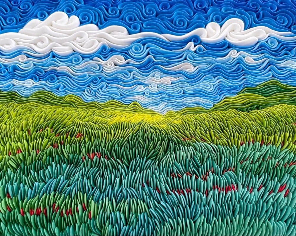
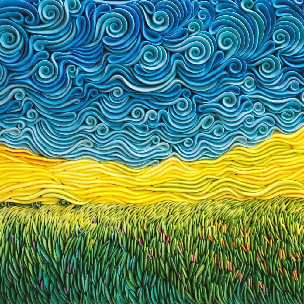
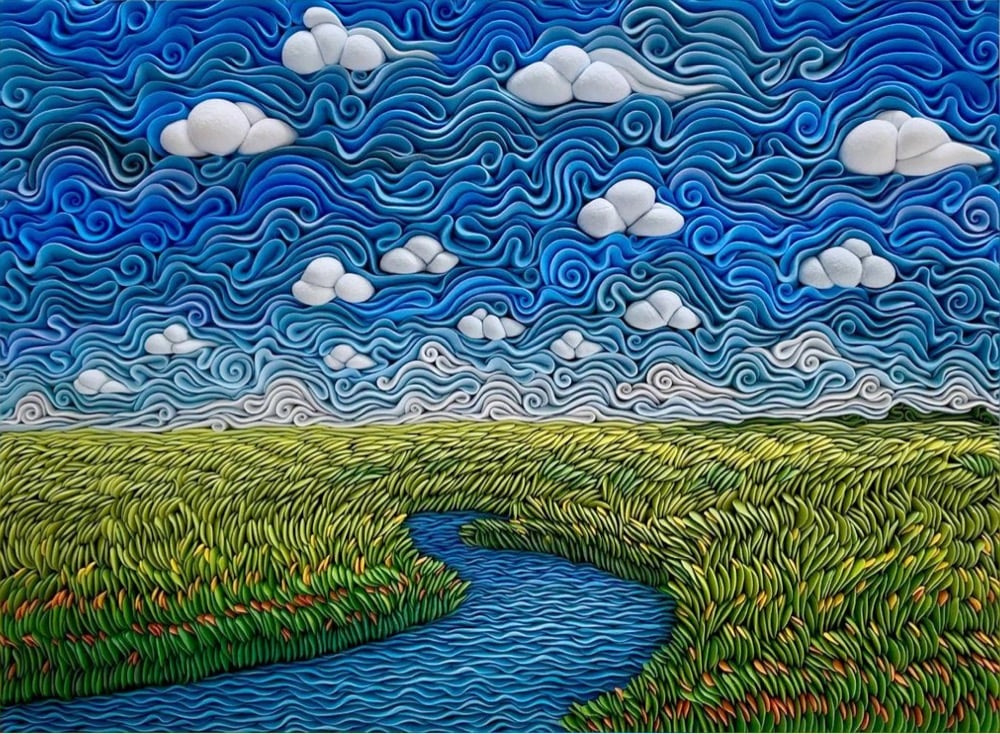
Alisa Lariushkina uses air-dry clay to make swirling sculptures that look like landscape paintings. Lariushkina’s patterns and color palette evoke the style of Post-Impressionist painters — indeed she’s even recreated van Gogh’s Starry Night in clay. (via my modern met)
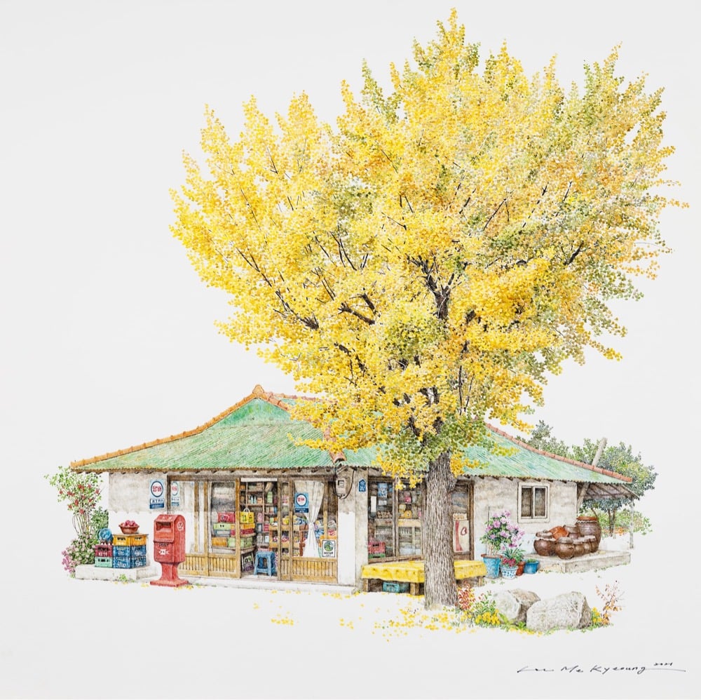
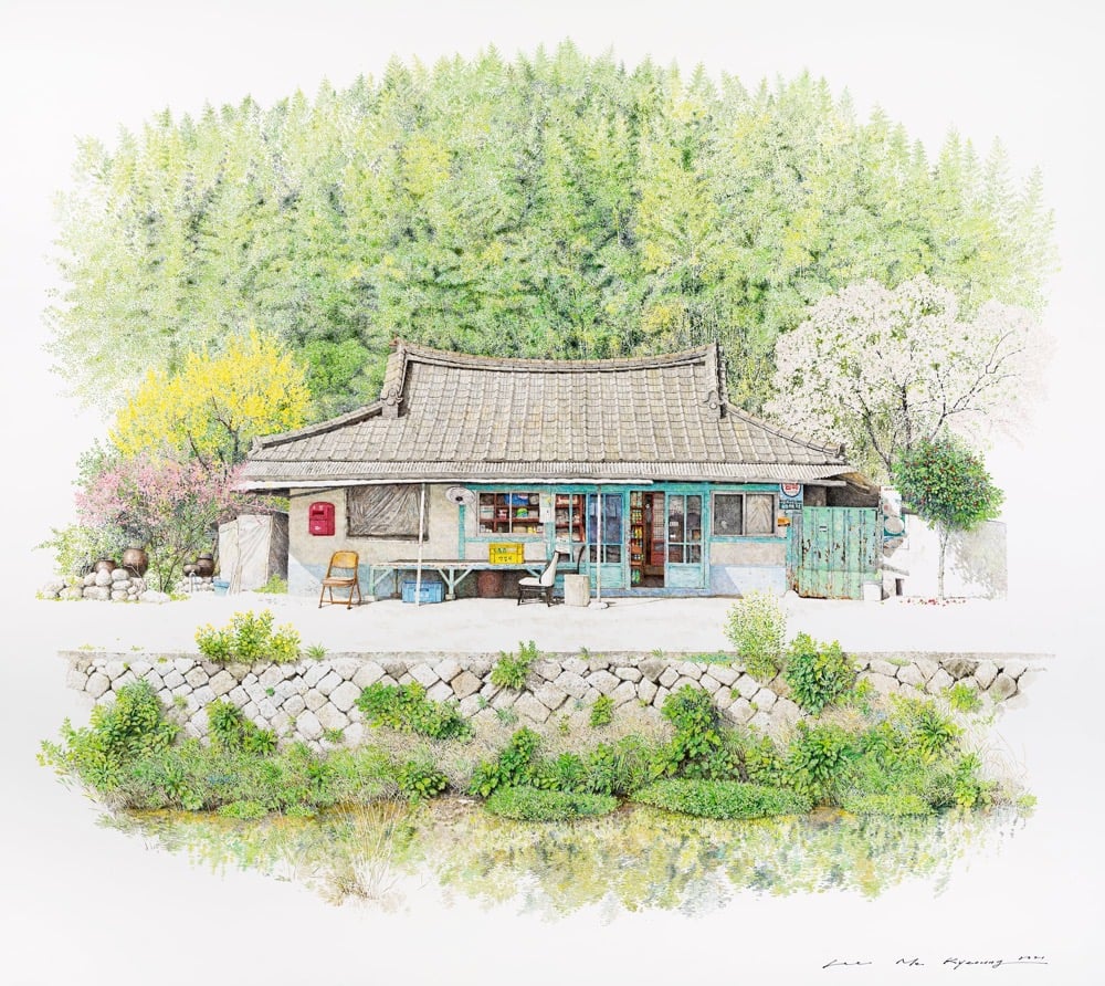

Always great to check back in on the work of Me Kyeoung Lee, who has been drawing delicate & detailed portraits of convenience stores from around Korea. Check out her Instagram for more work and some behind-the-scenes — I was surprised at how large some of her drawings are. (via colossal)
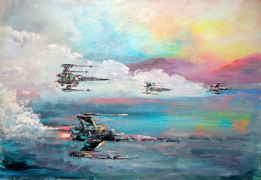
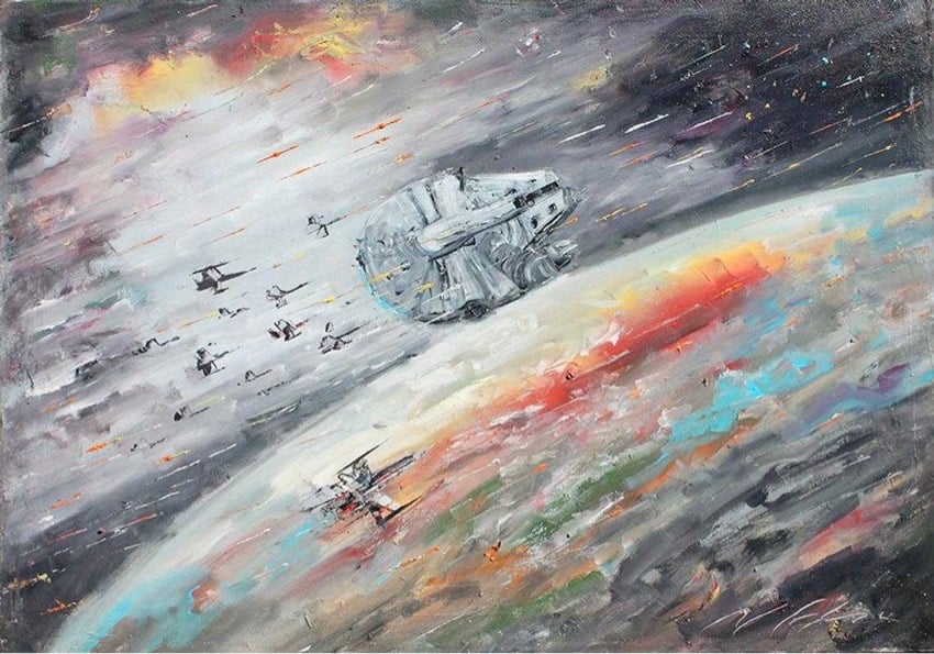
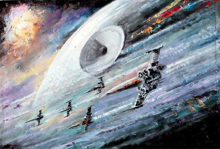
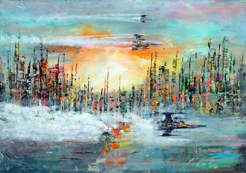
Check out these expressive impressionist oil paintings of scenes from Star Wars by Naci Caba. (He also does paintings of Lord of the Rings and Harry Potter.) Seeing futuristic sci-fi rendered in this medium is giving me a bit of cognitive dissonance.
You can buy prints and even the original oil paintings in his shop or at Etsy. (via digg)
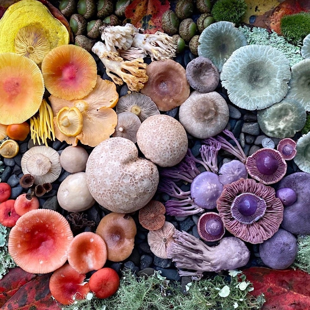

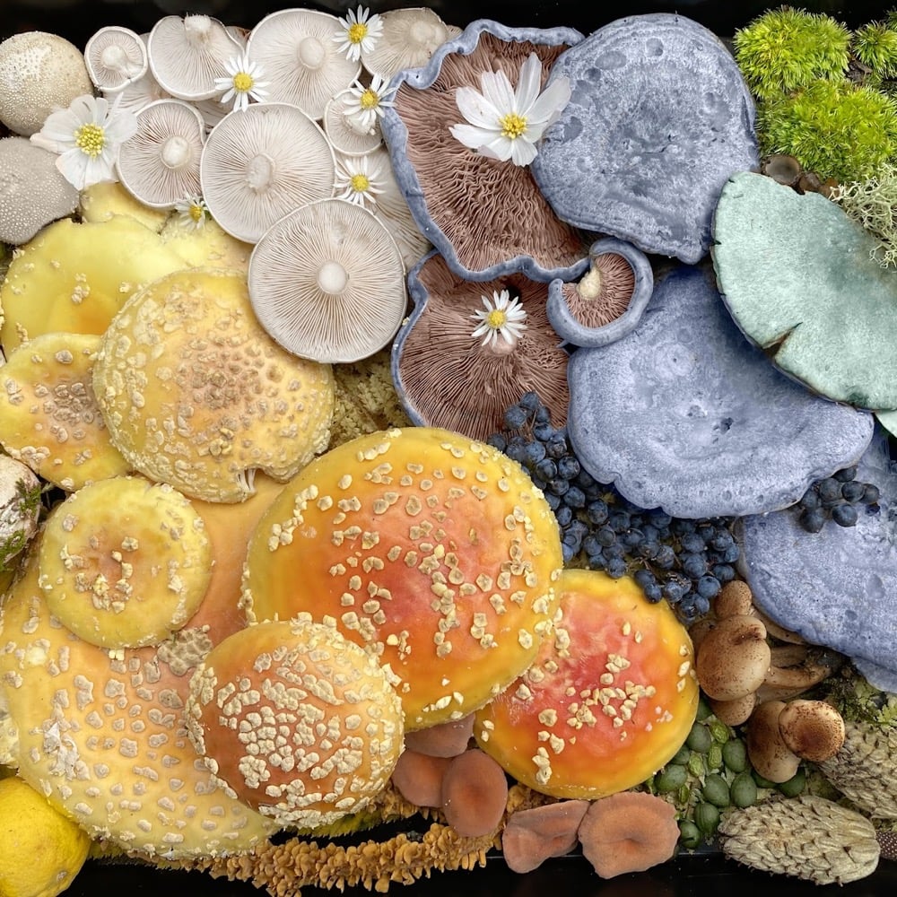
Using foraged mushrooms, berries, leaves, moss, and other natural materials, Heather Brooks makes these lovely and lively colorful collages, which she displays on Instagram and offers prints of on Etsy and on her website. (via life is so beautiful)
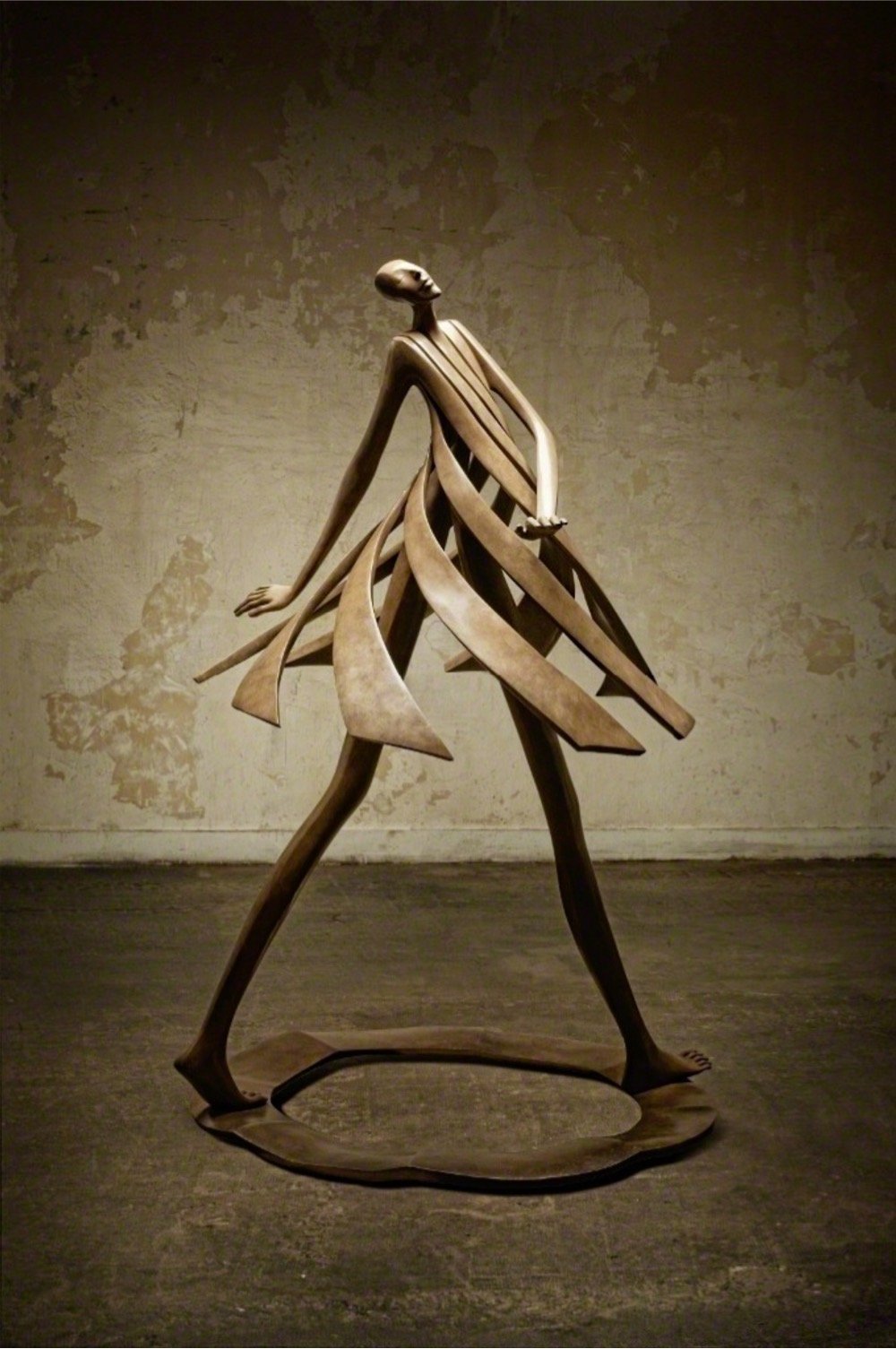
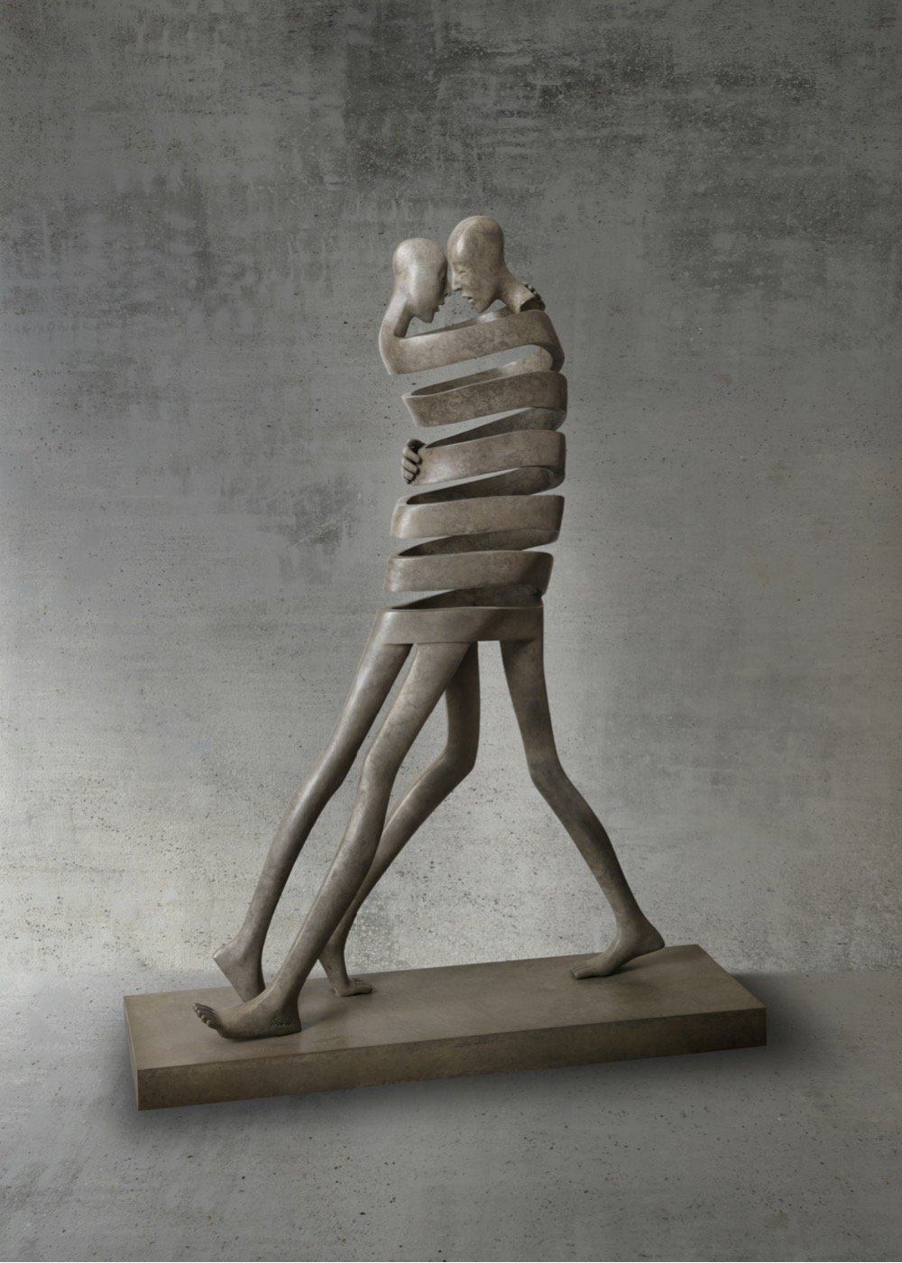
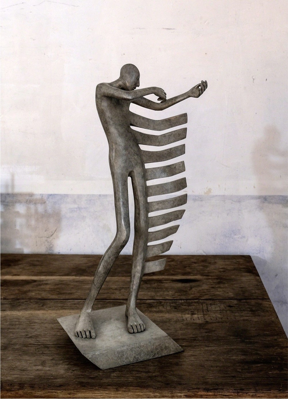
It’s quite a neat trick of the artistically gifted to make figures cast in solid bronze seem like they’re moving, and that’s exactly what Isabel Miramontes has done with her ribboned sculptures of people. (via colossal)
This is Samson and Delilah, a painting attributed to the Flemish master Peter Paul Rubens that hangs in the National Gallery in Britain.
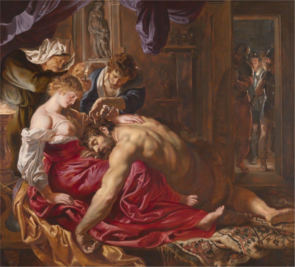
Since the late 90s, there’s been some doubt cast upon the painting’s authorship, summarized in this short video:
From a recent piece in the Guardian about an AI art-analysis algorithm that declared Samson and Delilah is not a Rubens painting:
Critics have long argued that it is only a copy of a Rubens original that is known to have been painted between 1608 and 1609 for his Antwerp patron Nicolaas Rockox which then disappeared after his death in 1640.
They argue that the National Gallery picture is a different painting, one that only surfaced in 1929, declared a Rubens by Ludwig Burchard, an expert who, after his death in 1960, was found to have misattributed paintings by giving out certificates of authenticity for commercial gain.
The picture’s critics dismiss its colours as uncharacteristic of Rubens’s palette and its composition as awkward. They question why, for example, it differs from two contemporary copies made from Rubens’s original. The toes of Samson’s outstretched right foot, for example, are cropped in the National Gallery version, while they are shown in an engraving by Jacob Matham and a painting that depicts the Samson and Delilah hanging in Rockox’s home by Frans Francken the Younger.
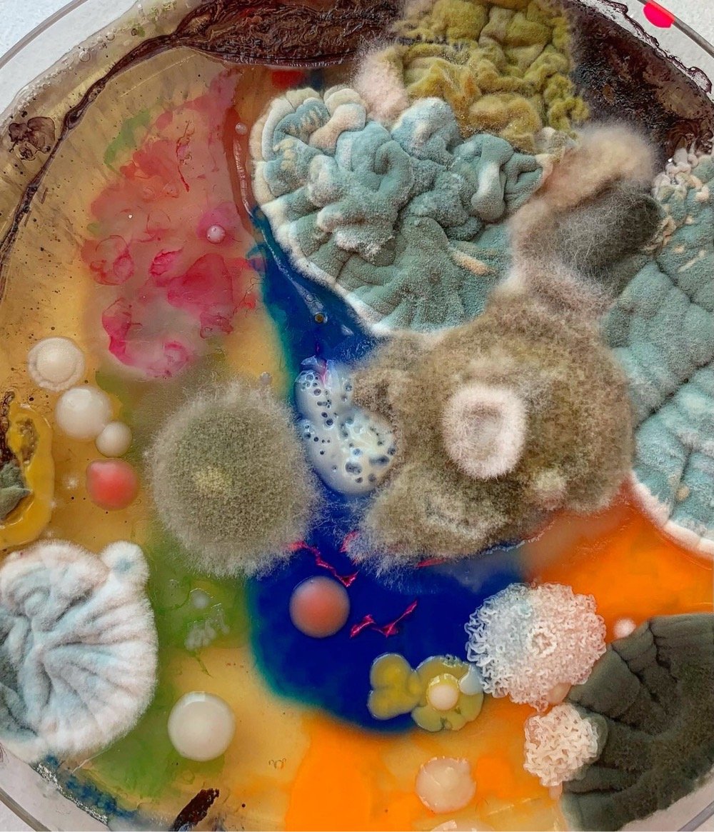
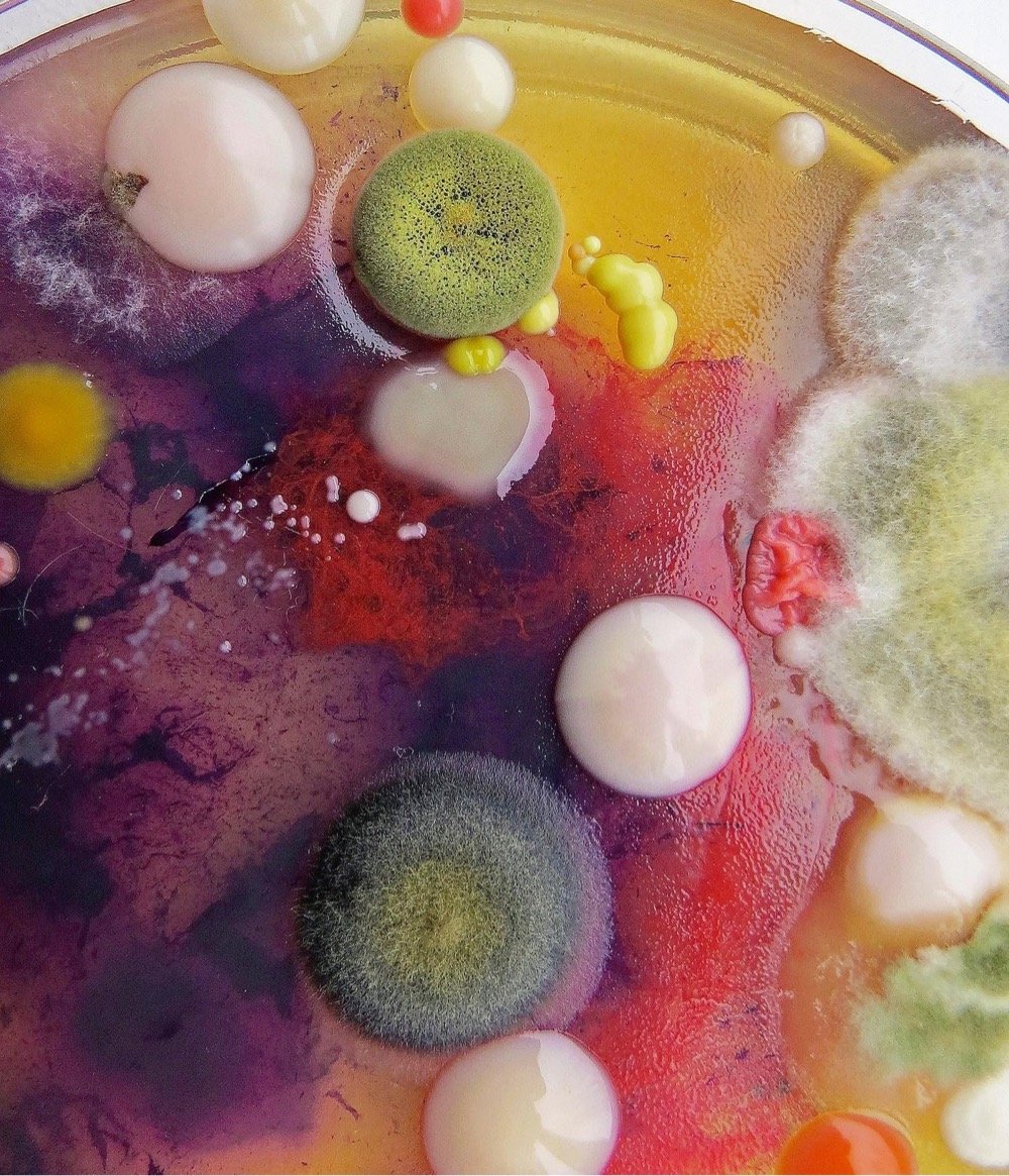
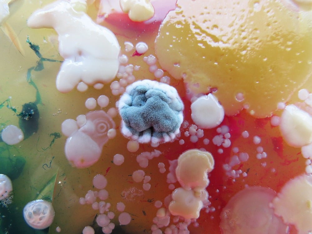
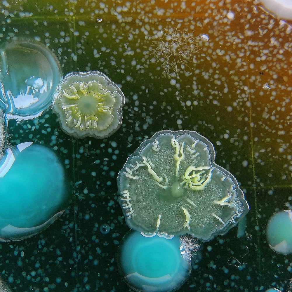
Artist Dasha Plesen combines molds, bacteria, spores, and other objects in petri dishes to create these colorful abstract photographs. You can find more of her work on Behance and Instagram. (via neatorama)
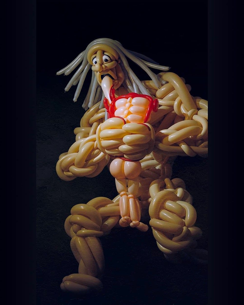
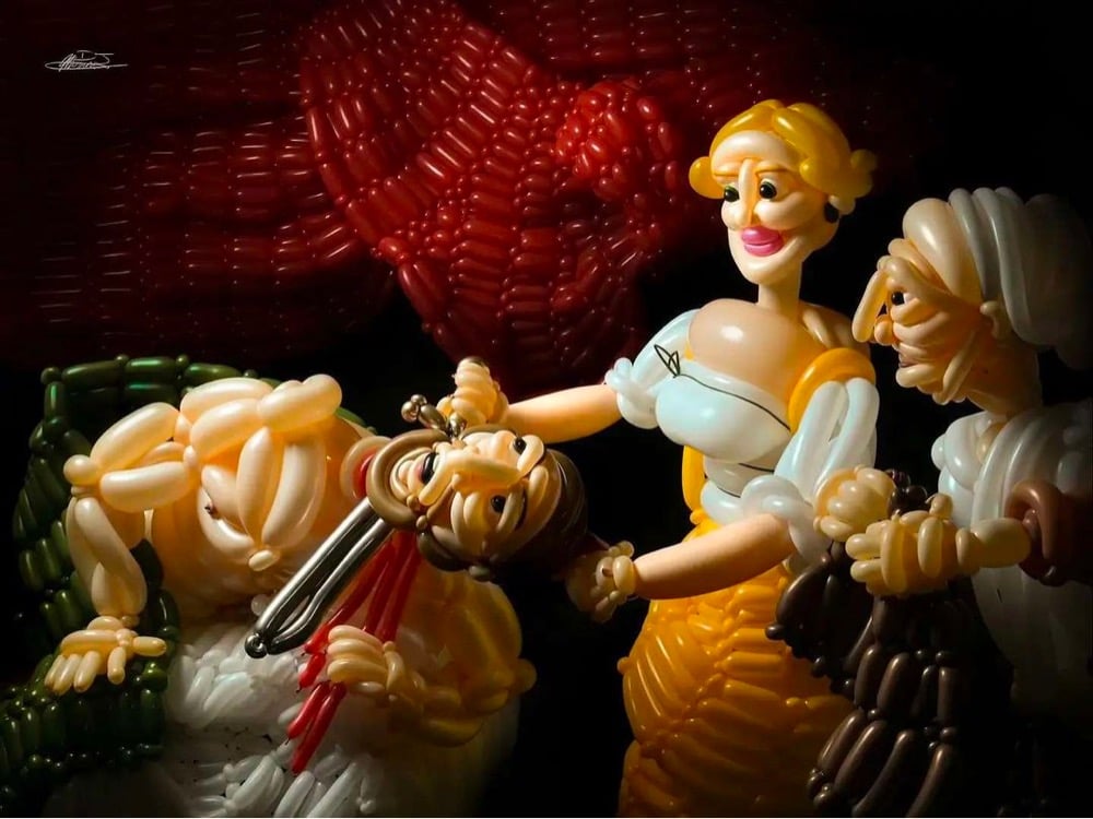
Balloon artist DJ Morrow has been branching out recently. Morrow makes elaborate balloon animals and other things but two of his latest creations are his amazing interpretations of Francisco Goya’s Saturn Devouring His Son and Judith Beheading Holofernes by Caravaggio. I can’t stop looking at these. And prints are available! (thx, caroline)
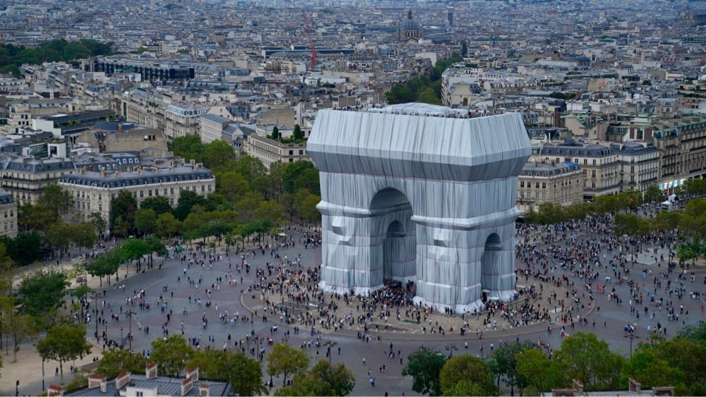
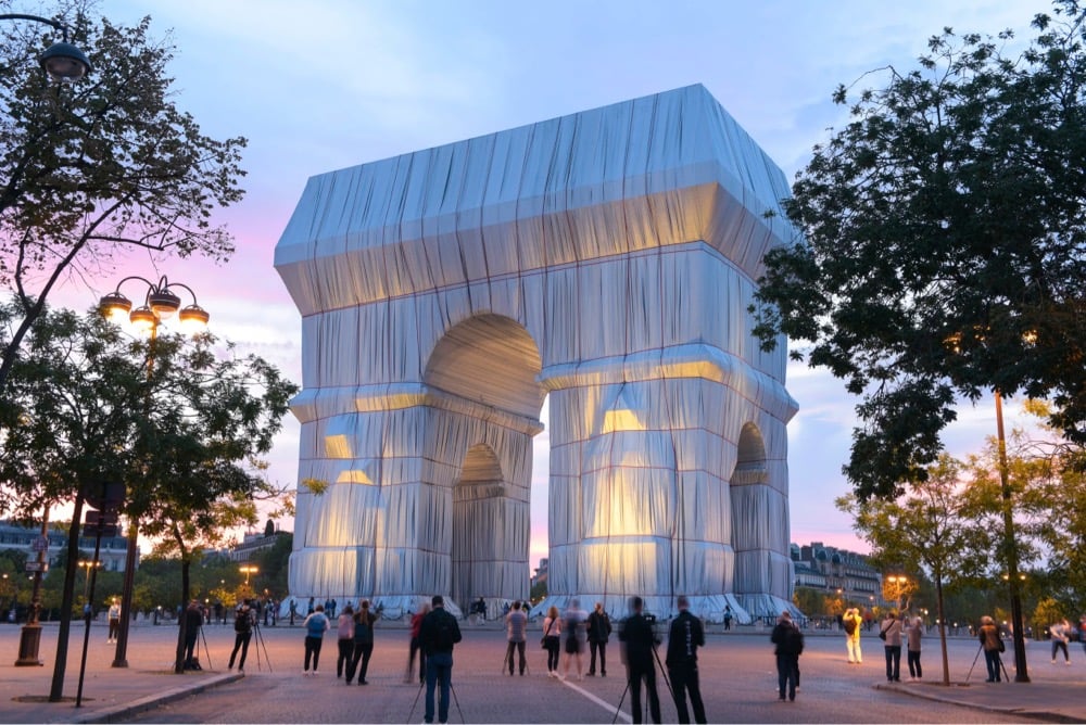
For the next two weeks, L’Arc de Triomphe in Paris will be wrapped, an installation that realizes a project begun by the late husband and wife team Christo and Jeanne-Claude in 1961.
L’Arc de Triomphe, Wrapped, a temporary artwork for Paris, is on view for 16 days from Saturday, September 18 to Sunday, October 3, 2021. The project has been realized in partnership with the Centre des Monuments Nationaux and in coordination with the City of Paris. It also receives the support of the Centre Pompidou. The Arc de Triomphe is wrapped in 25,000 square meters of recyclable polypropylene fabric in silvery blue, and with 3,000 meters of red rope.
In 1961, three years after they met in Paris, Christo and Jeanne-Claude began creating works of art in public spaces. One of their projects was to wrap a public building. When he arrived in Paris, Christo rented a small room near the Arc de Triomphe and had been attracted by the monument ever since. In 1962, he made a photomontage of the Arc de Triomphe wrapped, seen from the Avenue Foch and, in 1988, a collage. 60 years later, the project will finally be concretized.
Jeanne-Claude died in 2009 and Christo followed in 2020, so the project was completed by their team according to their wishes. I would have liked to have seen this in person…The Gates in NYC were wonderful.
In this wonderful short documentary by Lydia Cornett, we meet Yves Deshommes and observe him moving through his many responsibilities and interests in life, including being an NYC concierge, art dealing, raising his daughter, playing the violin, and helping his home country of Haiti.
Deshommes, who grew up in Haiti, came to New York on a student visa in 1985. He was seventeen years old, and when his visa expired he became undocumented. He lived with an older brother and took classes day and night and through the summer in order to finish high school in two years. “I became a man the moment I set foot on U.S. soil, full of responsibility,” he told me. He started playing the violin a few years later, with teachers at the Harlem School of the Arts. He was soon practicing several hours a day and working long shifts at Pizza Hut. He felt that he was too old to train as a professional, but his practice had become central to his life: “Music was the escape, music was the goal. Music was what made me achieve great things,” he said. “The violin gives me a discipline where I feel I can conquer anything.”
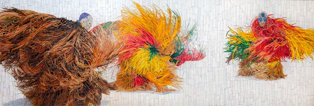
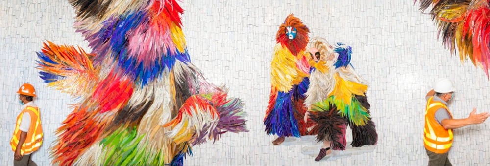
Oh, I really like this new NYC subway mosaic installed in the corridor between Times Square and Bryant Park designed by Nick Cave.1 It’s based on Cave’s Soundsuits project, full-body suits that “camouflage the shape of the wearer, enveloping and creating a second skin that hides gender, race, and class, thus compelling the audience to watch without judgment”. From a NY Times piece on the mosaic:
The Soundsuits have always been an amalgam of cultural references, Cave explained: the concepts of shamans and masquerade, obscuring the race, gender and class of the wearer and forging a new identity. They contain ties to Africa, the Caribbean and Haiti.
“It’s very important that you can make references, you can connect to something,” Cave said. “In one of the mosaics in the corridor, there’s a sneaker. So that brings it to this urban, right-now time.”
From beneath a pink-and-black cloak of raffia, carefully crafted out of glass shards, pokes a contemporary sneaker in shades of salmon, white and maroon. Cave likes the play that’s happening here: The form is sometimes figurative, sometimes abstract. “Sometimes it’s identifiable and sometimes it’s not,” he said. “But that’s the beauty of it all.”
(thx, caroline)
No, not that Nick Cave.↩
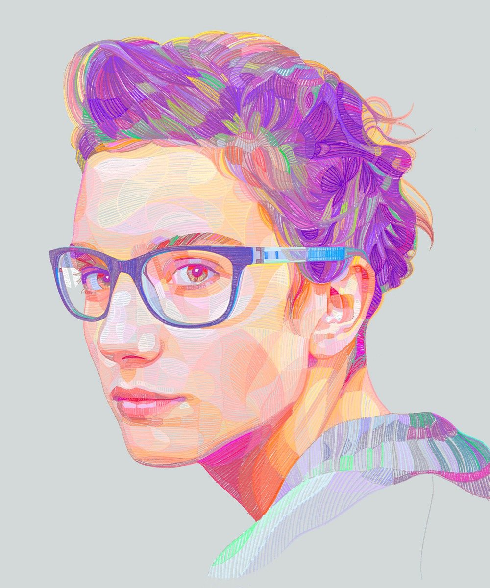
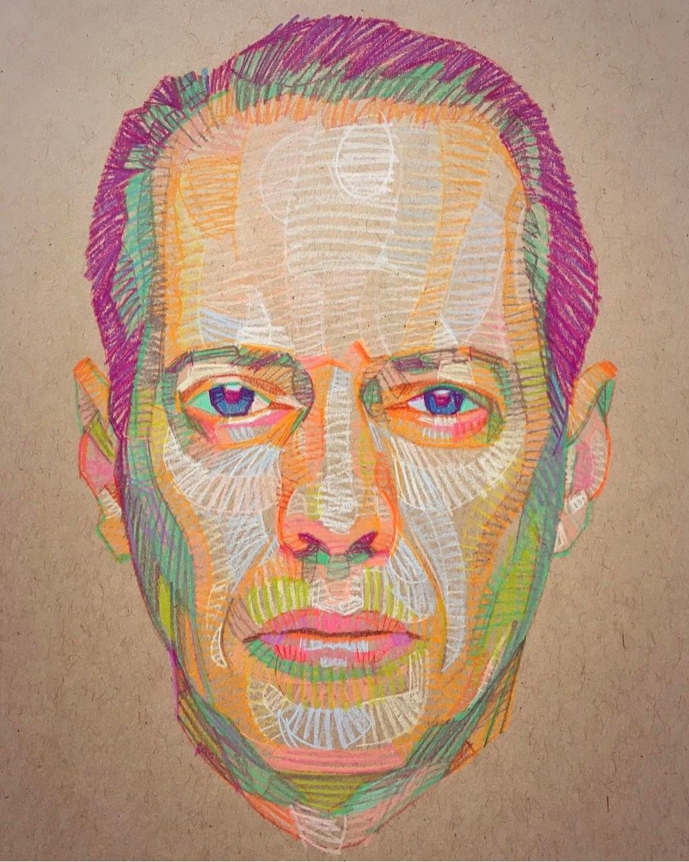
Loving these portraits from Lui Ferreyra, particularly the top one, which is a little Impressionistic — the colors remind me particularly of van Gogh and Seurat. Ok fine, it’s not Impressionism but it’s not not Impressionism either. (via colossal)
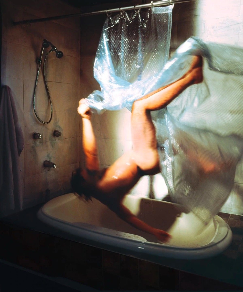
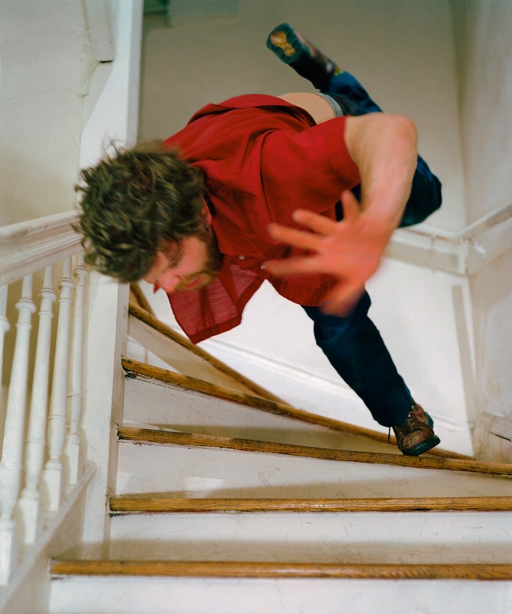
Control meets chaos in these carefully arranged images from Kerry Skarbakka’s series The Struggle to Right Oneself.
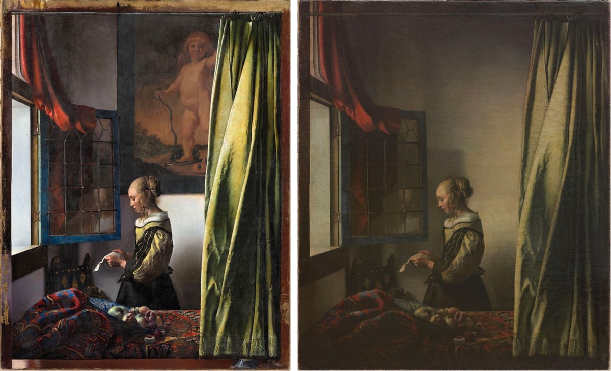
Only 34 paintings by Dutch master Johannes Vermeer, art history’s foremost painter of Side Views of People Doing Things Near Windows, have been known to survive to the present day, so when one of them is restored, it’s a big deal. The Gemäldegalerie Alte Meister in Dresden shared the first image of the completed restoration of Girl Reading a Letter at an Open Window — and you might notice a pretty big change on the wall behind the girl.
The painting has been in the museum’s collection for more than 250 years and the hidden Cupid had been known about since an x-ray in 1979 and infrared reflectography in 2009. It had been assumed that the artist himself had altered the composition by covering over the painting of Cupid.
But when a major restoration project began in May 2017, conservators discovered that the paint on the wall in the background of the painting, covering the naked Cupid, had in fact been added by another person. When layers of varnish from the 19th century began to be removed from the painting, the conservators discovered that the “solubility properties” of the paint in the central section of the wall were different to those elsewhere in the painting.
Following further investigations, including tests in an archaeometry laboratory, it was discovered that layers of binding agent and a layer of dirt existed between the image of Cupid and the overpainting. The conservators concluded that several decades would have passed between the completion of one layer and the addition of the next and therefore concluded that Vermeer could not have painted over the Cupid himself.
There is a certain aesthetic amenity to the bare wall in the altered version but maaaybe the original Cupid lends the painting some figurative meaning?
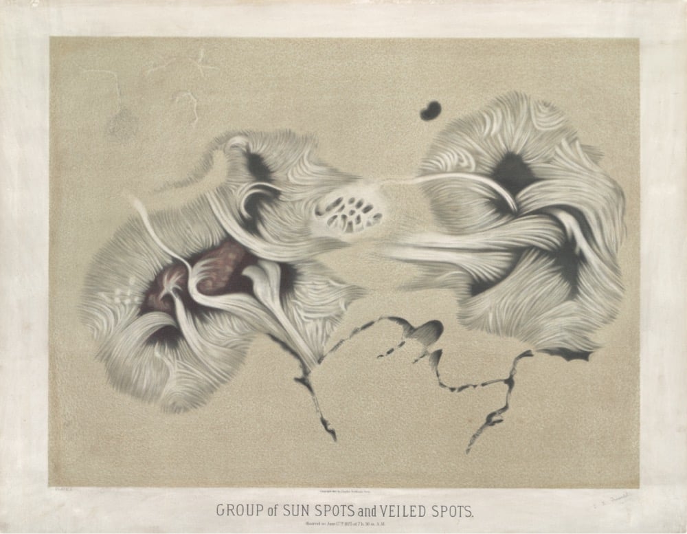
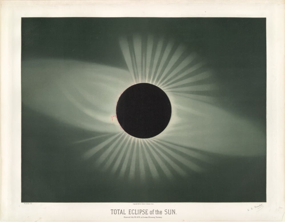
I love this post from the NYPL comparing astronomical drawings by E.L. Trouvelot done in the 1870s to contemporary NASA images.
Trouvelot was a French immigrant to the US in the 1800s, and his job was to create sketches of astronomical observations at Harvard College’s observatory. Building off of this sketch work, Trouvelot decided to do large pastel drawings of “the celestial phenomena as they appear…through the great modern telescopes.”
He made drawings of Saturn, Jupiter, aurora borealis, the Milky Way, and more. Here’s his incredible drawing of sun spots compared to a recent image of the Sun’s surface:

And his drawing of a solar eclipse compared to a recent image:
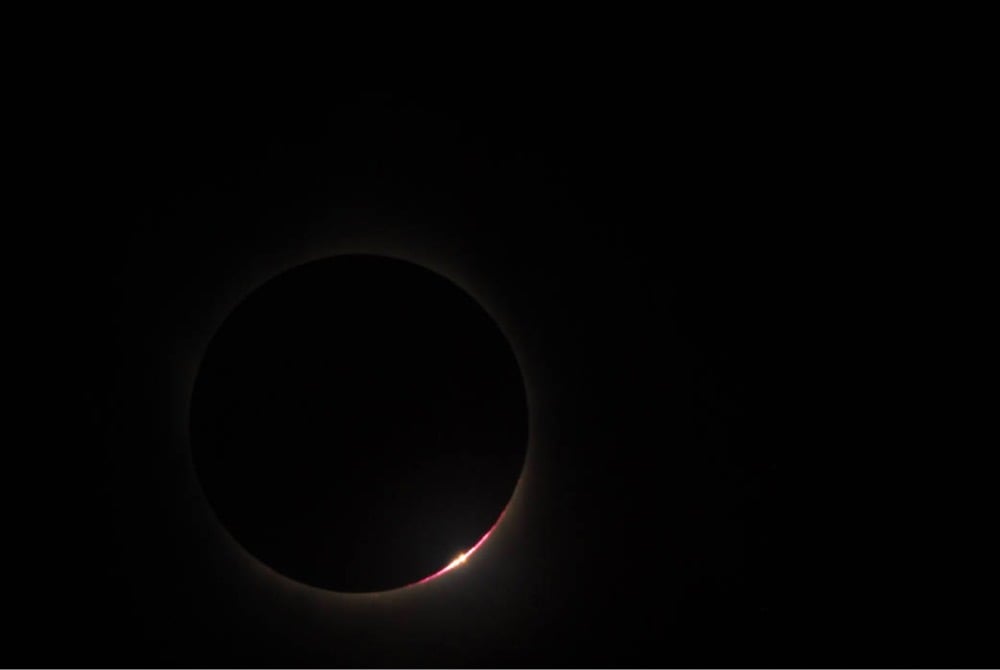
Check out the post for more examples of Trouvelot’s work.
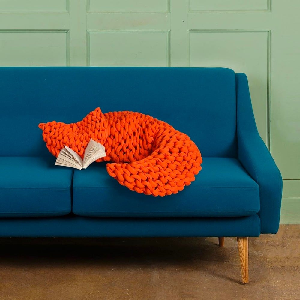
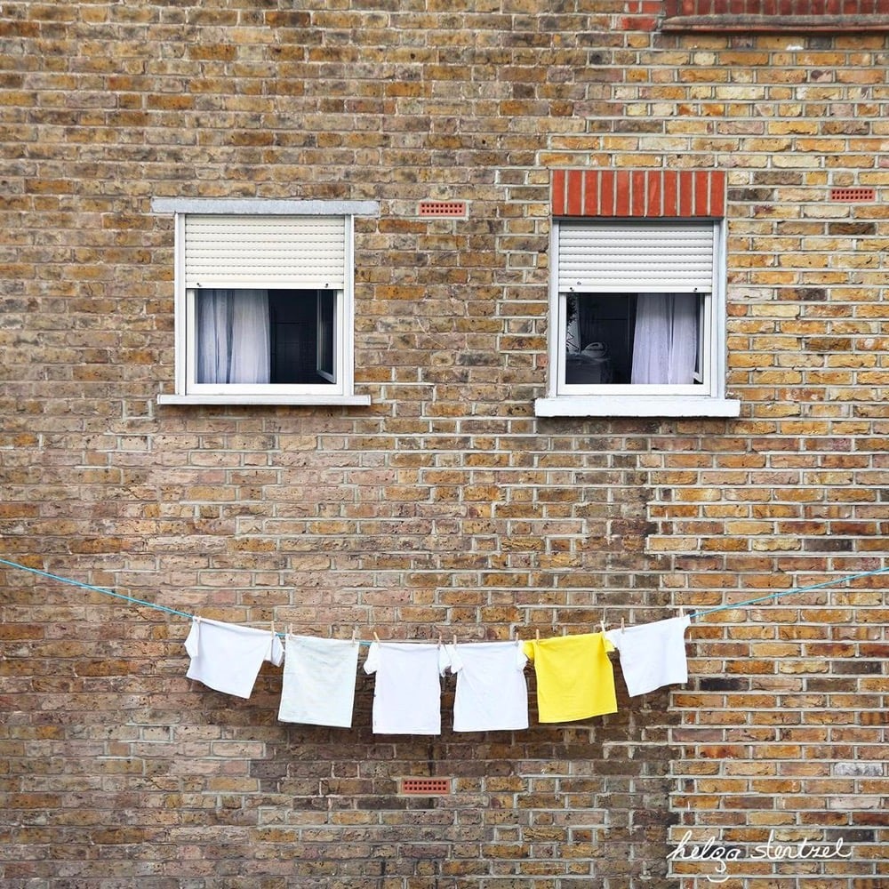
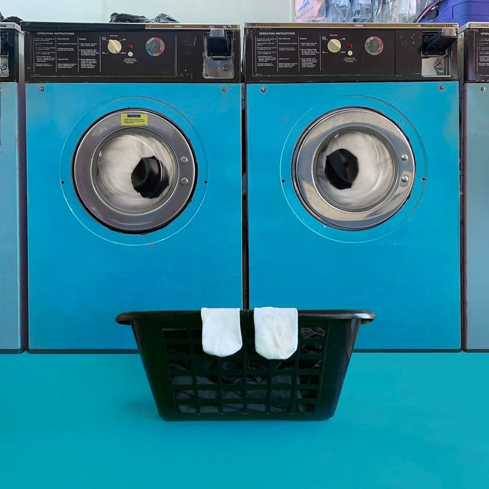
Often using the phenomenon of pareidolia, Helga Stentzel arranges common household items to resemble faces, animals, and other fun characters. You can find prints of some of her creations on her website.
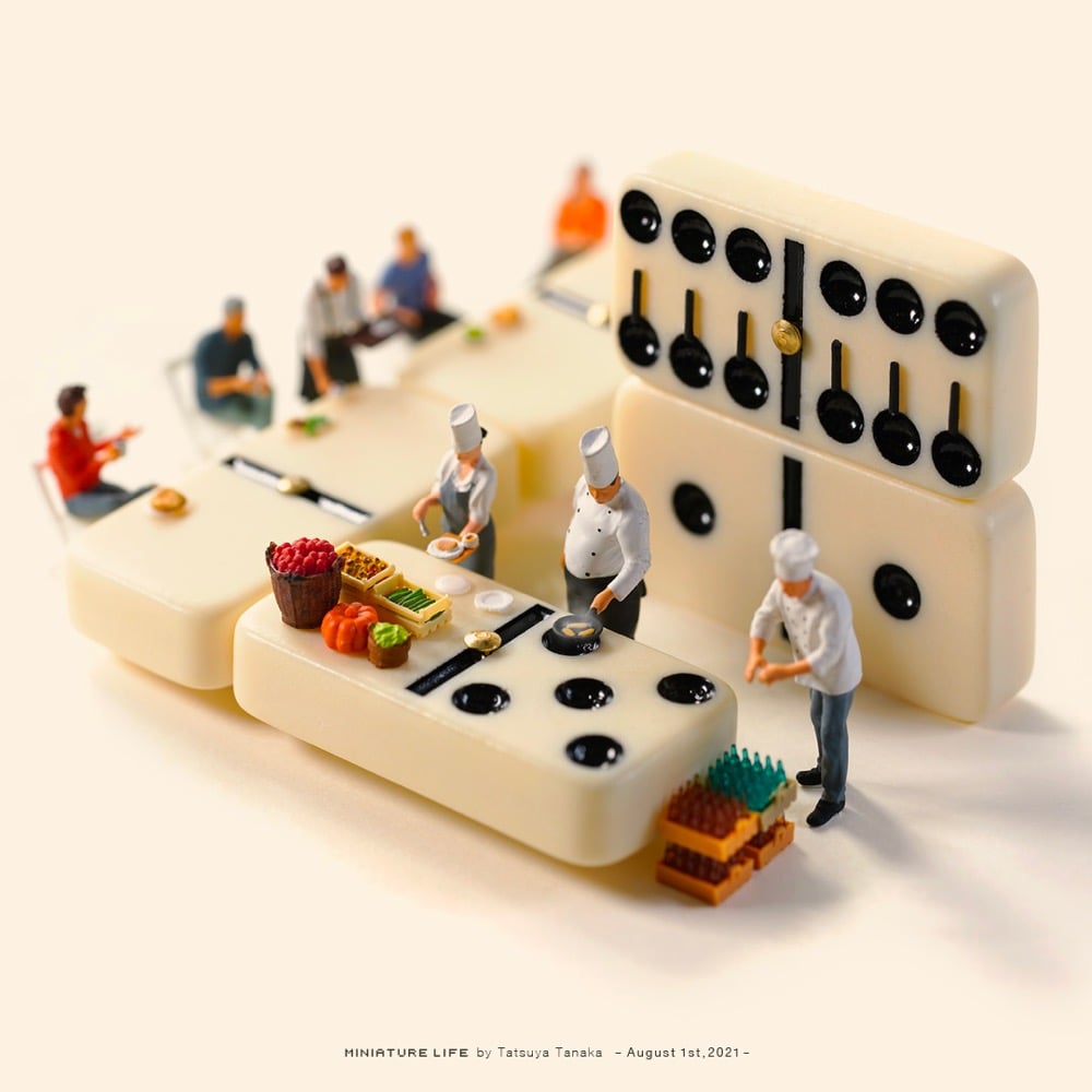
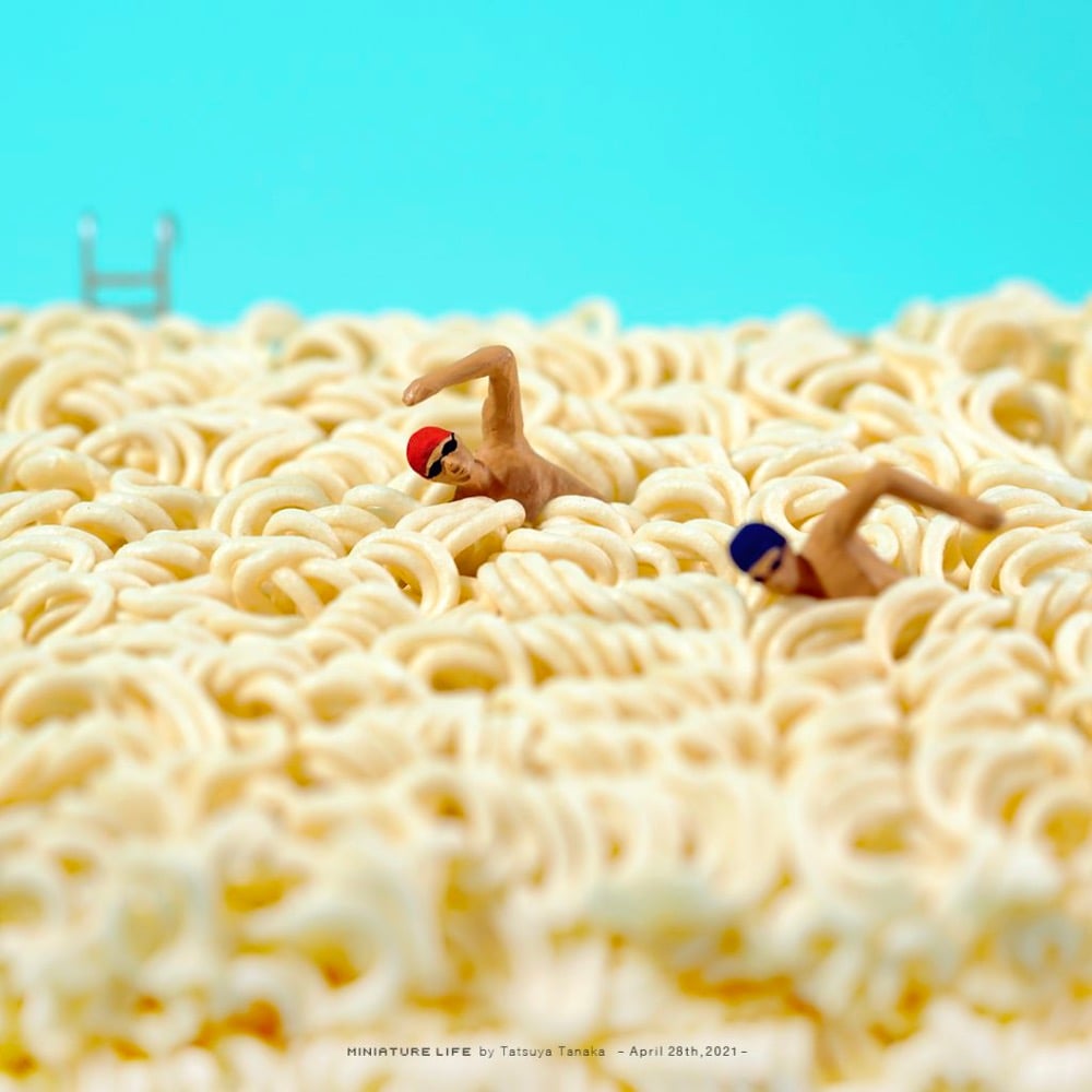
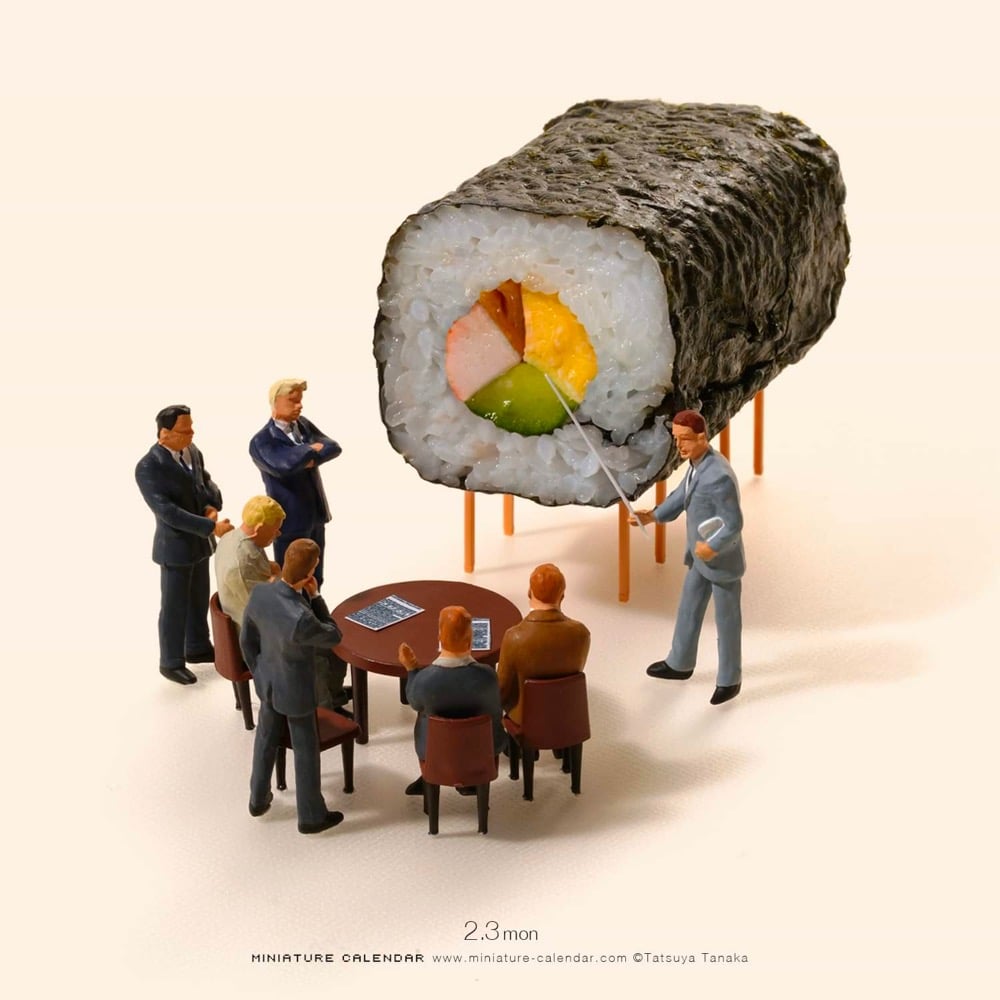
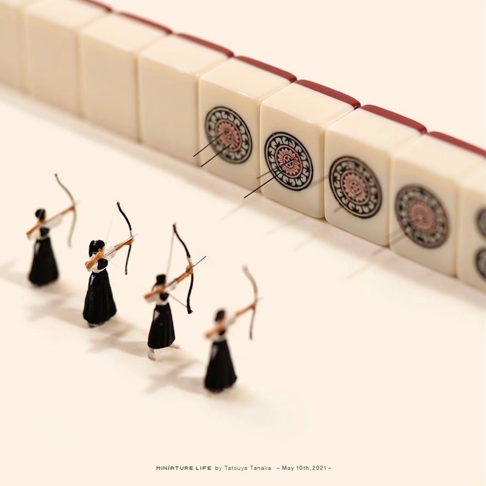
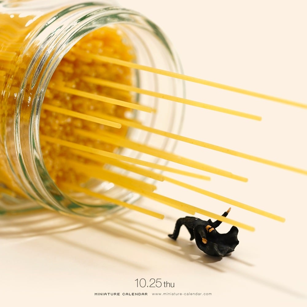
Since 2011, Tatsuya Tanaka has been creating daily images of miniature people in the midst of everyday items that resemble bigger things (think broccoli as trees, rows of staples as countertops, floating leaves as boats). Here’s a short video of Tanaka at work on his miniatures:
You can follow his work on his website or on Instagram. (thx, porter)
I love these little stop motion videos by Huw Messie (using Processing, I think) that use embroidery for the animation.
You can check out more of Messie’s work on Vimeo, Instagram, and NFT repository hic et nunc.
Stay Connected