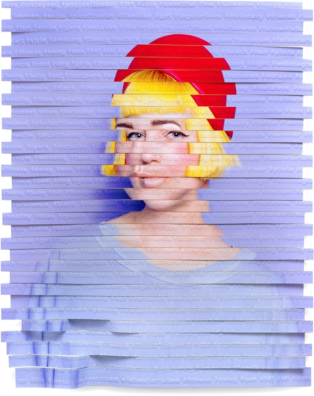
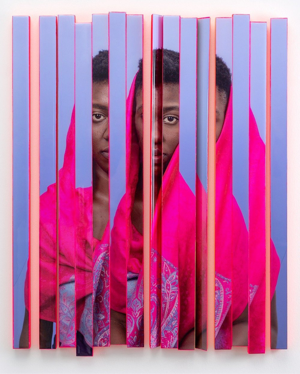
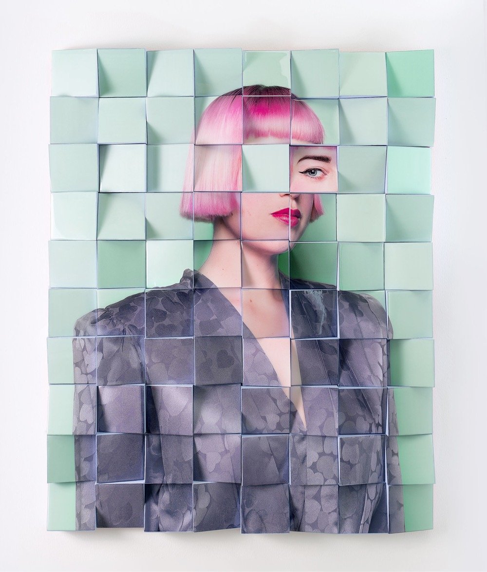
Reconstructed Portraits
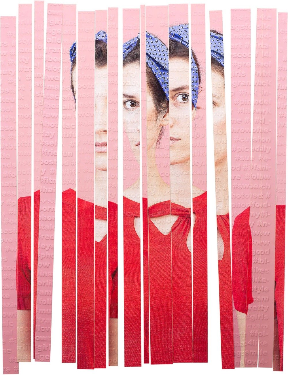
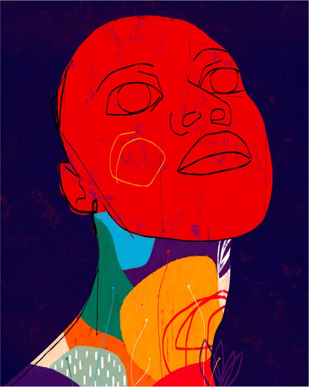
These images are drawn from Argentinian-born artist Karen Navarro’s projects El Pertenecer en Tiempos Modernos (Belonging in Modern Times) and The Constructed Self. You can also find her on Instagram.
This site is made possible by member support. 💞
Big thanks to Arcustech for hosting the site and offering amazing tech support.
When you buy through links on kottke.org, I may earn an affiliate commission. Thanks for supporting the site!
kottke.org. home of fine hypertext products since 1998.
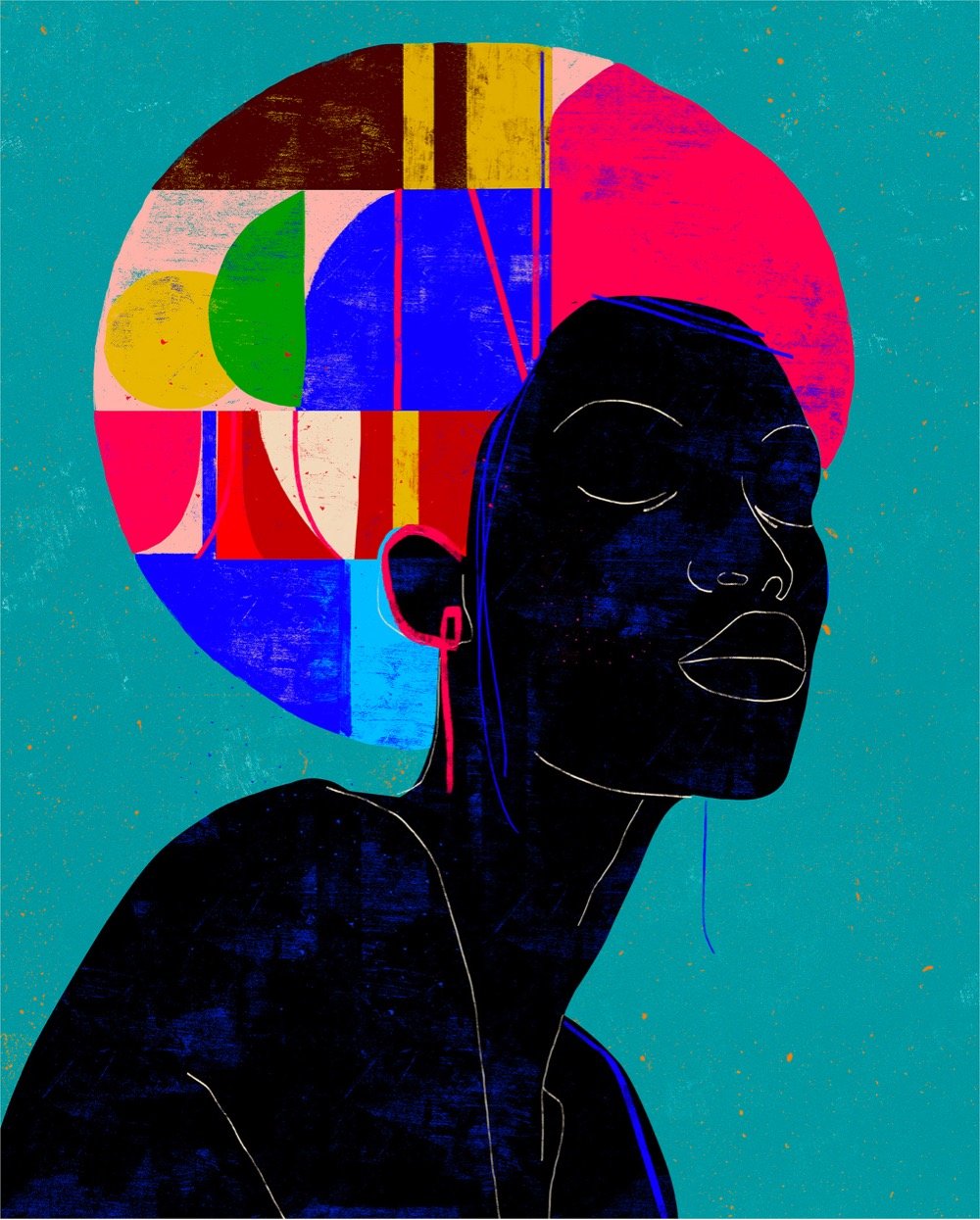
These images are drawn from Argentinian-born artist Karen Navarro’s projects El Pertenecer en Tiempos Modernos (Belonging in Modern Times) and The Constructed Self. You can also find her on Instagram.
Here’s a description of what the machine featured in this video does: “The HD Video Feedback Kinetic Sculpture creates fractals and organic-looking images in real-time, without a computer: this is old-school video feedback.” But just watch the video for the full effect — this thing produces some amazing imagery.
This is part sculpture, part performance art, and may make the most complex video feedback ever created, using three cameras, two video switchers, a sheet of beam-splitter glass, and an HDMI input from a phone or live video feed.
Much like a musical instrument, the operator at the helm of this device plays it, but instead of making sounds, makes entire worlds, spirals within spirals, loops within loops, galaxies, classical fractal imagery and primordial organisms, leaves, trees, and insects. It really is the God machine.
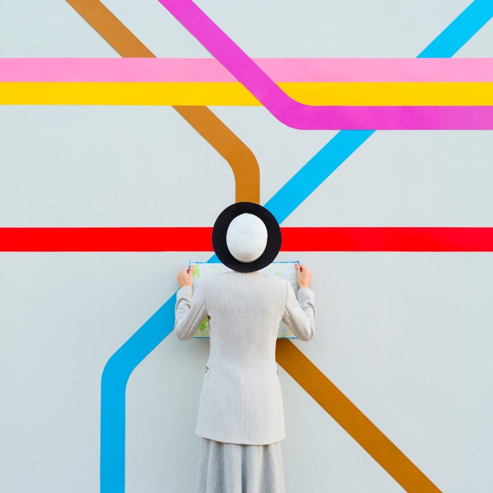

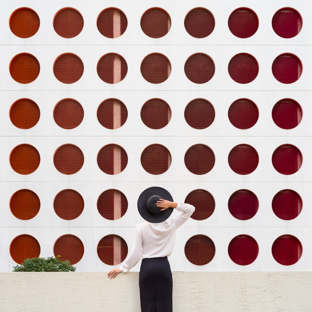
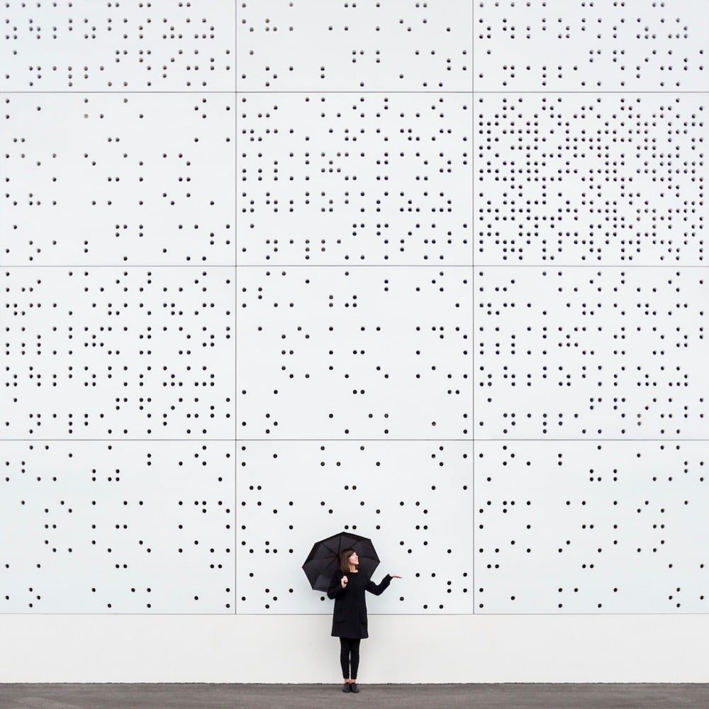
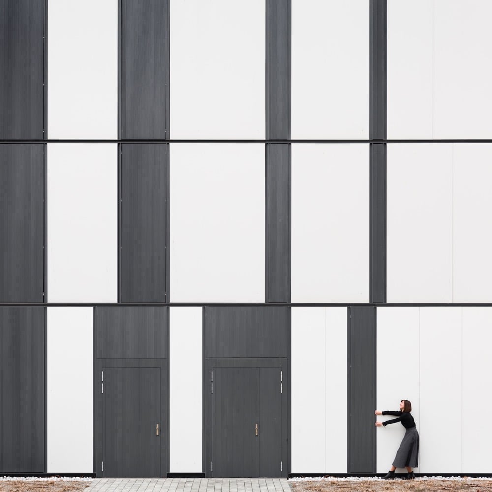
Spanish photographers Anna Devís and Daniel Rueda cleverly use landscapes and architectural elements to create minimalist and fun portraits of themselves. You can check out more of their work on Instagram. (via moss & fog)
In this video, The Snoopy Show storyboard artist Krista Porter and Apple’s Anthony Jackson show us how to draw yourself as a Peanuts character. Once you get past all of the Apple synergy stuff (Pages! Pencil! Apple TV+!), this is actually pretty neat and you can obviously do it with any device/app or even pencil & paper. They’ve even included a PDF of drawing references to make it easier.
See also Watch Charles Schulz Draw Charlie Brown — it takes him about 35 seconds. (via print)
On his Art History School YouTube channel, Paul Priestley gives a short but thorough overview of the life and work of pioneering abstract artist Hilma af Klint.
Hilma af Klint shared an interest in the spiritual with the other pioneers of abstract art including Wassily Kandinsky, Kazimir Malevich, and Piet Mondrian. And like Hilma af Klint many were drawn to Theosophy, which opened a route towards a new world of spiritual reality, rather than merely depicting visual impressions of the world around them.
Had she not kept her abstract work secret she would surely have held the accolade of producing the world’s first abstract paintings. Instead, Kandinsky’s paintings of 1911 would, until recently, come to be recognised as the first abstract works of art.
(via open culture)
Bear with me, I am on a bit of an art kick lately. As I said earlier this week, I’ve been slowly working my way through James Payne’s Great Art Explained video series. But then — bang! — he came out with a new episode on Vincent van Gogh and his masterpiece, Starry Night. Having seen this painting in person for the first time in a few years just days ago at MoMA, I abandoned the back catalog and dug in to this new one immediately.
Van Gogh is one of my favorites — I spent several happy hours at his museum in Amsterdam in 2017 — and Payne does a good job of contextualizing his life and work around the time he painted Starry Night, particularly the emphasis on the influence of Japanese art on his work and his probable incorporation of spiral galaxy imagery into Starry Night. Highly recommended, especially if you’ve seen the painting in person.
Evan Puschak looks at how the personal nature, intimacy, and stylistic approachability have given Frida Kahlo’s work enduring and increasing popularity.
Great Art Explained is one of my favorite newish YouTube channels and I’ve been slowly working my way through their back catalogue. Today’s watch was a 15-minute explanation of one of the signature masterpieces of the Renaissance, Michelangelo’s David. The details related to the carving of the swollen jugular vein and the variable visibility of the veins in the hands is fantastic. (via open culture)
Last week I posted about the digital “restoration” of Rembrandt’s The Night Watch with the help of an AI program.
Using a contemporary copy of the full scene painted by Gerrit Lundens and an AI program for getting the colors and angles right, the Rijksmuseum has “restored” The Night Watch, augmenting the painting with digital printouts of the missing bits.
Edith Zimmerman got access to this technology and ran some of her own experiments of famous artworks. You may be shocked and delighted at what she found.
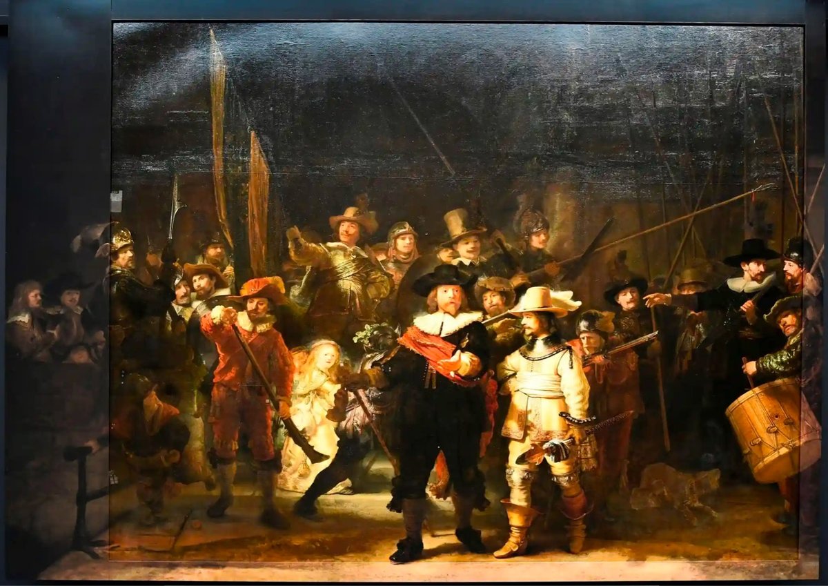
In 1715, a significant chunk of Rembrandt’s masterpiece The Night Watch, including a 2-foot-wide swath from the left side of the painting, was lopped off in order to fit the painting in a smaller space. (WTF?!) Using a contemporary copy of the full scene painted by Gerrit Lundens and an AI program for getting the colors and angles right, the Rijksmuseum has “restored” The Night Watch, augmenting the painting with digital printouts of the missing bits. The uncropped Rembrandt is shown above and here is Lundens’s version:
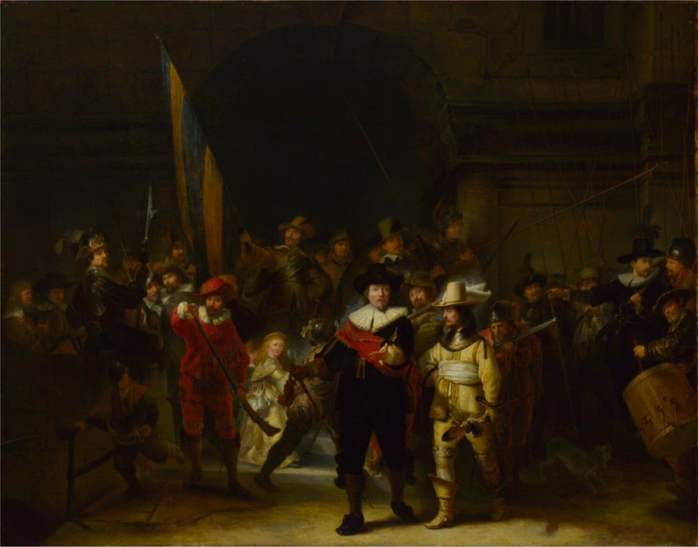
I’m not an expert on art, but the 1715 crop and the shift of the principal characters from right-of-center to the center appears to have radically altered the whole feel of the painting.
With the addition especially on the left and the bottom, an empty space is created in the painting where they march towards. When the painting was cut [the lieutenants] were in the centre, but Rembrandt intended them to be off-centre marching towards that empty space, and that is the genius that Rembrandt understands: you create movement, a dynamic of the troops marching towards the left of the painting.
(via @john_overholt)
In just over two hours, this video presents 1540 paintings by impressionist master Claude Monet, a significant portion of his lifetime output. This is a really intriguing way to look at art. It’s not in-person and you don’t get a lot of time with each piece, but the video is HD, you can pause or slow the playback speed, and by seeing a lot of work over a short span of time, you can get a real sense of the stylistic choices and variations across Monet’s oeuvre — a view of the forest rather than the trees. (via open culture)
Check out these striking portraits by Brazilian artist Luciano Cian from his Magna and Kuhle projects. Find more on his website, Behance, and Instagram. (via colossal)
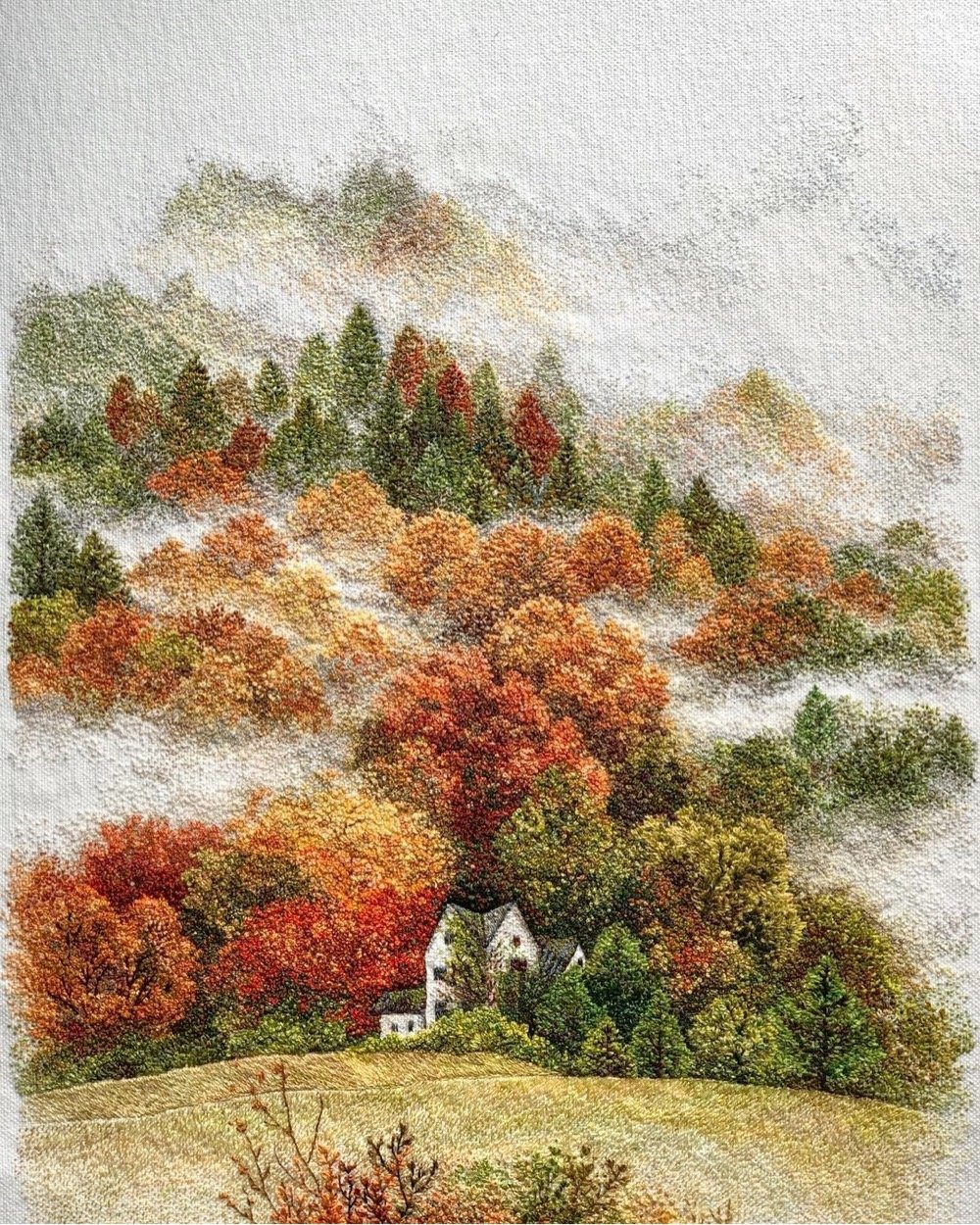
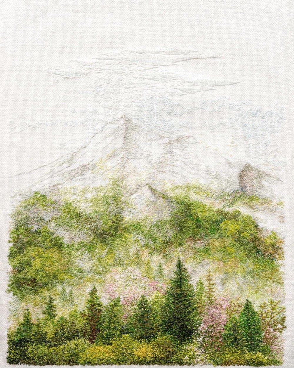
I am enjoying these embroidered forest landscapes by Katrin Vates. The stitching provides a lovely & subtle variable depth to the bushy trees that you don’t get from a drawing or painting.
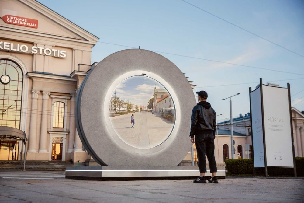
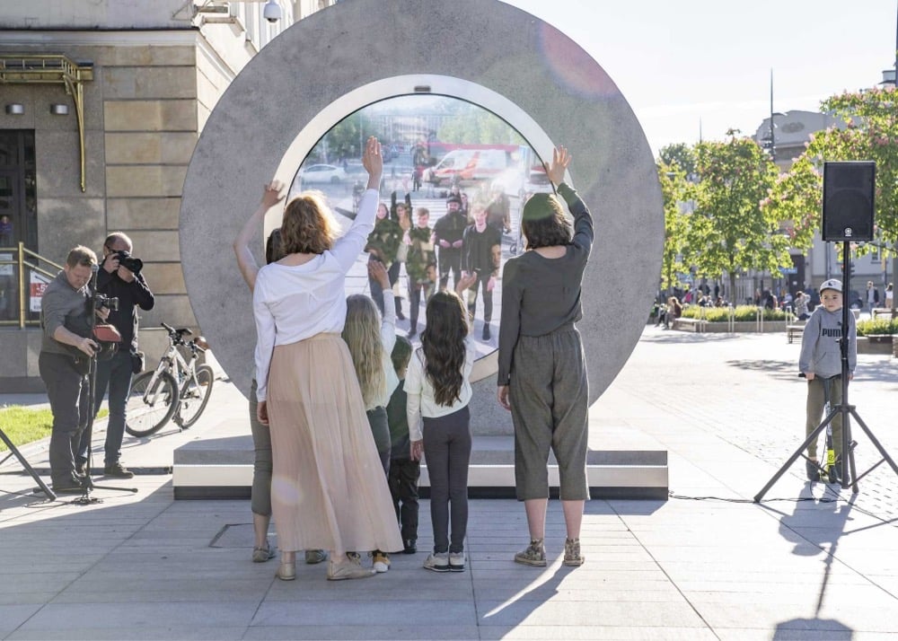
pOrtal is a project that allows for people in two different locations to interact via circular video screens. Right now, the link is between Vilnius, Lithuania and Lublin, Poland but there are plans to add more cities (Reykjavik/Vilnius and Vilnius/London to start). The production is a bit over-the-top (e.g. the video), but the idea of fun, seamless, sci-fi presence between two locations is a good one. (via moss & fog)
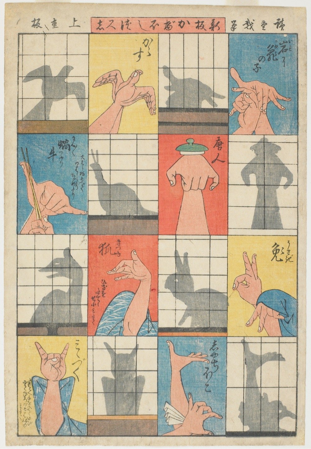
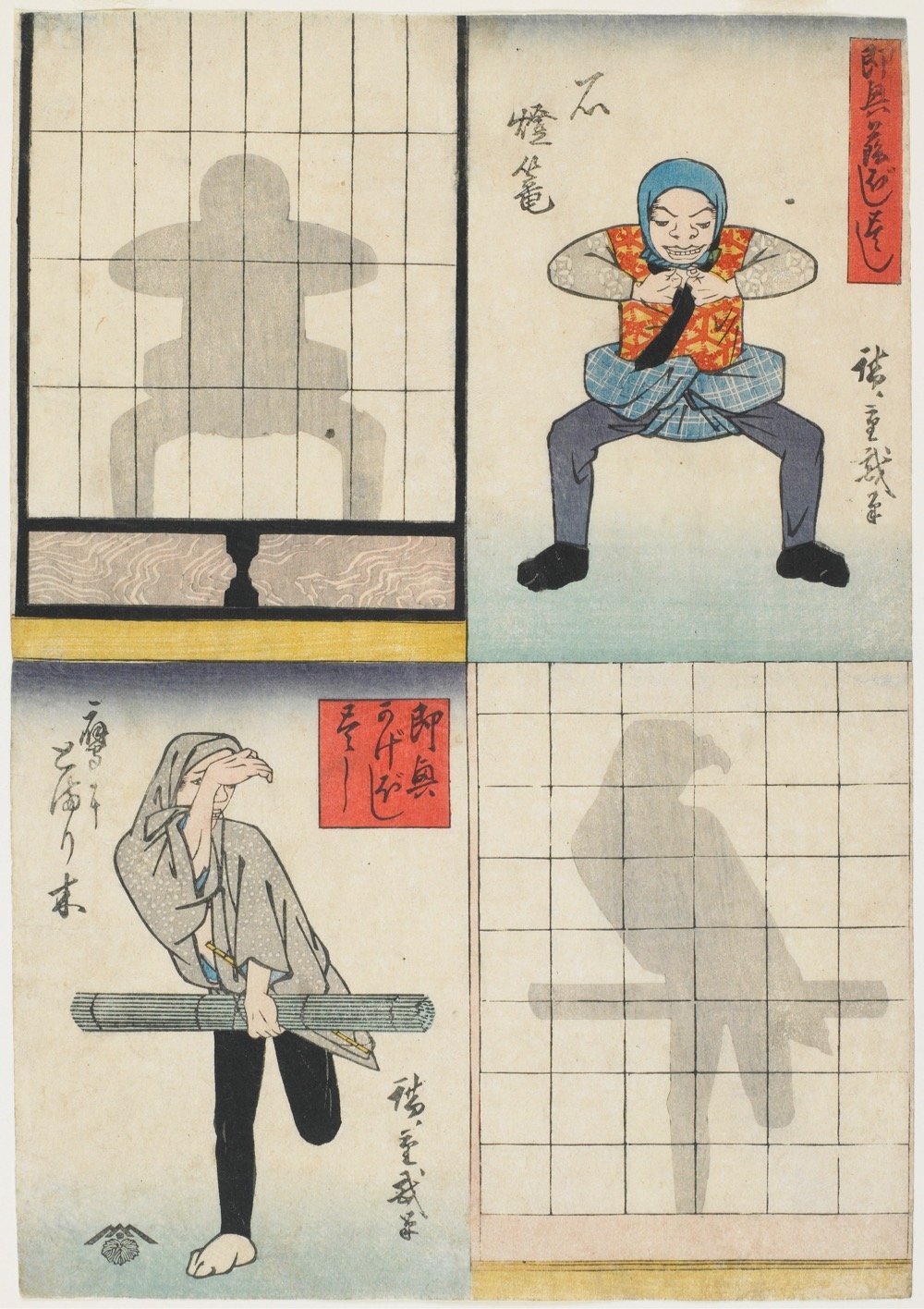
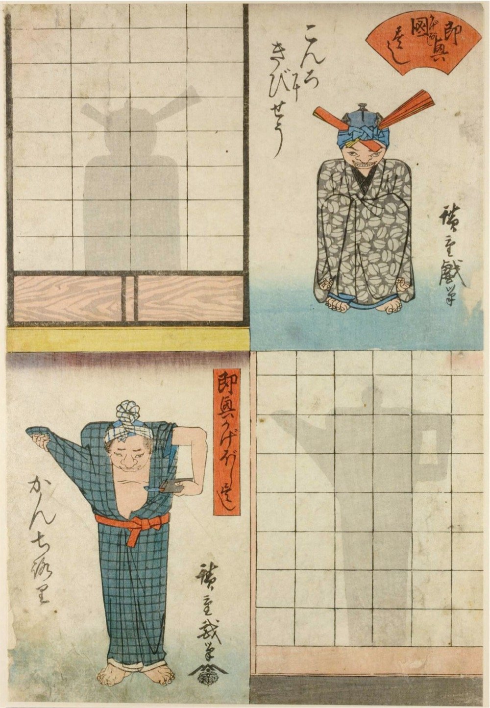
Circa 1842, ukiyo-e artist Utagawa Hiroshige released an 11-print series revealing the secrets of shadow puppetry performances. From the description of one of these woodblock prints held in the collection at The Minneapolis Institute of Art:
As comic entertainment, shadow performances were among the many diversions, including music and dance, offered at teahouse parties during the Edo period. In the eleven-print series Improvised Shadow Performances, Hiroshige depicted figures making shadows on shōji screens by contorting their bodies. The images demonstrate how to create ingenious shadows and could easily have been used as a how-to guide for clever shadow making.
You can find more of Hiroshige’s shadow prints at Ukiyo-e.org. (via colossal)
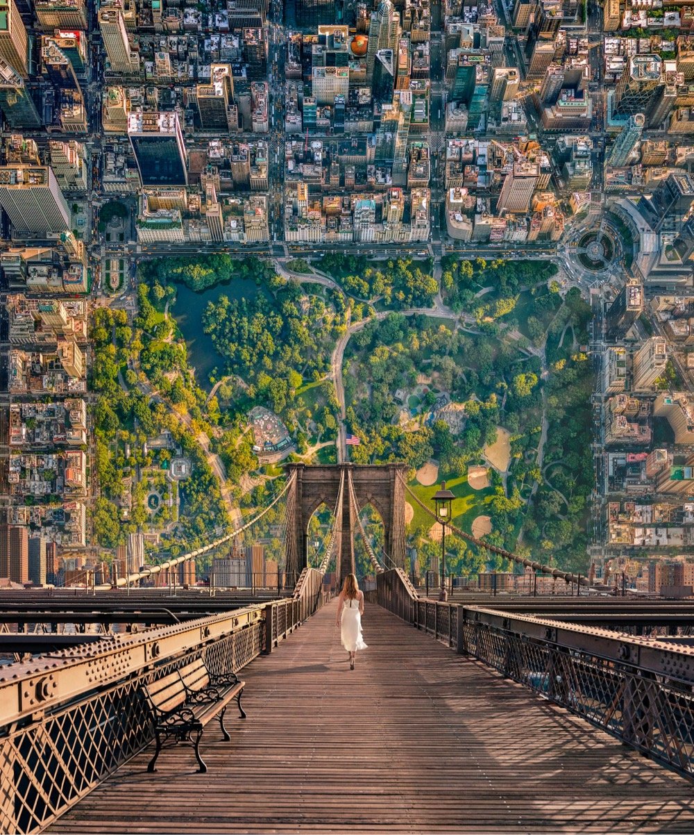

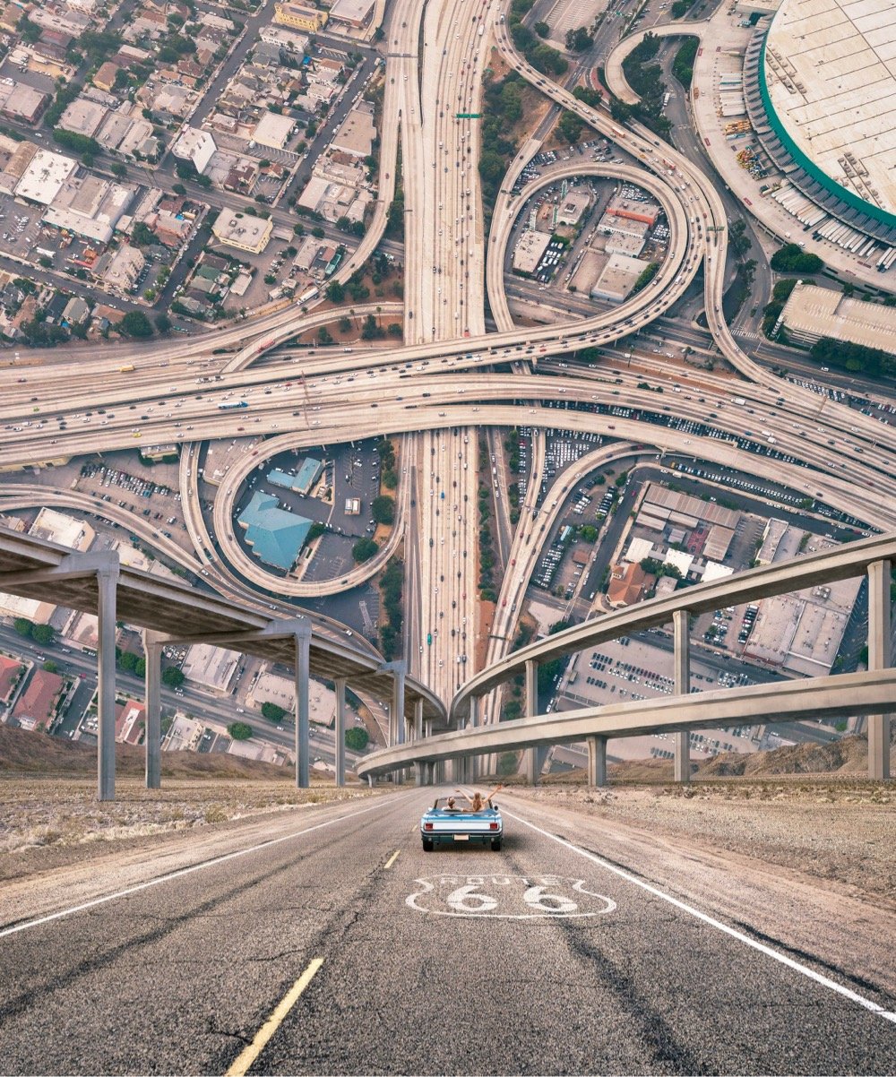
These surrealistic images were created by Cream Electric Art for a United Airlines ad campaign. Here’s a quick behind-the-scenes on how the Route 66 image was constructed. Prior art: Berg’s Here & There map of Manhattan, Inception, and these curved cityscape panoramas. (via moss & fog)
Great Art Explained is a super YouTube series that I am somehow just now learning about that, uh, explains great art. Host James Payne has done about a dozen videos on pieces like Artemisia Gentileschi’s Judith Beheading Holofernes, Warhol’s Marilyn Diptych, and Untitled (Skull) by Jean-Michel Basquiat. His latest is about The Great Wave Off Kanagawa by Katsushika Hokusai.
In 1639 Japan closed its borders and cut itself off from the outside world. Foreigners were expelled, Western culture was forbidden, and Entering or leaving Japan was punishable by Death. It would remain that way for over 200 years.
It was under these circumstances that a quintessentially Japanese art developed. Art for the people that was consumed on an unprecedented scale.
Really interesting stuff. Subscribed.
See also several different versions of The Great Wave print and The Art of Traditional Japanese Printmaking. (via open culture)
This is pretty unusual. Years ago, NY Times film critic AO Scott panned Sarah Silverman: Jesus Is Magic and Silverman, instead of reacting in a typical way, ultimately took his core criticism to heart and changed the way she thought about her comedy. The two of them recently linked up for a conversation about the “challenges both of doing comedy and of writing criticism”, namely that:
You’re supposed to be honest, and you’re supposed to tell the truth and not worry about giving offense. On the other hand, what you do, what I do has a risk of hurting people.
Here’s Silverman:
But the thing you wrote that kind of changed me on a molecular level, which is what, I think, you were kind of onto at the time was completely what I was abusing — and you saw that before anyone else, and you made me see it — which is I’m liberal, so I’m not racist, so I can say the N-word, because I’m illuminating racism.
My intentions were good but ignorant, and it’s funny that in that movie and in the subsequent series I did, my character was ignorant [and] arrogant, but what I didn’t realize was [that I] myself was arrogant [and] ignorant.
I couldn’t help thinking of Pixar’s Ratatouille here, in which the opposite thing happens: the artist changes the critic’s mind.
This is a treat: artist David Hockney wordlessly flipping through one of his sketchbooks from 2019 for 6 minutes. For the first few minutes, I thought that some verbal annotation would be nice, but it’s actually perfect as-is — you can just focus on looking. (via open culture)
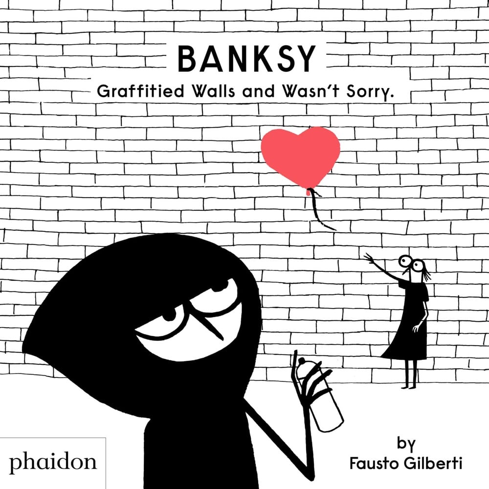
Banksy Graffitied Walls And Wasn’t Sorry is biography of street artist Banksy written for children by Fausto Gilberti. Gilberti has also written kid’s books about other artists: Jackson Pollock Splashed Paint and Wasn’t Sorry, Yayoi Kusama Covered Everything in Dots and Wasn’t Sorry, and Yves Klein Painted Everything Blue and Wasn’t Sorry.
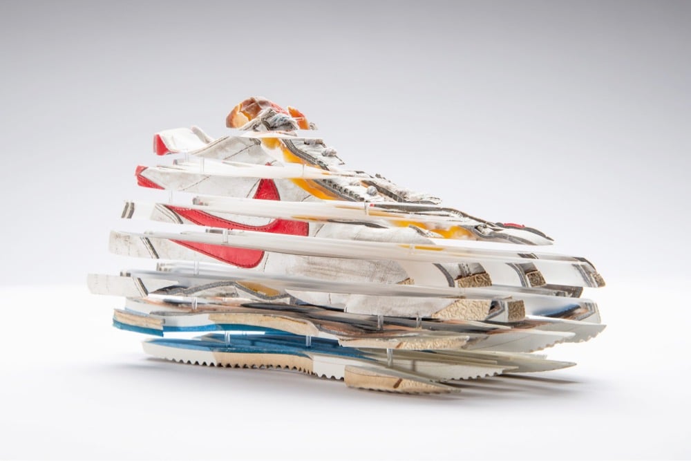
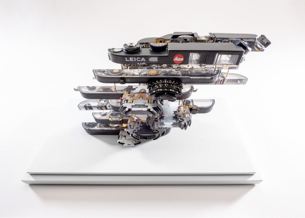
Fabian Oefner takes physical objects apart and puts them back together into exploded/fragmented sculptures.
The sculptures of the Heisenberg Series are based on Werner Heisenberg’s famous Uncertainty Principle. This theory states, that you can not measure two separate parameters of a particle simultaneously. You can either determine one parameter and ignore the other or vice versa, but you can never know everything at once.
Oefner took this idea from the world of physics and created an artistic equivalent of it. The sculptures are made of five different everyday objects: shoes, a clock, a tape recorder and a black box. The artist filled these with resin and carefully sliced them into hundreds of individual parts. He then rearranged the slices into a distorted new version of the object, that lets you see its inner workings.
Through this transformation, the objects have a peculiar effect on their observer: When you look at them from a distance, you can easily identify the object. However, if you start to get closer to observe its inner workings, the shape of the object starts to get distorted and vanishes completely. As an observer you are never able to observe the object as a whole and its inner workings simultaneously. The more accurately we see one view, the less clearly we see the other.
When I first glanced at Oefner’s images, I thought they were uninterestingly digital — 3D-generated images digitally manipulated or some such — but they’re real-world things actually sliced apart. (via colossal)
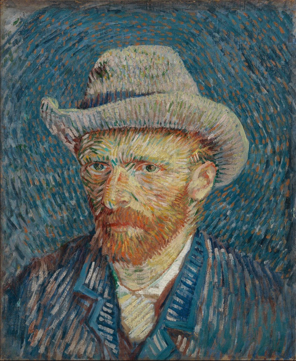
There are certain writers that, when I see their byline, I read their stuff, even if it takes me a few weeks to find the time. Ever since reading his excellent The Island at the Center of the World, Russell Shorto has been one of those writers. His latest piece, The Woman Who Made van Gogh, tells the story of Jo van Gogh-Bonger who, after both her husband Theo and her brother-in-law Vincent died within a year and a half of each other, worked tirelessly for decades to get Vincent’s work out into the world.
The brothers’ dying so young, Vincent at 37 and Theo at 33, and without the artist having achieved renown — Theo had managed to sell only a few of his paintings — would seem to have ensured that Vincent van Gogh’s work would subsist eternally in a netherworld of obscurity. Instead, his name, art and story merged to form the basis of an industry that stormed the globe, arguably surpassing the fame of any other artist in history. That happened in large part thanks to Jo van Gogh-Bonger. She was small in stature and riddled with self-doubt, had no background in art or business and faced an art world that was a thoroughly male preserve. Her full story has only recently been uncovered. It is only now that we know how van Gogh became van Gogh.
Because of her work, Vincent van Gogh is a household name all over the world and even the way people think about artists and their art forever changed.
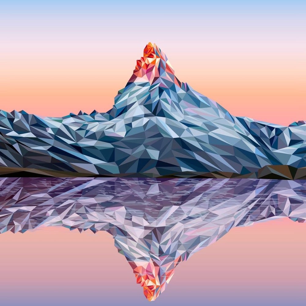
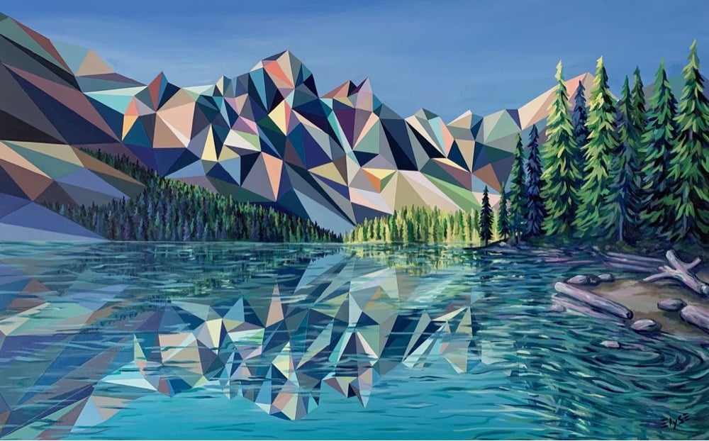
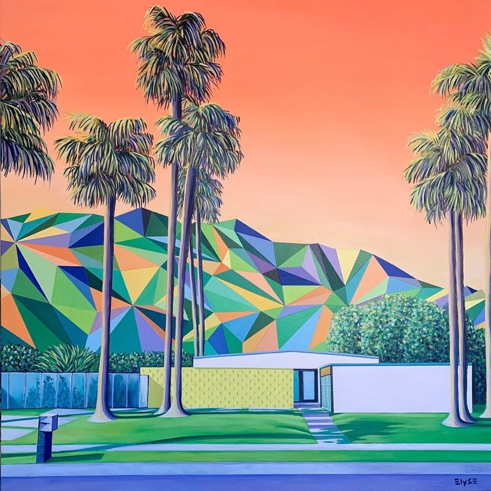
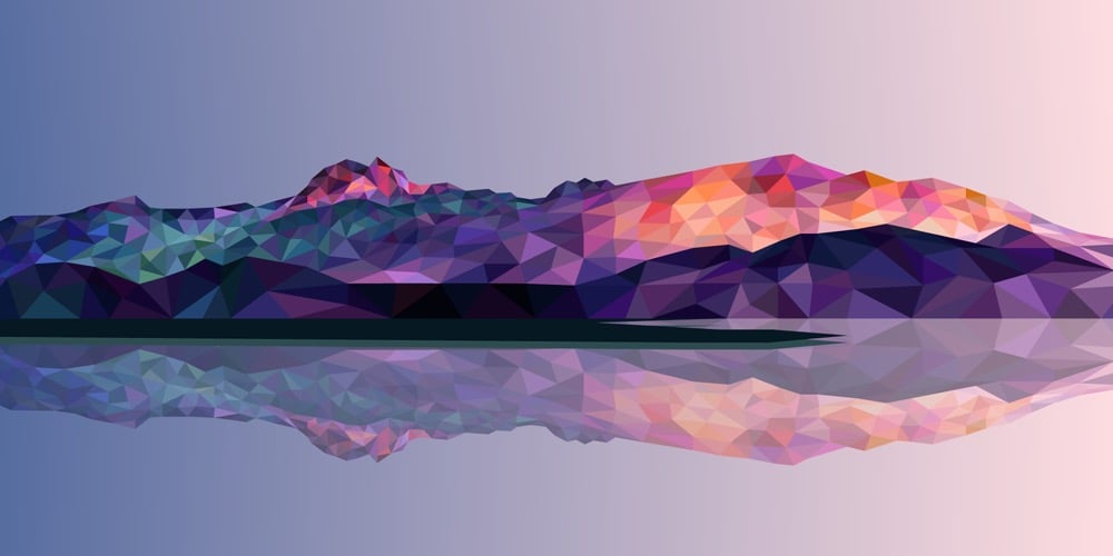
Lovely work here by Elyse Dodge — these look like half-finished renderings by the machine that’s simulating our universe. You can keep up with her work on Instagram or get some for yourself in her shop. (via moss & fog)
After months of lockdown and closure due to the pandemic, Desus Nice & The Kid Mero go to the Met Museum in NYC to take in some art. Would 100% take a tour of any art museum with these two astute cultural commentators.
Always a pleasure to see new work from Reuben Wu, whose stuff I’ve featured here before. For this piece, Wu journeys into the audiovisual realm, combining his light-forward photography with his music production work (he’s a member of the band Ladytron). Colossal, as usual, has the skinny:
For EX STASIS, Wu programmed a stick of 200 LED lights to shift in color and shape above the calm landscapes. He captured the mesmerizing movements in-camera, and through a combination of stills, timelapse, and real-time footage, produced four audiovisual works that juxtapose the natural scenery with the artificially produced light and electronic sounds. “As it gets dark, my surroundings cease to be an exterior experience and become a subliminal space, and that’s when I feel most connected and aware of my sense of being,” Wu says. “This dynamic terrestrial chiaroscuro synchronizes with my sound design and music to form singular looping pieces.”
“Dynamic terrestrial chiaroscuro”!!! Also, this photo from Wu’s Insta is just fricking beautiful. (via colossal)
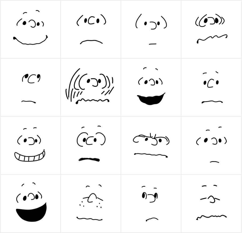
In this video, artist TM Davy demonstrates how to draw a self-portrait in 11 levels of increasing complexity. As he notes early on, this isn’t so much about the mechanics of art as the levels of thinking that go into creating a portrait. Davy defines complexity as “the layers of thinking that help us to build observational truths that are necessary for a picture that somehow feels right”.
In his journey towards complexity in portraiture, he starts with the “solar head” (basically a smiley face) and moves to individually identifying features, depicting simple volume & proportion, and the more complex geometry of the human face. From there, observation becomes increasingly important — he uses variations on “looking” or “observing” many times in his explanation — as he covers contours, light & shadow, chiaroscuro, and color.
See also Tony Hawk on the 21 Levels of Complexity of Skateboard Tricks and A Demonstration of 16 Levels of Piano Playing Complexity.
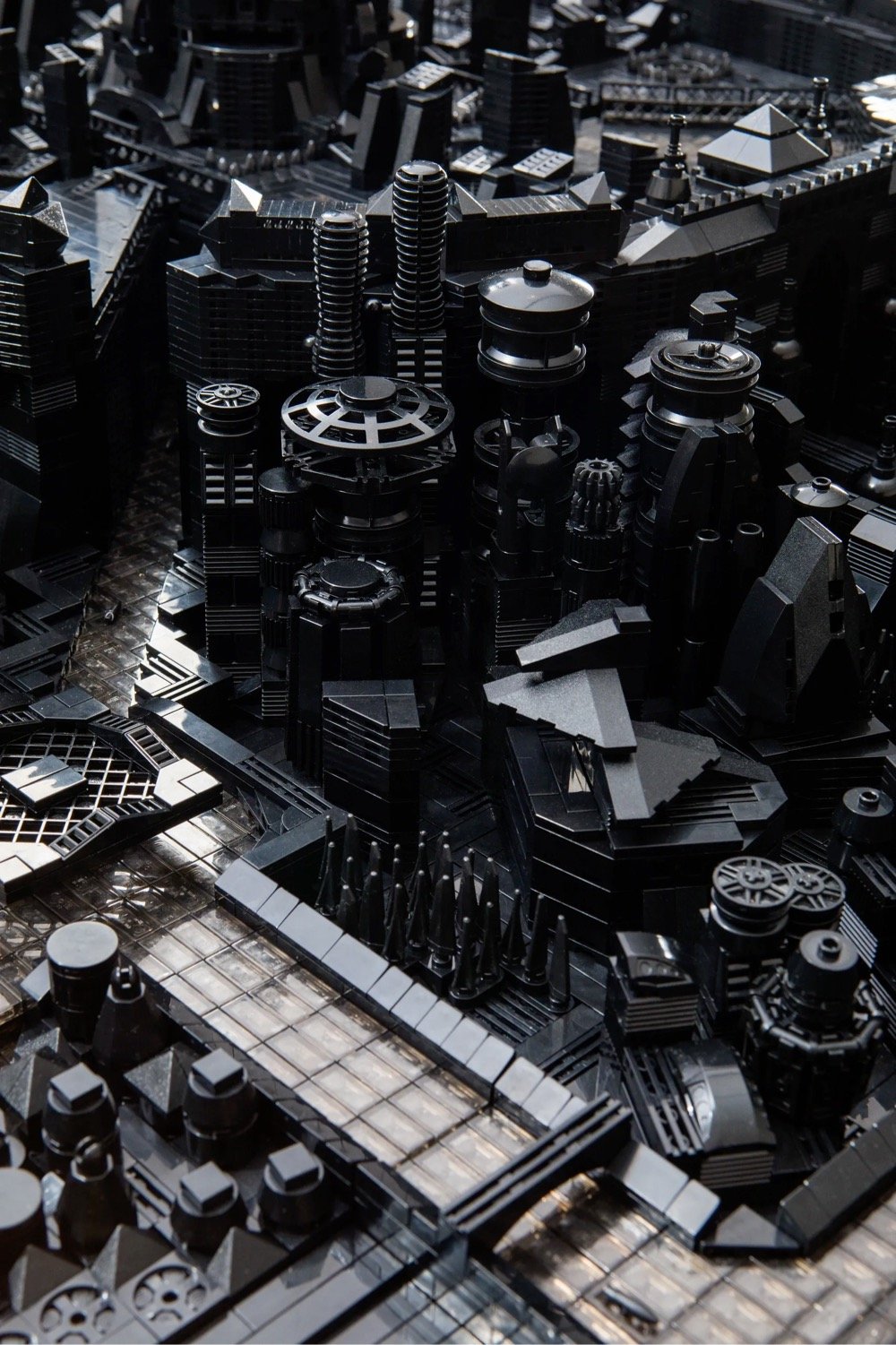
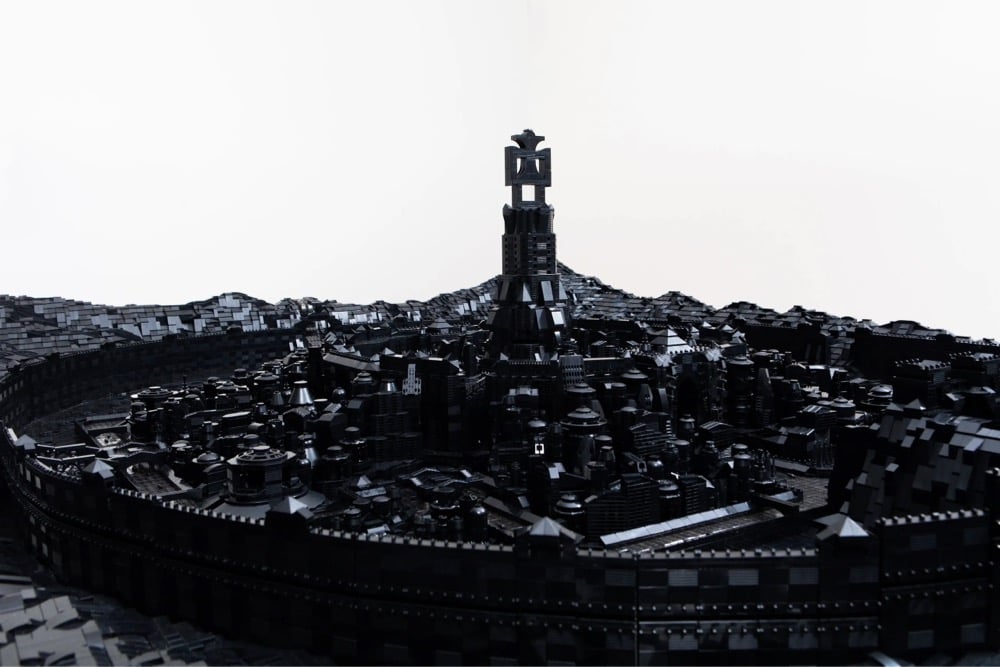
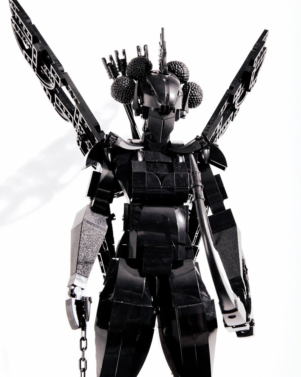
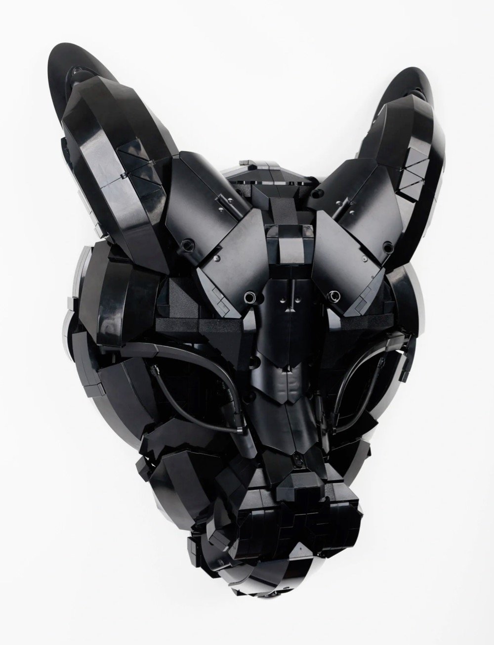
For his series called Building Black, Ekow Nimako uses only black Lego pieces to build fantastical and futuristic sculptures based on West African masks, folklore, and medieval kingdoms. From Colossal:
Running through each of these artworks is a fluid understanding of time and space that blurs the distinction between generations, locations, and histories in order to imagine a new reality. “We are all living proof of our ancestors, all their joy, love, knowledge, and pain. They live in our DNA,” the Ghanaian-Canadian artist says. “Aesthetically, I enjoy taking elements from bygone eras and creating futuristic landscapes, particularly of African utopias to imagine a liberated existence for us all.”
That blurred temporality that foregrounds his sculptures and installations parallels his own trajectory, as well. “My art practice developed when I was four years old, as I constantly told myself I want to do this (play with LEGO) forever, and sometimes it feels as though my future self communicated with my past self, astrally perhaps, to ensure this very specific destiny manifested,” he says, noting that the plastic blocks have remained a fixture in both his personal and professional life since becoming a father.
Vice did a short video feature on Nimako and his work:
(via colossal)
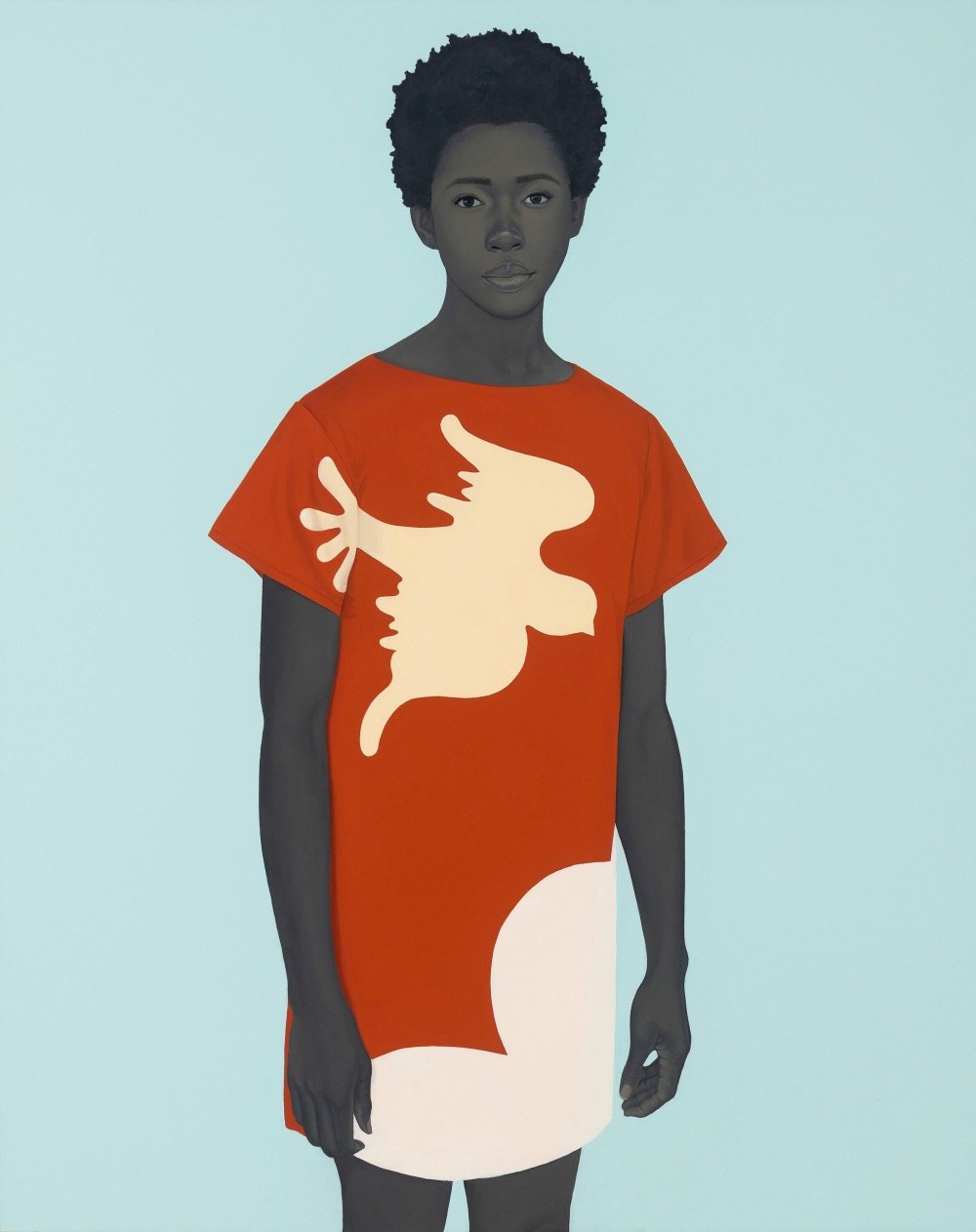
Painter Amy Sherald is displaying new work at the Hauser & Wirth gallery in LA through June 6: The Great American Fact. One thing I really notice in her art now, after watching the excellent documentary Black Art: In the Absence of Light, is how at least one person in her paintings is looking directly at the viewer. Here’s Sherald talking about that in the documentary:
The eyes tell you what’s in the soul and, for me, the people that I paint, they’re no longer themselves in the painting. They are these archetypes that know they are present. These aren’t passive portraits — they’re maybe subversively confrontational, if you will — but it’s definitely a response to a lot of images I saw growing up where our gaze was always averted. Or thinking about the fact that you couldn’t look at a white person in the eye. So, this is my way of nodding my head at that narrative and empowering the image in a way. I like the paintings hung a little lower for that reason so when the viewer walks up, it’s a different conversation. You’re not looking up at it — it’s almost looking directly at you and I think that creates a different kind of sensation.
She also says of her subjects: “It’s important for me that they’re just Black people being Black” and I think that really comes through in this new work. (via colossal)
There are many steps in making traditional Japanese woodblock prints (ukiyo-e), but this short video focuses on the printing process as demonstrated by master printmaker Keiji Shinohara. This is a delight to watch — Shinohara’s deliberate precision is impressive and inspiring.
My absolute favorite part of this video is at the 3:40 mark when he precisely and firmly grasps the pressing tool (called a baren), swipes it on his face three times, and then uses it to press the paper into the inked block. This pre-press face maneuver is repeated several times but otherwise goes unremarked upon in the video — one of the commenters offers this explanation: “The oils from his face help grip the paper, making a firm and even press.” (via open culture)
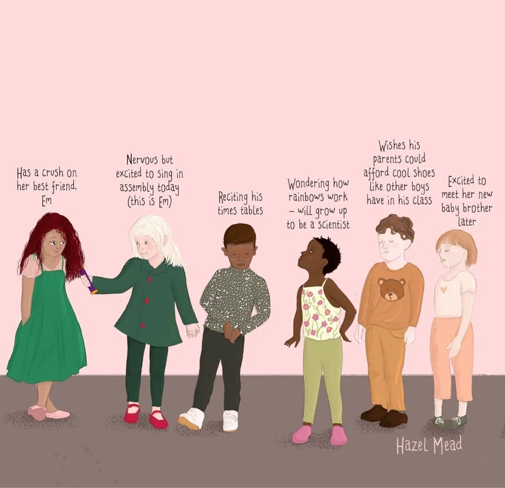
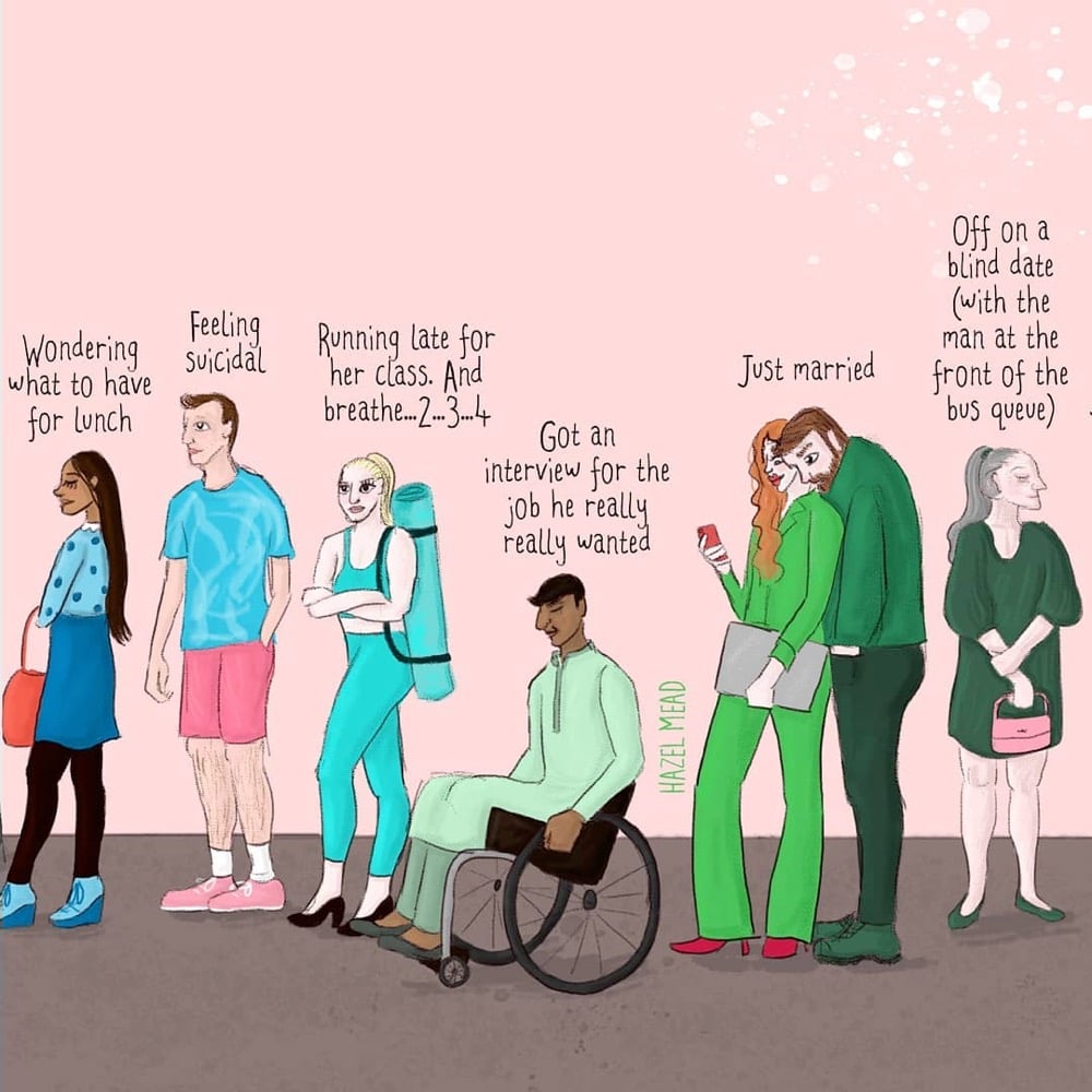
Illustrator Hazel Mead created a pair of pieces called You Don’t Know What’s Going On In People’s Lives: the original version and one featuring children. The images above are snippets from the larger images, both of which are available as prints in Mead’s shop. (via cup of jo)
Update: Several people sent me a link to this video from Cleveland Clinic that is very similar to Mead’s illustrations.
Stay Connected