kottke.org posts about infoviz
Using the Flesch-Kincaid readability test, Vocativ analyzed more than 600 speeches from all the American Presidents for ease of comprehension. What they found was a trend toward simpler language as speeches needed to appeal to a wider range of people, not just super-educated white men.
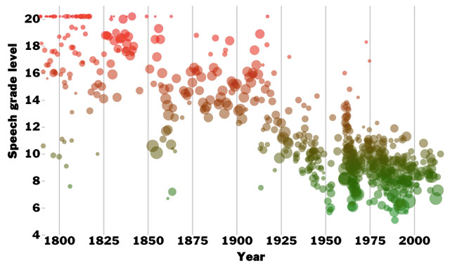
I think President Obama, no more or less than President Bush, tries to pack a lot of nuance and subtext into language that is as plain and straightforward as possible. While President Bush was often inarticulate off the cuff, Bush’s speeches were underestimated. There was a crisp formality to a lot of his best speeches, particularly the ones he delivered shortly after Sept. 11.
Definitely click through for their analysis of the data.
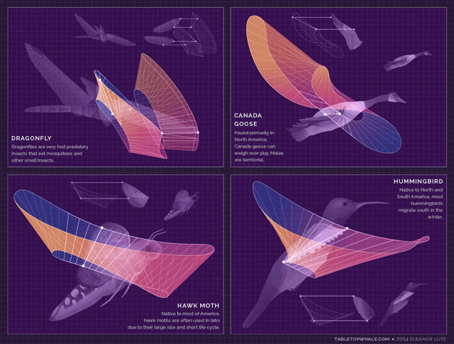
Eleanor Lutz has a degree in molecular biology, works as a designer, and loves to combine the two interests by making these wonderful information graphics on her site, Tabletop Whale. Her most recent post is an animated graphic showing how several animals (birds, bats, insects) move their wings while flying.
I love love love Lutz’s animated chart of North American butterflies. So playful!
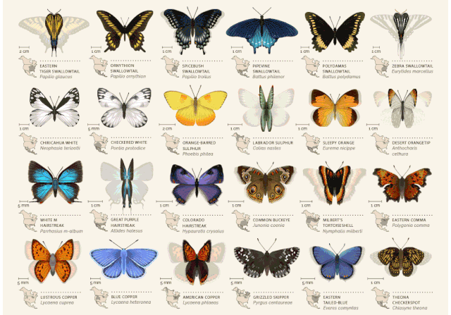
There are only four posts on the site so far, but she’s done other stuff as well; this woodcut map for instance. Prints are available…I’m getting one of the butterflies for sure.

David McCandless has been highlighting good information design for years on Information Is Beautiful. The site spawned a book of the same name in 2009. Now McCandless is back with a new book, Knowledge Is Beautiful.
Every day, every hour, every minute we are bombarded with information, from television, from newspapers, from the Internet, we’re steeped in it. We need a way to relate to it. Enter David McCandless and his stunning infographics, simple, elegant ways to interact with information too complex or abstract to grasp any way but visually. McCandless creates visually stunning displays that blend the facts with their connections, contexts, and relationships, making information meaningful, entertaining, and beautiful. And his genius is as much in finding fresh ways to provocatively combine datasets as it is in finding new ways to show the results.
Here’s some more information about the book.
This clever and well-done visualization shows where individual NYC taxis picked up and dropped off their fares over the course of a day.
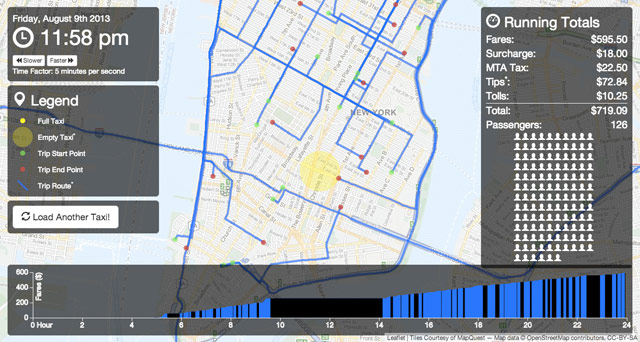
Mesmerizing. Has anyone done analysis on which drivers are the most effective and what the data shows as the most effective techniques? The best drivers must have their tricks on where to be at which times to get the most fares. (via @dens)

In an adaptation of a talk he gave at the recent Eyeo Festival, Mike Bostock talks about visualizing algorithms.
Algorithms are a fascinating use case for visualization. To visualize an algorithm, we don’t merely fit data to a chart; there is no primary dataset. Instead there are logical rules that describe behavior. This may be why algorithm visualizations are so unusual, as designers experiment with novel forms to better communicate. This is reason enough to study them.
But algorithms are also a reminder that visualization is more than a tool for finding patterns in data. Visualization leverages the human visual system to augment human intellect: we can use it to better understand these important abstract processes, and perhaps other things, too.
If nothing else, skim through the text and play the visualizations. The one of the maze turning into a tree visualization baked my noodle a little bit.
The center of the population of the United States has been moving steadily west and south since 1790. This video shows the progression until 2010:
You can step through the animation yourself on the US Census Bureau site. It’s interesting to see how even the changes are…there was one big jump from 1850 to 1860 and a slow down in westward migration from 1890 to 1940, but other than that, it shifted west about 40-50 miles each decade.
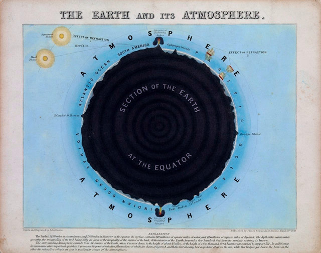
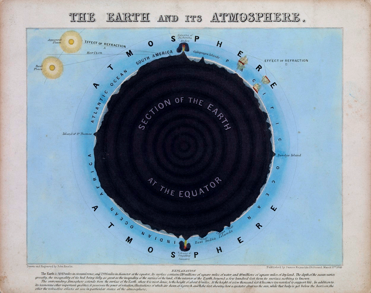
These maps, diagrams, and charts by John Philipps Emslie done in the mid-to-late 1800s are gorgeous.
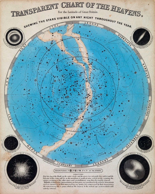
Intrigued, I went searching for more examples. I loved this one just for pure compositional beauty:
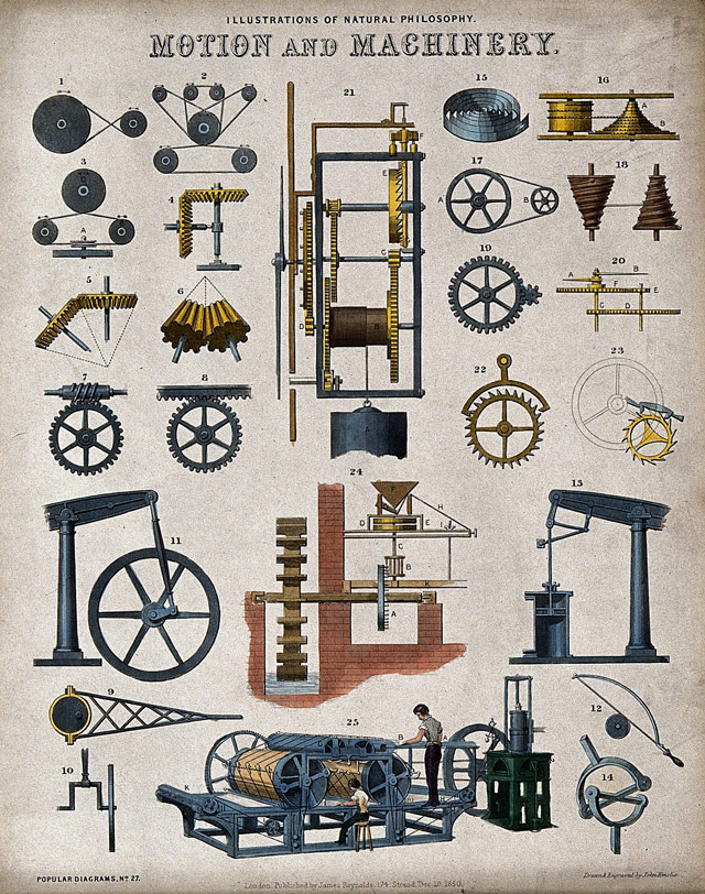
And this lithograph from 1850 showing various machines of the time:
(thx, greg)
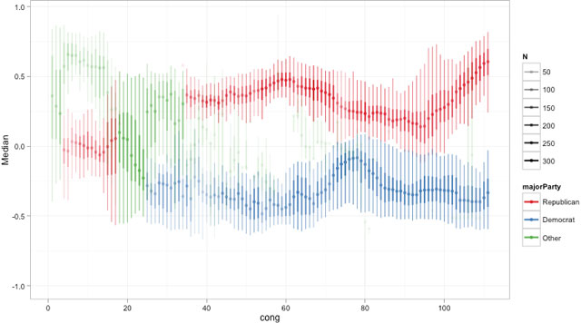
The Pew Research Center has data and visualizations showing how much more polarized Americans have become about their politics over the past 20 years.
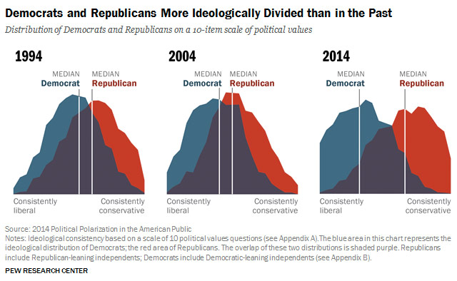
In 1994, the overlap was much greater than it is today. Twenty years ago, the median Democrat was to the left of 64% of Republicans, while the median Republican was to the right of 70% of Democrats. Put differently, in 1994 23% of Republicans were more liberal than the median Democrat; while 17% of Democrats were more conservative than the median Republican. Today, those numbers are just 4% and 5%, respectively.
Even more pronounced is the shift by the Republican members of Congress toward the right.
(via @mulegirl)
Tyler Vigen is collecting examples of data that correlate closely but are (probably) otherwise unrelated.
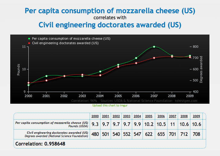
Remember kids, correlation != causation.
Programming sorting techniques visualized through Eastern European folk dancing. For instance, here’s the bubble sort with Hungarian dancing:
See also sorting algorithms visualized. (via @viljavarasto)
Data visualization of Citi Bike trips taken over a 48-hour period in NYC:
Love seeing the swarms starting around 8am and 5:30pm but hate experiencing them. I’ve been using Citi Bike almost since the launch last year and I can’t imagine NYC without it now. I use it several times daily, way more than the subway even. I hope they can find a way to make it a viable business.
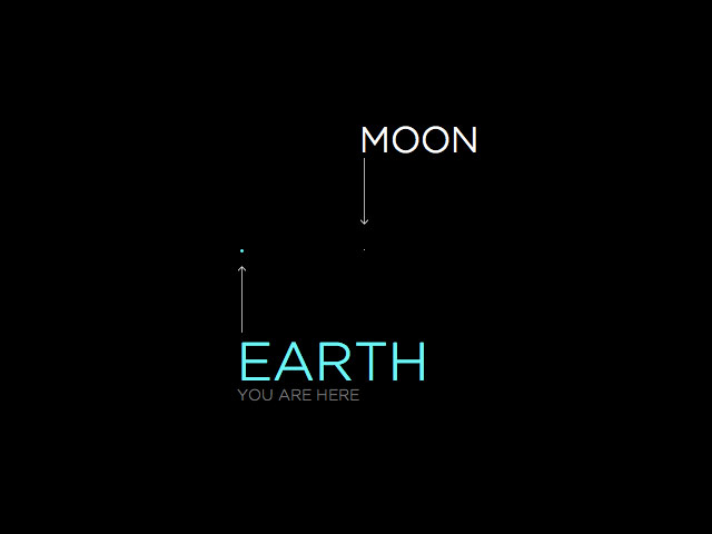
Nice visualization of the solar system; the Moon is one pixel across and everything else is scaled to that, including the distances between planets. Get ready to scroll. A lot.
It would be neat to do this with a plutonium atom or something. Related: typographically speaking, what’s the point size of the Moon?
NASA announced the discovery of 719 new planets today. That brings the tally of known planets in our universe to almost 1800. 20 years ago, that number was not more than 15 (including the nine planets orbiting the Sun). Here’s a rough timeline of the dramatically increasing pace of planetary discovery:
4.54 billion BCE-1700: 6
1700-1799: 1
1800-1899: 1
1900-1950: 1
1951-1990: 1
1991-2000: 49
2001-2005: 131
2006-2010: 355
2006: -1 [for Pluto :( ]
2011-2014: 1243
Last year, Jonathan Corum made an infographic of the sizes and orbits of the 190 confirmed planets discovered at that point by the Kepler mission. I hope the Times updates it with this recent batch.
In a presentation for the Visualized conference, Jonathan Corum says that he looks for the “weight of rain” when working on data graphics.
So when I’m looking at data, or working on an explanatory graphic, these are the moments I’m looking for. Little “Aha!” moments that I can point to, and say “Look here, something happened,” and then try to explain. Often those small moments can help lead a reader into the graphic, or help to explain the whole.
The actual non-metaphorical weight of rain is surprisingly heavy; an inch of rain on an acre of land weighs 113.31 tons.
I love this sort of thing: visualizations of Olympic venues plopped into Manhattan to provide a sense of scale. My favorite is the bobsled run in Times Square:
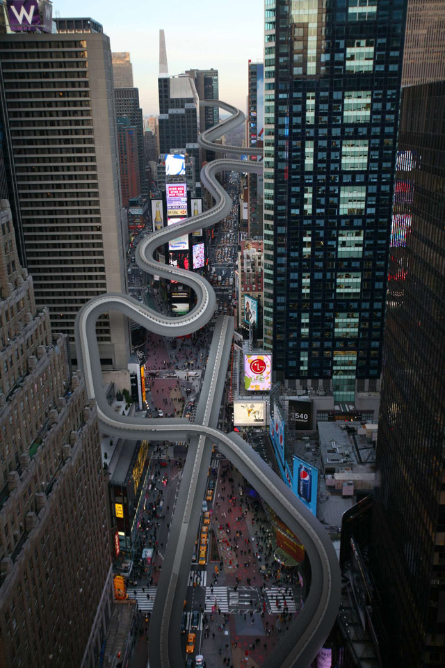
My son and I were just talking about this and when he asked me, I had no idea how big the track actually was. Can’t wait to show him this when I get home tonight.
In other news, the news media has arrived in Sochi and the town doesn’t seem to be ready for the Games. Oopsie!
From Rap Genius, a chart showing mentions in rap songs of popular social sites and apps like Twitter and Instagram:
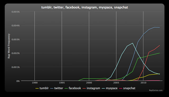
Compare with the graph for the same terms from Google News:
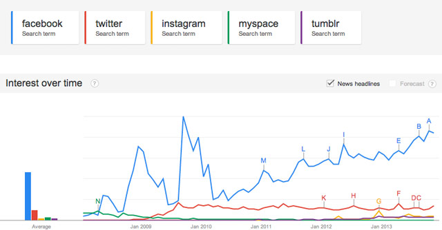
And here’s the graph for general search terms. (I excluded Snapchat from the Google graphs because Google wouldn’t allow 6 search terms at a time…it barely showed up in either case.) Twitter rules the rap roost, but Facebook demolishes everyone in general and news search traffic.
A chart of where many varieties of bourbon come from, along with five things you can learn from the chart.
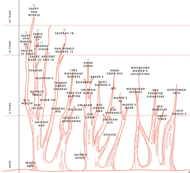
Pappy Van Winkle is frequently described by both educated and uneducated drinkers as the best bourbon on the market. It is certainly aged for longer than most premium bourbons, and has earned a near hysterical following of people scrambling to get one of the very few bottles that are released each year. Of the long-aged bourbons, it seems to be aged very gently year-to-year, and this recommends it enormously. But if you, like most people, can’t find Pappy, try W. L. Weller. There’s a 12 year old variety that retails for $23 around the corner. Pappy 15-year sells for $699-$1000 even though it’s the exact same liquid as the Pappy (same mash bill, same spirit, same barrels); the only difference is it’s aged 3 years less.
The chart is taken from the Kings County Distillery Guide to Urban Moonshining.
Written by the founders of Kings County Distillery, New York City’s first distillery since Prohibition, this spirited illustrated book explores America’s age-old love affair with whiskey. It begins with chapters on whiskey’s history and culture from 1640 to today, when the DIY trend and the classic cocktail craze have conspired to make it the next big thing. For those thirsty for practical information, the book next provides a detailed, easy-to-follow guide to safe home distilling, complete with a list of supplies, step-by-step instructions, and helpful pictures, anecdotes, and tips.
(via df)
This video visualization of 15 different sorting algorithms is mesmerizing. (Don’t forget the sound.)
An explanation of the process. You can play with several different kinds of sorts here.
Sadly, most infographics these days look like this, functioning as a cheap and easy way to gussy up numbers. But when done properly, infographics are very effective in communicating a lot of information in a short period of time and can help you see data in new ways. In The Best American Infographics 2013, Gareth Cook collects some of the best ones from over the past year. Wired has a look at some of the selections.
The Rolling Stones have been touring for almost 50 years, starting with a British tour in 1963, and this tool allows you to visualize their travels. It’s really cool. The craziest part to me is how dramatically the length of their tours has increased since they started out. Their first tour in 1963 (actually one of their longer tours early in their career) was about 28 shows over the course of a month. Their last tour in 2005 had about a gabillion shows over two years and grossed $528 million.
On a personal note, I read “The Rolling Stones” several times on this page and still spent parts of two days looking at it and thinking it was The Beatles tour visualization. Twice. I read “The Rolling Stones,” thought it was The Beatles, corrected myself, and then thought it was The Beatles again. (via @pbump)
Uroscopy is the now obsolete practice of using the smell, taste, and color of urine to diagnose illness. There were even charts to help doctors and other healers identify different types of urine.
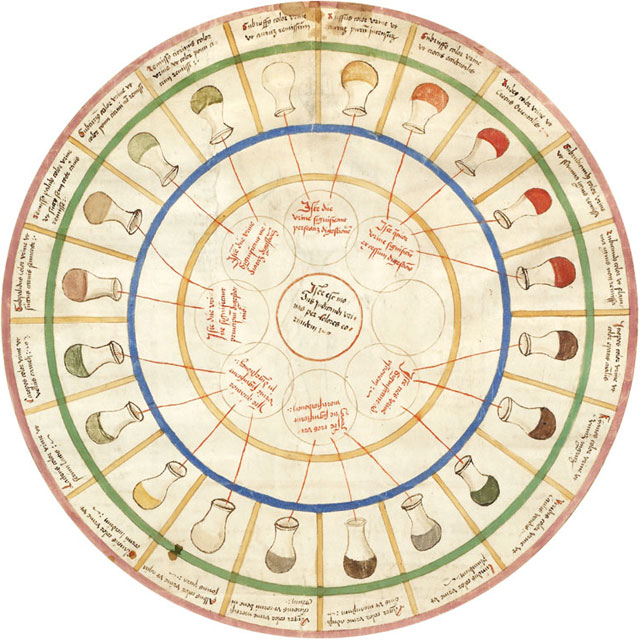
Many diseases affect metabolism and many changes in metabolism can be detected in the urine. For example, diabetics will excrete sugar in their urine — sometimes enough sugar that it can be fermented into whisky. There are many other diseases that change the smell of a person’s urine, including the very descriptively named Maple Syrup Urine Disease or Sweaty Feet Syndrome, now much more likely to be diagnosed by electronic sensor arrays than actually tasting the urine.
(via edible geography)
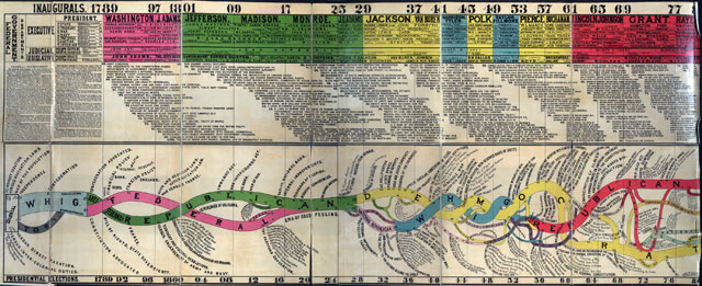
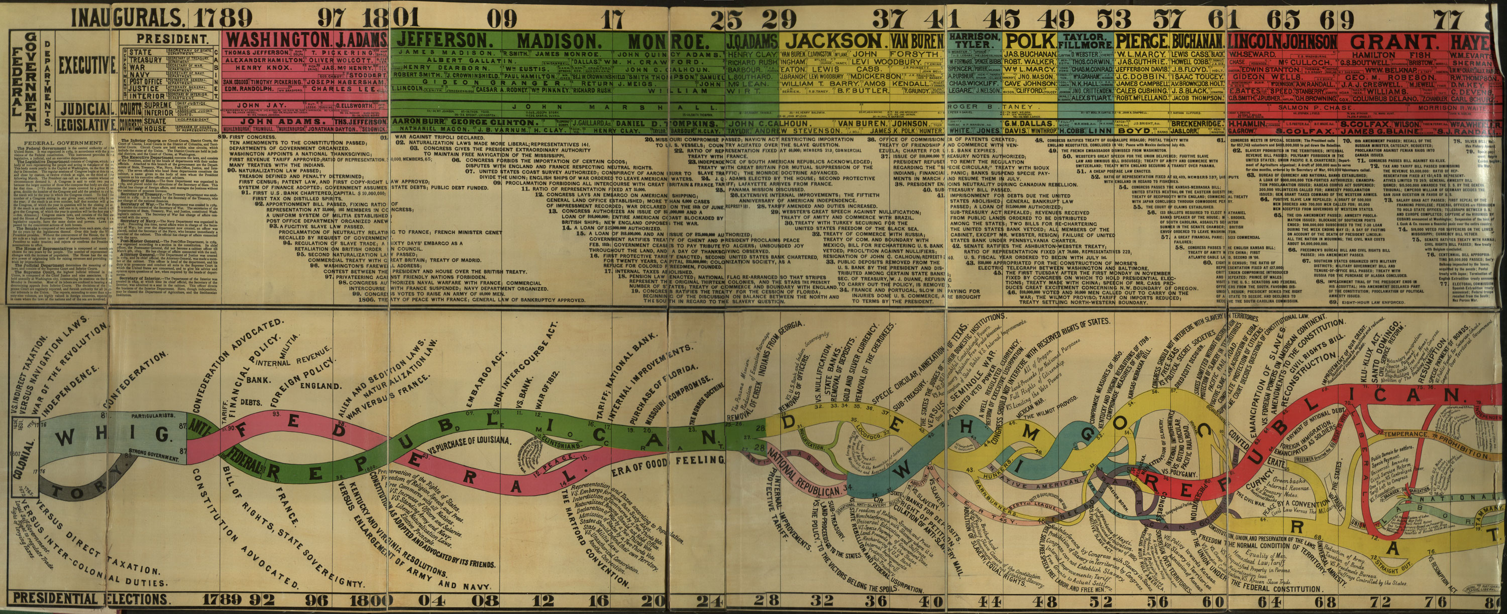
It was not my intent to be so politically oriented this morning but here we are. This is a chart that tracks the ideologies of the Democratic and Republican members of Congress from 1789 to 2010. As you can see, the shift away from the center by the Republicans since 1975 is unprecedented, perhaps matched only by the shift toward the center by the Democrats beginning in 1921 and ending in 1945.
This reminds me of a timeline created circa 1880 for a book called Conspectus of the History of Political Parties and the Federal Government:
Bigger version here. (via @joecarryon)
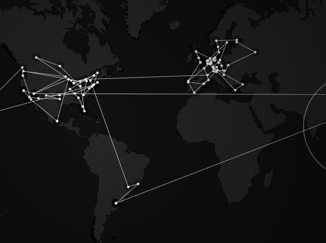
This is a long zoom look at how pizza gets delivered to hungry people. It starts by looking at the routes taken by a Dominos delivery person during a typical night and slowly zooms out to reveal the pizza giant’s national supply chain.
Embark with Kwon on a trip that begins with a pizza delivery route in New York City, then goes across the country to California’s Central Valley, where nearly 50 percent of America’s fruits, nuts and vegetables are grown, and into the heartland for an aerial look at our farmlands.
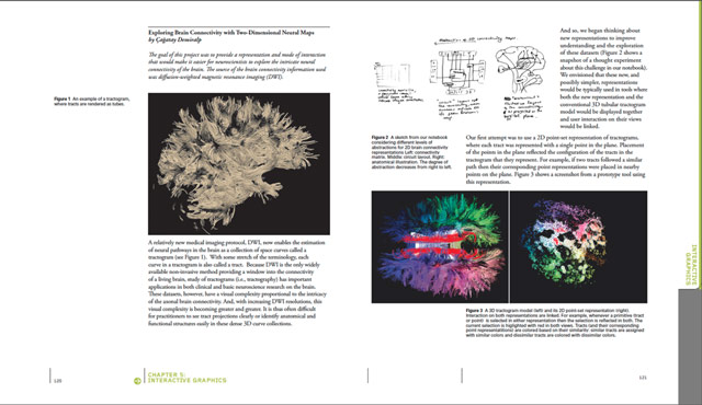
This looks like an interesting new book from Taschen, Information Graphics (buy at Amazon).
Our everyday lives are filled with a massive flow of information that we must interpret in order to understand the world we live in. Considering this complex variety of data floating around us, sometimes the best — or even only — way to communicate is visually. This unique book presents a fascinating historical perspective on the subject, highlighting the work of the masters of the profession who have created a number of breakthroughs that have changed the way we communicate. Information Graphics has been conceived and designed not just for designers or graphics professionals, but for anyone interested in the history and practice of communicating visually.
The in-depth introductory section, illustrated with over 60 images (each accompanied by an explanatory caption), features essays by Sandra Rendgen, Paolo Ciuccarelli, Richard Saul Wurman, and Simon Rogers; looking back all the way to primitive cave paintings as a means of communication, this introductory section gives readers an excellent overview of the subject. The second part of the book is entirely dedicated to contemporary works by the current most renowned professionals, presenting 200 graphics projects, with over 400 examples — each with a fact sheet and an explanation of methods and objectives — divided into chapters by the subjects Location, Time, Category, and Hierarchy.
This looks like a potentially interesting book from Felice Frankel: Visual Strategies (at Amazon).
Any scientist or engineer who communicates research results will immediately recognize this practical handbook as an indispensable tool. The guide sets out clear strategies and offers abundant examples to assist researchers-even those with no previous design training-with creating effective visual graphics for use in multiple contexts, including journal submissions, grant proposals, conference posters, or presentations.
Visual communicator Felice Frankel and systems biologist Angela DePace, along with experts in various fields, demonstrate how small changes can vastly improve the success of a graphic image. They dissect individual graphics, show why some work while others don’t, and suggest specific improvements. The book includes analyses of graphics that have appeared in such journals as Science, Nature, Annual Reviews, Cell, PNAS, and the New England Journal of Medicine, as well as an insightful personal conversation with designer Stefan Sagmeister and narratives by prominent researchers and animators.
chartsandthings is a behind-the-scenes look at how the infographic sausage is made at the NY Times.
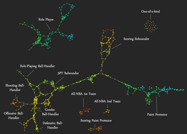
Muthu Alagappan used topological data analysis to group NBA players into thirteen different player types, including Role-Playing Ball-Handler, Paint Protector, All-NBA 1st Team, and One-of-a-Kind.
Newer posts
Older posts
Socials & More