The Best American Infographics 2013
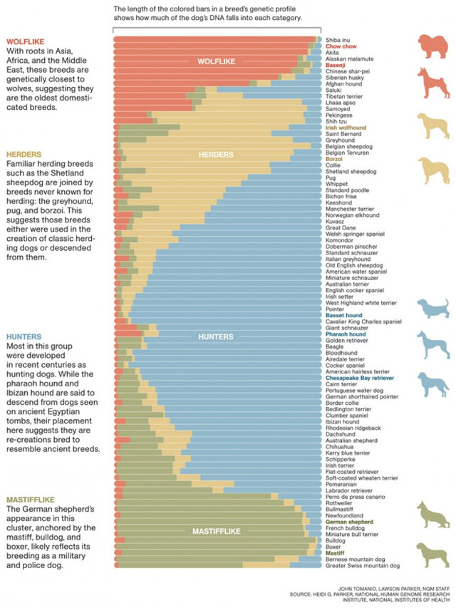
Sadly, most infographics these days look like this, functioning as a cheap and easy way to gussy up numbers. But when done properly, infographics are very effective in communicating a lot of information in a short period of time and can help you see data in new ways. In The Best American Infographics 2013, Gareth Cook collects some of the best ones from over the past year. Wired has a look at some of the selections.





Socials & More