kottke.org posts about design
Item of note included in the announcement of Luke Hayman’s addition to the NYC Pentagram office: he and Paula Scher are completely redesigning Time magazine, due to launch in January 2007. Hayman was formerly design director at New York magazine.
An oldie but a goodie: Bruce Mau’s Incomplete Manifesto for Growth. “Ask stupid questions. Growth is fueled by desire and innocence. Assess the answer, not the question. Imagine learning throughout your life at the rate of an infant.”
Update: Also old but good: Dean Allen’s Annotated Manifesto for Growth. (thx, oscar)
Portfolio site of graphic designer Si Scott. The navigation is ridiculous and inscrutable, but the work within is worth seeing.
Some mobile phones come with water damage stickers that change color when they get wet, thereby voiding the warranty on your phone if it stops working, no matter if the color change and the breakage is related. “As a designer, I would much prefer to look at the problem as ‘How can we improve the sealing of phones so that water ingress is no longer a major problem?’ than ‘How can we design something to cover our backs and shift all the blame onto the user for our design fault?’”
Praise be! The New Yorker seems to have reversed their position on splitting their articles up into multiple pages…the articles from this week’s issue all seem to be one-pagers (for example). Nice work.
Update: I spoke too soon…they are still doing multi-page articles. What I observed seemed to be a technological hiccup. Booo!!!
Fuck, this pisses me off: the New Yorker is splitting up their longer pieces into multiple pages (for example: Ben McGrath’s article on YouTube). I know, everyone else does it and it’s some sort of “best practice” that we readers let them get away with so they can boost pageviews and advertising revenue at the expense of user experience, but The New Yorker was the last bastion of good behavior on this issue and I loved them for it. This is a perfect example of an architecture of control in design and uninnovation. I want the New Yorker’s web site to get better, not worse. Blech and BOOOOOOOOOOOOO!!!!
Update: Dan Lockton has some further thoughts on multi-page articles.
Update: The New Yorker seems to have reversed their opinion on the matter. Nice work.
Update: Nope, still busted. Crap.
Alan Fletcher: “I’d sooner do the same on Monday or Wednesday as I do on a Saturday or Sunday. I don’t divide my life between labour and pleasure.”
Images of the dashed line in use (as hidden geometry, movement, paths, ephemeral material, etc.). “I’ve had trouble justifying my excitement about this intricate visual detail, so I thought it would be good to collect a bunch of examples from over fifty years of information design history, to show it as a powerful visual element in ubicomp situations.” (via migurski)
Deron Bauman on design language: “What I am beginning to suspect however is that contemporary designers are spending more time creating products that reflect the design language of the brand than are perpetuating beauty. For instance, it seems more important to create a car that looks like a Pontiac than to create a Pontiac that is beautiful.”
Short profile of designer Paula Scher in Fast Company. “I’m not going to put on a party dress and play nicey-nicey because Laura Bush is having tea with people she doesn’t know who the hell they are anyway.”
Forgot to post this when it came out a month ago, but John Maeda’s book on simplicty is available. Maeda worked on the his ideas for The Laws of Simplicity in public on his SIMPLICITY blog.
A weblog about “architectures of control in design”, an ongoing exploration of products “designed with features that intentionally restrict the way the user can behave, or enforce certain modes of behaviour”.
The National Park Service has made some of their map symbols and patterns (lava/reef, sand, swamp, and tree) freely available for download in PDF and Illustrator formats. (via peterme)
Michael Bierut on his design process, written in plain language that the client never gets to hear (but maybe they should):
When I do a design project, I begin by listening carefully to you as you talk about your problem and read whatever background material I can find that relates to the issues you face. If you’re lucky, I have also accidentally acquired some firsthand experience with your situation. Somewhere along the way an idea for the design pops into my head from out of the blue. I can’t really explain that part; it’s like magic. Sometimes it even happens before you have a chance to tell me that much about your problem! Now, if it’s a good idea, I try to figure out some strategic justification for the solution so I can explain it to you without relying on good taste you may or may not have. Along the way, I may add some other ideas, either because you made me agree to do so at the outset, or because I’m not sure of the first idea. At any rate, in the earlier phases hopefully I will have gained your trust so that by this point you’re inclined to take my advice. I don’t have any clue how you’d go about proving that my advice is any good except that other people - at least the ones I’ve told you about - have taken my advice in the past and prospered. In other words, could you just sort of, you know…trust me?
It is like magic. Reminds me of something Jeff Veen wrote last year on his process:
And I sort of realized that I do design that way. I build up a tremendous amount of background data, let it synthesize, then “blink” it out as a fully-formed solution. It typically works like this:
- Talk to everybody I possibly can about the problem.
- Read everything that would even be remotely related to what I’m doing. Hang charts, graphs, diagrams, and screenshots all over my office.
- Observe user research; recall past research.
- Stew in it all, panic as deadline approaches, stop sleeping, stop eating.
- Be struck with an epiphany. Instantly see the solution. Curse my tools for being too slow as I frantically get it all down in a document.
- Sleep for three days.
Like I said when I first read Jeff’s piece, in my experience, a designer gets the job done in any way she can and then figures out how to sell it to the client, typically by coming up with an effective (and hopefully at least partially truthful) backstory that’s crammed into a 5-step iterative process, charts of which are ubiquitous in design firm pitches.
Bill Stumpf, designer of the Aeron chair, passed away late last month at age 70. “I work best when I’m pushed to the edge, when I’m at the point where my pride is subdued, where I’m an innocent again.” (via matt)
Want to draw you some diagrams, charts, or flowcharts? Try these nifty tools.
Last week, Vanity Fair published an article about the U.S. Air Force’s response to 9/11. In writing the article, Michael Bronner makes extensive use of audio tapes from the control room of NORAD’s Northeast headquarters and in the online version, you can listen to audio clips of those tapes. As you can see in the screenshot below, not only are the transcripts of the audio part of the main narrative (and not collected elsewhere or put into a separate footnote or sidebar), but the controls for playing the audio clips (PLAY | STOP) are presented inline as well:
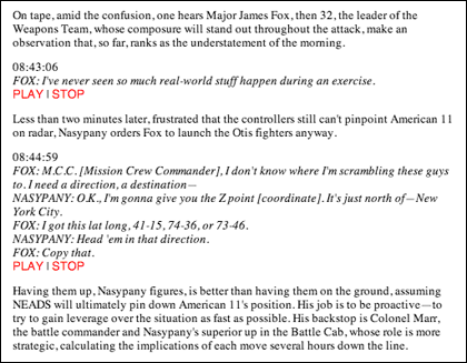
That’s a nice bit of design. No need for a clunky player or to download the clips at the end of the article when two simple text-only inline commands will do. In Beautiful Evidence, Edward Tufte argues for the placement of information in the location where it will do the most good for those attempting to understand the matter at hand, regardless of form:
Evidence is evidence, whether words numbers, images, diagrams, still or moving. It is all information after all. For readers and viewers, the intellectual task remains constant regardless of the particular mode of evidence: to understand and to reason about the materials at hand, and to appraise their quality, relevance, and integrity.
The examples that Tufte cites in the book are all visual and published on paper. This is an instance where web publishing provides for a better way to design for the information at hand than print. (thx to david for kickstarting this post)
Lionel Shriver: bad book covers happen because people use computers to design them and don’t know how to draw. What, you can’t draw with a computer? Not sure I see the cause and effect that Shriver is talking about here.
Newer posts
Older posts
Socials & More