
Browsing over the shoulder
Artist Jonus Lund is broadcasting what he’s browsing in realtime. Each time he goes to a new site in his web browser, his site updates. When I visited earlier, he was looking at Lifehacker.

This site is made possible by member support. 💞
Big thanks to Arcustech for hosting the site and offering amazing tech support.
When you buy through links on kottke.org, I may earn an affiliate commission. Thanks for supporting the site!
kottke.org. home of fine hypertext products since 1998.
Beloved by 86.47% of the web.
Artist Jonus Lund is broadcasting what he’s browsing in realtime. Each time he goes to a new site in his web browser, his site updates. When I visited earlier, he was looking at Lifehacker.
This is … well, I don’t really know what to say about it. It’s a video game version of Marina Abramović’s The Artist is Present. You buy a ticket, walk into the museum, look at some art, and then you wait in line. (via waxy)
Ursus Wehrli is coming out with a new book, The Art of Clean Up, which features pairs of photographs of different objects, in disorder and then sorted. Here’s my favorite pair:

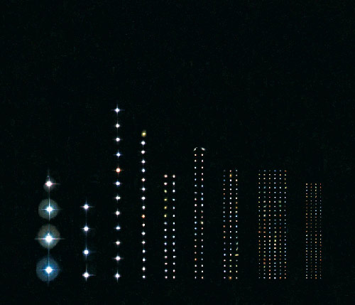
Photos from the book are disappearing from various sites around the web as takedown notices are sent out, but you can get the gist of the book by watching this video by Wehrli about how one of the photos was made:
On Saturday night, an 11-by-6-inch Rembrandt pen-and-ink drawing called “The Judgement”, worth $250K, was stolen from the Ritz-Carlton Marina del Rey. Interestingly, Rembrandt pieces are the second most stolen pieces of art.
Art experts reached Sunday said works by Rembrandt are among the most popular targets for art thieves, second only to those by Picasso, because of the artist’s name recognition and their value. Anthony Amore, chief investigator at the Isabella Stewart Gardner Museum in Boston and co-author of the book “Stealing Rembrandts,” said there have been 81 documented thefts of the artist’s work in the last 100 years.
It’s like I always say: When I edit Kottke, art gets stolen.
Update:
That was fast. The drawing has been recovered. Thanks, Patrick.
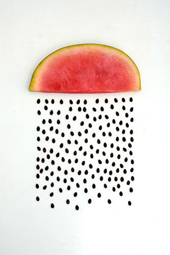
By Sarah Illenberger, who does many other things in a similarly playful style. Print is available. And now that I’m looking, I think I’ve seen her Soft Brain piece before. (Hey, I have!)
I posted about Chris Burden’s Metropolis II a few months ago. The artist is almost set to deliver the piece to Los Angeles County Museum of Art and there’s a proper preview for it:
My favorite line of the interview with Burden that runs over the video:
The idea that a car runs free, those days are about to close.
(via sippey)
Thomas Pavitte designed and then solved the world’s largest connect-the-dots puzzle (of the Mona Lisa). It took him 9 and 1/2 hours.
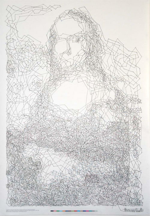
A time lapse video of Pavitte solving the puzzle is up on Vimeo. (via colossal)
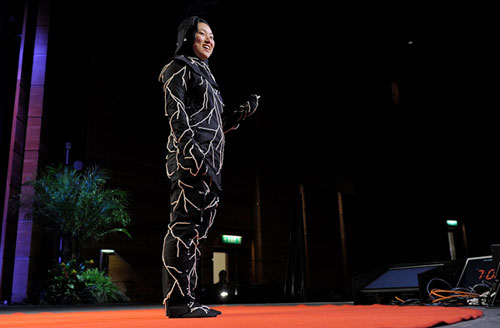
Jae Rhim Lee is growing mushrooms that will eat her body after she dies. She has also designed a special suit that will house the mushrooms as they do their work.
I am interested in cultural death denial, and why we are so distanced from our bodies, and especially how death denial leads to funeral practices that harm the environment — using formaldehyde and pink make-up and all that to make your loved one look vibrant and alive, so that you can imagine they’re just sleeping rather than actually dead. The US government recently upgraded formaldehyde from a probable carcinogen to a known carcinogen, so by trying to preserve the body we poison the living.
So I was thinking, what is the antidote to that? For me the answer was this mushroom - the Infinity Mushroom. It is a symbol of a new way of thinking about death.
Laura Bifano is selling prints of pixelated animals in her Etsy shop, like this honey badger one:
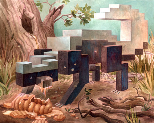
(via colossal)
This is pointillism taken to its limit.
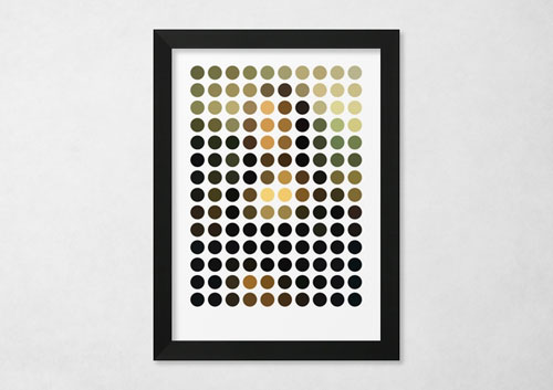
Leonardo da Vinci’s ‘The Mona Lisa’ reduced & remixed down into 140 exact circles of colour. Makes no sense close up. Makes every sense from the other side of the room.
Prints are available.
Artist Jeremy Hutchison commissioned a series of intentionally incorrect products from factories around the world.
“I asked them to make me one of their products, but to make it with an error,” Hutchison explains. “I specified that this error should render the object dysfunctional. And rather than my choosing the error, I wanted the factory worker who made it to choose what error to make. Whatever this worker chose to do, I would accept and pay for.”
Hutchison received a comb without tines, the ordering of which prompted a letter from the confused factory rep:
I have read your email, which makes me confused. As you know, combs shold be fabricated correctly and customers should like to buy combs which can comb hair. However, from your words, it seems you need us to fabricate combs incorrectly and combs can not comb the hair. I can not understand this well. Pls kindly explain detailedly.
There is also a Magritte-esque pipe with no place to put tobacco, and these impractial sunglasses:
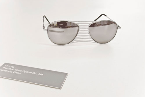
(via @kevmaguire)
Art scholars have authenticated a painting by Leonardo da Vinci that has been lost for centuries.
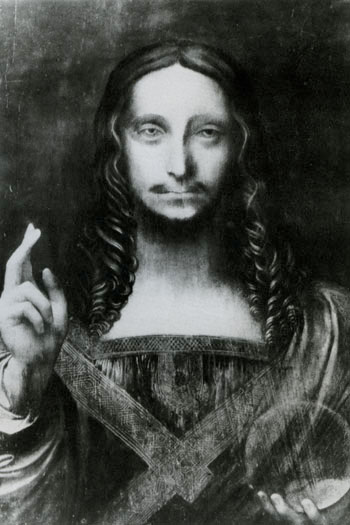
Simon brought the panel to the Metropolitan Museum of Art about two years ago to have it examined by several curators and conservators. “It was brought in for inspection in the conservation studio,” said a person close to the Metropolitan who asked not to be identified. “The painting was forgotten for years. When it turned up at auction, Simon thought it was worth taking a gamble. It had been heavily overpainted, which makes it look like a copy. It was a wreck, dark and gloomy. It had been cleaned many times in the past by people who didn’t know better. Once a restorer put artificial resin on it, which had turned gray and had to be removed painstakingly. When they took off the overpaint, what was revealed was the original paint. You saw incredibly delicate painting. All agree it was painted by Leonardo.”
A pair of fair use crusaders hired some “street art underground” friends to place several posters of the Kind of Bloop album cover on the building that Jay Maisel owns in Manhattan as payback for Maisel threatening to sue Andy Baio over using a representation of Maisel’s photo of Miles Davis for Bloop’s cover.
I hope that every time Jay leaves the house, he sees these posters — and as he looks at them or tries to tear them down he thinks about how evil what he did was. Maybe he’ll realize that at some level all art borrows from other art, and suing another artist for fair use appropriation undermines all artists. Maybe he’ll feel guilty about being such a thief. And then maybe he’ll think about giving that money back — or donating it to charity or something. But probably not.
Something tells me this isn’t going to end well. (via @jakedobkin)
Can’t remember who tipped me off to this (Cederholm? Hoefler? Pieratt?), but Colossal is a top-notch visual art/design blog. There are a dozen things on the first two pages that could slide right into kottke.org quite easily. He’s on Stellar too!
Textify.it is a web app that uses text to make alphabetic pointillist representations of images. I turned a photo of the Most Photographed Barn in America into this:

It’s also available as an iOS app. (via prosthetic knowledge)
Olafur Eliasson’s latest project is now on display at the ARoS Aarhus Kunstmuseum in Denmark…it’s a circular viewing platform with rainbow-hued glass.
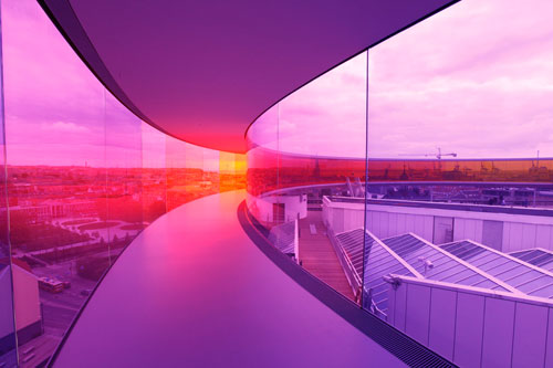
I love Idan Friedman’s profiles project…he hand-embosses the profiles of everyday people into disposable aluminum pans.
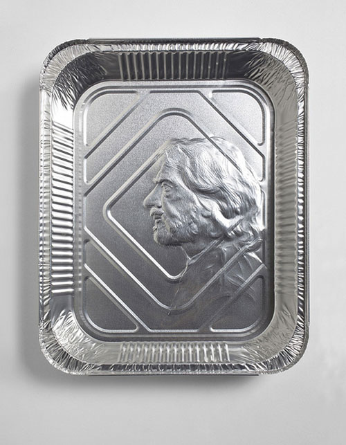
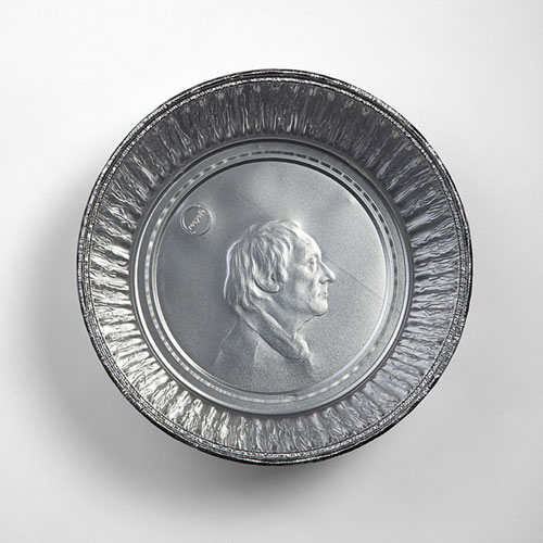
Royals and world leaders are forever immortalized on coins and normal people get disposable pie tins. Makes sense. (via ★feltron)
Synesthesia is a short film by Terri Timely that attempts in an artful way to give the viewer a sense of what synesthesia (“the blending or mixing of senses”) is like.
Cory Arcangel has a solo exhibition coming up at The Whitney.
Cory Arcangel: Pro Tools, an exhibition of new work, revolves around the concept of “product demonstrations.” All of the works featured in the exhibition — ranging from video games, single channel video, kinetic sculpture, and prints, to pen plotter drawings — have been created by means of technological tools with an emphasis on the mixing and matching of both professional and amateur technologies, as well as the vernaculars these technologies encourage within culture at large.
Opens May 26 and runs through September. Interview Magazine has a recent profile and interview.
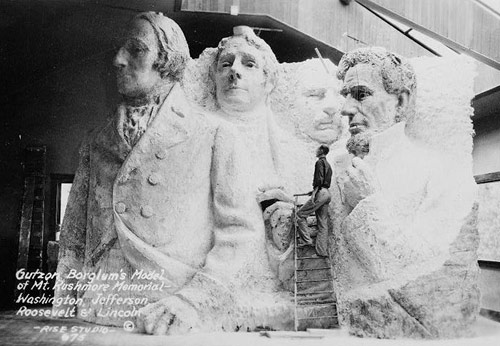
The presidents were to be depicted from head to waist, but the sculpture was scaled back due to insufficient funding.
In the late 70s, Anton Perich built something resembling an inkjet printer to make large-scale paintings like this:
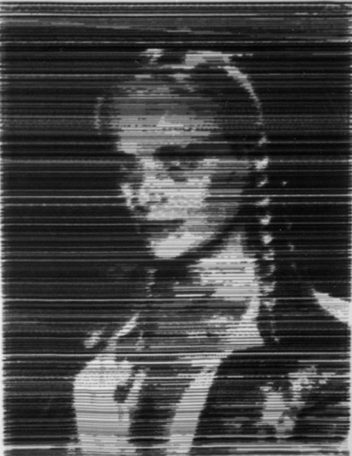
The photography section of Perich’s web site is also worth a look…lots of photos of the Warholish NYC scene in the 70s and 80s: Warhol, Jagger, Mapplethorpe, John Waters, etc. (via today and tomorrow)
Logo Tourist is a project by Risto-Jussi Isopahkala that depicts cityscapes and famous Parisian landmarks made up of famous logos. Here’s the Arc de Triumph (sponsored by Pepsi and Adidas):
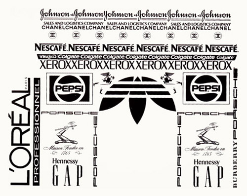
See also Logorama.

Clement Valla collects Google Earth images where the 2-D to 3-D terrain mapping doesn’t work as well as it should. (via lens culture)
My vacation reading: Master of Shadows: The Secret Diplomatic Career of the Painter Peter Paul Rubens by Mark Lamster.
Peter Paul Rubens gives us a lot to think about in his canvasses of rushing color, action, and puckered flesh, so it’s not surprising that his work as a diplomat and spy has been neglected. One of my goals in writing Master of Shadows was to fill that gap in the record. Here, after all, is an actual Old Master using actual secret codes, dodging assassination, plotting the overthrow of foreign governments, and secretly negotiating for world peace.
Certainly, a biographer could not ask for a more compelling subject. Rubens was a charismatic man of extraordinary learning, fluent in six languages, who made a fortune from his art. He never fit the paradigm of the artist as a self-destructive figure at odds with convention. More than one of his contemporaries actually thought his skill as a statesman surpassed his unmatched talent before an easel.
Art history page-turner? Yep.
David Lynch’s hair compares favorably to several works of art, mostly modern, including Starry Night, Water Lilies, and Lichtenstein’s Brush Stroke.
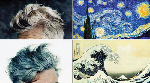
Just, wow.
James Gulliver Hancock is attempting to draw every building in NYC. Here are a few buildings on Rivington:
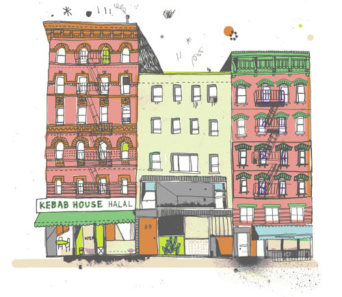
See also Every Person In New York.
But we’ve got to wait a whole year…the exhibition opens on Feb 26, 2012.
The MoMA retrospective will be thematic. There will be rooms devoted to Ms. Sherman’s explorations of subjects like the grotesque, with images of mutilated bodies and abject landscapes, as well as a room with a dozen centerfolds, a takeoff of men’s magazines, in which she depicts herself in guises ranging from a sultry seductress to a vulnerable victim. There will also be a room that shows her work critiquing the fashion industry and stereotypical depictions of women.
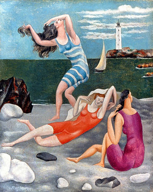
Jealous of all the attention garnered by Sports Illustrated’s annual swimsuit issue, Tyler Green of Modern Art Notes decided to compile his own swimsuit publication. Here’s a sample from a Mr. P. Picasso:
Watch as a woman gets chocolate sauce poured all over her face for almost ten minutes.
I don’t know what to think of this one: mesmerizing? yucky? erotic? hunger-inducing? I have a hungry tingling disgust going on here…

Socials & More