kottke.org posts about subway
A profile of the woman who does the announcements — the ones you can actually understand — for the NYC subway. Since becoming “the voice”, she hasn’t actually ridden the subway.
On the telephone, her voice does not have quite as much oomph as it does on the subway. “My husband says he doesn’t hear the nice voice as often as he’d like,” she said.
But the nice voice cannot be disobeyed. Before 9/11, when they lived in Louisville, Ky., he drove to the airport to pick up her. He was early. He parked right in front of the terminal. He could hear her on the public-address system, saying no one was supposed to park there.
A traffic officer came along and said he had to follow the voice’s orders.
Her husband said, “I don’t listen to that voice at home; I’m not going to listen to it here.”
Slideshow of almost 100 years of photography of the NYC subway system by the NY Times.
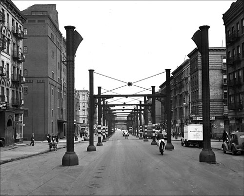
The caption for the photo above reads:
1940: In a view north from 106th Street, only the supports of the old Ninth Avenue elevated line remained as the push to go underground continued.
This week’s Geeking Out, Gelf Magazine’s nerdy event series, is all about NYC transportation.
The evening will feature Benjamin Kabak (Gelf interview), author of popular subway blog Second Avenue Sagas discussing the MTA; Sharon Zukin (Gelf interview), author of Naked City: The Death and Life of Authentic Urban Places, on gentrification; and Charles Komanoff (Gelf interview), creator of the Balanced Transportation Analyzer, discussing how to optimize the city’s transportation network.
Free. Sept 16, 7:30p in Dumbo. Click through for more details.
The MTA in NYC is looking for someone to keep their transit maps fresh.
As part of a two-person team, the incumbent of this position is responsible for the design and timely updating of NYCT’s printed and online map products, including the extensive service schedule panels on the reverse side of all “pocket” bus maps; researching and responding to map design and information issues; identifying, researching, recommending, and adapting evolving map drawing and production technologies; adapting Transit’s map products to the agency website and providing modified products for third party publications; advising on or producing custom maps for major agency initiatives and proposals; advising and assisting on other product design, graphics technology procurements and related staff training for all graphics services in Marketing and Service Information.
This has to be some kottke.org reader’s dream job…go get it!
In a long excerpt from O’Reilly’s recent book “Beautiful Visualization”, KickMap designer Eddie Jabbour talks about his process for redesigning the NYC Subway map.
While I felt that it was important to show certain shapes aboveground, I also felt that it was important to leave out certain pieces of belowground information. There are several places where the subway tunnels cross and overlap each other beneath the surface. This may be important information for city workers or utility companies trying to make repairs, but for the average commuter, showing these interactions just creates visual noise. I tried to reduce that noise by cleanly separating the lines on the map so they don’t overlap. Consider the different depictions of the 4 line and the 5 line in the Bronx; sure, the MTA’s paths may be accurate, but they’re also confusing, and riders don’t really need to see those particular details to understand where they’re going.
(Via @TheJames)
Next month, the MTA will release a new subway map. The NY Times has a look at the new map.
The new subway map makes Manhattan even bigger, reduces Staten Island and continues to buck the trend of the angular maps once used here and still preferred in many other major cities. Detailed information on bus connections that was added in 1998 has been considerably shortened.
Manhattan will be shown on the map as nearly twice as wide as in real life. Cut back on the chili-cheese fries, my friend!
Map of the US Interstate system in the style of the London Tube map.
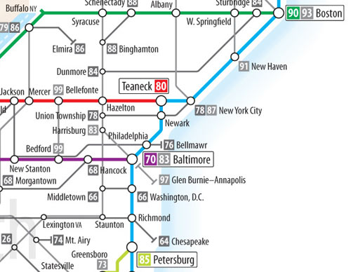
Go large for detail. (via coudal)
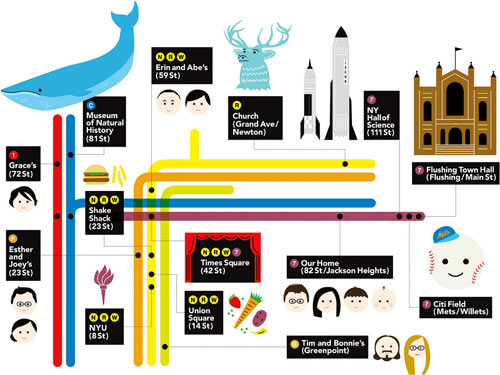
This was my present to my nephew for his 3rd birthday. He loves, loves, loves the subway so my sister asked me if I could make a custom map with all the places that mean something to him on the poster.
Best viewed a bit large.
Update: There’s been a bit of confusion…this is not something that I made. I don’t even have a nephew.
Update: The subway map was made by Erin Jang.
A recent Improv Everywhere endeavor had a photo booth set up in a New York subway car. They told riders that the MTA had hired them to take photographs of every person who used the subway, and that there would be a yearbook at the end of the year. The result was one interesting, if misinformed, class.
You’d need the equivalent of a 228-lane Brooklyn Bridge to move all those people into Manhattan during Monday morning rush hour.
At best, it would take 167 inbound lanes, or 84 copies of the Queens Midtown Tunnel, to carry what the NYC Subway carries over 22 inbound tracks through 12 tunnels and 2 (partial) bridges. At worst, 200 new copies of 5th Avenue. Somewhere in the middle would be 67 West Side Highways or 76 Brooklyn Bridges. And this neglects the Long Island Railroad, Metro North, NJ Transit, and PATH systems entirely.
Kinda puts the subway in perspective, doesn’t it? And don’t miss the map at the bottom that shows the size of the parking lots needed for all those cars.
Get traffic and transit updates for NY on Twitter…including NYC subway lines! There are separate accounts for the 123, ACE, JMZ, 456, BDFV, LS, 7, G, and NQRW. (via @bobulate)
Update: @NYCtrains also does NYC subway updates. (thx, pierre)
Exit Strategy NYC is an iPhone app that tells you where to get on the subway train so as to be in an optimal position when you get off.
Taking the 1 train uptown to 28th street? Get on right behind the middle conductor. Need to transfer to the L at Union Square from the N downtown? Ride in the 1st car. Detailed diagrams eliminate the guesswork and frustration from your ride, making your subway trip easier and faster.
See also prewalking. (via @dens)
Update: The Times writes 650+ words on an app that calculates prewalking coordinates but doesn’t use the word “prewalking”.
Update: Exit Strategy NYC has been updated to include every stop in the subway system and subway entry points.
The MTA is trying to sell the naming rights to the Atlantic Ave subway stop in Brooklyn to Barclays, a London bank. If approved, other rights may be sold as well. Yes, let’s make the NYC subway even more confusing than it already is, although I’m sure the MTA will come up with some reason that cramming “Domino’s® Breadbowl Pasta™ Station” onto a map makes more sense than “23rd Street”.
On the other hand, a casual study of the NYC subway map reveals the following brand names already in use:
Rockefeller Center
Columbia University
JFK Airport
Museum of Natural History
Lincoln Center
Hunter College
Yankee Stadium
Aqueduct Racetrack
Times Square
Herald Square
NY Aquarium
World Trade Center
Brooklyn Museum
Mets
But, without exception, station names are derived from nearby landmarks: streets, airports, schools, stadiums, squares, parks, etc.
I really like the subway travel time heatmaps on Triptrop NYC.
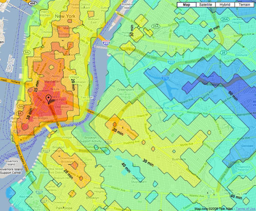
Put in an address and you get a map of how far away everything is using the subway. 15 minutes, forty minutes, two hours — all set up with nice little colors. That’s pretty easy, I think. Triptrop can help you find a convenient place to live. It’s also a nice way to tell your friend to stop inviting you to the purple part of the Bronx, or to prove that the G isn’t actually that bad.
(via fake is the new real)
Mike Frumin took the NYC subway ridership data from all the way back to 1905 (!!) and graphed it on a map, with a sparkline of the ridership data for each stop. Frumin explains the project a little more here.
The result, after much whacking, is, I think, compelling, but you’ll have to see for yourself. The general idea it that the history of subway ridership tells a story about the history of a neighborhood that is much richer than the overall trend. An example, below, shows the wild comeback of inner Williamsburg, and how the growth decays at each successive stop away from Manhattan on the L train.
Update: Here’s another representation of the same data. In this one, the ridership numbers are represented by the thickness of the subway line.
If you don’t like this re-imagined NYC subway map, I’ll kick you in the Brooklyn. Somewhat NSFW. (via illustration art)
Improv Everywhere turned the 23rd Street C/E subway platform into an art gallery opening, complete with a cellist, sparkling drinks, signs explaining the “art”, and a coat check. An explanatory sign placed near a drain read:
Drain (1975)
MTA and unknown artists
Mixed Media on Metal and Concrete
Describing the irresistibility of natural urges, and situated thematically near the restroom, this drainage grate offers deliverance. Consequently, here lies an indeliable yellow nitrogen stain, as evidence of the passings of hundreds, if not thousands of strained commuters. Each straphanger, surreptitiously seeking relief, has helped create this totally organic, revolutionary art piece.
Harry Beck, designer of the iconic London Tube map, once took a crack at a map for the Paris Metro, but his effort was rejected for being too geometric.
So why did the Paris Metro (now operated by the RATP) reject Beck’s clear simplification of their beloved system? One reason is visible at each station entrance; Parisians use the maps here as a free public service to help them find their way round the city - the ubiquitous geographic wall map is more than just a Metro plan.
At the Shibuya Pink Girl’s Club in Tokyo, men pay upwards of $130 to grope the girl of their choice on a simulated subway train.
The connoisseur picks out from the menu the girl of his choice, dressed either as a schoolgirl or office receptionist. This girl then beckons him through the window of a mock-up train carriage, which not only broadcasts station announcements, but even shakes and rattles.
Real-life incidents of subway train groping are on the decline, in part because more women are reporting them and the subway offering women-only cars during peak times.
A beautiful heart-shaped map of the NYC subway system is among the several such maps done by a pair of Korean graphic designers calling themselves Zero Per Zero.
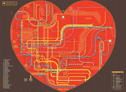
A portable map version is available for sale, but the shipping cost from Korea to the US is a bit steep.
Here’s a video from 1905 of a NYC subway car going from 14th Street to 42nd Street. It’s funny to see all the men in suits and hats running for the train…it takes some of the formality out what seems from photographs to be a more dignified time. Also, anyone know what line/train this is?
Update: The inbox consensus seems clustered around the opinion that this train is running on the contemporary 4/5/6 line. Here’s a 1904 map which shows the then-IRT line in question (in red). At 42nd St, the line runs crosstown to Times Square and then up the 1/2/3. (thx jason et al.)
The (Mostly) True Story of Helvetica and the New York City Subway details the use of type in signage, maps, and manuals for the NYC subway. A must-read for type and subway fans.
As if this plethora of signs were not enough, the subway system also had a bewildering variety of other porcelain enamel and hand-painted signs. The porcelain enamel signs, either hung from the ceiling or posted on the walls, were directional as well as informational. The directional signs included those on the outside of the station entrances as well as those intended for the corridors and platforms underground. Many of the informational signs warned against criminal, dangerous or unhealthy behavior: no peddling wares, no leaning over the tracks, no crossing the tracks, no smoking, no spitting. The directional and informational ones were made by Nelke Veribrite Signs and the Baltimore Enamel Company, while the behavioral ones were the product of the Manhattan Dial Company. Most were lettered in some form of sans serif capitals-regular, condensed, square-countered, chamfered, outlined-though some were in bracketed or slab serif roman capitals. They were usually white letters on a colored background (often dark green for the IND and dark blue for the IRT and BMT), yet many were also black on a white background. There was no house style.
What is to modern eyes a beautiful disorder of tiled text and hand-painted enamel became an embarrassing shambles in the 70s and 80s. It was only in late 1989 that Helvetica became the official typeface for New York City subway system signage…about 20 years too late to prevent the current signage from looking dated.
Google has added transit directions to Google Maps. Finally.
We’ve just added comprehensive transit info for the entire New York metro region, encompassing subway, commuter rail, bus and ferry services from the Metropolitan Transit Agency (MTA), the Port Authority of New York and New Jersey, New Jersey Transit and the City of New York.
One feature I’d like: a quick at-a-glance comparison of the three travel methods (walking, subway/train, driving) to see which is going to take less time.
Christoph Niemann has used some unusual image sources to tile his bathrooms. For the shower, an appropriation of Warhol’s Brillo box. For the kids bathroom, a NYC subway map.
The NYC subway system’s unlimited-ride MetroCard turned ten years old this month.
“I think it’s absolutely changed travel habits in the New York region, and it’s been a boon for the economy as well,” said Andrew Albert, who represents transit riders on the board of the Metropolitan Transportation Authority. “Where once you might have used it more sparingly because you had a finite number of trips, you’re more likely to take a trip during your lunch break, go shopping perhaps or go to dinner somewhere,” he said.
On average, unlimited-ride MetroCard users take 56 trips per month (~$1.45 per trip), although some take many more or less. (via buzzfeed)
Update: Mike Frumin notes that the Times excluded from their graph an important piece of information: the break-even point of the 30-day MetroCard. I used to get a monthly card but now pay by the ride because I don’t take the subway everyday anymore and would therefore find myself in Frumin’s “losing $$$$$” zone.
An illustrated tale of two young boys (ages 3 and 7) who love to ride the subway.
A chaperone on one of Arthur’s school trips told me something he overheard when all the kids were neatly lined up in rows of two. The girl holding Arthur’s hand asked him, “Have you heard of Peter Pan?” “No,” he replied, “have you heard of Metro North?”
James Danziger presents a short history of subway photos, starting with photos of sleeping Japanese salarymen on trains and then moving to Walker Evans, Bruce Davidson, etc. Some of my favorite subway photos are from the Moscow subway…Stalin look-a-likes, huge guitars, and many sleeping people.
Nice TV ad for the Madrid Metro…a view of the city from underground.
Newer posts
Older posts
Socials & More