Obesity infographics for several countries, the percentage
Obesity infographics for several countries, the percentage of population older than 15 with a body-mass index greater than 30. That USA man is really fat.
This site is made possible by member support. 💞
Big thanks to Arcustech for hosting the site and offering amazing tech support.
When you buy through links on kottke.org, I may earn an affiliate commission. Thanks for supporting the site!
kottke.org. home of fine hypertext products since 1998.
Beloved by 86.47% of the web.
Obesity infographics for several countries, the percentage of population older than 15 with a body-mass index greater than 30. That USA man is really fat.
While bumping around on the internet last night, I stumbled upon Alex Reisner’s site. Worth checking out are his US roadtrip photos and NYC adventures, which include an account and photographs of a man jumping from the Williamsburg Bridge.
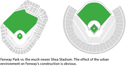
But the real gold here is Reisner’s research on baseball…a must-see for baseball and infographics nerds alike. Regarding the home run discussion on the post about Ken Griffey Jr. a few weeks ago, Reisner offers this graph of career home runs by age for a number of big-time sluggers. You can see the trajectory that Griffey was on before he turned 32/33 and how A-Rod, if he stays healthy, is poised to break any record set by Bonds. His article on Baseball Geography and Transportation details how low-cost cross-country travel made it possible for the Brooklyn Dodgers and New York Giants to move to California. The same article also riffs on how stadiums have changed from those that fit into urban environments (like Fenway Park) to more symmetric ballfields built in suburbs and other open areas accessible by car.
And then there’s the pennant race graphs for each year since 1900…you can compare the dominance of the 1927 Yankees with the 1998 Yankees. And if you’ve gotten through all that, prepare to spend several hours sifting through all sorts of MLB statistics, represented in a way you may not have seen before:
The goal here is not to duplicate excellent resources like Total Baseball or The Baseball Encyclopedia, but to take the same data and present it in a way that shows different relationships, yields new insights, and raises new questions. The focus is on putting single season stats in a historical context and identifying the truly outstanding player seasons, not just those with big raw numbers.
Reisner’s primary method of comparing players over different eras is the z-score, a measure of how a player compares to their contemporaries, (e.g. the fantastic seasons of Babe Ruth in 1920 and Barry Bonds in 2001):
In short, z-score is a measure of a player’s dominance in a given league and season. It allows us to compare players in different eras by quantifying how good they were compared to their competition. It it a useful measure but a relative one, and does not allow us to draw any absolute conclusions like “Babe Ruth was a better home run hitter than Barry Bonds.” All we can say is that Ruth was more dominant in his time.
I’m more of a basketball fan than of baseball, so I immediately thought of applying the same technique to NBA players, to shed some light on the perennial Jordan vs. Chamberlain vs. Oscar Robertson vs. whoever arguments. Until recently, the NBA hasn’t collected statistics as tenaciously as MLB has so the z-score technique is not as useful, but some work has been done in that area.
Anyway, great stuff all the way around.
Update: Reisner’s site seems to have gone offline since I wrote this. I hope the two aren’t related and that it appears again soon.
Update: It’s back up!
Summize is a product review site that uses sparkline-like color bars for ratings instead of stars. Here’s a bit more about how their display system works.
Ben Fry has updated his salary vs. performance graph for the 2007 MLB season…it plots team payrolls vs. winning percentage. The Mets and Red Sox should be winning and are…the Yankees, not so much. Cleveland and the Brewers are making good use of their relatively low payrolls.
Threadless is selling tshirts with a pie chart of pies on it.
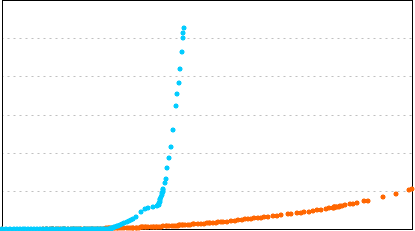
I’m working on a longish post for later today (or early tomorrow) about this graph:
More soon.
Update: The long post is done…the above graph is (roughly) the growth of Blogger (in orange) to the growth of Twitter (in blue).
Logical, linguistical, and infographical analysis of the #1 single on the Billboard chart, This Is Why I’m Hot by Mims. “Mims is hot because he’s fly. But it raises the question: Does being hot guarantee one’s being fly? […] It would appear that fly and hot are interchangable. If you are one, you are both; if you aren’t at least one, you are neither.” (via khoi)
Rollercoaster version of the graph of US home prices adjusted for inflation…you basically ride the curve of the graph. Brilliant…I want to ride all the graphs I come across! (via is it real or is it magnetbox)
Craig Robinson of Flip Flop Flyin’ presents his life so far as a series of pie charts.
Profile of Edward Tufte. “Running his own enterprise, Tufte says, allows him to work ‘elegantly, intensely, gracefully and incredibly efficiently.’”
Universe is another pretty but useless data visualization of the news. See also: just about every other data visualization of the news.
Neat music video by a band called The Longcut that uses infographics to tell the story of a boy and girl falling for each other.
Clever demographic data visualizations using faces ripped out of the SkyMall catalog.
Dumb interface, but here are some neat maps of global fish catch locations, mostly tuna. For example, on these maps you can see the dramatic increase of purse seine fishing from 1964-1998. (thx, spencer)
A 3-D world map that depicts economic activity. (via mr)
Social network map of the New Testament. Jesus Christ, supernode. (via waxy)
Diagram that charts instances of the “x is the new y” snowclone from 2005. See also: a list I compiled last last year.
Genealogy of Influence: “a graph of biographical entries at Wikipedia with connections denoting creative influence between philosophers, social scientists, writers, artists, scientists, mathematicians”. Reminds me peripherally of Simon Patterson’s The Great Bear (a print of which is hanging behind me right now).
Netlag: infovisualization of the world made of exterior web cams over time. So as the day goes on, you can see Europe light up, then the eastern seaboard of the US, then the western US, and so on.
Images of the dashed line in use (as hidden geometry, movement, paths, ephemeral material, etc.). “I’ve had trouble justifying my excitement about this intricate visual detail, so I thought it would be good to collect a bunch of examples from over fifty years of information design history, to show it as a powerful visual element in ubicomp situations.” (via migurski)
Chart by Ben Schott (of Schott’s Original Miscellany) detailing the 5 years since 9/11.
How to do a click heatmap on your site with JavaScript and Ruby. Includes source code. Very slick.
Slides for Michal Migurski’s talk on data visualization at UX Week 2006.
Want to draw you some diagrams, charts, or flowcharts? Try these nifty tools.
Script for producing sparklines (a la Edward Tufte) in Photoshop.
The Independent has a great infographic on its cover today depicting which countries support the immediate ceasefire in the Middle East demanded by the UN and which do not:
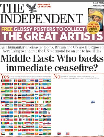
That message would take up less space as words, but somehow the impact wouldn’t be quite the same. (thx, g)
Beautiful Evidence is both the title of Edward Tufte’s latest book and an accurate description of the document itself. Like few other mass market publications, BE is lovingly hand-crafted, a physical manifestation of the ideas expressed in its pages; the text and images therein could be about another subject entirely and you might still get the point: “Words, Numbers, Images - Together” (the title of the book’s fourth chapter).
Case in point. Pages 123 and 124 fold out into a spread depicting Charles Joseph Minard’s famous infographic of the disastrous 1812 invasion of Russia by France. But unlike most magazine and book fold-outs, the page that folds out is cut 1/2 inch narrower than the underlying page so that a) a bit of the page underneath peeks out, providing a visual cue for unfoldability, and b) there’s no difficulty when you go to refold the page with getting it caught in the book’s crease or otherwise undesirably bending/creasing it. The fold-out design is a small thing that the casual reader might not even notice, but it demonstrates the care that went into the production of the book (and perhaps the reason why Tufte took so long in writing/designing it).
The gang at 37signals noticed similar craftsmanship in the writing and presentation:
“What struck me is how you almost never have to hold something in your head while turning the page…he usually finishes his thought within the two pages you can see…and when you flip, it’s something new…that’s an excellent self-imposed constraint…’whatever i need to say, i’ll do it here.’” Jason replied, “Yes, I love that. I noticed that more on this book than others. The image and text is in one spread so when you turn you are turning your attention to a new idea. If you have too much to say than the space allowed then you are probably saying too much…it definitely makes it easier to design the book too…you can design each spread as if it was a standalone poster.”
What I’ve also noticed about Beautiful Evidence is the lack of reviews in mainstream publications; I can’t find a single newspaper or magazine that has published a review. Compare that to the releases of Gladwell’s Blink, Remnick’s Reporting, and Anderson’s The Long Tail, for which reviews started appearing almost everywhere before the books were even available. Those books were written for mass audiences and backed by large publishing companies with ample PR resources and plenty of review copies to go around. In contrast, Beautiful Evidence is self-published by Tufte, which means it’s beautiful, personal, and done just right, but also invisible to the mainstream press. Not that Beautiful Evidence is being ignored — the blogosphere is talking about it and the Amazon Sales Rank is currently about 600 (which doesn’t count online sales directly from edwardtufte.com) — but it deserves the consideration of the mainstream press.
This tshirt with infographics on it is too nerdy even for me. That and I’ve been getting a ton of crap from everyone I know about how many Threadless tshirts I own.
FAS.research has produced a visualization of the 2006 World Cup final showing “the passes from every player to those three team-mates he passes to most frequently”. The graphic also shows the “flowbetweenness” of a player.
Socials & More