kottke.org posts about art
Yesterday, the FBI announced major advances in solving the biggest art heist in history. The break in occurred at the Isabella Stewart Gardner Museum in 1990 when a night watchman opened the door to men dressed as police. Works by Vermeer, Rembrandt, Degas, and Manet valued at over $500M were taken and have not been seen since.
“The FBI believes with a high degree of confidence in the years after the theft the art was transported to Connecticut and the Philadelphia region and some of the art was taken to Philadelphia where it was offered for sale by those responsible for the theft. With that confidence, we have identified the thieves, who are members of a criminal organization with a base in the mid-Atlantic states and New England,” Richard DesLauriers, special agent in charge of the Boston office of the FBI, said.
The guard who opened the door, Richard Abath, was looked at pretty closely again last week, though he’s not mentioned specifically this week.
Artist Phillip Stearns makes blankets and tapestries out of glitch art. Some of the source images are taken from intentionally short-circuited digital cameras.
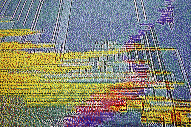
All items are woven in the US and cost $200 and up (plus shipping).
Artist Rutherford Chang only collects first pressings of The Beatles’ The White Album on vinyl. Dust & Grooves recently interviewed Chang about his collection.
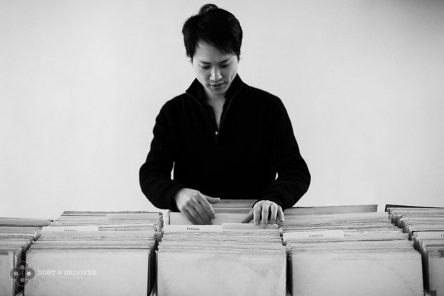
Q: Are you a vinyl collector?
A: Yes, I collect White Albums.
Q: Do you collect anything other than that?
A: I own some vinyl and occasionally buy other albums, but nothing in multiples like the White Album.
Q: Why just White Album? why not Abbey road? or Rubber Soul?
A: The White Album has the best cover. I have a few copies of Abbey Road and Rubber Soul, but I keep those in my “junk bin”.
Q: Why do you find it so great? It’s a white, blank cover. Are you a minimalist?
A: I’m most interested in the albums as objects and observing how they have aged. So for me, a Beatles album with an all white cover is perfect.
Q: Do you care about the album’s condition?
A: I collect numbered copies of the White Album in any condition. In fact I often find the “poorer” condition albums more interesting.
Chang’s collection is currently on view at Recess in Soho, NYC until March 7th. Gotta get down there and see this. (via mr)
Chris Buck takes pictures of celebrities after giving them 30 seconds to hide. Here’s Cindy Sherman:
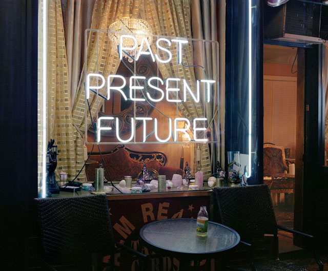
Buck’s photos are on display in NYC for a couple more days at Foley but are also available in book form. (via digg)
This video of artist Li Hongbo demonstrating the complexity of his paper sculptures will blow your mind. More wild images at Dominik Mersch Gallery.
(via ★stellar)
These are all so perfect but I’m having a hard time deciding which is the most perfect….the Mrs Patmore tabby or the Dowager Countess Sphynx?


Prints are $22 a pop on Etsy and likely to go quickly. (via @mathowie)
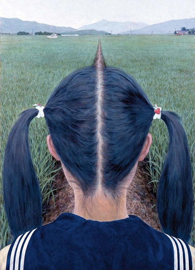
A Path Between Rice Fields is a gorgeous painting by Makoto Aida that caught my eye the other day.
(via ls)
I have a lot more respect for painters now. Who knew it was such an intense sensory workout?
This is taken from a longer video piece with less screaming that will be on display at the Walker Art Center in 2013.
Inspired by Bob Ross-style instructional television programs, the Seoul-based artist says “the theme of this video is the existential nature of contemporary art (and culture) as well as of artists.” Characteristic of Beom’s deadpan humor, the narrator’s demonstration shows how to apply paint while engaged in “a long scream that sounds like when you’re hurt”; “a scream induced by psychological pain”; and “a more pained, wronged, and regretful scream.”
(via ★spavis)
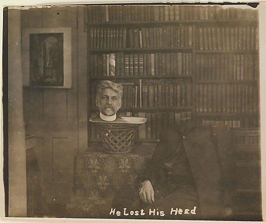
NYC’s Metropolitan Museum of Art has an exhibit running until January 27, 2013 featuring over 200 photos employing old timey trickery.
For early art photographers, the ultimate creativity lay not in the act of taking a photograph but in the subsequent transformation of the camera image into a hand-crafted picture.
A new series of photographs from Shinichi Maruyama shows the nude human form in motion. (Totally SFW.)
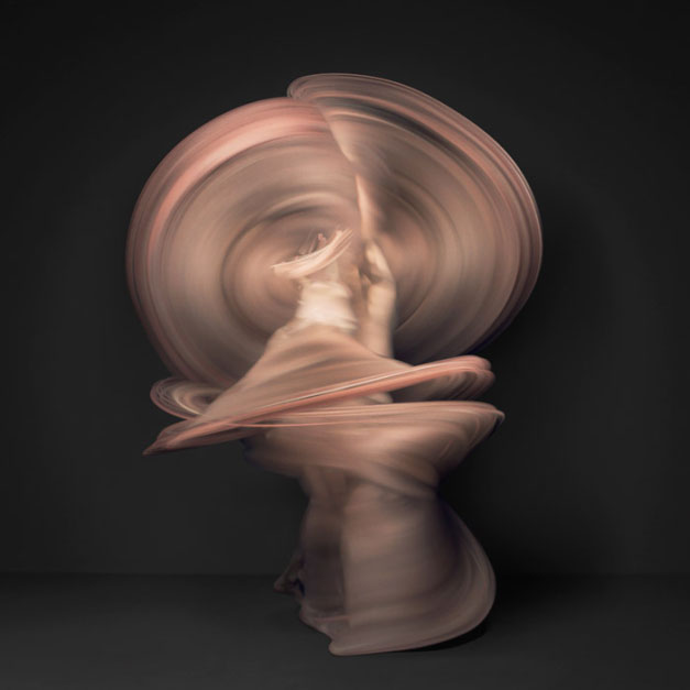
According to Petapixel, these are not long exposure shots (like these).
Although the photographs look like long-exposure shots, they’re actually composite images created by combining ten thousand individual photographs of each dancer. The result is a look in which each model’s body is (mostly) lost within the blur of its movement.
You may remember Maruyama from his hand-thrown water sculptures.
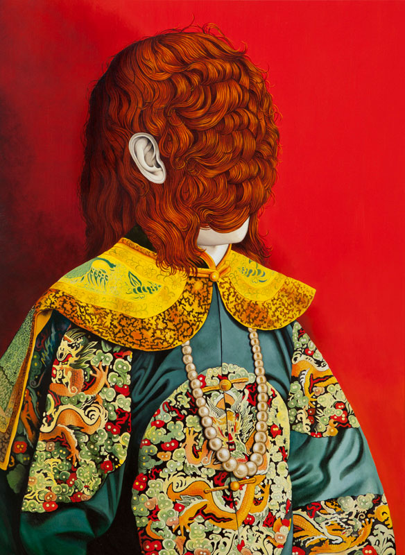
Sicilian artist Valerio Carrubba takes portraits and modifies them with MOAR HAIR!
(thx, david)
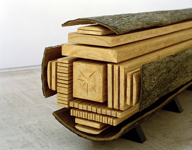
Billion, by artist Vincent Kohler, shows the different pieces of wood derived from a log. It reminds me of the iconic butchery map showing the different cuts of meat. The sculpture, interestingly, is made out of polystyrene.
(via dens)
This forgotten Vermeer has been floating around for a few months but I just saw it. Love it:
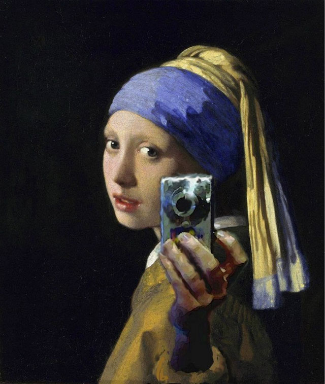
Anyone know who did this? I spent a few minutes trying to find out but got dead-ended in a Tumblr/Imgur attribution black hole. (via ★ryanvlower)
Update: The creator of the image is supposedly Mitchell Grafton, although I couldn’t find any airtight attribution. (thx, all)
Artists in the UK have created a ‘Rain Room’ inside the Barbican that gives the impression from the outside that it is pouring rain. 3D cameras make it so the rain stops when you walk through it. That is, the rain is everywhere you aren’t, and you don’t get wet at all.
(via ★adamkuban)
Update: Neglected to mention the Rain Room is an installation by rAndom International artists Stuart Wood and Hannes Koch.
A 1958 Mark Rothko painting worth millions of dollars, Black On Maroon, was defaced by graffiti at the Tate Modern on Sunday. The vandalism was some sort of ‘artistic statement’ by a guy with a neck tattoo.
Questions will be asked about security at the gallery, where the Rothkos are not protected by glass and are separated from visitors only be a low-level barrier that can easily be stepped over.
Typically, each room is monitored by a single gallery attendant.
It was Rothko himself who stipulated how his work should be displayed at the Tate.
The defaced painting was one of a series commissioned from Rothko in 1958 for the Four Seasons restaurant in New York’s Seagram Building, but never installed.
In 1969, the artist donated nine of the paintings to the Tate on the proviso that they be displayed “as an immersive environment”. He died the following year.
This is Cedro di Versailles, a sculpture by Giuseppe Penone, carved out of a five-ton cedar log from Versailles.

To create the piece, Penone removed the outer rings of the tree to reveal the younger tree within. (via ★spavis)
A 15-foot-tall statue of Zinedine Zidane head-butting Marco Materazzi by sculptor Adel Abdessemed has been placed in the courtyard of the Pompidou Center in Paris.

The statue, entitled “Headbutt,” is by the Algerian sculptor Adel Abdessemed, and coincides with an exhibition of his work in the museum. “This statue goes against the tradition of making statues to honor victories,” said Phillipe Alain Michaud, who directed the exhibition. “It is an ode to defeat… Zidane’s downward glance recalls that of Adam, chased from paradise.”
But as Michaud knows, and surely as Abdessemed intends, it is both not so simple and much simpler. It is an ode to more than defeat; but it’s also a representation of very basic feelings complicated by literary analogy. The Headbutt was full of anger, stupidity, and recklessness, but beneath them lay a damaged sense of honor. This makes it hard for even the calmest football fan to wholly begrudge Zidane his actions.
The Swiss-based Mona Lisa Foundation is presenting an earlier version of the famed Leonardo da Vinci painting. According to one foundation member, “We have investigated this painting from every relevant angle and the accumulated information all points to it being an earlier version of the Giaconda in the Louvre.” Seems like a good excuse to listen to The Rolling Stones sing Mona (I Need You Baby).
Beginning in October, a copy of Edvard Munch’s iconic The Scream of Nature will be on display at MoMA for a six-month stint.
Of the four versions of The Scream made by Munch between 1893 and 1910, this pastel-on-board from 1895 is the only one remaining in private hands. The three other versions are in the collections of museums in Norway. The Scream is being lent by a private collector, and will be on view at MoMA through April 29, 2013.
Archaeologist Marc Azéma thinks that Stone Age artists may have fashioned their cave paintings in such a way as to suggest movement, crude movies that came to life as the flickering light from a fire danced on the walls.
Not only that, Paleolithic artists may have also have invented the thaumatrope thousands of years before the Victorians in the 1800s.
Consisting of a card or disk with different designs on either side, the device demonstrates the persistence of vision: When the card or disk is twirled, the designs appear to blend into one.
Rivère discovered that Paleolithic artists used similar optical toys well in advance of their 19th-century descendants.
The artist examined Magdalenian bone discs — objects found in the Pyrenees, the north of Spain and the Dordogne, which measure about 1.5 inches in diameter.
Often pierced in their center, the discs have been generally interpreted as buttons or pendants.
“Given that some are decorated on both sides with animals shown in different positions, we realized that another type of use, relating to sequential animation, was possible,” the researchers said.
They mentioned one of the most convincing cases, a bone disc found in 1868 in the Dordogne. On one side, the disc features a standing doe or a chamois. On the other side, the animal is lying down.
Azéma and Rivère discovered if a string was threaded through the central hole and then stretched tight to make the disc rotate about its lateral axis, the result was a superimposition of the two pictures on the retina.
Incredible that moviemaking is tens of thousands of years old instead of just a couple hundred.
I can’t find any other information about this online or anywhere else, but tucked away in a fall arts preview in today’s NY Times is the juicy news that MoMA has picked a date for their screening of Christian Marclay’s 24-hour movie, The Clock. The show will open on Dec 21 and run through Jan 21. It sounds like the screening will happen in the contemporary galleries and won’t show continuously except on weekends and New Year’s Eve. Which is lame. Just keep the damn thing running the whole month…get Bloomberg to write a check or something.
Anyway, probably best to check this out on the early side during the holiday season because it’ll turn into a shitshow later on.
Opening on September 15 at Edward Tufte’s gallery in Chelsea is All Possible Photons, an exhibit of sculptures by Tufte of Richard Feynman’s subatomic particle diagrams.

Made from stainless steel and air, the artworks grow out of Richard Feynman’s famous diagrams describing Nature’s subatomic behavior. Feynman diagrams depict the space-time patterns of particles and waves of quantum electrodynamics. These mathematically derived and empirically verified visualizations represent the space-time paths taken by all subatomic particles in the universe.
The resulting conceptual and cognitive art is both beautiful and true. Along with their art, the stainless steel elements of All Possible Photons actually represent something: the precise activities of Nature at her highest resolution.
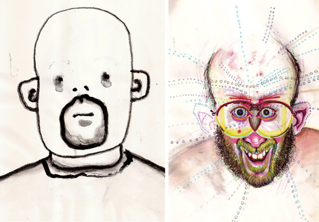
Artist Bryan Lewis Saunders has been making self-portraits of himself every day since 1995. For one particularly interesting sub-series, Saunders drew himself under the influence of all kinds of different drugs (adderall, coke, meth, huffing lighter fluid, etc.). Here he is on absinthe and mushrooms respectively:
Neat project from Michal Kohút: glasses that turn the lights off whenever the person wearing them blinks.
The lights in the room are temporarily turned off whenever the person wearing the glasses blinks. It all happens so fast that the person wearing the glasses does not even notice the change.
(via @essl)
NYC Sanitation Department employee Nelson Molina has curated a makeshift museum of trash gathered by Molina and other sanitation workers over the past 20 years.
Mr. Molina, 58, a lifelong New Yorker and a sanitation worker since 1981, began collecting pictures and trinkets along his route about 20 years ago, he said, to brighten up his corner of the garage locker room. Gradually, his colleagues on East 99th Street began to contribute, gathering up discarded gems they thought he might enjoy. As the collection grew, word spread, and workers from other boroughs started to drop off contributions from time to time. Next, building superintendents along Mr. Molina’s route started putting things aside they thought he could use.
Today, he estimates he has close to 1,000 pieces in his collection, arranged with great thoughtfulness, and even humor, in an enormous open room against cream-colored brick. (He painted the walls, mixing together beige, ivory, white and every other light-colored paint he and his colleagues could find, he explained, so that the pictures would pop.)
For the next two weeks, Christian Marclay’s 24-hour supercut of clocks from movies will be on display at Lincoln Center. The Clock shows Tue-Thu from 8am to 10pm and continuously over the weekend.
The Clock is a spectacular and hypnotic 24-hour work of video art by renowned artist Christian Marclay. Marclay has brought together thousands of clips from the entire history of cinema, from silent films to the present, each featuring an exact time on a clock, on a watch, or in dialogue. The resulting collage tells the accurate time at any given moment, making it both a work of art and literally a working timepiece: a cinematic memento mori.
Admission is free, the space air-conditioned, and the couches only slightly uncomfortable. Seating capacity is 96, so the venue is posting updates on Twitter about how long the line is. I popped in earlier today expecting to wait 20 minutes or more and walked right in…quicker than the Shake Shack. I think the MoMA is supposed to be showing it in the next year or two and that is sure to be a complete mob scene so this is your chance to check it out with relative ease.
Earlier this year, Daniel Zalewski profiled Marclay for the New Yorker about how the artist created the film.
Marclay had a dangerous thought: “Wow, wouldn’t it be great to find clips with clocks for every minute of all twenty-four hours?” Marclay has an algorithmic mind, and, as with Sol LeWitt’s work, many of his best pieces have originated with a conceit as straightfoward as a recipe. The resulting collage, he realized, would be weirdly functional; the fragments, properly synched, would tell the time as well as a Rolex. And, because he’d be poaching from a vast number of films, the result would offer an unorthodox anthology of cinema.
There were darker resonances, too. People went to the movies to lose track of time; this video would pound viewers with an awareness of how long they’d been languishing in the dark. It would evoke the laziest of modern pleasures-channel surfing-except that the time wasted would be painfully underlined.
This is a five-minute video of Andy Warhol eating a Burger King hamburger accompanied by Heinz ketchup.
The scene is part of a film done by Jorgen Leth called 66 scenes from america.
Leth had his assistant buy some burgers and directly advised him to buy some in halfway neutral packaging as Leth was afraid that Warhol might reject some brands (Warhol always had an obsession with some of his favorite brands).
So Andy Warhol finally did arrive at the studio, of course along with his bodyguards, and when he saw the selection of burgers the assistant had brought he asked “Where is the McDonald’s?” and Leth — slightly in panic — was immediately like “I thought you would maybe not like to identify…” and Warhol answered “no that is the most beautiful”. Leth offered to let his assistant quickly run to McDonald’s but Warhol refused like “No, never mind, I will take the Burger King.”
(via bon appetit)
I love McLean Fahnestock’s series of modified photos of rocket launches without the rockets:

Fahnestock also did the video of all 135 Space Shuttle launches at once.
Newer posts
Older posts










Socials & More