kottke.org posts about art
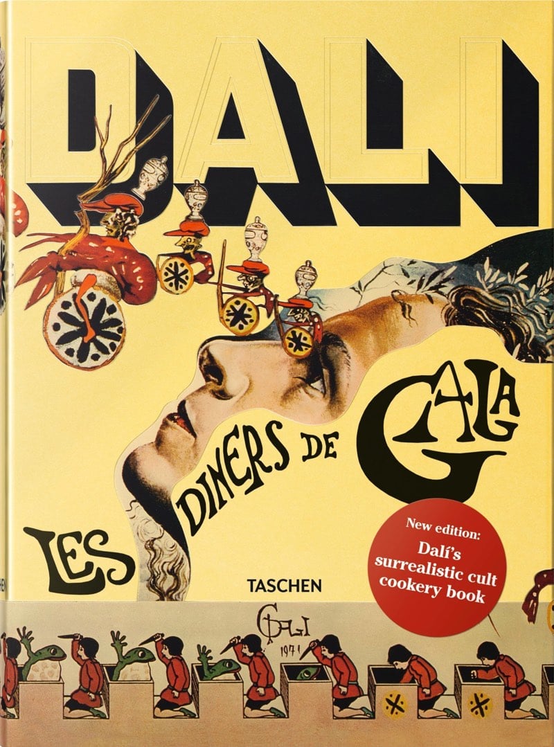
More than 40 years ago, food enthusiast and artist Salvador Dali published a cookbook called Les Diners de Gala. The book mixes Dali’s surrealist imagery and with dozens of recipes, including some that originated from the top restaurants in Paris at that time. The original book is quite rare and valuable now, but Taschen is reprinting it; it’s available for pre-order here.
This reprint features all 136 recipes over 12 chapters, specially illustrated by Dal’i, and organized by meal courses, including aphrodisiacs. The illustrations and recipes are accompanied by Dal’i’s extravagant musings on subjects such as dinner conversation: “The jaw is our best tool to grasp philosophical knowledge.”
See also The Artists’ and Writers’ Cookbook. (via colossal)

Isabelle Mège does not call herself an artist, but she has nonetheless been working on an interesting project for the last 30 years. Mège contacts photographers she likes and asks them to incorporate her into their work, keeping a copy of each photograph afterwards. She has over 300 photographs and has curated 135 of them into what she calls “the collection”.
After each shoot, Mège would follow up and ask the artist for a print, signed and sometimes numbered by its edition. The print would go into her archive, along with any artifacts related to its making; Elkoury’s letter, for instance, is accompanied in the archive by Mège’s notes about their encounter (he was late to their first meeting, and arrived with his shoelaces untied). Also in her archive are the heels that Witkin attached to her feet during the 1990 shoot, and a news item about Japanese customs having seized incoming copies of the magazine ARTnews to prohibit their circulation; the photograph, in which Mège’s pubic hair is visible, was considered obscene. Her diarizing and collection of correspondence, clippings, image reproductions, and relevant items reveal that the planning around certain images often lasted years. Several times, having worked with an artist to make an image, she was unhappy with the results and excluded it from her collection. When approached by artists who wanted to work with her but for whose work she had no feeling, she refused.
Mège felt strongly that no money should be exchanged in these interactions. (“As soon as there’s a question of payment, it’s dead, you fall asleep,” she told me.) She also asked each artist to sign a contract printed on a three-inch slip of paper, stating that she would have the right to exhibit or publish the image for noncommercial reasons only.
Mège’s project fits neatly into contemporary selfie culture. Her collection reminds me of other creative people who have incorporated themselves into their media of behalf of someone or something else. Call them “selfie auteurs”. Adam Lisagor has starred in many of the videos his company makes for tech clients. Casey Neistat films himself going on adventures for clients like J. Crew and Nike. Noah Kalina was commissioned by VH1 to take photos of himself posing with celebrities in his Everyday stance. I’m sure there are many more examples1 but few have done it as cleanly and purely as Mège.
Vugar Efendi has made a pair of videos showing scenes from films that have been inspired by famous paintings. The second video is especially good, showing references in There Will Be Blood, Lost In Translation, and a Jacques-Louis David reference from About Schmidt.
Leonardo da Vinci’s Mona Lisa is overrated. Why? For starters, the director of the Louvre said that 80% of the museum’s visitors are there just to see the Mona Lisa. 80%! We’re talking about one of the finest museums in the world, overflowing with some of the world’s greatest artworks, and people come to only see one thing. Overrated. The story of how that happened involves a passionate art critic and a crime.
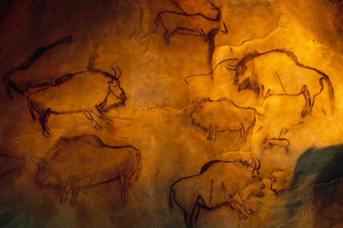
New York Magazine art critic Jerry Saltz has presumably been to most of the finest museums in the world, seen the works of the great masters, and generally spent a lifetime looking at great art. But he encountered what he calls “the most powerful artwork I have ever seen” in a French cave with drawings from about 13,000 years ago.
The idea that perspective was invented in Florence in 1414 collapsed in an instant. Here, larger mammals are in front of smaller ones who trail behind; animals at the back of packs are smaller than those in front. There’s also what’s called reverse perspective, the sort of system used in China, where closer things are rendered smaller than farther things. Elsewhere, an ibex is depicted from behind and over the shoulder — an incredibly sophisticated perspective. One horse is seen from a highly accomplished three-quarters view. Imagery seemed adjusted for curvatures and protrusions of the walls in the same ways that Renaissance frescoes adjust for distortions, distance, and odd viewing angles. I saw a bison with one horn curving up, the other curving down — either from battle or birth. Whatever the cause, this was something that had been seen and intentionally rendered.
Just penciled this in for my next trip to France, whenever that is.
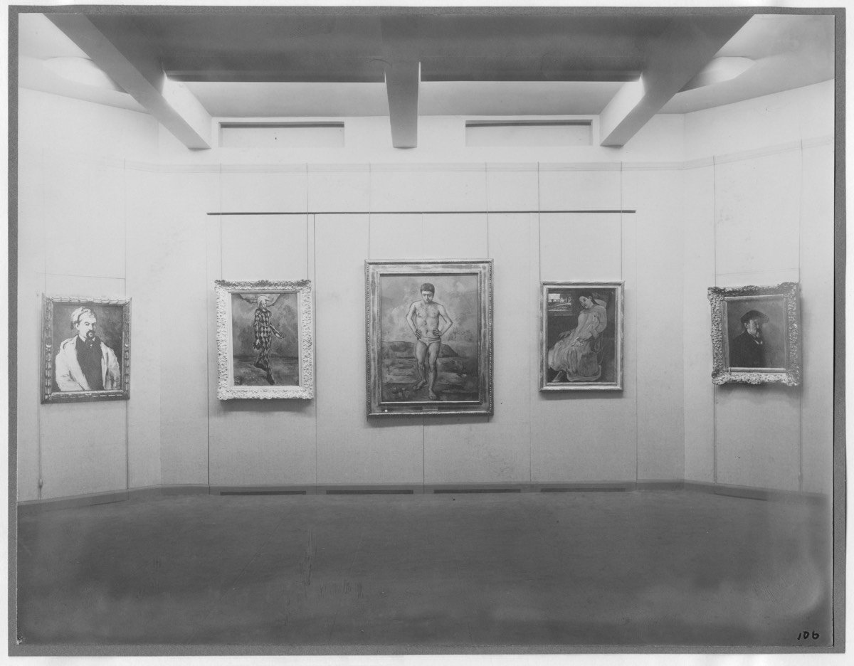
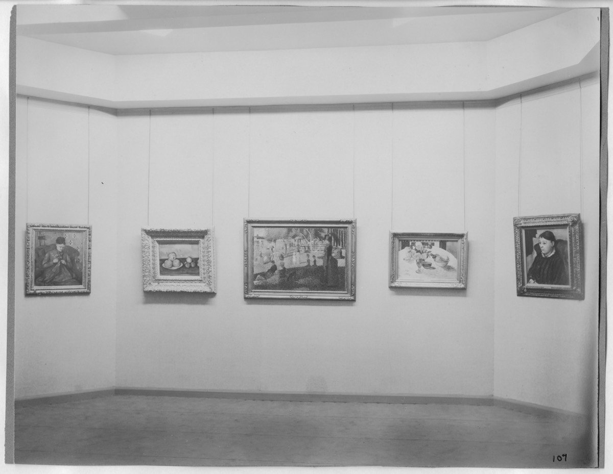
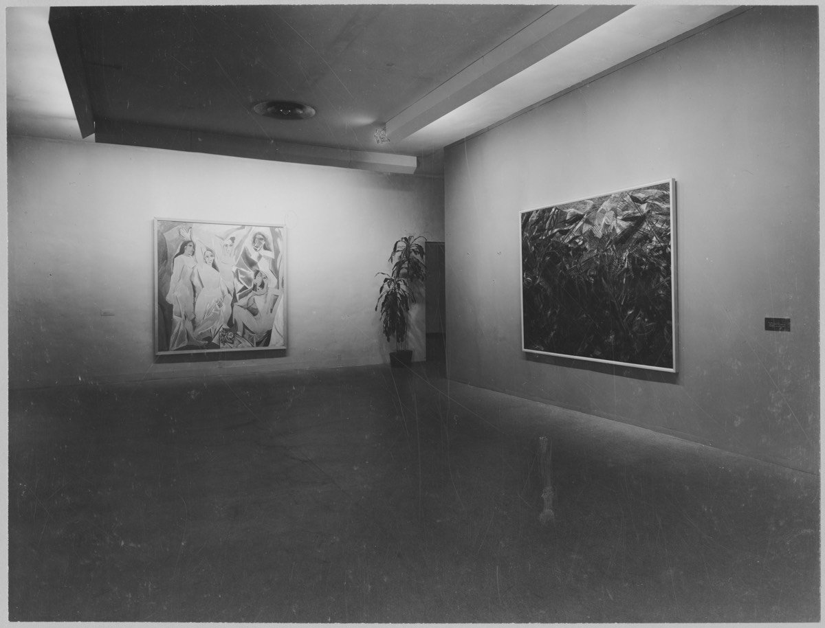
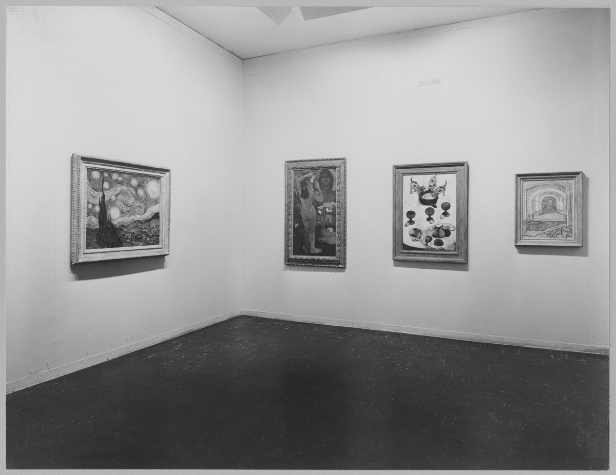
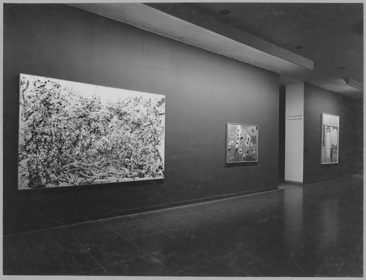
The Museum of Modern Art has started the process of putting online a massive trove of photographs of what the museum’s exhibitions looked like, extending back to their earliest big exhibition in 1929 of works by Cézanne, Gauguin, Seurat, and van Gogh. The NY Times has the story.
The digital archive project will include almost 33,000 exhibition installation photographs, most never previously available online, along with the pages of 800 out-of-print catalogs and more than 1,000 exhibition checklists, documents related to more than 3,500 exhibitions from 1929 through 1989.
Shown above are some notable works of art pictured among the first times they were displayed at the museum…the top one is from that first show in 1929. I happily spent an hour browsing through these exhibitions1 and I haven’t been gripped with this powerful of a desire to travel through time in quite some time. To be able to see that first exhibition…what a thing that would be. In part, I love going to museums for this very reason: standing in the very spot where the artist stood in making their drawing or painting is a very cheap form of time travel.

In 2014, Stian Korntved Ruud hand-carved a different wooden spoon every single day for the entire year. Yep, 365 spoons.
The past year Stian spent most of his time exploring the unique organic qualities of wood and how adding of a function can beautifully refine a piece of wood. The project consists of 365 unique hand carved spoons made from various types of wood. One carved everyday through a year.
By repeating the production of a spoon every day for a longer period of time (365 days), the goal is to challenge and explore a spoons aesthetic and functional qualities.
(via @pieratt)

Artists Katja Kublitz and Ronnie Yarisal built Anger Release Machine, a vending machine stocked with breakable items like glass plates, porcelain statues, etc. When you put some coins in, the machine dispenses an item, sending it crashing against the bottom of the machine. Then, you feel better. I love the concept, but the implementation leaves something to be desired. Here’s a video of the machine in “action”:
(via bb)
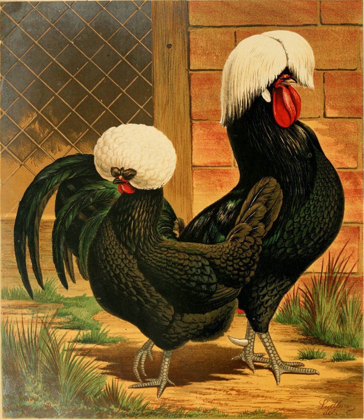
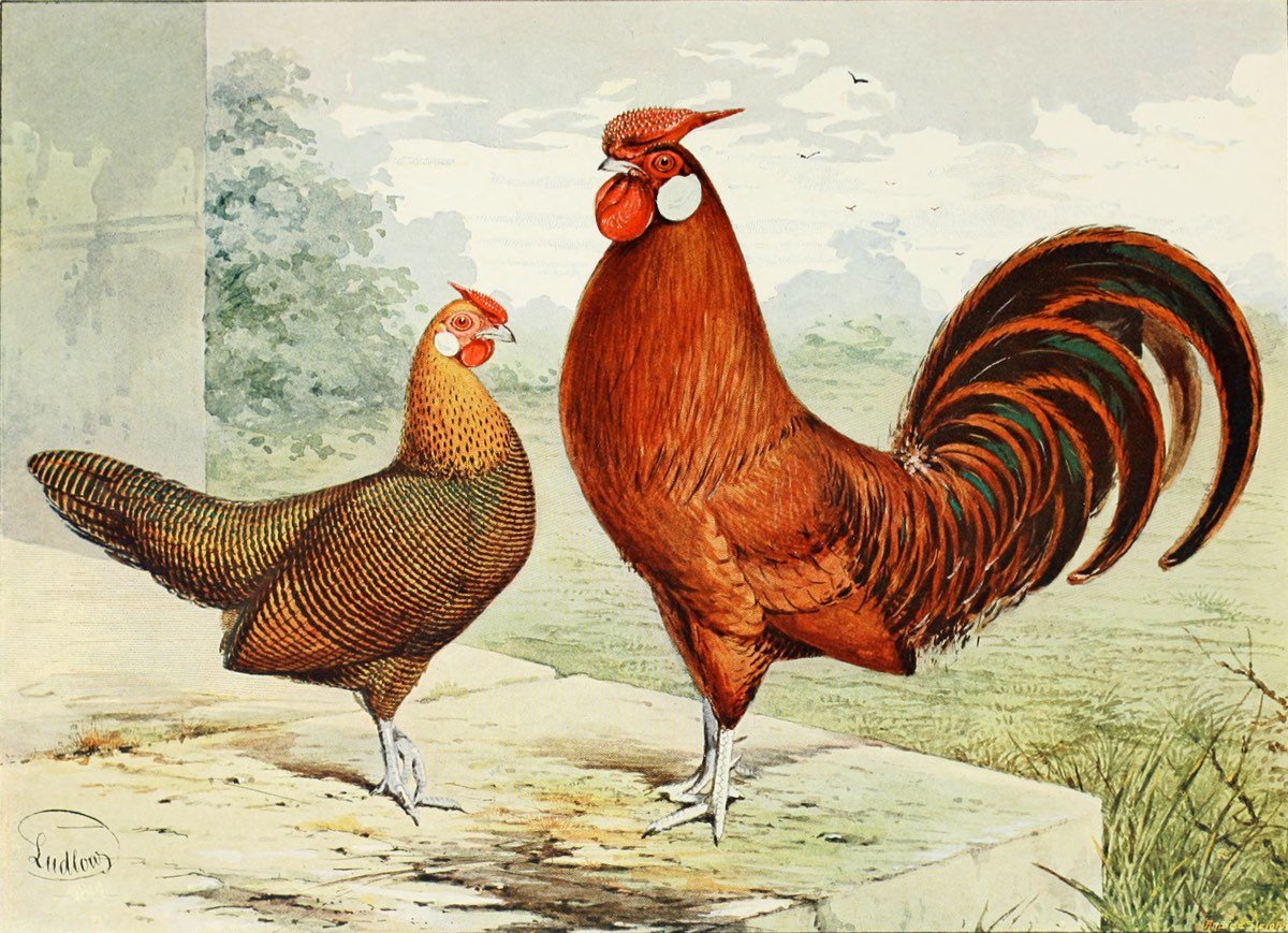
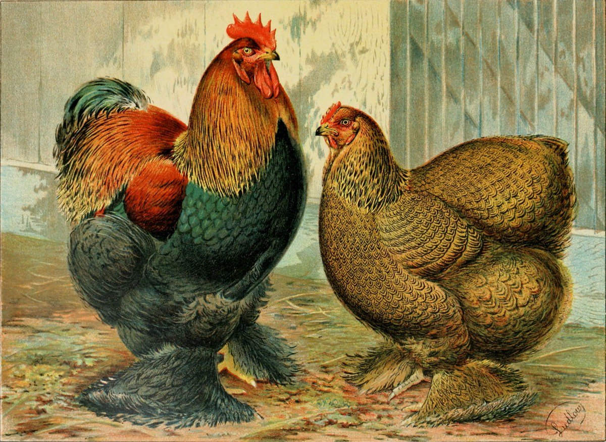
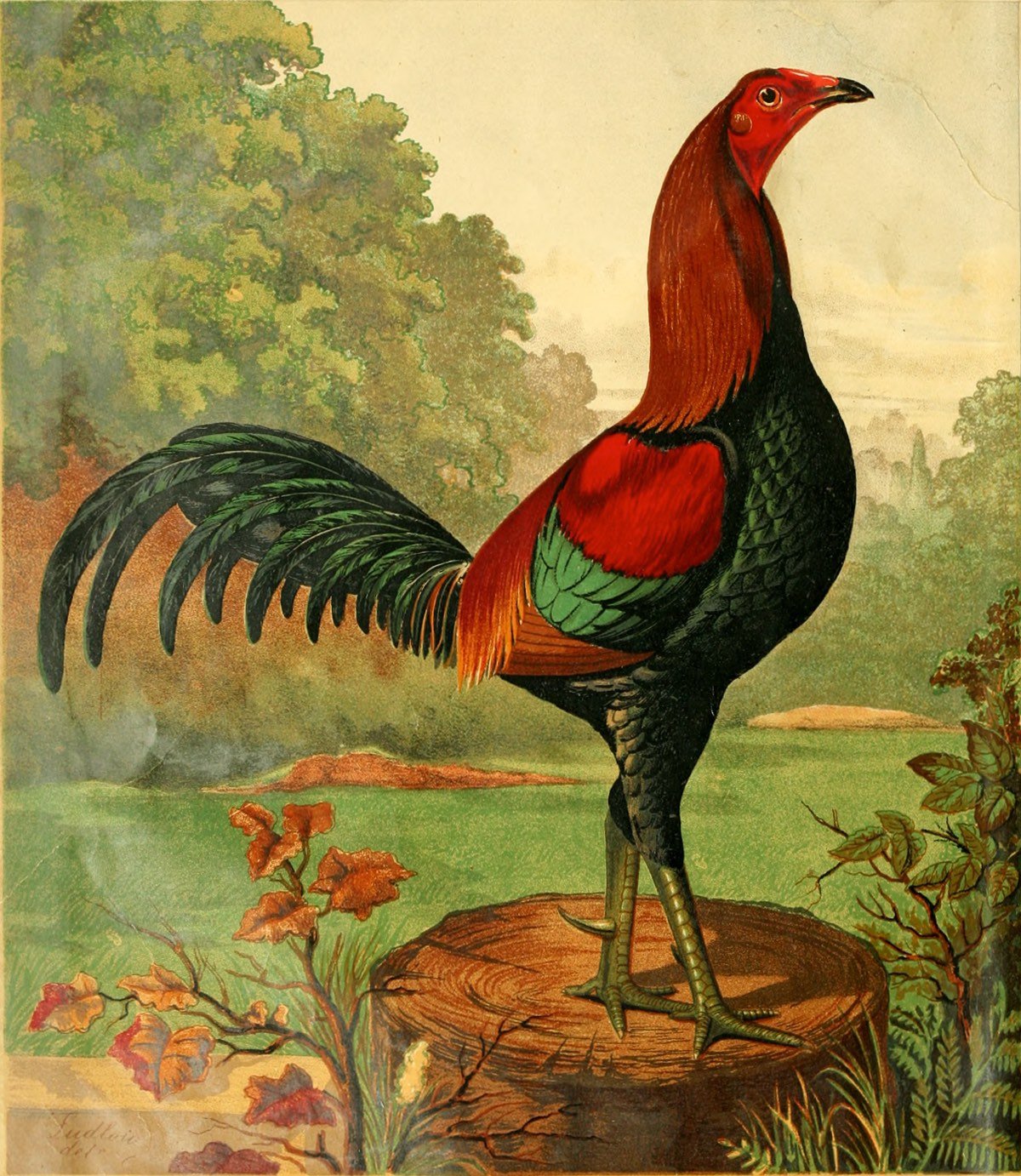
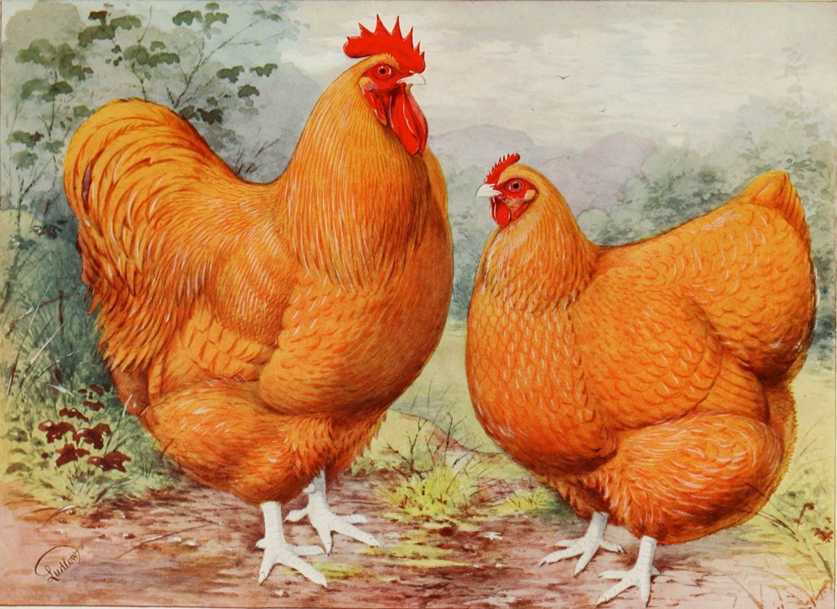
The Illustrated Book of Poultry by Lewis Wright, first published in 1870 and revised several times in the decades following, was “regarded as the most desirable of the English poultry books”. Poultry was very popular in Victorian England and the book housed a tremendous amount of practical poultry knowledge. From a Harvard Library blog post:
“Hen Fever”, as it became known during the Victorian Age, was an unprecedented obsession with owning, breeding, and showing the finest chickens in the world. The genesis of the poultry fancier owes much to Queen Victoria and her royal menagerie. In 1842, she acquired exotic chickens from China, and whatever the Queen did, the public would soon try to imitate and incorporate at home. The Illustrated London News reported “Her Majesty’s collection of fowls is very considerable, occupying half-a-dozen very extensive yards, several small fields, and numerous feeding-houses, laying-sheds, hospitals, winter courts, &c.”. From this point forward, poultry was no longer viewed as common farmyard critters, but valued and appreciated throughout the classes of Victorian Britain. The import and breeding of poultry was not just a leisurely hobby, but a profitable endeavor with sky rocketing price tags for the finest examples.
But the books also contained many wonderful illustrations of the finest examples of chickens and other poultry in the style of Audubon. The different breeds have amazing names like Buff Orpingtons, Plymouth Rocks, Dark Dorkingtons, and Gold Pencilled Hamburghs.
I pulled the images above from a 1911 edition of the book. (via @john_overholt)
Update: I removed a link to a reproduction of the book on Amazon because a reader reported that the quality was not great. (thx, alex)
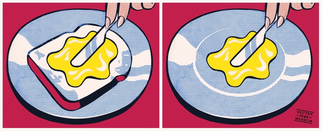
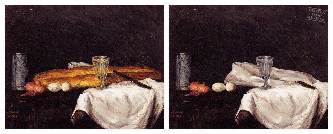

Gluten Free Museum takes works of art (high and low) and removes all of the gluten from them. A one-trick pony, but a particularly entertaining one. (via tmn)
In an episode of Doctor Who from 2010, the Doctor and his companion Amy take Vincent van Gogh, who was not a commercially successful artist in his own lifetime, to the Musée d’Orsay to see an entire room filled with his paintings. The resulting scene is unexpectedly touching.
This is an hour-long documentary on the Louvre’s recent restoration of Leonardo da Vinci’s The Virgin and Child with Saint Anne.
The Virgin and Child with Saint Anne is one of the most beautiful paintings in the world. It is also one of the most mysterious. Disfigured and even jeopardised by “repairs” and by the successive layers of varnish applied to it over the centuries, it was also in very bad condition. To save the painting, it had to be restored.
The spectacular operation, the likes of which occurs only once a century, took over three years to complete. The complex and outstanding restoration process provided a unique opportunity to get as close as possible to the painting, to how it was originally painted, and to better understand the complex relationship Leonardo da Vinci had with one of his finest masterpieces.
Restorations are fascinating. I only had time today for the first five minutes, but it hooked me enough that I’m going to go back to it tonight. (via @BoleTzar)
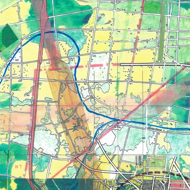
Since 1963, Jerry Gretzinger has been working on a map of a world that doesn’t exist. The map is never finished. In the morning, when Gretzinger draws a card out of the deck that sets his task for the day, sometimes that card says “scan”. That means a portion of the map is scanned and archived, and the copy is reworked to “upgrade” that part of the map. And that’s not even the half of it…just watch the whole thing to see how the map has evolved over the years.
It now comprises over 3200 individual eight by ten inch panels. Its execution, in acrylic, marker, colored pencil, ink, collage, and inkjet print on heavy paper, is dictated by the interplay between an elaborate set of rules and randomly generated instructions.
Portions of the map have been shown in Florence, Paris, and New York and it’ll be shown at an upcoming exhibition in Japan. (But where he really wants to display it is in MoMA’s huge atrium.) Prints and original panels are available on Gretzinger’s eBay store. (via @lukaskulas)
For a project called Tag Clouds, street artist Mathieu Tremblin paints over graffiti tags and makes them more legible.
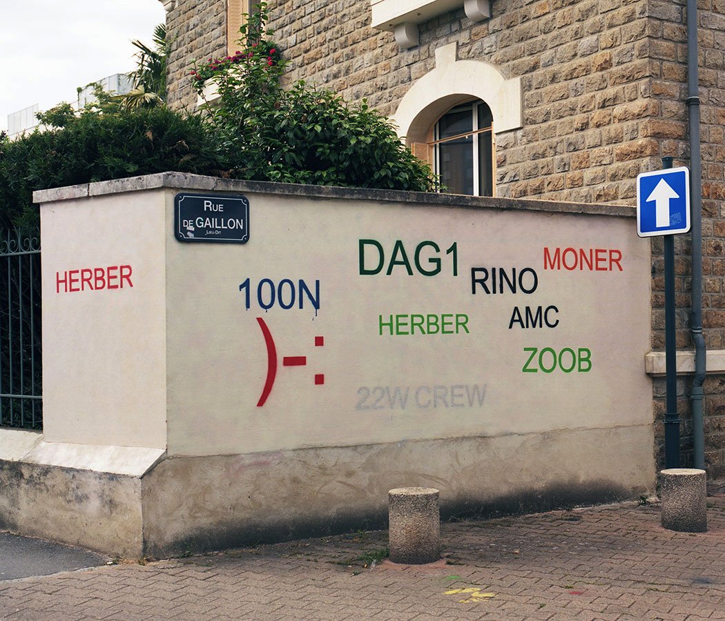
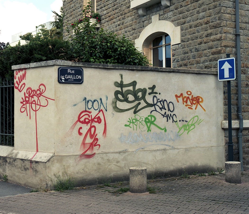
The result looks like when Word says that the Hardkaze and Aerosol fonts are used in the document you’re trying to open but are missing from your computer and you click OK to replace them with whatever’s available. I think the font above is Arial, which is perfect. I also like this faux-watermark piece he did:

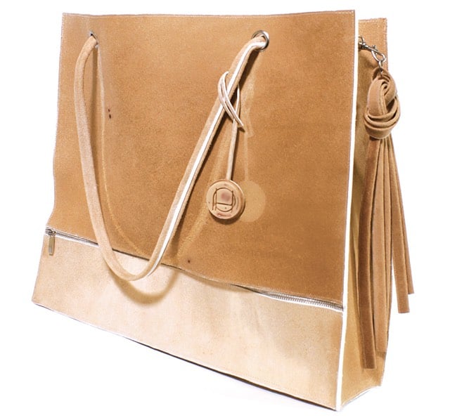
Designer Tina Gorjanc plans to create a collection of leather goods made from skin grown from human DNA, specifically the DNA of fashion designer Alexander McQueen. McQueen died in 2010, but he sewed his own hair into the items in his first collection, which is where Gorjanc is sourcing the genetic material for her leather.
The Pure Human project was designed as a critical design project that aims to address shortcomings concerning the protection of biological information and move the debate forward using current legal structure.
Furthermore, the project explores the ability of the technology to shift the perception of the production system for luxury goods as we know it and project its implementation in our current commercial system.
In other words, should we be able to make handbags from of Alexander McQueen’s DNA without his (or his estate’s) permission? Dezeen has more details on the project. BTW, the handbag pictured above is a mockup created from pigskin, onto which freckles have been applied. Other mockups include replicas of McQueen’s tattoos, which, you know, wow. (via @claytoncubitt)
This is cool. StyLit is a patent-pending program for tranferring the style of an artist’s drawing to a 3D rendering in realtime. (via subtraction)
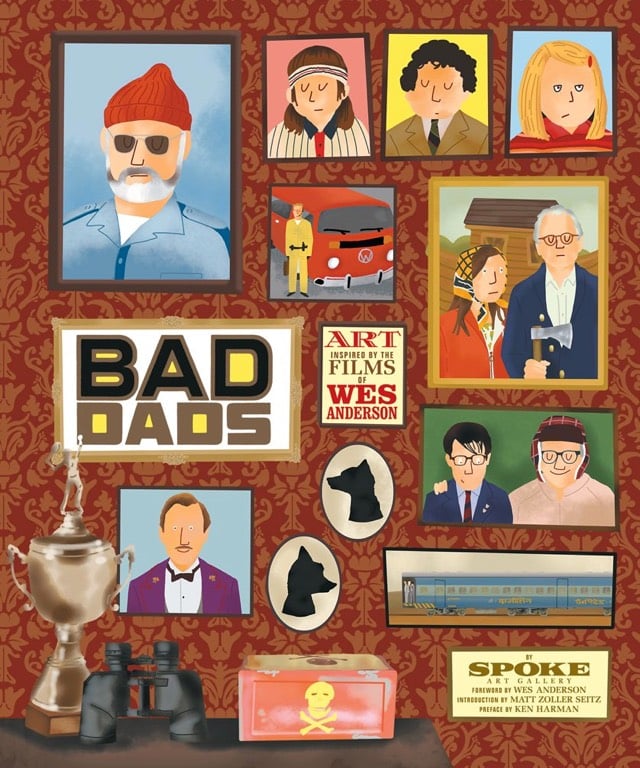
Wes Anderson’s films are chock full of bad fathers and father figures. Bad Dads, the third book in the Wes Anderson Collection, showcases some of the art from the annual Bad Dads art show (prints!) at the Spoke Art Gallery in San Francisco.
The Floating Piers is a new art installant from Christo and Jeanne-Claude consisting of massive floating bridges and docks covered in yellow fabric that connects a pair of islands to the mainland in Italy’s Lake Iseo. The video above offers an aerial view of the installation.
Visitors can experience this work of art by walking on it from Sulzano to Monte Isola and to the island of San Paolo, which is framed by The Floating Piers. The mountains surrounding the lake offer a bird’s-eye view of The Floating Piers, exposing unnoticed angles and altering perspectives. Lake Iseo is located 100 kilometers east of Milan and 200 kilometers west of Venice.
“Like all of our projects, The Floating Piers is absolutely free and accessible 24 hours a day, weather permitting,” said Christo. “There are no tickets, no openings, no reservations and no owners. The Floating Piers are an extension of the street and belong to everyone.”
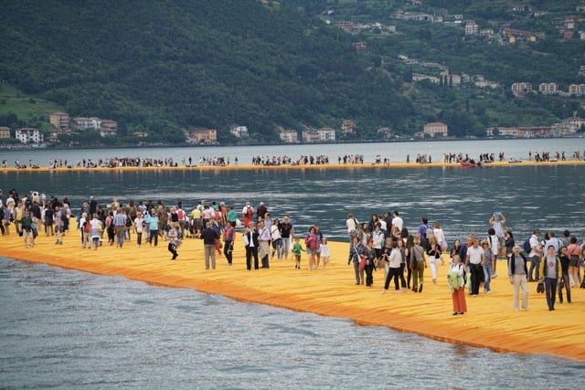
This is very reminiscent of The Gates, which is one of my favorite pieces of art. (via tksst)
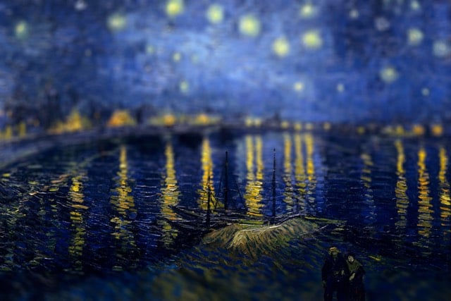
Bhautik Joshi took 2001: A Space Odyssey and ran it through a “deep neural networks based style transfer” with the paintings of Pablo Picasso.
See also Blade Runner in the style of van Gogh’s Starry Night and Alice in a Neural Networks Wonderland.


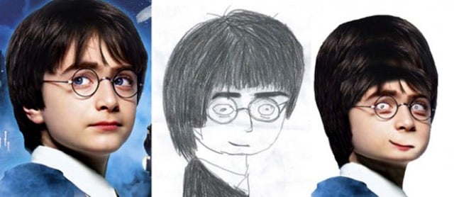
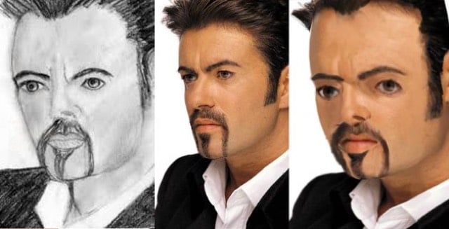
Velocipedia is a collection of drawings of bicycles paired with realistic renderings of what the real-life bikes would look like. Some of the sketches, drawn from memory, are not that accurate and result in hilariously non-functional bikes.
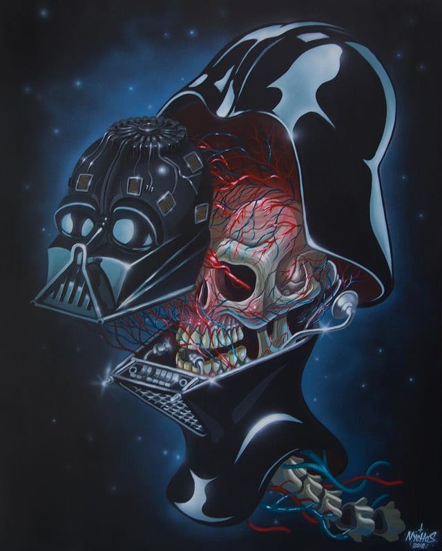
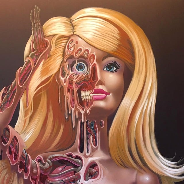
From Austrian street artist Nychos, previews of a Dissection of Darth Vader’s Head piece and a “Barbie meltdown” piece from an upcoming show at Jonathan LeVine Gallery in June. You can see more of his work on his Tumblr and Instagram.
It’s impossible to tell someone how to interpret paintings by Picasso in only 8 minutes, but Evan Puschak provides a quick and dirty framework for how to begin evaluating the great master’s work by considering your first reaction, the content, form, the historical context, and Picasso’s own personal context.
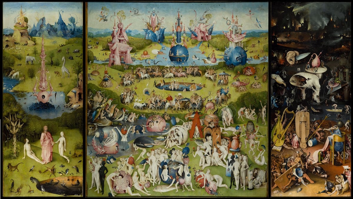
On the 500th anniversary of his death, the Dutch public broadcasting service has created an interactive version of Hieronymus Bosch’s The Garden of Earthly Delights.
Tobias Gremmler used motion capture to transform kung-fu moves into a variety of digital sculptures. (via colossal)


The Misplaced Series removes notable New York buildings from their surroundings and “misplaces” them in desolate landscapes around the world. Concrete behemoths and steel-and-glass towers rise from sand dunes and rocky cliffs, inviting viewers to see them as if for the first time. Out of context, architectural forms become more pronounced and easily understood.
See all 10 buildings in their new surroundings at Misplaced New York.
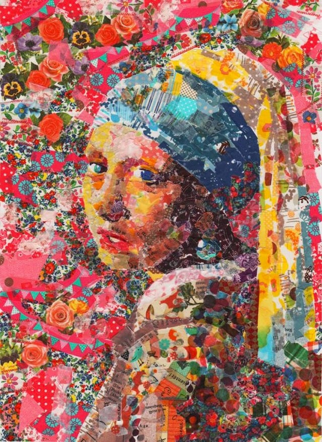
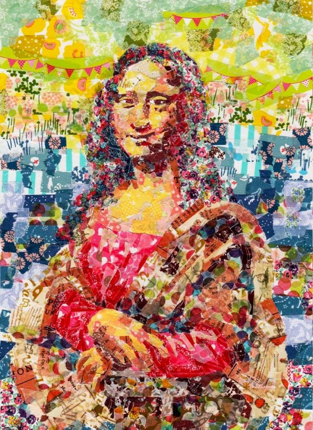
Nasa Funahara makes art out of colorful masking tape, including recreations of famous artworks.
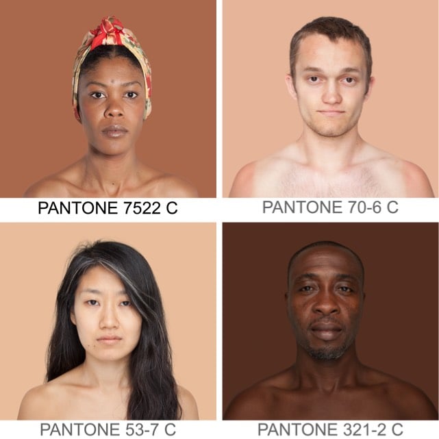
Angélica Dass’ Humanæ project matches photos of volunteer participants with the Pantone colors of their skin tones.
Update: Turns out this really cool blog you guys should be reading covered this project almost 4 years ago. (thx, @djacobs)
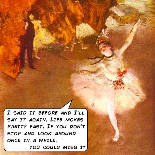
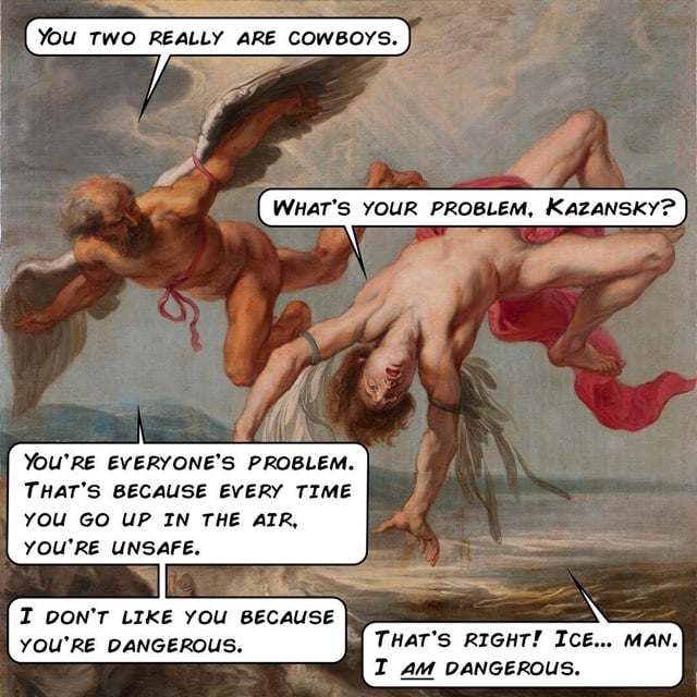
The Popquotery Instagram account mixes fine art with pop culture quotations, mostly from movies. Here for instance, is Degas + Ferris Bueller:
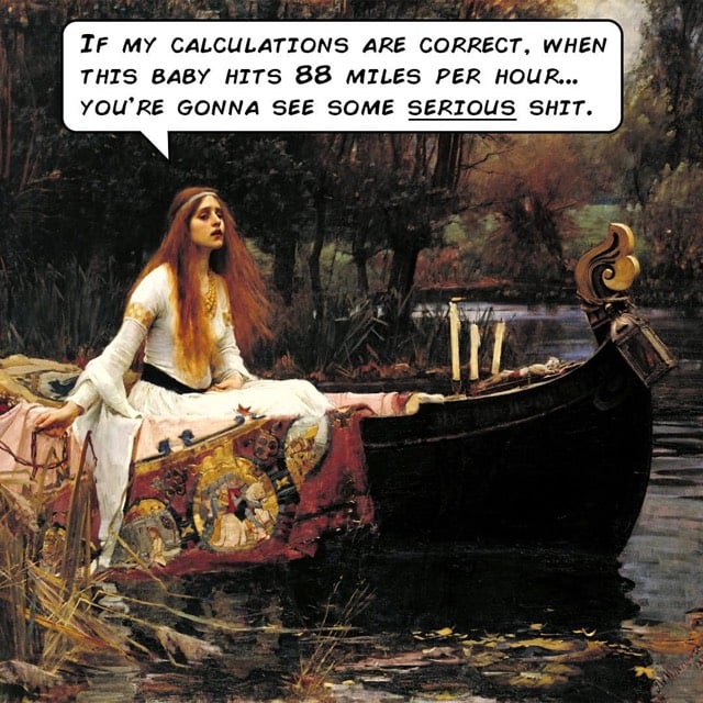
And Waterhouse + Back to the Future:
How about Gowy + Top Gun:
Newer posts
Older posts








Socials & More