kottke.org posts about Art
Euro art collective Henry VIII’s Wives recreate iconic 20th century photographs using Glaswegian pensioners as models, all posed outside their housing complex in Glasgow. A real glaswegian kiss to the complacent gaze with which the original photos are too-easily met.
(thx, joseph)
Alexander Bohn wrote a glowing review of FFFFOUND! at Speak Up the other day. My FFFFOUND! fandom is documented elsewhere, so I’ll comment instead on an observation Bohn made in his initial paragraph:
Graphic design might not work in the white cube, but it flourishes on a white background. A new mutated strain of design blog has evolved: The Randomly Curated Other People’s Images White Background Site, or RCOPIWS. Sites like Manystuff, Monoscope, Your Daily Awesome, and VVORK (among countless others) offer designers and design aficionados a constant flood of typographic morsels, interesting photos, arresting new art, and the like. One such site sets itself apart, notably, from the other RCOPIWSes: the collaborative image-bookmarking site ffffound.com — allegedly, but unconfirmed, initiated by online fiend Yugo Nakamura.
Among the many things that the internet has democratized is curating, a task once more or less exclusive to editors (magazine, book, and newspaper), art gallery owners, media executives (music, TV, and film), and museum curators. They choose the art you see on a museum’s wall, the shows you see on TV, the movies that get made, and the stories you read in the newspaper. The ease and low cost of publishing on the web coupled with the abundance of sample-ready media has made the curating process available to many more people. Smashing Telly is David Galbraith’s rolling film festival (or TV channel). By simply listening to the music that you like, Last.fm allows anyone to put together their own radio station to share with others. kottke.org is essentially a table of contents for a magazine I wish existed. Shorpy has freed old photography from the nearly impenetrable Library of Congress web site and presented it in a compelling blog-like fashion.
In the case of FFFFOUND! and other RCOPIWSs, I would argue that these sites showcase a new form of art curating. The pace is faster, you don’t need a physical gallery or museum, and you don’t need to worry about crossing arbitrary boundaries of style or media. Nor do you need to concern yourself with questions like “is this person an artist or an outsider artist?” If a particular piece is good or compelling or noteworthy, in it goes. The last week’s output at Monoscope would make a pretty good show in a Chelsea art gallery, no? It’ll be interesting to see how this grassroots art curating will affect the art/design/photography world at large. Jen Bekman, who has roots in the internet industry, is already exploring this new frontier with her nimble gallery and the Hey, Hot Shot! competition. Others are sure to follow.
Ursine is a new series of photos by Jill Greenberg, who previously did monkey portraiture and crying children, the latter of which provoked some controversy in the blogosphere.
I was going to shoot grizzly bears because they’re safer than bloggers.
A complete series of photos are available on Greenberg’s web site, sadly buried in an inscrutable Flash interface.
A pair of Lego skyscrapers (made from 250,000 pieces and inhabited by 1000 Lego people) are on display at the Storefront for Art and Architecture in NYC through November 24. Dennis Crowley’s got some pictures and a short movie. Details include a wee Banksy piece on the side of the building and tiny iPod ads. Here’s a timelapse video of the construction. (thx, dens)
Photograph of the graves of Vincent and Theodore van Gogh in Auvers-sur-Oise, France. (Don’t quite know why I’m posting this…it just struck me is all.)
Casey Reas and Ben Fry, inventors of the Processing programming language (that’s Proce55ing to you old schoolers), have just come out with a book on the topic that looks fantastic. In addition to programming tutorials are essays and interviews with other heavy hitters in the programmatic arts like Golan Levin, Alex Galloway, Auriea Harvey, and Jared Tarbell. The site for the book features a table of contents, sample chapters, and every single code example in the book, freely available for download. Amazon’s got the book but they’re saying it’s 4-6 weeks for delivery so I suggest hoofing it over to your local bookstore for a look-see instead.
Fritz Kahn’s Man As Industrial Palace.
Kahn’s modernist visualization of the digestive and respiratory system as “industrial palace,” really a chemical plant, was conceived in a period when the German chemical industry was the world’s most advanced.
Be sure to check out the larger version.
Is lazy reporting hurting the visual arts? Jonathan Jones argues that almost all reporting about art takes one of six forms: expensive art, graffiti, plagiarism, earth-shattering discoveries, and restoration. Looking back through kottke.org’s art tag page, I am guilty of linking to stories of all those types. Eep.
Hoax or art? Or both? Artist Xu Zhen climbed Mt. Everest and shaved off almost 2 meters of the top of the mountain, the literal peak of Everest, and is displaying it as art.
Audiences may not believe that this is real, which is similar to how people rarely question whether the height of Everest truly is 8848 meters. This relationship between belief and doubt has to deal with questions of standard, height, reality, and borders.
(via daily awesome)
Jessica Lagunas’ Return to Puberty, an artwork consisting of a “video close-up of my pubis in a static single shot, in which I depilate most of my pubic hair with a pair of tweezers continuously for one hour”. It’s like the female version of Empire. NSFW.
Get Lost is a collection of maps of downtown Manhattan drawn by a variety of artists.
I’m intrigued by Marc Hedlund’s differentiation of Impressionist bloggers from Realist bloggers. My interpretation of this difference (which might not be what Marc meant by it) is that Realist blog posts are self-contained, -explanatory, and -evident entities while a post on an Impressionist blog serves to complement the whole, much like the dots making up a Seurat painting aren’t that interesting until you stand back to see the whole thing.
The downside for Impressionist blogs is that their individual posts don’t work that well outside of their intended context. If you run across a single post from an Impressionist blog in your River of News, a remixed Yahoo Pipes RSS feed, in del.icio.us, or an item in a Google search results set, it might not make a whole lot of sense. Impressionist blog posts are less likely to get Dugg or bookmarked in del.icio.us or linked around much at all. Fewer incoming links, big or small, to individual pages means fewer pageviews, which makes it more difficult to run an Impressionist blog as a business that relies on advertising revenue. If you look at most of the big blog sites, they’re all non-Impressionist blogs. All the sites whose posts are featured on the front page of Digg are non-Impressionist…those posts/articles are designed to float self-contained around the web. The blogosphere is dominated by non-Impressionist blogs and the sort of content they produce…which is sad for me because, like Marc, I value Impressionism in a weblog.
Tauba Auerbach: startling starting staring string sting sing sin in i. More of her typographic work here.
Remember the Splasher/graffiti/defacing business from last week? The group of people collectively know as the Splasher is back with a manifesto: “if we did it, this is how it would’ve happened”. Not the most succinct, these art school revolutionaries.
A fellow named the Splasher has been splashing paint on street art around NYC over the past few months. Here’s some of his, er, work. Well-known street artist Shepard Fairey (the Splasher has targeted several of his pieces) opened a show last night in DUMBO and two guys tried to set off a homemade smoke bomb at the opening, leading to speculation that one (or both) of them was the Splasher. Gothamist has more. Jake Dobkin has photos from Fairey’s show, which looks pretty nice.
Update: The Brooklyn Paper is reporting that DJ 10 Fingers subdued the suspected Splasher before he could light his stink bomb. (No, seriously!) The would-be stink bomber is facing a possible 15 years in jail.
Regarding Eve Mosher’s project to draw a flood line around Brooklyn and lower Manhattan, here are a couple of related projects. Ledia Carroll’s Restore Mission Lake Project outlined the shore of an historical lake which used to sit in the midst of San Francisco’s Mission neighborhood. Under The Level explores the possibility and consequences of Katrina-level flooding in NYC. (thx, kayte and dens)
Artist Eve Mosher is drawing a chalk line around Brooklyn and lower Manhattan that denotes the encroachment of the ocean if it were to rise 10 feet above the current sea level. There’s a web site for the project, including a progress blog. See also Flood Maps.
Regarding my post about Tim Knowles’ work, Greg sent in a couple of links to similar projects. Olafur Eliasson created these drawings much like Knowles did with his Vehicle Motion Drawings, except he used the motion of his father’s fishing boat. William Anastasi has done drawings for almost 40 years by letting his pen drift on a piece of paper while riding the subway.
I just stumbled upon the work of Tim Knowles, whose art explores the mostly hidden, obscured, or otherwise unnoticed motion of objects. One of his projects is Tree Drawings:
Drawings produced by pens attached to the tips of tree branches, as the branches move in the wind the tree draws on to a panel or drawing board on an easel. Like signatures the trees drawings tell of the tree’s character; a Hawthorn producing a stiff, scratchy & spikey drawing an Oak a more elegant flowing line.
Here’s the oak at its easel and the resulting art:
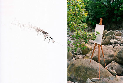
For Vehicle Motion Drawings, he constructed an apparatus to capture the motion of a car being driven…the turns, stops, and starts of the vehicle move the pen over the paper. His postal projects capture the motion of packages through the postal system, both with drawings and photography. (Knowles’ Spy Box reminds me of Kyle Van Horn’s cameramail.)
Love his stuff. (via waxy)
Opening Friday, June 22 at jen bekman gallery in NYC: A New American Portrait, “a group exhibition of photographs featuring artists at the vanguard of contemporary portraiture in America”. Curated by Jen Bekman and Joerg Colberg, one of my favorite bloggers on the topic of photography.
Newer posts
Older posts



Stay Connected