kottke.org posts about photography
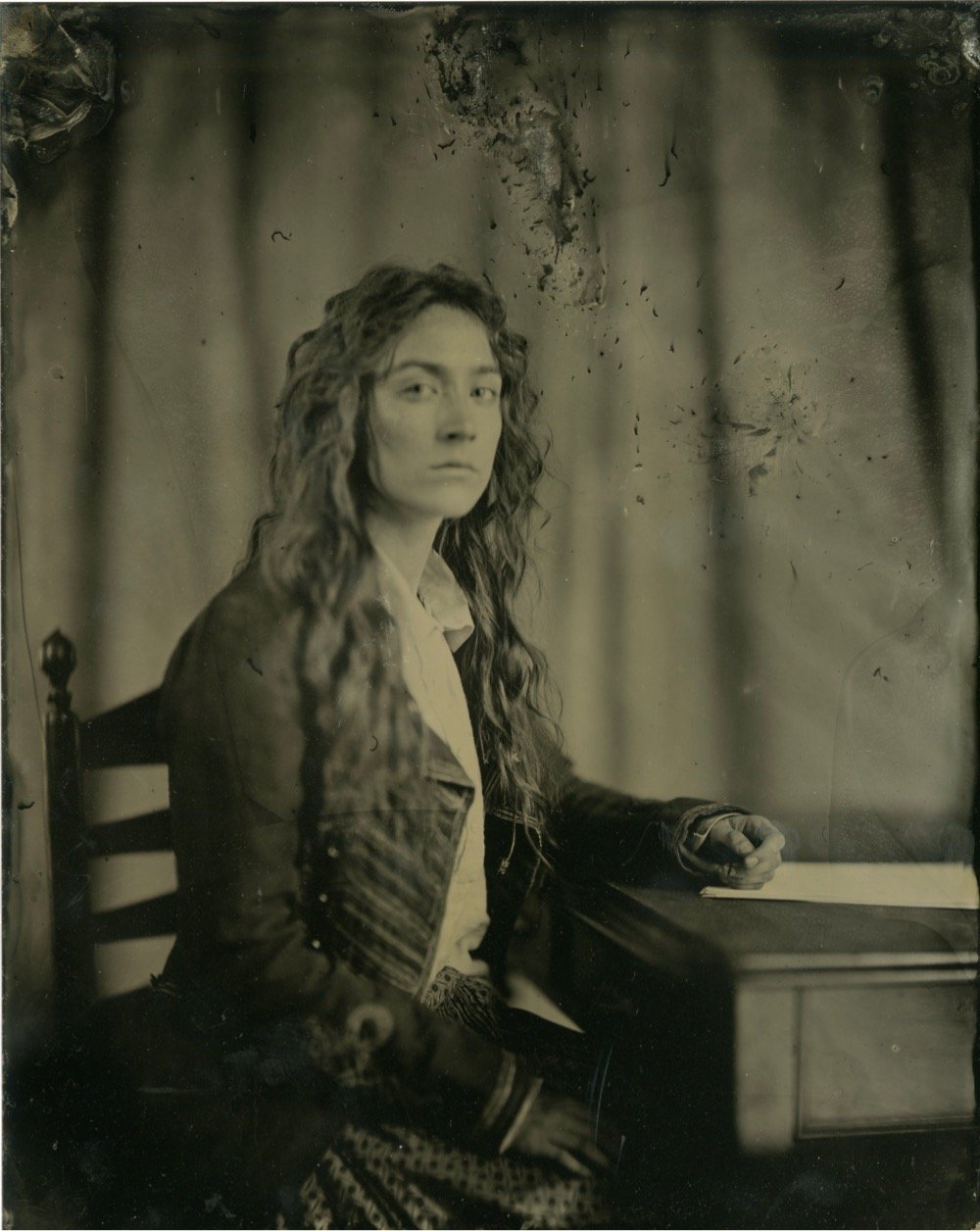
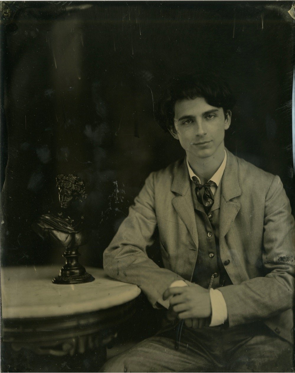
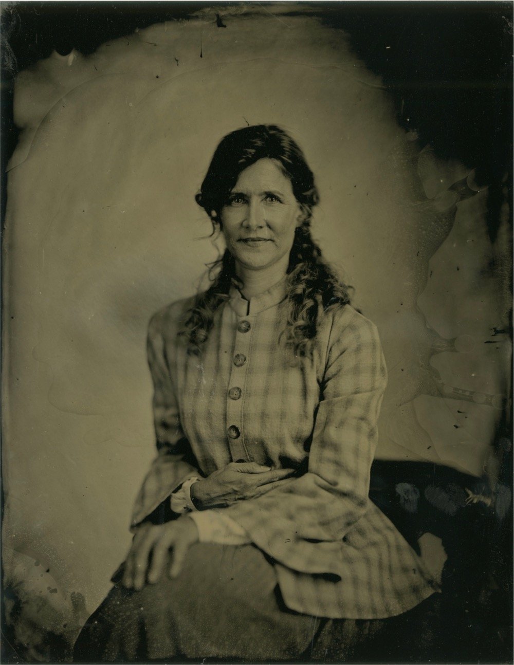
Photographer Wilson Webb made these great tintype portraits of the cast of Little Women. Invented in 1851, the collodion process would have been in use during the time the movie takes place. You can read about Webb’s process at PetaPixel.
To capture the actual portraits, Webb got his hands on a 130-year-old Dallmeyer lens that he strapped to a modern large format camera, and set up 25,000 Watt-seconds worth of flash to ensure he had enough light. That’s… a lot of light. So much that Webb says his subjects “can feel a wave of heat and they can also smell the ozone that’s created when the picture’s taken.”
But despite all of this light — which allowed him to capture a much faster “shutter speed” than traditional wet plates — he still had the cast pose in a traditional fashion: facing the camera, stoic expression, sitting still for 30 seconds at a time to capture each individual frame.
You can check out the whole series of portraits at My Modern Met.


Digging this work from Noe Alonzo. The top image is from his Anime World project and the bottom from a collection of Blade Runner-esque images shot at night. His images are obviously heavily processed — he offers tutorials on his YouTube channel — but what photos aren’t? Very little comes out of the camera looking amazing, which was as true in Ansel Adams’ day as it is today. (thx, @thelastminute)


The World Nature Photography Awards have announced the winners of their 2020 competition. Thomas Vijayan’s photo of an orangutan (top) won the overall prize and I enjoyed the optical illusion created by Naomi Rose (bottom). You can see the rest of the winners in several different categories here. (via in focus)
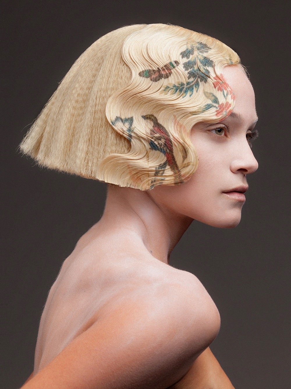
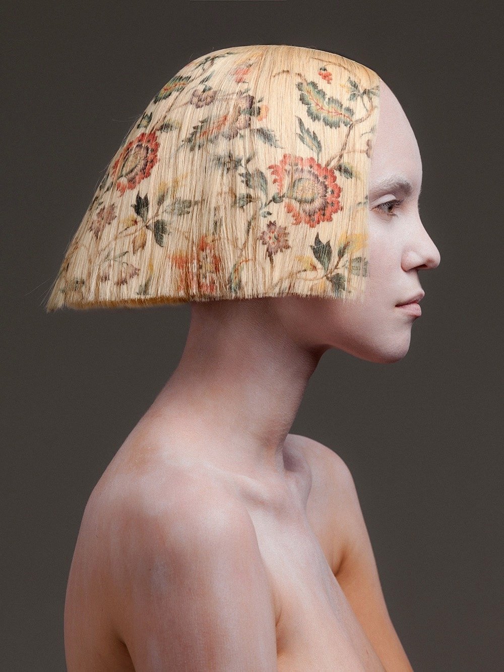

After many years of experimentation, Spanish hairdresser Alexis Ferrer has developed a process for vibrant, full-color printing onto hair extensions, culminating in his recent collection, La Favorite (photographed by Rafael Andreu on model Emma Fuhrmann).1
Photographer James Crombie and his friend Colin Hogg captured an amazing moment over Lough Ennell in County Westmeath, Ireland on Tuesday: a murmuration of starlings that, for a split second, looked like a huge bird. Crombie took the photo and Hogg the video:
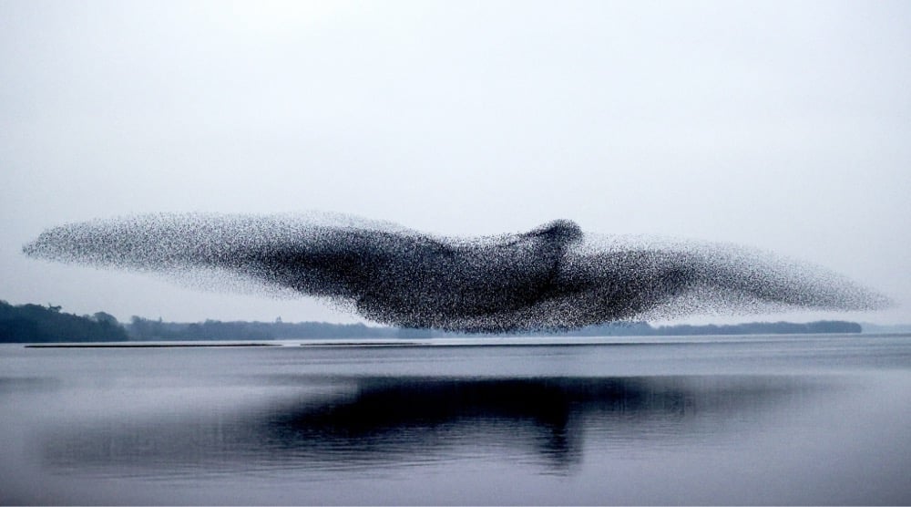
Crombie made, he thinks, about 50 trips to Lough Ennell in the past few months. “I’m usually a sports photographer, so for a while I’ve had a bit of time to think about other things. I had an image in my head,” he explains. “I could see they were making shapes. I kept going back, to get the image I had in my head.”
…
Finally, at about 6pm on Tuesday, Crombie focused his Canon EOS-1D X Mark III and got the image he wanted. That night alone he shot between 400 and 500 frames before capturing this unforgettable photograph. “It paid off,” he says.
I know there has to be a word for a collection of things that looks like an individual member of the group (like the school of fish in Finding Nemo) but I can’t find it right now. Anyone know? Or have a good suggestion? (thx, aaron)
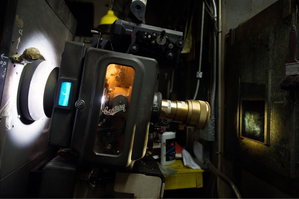
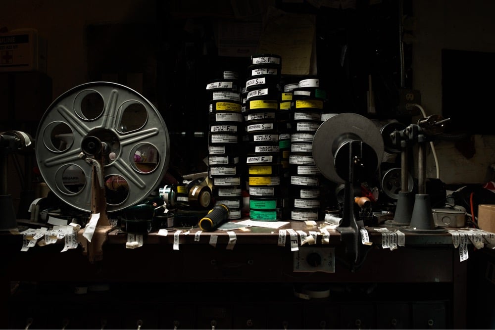
Projection is a short film by Joseph Holmes of clips from 50 different films that take place in movie theater projection rooms. This supercut was made to accompany Holmes’ series The Booth, a collection of photos from 2012 that document the disappearing/changing movie theater projection rooms.
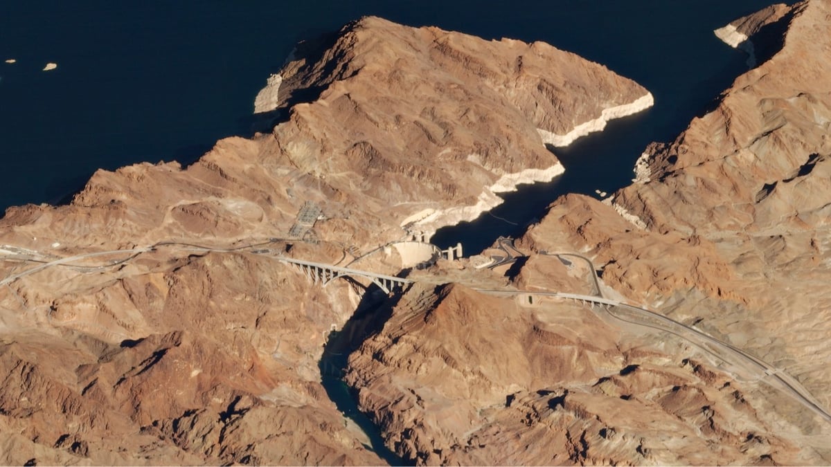
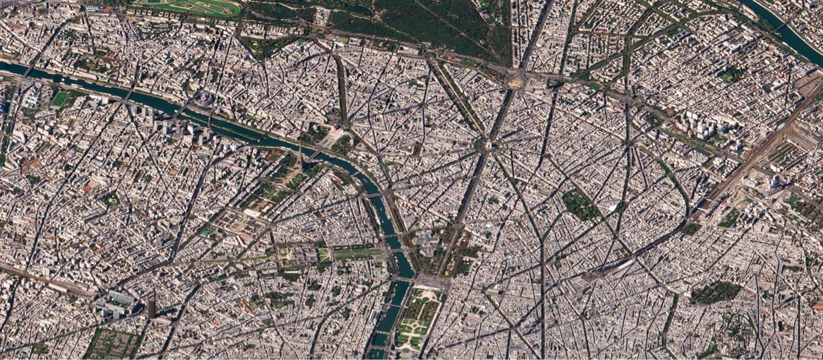
As previously documented, I am a big fan of satellite images taken from a low angle. Planet Labs’ Robert Simmon wrote a post that talks about the history and uses of low-angle satellite imaging and shares many examples (like the two above of the Hoover Dam and Paris).
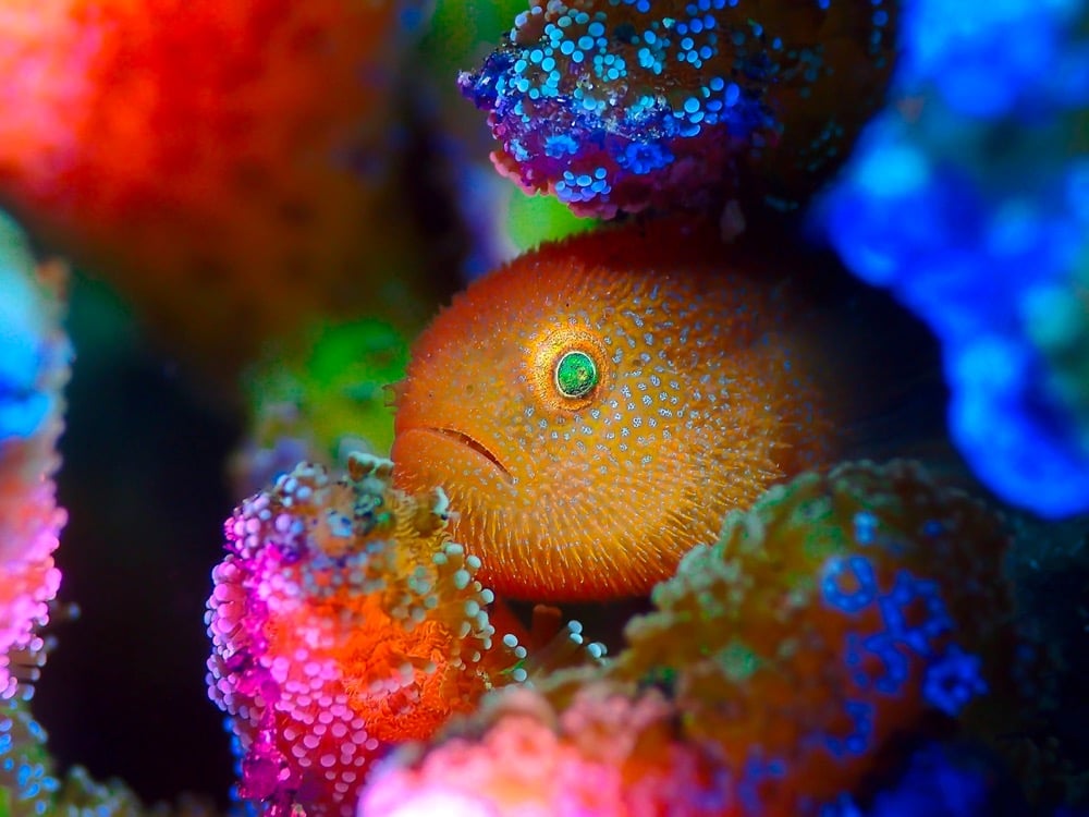
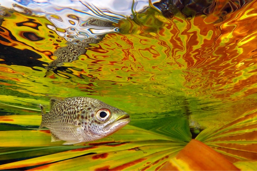
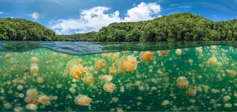
The winners of the Underwater Photographer of the Year 2021 have been announced. I picked a few of my favorites and you can see more from In Focus. Photos above from top to bottom: ManBd, Jack Berthomier, and Oleg Gaponyuk.
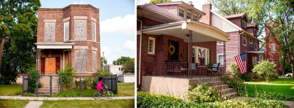
With regard to the Chicago’s street numbering system, Madison Street is the boundary between the North and South Sides of Chicago. Because of discriminatory housing policies and practices, especially during the Great Migration, Chicago is one of the most segregated cities in America. Generally speaking, a predominantly white North Side has had better access to resources and higher home values while a largely Black South Side has had lower home values and less access to resources.
Artist Tonika Johnson’s Folded Map Project explores the differences and similarities across this boundary by comparing an addresses on the North Side with the corresponding addresses on the South Side. She does this through paired photos of the houses and the residents living at each twinned address, and video interviews with those “map twin” residents, as well as a movie, an installation, workshops, and even a stage play. The image at the top of the post is of one of the address pairs (6329 S. Paulina and 6330 N. Paulina).
Colossal recently posted an interview with Johnson about the project:
The ultimate point that I was trying to get across was that Chicago’s history of segregation is still with all of us today. I wanted to prove this point for people who might not make that connection [between] the disparity that exists and the history behind it. I wanted the project to be an entree into expanding people’s minds of Chicago’s history of segregation through thinking about their own lived experience. I really appreciated being able to do that through art, through photos and portraits and video because I wasn’t blaming people who live on these different sides. I was offering them insight into the larger question of, “did you really choose this? Does our segregation reflect how we want to interact? And if it doesn’t, then you have to question why is it this way?”
There is this narrative that people think [Chicagoans] don’t interact. But we do, a lot, especially through art. That’s how we know the city is segregated. (laughing) We know that we’re disrupting this segregation when we come together. And that’s why I think art is such a beautiful common denominator.
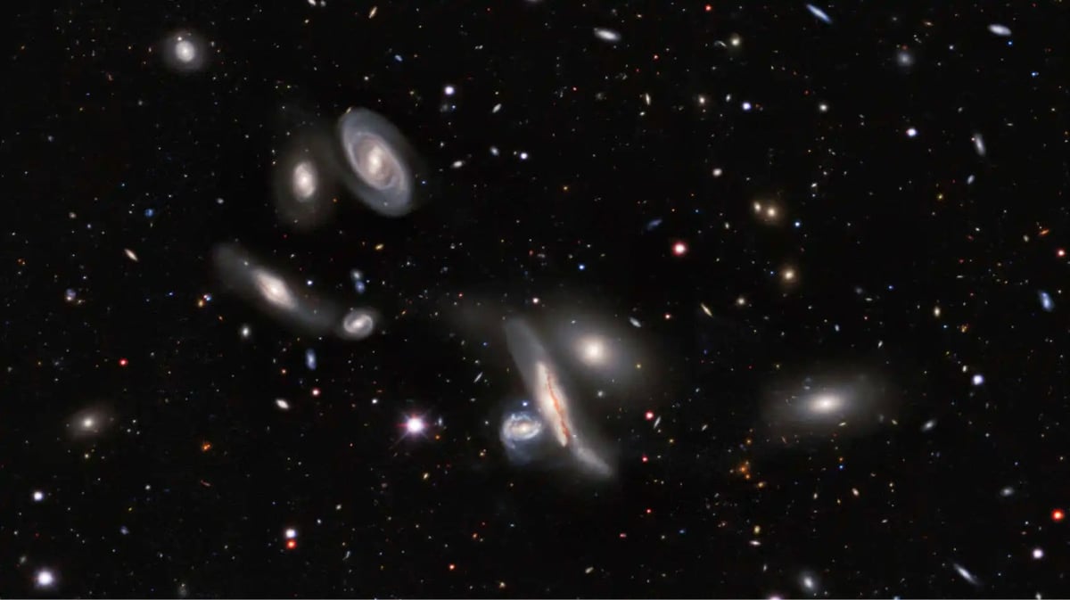
After 1405 nights of observation over 6 years, astronomers at three observatories have produced an image of the night sky that contains 10 trillion pixels of data and depicts over a billion galaxies. Bad Astronomy’s Phil Plait has the details.
It’s the result of the DESI Legacy Imagining Surveys, maps of the sky made by the three observatories (the Dark Energy Camera Legacy Survey, the Beijing-Arizona Sky Survey, and the Mayall z-band Legacy Survey, in combination with the orbiting WISE infrared observatory). They mapped the northern sky in seven colors, covering a third of the entire sky — 14,000 square degrees, or the equivalent area of 70,000 full Moons on the sky.
The ultimate goal is to better understand dark energy, the mysterious substance that’s accelerating the expansion of the Universe, by looking at the distribution of galaxies throughout the Universe. They’ll do that by picking tens of millions of the billion galaxies in the data and getting follow-up observations with the Dark Energy Spectroscopic Instrument (DESI), which will take spectra of those galaxies and find their distances.
Since we’ll know their positions on the sky, and their distances, this will make a 3D map of the Universe larger than any ever before.
The photo included at the top of the post is just a tiny tiny bit of the full image — you can pan and zoom the whole thing in this viewer. Be sure to zoom out in increments from the default view so as to fully appreciate just how absurdly large this image (and the universe) is.
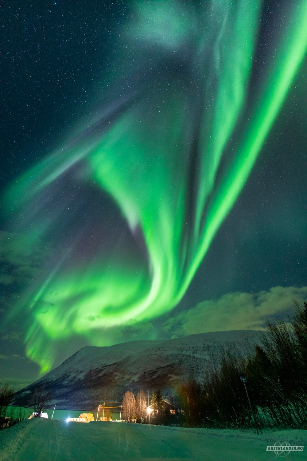
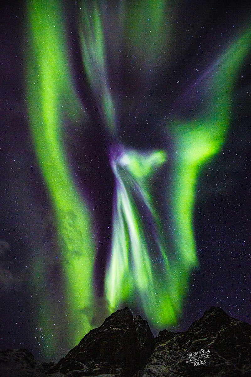
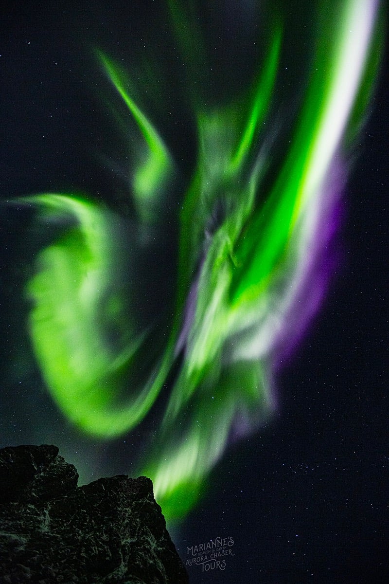
The aurora borealis was amazing last night in Norway. The top photo is from Markus Varik and the bottom two are from Marianne Bergli, who runs a company that offers tours of the aurora. (via @AvatarDomy)


How will we remember this pivotal year in human history? Many of us won’t want to, but in doing so we risk repeating what got us into this mess in the first place. Photography is always a powerful way to document events and this year was particularly suited to it: these photos vividly tell the story of 2020. You can check out many more of them here:
The embedded photos above, from top to bottom: Black Lives Matter protests by Dai Sugano, hospital staff by Sarah Lawrence, Black Lives Matter protests by Matt Rourke, empty grocery shelves by Justin Sullivan, Black Lives Matter protests by David Dee Delgado, California wildfires by Noah Berger, Covid-19 vaccine by Graeme Robertson.
(Note: The images below depict simulated violent death.) By An Eye-Witness is an arresting series of images by Azadeh Akhlaghi that recreate seventeen prominent deaths from Iran’s history. According to this interview, Akhlaghi was inspired by post-election uprisings in Iran and Arab Spring to document these deaths.
Eiferman: How was this like shooting a movie?
Akhlaghi: After three years of research by myself, I found a producer and then a crew. We had one month for pre-production and 20 days to shoot all 17 pictures, so we had to be very quick, with only one day to shoot each picture. We had a very low budget so we couldn’t hire actors, and we mostly used friends or extras. But like a movie, I had a professional team with a make-up artist, set designer, assistant director, and everything.
Eiferman: You have a lot of experience in filmmaking; why did you choose to do this series as photographs?
Akhlaghi: I worked as an assistant director for a few years, yes. But I thought staged photography would be closer to the idea of art I had in mind. I was heavily influenced by old paintings but the narrative techniques are borrowed from my old engagement with cinema and literature.


Since 1982, Nancy Floyd has regularly been taking photos of herself around the house and now she’s compiled 1200 of them into a book called Weathering Time, “a meditation on the passage of time, loss and the ageing female body”.

Johanna Fateman wrote about the project for the New Yorker:
Floyd began the undertaking in 1982, at the age of twenty-five, as a recent graduate of the University of Texas at Austin. Each morning, she’d capture herself in a full-length shot, with her camera set up on a tripod in the corner of her room. Her aim, at the start, was to keep up the daily ritual for twenty years, in order to observe herself aging. At first, on days when she skipped taking a photo, she advanced the film in her camera, leaving a blank when she processed the roll. But, as the project continued, she ended up skipping weeks, entire months, a good chunk of the nineties. Over the years, she moved the tripod around, from room to room, from house to house, outdoors, and around the world; she included family members and pets in her pictures. The metamorphosis or decline of her own body turned out to be, it seems, less interesting than — or inextricable from — the major events, changing backdrops, and interdependent relationships that made up her life.
Amazing project. (via noah kalina)


Those are just a couple of the shots of birds in the air from Mark Harvey’s In Flight series. I love that top photo — I don’t know if those feathers are translucent or if it just appears that way because of the sky color. You can see more of Harvey’s photography on his website, at Instagram, and at Colossal.
Newer posts
Older posts


Socials & More