ASCII pointillism
Textify.it is a web app that uses text to make alphabetic pointillist representations of images. I turned a photo of the Most Photographed Barn in America into this:

It’s also available as an iOS app. (via prosthetic knowledge)


This site is made possible by member support. ❤️
Big thanks to Arcustech for hosting the site and offering amazing tech support.
When you buy through links on kottke.org, I may earn an affiliate commission. Thanks for supporting the site!
kottke.org. home of fine hypertext products since 1998.
Textify.it is a web app that uses text to make alphabetic pointillist representations of images. I turned a photo of the Most Photographed Barn in America into this:

It’s also available as an iOS app. (via prosthetic knowledge)
Olafur Eliasson’s latest project is now on display at the ARoS Aarhus Kunstmuseum in Denmark…it’s a circular viewing platform with rainbow-hued glass.

I love Idan Friedman’s profiles project…he hand-embosses the profiles of everyday people into disposable aluminum pans.
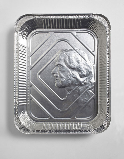
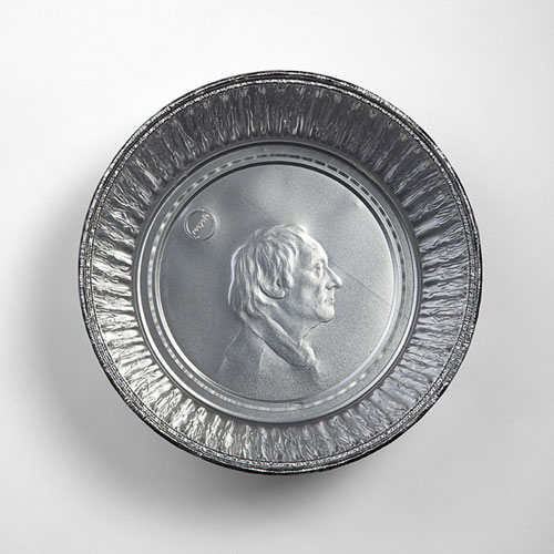
Royals and world leaders are forever immortalized on coins and normal people get disposable pie tins. Makes sense. (via ★feltron)
Synesthesia is a short film by Terri Timely that attempts in an artful way to give the viewer a sense of what synesthesia (“the blending or mixing of senses”) is like.
Cory Arcangel has a solo exhibition coming up at The Whitney.
Cory Arcangel: Pro Tools, an exhibition of new work, revolves around the concept of “product demonstrations.” All of the works featured in the exhibition — ranging from video games, single channel video, kinetic sculpture, and prints, to pen plotter drawings — have been created by means of technological tools with an emphasis on the mixing and matching of both professional and amateur technologies, as well as the vernaculars these technologies encourage within culture at large.
Opens May 26 and runs through September. Interview Magazine has a recent profile and interview.
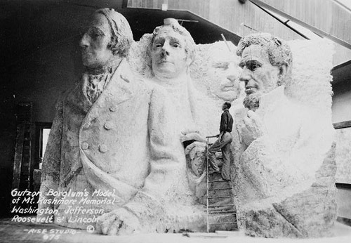
The presidents were to be depicted from head to waist, but the sculpture was scaled back due to insufficient funding.
In the late 70s, Anton Perich built something resembling an inkjet printer to make large-scale paintings like this:
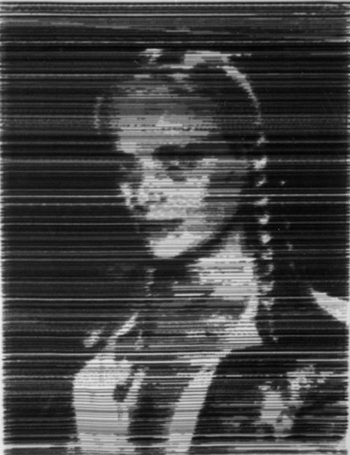
The photography section of Perich’s web site is also worth a look…lots of photos of the Warholish NYC scene in the 70s and 80s: Warhol, Jagger, Mapplethorpe, John Waters, etc. (via today and tomorrow)
Logo Tourist is a project by Risto-Jussi Isopahkala that depicts cityscapes and famous Parisian landmarks made up of famous logos. Here’s the Arc de Triumph (sponsored by Pepsi and Adidas):
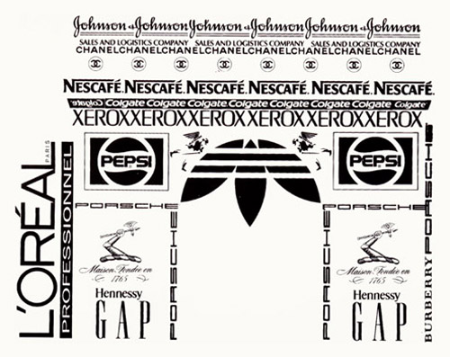
See also Logorama.

Clement Valla collects Google Earth images where the 2-D to 3-D terrain mapping doesn’t work as well as it should. (via lens culture)
My vacation reading: Master of Shadows: The Secret Diplomatic Career of the Painter Peter Paul Rubens by Mark Lamster.
Peter Paul Rubens gives us a lot to think about in his canvasses of rushing color, action, and puckered flesh, so it’s not surprising that his work as a diplomat and spy has been neglected. One of my goals in writing Master of Shadows was to fill that gap in the record. Here, after all, is an actual Old Master using actual secret codes, dodging assassination, plotting the overthrow of foreign governments, and secretly negotiating for world peace.
Certainly, a biographer could not ask for a more compelling subject. Rubens was a charismatic man of extraordinary learning, fluent in six languages, who made a fortune from his art. He never fit the paradigm of the artist as a self-destructive figure at odds with convention. More than one of his contemporaries actually thought his skill as a statesman surpassed his unmatched talent before an easel.
Art history page-turner? Yep.
David Lynch’s hair compares favorably to several works of art, mostly modern, including Starry Night, Water Lilies, and Lichtenstein’s Brush Stroke.
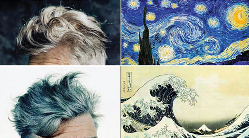
Just, wow.
James Gulliver Hancock is attempting to draw every building in NYC. Here are a few buildings on Rivington:
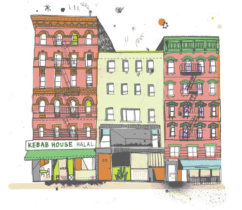
See also Every Person In New York.
But we’ve got to wait a whole year…the exhibition opens on Feb 26, 2012.
The MoMA retrospective will be thematic. There will be rooms devoted to Ms. Sherman’s explorations of subjects like the grotesque, with images of mutilated bodies and abject landscapes, as well as a room with a dozen centerfolds, a takeoff of men’s magazines, in which she depicts herself in guises ranging from a sultry seductress to a vulnerable victim. There will also be a room that shows her work critiquing the fashion industry and stereotypical depictions of women.
Jealous of all the attention garnered by Sports Illustrated’s annual swimsuit issue, Tyler Green of Modern Art Notes decided to compile his own swimsuit publication. Here’s a sample from a Mr. P. Picasso:
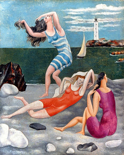
Watch as a woman gets chocolate sauce poured all over her face for almost ten minutes.
I don’t know what to think of this one: mesmerizing? yucky? erotic? hunger-inducing? I have a hungry tingling disgust going on here…
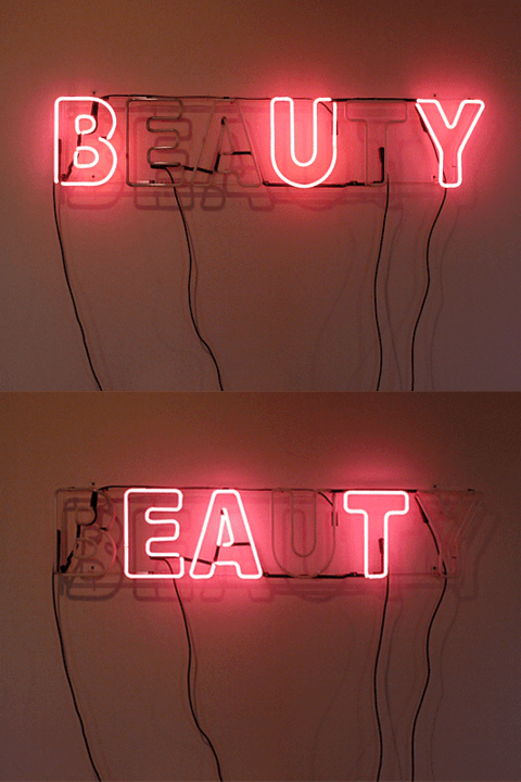
This is a piece called Operators Are Standing By by Jean Bevier. No idea who did this, but I love it. (via prosthetic knowledge and thx for the correction, dan)
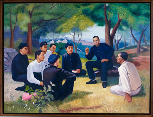
After noticing the similarities between artists and dictators, photographer Philip Toledano commissioned a series of paintings and sculpture with himself as Stalin, Kim Il Sung, etc.
Xavier Antin’s Just in Time project utilizes four printing techniques to produce full-color books.
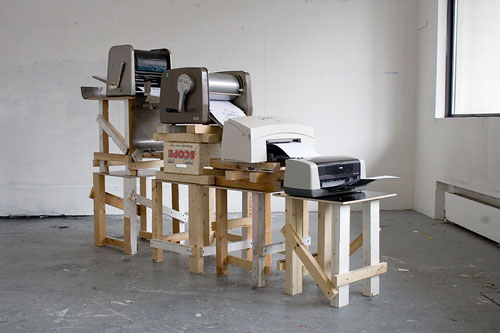
A book printed through a printing chain made of four desktop printers using four different colors and technologies dated from 1880 to 1976. A production process that brings together small scale and large scale production, two sides of the same history.
* MAGENTA (Stencil duplicator, 1880)
* CYAN (Spirit duplicator, 1923)
* BLACK (Laser printer, 1969)
* YELLOW (Inkjet printer, 1976)
For the second straight year, the best Super Bowl bet is between art museums in the cities playing in the big game.
The Milwaukee Art Museum and the Carnegie Museum of Art have agreed to a Super Bowl bet! Even better: The museums have put major works by major artists on the line. The bet continues an annual tradition begun last year when MAN instigated a wager between the Indianapolis Museum of Art and the New Orleans Museum of Art.
Both museums are offering up significant impressionist paintings: The Carnegie Museum of Art has wagered Pierre Renoir’s playful, fleshy Bathers with a Crab (cicra 1890-99, above) on a Pittsburgh Steelers victory. The Milwaukee Art Museum has put on the line Gustave Caillebotte’s serene Boating on the Yerres (1877, below).
As you might have heard, MoMA recently acquired 23 typefaces for its Architecture and Design collection. I was curious about how such an acquisition works, so I sent a quick email to Jonathan Hoefler, one of the principals at Hoefler & Frere-Jones, a New York City type foundry that contributed four typefaces to the MoMA.
Kottke: Three of the four H&FJ typefaces acquired by MoMA are available for purchase on your web site. Did they just put in their credit card info and voila? Or was there a little more to it?
Hoefler: MoMA’s adopting the fonts for their collection was much more complex than buying a copy online (and not only because Retina, one of our four, isn’t available online.) I should start by stating that you can never actually “buy fonts” online: what one can buy are licenses, and the End-User License that surrounds a typeface does not extend the kinds of rights that are necessary to enshrine a typeface in a museum’s permanent collection. The good news is that H&FJ has become as good at crafting licenses as we have at creating typefaces, an unavoidable reality in a world where fonts can be deployed in unimaginable ways. This was a fun project for our legal department.
It was actually a fascinating conversation with MoMA, as we each worked to imagine how this bequest could be useful to the museum for eternity. What might it mean when the last computer capable of recognizing OpenType is gone? What will it mean when computers as we know them are gone? How does one establish the insurance value of a typeface: not its price, but the cost of maintaining it in working order? Digital artworks are prone to different kinds of damage than physical ones, but obsolescence is no less damaging to a typeface than earthquakes and floods to a painting. On the business side there are presumably insurance underwriters who can bring complex actuarial tables to bear on the issue, but I think it’s an even more provocative issue for conservators. 472 years after its completion, the frescoes of the Sistine Chapel underwent a restoration that scholars still find controversial. What might it mean for someone to freshen up our typefaces in AD 2483?
—
Thanks, Jonathan.
In addition to sculpture, Richard Serra makes films. This is Serra’s first film from 1968, featuring a hand’s repeated attempts to catch pieces of lead.
Watching just 20 seconds made me surprisingly anxious. (via sippey, i think)
The photographs taken of everyone who sat with Marina Abramovic at her The Artist is Present show at MoMA are being compiled into a book called Portraits in the Presence of Marina Abramovic.
Just as Abramovic’s piece concerned duration, the photographs give the viewer a chance to experience the performance from Abramovic’s perspective. They reveal both dramatic and mundane moments, and speak to the humanity of such interactions, just as the performance itself did. The resultant photographs are mesmerizing and intense, putting a face to the world of art lovers while capturing what they shared during their contact with the artist.
Shinchi Maruyama throws water from his hands or from glasses and catches the temporary sculptures they make with his camera.
The Morning News has an interview with Maruyama and a photo gallery of his work; this one is really cool.
This is a wonderfully whimsical introduction to doodling by way of graph theory, snakes, Oroborous and mobius strips. Oh, and the Mobiaboros.
(via vulture)
For a piece called Metropolis II, artist Chris Burden is building a huge track and put 1200 Hot Wheels cars on it…the noise is deafening when they’re all circulating.
It includes 1,200 custom-designed cars and 18 lanes; 13 toy trains and tracks; and, dotting the landscape, buildings made of wood block, tiles, Legos and Lincoln Logs. The crew is still at work on the installation. In “Metropolis II,” by his calculation, “every hour 100,000 cars circulate through the city,” Mr. Burden said. “It has an audio quality to it. When you have 1,200 cars circulating it mimics a real freeway. It’s quite intense.”
(thx, aaron)
The Pierre Bergé – Yves Saint Laurent Foundation in Paris is currently displaying an exhibition of David Hockney’s iPhone and iPad drawings. The exhibition is on display through Jan 30, 2011.
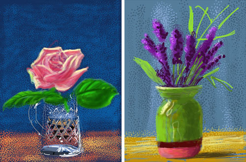
Hockney uses the Brushes app to create his digital paintings and even has his suits made with a pocket just for the iPad:
He picks up his iPad and slips it into his jacket pocket. All his suits have been made with a deep inside pocket so that he can put a sketchbook in it: now the iPad fits there just as snugly. Even his tux has the pocket, he tells me.
Mosaic collages like this one — where each “pixel” is a tiny self-contained image — are fairly common but I haven’t seen too many like these before:
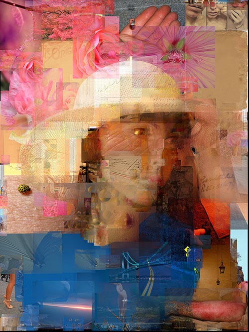
Lovely effect; they’re fun to look at zoomed in or out. (via matt)
Man, what if Spike Jonze had made Being Bill Murray instead? Casey Weldon did a series of paintings of Bill Murray as characters from Wes Anderson’s movies…but non-Murray characters like Max Fischer, Margot Tenenbaum, and the Baumer.
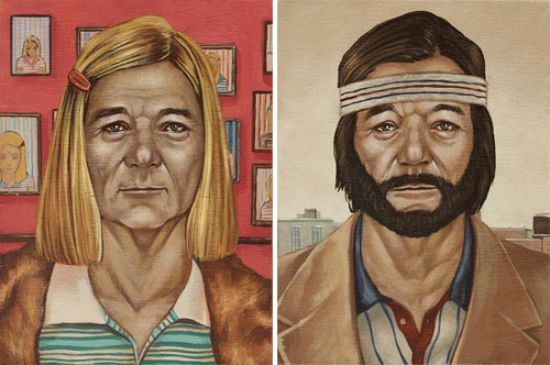
Prints are available. And these were a part of a show called Bad Dads, consisting of art inspired by various Anderson films. Again, prints are available.
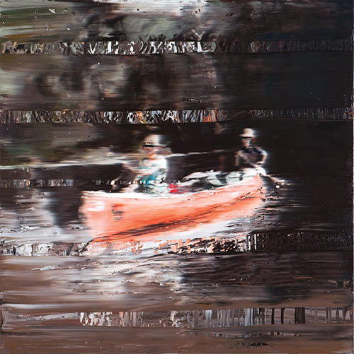
Andy Denzler does these great paintings that look as though they’re highly compressed JPEGs with encoding issues.
Stay Connected