kottke.org posts about typography
This is a page from a book called Hypnerotomachia Poliphili.
Any guesses as to when it was published? The title, Latin text, yellowed paper, and lack of page numbers might tip you off that it wasn’t exactly released yesterday. Turns out that Hypnerotomachia Poliphili was published in 1499, more than 500 years ago and only 44 years after Gutenberg published his famous Bible. It belongs to a group of books collectively referred to as incunabula, books printed with a printing press using movable type before 1501.
To contemporary eyes, the HP looks almost modern. The text is very readable. The typography, layout, and the way the text flows around the illustration; none of it looks out of the ordinary. When compared to other books of the time (e.g. take a look at a page from the Gutenberg Bible), its modernity is downright eerie. The most obvious difference is the absence of the blackletter typeface. Blackletter was a popular choice because it resembled closely the handwritten script that preceded the printing press, and I imagine its use smoothed the transition to books printed by press. HP dispensed with blackletter and instead used what came to be known as Bembo, a humanist typeface based on the handwriting of Renaissance-era Italian scholars. From a MIT Press e-book on the HP:
One of the features of the Hypnerotomachia that has attracted the attention of scholars has been its use of the famed Aldine “Roman” type font, invented by Nicholas Jenson but distilled into an abstract ideal by Francesco Biffi da Bologna, a jeweler who became Aldus’s celebrated cutter. This font — generally viewed as originating in the efforts of the humanist lovers of belles-lettres and renowned calligraphers such as Petrarch, Poggio Bracciolini, Niccolo Niccoli, Felice Feliciano, Leon Battista Alberti, and Luca Pacioli, to re-create the script of classical antiquity — appeared for the first time in Bembo’s De Aetna. Recut, it appeared in its second and perfected version in the Hypnerotomachia.
In that way, Hypnerotomachia Poliphili is both a throwback to Roman times and an indication of things to come.
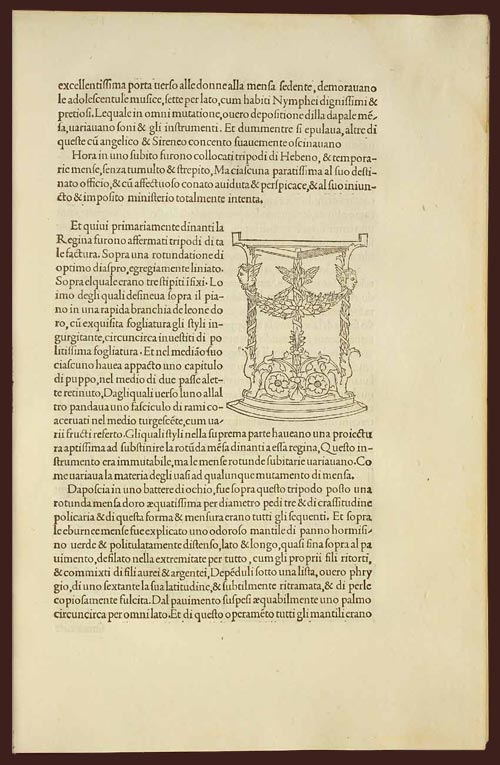
The MIT Press site also notes a number of other significant aspects of the book. As seen above, illustrations are integrated into the main text, allowing “the eye to slip back and forth from textual description and corresponding visual representation with the greatest of ease”. In his 2006 book, Beautiful Evidence, Edward Tufte says:
Overall, the design of Hypnerotomachia tightly integrates the relevant text with the relevant image, a cognitive integration along with the celebrated optical integration.
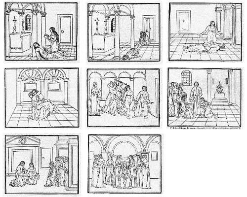
Several pages in the book make use of the text itself to illustrate the shapes of wine goblets. The HP also contained aspects of film, comics, and storyboarding…successive illustrations advanced action begun on previous pages:
All of which makes the following puzzling:
The Hypnerotomachia Poliphili is one of the most unreadable books ever published. The first inkling of difficulty occurs at the moment one picks up the book and tries to utter its tongue-twisting, practically unpronounceable title. The difficulty only heightens as one flips through the pages and tries to decipher the strange, baffling, inscrutable prose, replete with recondite references, teeming with tortuous terminology, choked with pulsating, prolix, plethoric passages. Now in Tuscan, now in Latin, now in Greek — elsewhere in Hebrew, Arabic, Chaldean and hieroglyphs — the author has created a pandemonium of unruly sentences that demand the unrelenting skills of a prodigiously endowed polyglot in order to be understood.
It’s fascinating that a book so readable, so beautifully printed, and so modern would also be so difficult to read. If you’d like to take a crack at it, scans of the entire book are available here and here. The English translation is available on Amazon.
Typographically inspired movie titles, including Full Meta Jacket, Bembo: First Blood, and He-Man and the Masters of the Univers.
FontStruct is an awesomely simple online font creation tool. Just draw on a grid with simple Photoshop-like tools, save, and download a TrueType version of the fonts you’ve just created. If this had been around when I made Silkscreen, it would have taken so much less time.
Over at H&FJ, the H talks about the &.
As both its function and form suggest, the ampersand is a written contraction of “et,” the Latin word for “and.” Its shape has evolved continuously since its introduction, and while some ampersands are still manifestly e-t ligatures, others merely hint at this origin, sometimes in very oblique ways.
He goes on to describe several ampersands they’ve designed for their typefaces. When designing the ampersand for Silkscreen, I came up with a solution that many continue to dislike:
If you’re logged in to Flickr, you can see it action at a more appropriate size in the “prints & more” label above a photo. The symbol is basically a capital E with a vertical line through the middle…an e-t ligature that’s really more of an overstrike. I fashioned it after the way I hand-write my ampersand, which I got from my dad’s handwriting1. I don’t know where he got it from; it’s not a common way to represent that symbol, although I did find a few instances in the list of fonts installed on my computer.
I didn’t think about this way at the time, but the odd ampersand is one of the few distinguishing features of Silkscreen. There’s only so many ways you can draw letterforms in a 5x5 pixel space so a lot of the bitmap fonts like Silkscreen end up looking very similar. The ampersand gives it a bit of needed individuality. (The 4 is the other oddish character…it’s open at the top instead of diagonally closed.)
[1] Now that I think about it, I borrowed several aspects from my dad’s handwriting. I write my 7s with a bar (to distinguish them from 1s), my 8s as two separate circles rather than a figure-eight stroke, and my 4s with the open top. Oh, and a messy signature. ↩
Gar, I missed another one of Tobias Frere-Jones’ NYC Typographic Walking Tours but luckily Jason Santa Maria — a fellow so nice they named him thrice — has photos. Photos from his first tour here. (via airbag)
Here’s the trailer for Dr. Strangelove or: How I Learned to Stop Worrying and Love the Bomb.
It was done by a fellow named Pablo Ferro; it was his first movie trailer. Steven Heller writes:
After seeing Ferro’s commercials, Kubrick hired him to direct the advertising trailers and teasers for Dr. Strangelove and convinced him to resettle in London (Kubrick’s base of operations until he died there in March 1999). Ferro was inclined to be peripatetic anyway, and ever anxious to bypass already completed challenges he agreed to pull up stakes on the chance that he would get to direct a few British TV commercials, which he did. The black and white spot that Ferro designed for Dr. Strangelove employed his quick-cut technique — using as many as 125 separate images in a minute — to convey both the dark humor and the political immediacy of the film. At something akin to stroboscopic speed words and images flew across the screen to the accompaniment of loud sound effects and snippets of ironic dialog. At a time when the bomb loomed so large in the US public’s fears (remember Barry Goldwater ran for President promising to nuke China), and the polarization of left and right — east and west — was at its zenith, Ferro’s commercial was not only the boldest and most hypnotic graphic on TV, it was a sly subversive statement.
Ferro worked with Kubrick on the iconic and fantastic main titles for the film as well.
Kubrick wanted to film it all using small airplane models (doubtless prefiguring his classic space ship ballet in 2001: A Space Odyssey). Ferro dissuaded him and located the official stock footage that they used instead. Ferro further conceived the idea to fill the entire screen with lettering (which incidentally had never been done before), requiring the setting of credits at different sizes and weights, which potentially ran counter to legal contractual obligations. But Kubrick supported it regardless. On the other hand, Ferro was prepared to have the titles refined by a lettering artist, but Kubrick correctly felt that the rough hewn quality of the hand-drawn comp was more effective. So he carefully lettered the entire thing himself with a thin pen. Yet only after the film was released did he notice that one word was misspelled: “base on” instead of “based on”. Ooops!
If you want that hand-lettered look for yourself, Pablo Skinny is a font by Fargoboy that closely duplicates Ferro’s handwriting.
Ferro went on to make several well-known movie title sequences, including those for Bullitt and the original The Thomas Crown Affair but not Napoleon Dynamite. He collaborated with Kubrick once again on the trailer for A Clockwork Orange, another classic.
Update: According to this Wikipedia article, the work of Canadian avant-garde filmmaker Arthur Lipsett caught the eye of Stanley Kubrick after an Oscar nomination for his short film, Very Nice, Very Nice and, more importantly for our business here, that Kubrick directed the Strangelove trailer himself in Lipsett’s style after Lipsett refused to work with Kubrick on it:
Stanley Kubrick was one of Lipsett’s fans, and asked him to create a trailer for his upcoming movie Dr. Strangelove. Lipsett declined Kubrick’s offer. Kubrick went on to direct the trailer himself; however, Lipsett’s influence on Kubrick is clearly visible when watching the trailer.
The two are stylistically similar for sure, but Ferro is credited with having designed the main title sequence (according to the titles themselves). That passage doesn’t appear to have been derived from any particular source, so I looked for something more definitive. From a 1986 article by Lois Siegel
After his Academy Award nomination, he received a letter from British filmmaker Stanley Kubrick. The typewritten letter said, “I’m interested in having a trailer done for Dr. Strangelove.” Kubrick regarded Lipsett’s work as a landmark in cinema — a breakthrough. He was interested in involving Lipsett. This didn’t happen, but the actual trailer did reflect Lipsett’s style in Very Nice, Very Nice.
An endnote to a 2004 profile of Lipsett by Brett Kashmere describes what Kubrick wrote to Lipsett in the letter:
Kubrick described Very Nice, Very Nice (1961) as “one of the most imaginative and brilliant uses of the movie screen and soundtrack that I have ever seen.” Kubrick was so enthused with the film he invited Lipsett to create a trailer for Dr. Strangelove (Stanley Kubrick, 1965) an offer Lipsett refused. Stanley Kubrick, letter to Arthur Lipsett, Arthur Lipsett Collection, Cinematheque québécoise Archives, Montreal, May 31, 1962.
It’s not clear what the connection is between Lipsett’s work and the trailer that Ferro ended up producing for Strangelove, but several sources (including Heller) say that Ferro developed his quick-cut style directing commercials in the 1950s, work that would predate that of Lipsett.
Lipsett more clearly influenced the work of another prominent filmmaker, George Lucas. Lucas found inspiration in Lipsett’s 21-87 in making THX-1138 and borrowed the concept of “the Force” for the Star Wars movies. Lucas’ films are littered with references to Lipsett’s film; e.g. Princess Leia’s cell in Star Wars was in cell #2187. (thx, gordon)
A short history of the ampersand.
Ampersand usage varies from language to language. In English and French text, the ampersand may be substituted for the words and and et, and both versions may be used in the same text. The German rule is to use the ampersand within formal or corporate titles made up of two separate names; according to present German composition rules, the ampersand may not be used in running text. In any language, the ampersand’s calligraphic qualities make it a compelling design element that can add visual appeal and personality to any page.
A list of 63 must-have grunge fonts. Back in 1996, this would have been my thing. Is grunge type coming back?
Jonathan Hoefler on how a joke version of OCR-A with swashes came about…and then ended up in an issue of Rolling Stone.
I tacked this specimen of Estupido Espezial!!! to my wall, where it immediately became a litmus test for visitors. Most people would say nothing, but woe be unto anyone who admired the thing in earnest: “hey, cool font!” would immediately land any visitor on the Suspicious Persons list. The best were those who would stare for a moment with bafflement before bursting out laughing, a few of whom became good friends, good clients, or both.
Robots need type too.
Craig Oldham’s Nudist typeface is flesh-colored with some bits pixelated out. Other “weights” include a fig leaf version and a black censor bar version. Entirely SFW.
Short post about the favorite letters drawn by H&FJ type designers, including the awesomely named Sulzbacher Eszett character.
The designers at H&FJ are often asked if there are particular letters that we especially enjoy drawing. Office doodles testify to the popularity of the letter R, perhaps because it synopsizes the rest of the alphabet in one convenient package (it’s got a stem, a bowl, serifs both internal and external, and of course that marvelous signature gesture, the tail.)
I would love to see a collection of those office doodles.
Typographica’s list of their favorite typefaces of 2007. Some great work in that list. I also enjoyed Mark Simonson’s explanation of the difference between a font and a typeface:
The physical embodiment of a collection of letters (whether it’s a case of metal pieces or a computer file) is a font. When referring to the design of the collection (the way it looks) you call it a typeface.
Oh and also good was that they were thoughtful enough to wait until 2007 was actually over to make their selections.
Interview with Susan Bradley, who did some graphic design and designed a typeface for Pixar’s Ratatouille. I enjoyed her response when asked about “one thing everybody should do today”:
Something backwards or something analog you’d normally computerize.
You can find out more about Susan on her site. (via waxy)
Check out these “flair” typefaces from the 70s.
They were very big around 1970 or so. Bookman set the example, even though it’s from much earlier. By the mid-seventies, they were adding Bookman-style swashes to everything. They were usually called Whateverthefontwascalled Flair.
Scroll down the page for samples of Univers Flair, Franklin Gothic Flair, etc.
All but a few of the title sequences of Woody Allen’s films are set in one typeface: white Windsor on a black background.
I feel like this happens to a lot of authors…the covers of their books end up being the opposite of what they should be.
Does one’s choice of typeface affect the grade you get on a college paper? Papers written with Georgia and Times New Roman (serifs) got As while those with Trebuchet (sans serif) got Bs.
The goal of Oded Ezer’s Typosperma Project “was to create some sort of new transgenic creatures, half (human) sperm, half letter”. (via buzzfeed)
In light of the Mitchell Report, Yanksfan vs Soxfan has proposed a record book annotation system so that sports fans can tell which records were set under the influence of which substances. The asterisk is for straight-up steroids and some of the other marks are as follows:
! = Amphetamines
$ = Gambling
|| = Cocaine
~ = Alcohol
. = Dead ball era
∞ = Wore glasses
† = Crazy religious freak
X = General douchebag
The Goodie Bag podcast has an entertaining little video on Trajan, the font used ubiquitously in movie credits and posters:
Like indoor plumbing and toga parties, Trajan hails from Rome. Matter of fact, you can find almost 2,000-year-old inscriptions on Trajan’s column, where they have totally off-the-leash keggers on Saturdays… Russell Crowe has co-starred with Trajan three times now.
This reminds me of Red is Not Funny, J. Tyler Helms’ illustration of the wide use of bold red letters in distinctly unfunny comedies. (via cameron hunt)
Eric Gill was a respected British artist and typographer — Gill Sans is his most famous typeface — but according to his diaries, he also regularly engaged in sexual relations with his sisters, his daughters, and the family dog.
For some of Gill’s fans, even looking at his work became impossible. Most problematically, he was a Catholic convert who created some of the most popular devotional art of his era, such as the Stations of the Cross in Westminster Cathedral, where worshippers pray at each panel depicting the suffering of Jesus.
These details of Gill’s private life were revealed in a 1989 book by Fiona MacCarthy…here’s a NY Times review of the book soon after it was published.
In the past few weeks, I’ve seen several people mention the 50 Years of Helvetica exhibit at the MoMA along with some variation of “Woo! I might need to take a trip to New York to go see this!” You should know that this exhibit takes up just a small corner of the Architecture and Design Gallery on the 3rd floor…it’s essentially a case and a handful of posters and other specimens. If you’re in the museum already, definitely check it out, but you’ll be disappointed if you make a special expensive trip just to see the Helvetica stuff.
The 2008 version of Pentagram’s big-ass wall calendar is now available, featuring the typefaces of Matthew Carter. If that’s not to your liking, there’s always this calendar by Massimo Vignelli set in, you guessed it, Helvetica.
Jon Hicks has a nice slideshow of typography from the Harry Potter and the Order of the Phoenix. (via waxy) Design Observer did a piece on the typography of Order of the Phoenix becoming its own character.
It is The Daily Prophet which emerges in this film as a secondary character, performing interstitial cameos made all the more exhilarating because the camera sweeps in and out, ricocheting off the page, magnifying and dramatizing a typographic vocabulary that combines a slightly mottled, letterpress-like display face with great portions of illegible calligraphy.
Erik Spiekermann on FE-Mittelschrift, the typeface used for German license plates.
The official typeface for our license plates is now called FE-Mittelschrift, with FE meaning it is Fälschungs-Erschwert, i.e. difficult to forge. Apparently car thieves, terrorists and notorious law-breakers had been exploiting DIN’s geometric construction principle and turning E into F or 3 into 8 etc by simply using a bit of black tape or white paint.
Here are all the alphanumeric characters:
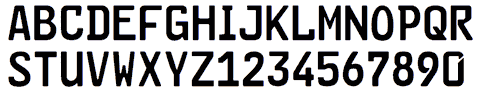
Note the tamper-resistant differences between the 6 (no notch) and 9 (notched), the E & F, the I & 1, the O & zero, the P & R, and so on.
Newer posts
Older posts
Socials & More