This advice to museums applies equally well to troubled magazines, newspapers, companies, and the like.
The Louvre has Venus. What do you have instead? If you can answer that question confidently and concisely without a lot of stimulating-the-following-target-audiences mission statement hooey — and your answer isn’t on SecondLife, then you may be one the few museums that doesn’t suck.
You’re a museum, right? You’re not an outreach summercamp. You’re not an Imax theatre lobby. You’re not a social networking iPhone app. Be a museum. And try harder not to suck at it.
The Printed Picture is an exhibition of physical specimens made using all the different ways that type and image can be printed on paper, metal, glass, etc, with a special emphasis on dozens of photography techniques, from albumen prints to dagguereotypes to color photography. On view at MoMA until June 1.
Revolving Hotel Room is an art installation comprising three outfitted, superimposed turning glass discs mounted onto a fourth disc that all turn harmoniously at a very slow speed. During the day the hotel room will be on view as part of the Guggenheim’s theanyspacewhatever exhibition, which runs from October 24, 2008-January 7, 2009. At night, the art installation becomes an operative hotel room outfitted with luxury amenities.
During the first decades of the 20th century, the AMNH posed its T. rex bones in an upright position, propped on its tail. Skeletons were broken, some bent and others removed altogether so that it looked like the “marauding predator” people thought they were. And also so that it didn’t look too diminutive in the large exhibition hall. Natural history as a function of architecture: it had to reach high up to the ceiling, fill up all that space, loom large over the crowds.
The museum sits on a twenty-acre reclaimed industrial site directly across the Menomonee River from downtown Milwaukee and has been conceived as an urban factory ready-made for spontaneous motorcycle rallies. The three-building campus includes space for permanent and temporary exhibitions, the company’s archives, a restaurant and cafe, and a retail shop, as well as a generous amount of event and waterfront recreational space. The museum’s indoor and outdoor components were inspired by the spirit of Harley rallies in towns like Sturgis and Laconia, where thousands of riders congregate every year.
2. The rest of Eliasson’s show on the third floor. His art seems so conceptually and constructurally simple yet, I dunno, I just wanted to hang out in the gallery all day, like I was required to remain part of the experience. Left me wishing I’d made it to London to see The Weather Project.
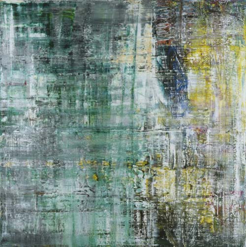
The six paintings are composed in his characteristic swiping, blurred style of over-painted and obliterated layers, fine-tuned nuances of grey and white worked through with coruscating colours — carmine, emerald, turquoise, cadmium yellow, fiery orange — dragged across the canvas, smeared, wiped, leaving fragments of beauty on cool but sensuous surfaces. They suggest rain and mist, instability and displacement, absence and endings, classical rigour and postmodern ruin. They echo the northern European palette of earnest darkness and piercing brightness that goes back to Grunewald and Caspar David Friedrich, but Richter is also a minimalist, a denier of meaning, ideals, personal signatures. He has named the works in honour of composer John Cage, in reference to his Lecture on Nothing — “I have nothing to say and I’m saying it.”
Three other things I found interesting there:
1) Miroslaw Balka’s 480x10x10, a sculpture consisting of used bars of soap held together by a stainless steel rope hanging from the ceiling. It’s not often that contemporary art smells Zestfully Clean.
3) The Turbine Room is an amazing, amazing space…I could have spent hours in there. I took this photo of Ollie attempting to take his first steps in the Turbine Room. Oh, and they’ve patched the cracks from Doris Salcedo’s Shibboleth. The patching is shoddy…I wonder if that’s on purpose as a permanent aftertaste of the artwork.
Paola Antonelli, a senior curator at the museum, had to kill the coat. “It was growing too much,” she said in an interview from a conference in Belgrade. The cells were multiplying so fast that the incubator was beginning to clog. Also, a sleeve was falling off. So after checking with the coat’s creators, a group known as SymbioticA, at the School of Anatomy & Human Biology at the University of Western Australia in Perth, she had the nutrients to the cells stopped.
Now I find out there was already an entire Moon Museum, with drawings by six leading contemporary artists of the day: Andy Warhol, Robert Rauschenberg, David Novros, Forrest “Frosty” Myers, Claes Oldenburg, and John Chamberlain. The Moon Museum was supposedly installed on the moon in 1969 as part of the Apollo 12 mission.
I say supposedly, because NASA has no official record of it; according to Frosty Myers, the artist who initiated the project, the Moon Museum was secretly installed on a hatch on a leg of the Intrepid landing module with the help of an unnamed engineer at the Grumman Corporation after attempts to move the project forward through NASA’s official channels were unsuccessful.
In the past few decades, individuals have experienced dramatic changes in some of the most established dimensions of human life: time, space, matter, and individuality. Working across several time zones, traveling with relative ease between satellite maps and nanoscale images, gleefully drowning in information, acting fast in order to preserve some slow downtime, people cope daily with dozens of changes in scale. Minds adapt and acquire enough elasticity to be able to synthesize such abundance. One of design’s most fundamental tasks is to stand between revolutions and life, and to help people deal with change.
I was surprised at how many of the show’s ideas and objects I’d seen or even featured on kottke.org already. But getting there first isn’t the point. The show was super-crowded and I didn’t have a lot of time to look around, but here are a couple of things that caught my eye.
Using eight of my favourite films from eight of my most admired directors including Sidney Lumet, Francis Ford Coppola and John Boorman, each film is processed through a Java program written with the processing environment. This small piece of software samples a movie every second and generates an 8 x 6 pixel image of the frame at that moment in time. It does this for the entire film, with each row representing one minute of film time.
Unlike the belongings of artists who fade gradually from view, which are sometimes scattered, pilfered or lost, Arbus’s effects were in some ways frozen in time when she committed suicide at 48. Quickly her life began to acquire a cult status paralleling that of her photography.
In the past few weeks, I’ve seen several people mention the 50 Years of Helvetica exhibit at the MoMA along with some variation of “Woo! I might need to take a trip to New York to go see this!” You should know that this exhibit takes up just a small corner of the Architecture and Design Gallery on the 3rd floor…it’s essentially a case and a handful of posters and other specimens. If you’re in the museum already, definitely check it out, but you’ll be disappointed if you make a special expensive trip just to see the Helvetica stuff.
Coming at a time of unprecedented growth and redevelopment in the city, this exhibit aims to encourage New Yorkers to observe the city closely and to empower them, with a combination of tools and resources, to take an active role in advocating for a more livable city.
The exhibit runs from Sept 25 through Jan 5, 2008.
Update:A review of the exhibition in the NY Times (slideshow). Among the artifacts at the show is a letter sent by Robert Moses to Jacobs’ publisher: “I am returning the book you sent me. Aside from the fact that it is intemperate and inaccurate, it is also libelous.”
The Cooper Hewitt Design Museum has announced plans for expansion. I was up there this weekend checking out the Design Triennial and found the exhibition a bit small; a similar show at the expansive MoMA might have run to twice the size and would have included larger items. I hope they don’t do too much to the building though…in many rooms, the building is just as much of an attraction as the items on display.
Map of the cracks in the Guggenheim’s facade. “Since the Guggenheim Museum opened in 1959, Frank Lloyd Wright’s massive spiral facade has been showing signs of cracking, mainly from seasonal temperature fluctuations that cause the concrete walls, built without expansion joints, to contract and expand.”
Exhibit on Helvetica (the font, not the film) opens tomorow at the MoMA and will be available for a good long time (until March 31, 2008). “Widely considered the official typeface of the twentieth century, Helvetica communicates with simple, well-proportioned letterforms that convey an aesthetic clarity that is at once universal, neutral, and undeniably modern.”
A comparison: London’s Tate Modern versus the MoMA. The MoMA is a stuffy, inaccesible place, while the “Tate Modern is an enormously user-friendly place, physically comfortable and hospitable, with inexpensive places to eat and frequent opportunities to sit.”
Note: If you are a member and tried to log in, it didn't work, and now you're stuck in a neverending login loop of death, try disabling any ad blockers or extensions. Or try logging out and then back in. Still having trouble? Email me!
Socials & More