kottke.org posts about art
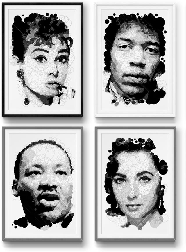
This looks cool…Thomas Pavitte has reinvented the paint-by-numbers with Querkles. Instead of simple numbered areas to fill in, Querkles cleverly uses overlapping circles that you fill in with different shading techniques or colors to reveal hidden faces. Here’s a short demo of how it works:
Pavitte has two different books available: Querkles and Querkles Masterpiece, featuring famous faces from the art world. See also coloring books for adults.
The NY Times has a short documentary on Chris Burden’s Shoot, a conceptual art piece from 1971 in which Burden is shot in the arm by a friend.
Burden passed away earlier this month. (via digg)
For his project Trophy Scarves, artist Nate Hill photographed himself “[wearing] white women for status and power”.

Hill says “it’s a satire on black men who like to see white women as status symbols”. NSFW (some nudity)…or you can view censored pics on Instagram.
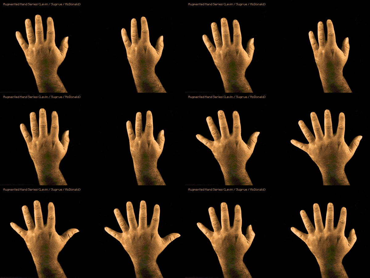
Augmented Hand Series is an interactive software system created by Golan Levin, Chris Sugrue, and Kyle McDonald. You stick your hand in and on the screen you see your hand with an extra thumb, one fewer knuckle in each finger, fingers with springs in them, variable sized fingers, and the ultra freaky Breathing Palm.
(via prosthetic knowledge)
Artist JK Keller has digitally widened1 episodes of The Simpsons and Seinfeld to fit a 16:9 HD aspect ratio. Watching the altered scenes is trippy…the characters and their surroundings randomly expand and contract as the scenes play out.
Keller also HD-ified an episode of the X-Files and slimmed an old episode of Star Trek into a vertical aspect ratio. (via @frank_chimero)
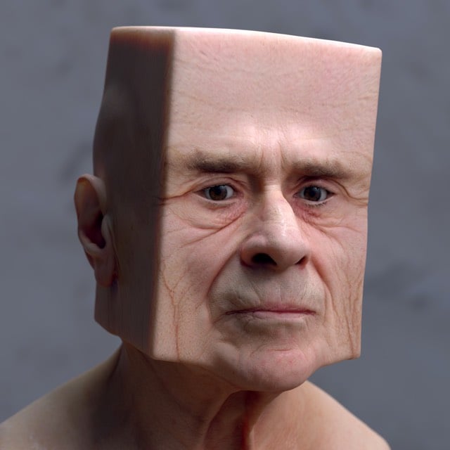
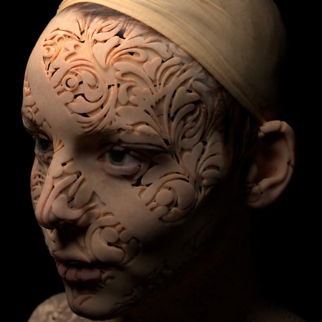
Using professional-grade visual effects combo Arnold and Maya, Lee Griggs makes art. Like these Deformations:
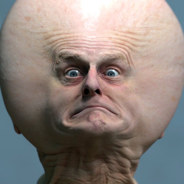
And Abstract Portraits:
(via ignant)
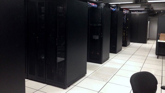
Ben Fino-Radin of MoMA’s Department of Conservation wrote a brief post about how the museum manages their digital artworks, including a bit about how they think about futureproofing the collection.
The packager addresses the most fundamental challenge in digital preservation: all digital files are encoded. They require special tools in order to be understood as anything more than a pile of bits and bytes. Just as a VHS tape is useless without a VCR, a digital video file is useless without some kind of software that understands how to interpret and play it, or tell you something about its contents. At least with a VHS tape you can hold it in your hand and say, “Hey, this looks like a VHS tape and it probably has an analog video signal recorded on it.” But there is essentially nothing about a QuickTime .MOV file that says, “Hello, I am a video file! You should use this sort of software to view me.” We rely on specially designed software-be it an operating system or something more specialized-to tell us these things. The problem is that these tools may not always be around, or may not always understand all formats the way they do today. This means that even if we manage to keep a perfect copy of a video file for 100 years, no one may be able to understand that it’s a video file, let alone what to do with it. To avoid this scenario, the “packager” — free, open-source software called Archivematica — analyzes all digital collections materials as they arrive, and records the results in an obsolescence-proof text format that is packaged and stored with the materials themselves. We call this an “archival information package.”
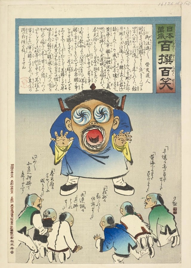
This collection of prints produced by artists about the Sino-Japanese War and housed in The British Library is great, but this particular print is just beyond:
From Evan Puschak, aka The Nerdwriter, comes an entertaining analysis of Jacques-Louis David’s neoclassical masterpiece, The Death of Socrates.
The Death of Socrates is on display at the Met here in NYC. From the Met’s catalogue entry:
In 399 B.C., having been accused by the Athenian government of impiety and of corrupting young people with his teachings, the philosopher Socrates was tried, found guilty, and offered the choice of renouncing his beliefs or drinking the cup of hemlock. He died willingly for the principles he held dear. Here he gestures toward the cup, points toward the heavens, and discourses on the immortality of the soul. The picture, with its stoic theme, has been described as David’s most perfect neoclassical statement.
The artist consulted Plato’s “Phaedo” and a variety of sources including Diderot’s treatise on dramatic poetry and works by the poet André Chenier. The pose of Plato, the figure seated in profile at the foot of the bed (who was not actually present at the scene), was reportedly inspired by the English novelist Richardson. The printmaker and publisher John Boydell, writing to Sir Joshua Reynolds, called The Death of Socrates “the greatest effort of art since the Sistine Chapel and the stanze of Raphael,” further observing that the painting “would have done honour to Athens at the time of Pericles.”
Here’s a bigger view of the painting, which you’ll want to pore over once you’ve watched the video. (via ★interesting)
I really love this video featuring the opening and closing shots of fifty-five movies presented side-by-side, “First and Final Frames.” Created by Jacob T. Swinney.
My favorites: “Tree of Life,” “Raging Bull,” “Melancholia.”
Update: Swinney has released a second installment of First and Final Frames.
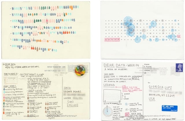
Giorgia Lupi, who lives in New York, and Stefanie Posavec, who lives in London, are engaged in a long-distance, postcard-based data exchange in order to get to know each other better: “Dear Data.” They’ve only met in person twice, and they’re both interested in data, so they’re sending each other postcard drawings of data about their day-to-day lives.
Each week we collect and measure a particular type of data about our lives, use this data to make a drawing on a postcard-sized sheet of paper, and then drop the postcard in an English “postbox” (Stefanie) or an American “mailbox” (Giorgia)!
Eventually, the postcard arrives at the other person’s address with all the scuff marks of its journey over the ocean: a type of “slow data” transmission.
By creating and sending the data visualizations using analogue instead of digital means, we are really just doing what artists have done for ages, which is sketch and try to capture the essence of the life happening around them. However, as we are sketching life in the modern digital age, life also includes everything that is counted, computed, and measured.
We are trying to capture the life unfolding around us, but instead we are capturing this life through sketching the hidden patterns found within our data.
The data appears on the front of the postcard, and a key explaining how to read the data appears on the back of the postcard. (via Coudal)
There are only a dozen images so far, but this Tumblr comparing art from before the 16th century and contemporary images of hip hop is fantastic. My favorites:
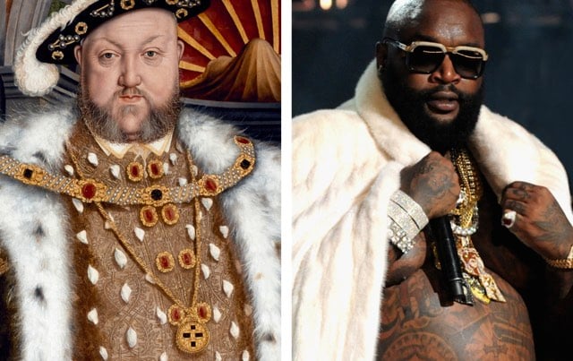
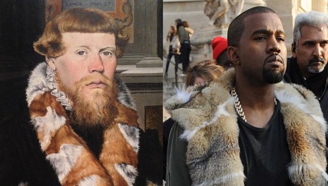
If, like me, you couldn’t get it together to make it to the Matisse cut-outs show at MoMA, the NY Times has you covered with an interactive look at the show.
Arthur Ganson is a kinetic sculptor who builds “Rube Goldberg machines with existential themes”. One of his works is called Machine with Concrete, which demonstrates the magic of gear ratios
According to a piece in Make, the input shaft spins at 200 rpm, which is reduced by gearing down to 1 revolution every 2 trillion years by the time you reach the gear on the end…which is so slow that even embedding the final gear in concrete doesn’t make any difference to the machine’s operation. (via interconnected)
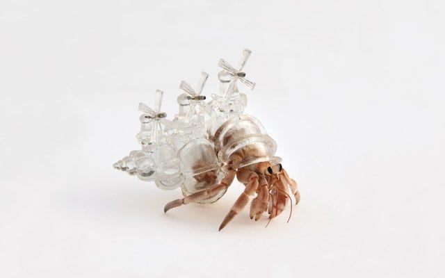
Artist Aki Inomata builds fanciful new houses for hermit crabs.
Miniature windmills, churches, and even entire cities jut from the surface of her 3D-printed shells, which are modelled upon CT scans of abandoned crab shells and then recreated in transparent resin. Inomata then allows the homeless crabs to inspect the shelters at their leisure — she says “most hermit crabs don’t even glance at” them, but occasionally one of the creatures finds its dream real estate and settles in.
Newer posts
Older posts



Socials & More