kottke.org posts about art
Greg Allen gives us the scoop on how big art auctions work. “People come to me and want to bid with a signal that they don’t want anyone else to see. He may hold his pencil in his mouth, or say, ‘I’m bidding as long as I have my legs crossed.’ And I’ve got their number, and they never show a paddle. That’s the way it’s done.”
Genealogy of Influence: “a graph of biographical entries at Wikipedia with connections denoting creative influence between philosophers, social scientists, writers, artists, scientists, mathematicians”. Reminds me peripherally of Simon Patterson’s The Great Bear (a print of which is hanging behind me right now).
A list of 20 works of art you need to see before you die. They want to make a list of 50…suggest your favorites in the comments.
Interview with Cory Arcangel about his new show at Team Gallery. “I made the conscious decision that the viewer shouldn’t have to understand it; it should stand on its own and be beautiful. Anyone can have an art moment with my work, regardless of their technical knowledge.”
Let’s say, like Steve Wynn, you’ve punched a hole in your Picasso. Here’s how to fix it.
Hasan Elahi ran into some trouble with the FBI in 2002 (they thought he was a terrorist) and ever since, he’s been voluntarily tracking his movements and putting the whole thing online: photos of meals, photos of toilets used, airports flown out of, credit card receipts, etc. His goal is to flood the market with information, so it devalues the information that the authorities have on him.
The Brian Eno/Will Wright session kicked things off quite well at PopTech. Lots of interesting stuff to say about this one, but I quickly wanted to highlight two things that Eno and Wright said independently in their presentations. Eno:
Art is created by artists so that the viewer has the opportunity to create something.
Later, Wright said in relation to games:
The real game is constructed in the player’s head.
Eno started his presentation by wondering about a overall system for describing culture, from high to low. He and Wright may be onto something here in that respect.
77 Million Paintings, a generative artwork by Brian Eno. “Work that continues to create itself in your absence.”
Netlag: infovisualization of the world made of exterior web cams over time. So as the day goes on, you can see Europe light up, then the eastern seaboard of the US, then the western US, and so on.
Onstage at PopTech just now, Brian Eno said that a musical piece by Steven Reich had a huge influence on how he thought about art. He said that Reich’s piece showed him that:
1. You don’t need much.
2. The composer’s role is to set up a system and then let it go.
3. The true composer is actually in the listener’s brain.
I’d never heard of Reich, but the name sounded familiar when Eno mentioned it. I realized I’d seen it yesterday when reading about Cory Arcangel’s show at Team Gallery in reference to his piece, Sweet 16:
Cory applied American avant-garde composer Steven Reich’s concept of phasing to the guitar intro of Guns and Roses’ track Sweet Child O’Mine. Rather than use instruments, Cory took the same two clips from the song’s music video and shortened one clip by a single note. As the videos loop, the two intros grow farther apart until they are back in sync.
He’s veered away from video games, but Cory’s new work is looking really interesting these days.
A collection of artists each picked a page from The Pat Robertson and Friends Coloring Book and “colored” them in. (thx, gk)
Photographs of female anatomy for artists, just in case you don’t have the resources to hire live nude models. Male anatomy photos available here. NSFW.
“From September 27th - October 21 the Museum of American Illustration at the Society of Illustrators will host ‘30 Years of Fantagraphics,’ a retrospective art exhibition of over 100 pieces of original art published by the Seattle underground giant.” Artists in the exhibition include Chris Ware, Daniel Clowes, and Robert Crumb.
If you asked me today to choose a medium in which to focus my future artistic energies, I’d have to go with the photo can. After finding this great Photojojo tutorial yesterday on using tin cans and glass jars as photo frames, I selected three recent pictures I’d taken and made this can triptych:
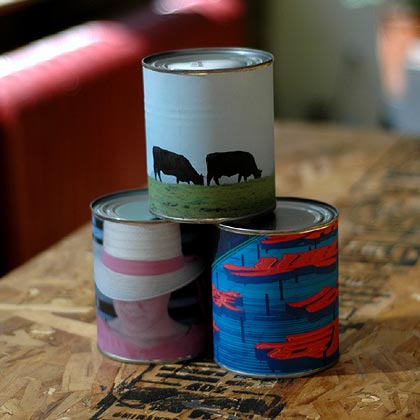
So cool! And simple too. I didn’t follow Photojojo’s directions exactly and I have a few observations to offer for those looking to play around with this:
- Paper quality. I just used regular old printer paper, not glossy photo paper or anything like that. This made the photos look more like actual cheap labels. I also didn’t worry too much about being careful with the glue. Again, a little mistake here and there actually enhances the effect.
- Glue. I removed the original label from the can and glued the photo directly to the can itself. Instead of rubber cement, I used a glue stick with acid-free acrylic emulsion. The glue stick made application really easy. And I didn’t apply the glue all the way around the can. I just glued down one end to the can, waited for that to dry, wrapped the photo around the can, pulled it tight, and glued the underside of that end to the end already affixed to the can. (When I tore the existing label off the can, I noticed that’s how it was glued on there, so I tried the same thing and it worked.)
- Can size, etc. Shopping in the canned food aisle of the supermarket takes on a different meaning when you’re not attempting to find green beans for dinner but trying to find aesthetically pleasing art supplies. I went with a larger can, one with stewed tomatoes; its proportions seemed more pleasing than those of a soup can. The problem was that when I got it home, it was almost 13 inches around, meaning that 8 1/2” x 11” paper wasn’t going to work. (I ended up getting some 8 1/2” x 14” paper.) So bring your tape measure to the grocery store with you to make sure the desired can will work with your paper size.
- No pop-tops. A lot of soup cans now feature pop-tops. Get the old fashioned kind instead…the last thing you want is Uncle Steve lifting your photo can off of the coffee table, fiddling with the pop-top, and, hey!, Chunky Vegetable three years past its expiration date all over the place.
- Botulism? Speaking of past the expiration date, what’s the shelf life of your artwork? The answer seems to be almost indefinitely when kept at temperatures at or below 75 degrees F, but I wouldn’t advise eating anything from your photo cans after a year or two. The risk of botulism is almost nonexistent in contemporary commercially canned food, but if you see any of your art swelling up, throw it out. In addition, botulism dislikes acidic environments, so you’re probably better off selecting cans with acidic food items in them, like tomatoes, fruits (without sweet syrups), and sauerkraut. But be careful not to get items that are too acidic…over a long period of time, the acid may eat through the can.
Good luck!
Barnaby Furnas’ “flood” paintings are quite impressive in person…check them out at the Boesky Gallery in Chelsea through Oct 18. Their sheer size and the degree to which their creation must have been out of the artist’s control is intriguing.
Tough art history quiz: who did ths painting…an elephant, an artist, or a preschooler? I play a similar game when I go to contemporary art museums: art or fire extinguisher? (via cyn-c)
Newer posts
Older posts

Socials & More