kottke.org posts about art
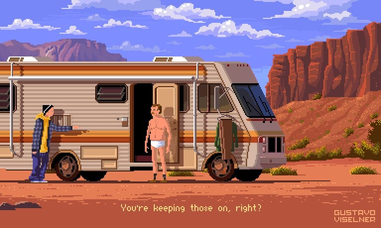
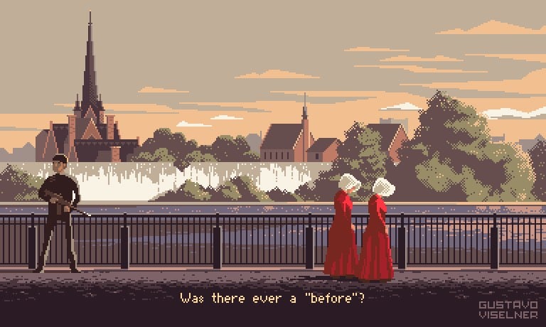
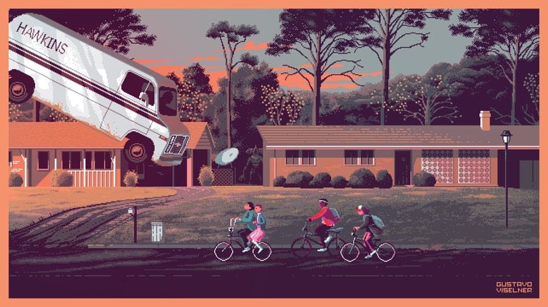
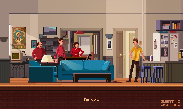
For his Pixel Art TV project, Gustavo Viselner illustrates scenes from TV shows in a pixelized video game style. Looks like he’s done scenes from Game of Thrones, The Handmaid’s Tale, Breaking Bad, The Fresh Prince of Bel-Air, Seinfeld, Star Trek, and several others. (via @john_overholt)
Update: See also The Screenshots, a project by Jon Haddock from 2000 in which scenes from historical & fictional events are rendered in a The Sims-like style. (via @dens)
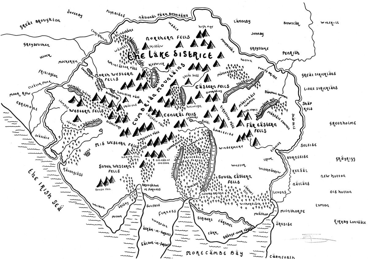

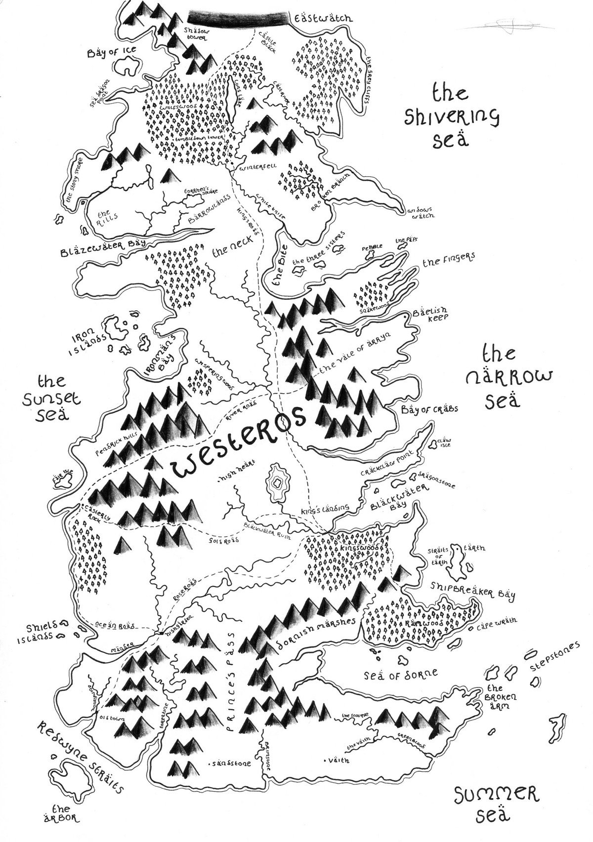
Artist Dan Bell has drawn maps of the UK’s national parks in the style of J.R.R. Tolkien’s Middle-Earth. Bell has also drawn maps of Westeros (from George R.R. Martin’s Game of Thrones series) and places like London and Oxford. Both prints and the original hand-drawn maps are available for purchase from Bell’s online shop.
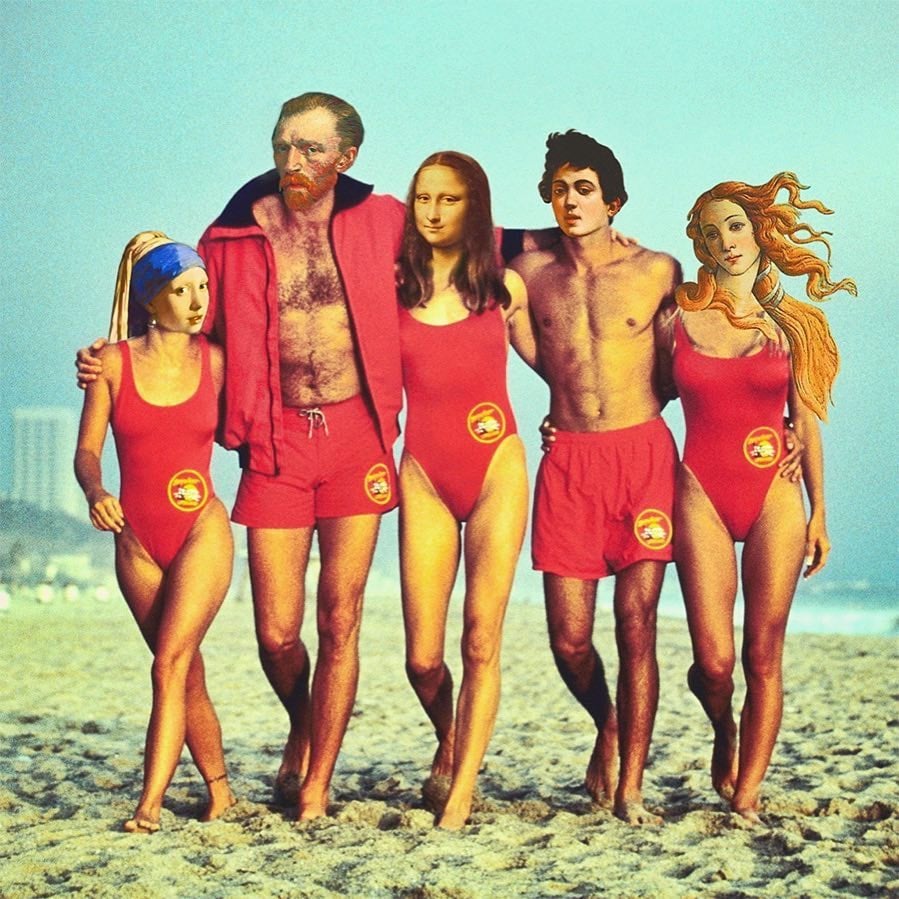
Photo collage by Dan Cretu.
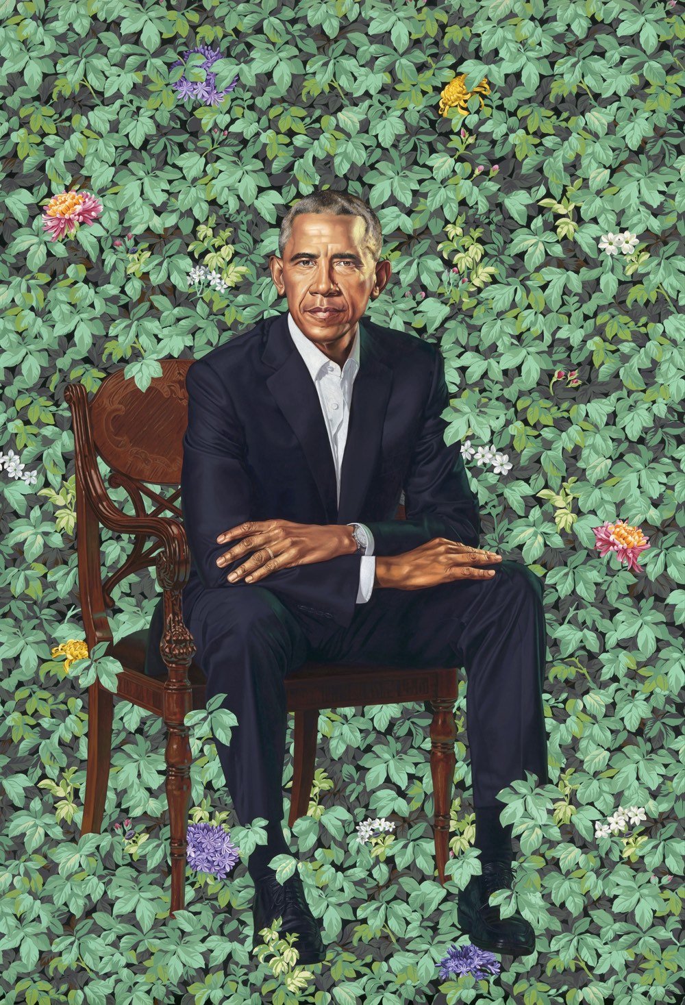
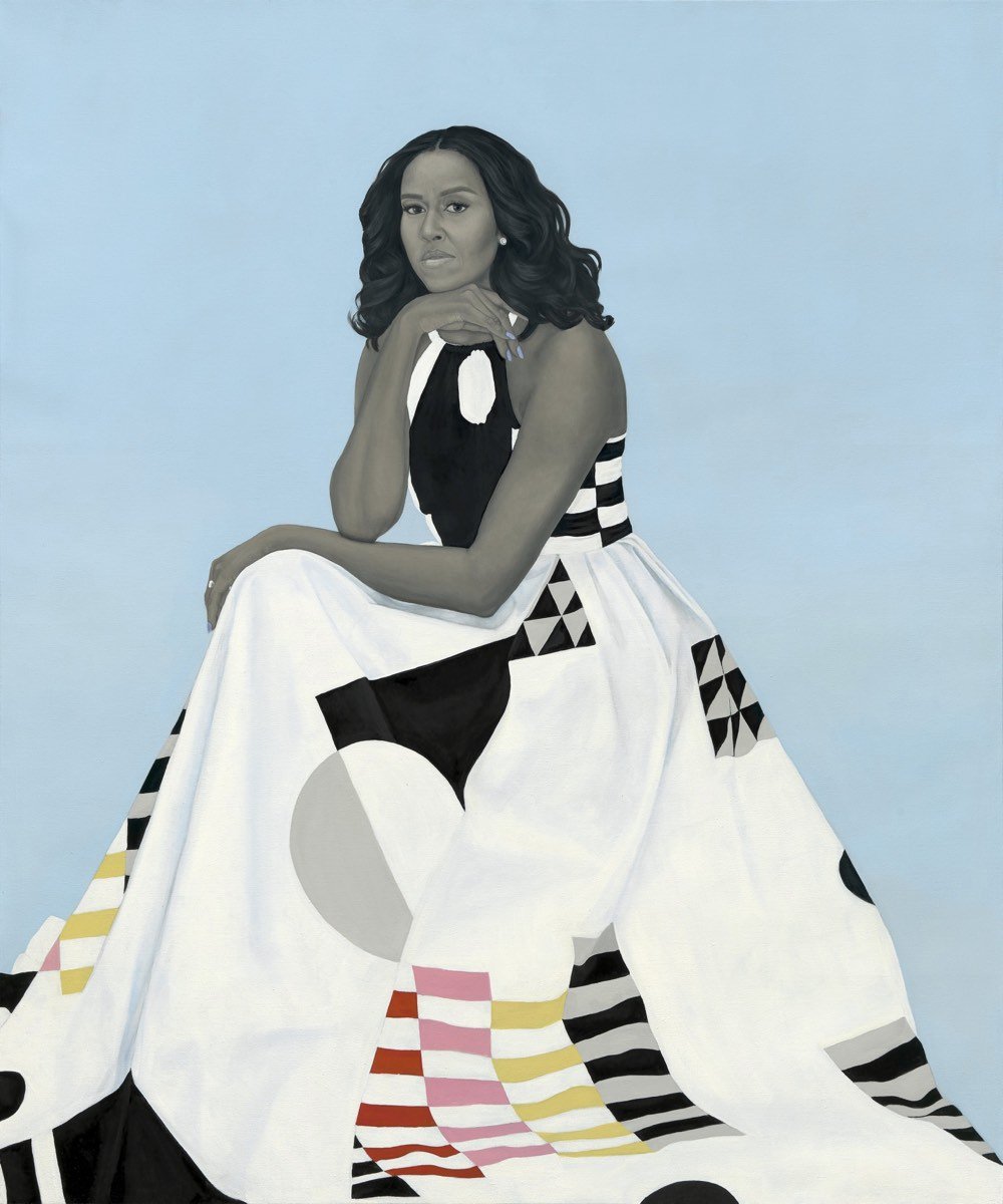
The Smithsonian’s National Portrait Gallery commissions paintings of each outgoing President and First Lady. The Obamas selected a pair of black artists, Kehinde Wiley and Amy Sherald, to paint their portraits, which were unveiled today. From Colossal:
Wiley’s depiction of President Obama features the artist’s signature style of richly-hued background patterns setting a vibrant symbolic environment for the portrait’s subject. President Obama is surrounded by a carefully selected variety of foliage: jasmine, which represents Hawaii; African blue lilies for his father’s Kenyan heritage; and Chicago’s official flower, the chrysanthemum. For Mrs. Obama’s portrait, Sherald engaged her distinctive combination of depicting skin tone in grayscale, offset by the sharply rendered full-color fabric of Mrs. Obama’s floor-length dress.
Even a cursory glance at other Presidential portraits shows how different the Obamas’ portraits are.
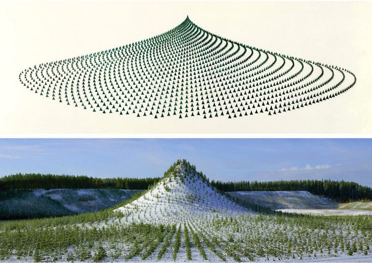
Tree Mountain is a man-made mountain 125 feet high covered in 11,000 trees planted in a configuration according to the Golden Ratio. This art installation was conceived and built by artist Agnes Denes in Finland and is designed to endure for 400 years.
A mountain needed to be built to design specifications, which by itself took over four years and was the restitution work of a mine that had destroyed the land through resource extraction. The process of bioremediation restores the land from resource extraction use to one in harmony with nature, in this case, the creation of a virgin forest. The planting of trees holds the land from erosion, enhances oxygen production and provides home for wildlife. This takes time and it is one of the reasons why Tree Mountain must remain undisturbed for centuries. The certificate the planters received are numbered and reach 400 years into the future as it takes that long for the ecosystem to establish itself. It is an inheritable document that connects the eleven thousand planters and their descendents reaching into millions, connected by their trees.
Here’s Tree Mountain on Google Maps and a lovely video of the mountain shot from a drone:
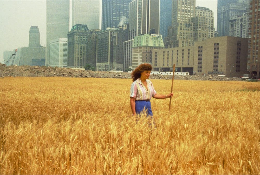
You may have seen another of Denes’ projects: a 2-acre wheat field she planted in 1982 near the World Trade Center in Manhattan.

(via shane)
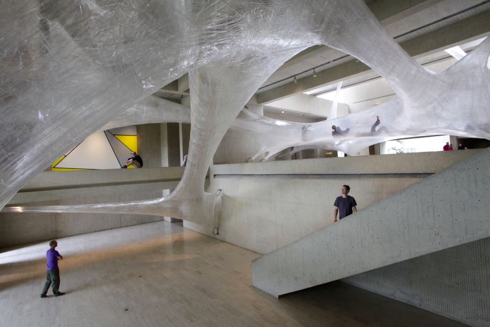
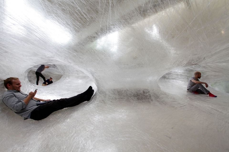
For their project Tape Des Moines, art collective Numen / For Use constructed tunnels in the Des Moines Art Center building made out of packing tape and invited people to crawl around in them. They’ve previously done tape tunnels in Vienna, Paris, and Frankfurt, but I have a looootta questions related to the structural soundness of packing tape. Like: how would puncturing the tunnel with a sharp object (accidentally or otherwise) affect the overall stability of the tunnel? (via colossal)
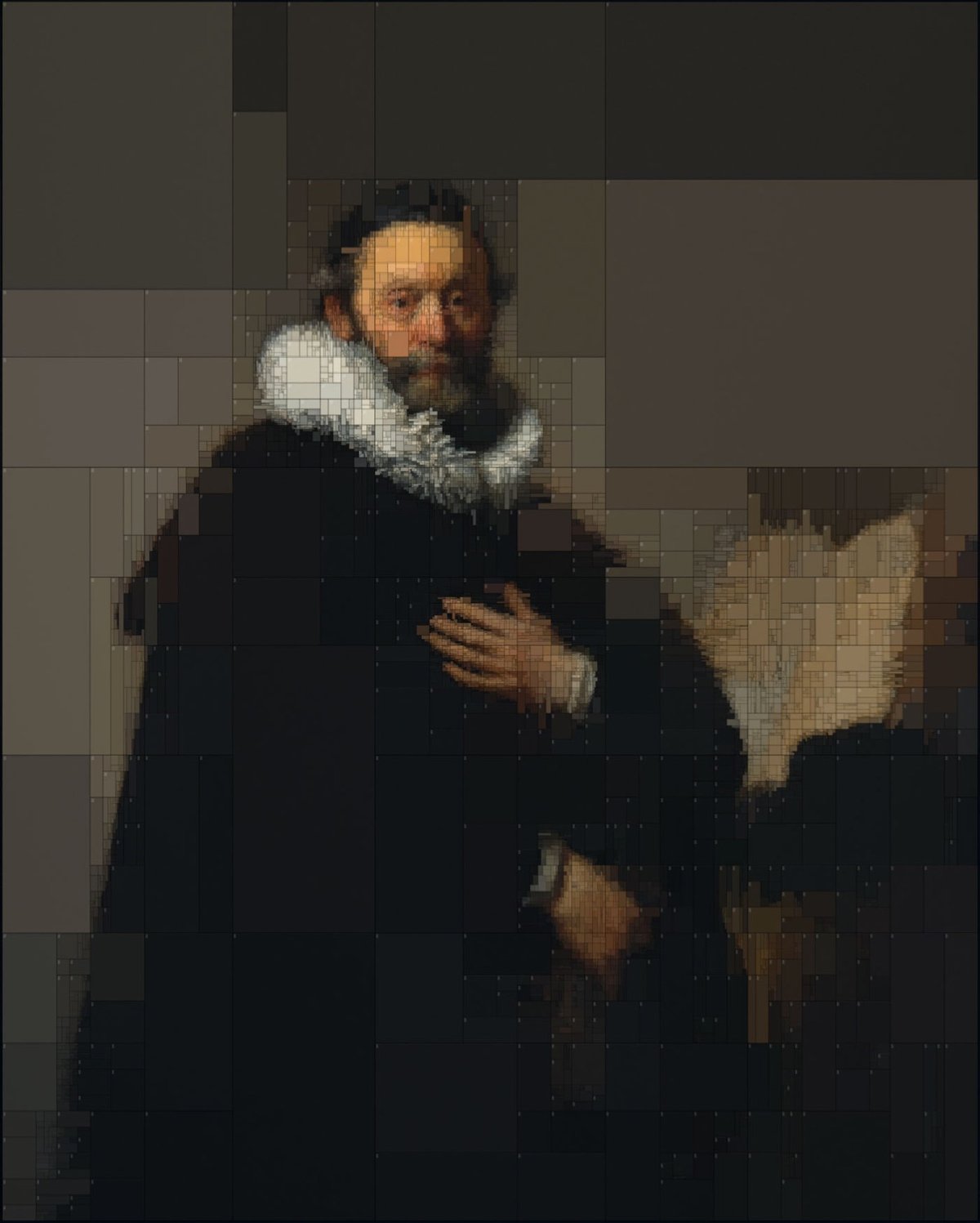
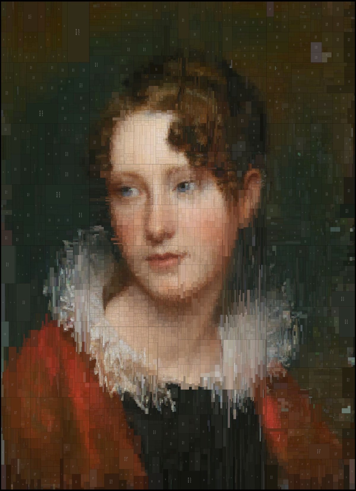
Greek visual designer Dimitris Ladopoulos took two of his favorite oil paintings, one by Rembrandt and the other (confusingly) by Rembrandt Peale, and used a piece of 3D modeling software called Houdini and pixelized them into treemaps of color. They look great in 2D (above), but he also rendered them in 3D with a worn texture:
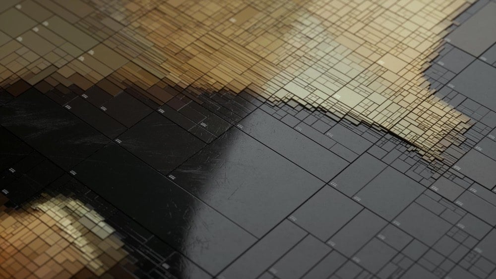
Those worn plastic rectangles with the beveled edges are reminding me of something in particular, like a piece of electronics. Something from Sony maybe? Anyone? (via colossal)
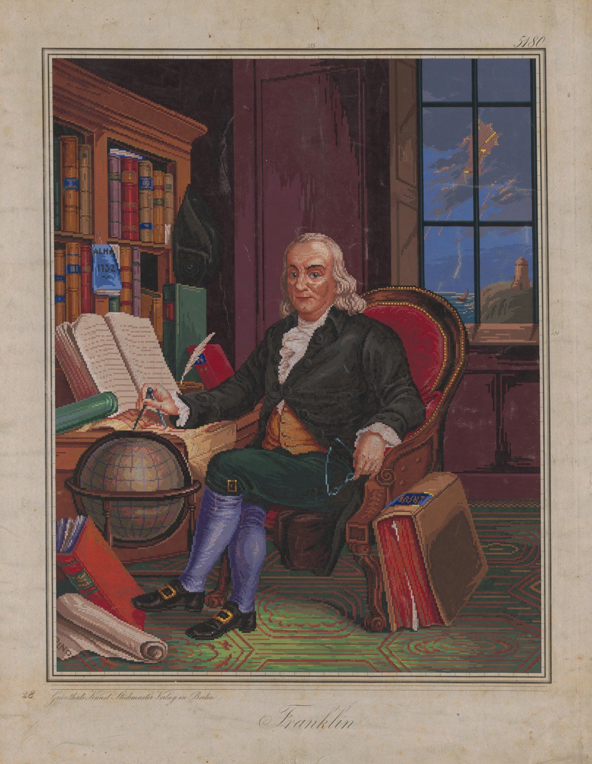
Ok, that’s not actually a screenshot from the hit Sega Genesis game Benjamin Franklin’s Polymath Academy. It’s a scan of an embroidery pattern from the 1840s or 1850s based on this engraving. Here’s a closer view:
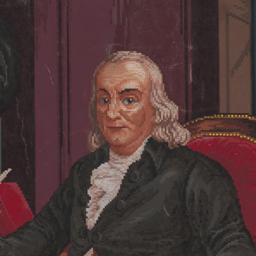
The scan is part of an ongoing project by the Library of Congress to scan their entire Popular Graphic Arts collection, a wonderful trove of prints, advertisements, and other printed documents from circa 1700 to 1900. (via @john_overholt)


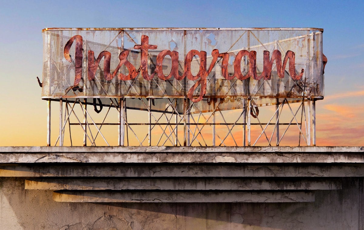
For a project called Social Decay, Andrei Lacatusu imagines what it would look like if big social media companies were brick & mortar and went the way of Blockbuster, Woolworth’s, and strip malls across America. These are really well done…check out the close-up views on Behance.
In a study done by UPenn researchers, first-year medical students who were taught art observation classes at the Philadelphia Museum of Art were more proficient at reading clinical imagery than students who didn’t take the classes.
If you’re unfamiliar or uncomfortable with how art and science can mingle to produce something clinically beneficial, it’s a study premise that might seem far-fetched — but it didn’t seem that way to Gurwin, an ophthalmology resident at Penn, in part because she’d already seen the benefits of art education on a medical career firsthand.
“Having studied fine arts myself and having witnessed its impact on my medical training, I knew art observation training would be a beneficial practice in medical school,” she said. “Observing and describing are skills that are taught very well in fine arts training, and so it seemed promising to utilize their teachings and apply it to medicine.”
Gurwin and Binenbaum’s findings, published in the journal Ophthalmology in September: The medical students who’ve dabbled in art just do better.
It’s a glimpse at how non-clinical training can and does make for a better-prepared medical professional. Not only does art observation training improve med students’ abilities to recognize visual cues, it also improves their ability to describe those cues.
The results of this study reminded me of Walter Isaacson’s assertion in his book that Leonardo da Vinci’s greatest skill was his keen observational ability. Not coincidentally, Leonardo was both an artist and a medical researcher who dissected more than 30 human cadavers to study human anatomy. These dissections helped him to represent the human form more realistically in his paintings and drawings.
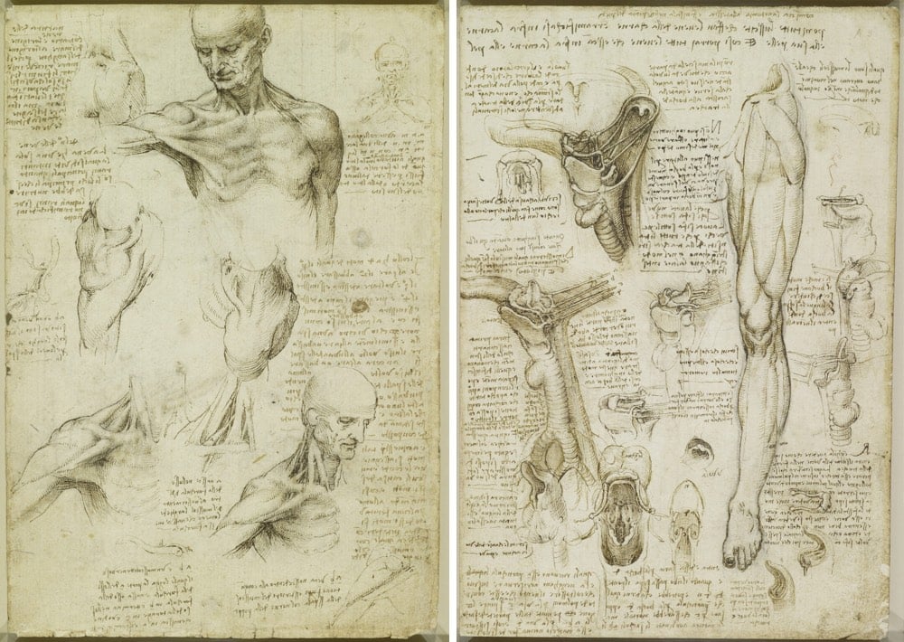
It’s easier to draw a hand, particularly a hand that appears to be moving (as Leonardo liked to do), if you know that’s going on underneath the skin. Looking carefully and purposefully at art, at anatomy, at the physical world, at people’s actions, at movies; it’s all the same skill that can be applied to anything.
I’ve been preoccupied with observation lately…the new kottke.org newsletter is named Noticing for good reason. Again, Leonardo factors in:
Isaacson argues that Leonardo’s observational powers were not innate and that with sufficient practice, we can all observe as he did. People talk in a precious way about genius, creativity, and curiosity as superpowers that people are born with but noticing is a more humble pursuit. Noticing is something we can all do.
Some people have been lucky enough to find themselves in paintings at art museums.
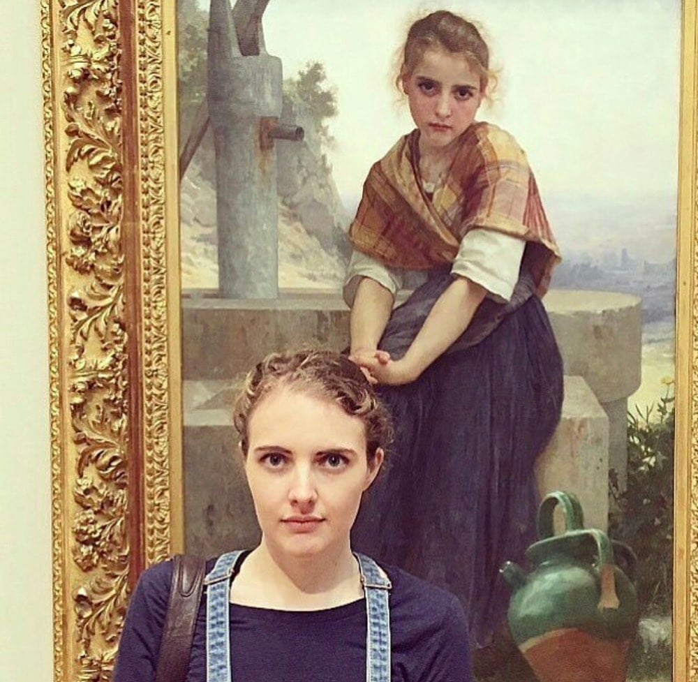
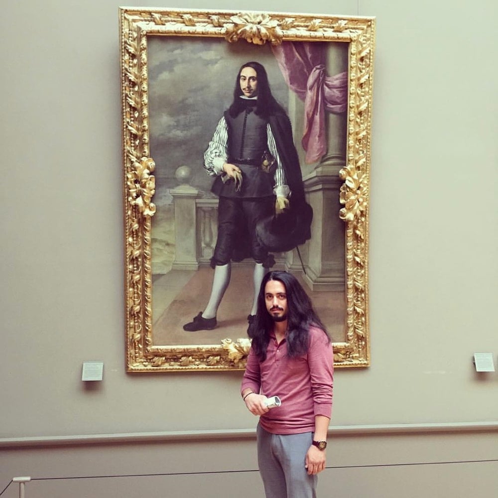
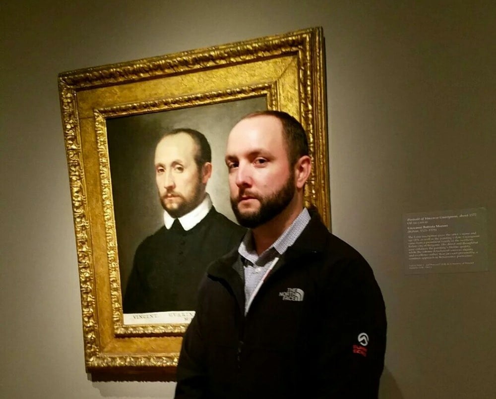
Now the Google Arts & Culture app lets you take a selfie and find your own art doppelganger. The results are kinds iffy — even when making my best Jesus-suffering-on-the-cross face, I couldn’t get it to match me with an actual Passion painting — but you can see some of the results here.
See also Stefan Draschan’s photos of people matching artworks.
Update: And the NY Times is on it!

Donald Hanson has created a digital art piece called Permanent Redirect that moves to a new URL every time someone views it.
A net art piece that moves to a new URL whenever someone views it. It is not possible to link to the art piece. Over time the art piece will become very hard to view. This is an experiment in introducing artificial scarcity into digital work.
So, it was here and then here but now it’s not, so good luck tracking it down. Or, ok, it’s not really the point, but you can cheat a little and find a screenshot on Twitter. (via @nickbaum)
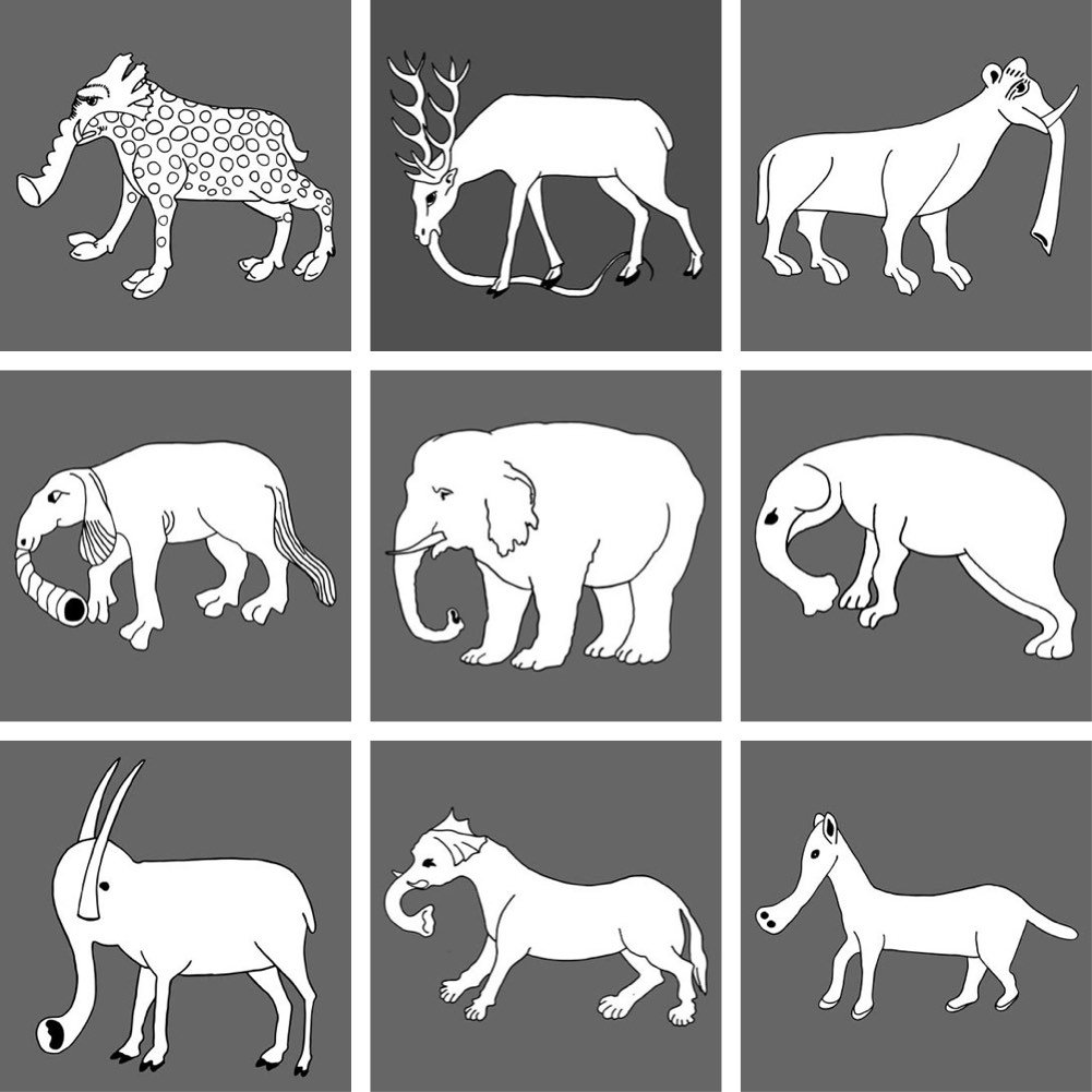
For his Elephas Anthropogenus project, Uli Westphal collected European illustrations of elephants dating from the fall of Rome to the end of the Renaissance, a period of time when very few people actually knew what an elephant looked like.
After the fall of the Roman Empire, elephants virtually disappeared from Western Europe. Since there was no real knowledge of how this animal actually looked, illustrators had to rely on oral and written transmissions to morphologically reconstruct the elephant, thus reinventing an actual existing creature. This tree diagram traces the evolution of the elephant depiction throughout the middle ages up to the age of enlightenment.
See also famous logos drawn from memory and drawing all 50 states from memory.
Have you ever wondered why, when you’re driving along on a straight road in the Western US, there’s a weird curve or short zigzag turn thrown into the mix? Grids have been used to lay out American roads and houses since before there was a United States. One of the most prominent uses of the grid was in the Western US: the so-called Jefferson Grid.
The Land Ordinance of 1785, drafted by Thomas Jefferson, extended government authority over the Mississippi River and the Great Lakes regions. As a response to what he believed to be a confusing survey system already in use, Jefferson suggested a new grid system based on the rectangle. The grid divided land into plots one mile square, each consisting of 640 acres. The grid also placed a visible design upon a relatively untouched landscape.
As most people know, the Earth is roughly spherical. When you try to cover the surface of a sphere with squares, they are not going to line up perfectly. That means, every so often, sections of the grid shift away from each other. Gerco de Ruijter’s short film, Grid Corrections, shows dozens of examples of places where this shift occurs and the corrections employed to correct them.
By superimposing a rectangular grid on the earth surface, a grid built from exact square miles, the spherical deviations have to be fixed. After all, the grid has only two dimensions. The north-south boundaries in the grid are on the lines of longitude, which converge to the north. The roads that follow these boundaries must dogleg every twenty-four miles to counter the diminishing distances.
If you want to look at some of the corrections yourself, try this location in Kansas (or this one). See that bend? Now scroll the map left and right and you’ll see a bunch of the north/south roads bending at that same latitude.

You can read more about de Ruijter’s project and grid corrections in this Travel & Leisure article by Geoff Manaugh.
Update: An email from my dad:
Hi son, just reading your blog on the section lines….don’t forget, you used to live on a correction line…that is why 3 of my 40’s were only 26.3 acres….
“40’s” refers to 40 acre plots…a common size for a parcel of land back when that area was divvied up. Wisconsin has so many lakes, rivers, and glacial features that interrupt the grid that it’s difficult to tell where the corrections are, but looking at the map, I can see a few roads curving at that latitude. Cool!
DeepDream is, well, I can’t improve upon Wikipedia’s definition:
DeepDream is a computer vision program created by Google engineer Alexander Mordvintsev which uses a convolutional neural network to find and enhance patterns in images via algorithmic pareidolia, thus creating a dream-like hallucinogenic appearance in the deliberately over-processed images.
The freaky images took the web by storm a couple of years ago after Google open-sourced the code, allowing people to create their own DeepDreamed imagery.
In the video above, Mordvintsev showcases a DeepDream-ish new use for image generation via neural network: endlessly zooming into artworks to find different artworks hidden amongst the brushstrokes, creating a fractal of art history.
Bonus activity: after staring at the video for four minutes straight, look at something else and watch it spin and twist weirdly for a moment before your vision readjusts. (via prosthetic knowledge)
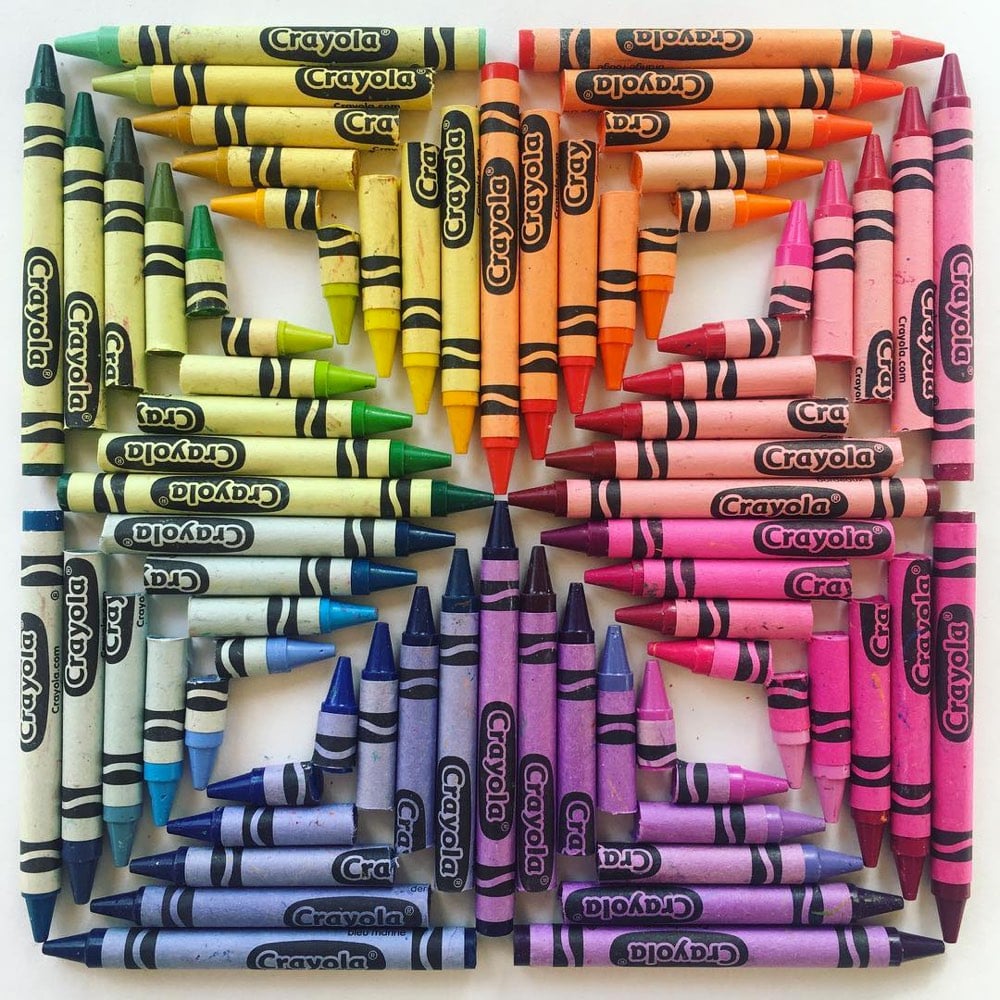
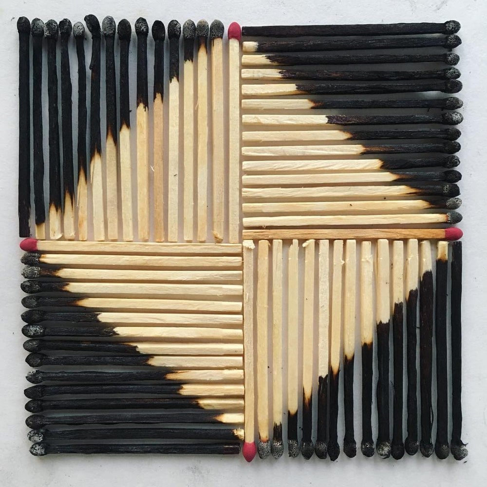
On his Instagram account, Adam Hillman arranges everyday objects into patterns. Prints are available. Related: Always. Be. Knolling. (via colossal)
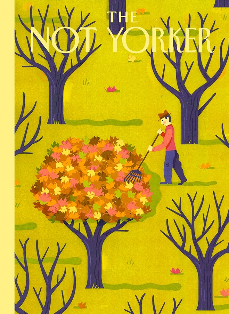
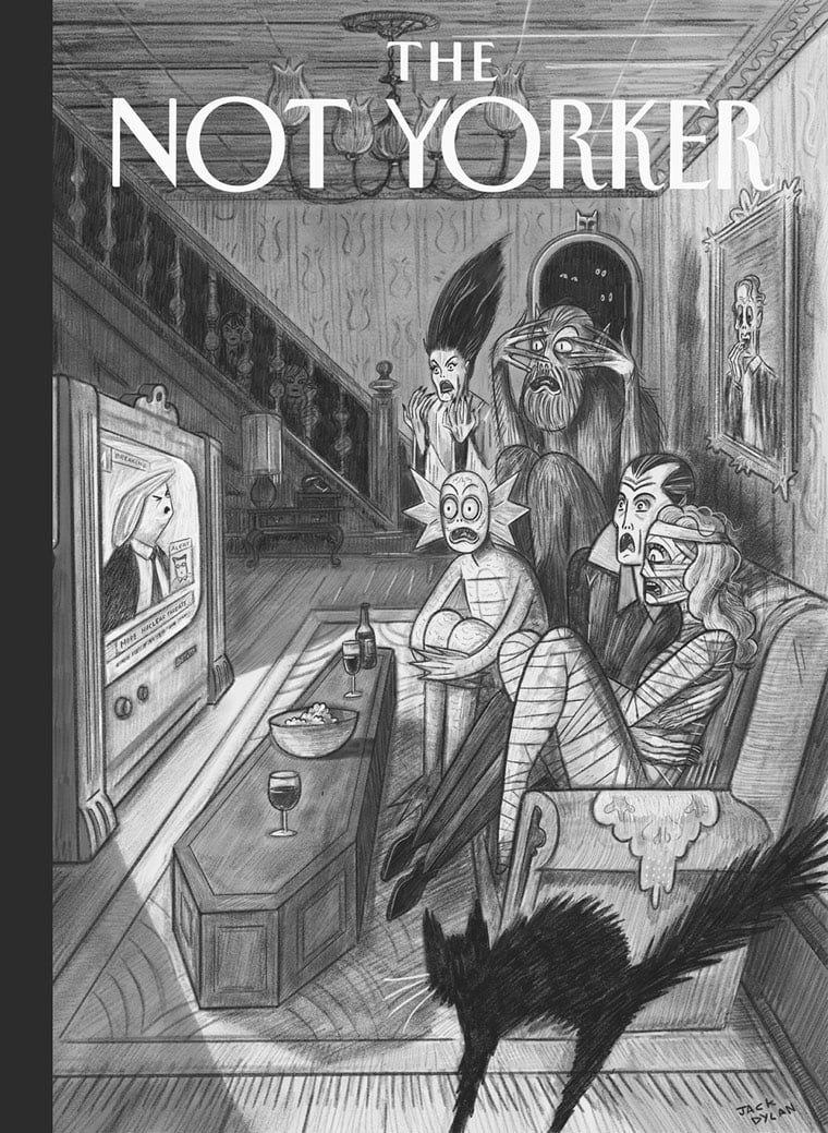
The Not Yorker is a blog collecting cover art rejected by the New Yorker. If you’re an illustrator who’s had a cover rejected, they’re soliciting submissions. (via the morning news)
For his work Nowhere and Everywhere at the Same Time, William Forsythe sets in motion hundreds of pendulums in a room and invites people to walk among them, attempting to avoid collisions.
Suspended from automated grids, more than 400 pendulums are activated to initiate a sweeping 15 part counterpoint of tempi, spacial juxtaposition and gradients of centrifugal force which offers the spectator a constantly morphing labyrinth of significant complexity. The spectators are free to attempt a navigation this statistically unpredictable environment, but are requested to avoid coming in contact with any of the swinging pendulums. This task, which automatically initiates and alerts the spectators innate predictive faculties, produces a lively choreography of manifold and intricate avoidance strategies.
When I read the preview for the video at The Kid Should See This, I was expecting heavy brass pendulums cutting large swaths through the room, not unlike the first challenge in Indiana Jones and the Last Crusade where “only the penitent man will pass”. That would have been fun but perhaps too dangerous and not art.
At the Museum is a new video series by MoMA in NYC that offers a behind-the-scenes look at what it takes to run a world-class modern art museum. The first episode, embedded above, follows the staff as they prepare for new exhibitions, both in the museum and across the Atlantic.
As the Museum of Modern Art prepares to ship 200 masterworks by artists like Picasso, C’ezanne, Rothko and de Kooning for a special exhibition at the Louis Vuitton Foundation in Paris, other MoMA staff begin to install a new line-up of exhibitions in New York.
New videos are posted each week. (via the kid should see this)

This might be Dorothy’s best print yet: a cutaway view of the Arriflex 35 IIC camera used extensively by directors like Stanley Kubrick but the guts of the camera has been replaced with some of the most iconic movies scenes of all time. The full print contains 60 scenes, but even in the small excerpt above, you can see The Wizard of Oz, Dr. Strangelove, The Empire Strikes Back, Forrest Gump, and The Godfather.
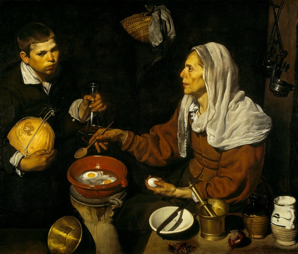
Can art history help us understand how food tasted in the 1600s? Not really, but it can shed some light on what people cooked and what kinds of foods were available.
What can we learn about how people ate in the seventeenth century? And even if we can piece together historical recipes, can we ever really know what their food tasted like?
This might seem like a relatively unimportant question. For one thing, the senses of other people are always going to be, at some level, unknowable, because they are so deeply subjective. Not only can I not know what Velazquez’s fried eggs tasted like three hundred years ago, I arguably can’t know what my neighbor’s taste like. And why does the question matter, anyway? A very clear case can be made for the importance of the history of medicine and disease, or the histories of slavery, global commerce, warfare, and social change.
By comparison, the taste of food doesn’t seem to have the same stature. Fried eggs don’t change the course of history.
Maybe fried eggs don’t, but spices did. Coffee beans did. Cacao beans, potatoes, and tomatoes did. Europe was in such a hurry to upgrade the flavor of its bland, rotten food that it colonized most of the world, waged wars, enslaved millions, and invented the multinational corporation.
See also Tom Standage’s An Edible History of Humanity and Charles Mann’s 1493. (via @robinsloan)
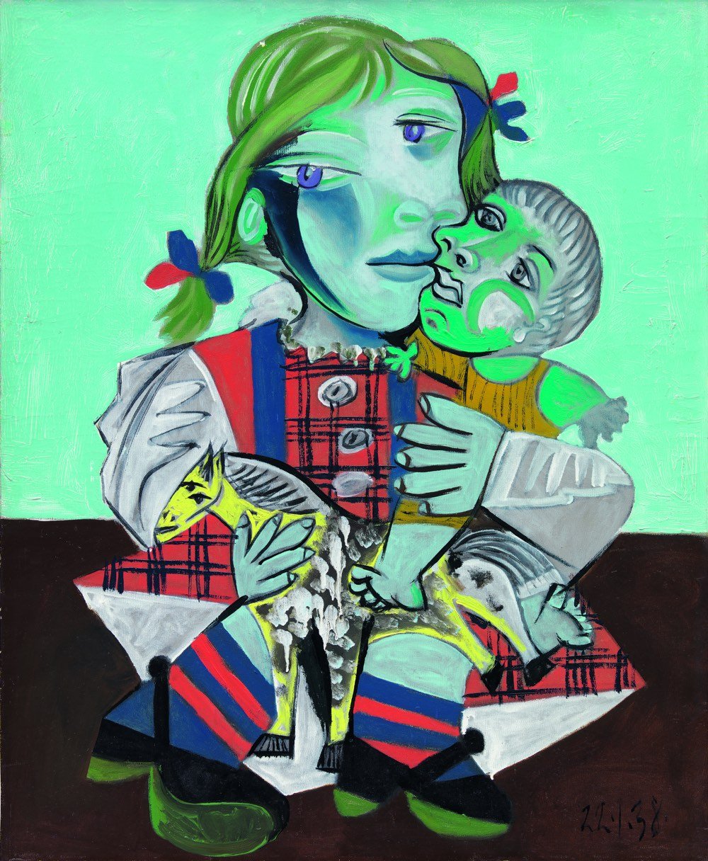
From Cody Delistraty in the Paris Review, a timely article on Pablo Picasso, his artwork, and how he treated the women in his life (spoiler alert: quite poorly).
Sixteen years ago, Marina Picasso, one of Pablo Picasso’s granddaughters, became the first family member to go public about how much her family had suffered under the artist’s narcissism. “No one in my family ever managed to escape from the stranglehold of this genius,” she wrote in her memoir, Picasso: My Grandfather. “He needed blood to sign each of his paintings: my father’s blood, my brother’s, my mother’s, my grandmother’s, and mine. He needed the blood of those who loved him.”
After Jacqueline Roque, Picasso’s second wife, barred much of the family from the artist’s funeral, the family fell fully to pieces: Pablito, Picasso’s grandson, drank a bottle of bleach and died; Paulo, Picasso’s son, died of deadly alcoholism born of depression. Marie-Therese Walter, Picasso’s young lover between his first wife, Olga Khokhlova, and his next mistress, Dora Maar, later hanged herself; even Roque eventually fatally shot herself.”Women are machines for suffering,” Picasso told Francoise Gilot, his mistress after Maar. After they embarked on their affair when he was sixty-one and she was twenty-one, he warned Gilot of his feelings once more: “For me there are only two kinds of women: goddesses and doormats.”
At the same time, his granddaughter has curated a show in Paris of Picasso’s art celebrating his relationship with his daughter Maya.
Diana Widmaier-Picasso, who is the daughter of Maya Widmaier-Picasso and Pierre Widmaier, a shipping magnate, and the granddaughter of Picasso and Marie-Therese, curated the exhibition. She is well aware of the usual misanthropic, misogynistic characterizations of Picasso. “He’s a man of metamorphoses,” she tells me carefully in Paris, a few days before the vernissage of her exhibition. “A complex person to grasp.”
When I was in Paris recently, I went to the Picasso Museum, where one of the exhibitions showcased his art from 1932, the artist’s “année érotique”. The Guardian described the show thusly:
Achim Borchardt-Hume, the gallery’s director of exhibitions and co-curator of the 2018 show, said the challenge facing curators was: “How can you get close to Picasso as an artist and a person? How can you get beyond the myth?”
Their answer was to focus on one period in Picasso’s long life. They chose 1932, a time called Picasso’s “year of wonders”.
It was a year when he cemented his superstar status as the world’s most influential living artist, producing some of his greatest works of art and staging his first retrospective, which he curated. It was also a year when his passion for Walter almost boiled over.
Picasso was 45 when, in 1927, he spotted the 17-year-old Walter as she exited a Paris Metro station. He approached her, grabbed her arm and declared: “I’m Picasso! You and I are going to do great things together.”
At this point, the quality of the art is undeniable but so too is Picasso’s treatment of women: he beat them, verbally and emotionally abused them, cheated endlessly on his wives, and entered into at least one sexual relationship with a girl under the age of consent (though with the permission of her parents it seems). He chewed women up for his art and then left them to die, literally. A small aspect of all of the allegations that have come out recently (Weinstein, Spacey, Louis CK, Roy Moore, Matthew Weiner, Charlie Sheen, Jeffrey Tambor, Dustin Hoffman, Leon Wieseltier, and — never forget! — fucking Trump) is the collective realization (mostly on the part of men…women have been aware) that not only has massive chunks of our culture been created by specific men who abuse women but also that so-called “Western culture” in its entirety has been marked and in many ways defined by systemic and institutionalized misogyny that has chewed up women for art and discarded them en masse. Never mind your fave is problematic…the whole damn culture is problematic. This aspect of the creation of culture has been largely written out of history, but going forward, it’s going to be important to write it back in.
A few years ago, in a forest just outside of Oslo, 1000 trees were planted. In 2114, after a century of growth, the trees will be cut down and made into paper for an anthology of books. Meet the Future Library, an artwork by Katie Paterson.
Between now and then, one writer every year will contribute a text, with the writings held in trust, unpublished, until the year 2114. Tending the forest and ensuring its preservation for the one hundred year duration of the artwork finds a conceptual counterpoint in the invitation extended to each writer: to conceive and produce a work in the hopes of finding a receptive reader in an unknown future.
The first three writers to contribute texts are Margaret Atwood, David Mitchell, and Icelandic novelist Sjón. Atwood said of her participation:
How strange it is to think of my own voice — silent by then for a long time — suddenly being awakened, after a hundred years. What is the first thing that voice will say, as a not-yet-embodied hand draws it out of its container and opens it to the first page?
See also the John Malkovich movie that no one will see for 100 years. The Future Library also has something in common with the (possibly apocryphal) story of the grove of oak trees specifically planted to replace the massive ceiling beams in the dining hall at Oxford hundreds of years in the future. Stewart Brand told the story in the TV adaptation of How Buildings Learn.
One of the Junior Fellows stuck his neck out and suggested that there might be some worthy oaks on the College lands. These colleges are endowed with pieces of land scattered across the country which are run by a college Forester. They called in the College Forester, who of course had not been near the college itself for some years, and asked him if there were any oaks for possible use.
He pulled his forelock and said, “Well sirs, we was wonderin’ when you’d be askin’.”
Upon further inquiry it was discovered that when the College was founded, a grove of oaks had been planted to replace the beams in the dining hall when they became beetly, because oak beams always become beetly in the end. This plan had been passed down from one Forester to the next for over five hundred years saying “You don’t cut them oaks. Them’s for the College Hall.”
Update: Karl Ove Knausgaard has become the 6th contributor to the library. (via @tedgioia)
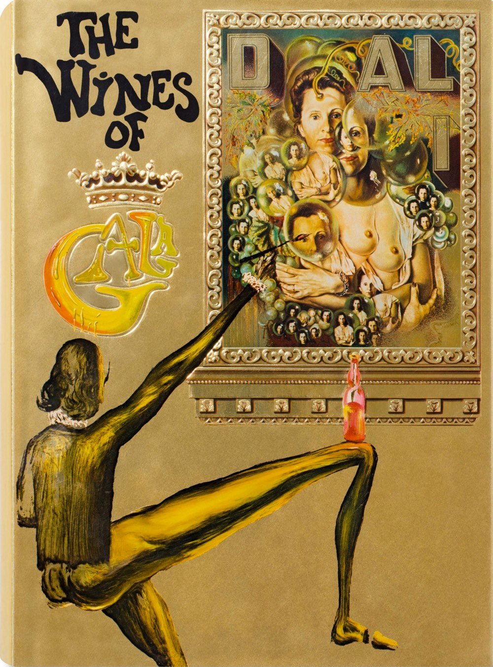
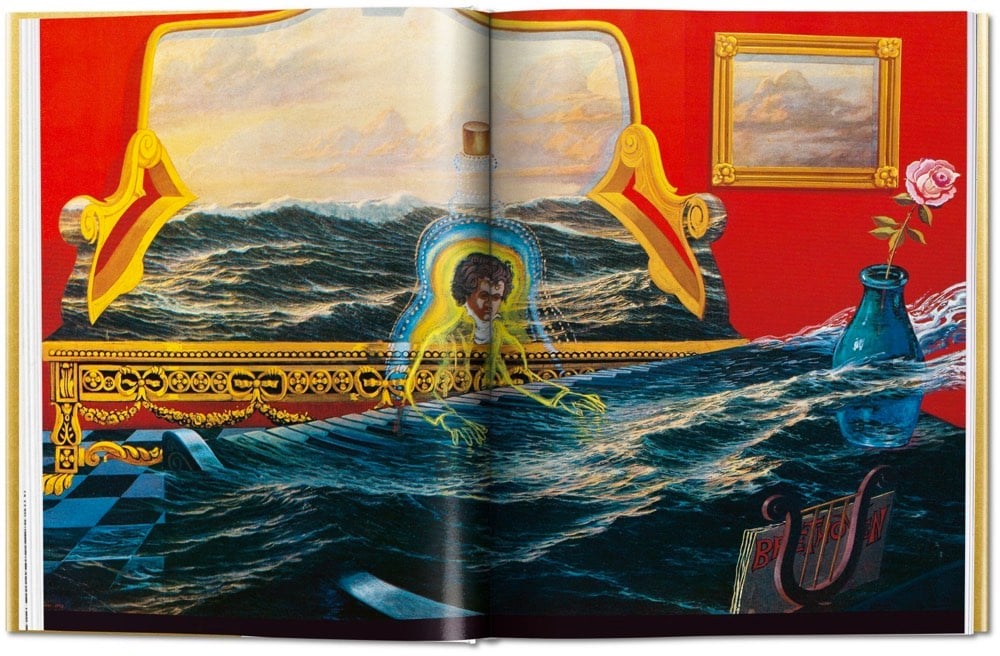
Last year, Taschen re-released a new edition of a surrealist cookbook originally written by the artist Salvador Dali back in the 70s. The quirky book was a hit, so now the company is re-releasing another of Dali’s food-related books, a guide to wine called The Wines of Gala.
A Dalinian take on pleasures of the grape and a coveted collectible, the book sets out to organize wines “according to the sensations they create in our very depths.” Through eclectic metrics like production method, weight, and color, the book presents wines of the world in such innovative, Dal’iesque groupings as “Wines of Frivolity,” “Wines of the Impossible,” and “Wines of Light.”
Accompanying the fanciful wine advice are more than 140 illustrations by Dali. Punch reviewed the original book a couple years ago.
Of the more than 140 illustrations by the artist, most are reprinted sketches and details from earlier paintings; of the original pieces made for the book, many were produced by slightly altering the work of other artists, adding touches like the aforementioned torso drawers and penis-wine bottle spout, which were appended to a traditional nude by Bouguereau, a 19th-century French Academy painter.
(via colossal)
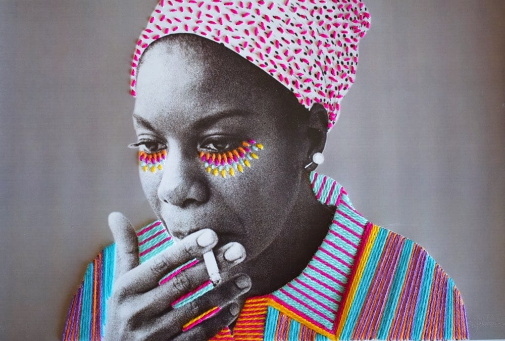
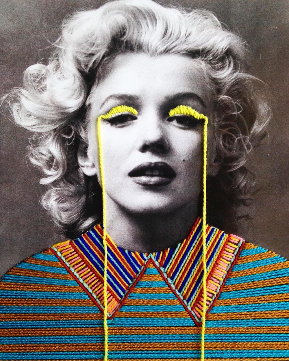
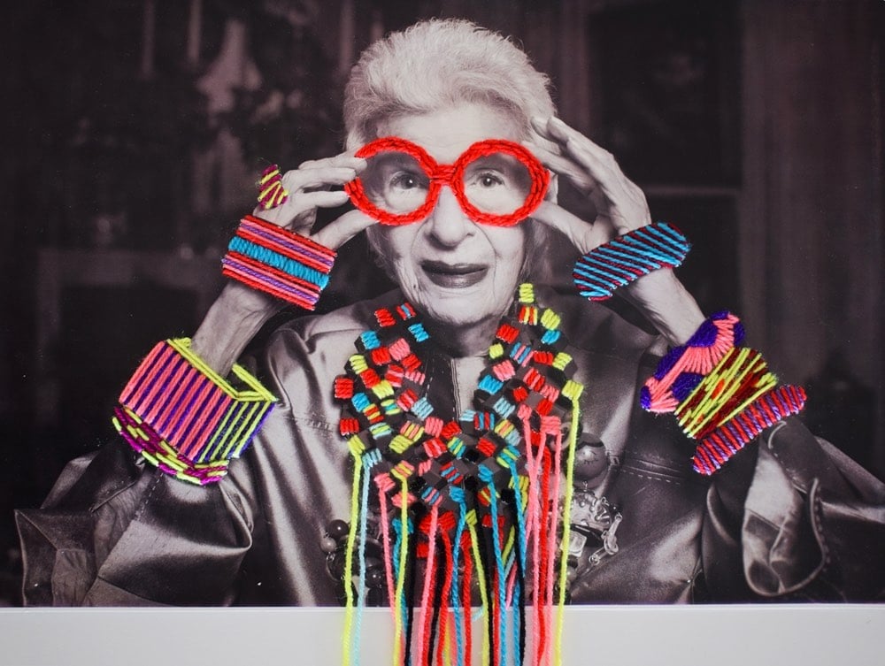
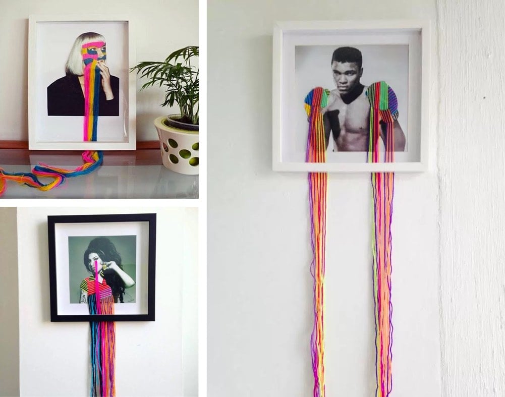
Victoria Villasana uses yarn to augment b&w photos of iconic people (Marilyn Monroe, Nina Simone, Frida Kahlo) to create these wonderful artistic portraits. When framed, her artwork spills out onto walls and tables:
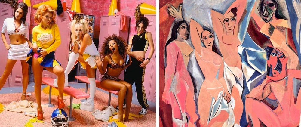
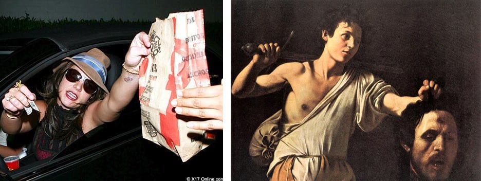
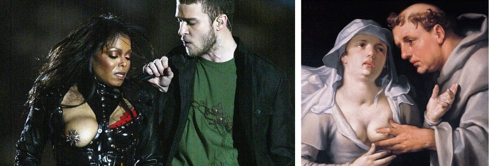
Twitter account Tabloid Art History shares pop culture images paired with art history references because, in their words, “for every pic of Lindsay Lohan falling, there’s a Bernini sculpture begging to be referenced”. A TAH art journal is also available (in online and paper versions).
Last week, I took a trip to France to visit friends, eat good food, and walk around (a lot).1 My friend David scooped me up from the Geneva airport and on the way out, we drove past one of the stops on his tongue-in-cheek unconventional tour of Geneva: “this is where all the dictators land their airplanes so they can stash art and diamonds in the Freeport”. In this film by Braden King for Field of Vision, Gilles Labarthe explains what the Geneva Freeport is.
Among other things, the Freeport is probably home to the world’s largest collection of art (including 1000 Picassos) and largest collection of wine in the world. But it’s mostly a tax-haven for the super-rich:
Free ports originated in the 19th century for the temporary storage of goods like grain, tea and industrial goods. In the last few decades, however, a handful of them — including Geneva’s — have increasingly come to operate as storage lockers for the superrich. Located in tax-friendly countries and cities, free ports offer savings and security that collectors and dealers find almost irresistible. (Someone who buys a $50 million painting at auction in New York, for example, is staring at a $4.4 million sales tax bill. Ship it to a free port, and the bill disappears, at least until you decide to bring it back to New York.)
This Economist article provides much more information on free ports. (via @daveg)
Update: Aaron Straup Cope suggests that maybe we should move museums out to the airports.
Do you notice something about each one of those places I’ve mentioned? They are all hubs for the major airlines. It’s not so much that everyone visits these places but they certainly all pass through their airports.
So why not just display the Smithsonian collection there? And not just the hub airports. All the airports. Seriously. I haven’t done the math but I would wager that the sum total of available square footage for displaying objects spanning all the airports, large and small, across the United States dwarfs the entirety of The National Mall in Washington.
The Smithsonian has a 137 million objects in its collection. It could fill every large and mid-sized airport in the country without breaking a sweat or even taking anything off the walls in Washington. Rotating those objects between airports would be trivial, or at least imaginable.
Photographer Stefan Draschan spent hours hanging around museums waiting for people who matched in some way the artwork around them.
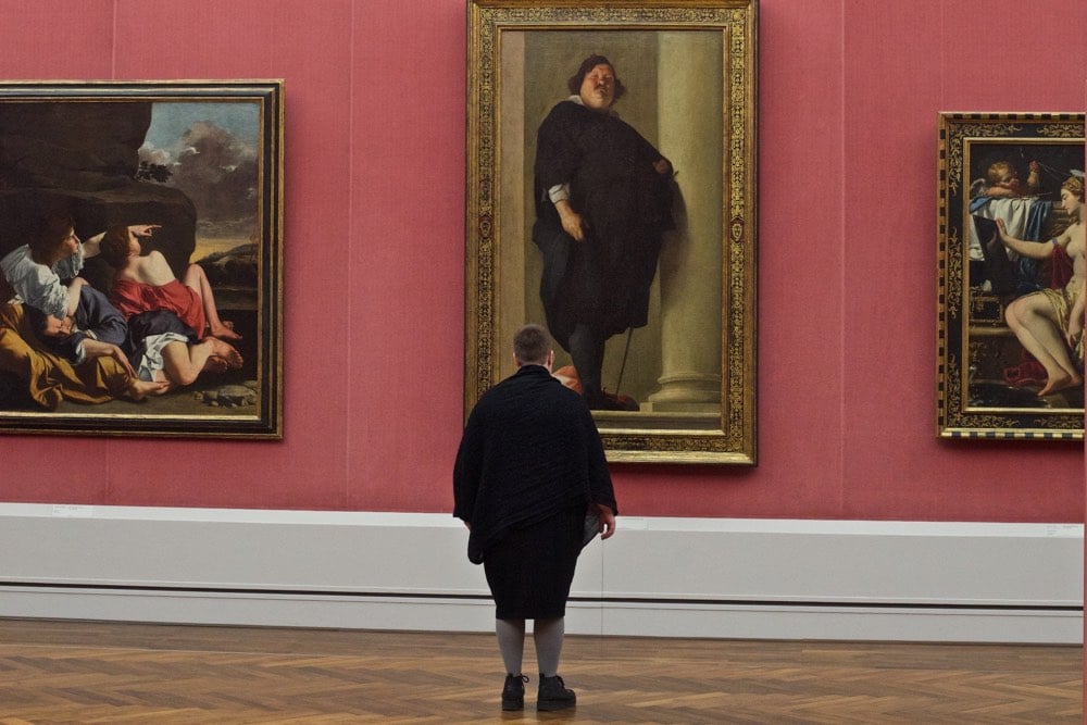
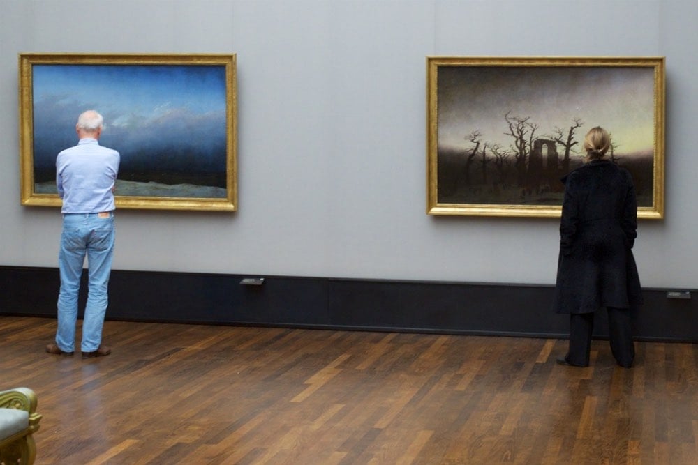
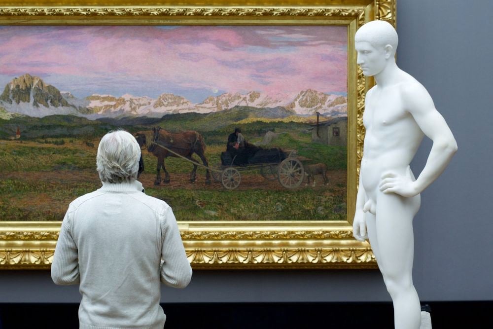
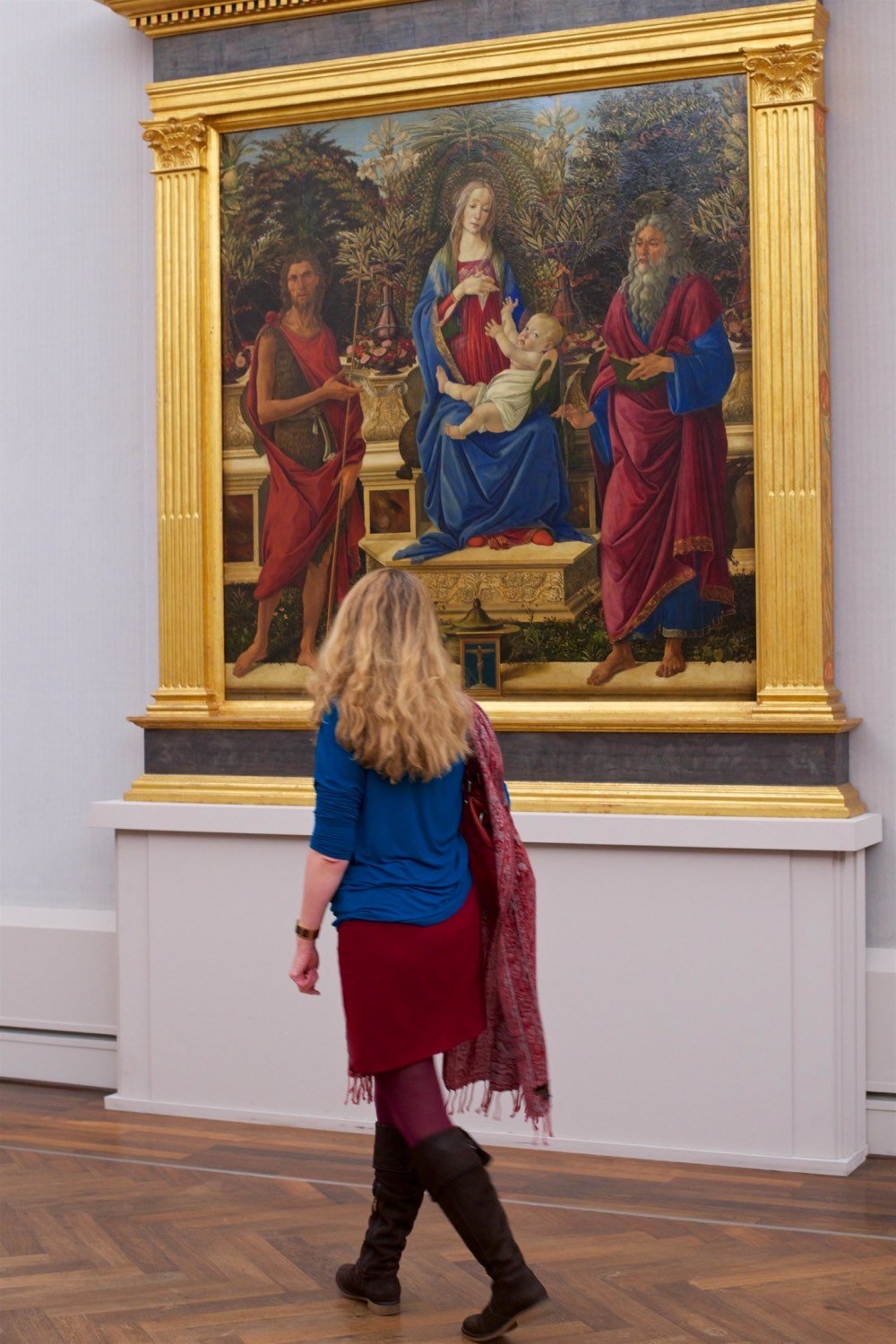
Draschan has done several other similar-ish projects, including People Touching Artworks. If I ever get really into Buddhism and mindfulness, I think my biggest obstacle in achieving enlightenment will be observing people in museums touching the art and remaining calm about it.
From choreographer Yoann Bourgeois, a mesmerizing trampoline performance called La mécanique de l’histoire (The mechanics of history). It often looks like they’re moving in slow motion, which is tough to do when the acceleration of gravity is involved.
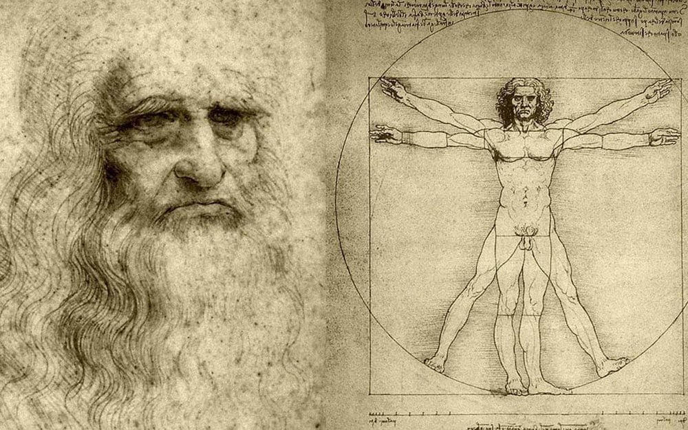
Tyler Cowen asks Is Leonardo da Vinci overrated? and, in a rebuke to Betteridge, proceeds to answer “yes”.
He has no work as stunning as Michelangelo’s David, and too many of his commissions he left unfinished or he never started them. The Notebooks display a fertile imagination, but do not contain much real knowledge of use, except on the aortic valve, nor did they boost gdp, nor are they worth reading. Much of his science is weak on theory, even relative to his time.
So Leonardo was perhaps not the best at any one thing but he was very good or great at many different things. He is literally the quintessential “Renaissance man” and yet Cowen fails to evaluate him on that basis. Not surprising…history’s generalists are under-celebrated as a rule. Anyway, I’m looking forward to reading Walter Isaacson’s biography of Leonardo in the next couple of weeks.
See also how the Mona Lisa became overrated.
Newer posts
Older posts
![]()
![]()
![]()
![]()




Socials & More