kottke.org posts about design
Edward Tufte has a new 24-page pamphlet out called The Cognitive Style of PowerPoint on how to improve your PowerPoint presentations:
In corporate and government bureaucracies, the standard method for making a presentation is to talk about a list of points organized onto slides projected up on the wall. For many years, overhead projectors lit up transparencies, and slide projectors showed high-resolution 35mm slides. Now “slideware” computer programs for presentations are nearly everywhere. Early in the 21st century, several hundred million copies of Microsoft PowerPoint were turning out trillions of slides each year.
Alas, slideware often reduces the analytical quality of presentations. In particular, the popular PowerPoint templates (ready-made designs) usually weaken verbal and spatial reasoning, and almost always corrupt statistical analysis. What is the problem with PowerPoint? And how can we improve our presentations?
I love the cover image.
For some years now, we web designers have been operating with a rough idea of exactly what it is we do. By mimicking the practices of other disciplines, sharing knowledge via web sites & mailing lists, reading industry magazines, following design gurus, and a whole lot of making it up as we go along, we’ve managed to get quite a bit done. That said, in order to move forward, there’s tremendous value in concisely presenting all that we’ve learned in one place, and that’s exactly what Jesse James Garrett has done with The Elements of User Experience (Amazon link).
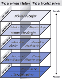
And he does this without pushing a trademarked process or holding himself up as a guru with all the answers. Instead, he simply describes the process that web designers have been using to get things done. I say “simply”, but that word belies the clarity and thoroughness of the book in its description of user experience design. One of the book’s most valuable contributions is the explanation of exactly how the various specialties fit into the larger process. Information design, information architecture, visual design, interface design, interaction design; they’re all represented in Jesse’s model of user experience design (shown at right).
Highly recommended for anyone involved in web design and developments, especially for managers and technical folk to get an idea of what us designers actually do. Here’s chapter 2 of the book in PDF format to get you started.
Don Norman, author of The Design of Everyday Things, has mixed feelings about Edward Tufte:
Tufte is often wrong about what constitutes good communication. Indeed, I am surprised he likes the Napoleon map so much because it has, in his terms, superfluous chart chunk - those drawings of soldiers. This is indeed an excellent graphic, but much of his work does not have this character.
Tufte is not the only statistician who has addressed the problems of representing graphical material. In my opinion, Bertin is the best.
Tufte preaches. I entered into a discussion with him about this once and tried to present some experimental data that one of my students had collected. he refused even to look at it. That is, it isn’t that he looked at the data and disagreed with the interpretation or even the collection— that would be permissible. No, he refused even to look.
Readerville has a great thread in their forums called Most Coveted Covers, a frequently updated list of well-designed book covers. Related are Edward Tufte’s book reviews, Book Design in Canada from Cardigan Industries, and an interview with Chip Kidd on Identity Theory.
Information design hero Edward Tufte has some thoughts on Mac OS X:
The OS X interface design is distracting and self-conscious, with a marketing slickness rather the straight-forward transparent charming style of the past. It is out of tune with the superb industrial design of Apple hardware. Mac users will probably get used to it.
For my own current work (Photoshop, Illustrator, Quark with large files on large monitors), I see no particular reason to prefer the new design to 9.04. Indeed I regard 9.04 as nearly ideal (large flat-screen monitors are key; the Apple Cinema monitor is an enormous advance in design and as a working tool). Maybe when we do digital video that will make a difference in favor of OS X.
Edward Tufte, well known amongst information & Web designers for his trilogy of ID bibles, puts a bit of magic into the possibility of Earth’s first contact with aliens:
Since the principles of physics hold everywhere, magic is conceivably a cosmological entertainment, with the wonder induced by theatrical illusions appreciated by all, regardless of planetary system. Accordingly the plaque aboard the Pioneer spacecraft for extraterrestrial scrutiny billions of years from now might have escaped from its conspicuously anthropocentric gestures by showing instead the universally familiar Amazing Levitation Trick.
Who says information designers don’t have a sense of humor?
This is what Milton Glaser has learned about design:
Less is not necessarily more. Being a child of modernism I have heard this mantra all my life. Less is more. One morning upon awakening I realised that it was total nonsense, it is an absurd proposition and also fairly meaningless. But it sounds great because it contains within it a paradox that is resistant to understanding. But it simply does not obtain when you think about the visual of the history of the world. If you look at a Persian rug, you cannot say that less is more because you realise that every part of that rug, every change of colour, every shift in form is absolutely essential for its aesthetic success. You cannot prove to me that a solid blue rug is in any way superior. That also goes for the work of Gaudi, Persian miniatures, art nouveau and everything else. However, I have an alternative to the proposition that I believe is more appropriate. “Just enough is more.”
I *love* that. Just enough is more. (via bbj)
Edward Tufte (author of three excellent books on information design) is working on a new book on cognitive art entitled “Beautiful Evidence”. Here are some copious notes from one of Tufte’s one day courses (upcoming schedule). There’s a really good bit at the end on his “principles for making presentations”…I’ll need that advice right around 8:30 this morning.
My mom has email now. The Internet has officially Arrived™.
I just finished reading Tom Clancy’s new book, Rainbow Six. It was OK.
The Avengers is possibly the worst movie I’ve seen since The Fifth Element.
Go rent Good Will Hunting. You know who you are.
I bought some drawstring pants. My unemployment experience is complete.
I will be gone for the weekend.
I’m looking though the Sunday paper today…searching for bargains. I open up the ad sheet for Dayton’s, an upscale department store, and what do I see but dinnerware by Calvin Klein. Let me repeat that: dinnerware by Calvin Klein. And Ralph Lauren makes Polo house paint. Tommy, Calvin, and Ralph all have their own “lines” of bed linen. I’m currently looking for a new car…does anyone know if I can get a Tommy car yet? If I can, I bet it’ll look just like a low-end Toyota and cost as much as a high-end Lexus.
And borrowing liberally from Henry Ford, Mr. Hilfiger had this to say about the Tommy car: “they can have a Tommy car in any color they want, as long as it’s red, white, or blue.”
On the one hand, you’ve got the good. On the other hand, you have the bad. And then there’s a bunch of stuff in the middle. I was in the middle for a long time. Most of my life actually…just sort of floating nonchalantly along.
Then life got weird. Ever since, I’ve been oscillating between the good and the bad, swinging (sometimes violently) back and forth from one extreme to the other. This weekend, I felt as bad as I’ve ever felt in my life. Despair the size of a watermelon. But, I also felt as good as I ever felt this weekend. Happiness you only see in the face of a small child during a really ripping game of Peek-a-boo.
And this existance is really different for me…I used to be on cruise control, but now I’m driving in the city, stopping and starting again at all the intersections. I really don’t know where I’m going to end up. Is all this oscillating going to rip me apart or will I settle on one or the other or end up somewhere in the middle again?
Right now, the good is far outpacing the bad…and I think that trend will continue for a while.
Newer posts





Socials & More