kottke.org posts about art
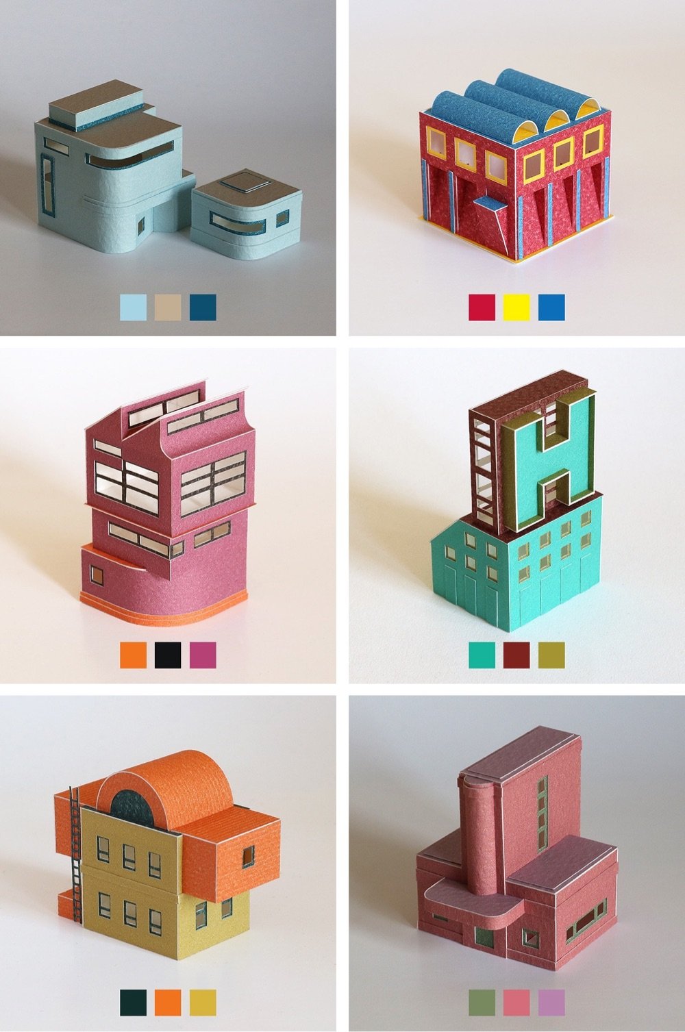
Papercraft artist Charles Young has been sourcing color combinations from this book and using them to construct extremely tidy and precise little buildings.
Starting in May 2020 I used Sanzo Wada’s Dictionary of Colour Combinations as inspiration for a new project introducing colour to my paper work for the first time. The book is made up of two, three and four colour combinations drawn from Japanese design and publishing in the early 20th century.
Check this out to get a sense of the scale — they’re really tiny. You can see many more of these on Instagram. It is actually hard to believe these are made out of paper and not computer generated. (via present & correct)
This story is a few years old but it charmed me too much this morning to let it slide. In 2017, four years after its grand reopening, Amsterdam’s Rijksmuseum welcomed its 10-millionth visitor, a man named Stefan Kasper. His lucky timing resulted in getting to spend the night in the museum, where he dined and slept underneath Rembrandt’s the Night Watch.
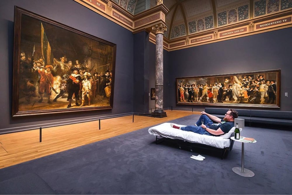
Here’s a short video of Kasper’s time in the museum:
I still can’t believe it. I discovered characters that I have never seen before. They came to life in front of me. It’s an experience that is forever etched in my memory.
Not the same, but I got to go to a press preview when the MoMA reopened a few years ago after renovations and it was quite an experience to wander those familiar galleries pretty much by myself. I stood in front of Starry Night and One: Number 31, 1950 for a really long time that morning.
One of my recent favorite YouTube channels is James Payne’s Great Art Explained, which does exactly what it says on the tin, showcasing works of art like Starry Night, the Great Wave, and A Sunday on La Grande Jatte. Payne recently launched a new channel in the same vein: Great Books Explained. Here’s a trailer, featuring a short clip of his exploration of Alice’s Adventures in Wonderland.
Being an avid reader, I always wanted to do a book channel as well, but did not have the time, so these films are collaborations with different writers who are passionate about certain books, and the first release will be James Joyce’s Ulysses (in this case co-created with Henry Mountford). This will be followed by Alice.
The video on James Joyce’s Ulysses is out now:
(via open culture)
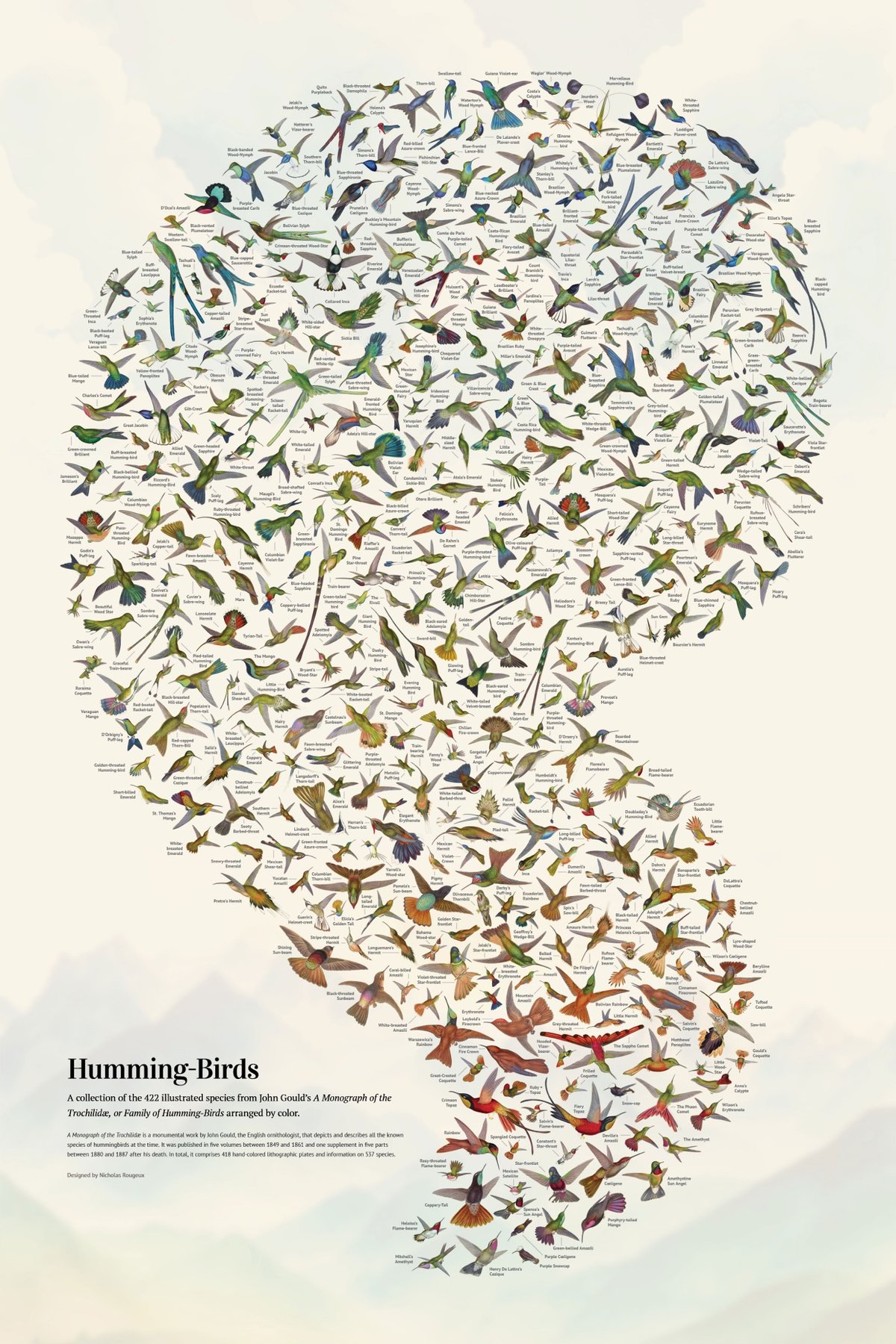
Wow, Nicholas Rougeux has restored John Gould’s A Monograph of the Trochilidæ, or Family of Humming-Birds, which was published between 1848 & 1887 and contains hand-colored lithographic depictions of almost every single hummingbird species known to exist at the time.


From Rougeux’s page about the project:
The monograph is considered one of the finest examples of ornithological illustration ever produced, as well as a scientific masterpiece. Gould’s passion for hummingbirds led him to travel to various parts of the world, such as North America, Brazil, Colombia, Ecuador, and Peru, to observe and collect specimens. He also received many specimens from other naturalists and collectors.
The image at the top of the post is the gorgeous poster that Rougeux created from the drawings in Gould’s monograph…you can order some for your walls and read a making-of.
See also other projects by Rougeux that I’ve posted about.
Perhaps the most prominent part of the most well-known painting of Henry VIII (a now-lost work by Hans Holbein the Younger) is the giant codpiece poking through the male-heirless king’s tunic. Evan Puschak analyzes the painting and fills us in on what makes this a particularly effective work of 16th-century propaganda.
Puschak had some fun with this one…I lol’d at “triple dick”, which under no circumstances should you google (like I did) at work or really anywhere else. Although, “triple dick art history” did lead me to this interesting piece on “ostentatio genitalium”:
Ostentatio genitalium (the display of the genitals) refers to disparate traditions in Renaissance visual culture of attributing formal, thematic, and theological significance to the penis of Jesus.
This bit got me laughing again:
…these Renaissance images shock us because they are so frequently ithyphallic: Christ has risen, but not in the way we have come to expect.
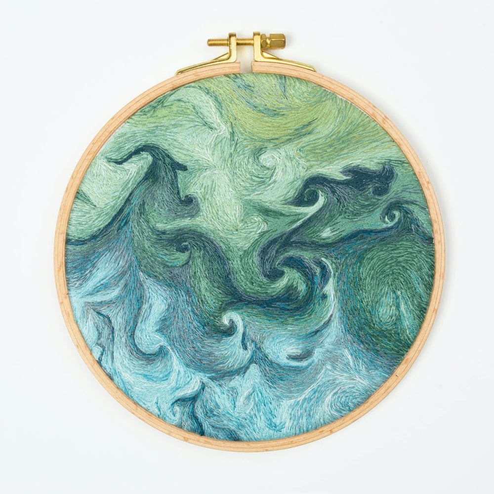
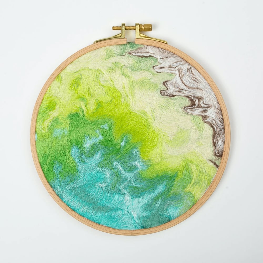
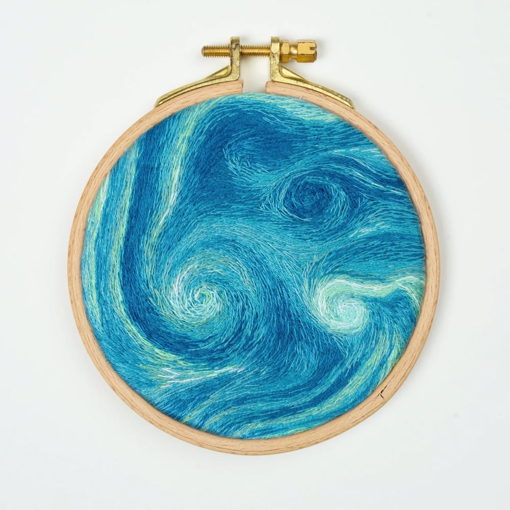
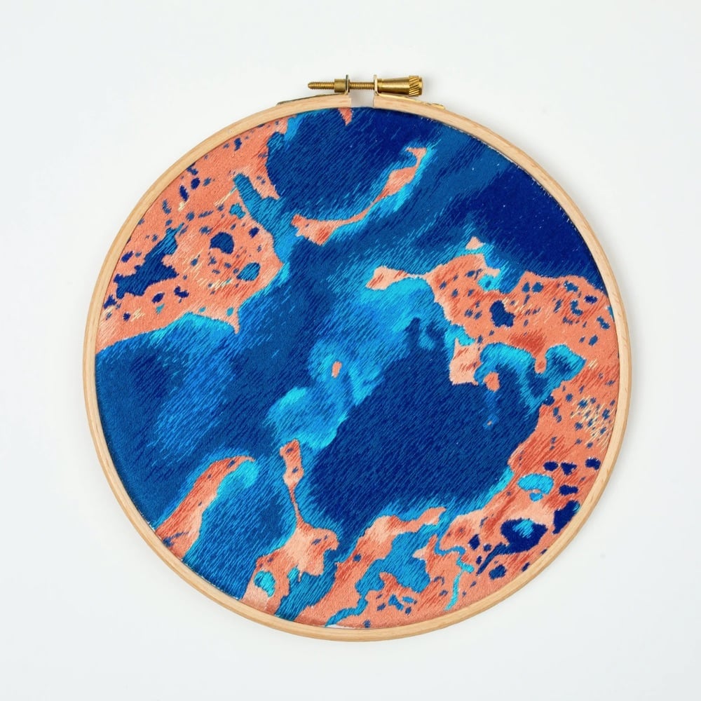
Danielle Currie creates these amazing hand-embroidered artworks of satellite views of Earth.
Danielle Currie’s intricate hand embroidered pieces capture the beauty of Earth from a satellite view. Each piece is named with the latitude and longitude coordinates, providing observers the opportunity to independently explore the area which inspired the piece.
Here’s the Landsat 8 satellite photo that inspired the embroidery at the top of the post.
Currie sells the original artworks as well as some prints of her work.
P.S. Apparently I’ve posted more than a little about embroidery over the years, so I gave the subject a tag page. There’s some cool stuff in there…I’d forgotten about The Embroidered Computer.
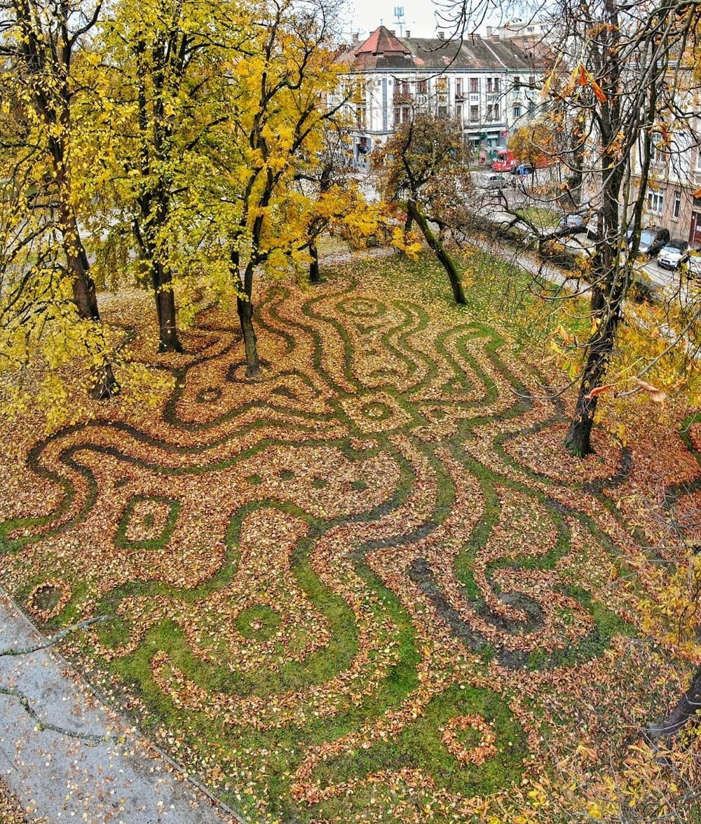
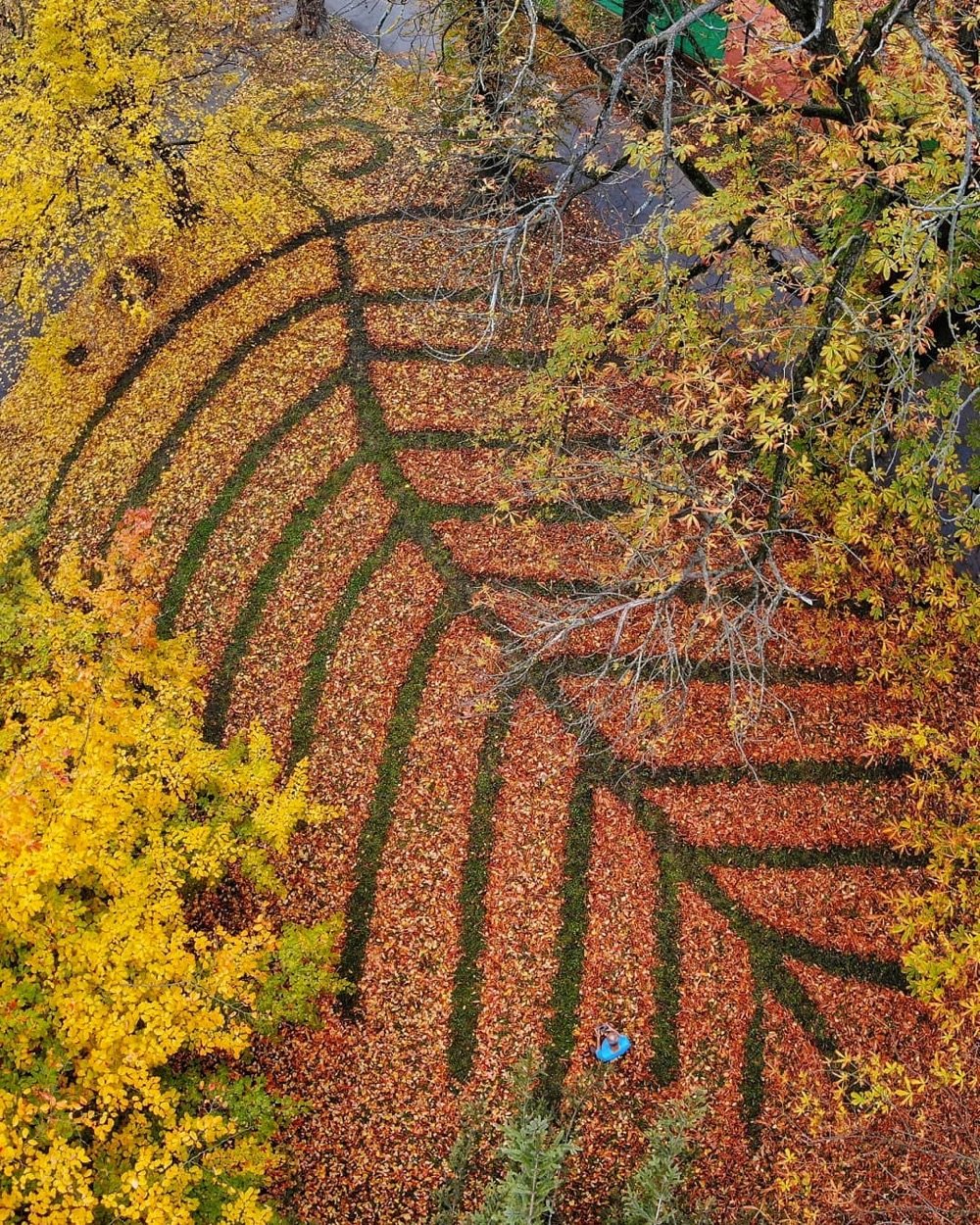
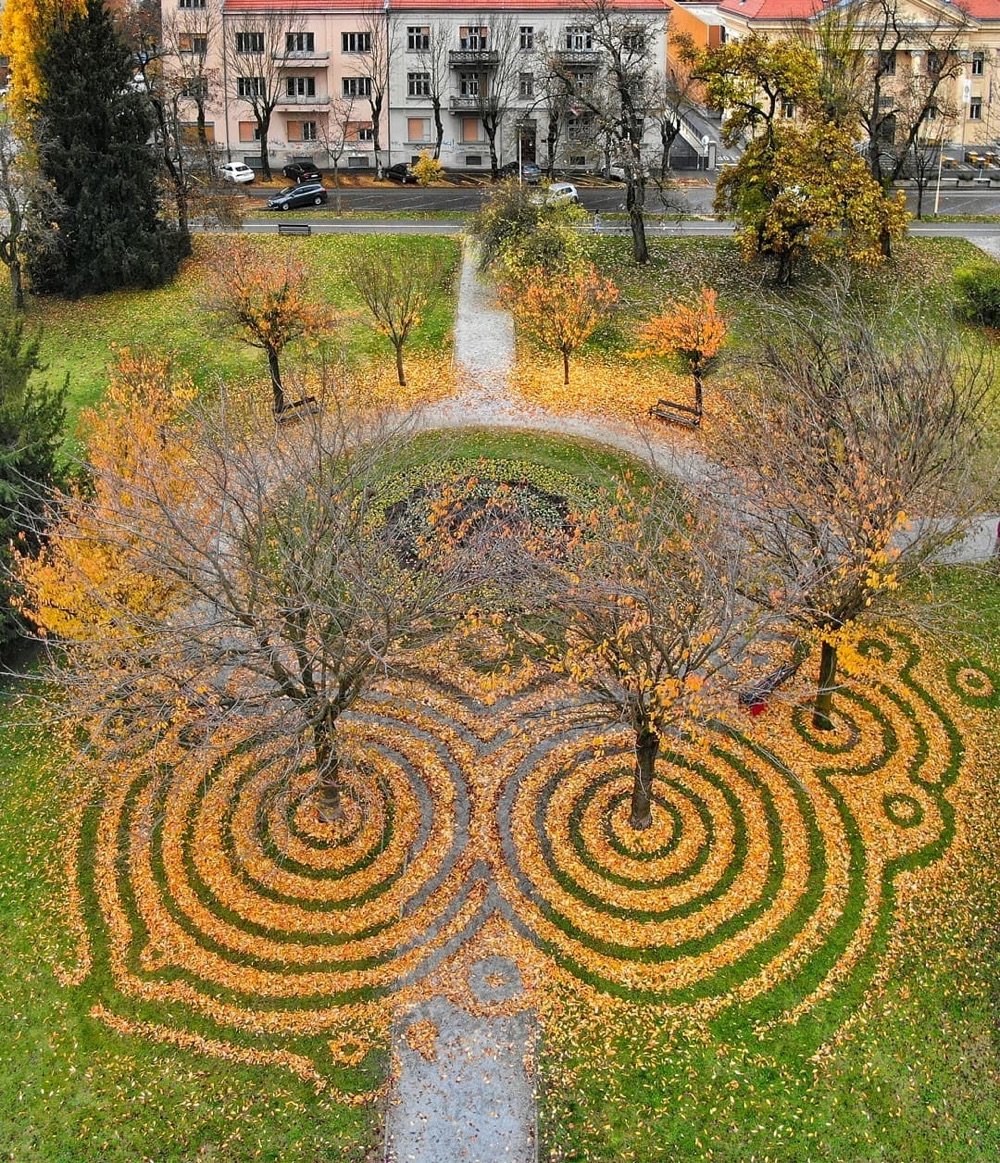
In a nice example of accidental occupational surnames, land artist Nikola Faller travelled to a pair of European parks (in Croatia and Hungary) to rake fallen leaves into a variety of patterns. You can check out more of Faller’s work, including the sand art he’s most well-known for, on Instagram and Facebook.
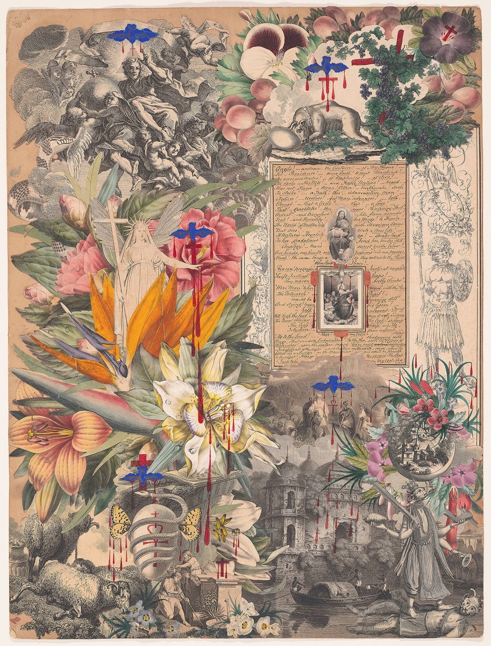
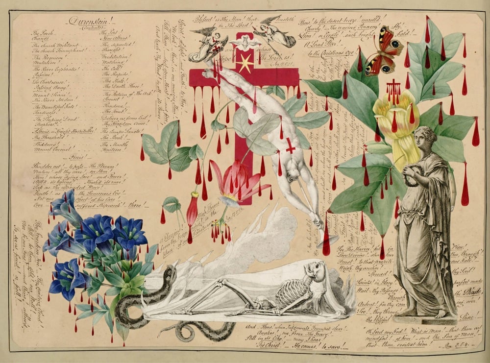
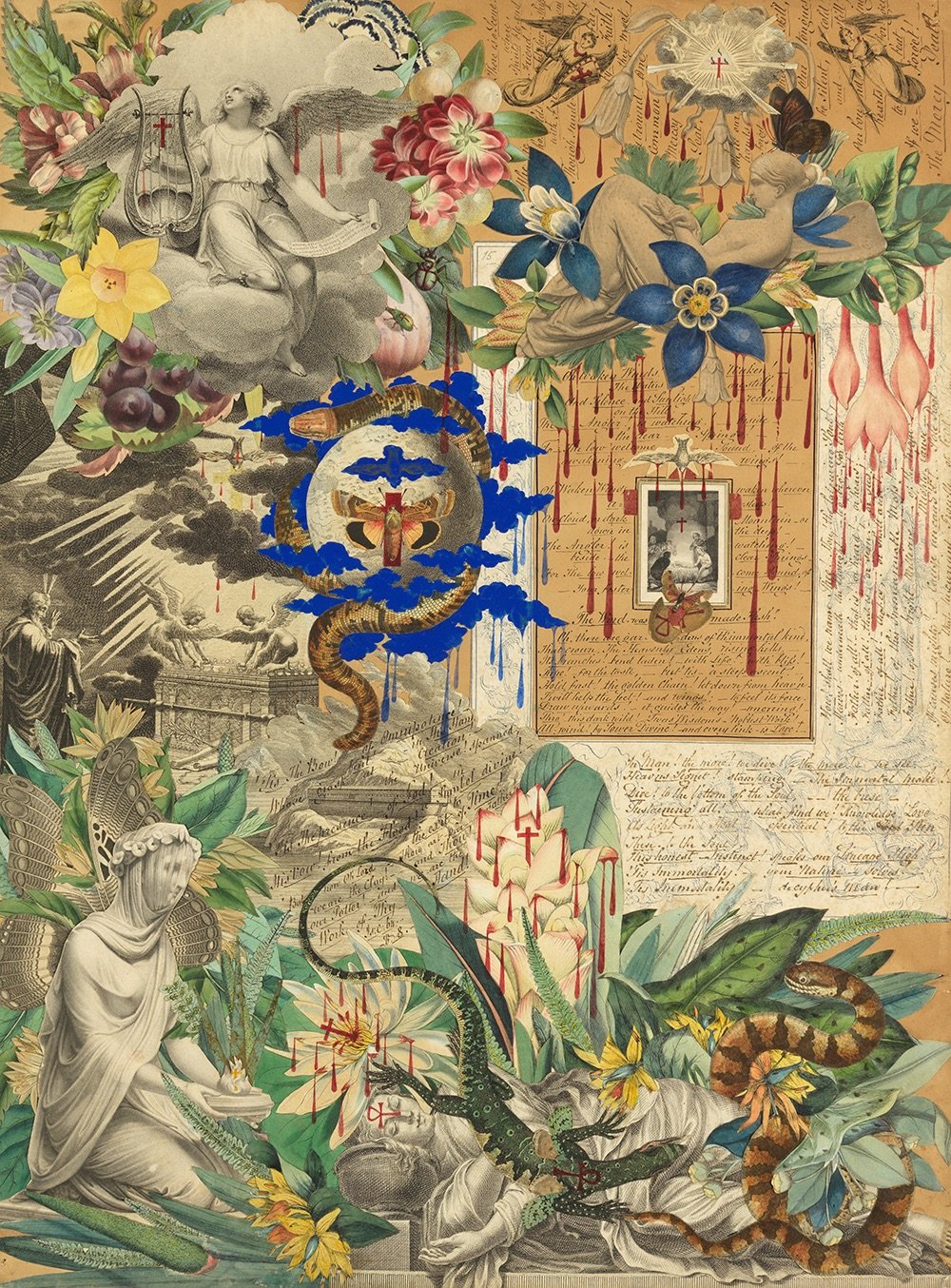
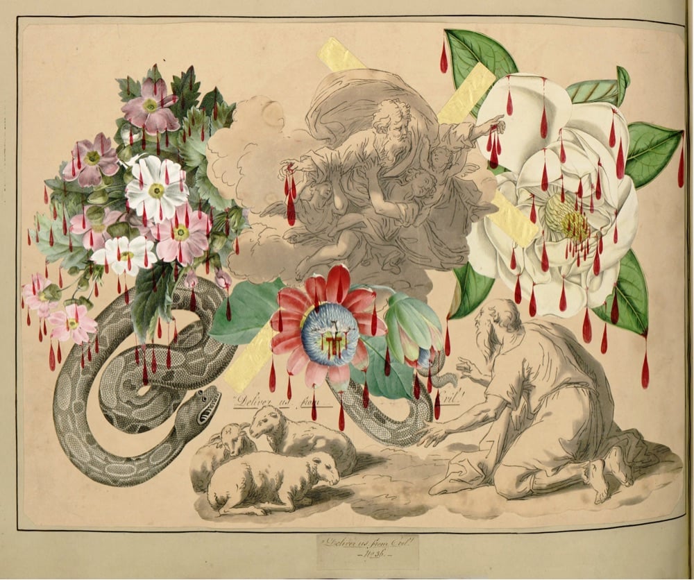
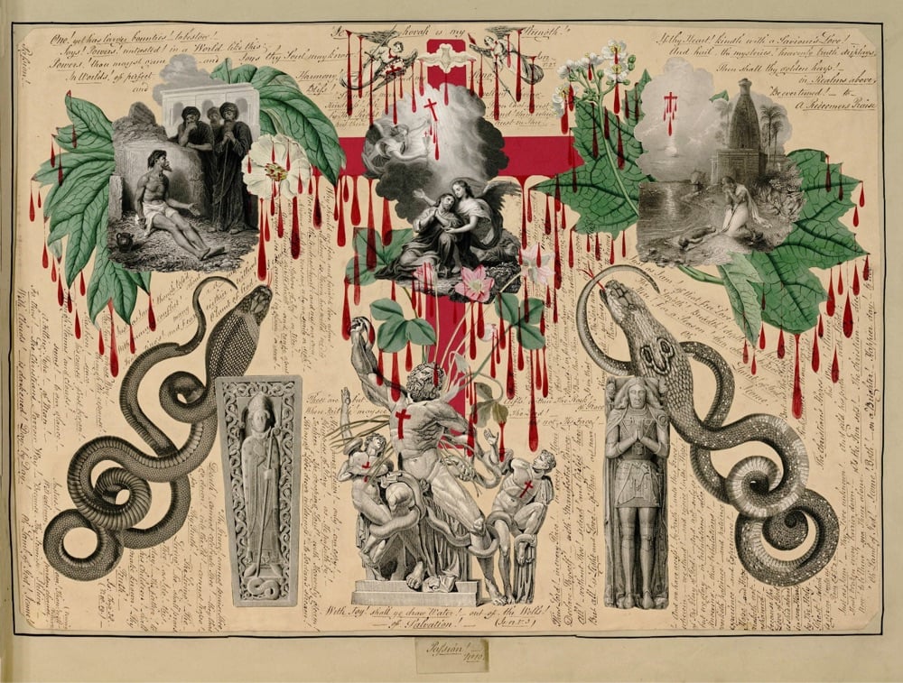
I don’t know about you, but the title “The Blood Collages of John Bingley Garland (ca. 1850–60)” made me click pretty damn fast to see what sort of Victorian age shenanigans this dude was up to. From the Public Domain Review:
The Blood Book is handmade, folio-sized, with a handsome marbled endpaper and forty-three pages of exquisitely crafted decoupage. John Bingley Garland, the manuscript’s creator, used collage techniques, excising illustrations from other books to assemble elegant, balanced compositions. Most of the source material is Romantic engravings by William Blake and his ilk, but there are also brilliantly colored flowers and fruits. Snakes are a favorite motif, butterflies another. A small bird is centered on every page. The space between the images is filled with tiny hand-written script that reads like a staccato sermon. “One! yet has larger bounties! to bestow! Joys! Powers! untasted! In a World like this, Powers!” etc.
The book’s reputation, however, rests on a decorative detail that overwhelms: To each page, Garland added languid, crimson drops in red India ink, hanging from the cut-out images like pendalogues from a chandelier. Blood drips from platters of grapes and tree boughs, statuaries and skeletons. Crosses seep, a cheetah drools, angels dangle bloody sashes. A bouquet of white chrysanthemums is spritzed.
To be clear, Garland’s blood is not that of surgery or crime or menses, but of religious iconography. He obviously intended the blood to represent Christ’s own.
The Blood Book are strikingly modern; as PDR states, Garland uses “techniques usually dated to Cubism in the early twentieth century” to make his collages. I love running across seemingly out-of-time objects like this.

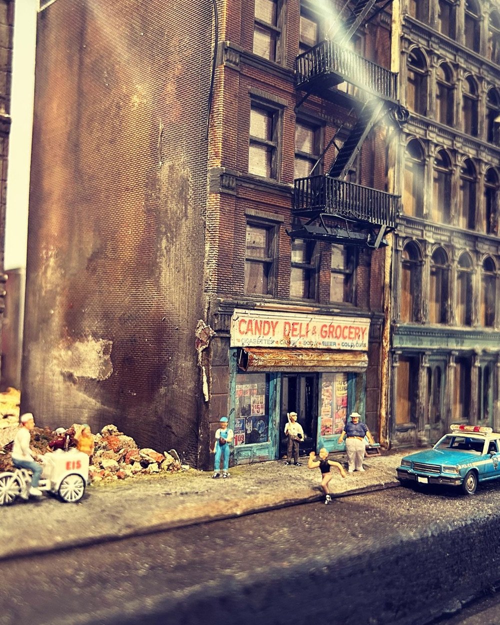
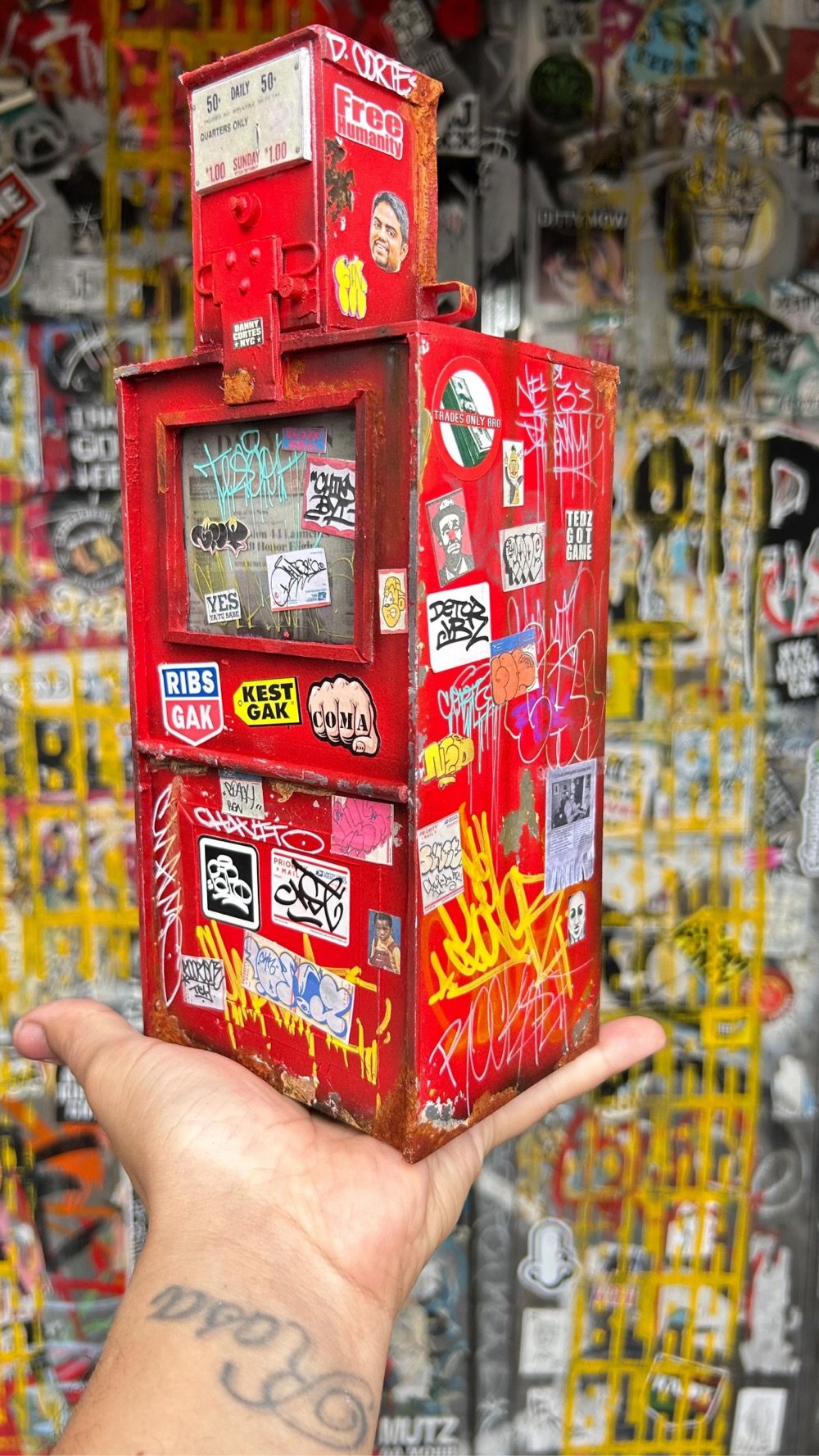

Danny Cortes took up making patinated miniatures of familiar NYC objects during the pandemic and it turned into a full-time vocation for him. He spoke to the NY Times about how his work puts him in the flow state:
“I loved that when I worked on a piece, I didn’t think about my problems — my divorce, the pandemic,” said Mr. Cortes. “It was an escape — like I’m meditating, literally floating. I didn’t have a problem in the world. I wanted that high again, I kept chasing that.”
Love that and love the miniatures…they are crazy realistic.
Blighted façades and distressed structures are the very scenes which fuel Daniel’s attention to detail. The work to produce each piece is arduous and requires great precision to achieve such realism. Daniel had developed techniques that can give a model an aged, distressed or patinated style. He also recreates miniature scaled vintage advertising posters and graffiti art on his models. Daniel’s miniature models make unique collectable creations that will take you on a gritty romantic journey through New York that everyday passers by have overlooked.
You can check out more of Cortes’ work on Instagram.

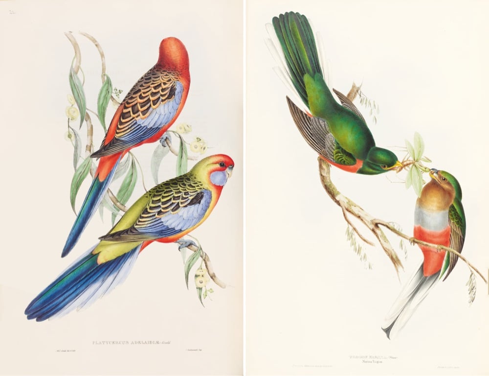
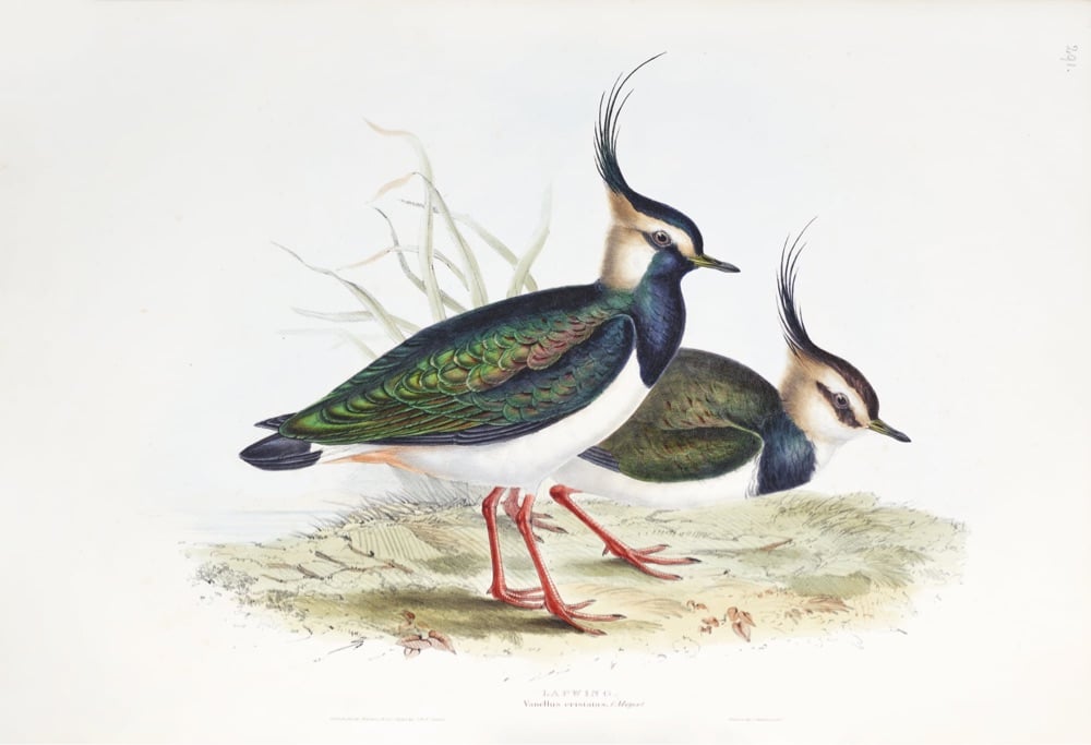
Birds of the World: The Art of Elizabeth Gould is a new book documenting the work of early 19th century naturalist artist Elizabeth Gould.
Artist and illustrator Elizabeth Gould is finally given the recognition she deserves in this gorgeous volume that includes hundreds of her stunning and scientifically precise illustrations of birds from nearly every continent.
For all of her short life, Elizabeth Gould’s artistic career was appreciated through the lens of her husband, ornithologist John Gould, with whom she embarked on a series of ambitious projects to document and illustrate the birds of the world. Elizabeth played a crucial role in her husband’s lavish publications, creating beautifully detailed and historically significant accurate illustrations of over six hundred birds -many of which were new to science. However, Elizabeth’s role was not always fully credited and, following her tragic death aged only thirty-seven, her efforts and talent were nearly forgotten.
Birds of the World: The Art of Elizabeth Gould is available for pre-order from Amazon or Bookshop.org and comes out on November 7. (via colossal)
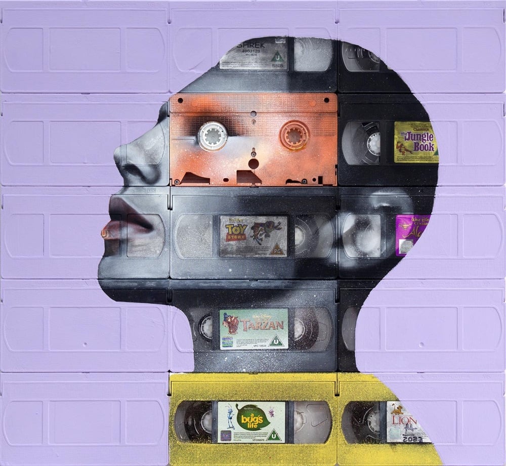
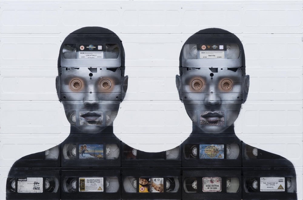
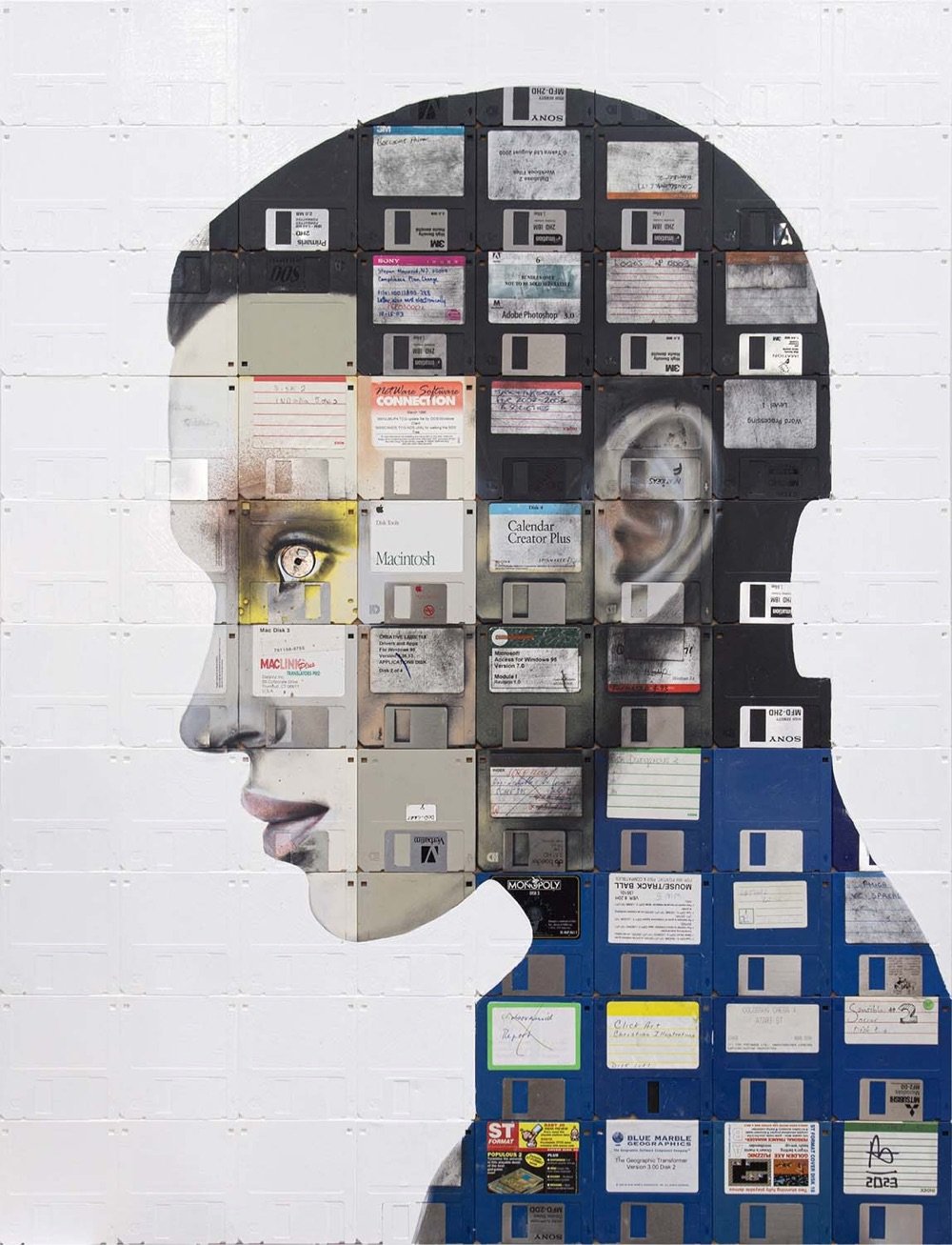
London artist Nick Gentry takes old recording media (VHS tapes, cassette tapes, floppy disks) and turns them into portraits (Instagram). Gentry gets his materials from members of the public:
Made from floppy disks contributed by members of the public. As a social art project, the process is open to everyone. Find out how to recycle and include your obsolete materials in future artworks by getting in touch.
(via colossal)
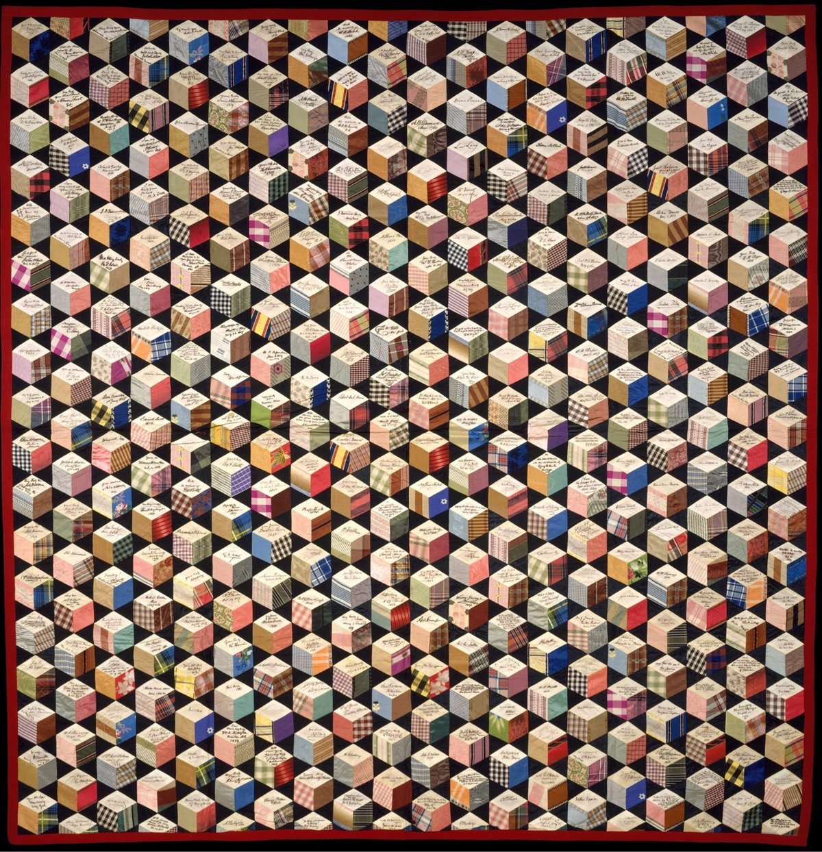
In 1856, a 17-year-old girl named Adeline Harris started making a unique quilt. Over the next two decades, she sent pieces of silk to famous people from around the world and they signed them and sent them back to her. She assembled them into a quilt with a tumbling blocks pattern (aka, the Q*bert pattern).
The signatures that Harris was able to acquire are astounding: Harriet Beecher Stowe, Charles Dickens, Oliver Wendell Holmes, Samuel Morse, Alexandre Dumas, Ralph Waldo Emerson, Henry Wadsworth Longfellow, Alexander von Humboldt, Washington Irving, and Nathaniel Hawthorne. Oh, and eight US Presidents: Martin Van Buren, John Tyler, Millard Fillmore, Franklin Pierce, James Buchanan, Abraham Lincoln, Andrew Johnson, and Ulysses S. Grant.
The aesthetics of this thing are just marvelous, with all the different colors and patterns arranged into a strict grid.
Oh and I couldn’t resist checking The Great Span of the quilt. The earliest-born signatory I could find is Alexander von Humboldt, who was born in 1769, and the last person to die was Mary Virginia Hawes Terhune, who died in 1922. That’s a span of 154 years, all in one incredible quilt.
I found this via the Public Domain Review, who is offering prints of the quilt.
Swiss Post has released a stamp that features concrete, an important material in the history of architecture. But first of all, look at the aesthetics of this thing:
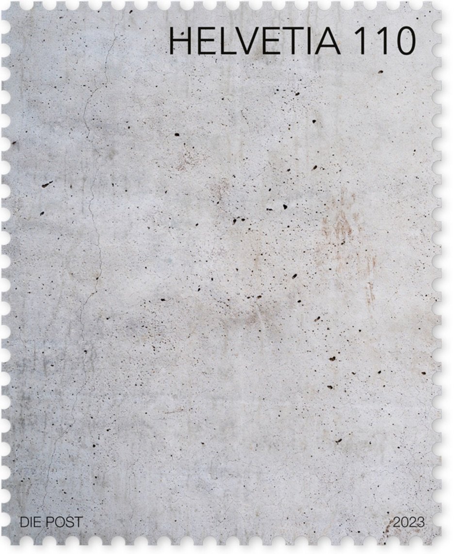
Aaahhh, it looks so nice and clean and Swiss. Love it. Even better: the stamp was designed to feel like concrete:
To give the concrete wall depicted in the design a tactile dimension, cement pigments were added to the ultra-matt finish.
In 2021, Swiss Post made a stamp out of canvas for the same series of stamps regarding art. Not quite as aesthetically pleasing as the concrete one, but still pretty cool.
You can order the concrete stamp from the Swiss Post online shop. (via greg.org)
Jan Hakon Erichsen does weird things with dried pasta, mostly spaghetti but also lasagna. This is goofy and fun. Check out his Instagram and YouTube for more artistic hijinks. (thx, clarke)
Very Expensive Maps is, well, I can’t say it much plainer than host Evan Applegate: “Very Expensive Maps is a podcast by cartographer Evan Applegate in which he interviews better cartographers.” A podcast about a visual medium like maps is maybe a tiny bit like dancing about architecture, but Applegate makes it work. The archives are a key part of the show…lots of links to the maps discussed during each episode. Here’s a sampling of some of the visuals from recent shows:
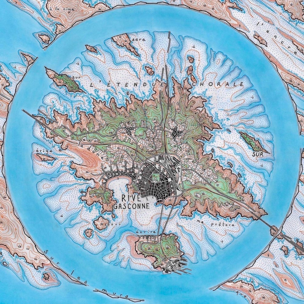
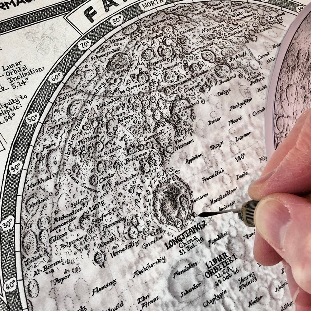
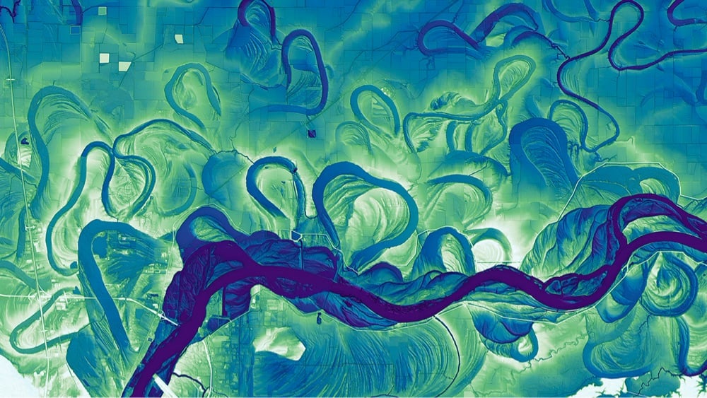


This is a lovely, mesmerizing short video made by artist Catherine Chalmers in collaboration with some leafcutter ants. I’m not gonna say why, but you should watch this all the way to the end…there’s a bit of a twist that’ll make you smile.
Earlier this year, Chalmers was the subject of a profile in the New Yorker:
The work encourages us to empathize with bugs. One reason they disgust us, Chalmers believes, is that they seem immoral, or at least differently moral. “We see ourselves as individuals,” she said. “And we see insects as being this uniform, formless mass that will sacrifice themselves and do all these sorts of things.” Some of her photos capture a praying mantis eating the head of her mate. “Civilization is a march for greater and greater and greater control over the world,” she said. But nature doesn’t play by our rules.
You can more of Chalmers’ collabs with ants and other insects on her website and Instagram. She’s also spoken about her work at a National Geographic Conference and at a TEDx event. (thx, andy)
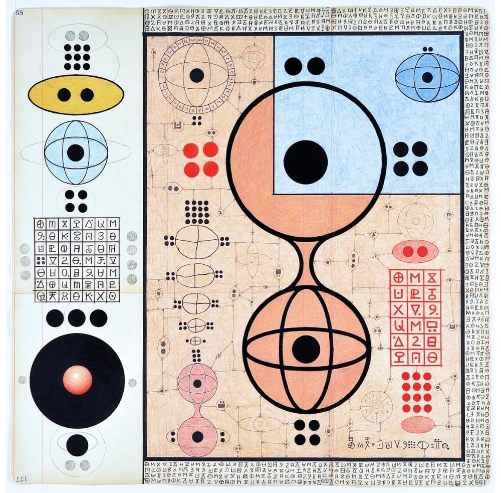
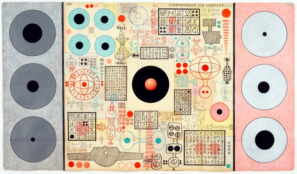
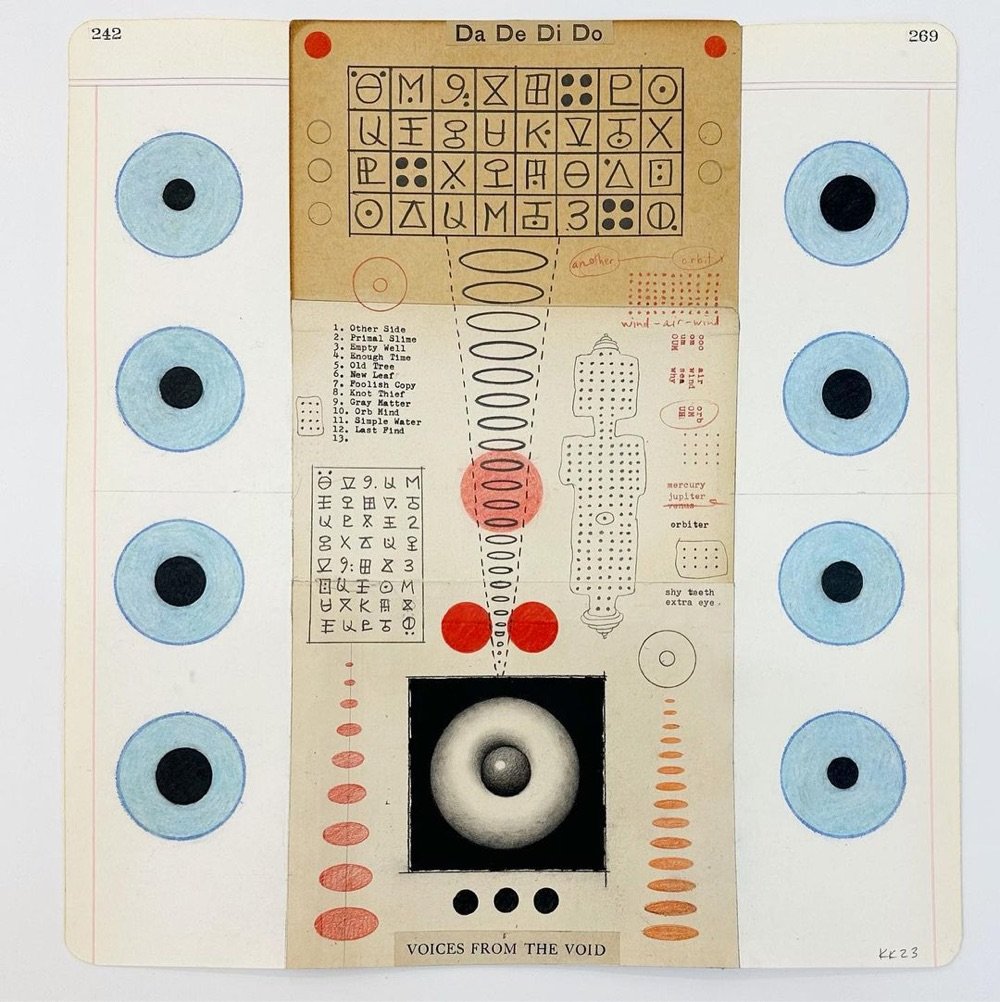
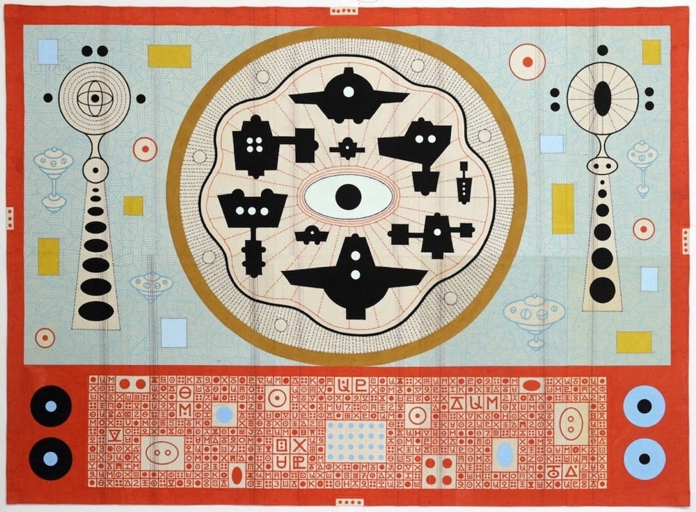
Oh wow, I love these spaceship paintings from Karla Knight. They’re from a series called 33 Spaceships for Another Planet but she’s been doing these diagrammatic/picographic paintings and drawings for some time now. It’s fun to back through Knight’s older work and see how her ancient yet futuristic style evolved. Here’s my best stab at a succinct description of her aesthetic: imagine Hilma af Klint as the production designer for Wes Anderson’s Stargate.
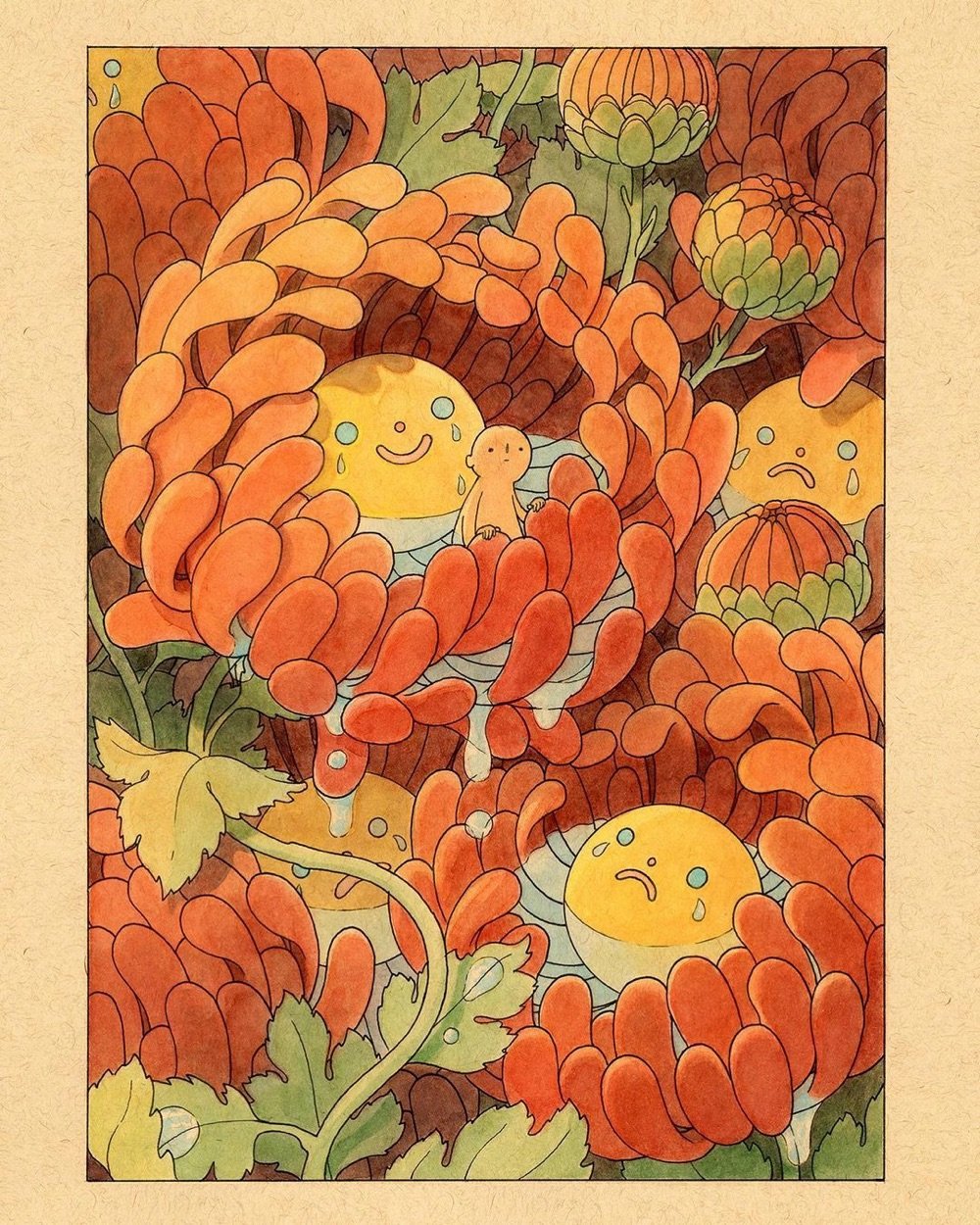
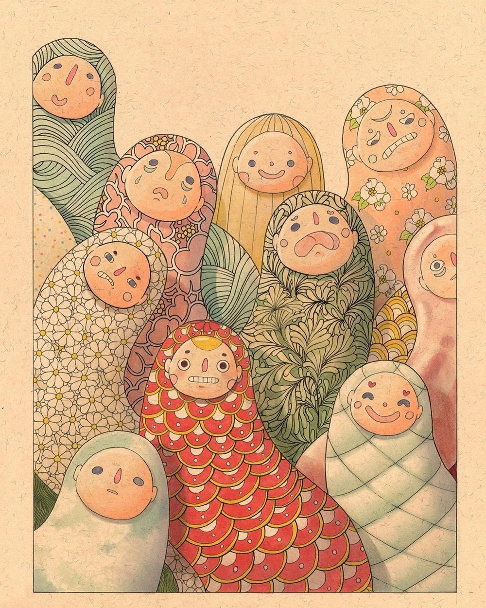
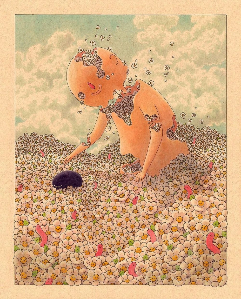
I really enjoyed taking a spin around Felicia Chiao’s Instagram (previously) — it’s chock full of vibrant, expressive and dreamy work. Oh and take a look at her sketchbook tours — and you can buy a reproduction of her 6th sketchbook here (here too).

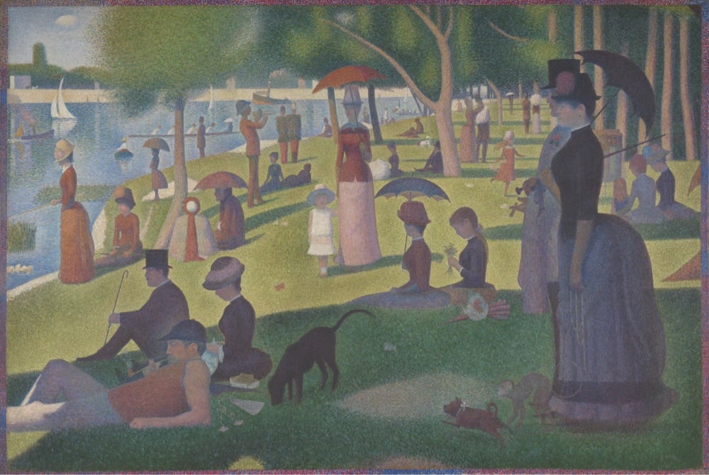
In 2006, photographer Mark Preuschl recreated Georges Seurat’s famous impressionist painting A Sunday on La Grande Jatte in Beloit, WI with a group of volunteers. Here’s the original for reference:
From My Modern Met:
In conceiving this tableau vivant, the organizers wanted to keep things modern. Thus, all participants are wearing contemporary clothes with umbrellas substituted in for the 19th-century parasols. Though the team was organized, they weren’t quite prepared for what mother nature threw their way the day of the shoot. Preuschl recalls winds of 20 to 25 mph coming off the river, as well as clouds that didn’t allow for the shadows they were so desperately looking for. Luckily, there was a window of about 25 minutes when the sun came out and cast those shadows.
He really couldn’t have scouted that location any better…it matches the original pretty well. Who knew you could find Belle Époque Paris in southern Wisconsin?
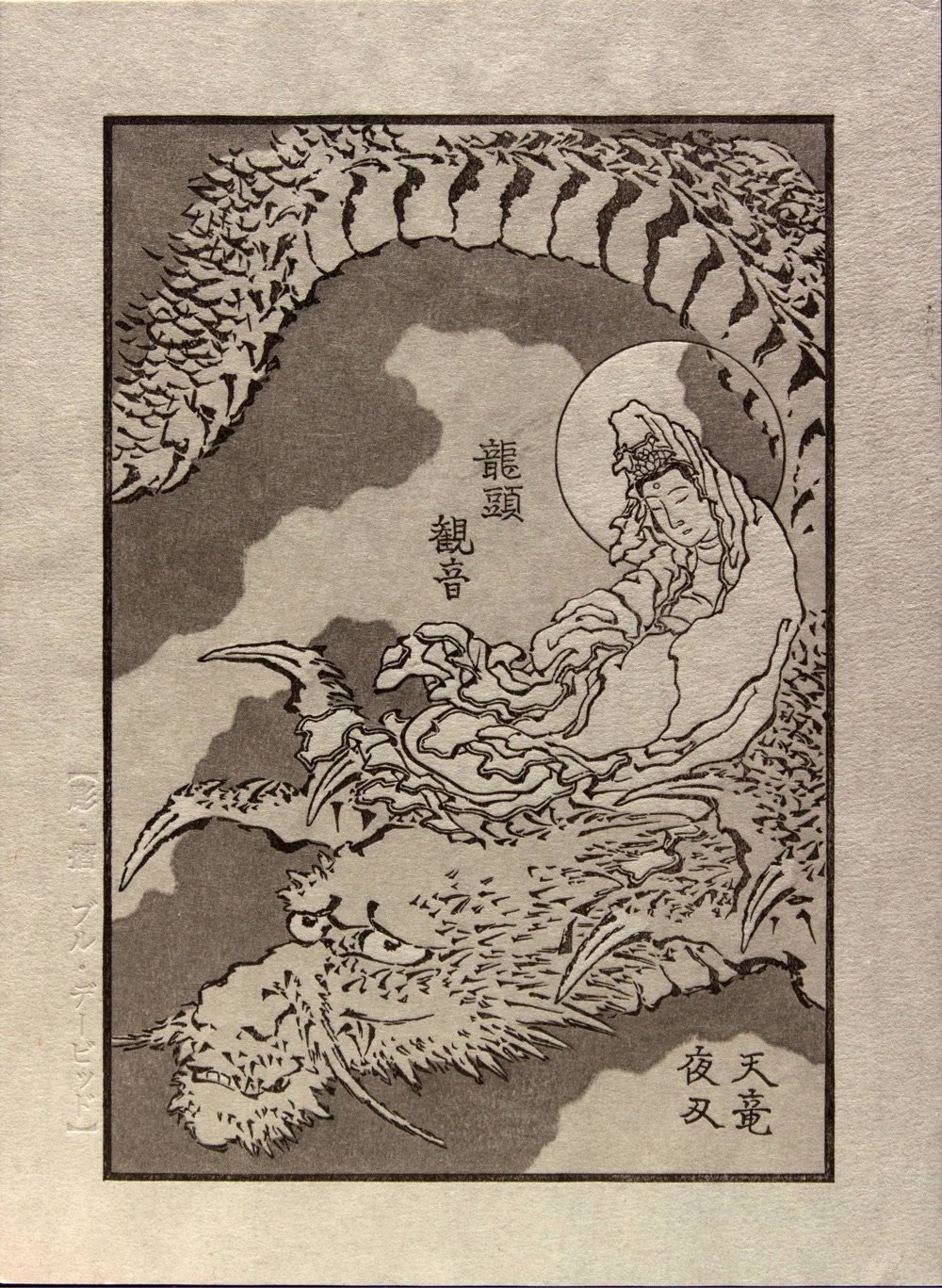
This is pretty cool: in collaboration with the British Museum, a team led by woodblock printmaker David Bull (who I first wrote about back in 20051) is carving woodblocks and creating prints from a series of previously unpublished drawings by legendary Japanese artist Katsushika Hokusai.
The Museum has in their possession a group of drawings by Hokusai that were apparently intended for use in the production of a series of books. For reasons unknown to us now that project was cancelled, but the drawings survived, and we have selected 12 of them for a new subscription series.
For more details of the collection of images, please refer to this page of the British Museum website. But here, we can simply note that the drawings fall into a number of categories, and our set will reflect that diversity. Hokusai’s series was intended to take his readers through aspects of Japanese historical culture, and we will meet Buddhist deities, warriors from ancient China, and historical landscapes, along with more prosaic scenes of the natural world.
The print shown above was the first one to be sent out in January. But look at this original drawing from the collection:
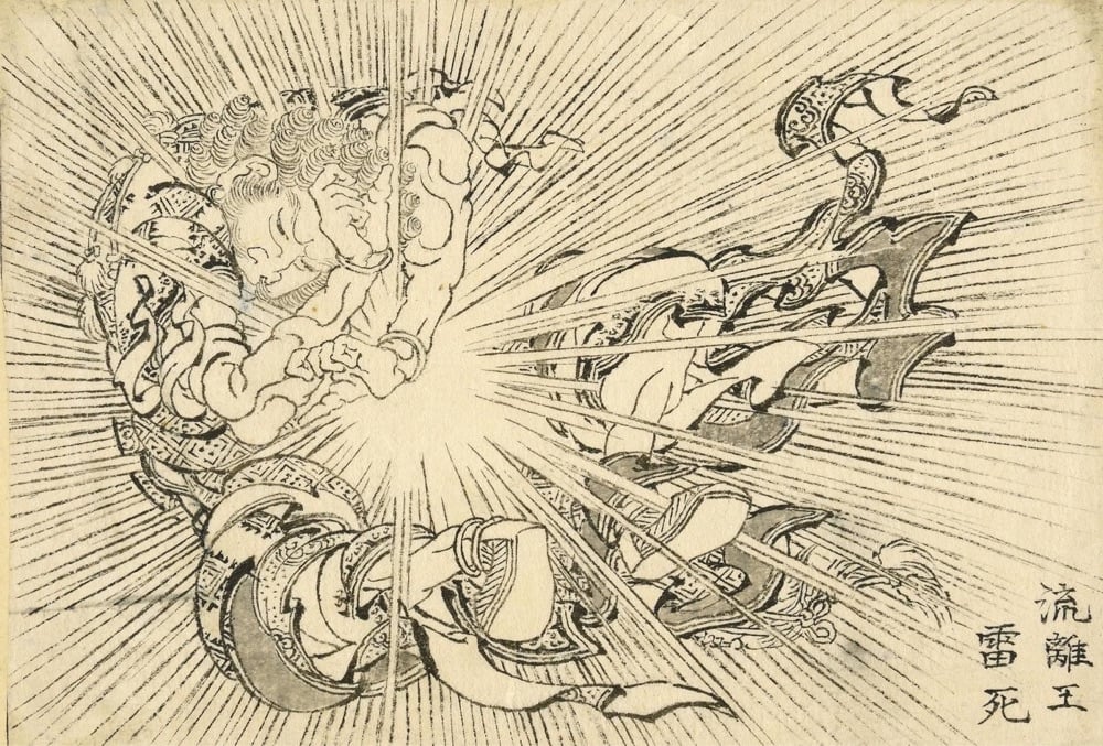
Wow. That is shockingly modern — like a 60s superhero comic or a still from 60s anime. I hope they reprint this one!
Here’s a video from the British Museum of Bull talking about the project:
If you make woodblock prints for a living, you know the name Hokusai, and if you’re a woodblock carver and you hear about original drawings from Hokusai that have never been carved into prints you would most likely do a little happy dance.
(via open culture)
In 1842, a French artist and scholar named Joseph-Philibert Girault de Prangey set out on a tour of the eastern Mediterranean to document sights and architecture via the brand new medium of photography. He started off in what is now Italy and continued on to Greece, Egypt, Turkey, Syria, and the Levant (which includes modern-day Lebanon, Israel, and Palestine). The daguerreotypes he took are the oldest surviving photos of those locations (aside from Italy). It’s incredible to time travel back 180 years to see what these places looked like. (via aeon)
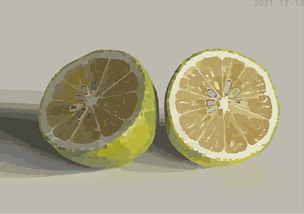
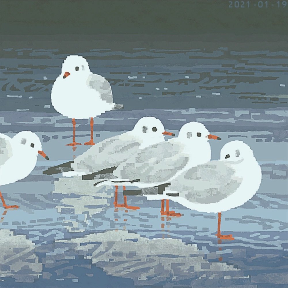
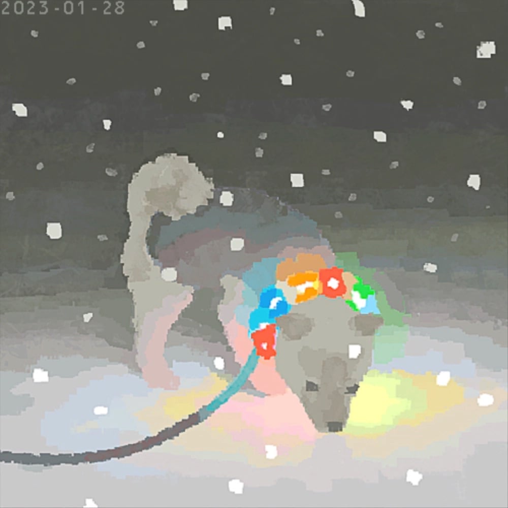
I’m taken with the style of Jun Kumaori’s illustrations — they look like drawings of (stay with me here) small JPEGs converted to GIFs and then clumsily enlarged, complete with all of the resultant digital artifacts. This makes me nostalgic for the late 90s web and Photoshop 3.0. (via the fox is black)
Traditionally, the subjects depicted in Western art were either religious or rich — wealthy patrons paid for paintings of themselves or of their religions. As Evan Puschak explains in this brief video essay, that began to change in the 16th century as revolution, reformation, and the development of a merchant class shifted who was worthy of depiction and who could pay.
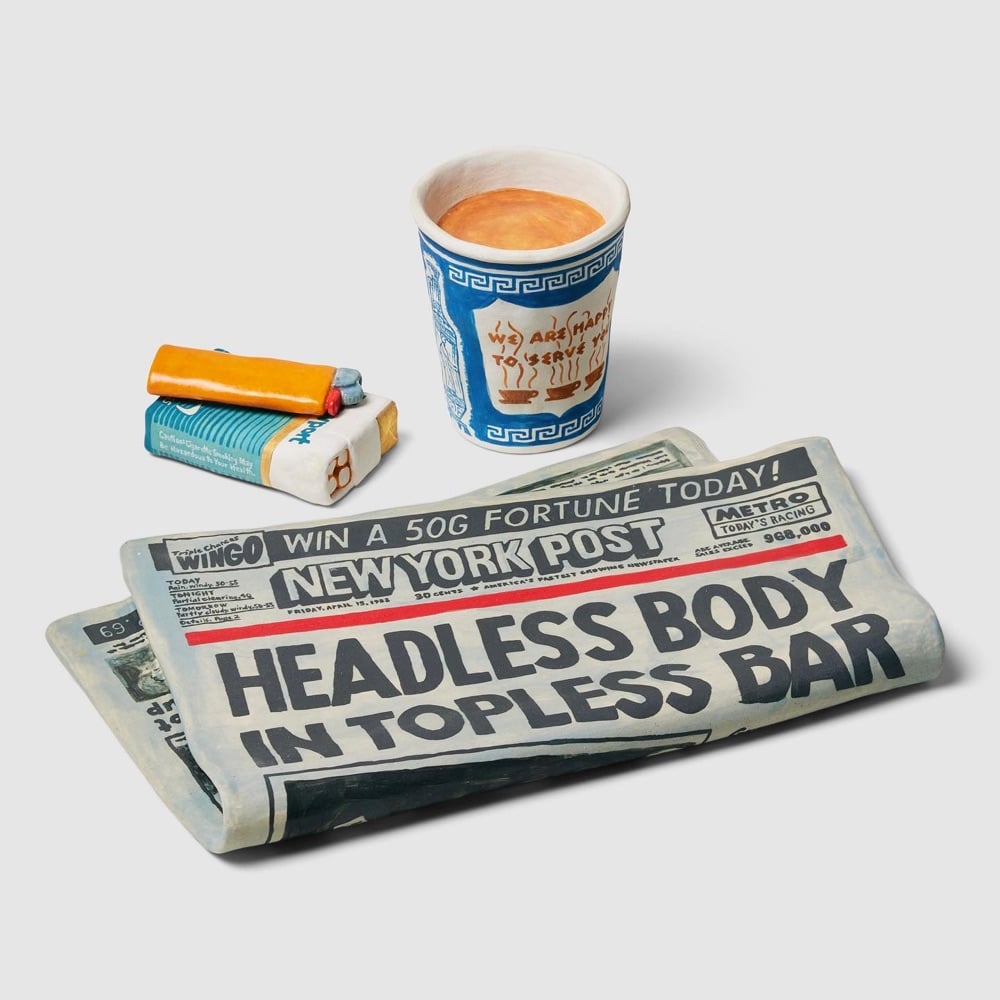


Stephanie Shih is a Brooklyn-based ceramic artist who makes painted sculptures of ordinary objects like food, shoes, hats, and signs. A recent exhibition focused on the overlap of immigrant communities of Asians and Jews on NYC’s Lower East Side and Chinatown.
A few yards from where the Bernstein-on-Essex sign hangs is a long table that displays Shih’s sculpted takes on other iconic food and drink, like a bilingual bottle of Soy Vay Veri Veri Teriyaki, roast pork on garlic bread, Golden Plum Chinkiang Vinegar, and a can of Dr. Brown’s Cel-Ray Soda.
“A lot of my solo shows are about this idea of authenticity,” says Shih, who has been working in ceramic full-time since 2015. “There are no cultures that are untouched by other cultures. These are two communities that grew up alongside each other. It was not always friendly, but simply from proximity and the fact that they were the two largest non-Christian immigrant groups, they had commonalities.” For example, she says, the tradition of Jews eating Chinese food on Christmas began right near Harkawik, on the Lower East Side.
You can find much more of her work on Instagram.

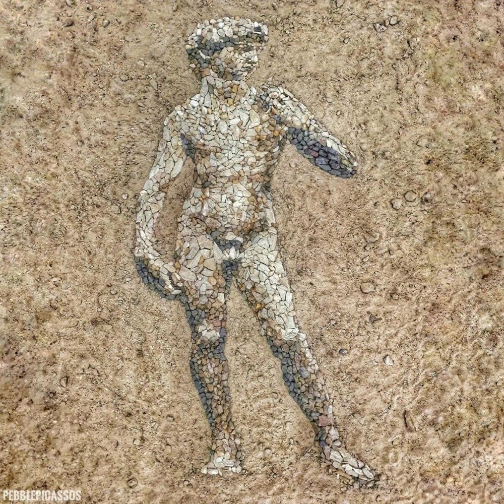
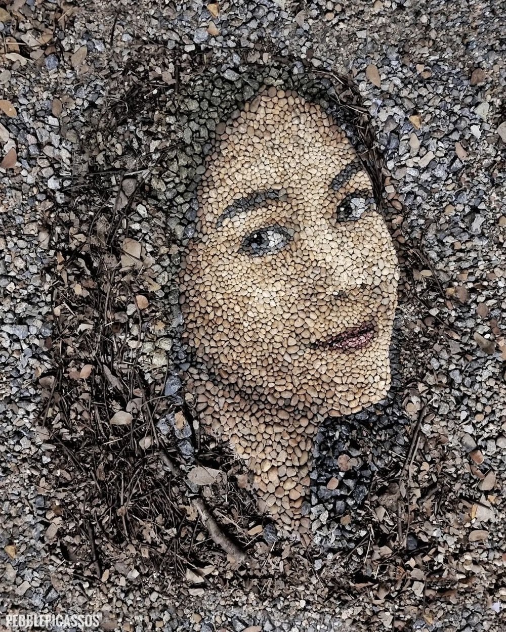
British land artist Justin Bateman makes these incredible portraits of people and objects using small stones and pebbles he finds in locations around his home in Chiang Mai, Thailand. Each portrait is documented and then left to atrophy, either by rain, wind, or human/animal intervention.
See also these stone alphabets by Clotilde Olyff. Prints are available. (via my modern met)
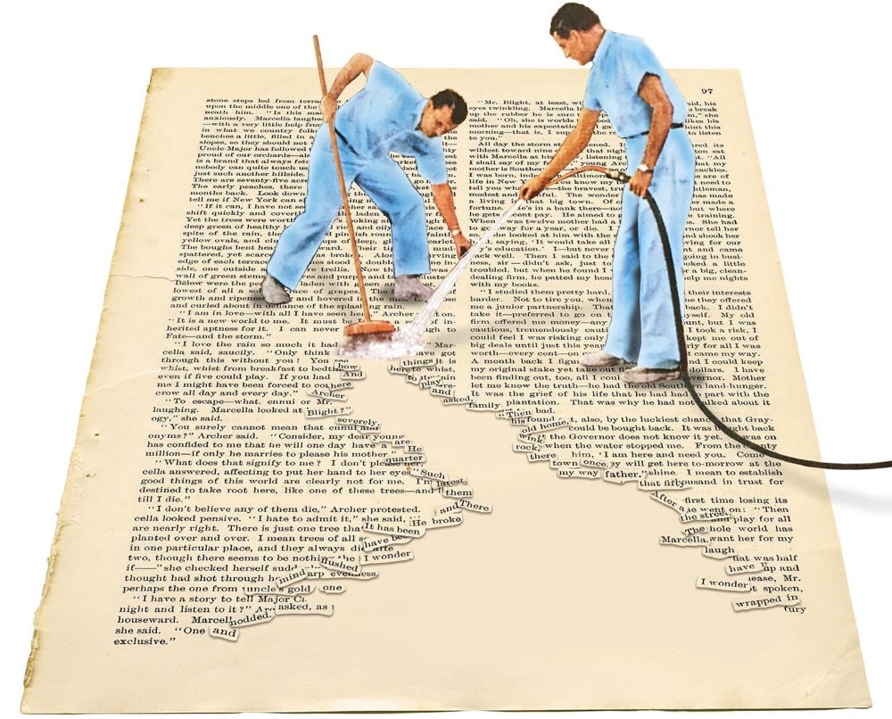
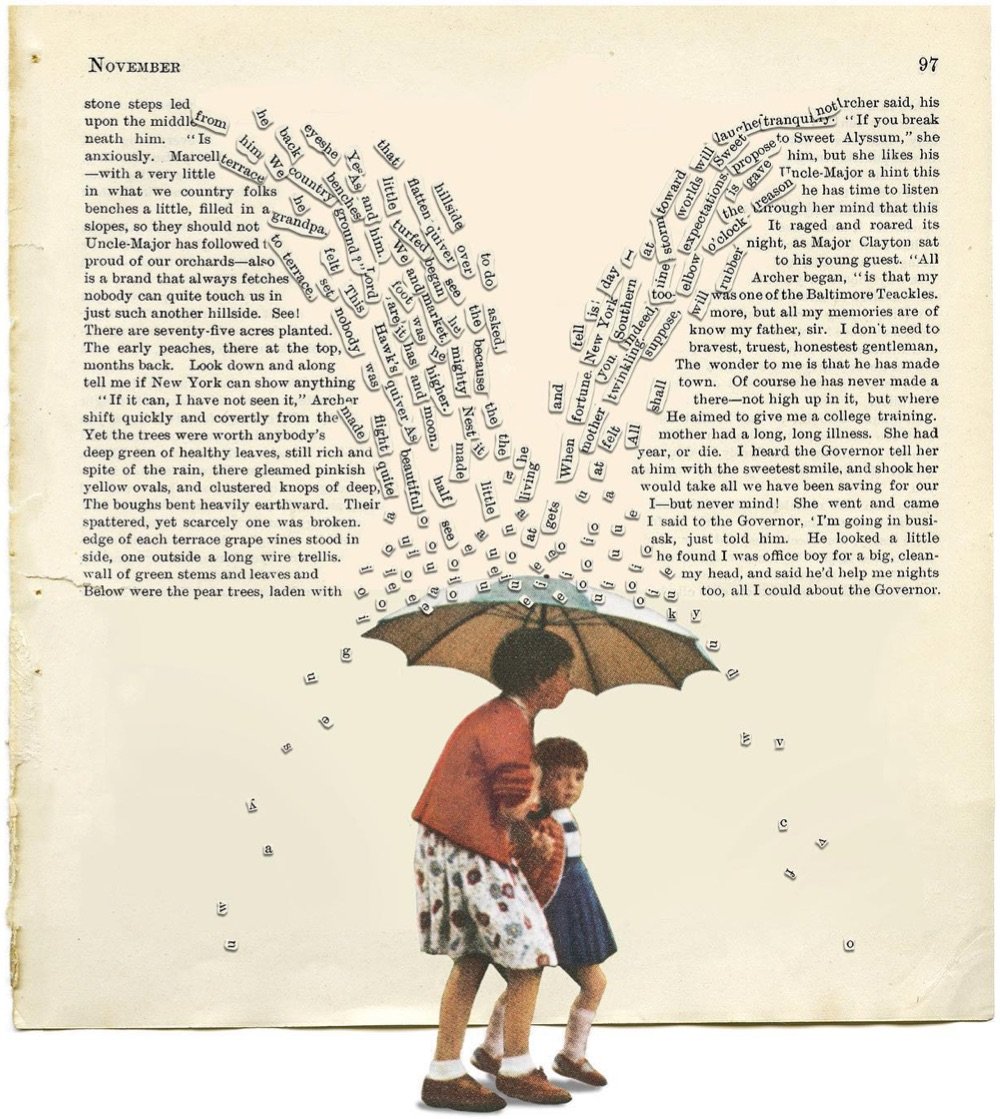
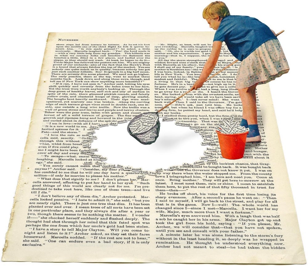
Among the many creative collages by Dutch art director Toon Joosen is this series of images of people interacting with the pages of books in fun ways. You can check them out on his Instagram or purchase some of them as prints on his Etsy shop.
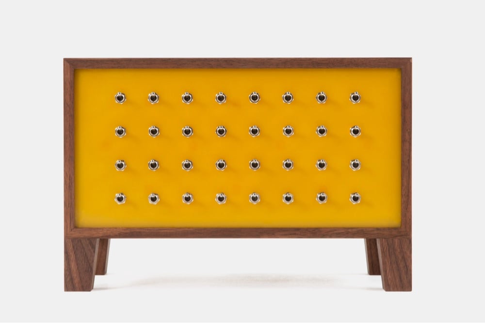
Yuri Suzuki’s The Ambient Machine is a device for creating atmosphere, playing ambient sounds. The machine has 32 toggle switches on it; each switch actives a different sound (waves, running water, birds, wind, white noise) that you can blend to create your perfect aural backdrop.
The Ambient Machine provides us with a variety of sounds and music that we can use to design our own background ambience. White noise can mask unpleasant sounds around us and give us a sense of relief, Natural sounds can provide the feeling of relocating to a new environment, providing a break from the environments we have been confined to, and musical rhythms can provide patterns for us to find stability with.
Only 20 models of the original machine were created and sold, but you can preorder a slightly different version for ¥143,000 (~$1,000).
For some reason, a chap calling himself Mr. Doodle has covered his entire house, like every single inch, with black and white illustrations. As a top commenter says on YouTube, “I would 100% go insane after my 2nd day living in that house but the props I give this man for his work are absolutely immense”. (via boing boing)
Heidi Gustafson is the curator of Ochre Sanctuary, a collection of iron-based earths that are the oldest natural pigments used by humans. In her new Book of Earth, Gustafson details where these pigments come from and how to use them to create art. Here are a few images from the book and the Ochre Sanctuary:

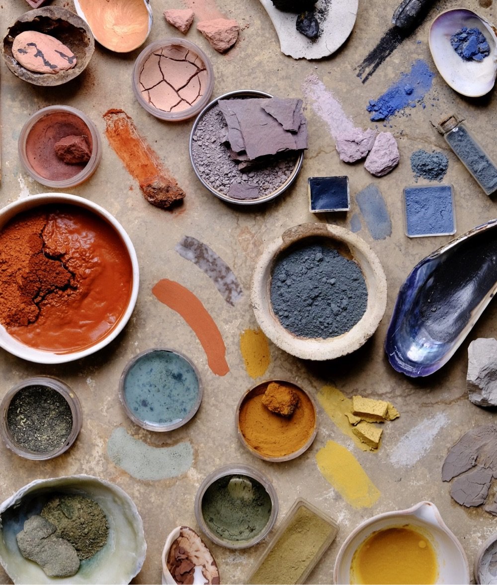
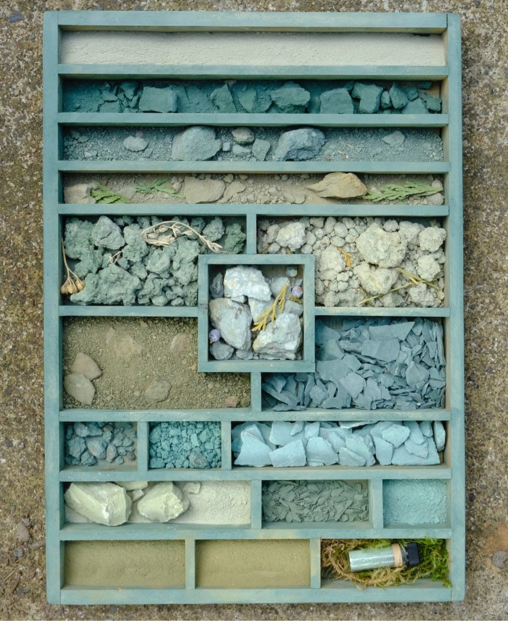
Looks like a gorgeous book. Check out her Instagram for more colorful photos of ochres.
Newer posts
Older posts







Socials & More