Brand minimalism
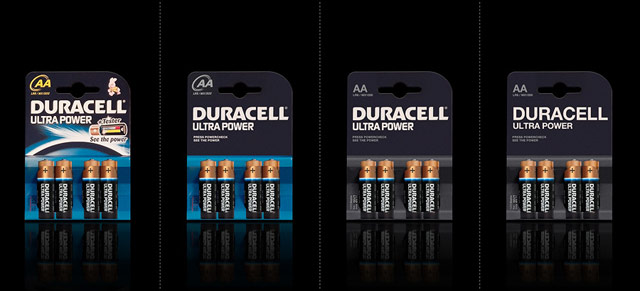
Shopping in a supermarket can be visually overwhelming. Designer Mehmet Gozetlik took the packaging of some well-known brands and simplified them (part two). It’s interesting how some of these work and some don’t. Duracell works really well because the batteries themselves still carry most of the branding:

The simplified branding of Guinness and Evian works pretty well too…the packaging is itself iconic and distinctive enough to carry them. The Pringles and Red Bull are missing something, but in almost all cases, I like one of the simplified options more than the original. (via @dunstan)


Socials & More