
“From September 27th - October 21 the Museum of American Illustration at the Society of Illustrators will host ‘30 Years of Fantagraphics,’ a retrospective art exhibition of over 100 pieces of original art published by the Seattle underground giant.” Artists in the exhibition include Chris Ware, Daniel Clowes, and Robert Crumb.

Advertise here with Carbon Ads
This site is made possible by member support. 💞
Big thanks to Arcustech for hosting the site and offering amazing tech support.
When you buy through links on kottke.org, I may earn an affiliate commission. Thanks for supporting the site!
kottke.org. home of fine hypertext products since 1998.
Beloved by 86.47% of the web.
kottke.org posts about art
Photo cans
If you asked me today to choose a medium in which to focus my future artistic energies, I’d have to go with the photo can. After finding this great Photojojo tutorial yesterday on using tin cans and glass jars as photo frames, I selected three recent pictures I’d taken and made this can triptych:
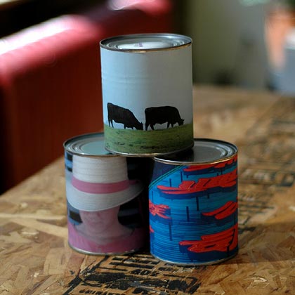
So cool! And simple too. I didn’t follow Photojojo’s directions exactly and I have a few observations to offer for those looking to play around with this:
- Paper quality. I just used regular old printer paper, not glossy photo paper or anything like that. This made the photos look more like actual cheap labels. I also didn’t worry too much about being careful with the glue. Again, a little mistake here and there actually enhances the effect.
- Glue. I removed the original label from the can and glued the photo directly to the can itself. Instead of rubber cement, I used a glue stick with acid-free acrylic emulsion. The glue stick made application really easy. And I didn’t apply the glue all the way around the can. I just glued down one end to the can, waited for that to dry, wrapped the photo around the can, pulled it tight, and glued the underside of that end to the end already affixed to the can. (When I tore the existing label off the can, I noticed that’s how it was glued on there, so I tried the same thing and it worked.)
- Can size, etc. Shopping in the canned food aisle of the supermarket takes on a different meaning when you’re not attempting to find green beans for dinner but trying to find aesthetically pleasing art supplies. I went with a larger can, one with stewed tomatoes; its proportions seemed more pleasing than those of a soup can. The problem was that when I got it home, it was almost 13 inches around, meaning that 8 1/2” x 11” paper wasn’t going to work. (I ended up getting some 8 1/2” x 14” paper.) So bring your tape measure to the grocery store with you to make sure the desired can will work with your paper size.
- No pop-tops. A lot of soup cans now feature pop-tops. Get the old fashioned kind instead…the last thing you want is Uncle Steve lifting your photo can off of the coffee table, fiddling with the pop-top, and, hey!, Chunky Vegetable three years past its expiration date all over the place.
- Botulism? Speaking of past the expiration date, what’s the shelf life of your artwork? The answer seems to be almost indefinitely when kept at temperatures at or below 75 degrees F, but I wouldn’t advise eating anything from your photo cans after a year or two. The risk of botulism is almost nonexistent in contemporary commercially canned food, but if you see any of your art swelling up, throw it out. In addition, botulism dislikes acidic environments, so you’re probably better off selecting cans with acidic food items in them, like tomatoes, fruits (without sweet syrups), and sauerkraut. But be careful not to get items that are too acidic…over a long period of time, the acid may eat through the can.
Good luck!
Barnaby Furnas’ “flood” paintings are quite impressive in person…check them out at the Boesky Gallery in Chelsea through Oct 18. Their sheer size and the degree to which their creation must have been out of the artist’s control is intriguing.
Tough art history quiz: who did ths painting…an elephant, an artist, or a preschooler? I play a similar game when I go to contemporary art museums: art or fire extinguisher? (via cyn-c)
Photos of a piece by artist Sharon Baker, a full-sized replica of herself made of dough and then baked. At the show she cut it up and served herself to guests. (An obvious move with a name like Baker.)
On TV tonight: Ric Burns documentary on Andy Warhol. Part 2 tomorrow night.
Profile of Michel Gondry, director of the upcoming The Science of Sleep. An exhibition at the Jeffrey Deitch gallery in Manhattan accompanies the film’s opening. View some of Gondry’s short work (commercials, music videos) on YouTube.
Old news, but the copy of Edvard Munch’s The Scream stolen two years ago from an Oslo museum has been recovered. M&M’s will honor their offer of 2 million M&M’s for the safe recovery of the painting. No word on whether the reward was responsible for the recovery.
Stolen mobile phone + automatic upload of the thief’s photos to Flickr = art project. (thx, stewart)
Mars, Inc. is offering a reward of 2 million dark chocolate M&M’s for the safe return of The Scream, the Edvard Munch painting stolen from a museum in Norway in 2004. Mmmm….Munch. (via girlhacker)
BMW commercial featuring the beautiful kinetic sculptures of Theo Jansen, who I covered previously on kottke.org. (via poptech)
New Barnaby Furnas show
The web site for the Marianne Boesky Gallery is a bit behind the times, so it doesn’t yet have the information for Barnaby Furnas’ upcoming show of his work from September 15 to October 14. The show will include his recent “flood” paintings; here’s a representative piece from the Saatchi Gallery:
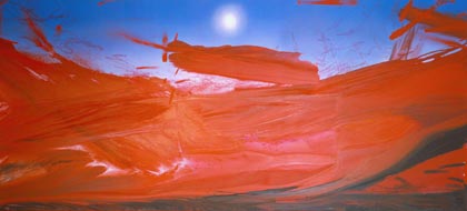
Furnas’ huge flood paintings are created using a technique called “the pour”, detailed in a New Yorker article from earlier this year:
Furnas started at the high end of the canvas, not pouring but slathering on water-based Mars Black with sweeps of a wide brush. He switched to a dark red, laying it down quickly, and sometimes flinging it out in Pollock-like arcs. Sarah and Jared went into action with plastic spritz bottles, spraying water on the paint to make it spread and flow down the inclined plane. Boesky, equipped with a bottle of her own, followed their lead. The canvas began to look like a river of blood, dark and murky at the bottom, shading to a brighter and more lurid red in the middle. It was happening very fast, and changing from one second to the next-streaks of different red combining and separating, and running down to the lower end, where they dripped off the canvas into pails and other receptacles. After fifteen minutes, the whole midsection of the canvas was covered.
His Hamburger Hill piece at the 2004 Whitney Biennial was one of my favorites there, so I’ll definitely be checking out this new show.
One of the three statues on the top of the Washburn Lofts in Minneapolis unwittingly represents the period in the city’s history when it led the world in the production of prosthetic limbs. See also The Mill City Museum. (thx, paul)
Socials & More