The Baskerville Punches
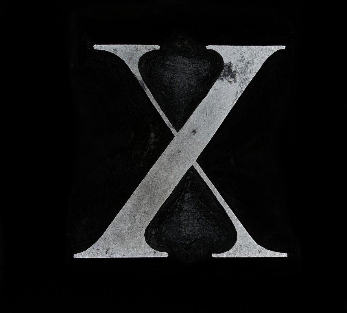
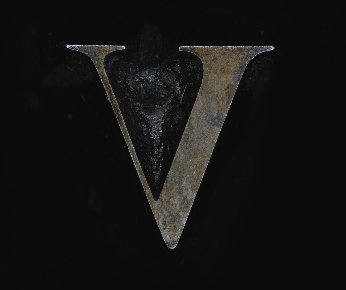
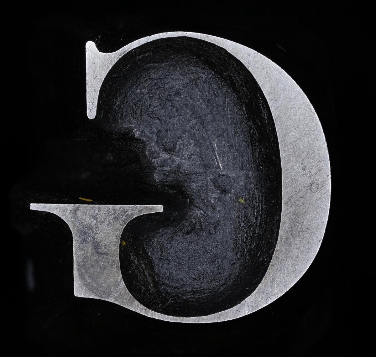
John Baskerville was an influential 18th-century printer and type designer; you’ve probably used (or at least heard of) the Baskerville typeface. Cambridge University has the original punches1 used to create his signature typeface and has made high-res digital photos of them available online. If you, like me, are not familiar with how lead type was made back in the day, an explanation of what a punch is:
The typographic punch is the initial design for the letterform and one of the first of three stages in the manufacturing of metal type: short lengths of steel onto which his letters were cut in reverse and in relief. The punch was ‘tempered’ to increase its toughness and enable its use as a tool. Secondly, the punch was struck into the surface of a softer piece of metal (copper), leaving an impression of the ‘right-reading’ character to be cast. This was called the matrix. Finally, type was manufactured when the matrix was passed to the type-caster and inserted into a mould, into which molten lead-alloy was poured. This produced a cast of the type in relief and in reverse which were then arranged to create a text block and once inked, paper could be pressed against it.
Baskerville is available in a number of different modern versions and revivals, but seeing close-ups of the actual cut & shaped metal from 1757 is something else. (via @jonathanhoefler)
Note from the collection: “Not all punches in this collection are Baskerville’s originals; some are later additions.” ↩

Socials & More