Climate Stripes
Using temperature data from around the world, climate scientist Ed Hawkins has built a tool for viewing the “climate stripes” for almost any location, a data visualization that represents the change in temperature over time over the past 100+ years. For most locations, the graphs shift from blues to oranges & reds as the climate warms, neatly illustrated by the global graph:

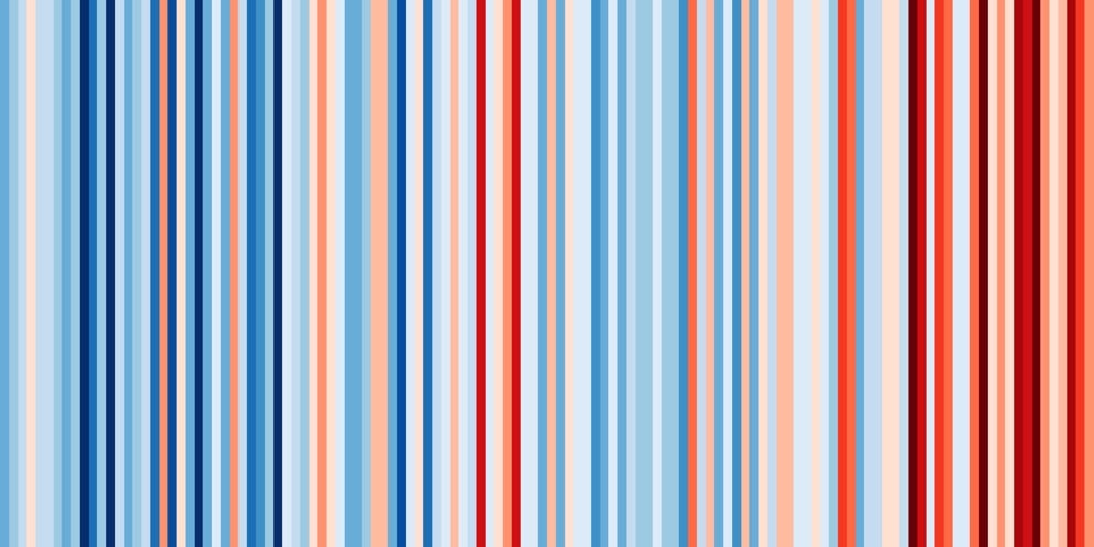
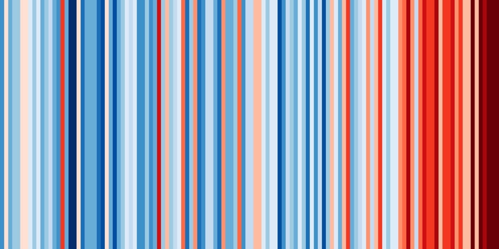
Here’s Vermont (where I live) and Arizona:
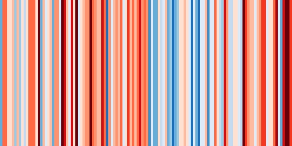
You can see there’s more variation on the regional level than globally. Check out the graph for Mississippi:
The warming patterns for particular regions are not going to be uniform…some places are actually forecast to get cooler and wetter rather than hotter and dryer. You can create and download your own climate stripes here…perhaps you can use it to make a global warming blanket. (via riondotnu)

Socials & More