Our potential neverending hot American summer
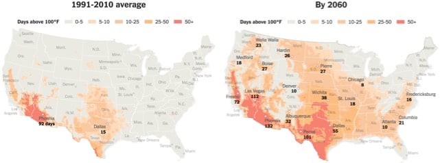
In today’s installment of terrifying graphics about climate change, the NY Times made a series of three maps showing the potential rise of 100 degree temperatures across the United States if current greenhouse gas emission trends continue through the end of this century. Look at the areas in orange and red on the 1991-2010 map: what sort of landscape do you picture? Keeping that landscape picture in your mind, look at the orange and red areas on the 2060 and 2100 maps. Yep! And Phoenix with 163 days above 100 degrees — that’s every day from March 25th to September 4th over 100 degrees.
P.S. A word about climate change and rising temperatures. The temperature that climate scientists typically reference and care about with regard to climate change is “the average global temperature across land and ocean surface areas”. According to the NOAA, the average temperature of the Earth in the 20th century was 13.9°C (57.0°F). In 2015, the average global temperature was 0.90°C (1.62°F) above that.
In order to avoid dangerous effects of climate change, climate scientists advocate keeping the global average temperature increase below 2 degrees (and more recently, below 1.5 degrees). In late 2015, 195 nations came together in Paris and agreed to:
[Hold] the increase in the global average temperature to well below 2°C above pre-industrial levels and to pursue efforts to limit the temperature increase to 1.5°C above pre-industrial levels, recognizing that this would significantly reduce the risks and impacts of climate change
That’s degrees Celsius, not Fahrenheit. I don’t know about you, but as an American, when I hear 2 degrees, I think, oh, that’s not bad. But 2°C is an increase of 3.6°F, which does seem significant.
Note also that it specifies keeping the temperature “below pre-industrial levels” and not below 20th century levels. It is maddeningly difficult to track down an exact figure for the pre-industrial global temperature, partially because of a lack of precise data, partially because of politics, and partially because of the impenetrability of scientific writing. From a piece Eric Holthaus wrote for FiveThirtyEight earlier this year:
It sounds easy enough to measure global warming: see how hot it was, compare it to how hot it used to be. But climate scientists have several ways of measuring how hot it used to be. NASA’s base period, as I mentioned above, is an average of 1951-80 global temperatures, mostly because that was the most recently available 30-year period when the data set was first created. By chance, it’s also pretty representative of the world’s 20th-century climate and can help us understand how much warmer the world has become while many of us have been alive.
Other organizations go further back. The Intergovernmental Panel on Climate Change, the body of climate scientists that was formed to provide assessments to the United Nations, bases its temperature calculations on an 1850-1900 global average. There was about 0.4 degrees of warming between that time period and the NASA base period.
Climate scientists often refer to that 1850-1900 timespan as “pre-industrial” because we don’t have comprehensive temperature data from the 1700s. But meteorologist Michael Mann, director of Penn State University’s Earth System Science Center, has argued that an additional 0.25 degrees of warming occurred between the start of the Industrial Revolution (around 1750) and 1850. Including Mann’s adjustment would bring February 2016 global temperatures at or very near 2 degrees above the “pre-industrial” average.
I now completely understand why some people deny that anthropogenic climate change is happening. Seriously. I looked for more than 30 minutes for a report or scientific paper that stated the average global temperature for 1850-1900 and I couldn’t find one. I looked at UN reports, NASA reports, reports from the UK: nothing. There were tons of references to temperatures relative to the 1850-1900 baseline, but no absolute temperatures were given. Now, I don’t mean to get all Feynman here, but this is bullshit. When the world got together in Paris and talked about a 1.5 degree increase, was everyone even talking about the same thing? You might begin to wonder what the scientists are hiding with their obfuscation.
Anyway, the important point is that according to climate scientists, we are already flirting with 1.5°C of global warming since pre-industrial times. Which means that without action, the spread of those Phoenician temperatures across the circa-2100 United States is a thing that’s going to happen.
Socials & More