Zines are the future of media
My favorite Nieman Lab prediction for journalism in 2018 (including this one I wrote myself) is Kawandeep Virdee’s “Zines Had It Right All Along.”
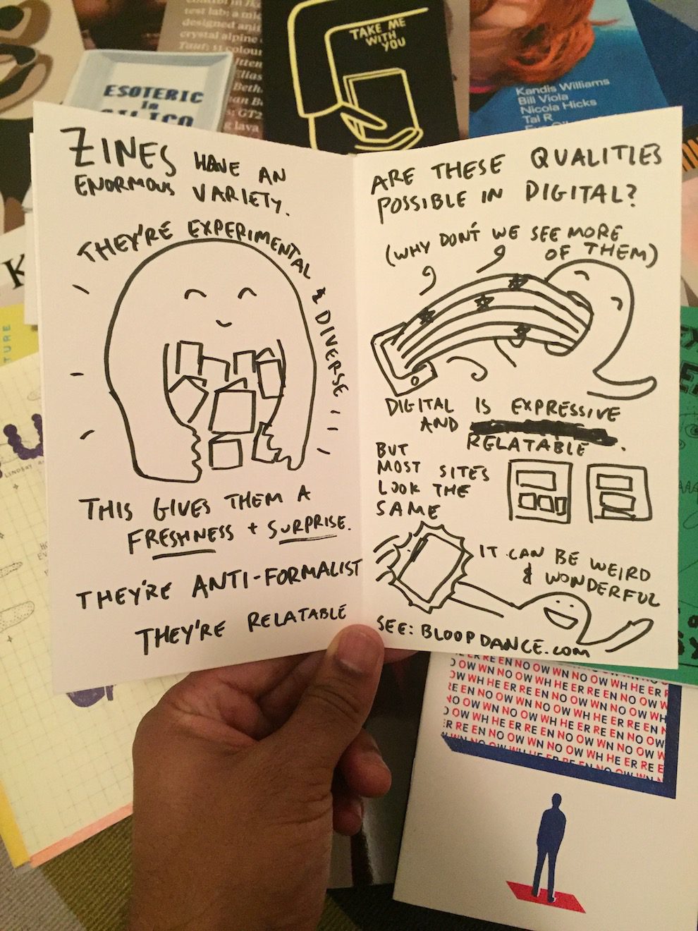
His actual prediction is that in 2018, digital media “will reflect more qualities that make print great.” Virdee distills a shortlist of qualities of zines and quarterly mags that he thinks are portable to digital:
- Quarterlies are a pleasure to read with a variety in layout and pacing
- They’re beautiful to hold.
- They’re less frequent, and much better.
- Even the ads are well-crafted, and trusted.
- Zines have an enormous variety.
- They’re experimental and diverse.
- This gives them a freshness and surprise.
- They’re anti-formalist; they’re relatable.
“Most sites look the same,” Virdee writes. “It can be weird and wonderful.”
The positive example he gives isn’t a text feature, but the NYT video series “Internetting with Amanda Hess.” It’s an odd choice because digital video hasn’t had much of a problem picking up on a zine aesthetic or giving us that level of freshness and surprise; it’s digital text that’s been approaching conformity.
It’s also weird that Virdee works product at Medium, which is one of the sites that, despite or maybe because of its initial splash, is kind of the poster child for the current design consensus on the web. If Virdee is making the case that Medium (and other sites) should look a lot less like Medium, that would be the most exciting thing that Medium has done in a couple of years.
The other point I’d add is that zines and quarterlies look the way they do and feel the way they feel not because of a certain design aesthetic they share, or a design consensus they break from, but because of how they’re run, who owns them, and why they’re published. They look different because they are different. So maybe we need to look at the whole package and create an… oh, I don’t know, what’s the phrase I need… an “indie web”?


Socials & More