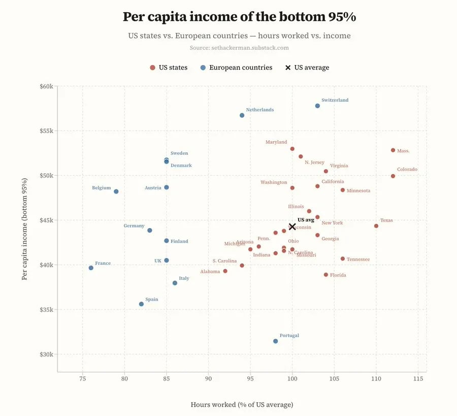
Yet another graph showing that when you control for quality of life (hours/week worked) and wealth inequality, American exceptionalism disappears.
Advertise here with Carbon Ads
This site is made possible by member support. 💞
Big thanks to Arcustech for hosting the site and offering amazing tech support.
When you buy through links on kottke.org, I may earn an affiliate commission. Thanks for supporting the site!
kottke.org. home of fine hypertext products since 1998.
Beloved by 86.47% of the web.

Comments 1
I felt like there was a simpler way to make this comparison so I took the data from the original chart and made this spreadsheet and bar chart that normalizes income by hours worked per week.
If you feel like this comment goes against the grain of the community guidelines or is otherwise inappropriate, please let me know and I will take a look at it.
This thread is closed for new comments & replies. Thanks to everyone for participating!