See Intricate Details in Leonardo da Vinci’s The Last Supper in a New Gigapixel Image
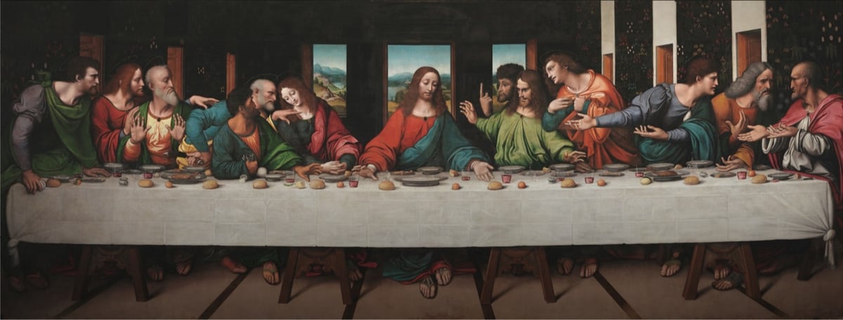
The Royal Academy of Arts and Google teamed up on a high-resolution scan of a copy of Leonardo da Vinci’s The Last Supper painted by his students. Even though the top part of the original is not depicted, this copy is said to be “the most accurate record of the original” and since the actual mural by Leonardo is in poor shape, this copy is perhaps the best way to see what Leonardo intended.
This version was made around the same time as Leonardo made his original. It’s oil paint on canvas, whereas Leonardo’s was painted in tempera and oil on a dry wall — an unusual use of materials — so his has flaked and deteriorated badly. It probably didn’t help that Napoleon used the room where the original hung as a stable during his invasion of Milan.
A zoomable version is available here. The resolution on this scan is incredible. The painting is more than 26 feet wide and this is the detail you can see on Jesus’ downcast right eye:
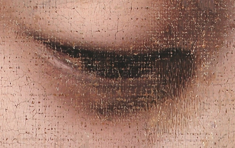
Wow. You can compare this painting to a high-resolution image of the original on the Haltadefinizione Image Bank or Wikimedia Commons. And you can learn more about the copy and how it relates to the original on the Royal Academy website.
The genius of Leonardo’s composition is much clearer in the RA copy. The apostles are arranged into four groups of three and there are many subtle interactions between the figures. Leonardo believed that gestures were very important in telling the story. He explained that the power of his compositions were such that “your tongue will be paralysed with thirst and your body with sleep and hunger before you depict with words what the painter shows in a moment”.
There are many elements in the copy which are more distinct that the original, such as the figure of Judas clutching his money bag and knocking over the salt. The landscape beyond the windows with its valleys, lakes and paths is well preserved in the copy, but has almost disappeared in the original. Leonardo’s use of colour was was greatly admired, but in the original the colours are very faded — Saint Simon on the extreme right clearly wears a pink cloak, but this is not visible in the original.
(via open culture)




Socials & More