The New MoMA
After months of renovations and a week or two of previews, MoMA officially reopens for business today. I was able to attend a press preview last week and here are some observations I had about my visit.

One of the main goals of the museum’s expansion was to “focus new attention on works by women, Latinos, Asians, African-Americans and other overlooked artists”. I’ll leave the question of their success in more qualified hands, but even making the attempt is an admission by one of the most influential museums in the world that the art that society considers important is highly subjective. If there are good paintings that aren’t currently considered that interesting or important (because they’re not by Picasso or Degas or Cezanne), maybe that can change depending on what stories you tell about them. Look at what the Hilma af Klint show at the Guggenheim did for example.
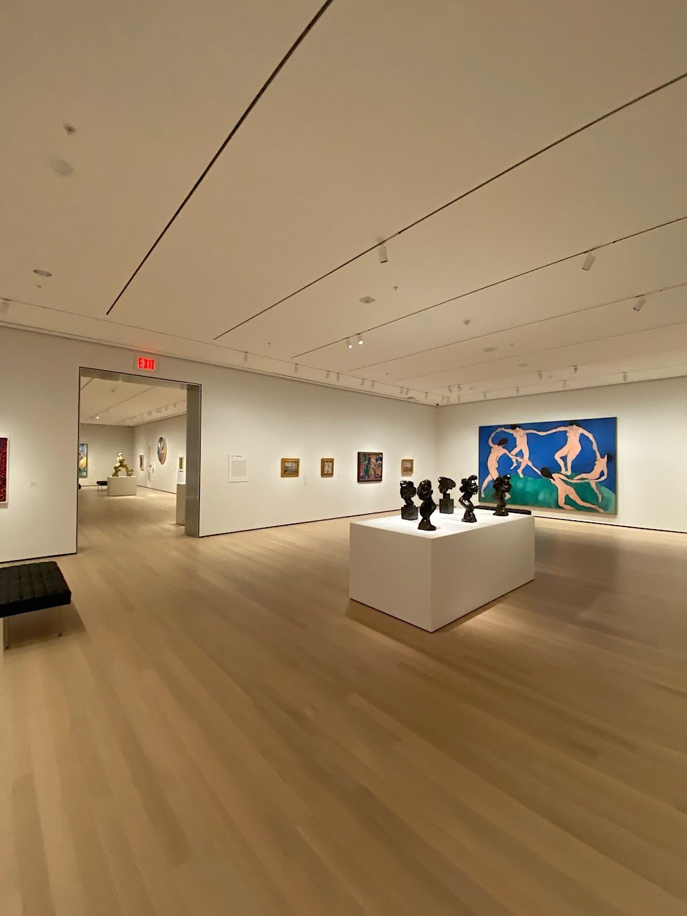
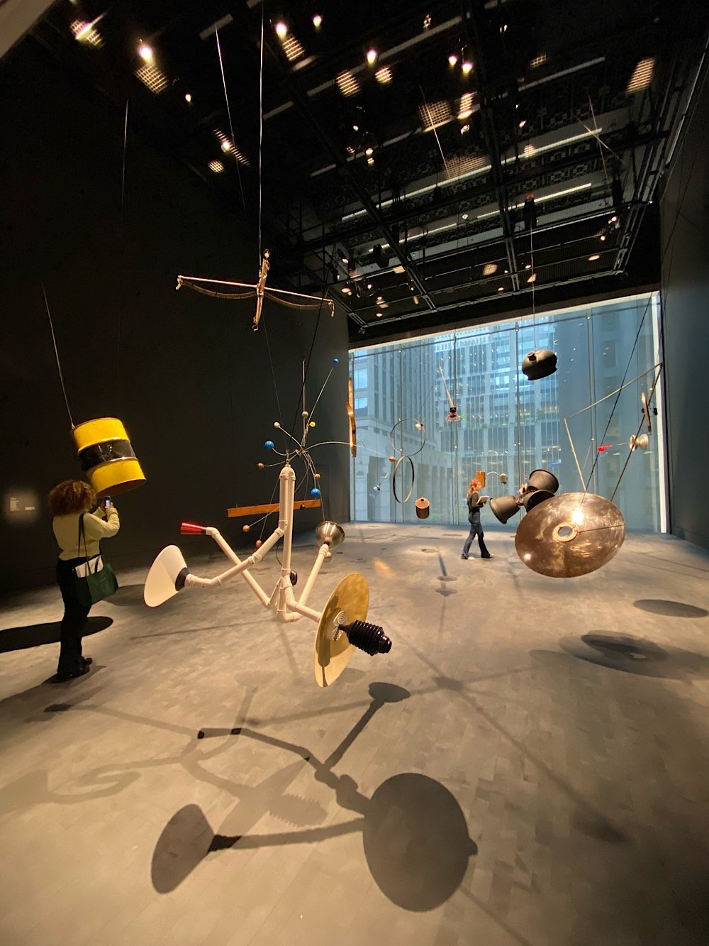
The display of the main collection is now not just paintings and a sprinkling of sculpture but also includes photography, film, architecture, performance art, design, and drawings. The art is also placed into much more of an historical context than before…the visitor gets more of a sense of what was going on in the world when these pieces were created and what societal happenings the artist may have been reacting to in creating their work. I very much enjoyed these improvements.

The general feel of the place is more casual than before. In Amy Sillman’s Artist’s Choice gallery, paintings and sculptures were resting on risers around a large room, all unlabelled. Gallery titles were sometimes colloquial instead of formal or academic. In the one of the exhibitions, the gallery titles were in all lowercase — “a revolution of limits” vs “A revolution of limits” or “A Revolution of Limits”.
In some areas, the space still smelled vaguely of construction.
One of the things I love about The Whitney is how it incorporates the city into the art viewing experience. On the top floors, you can look at what’s on display and then head out to the terrace to see the city on display: the architecure, the construction, people walking on the High Line, the Hudson River traffic. It doesn’t have the best location to work with, but the new MoMA tries to do this a little more after the renovation. There are new overlooks to the sculpture garden and larger windows with street views.
Was it my imagination, but was Matisse’s Swimming Pool room actually a bit warmer and more humid than the other galleries? You know, like an actual indoor swimming pool?

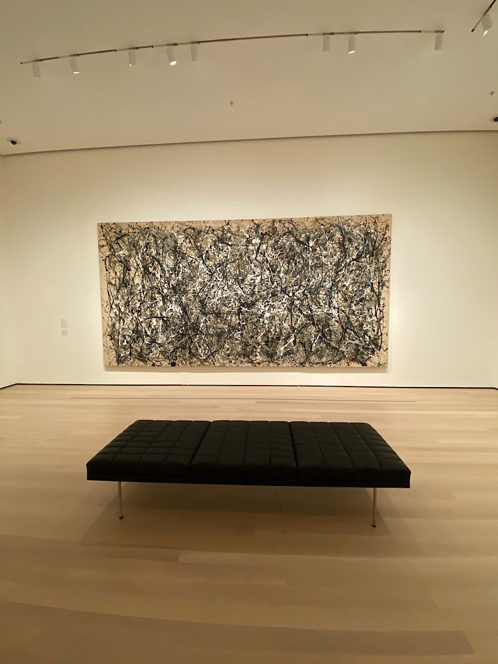
Honestly, the best part of my experience was how few people were there. This was the last of four press previews and was sparsely attended because most people had already filed their stories. In many galleries, I was completely alone with these amazing works of art. I stood in front of Starry Night for two minutes all by myself — same with Pollock’s One: Number 31, 1950 and Les Demoiselles d’Avignon. Monet’s Water Lillies gallery was empty. Empty! I sat for several blissful minutes taking it all in — it was almost meditative. This reveals a sad truth about large and popular art museums like MoMA: they are often not good places for actually viewing art. They’re just too crowded. Starry Night is basically an Instagram selfie wall at this point. During a normal visit, you can’t actually look at the thing to see what van Gogh was up to with his brushstrokes because there are 20 people waiting their turn to see it too. But you can’t spend $450 million on a renovation and just let a few hundred people a day into the place, right?


Socials & More