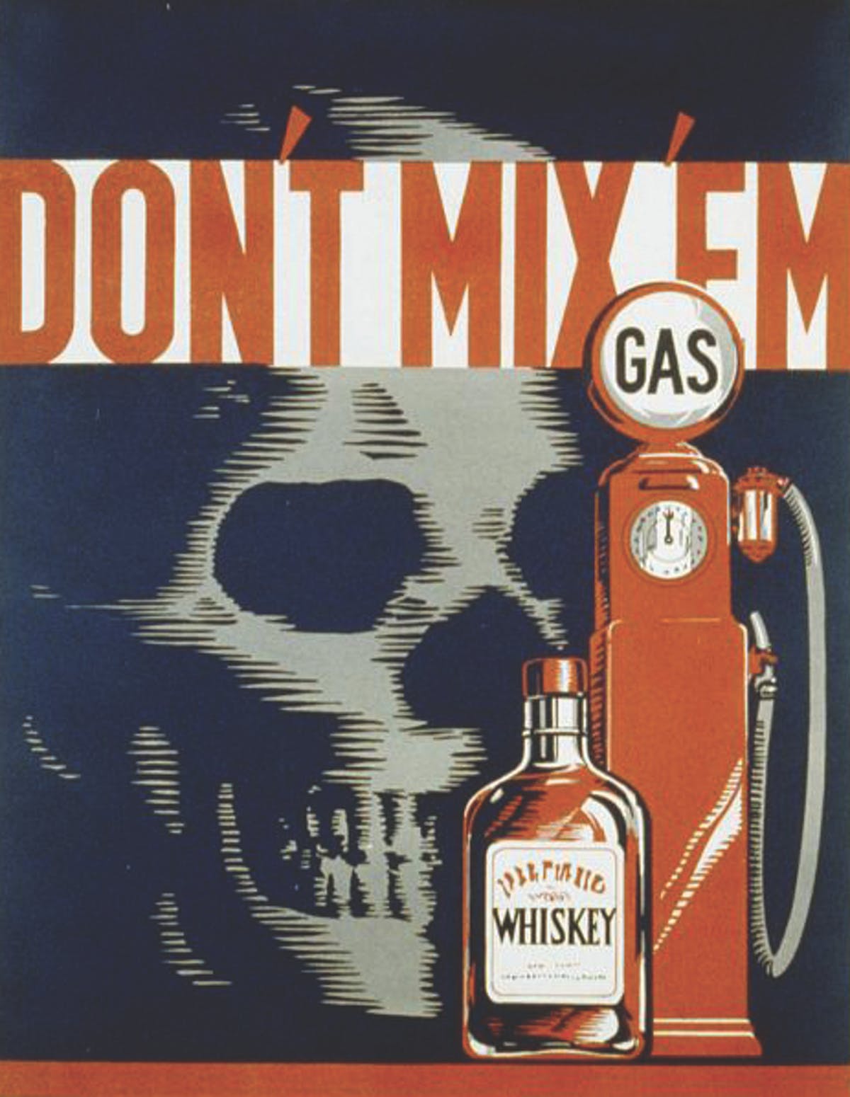
Contemporary Versions of WPA Public Service Announcement Posters
For Topic, MGMT. Design created a series of 2018 updates to the iconic WPA public service announcement posters from the 1930s and 1940s. Some of the posters are directly imitating specific WPA posters; others have a looser inspiration.
For example, here’s a “Don’t Mix ‘Em” WPA poster:

And here’s the corresponding 2018 version:

And the rest of the contemporary series:


In the accompanying essay, the designers write that “we noticed that the advertising of the 1930s and ’40s seemed far less cynical or manipulative than it is today… Today’s distribution methods have created a relentless flood of messages, putting a torrent of information in the palm of your hand. How the public values, rejects, or embraces this version of public information is up to them.”
The other obvious difference is the overall mood of the messages. The WPA posters are direct, imperative, and point towards solutions, even when they’re being particularly grim about it. The contemporary versions are ironic, diffident, and uncertain about solutions — or at least, uncertain about solutions that can be reduced to a bold-type message across a poster. (Except “Don’t Send Dick Pics.” That one, they’ve got nailed.)
At the same time, there’s a yearning for that level of clarity, aesthetically if not intellectually. All of this seems frustrating but basically honest about the mood and limitations of this political moment.


Socials & More