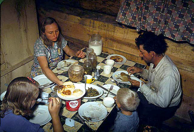
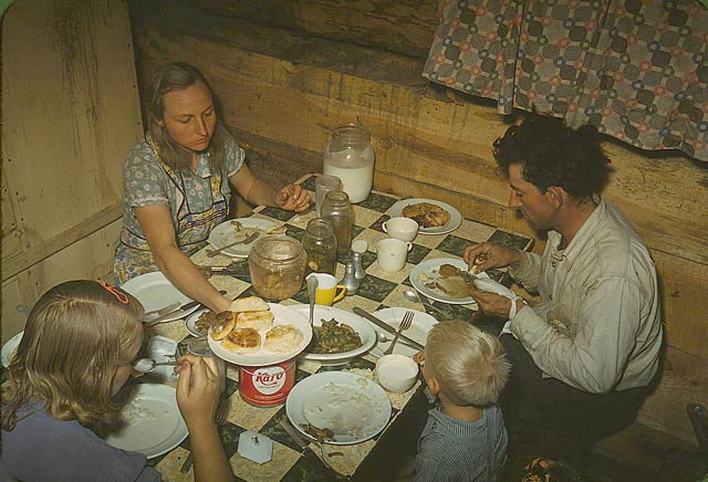
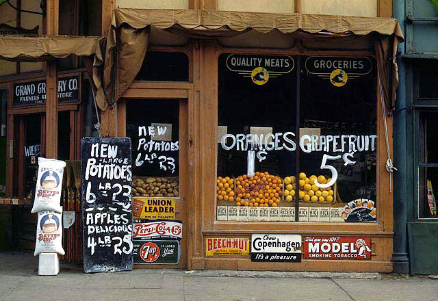
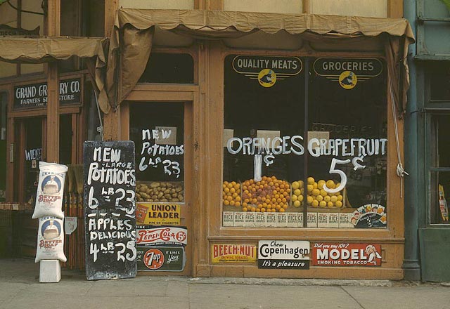
Until recently, the color palette of history was black and white. The lack of color is sometimes so overpowering that it's difficult to imagine from Matthew Brady's photos what the Civil War looked like in real life. Even into the 1970s, press photos documenting the war in Vietnam were in B&W and the New York Times delivered its news exclusively in B&W until the 90s, running the first color photograph on the front page in 1997.
Which is why when color photos from an event or era set firmly in our B&W history are uncovered, the effect can be jarring. Color adds depth, presence, and modernity to photography; it's easier for us to identify with the people in the pictures and to imagine ourselves in their surroundings. Some examples include Sergei Mikhailovich Prokudin-Gorskii's stunning photographs of Russia circa 1909-1915, color photos from World War I (more here), and color photos from World War II (more here).
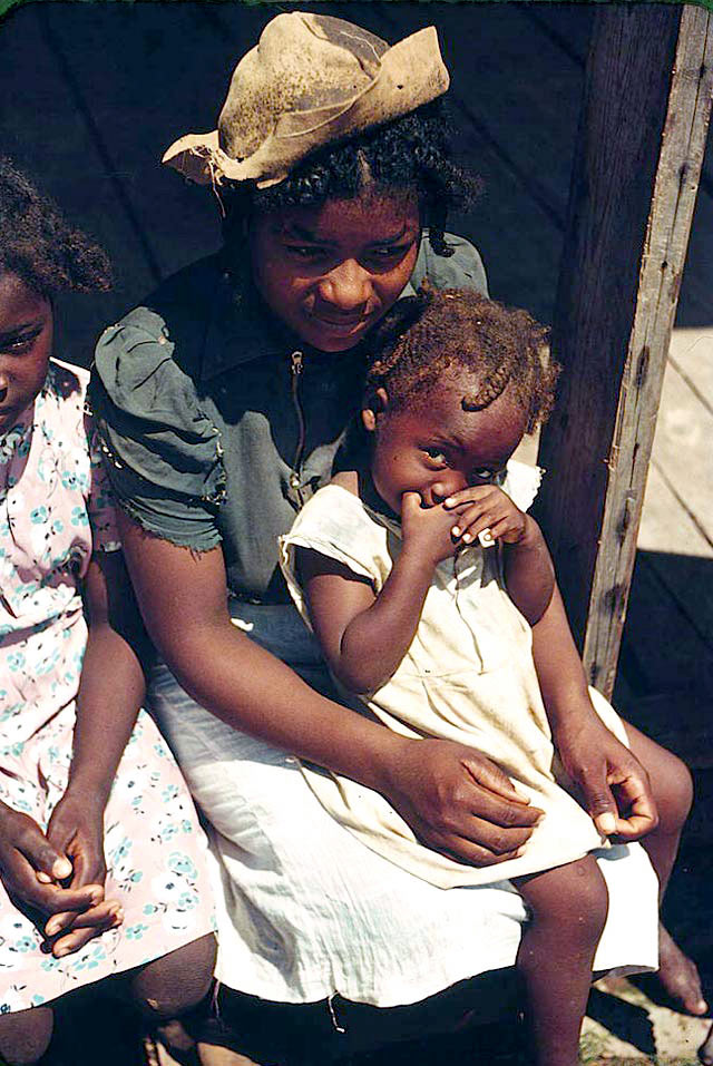
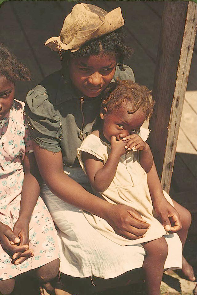
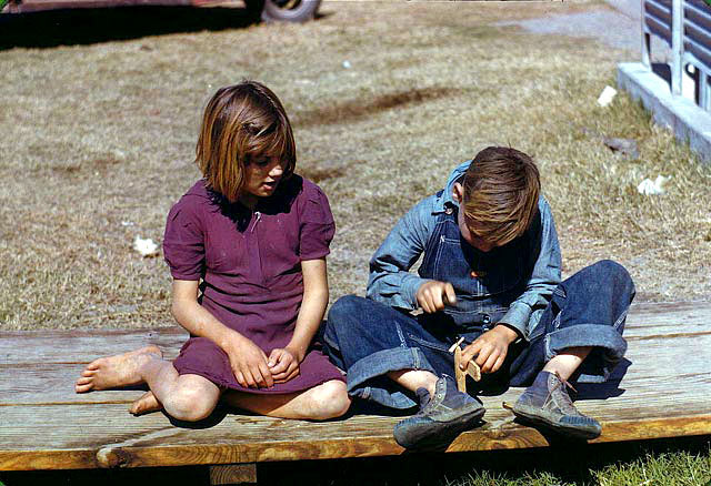
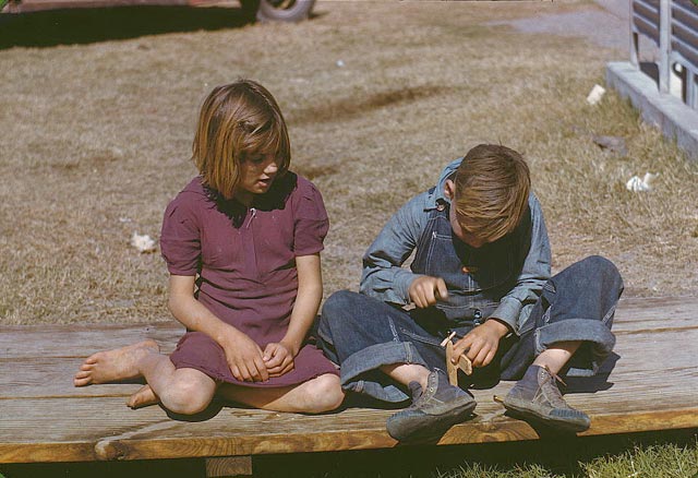
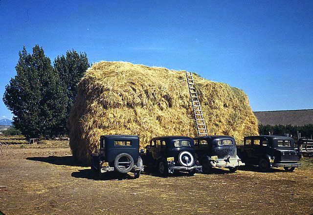
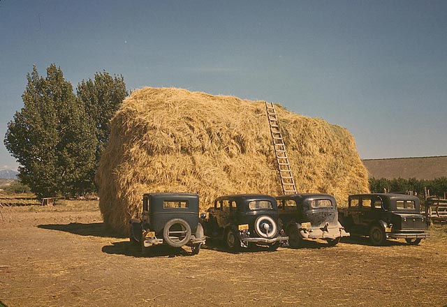
A reader recently sent in a link to Bound for Glory: America in Color, 1939-1943, a Library of Congress exhibition of several color photographs from that era. Like the photos referenced above, these look strikingly modern, but because they were produced by scanning color transparencies, most these photos have a low contrast, muddy quality to them.
To bring these photos more firmly into the modern era, I color corrected a few of them with Photoshop. My goal was not to blow out the contrast or unnecessarily accentuate colors, but attempt to duplicate what these photos would look like had they been taken with a contemporary camera and processed using contemporary techniques and materials. The photos are displayed in pairs, with the color-corrected version first, followed by the original for comparison.
