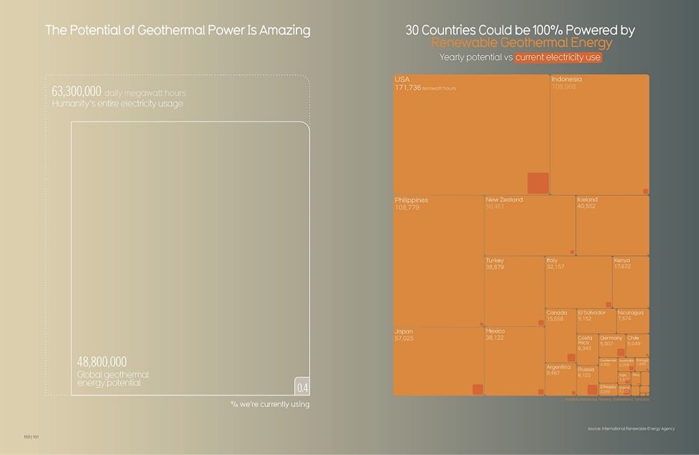
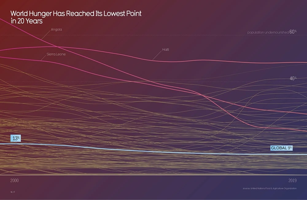
For the past few years, David McCandless at Beautiful News Daily has been sharing infographics about positive developments in the world, the “stuff we can’t always see because we’re fixated on the negativity of the news”. Now all that good news has been bundled into a new book, Beautiful News: Positive Trends, Uplifting Stats, Creative Solutions. Here are a couple of sample pages from the book:
From designer Karl Sluis, a list of nine great book about information visualization not written by Edward Tufte. Gonna keep my eye out for Stephen Few’s Now You See It and David McCandless’ The Visual Miscellaneum, but Herbert Bayer’s World Geographic Atlas is a little too rich for my blood.
David McCandless has been highlighting good information design for years on Information Is Beautiful. The site spawned a book of the same name in 2009. Now McCandless is back with a new book, Knowledge Is Beautiful.
Every day, every hour, every minute we are bombarded with information, from television, from newspapers, from the Internet, we’re steeped in it. We need a way to relate to it. Enter David McCandless and his stunning infographics, simple, elegant ways to interact with information too complex or abstract to grasp any way but visually. McCandless creates visually stunning displays that blend the facts with their connections, contexts, and relationships, making information meaningful, entertaining, and beautiful. And his genius is as much in finding fresh ways to provocatively combine datasets as it is in finding new ways to show the results.
Here’s some more information about the book.
David McCandless made a data visualization comparing the Atlantic Ocean fishing stocks in 1900 and in 2000. It’s a literal jawdropper…here’s just a little bit of it:
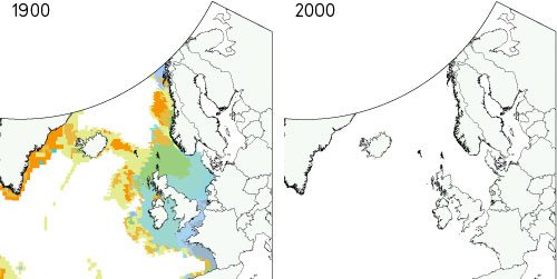
That’s not just depleted…the fish are just gone. Click through for the full craziness. (via @daveg)
Stay Connected