introduction & contents
Hi there. I'm Jason Kottke, a NYC-based web designer, and this is my design portfolio. I dislike portfolios somewhat because they offer such a flat view of the rich process and product of web design. As such, I consider this an introduction to a conversation about the work I do and how I do it. If you'd like to hear more, please get in touch.
portfolio of work
You are here. Scroll to your right (») to view samples of my work.
online resume
Job history, book learning, skills, relevant accomplishments, etc. Checked formispellings misspellings. There is also a print version.
Hi there. I'm Jason Kottke, a NYC-based web designer, and this is my design portfolio. I dislike portfolios somewhat because they offer such a flat view of the rich process and product of web design. As such, I consider this an introduction to a conversation about the work I do and how I do it. If you'd like to hear more, please get in touch.
portfolio of work
You are here. Scroll to your right (») to view samples of my work.
online resume
Job history, book learning, skills, relevant accomplishments, etc. Checked for
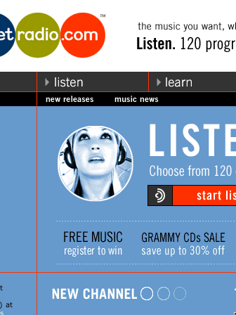
netradio
The redesign of the NetRadio site was my first project at B-Swing. The idea was to design for them a site that was visually distinct from the other Internet radio sites. They offered higher quality programming and content than their competitors and wanted the site to reflect that.
The best part about working on the NetRadio site was all the photography we had access to. Because they sold albums on the site, we could use imagery from any album cover we wanted. I was like a kid in a candy store with all those high-quality photos.
Launched fall 1999 (no longer live). Interface & visual design, HTML coding.
susan orlean
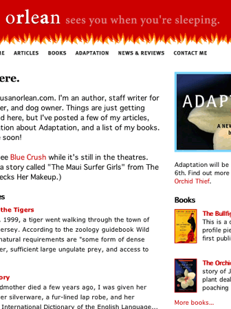
Susan is an author and staff writer for The New Yorker. She wanted to put up a web site because of the potential interest in her work due to Adaptation, an upcoming film based on her book, The Orchid Thief.
Susan is also my all-time favorite client. Many are burnt out on the web; the novelty of the web has worn off, several lost jobs & money in the post boom economy, and everyone has a web site already. Working with Susan was the perfect antidote to all of that. She was genuinely excited about building her site and exploring the possibilities of a new medium. Helping her reminded me why I'd been attracted to the web & design in the first place.
Launched Sep 2002. Interface design, visual design, HTML, CSS, Perl & database programming (I built an app for Susan to upload and manage her NYer articles).
instantdollars
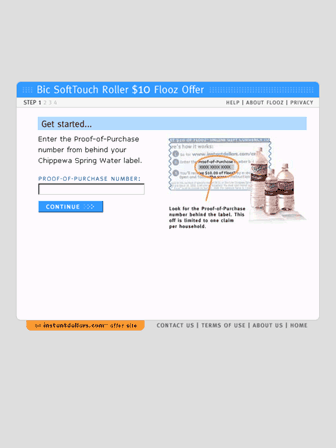
The InstantDollars program worked like this. Jimmy bought a bottle of spring water. On the inside of the label was a URL and a redemption code. Fill in the code & some personal information on the site and Jimmy's got $10 worth of store credit at select online retailers.
Now, InstantDollars got paid when people entered codes *and* spent the money at the retailers. The challenge with the site was: 1) to make it as easy as possible for your average consumer to enter their information; and 2) once they had done that, get them shopping.
Launched spring 2000 (no longer live). Interface & visual design, information architecture, HTML coding, JavaScript, and contingency design.
moreover.com
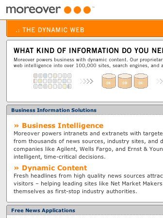
I believe I perform best when given lots of time, but I end up working under the gun a lot. When I arrived at Moreover, I was given a computer, a table, a logo, & a rough site map and was told we needed a complete site done, like, yesterday. "Like, yesterday" turned out to be four weeks or so, and I got it done on schedule, even though I had to work most of Thanksgiving weekend to do it.
Launched Dec 2000 (design no longer live). Duties included information architecture, visual design, HTML, CSS.
privateaccounts
PrivateAccounts knew their potential audience precisely -- upper middle class Americans with more than $500,000 in investments -- and wanted us to translate that into a site design. We did extensive brand analysis in that market segment and determined that we needed something clean, usable, and with a touch of class typically missing from your average financial site.
We never got a chance to see if we were right about what we had designed. The site prototype we built was just bait for an acquisition; E*Trade bought PrivateAccounts soon after it was completed. A modified version of the site eventually went live on etrade.com.
Internal prototype completed spring 2000. I was the lead interface designer on this project, doing interface & visual design, information design (charts and graphs), and HTML coding.
kottke.org
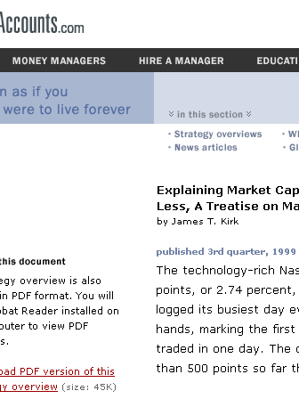
Kottke.org is my personal web site where I write near-daily thoughts on a variety of topics. Even though it's just a personal site, running the site for the last 4+ years has taught me much about the nature of web as it relates to design, writing, marketing, and technology.
One of the most valuable lessons I've learned is how powerful embracing the fluidity of the web can be. Fluidity doesn't imply chaos; you can have stability and consistency even in change.
Launched Mar 1998. My contribution includes everything really: writing, interface & visual design, Perl programming, database admin, HTML, CSS.
Additional portfolio items
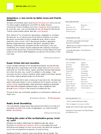
Gawker. The recently launched Gawker is a Manhattan weblog magazine: "a live review of city news, and by news we mean, among other things, urban dating rituals, no-ropes social climbing, Condé Nastiness, downwardly-mobile i-bankers, real estate porn -- the serious stuff". I designed the logo and did most of the interface design.
Silkscreen. I designed Silkscreen because I wanted a tiny typeface for web design. I put it up on my web site for free and tens of thousands of people have downloaded it and used it all over the place. Silkscreen has been sighted on MTV.com, Hermanmiller.com, Sephora's site, Volvo.com, & Britney Spears' official site and was featured in I.D. magazine.
0sil8. This is another personal site of mine. 0sil8 is a collection of interactive art and design "episodes" I did starting in 1996 until last year.
The Obscure Store and Reading Room. Jim Romenesko's Obscure Store is one of the oldest weblogs on the web. I designed him a site that was clean and readable with a little "ye olde shoppe" style.
Past clients include:
3M
ASHRAE
American Standard
Charles Schwab
Chronimed
Department 56
E*Trade
FLW Tour
Fossil Rim Wildlife Center
Imation
Jim Romenesko
Lawson Software
Minneapolis Star Tribune
Moreover.com
NetRadio
PrivateAccounts
Quris, Inc.
St. Paul Venture Capital
Susan Orlean
Target Corporation
University of Minnesota
End notes
If you want to view the source, you'll find valid XHTML and CSS. CSS and XHTML can't do everything in every browser yet, but with this layout it works great, keeping the content well-organized and the file sizes down.
The regular and print versions of my resume use the same HTML file with two different style sheets, which means I can keep both versions in sync without having to edit two different files.
The markup is not as semantically clean as it could be, but one of the important lessons I've learned over the years is that a 90% product today is better than a 99% product three months from now. (Maybe I'll clean it up in three months...)
Fonts used include Verdana, Geneva, Lucida, Helvetica, Arial, Interstate, and Hypnopaedia.
In case you missed it at the beginning, here's a link to my resume (print version).
