The Winners of the Information Is Beautiful Awards for 2018
Since 2012, Information Is Beautiful has picked the best data visualizations of the year. Here are the winners of the 2018 Awards, which includes the team at Northeastern University & National Geographic for their Simulated Dendrochronology of U.S. Immigration 1790-2016 project.
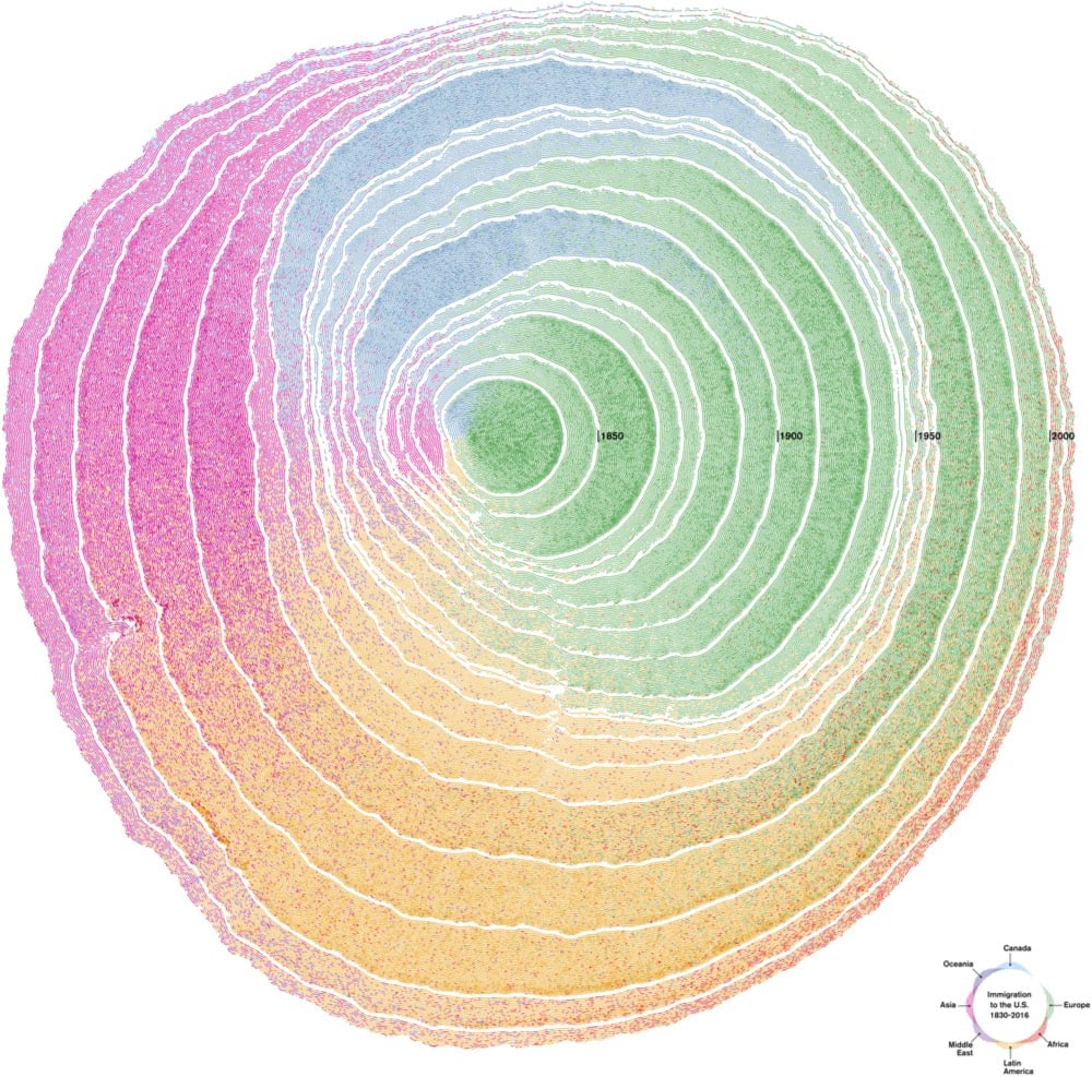
Nature has its own ways of organizing information: organisms grow and register information from the environment. This is particularly notable in trees, which, through their rings, tell the story of their growth. Drawing on this phenomenon as a visual metaphor, the United States can be envisioned as a tree, with shapes and growing patterns influenced by immigration. The nation, the tree, is hundreds of years old, and its cells are made out of immigrants. As time passes, the cells are deposited in decennial rings that capture waves of immigration.
A deserving winner in the “Most Beautiful” category. Here’s an animated view of US immigration’s “tree rings”:
Stay Connected